
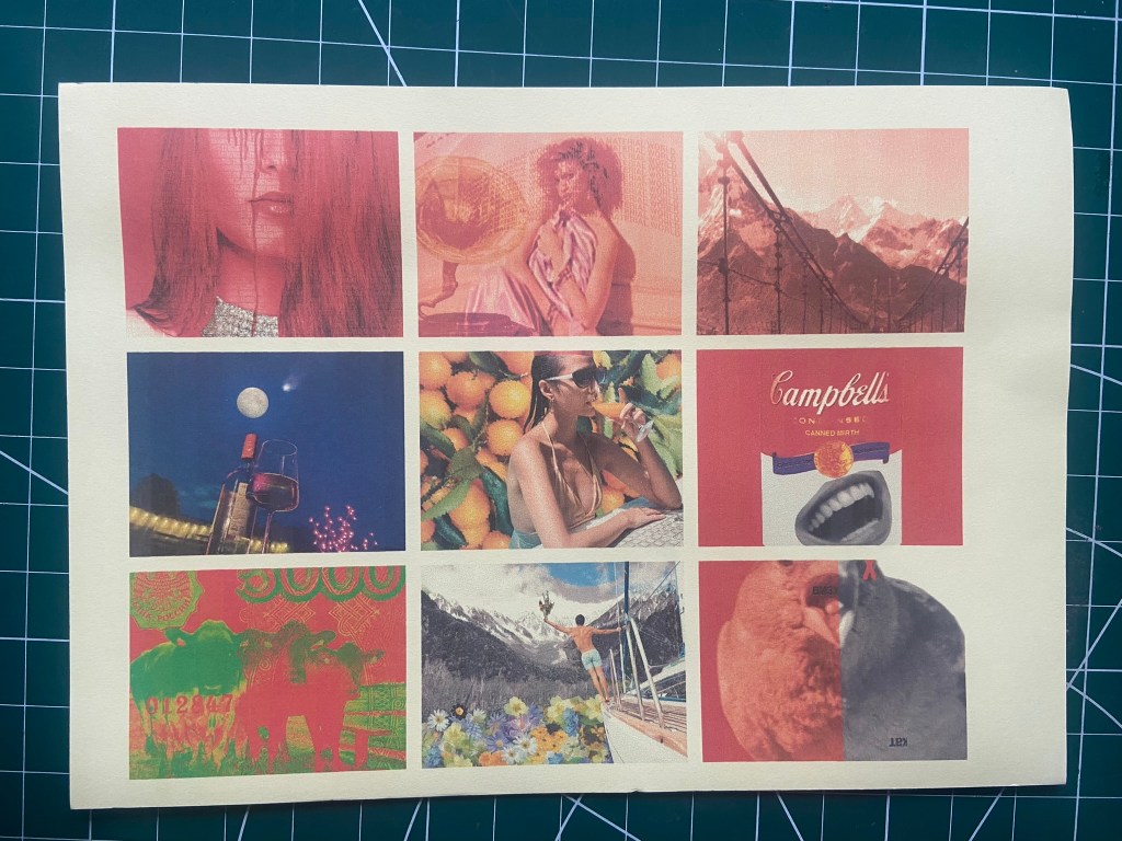
For this exercise I thought that it would just be easier to use the images I used for Tango with Cows, they are all the same size as well which made it easier. I wasn’t worried about the order of them now though. The home inkjet printer I have lets you print so many images to a page and because I am stuck at home poorly at the moment with no access to any other printer and my inks are low, I decided to be resourceful and print 9 to a page.
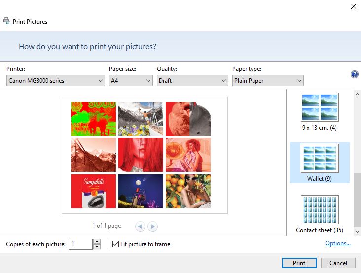
I can then print all the images onto one page and print them all onto different paper sources to see what each image looks like as supposed to picking certain images for certain media.
I raided my big bag for life once again to see what materials were in there:
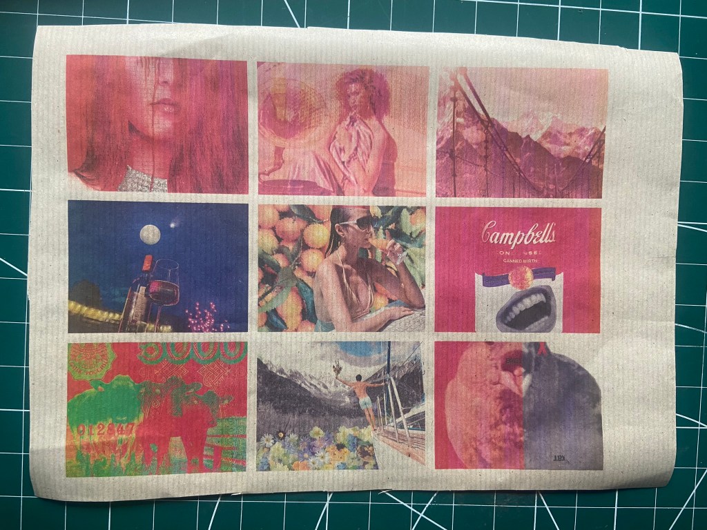
I cut some papers to the size of A4, I used:
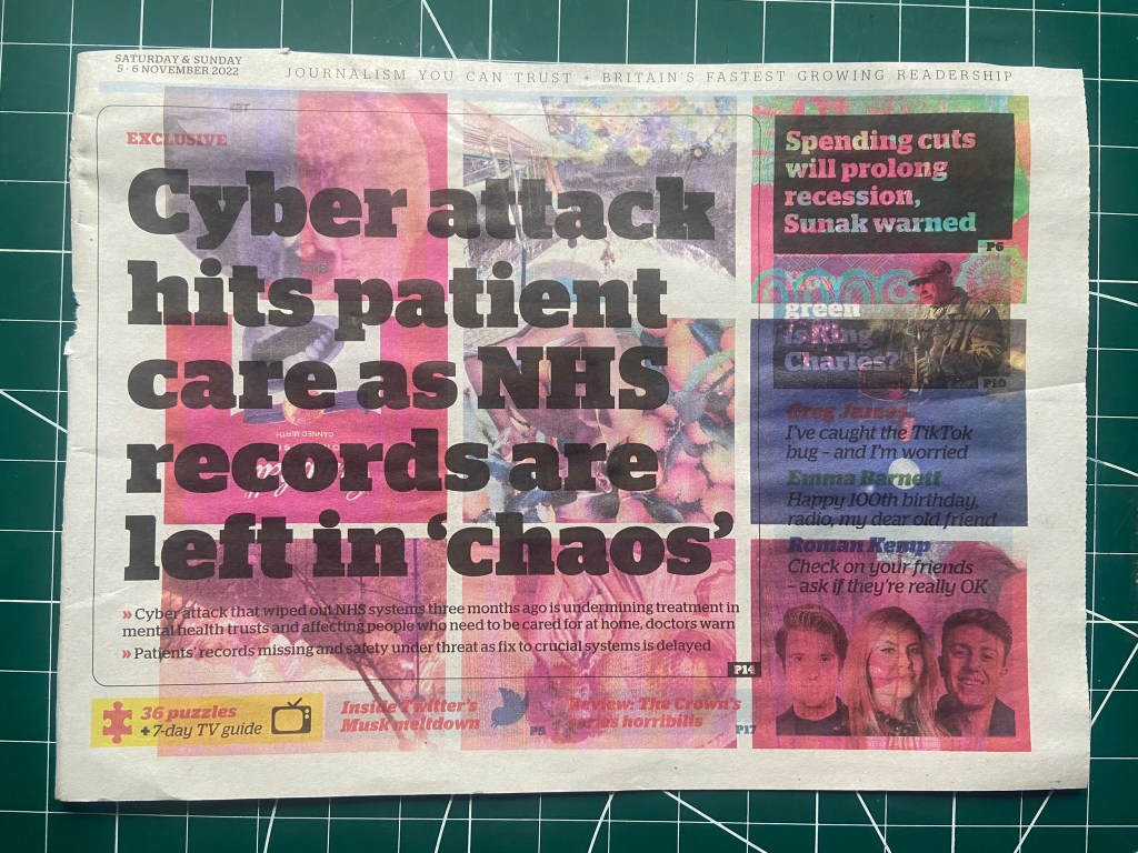
- Newspaper
- the back of an Amazon cardboard envelope
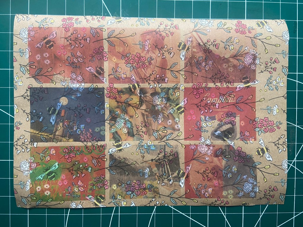
- wrapping paper with a beautiful bee design
- greaseproof paper
- tracing paper
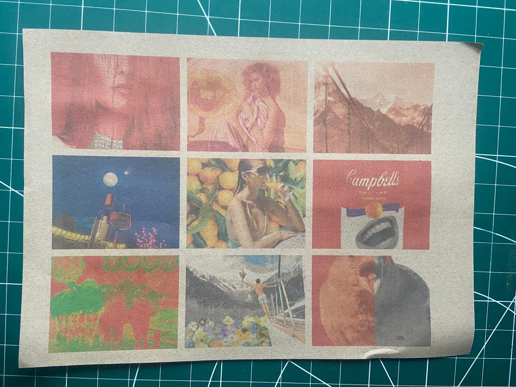
- brown paper
- orange coloured card
- yellow paper
- the back of a banana bag from the supermarket
- a firm ish grey board packaging paper

The winner for me was Tracing paper! Not only does it have that really nice crinkly sound when you move it about! It also printed out the most vibrantly! Baring in mind that I am using an inkjet printer and the results I got using a colour Laser printer would have been completely different again, but the colours are really bold and striking on tracing paper. The inks took a little while to soak into the paper and dry but once they did the colours popped! I have to revisit Tango with Cows in my feedback so I think once I do I shall rethink about how I make the book for them and consider trying out tracing paper for it. There is not only a visual aspect to this paper source but a sensory one too!

The Amazon parcel backing was difficult to feed through the printer which is why it has clipped part of the images off! It also printed out really faded which is great if you wanted a muted design to print text over the top with but for striking images it is not the right choice. It does give a nice textured effect though for if it were to be scanned in and used in a design.

The newspaper was just too overpowering for the images, Possibly because I used a main headline to feature on this one.. maybe if I just had a page of full print it might look better (I’ll try that one out again in a bit..) The images all bleed into one and you cannot make any of them out.
Although it is difficult to show on camera, the shiny, banana paper bag that you put your bananas in to weight them at the supermarket printed out quite nice and glossy! This is very similar to the tracing paper in that you are getting a very sensory experience as well as a visual one. I imagine it is also sustainable for the environment! The images are not as glossy as they appear on the tracing paper though.
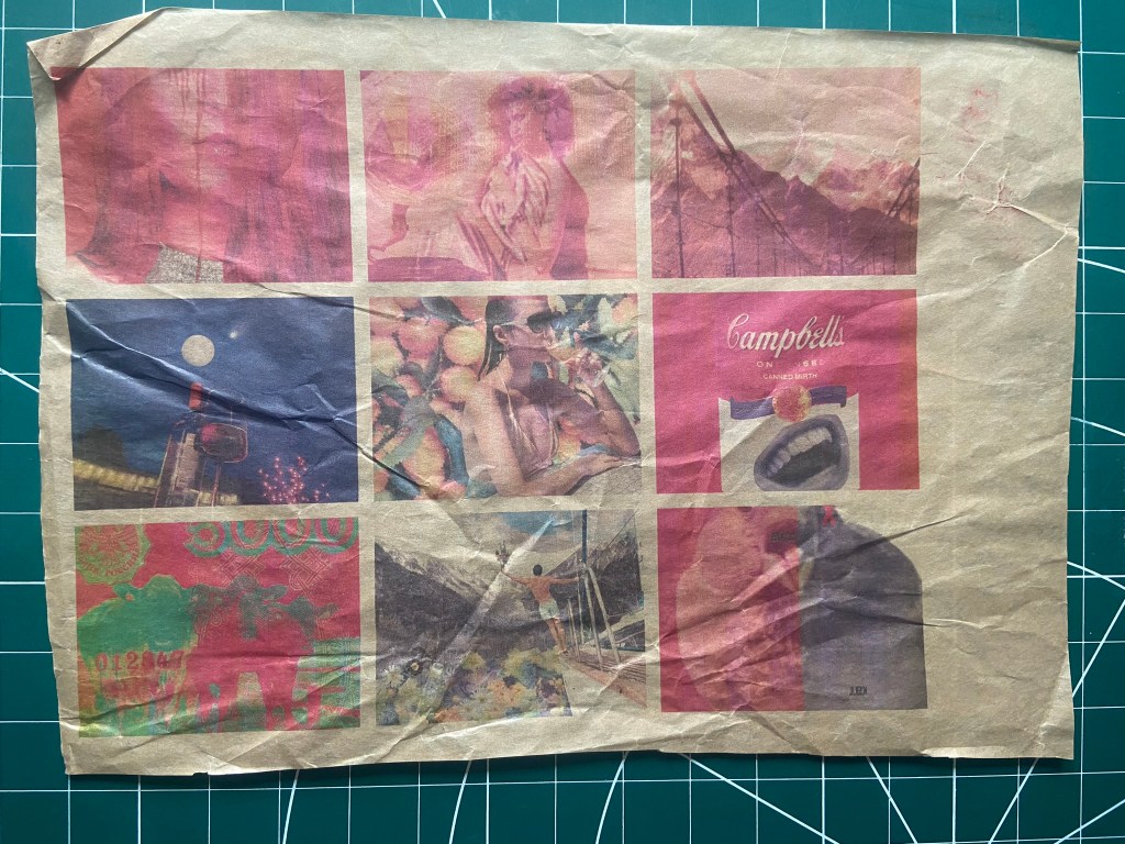
The brown kraft paper was very similar to the greaseproof paper which is below it. The brown paper is matte though and the greaseproof obviously has some sheen and gloss. The colours popped out ever so slightly a little bit more on the greaseproof paper. Neither wowed me though.

The wrapping paper, although it is very beautiful with its lovely Bee print, it didn’t go very well in the printing stakes.. it suffocates and smothers my images. I think it would be ok to layer over the top of solid colours and black and white images possibly but definitely not for these!
The orange card definitely is a non Photoshop version of giving my images a filter! Ideal for the Orange groves image! A lot of my images already have a red tint so the orange just deepens this. The image that stands out most is the comet one which has the deep blue colour, I think because this is a contrasting colour it works against the orange to pop out more.

The yellow paper is a very muted yellow and is almost the same effect as white paper.
This was a heavier weight version of brown paper, it is somewhere between brown paper and the Amazon packaging.. Either way, it doesn’t work. The images are really faded and muted.
It was interesting to see how tracing paper was the best paper as I thought that the ink would not absorb into it and the images wouldn’t print at all! To see that this came out the best and the colours were really vibrant even with using an inkjet printer was surprising! I shall keep this in minf for the next time I am producing a hand printed and handmade book!
For assignment 5 I won’t be using any of these papers though because I plan on having photographs in my book and I want them to be printed to a high quality glossy finish professionally. If I were to print them out myself I would be using the laser colour printer at work and some 160gsm glossy photo printer paper which prints them out to a glossy high standard.
