The Brief
I was very short of time by the time I reached this assignment! I had just about 2 weeks to complete a whole unit! I was feeling the pressure and the panic was on! Weirdly though having such a short deadline for this did help my “perfectionism” and my constant need to go back and change everything all the time! I had to use my gut instincts and go with my first idea and designs.
In my head and because of the limited timescale, I told myself to do a good job in such limited time it would be better to go with the third choice in this brief which was to design a poster and promotional material for a play called “Abigails party” but I knew that if I did not complete this book design choice I would have been really disappointed in myself and regretted my decision; I HAD to push myself and time manage myself to complete this assignment! I really like designing books and magazines so really pushed myself to work hard and achieve my final designs.
I didn’t realise that this brief was such a big brief and that there was so much design development involved with it until I started with the ideas and research. 1 day into this brief and I did panic that I would run out of time before I came up with a good idea for it let alone go through the design process!!
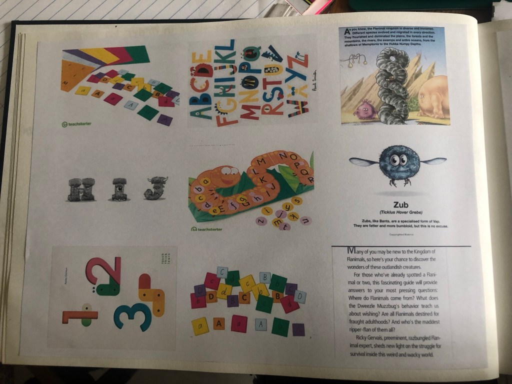
Anyway, I started off with Pinterest again and created a board full of existing book covers, inspiration and ideas to push me forward with my own ideas.
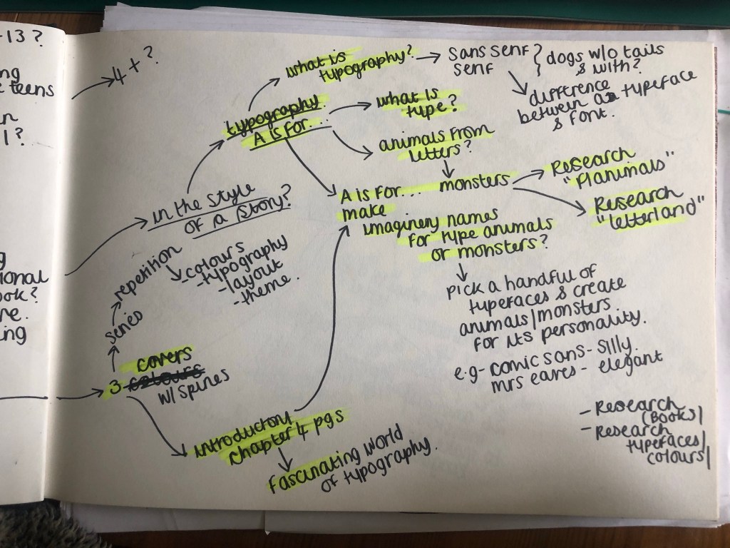
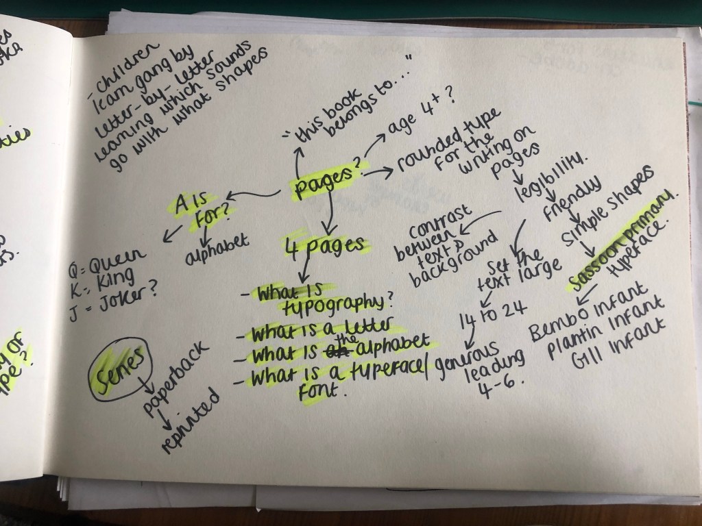
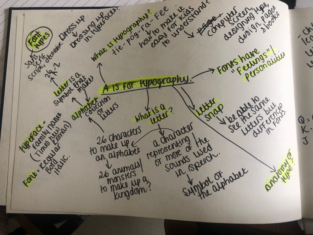
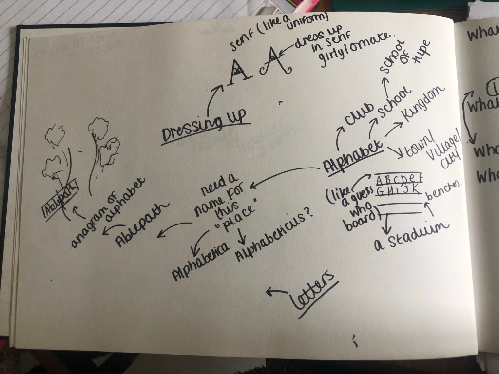
I also started mind mapping in my sketchbook what the brief was asking of me and any ideas I had.
First ideas
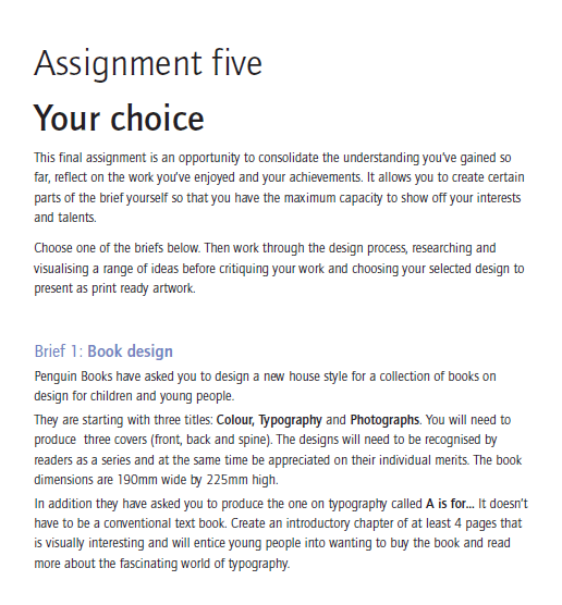
My first initial thoughts were that the brief was asking for a “new house style” of books for young children. The title of one of the books the brief had given me was “A is for..” in my head I decided that title is a book obviously designed for primary school children to help with their reading and writing. The brief also asked for at least 4 introductory pages to “visually entice” children to want to carry on reading the book. I thought that this was a very limited number of pages to get a lot of information in!! I decided I would do 6 double pages.
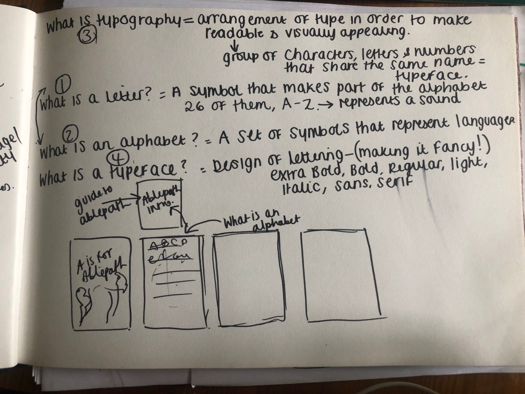
The “A is for…” book was to be based on Typography which is quite a long, complex, complicated subject to teach! There are several things which I knew would be important to know about Typography:
- 1) What is Typography
- 2) What are letters?
- 3) What is an alphabet?
- 4) What is a typeface?
- 5) What is a font?
- 6) What is the difference between a typeface and a font?
- 7) What is a Sans-Serif?
- 8) What is a Serif?
- 9) What is Bold, Italic, Regular, light, oblique, condensed etc…
- 10) The moods that typefaces can convey
How on earth would I explain something so complex to very small children? I was thinking back on my experiences of Graphics and I don’t think I knew what Typography was or the relevance of it until I started my BTEC at college!
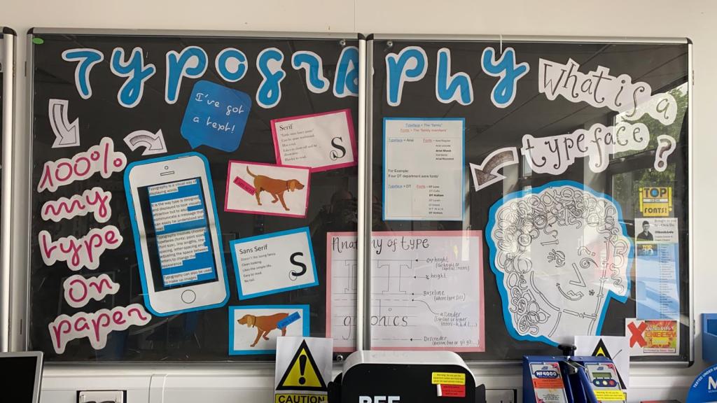
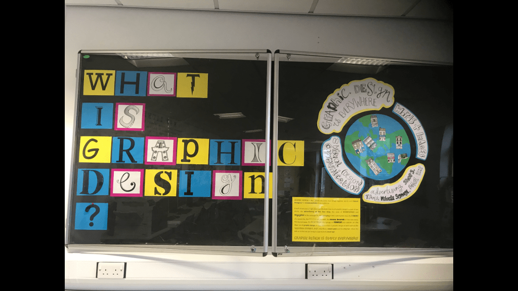
I had this same issue in my day job where I had to create display boards explaining to year 7/8 students what Typography was!- I decided to use these as a reference too!
I knew I would have to break it down into simple bitesize chunks and try and make it interesting and appealing for children. The only ways to do that would be limited text which is easy to read and understand and to create the information into pictures or images somehow…
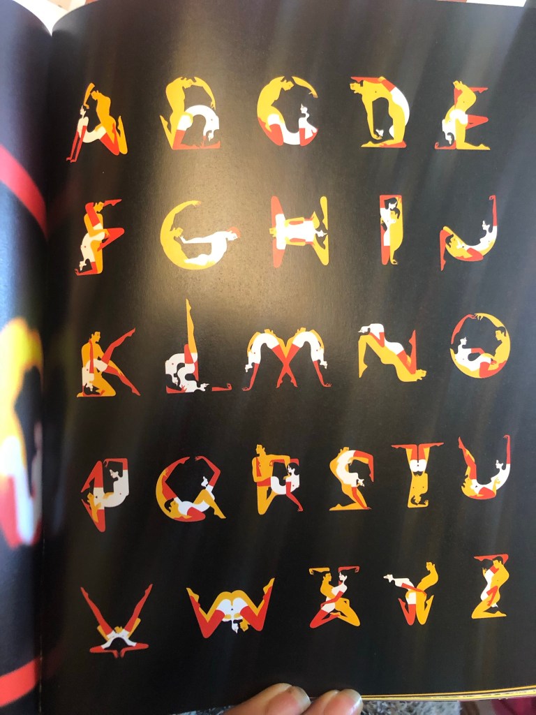
What if I could turn the typography information into a story? I instantly thought of the series by Ricky Gervais called “Flanimals”. These books I remember were really popular with young children when they first came out and I remember that because I couldn’t really understand why!! They are basically books about imaginary weird animals and naming each one and explaining what they are etc.. If I could do something similar in my book design it might be as popular.
I then started to brainstorm ideas around how I could create little monsters out of letters (I decided on monsters because they would be suitable for both boys and girls) Would I create monsters that looked exactly like the letters? – like an A” shaped monster? Or would I create monsters which all looked different but just had the letter on their body somewhere -e.g. on a T-shirt they are wearing? I had the idea that each monster would be a letter but I needed to help the children understand next what an Alphabet is… An alphabet is made up of letters so I decided that the alphabet could be the monsters kingdom and the letters could live inside it. I needed a name for this kingdom or alphabet. I couldn’t just call the kingdom “Alphabet kingdom” it seems a bit dull and uninteresting! – My boyfriend is a bit of a geeky nerd!- obviously in a loveable way to me! ;p (he openly admits to it anyway!) and he came up with the idea of an anagram. (Apparently in gaming him and his friends used to use anagrams for things in the game to beat opponents!) He googled “alphabet” and it came up with “Ablepath” He was really open to the idea of this kingdom or town to be called “Able Path” and told me he envisioned a “yellow brick road” kind of cover! I however was not taken by it at all! I did not think it would be easily understood by young children or be associated as a play on words for “alphabet”. I did not write the idea off completely and still brainstormed ideas around it but it was not the idea I went with. Another (geeky!) suggestion he made was that there is a Pokémon alphabet where they make the letters into monsters. He found the image and sent me it for me to look at. It was a good idea and I used it in my sketchbook as research but again, it was not an idea I rolled with.
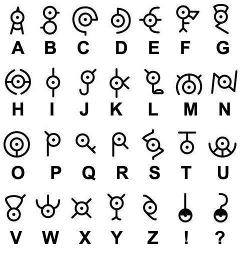
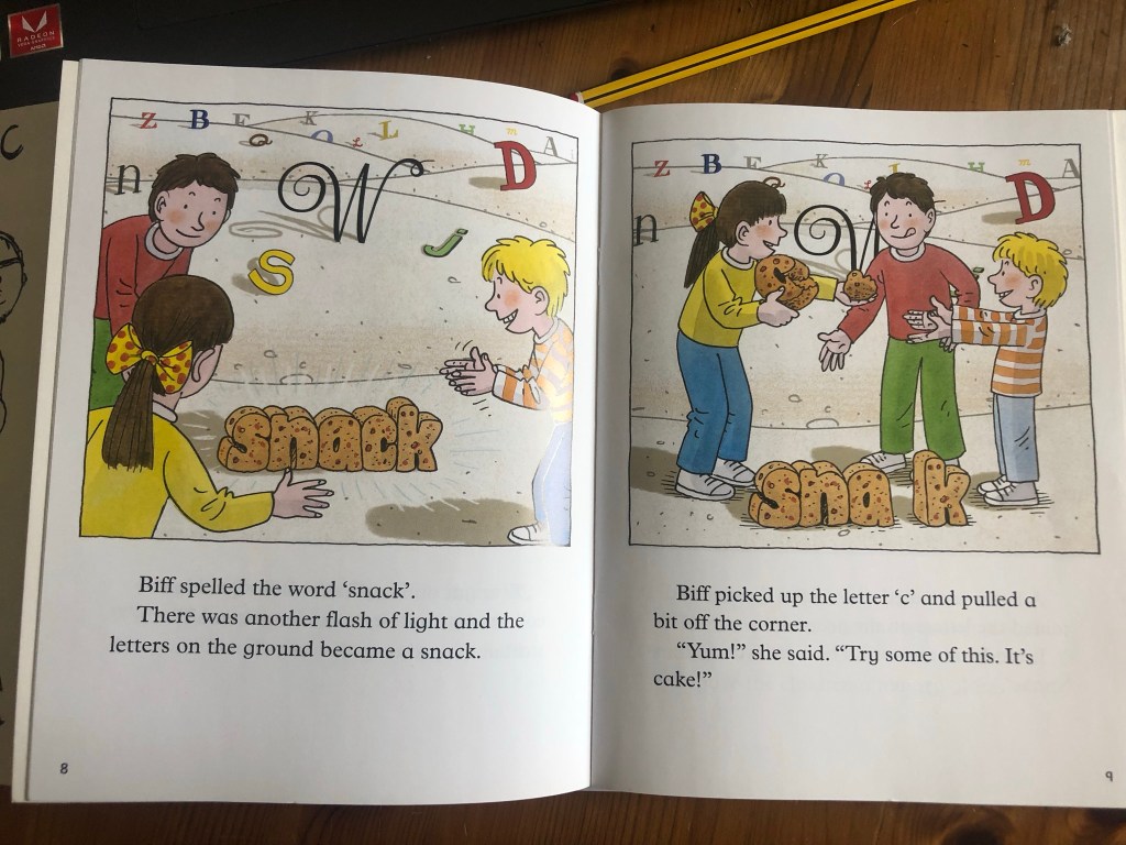
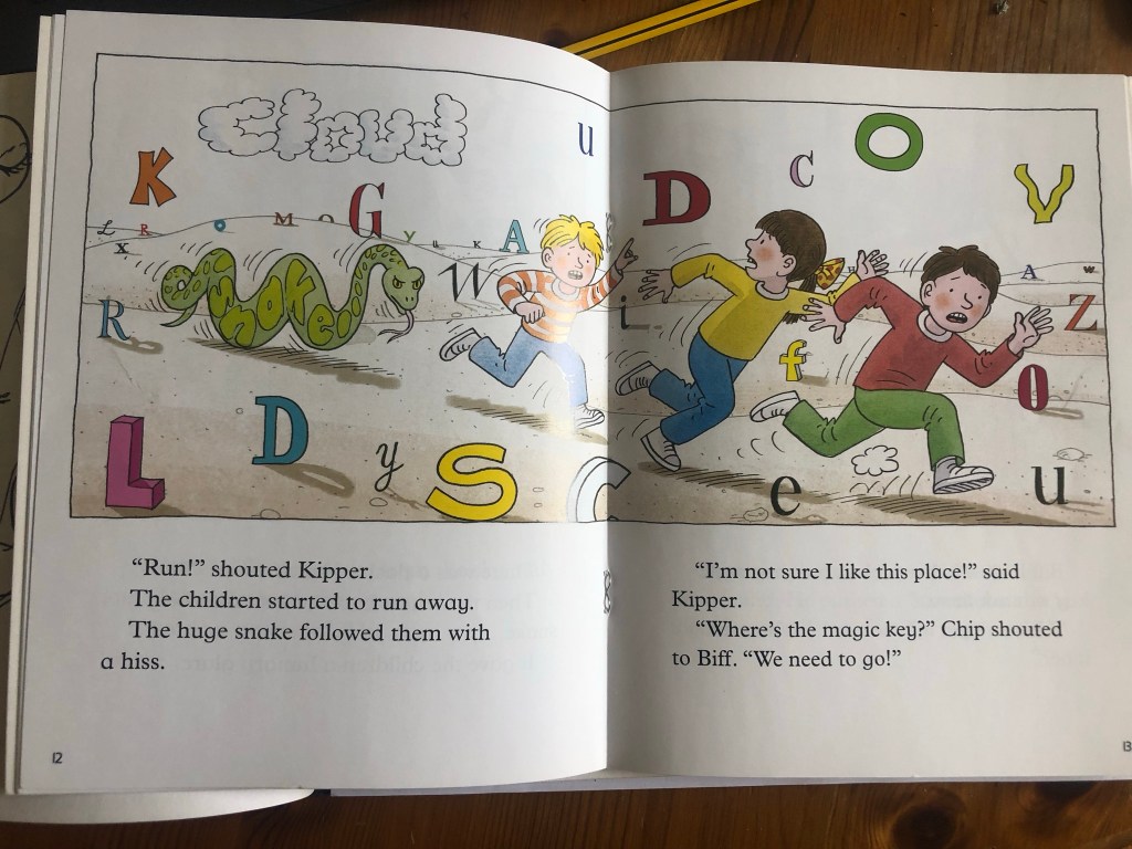
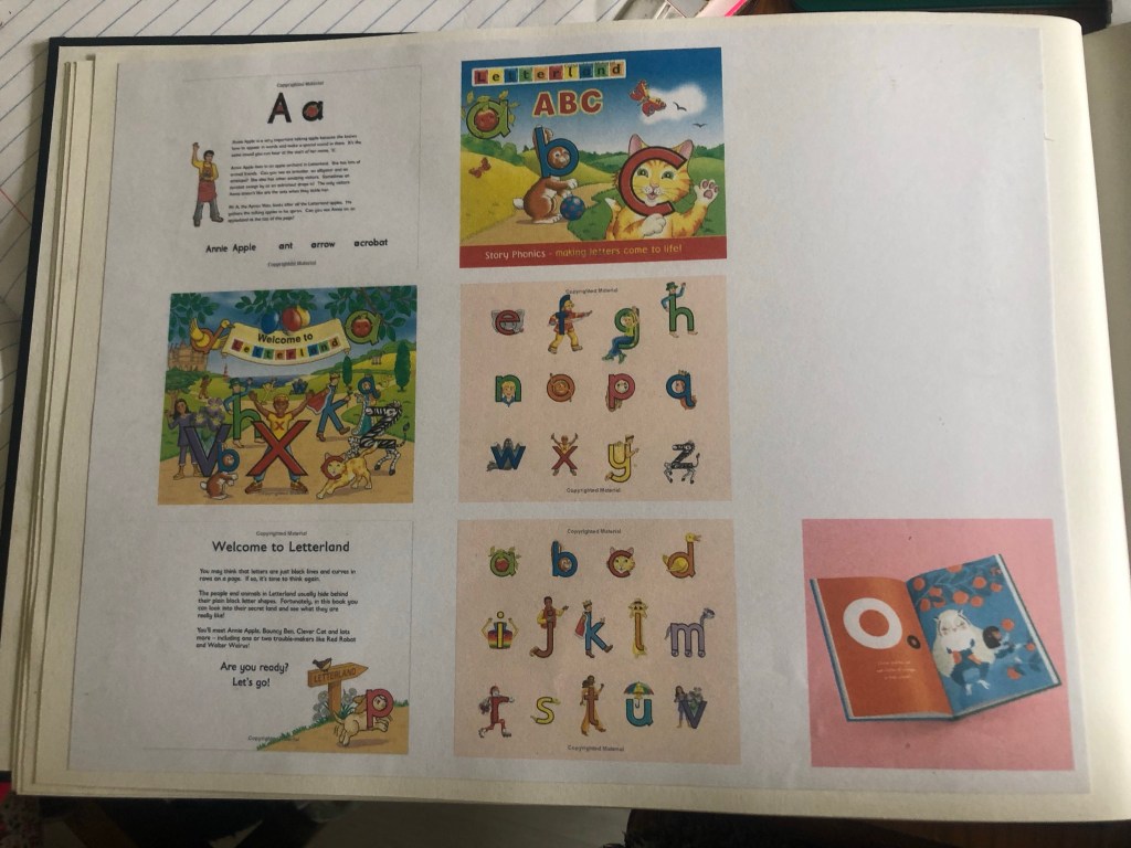
I went back to the drawing board to see how I could create popular, children’s, educational books in a series. A light bulb moment went off when I remembered about the Biff and Kipp books from my childhood! I had a google of the series and found a book called “Land of Letters” It was a Friday night and I have Amazon Prime so decided to order a copy for £5 to use as inspiration.
The book arrived early the next day and the storyline as how the magic key glowed for an adventure and they landed in a land full of letters – they created words of things and then they magically came to life. They then had to escape a snake they made up from the letters.
Creating the story
I spent the best part of the next day going back and forth with ideas and writing out potential narratives for storylines.
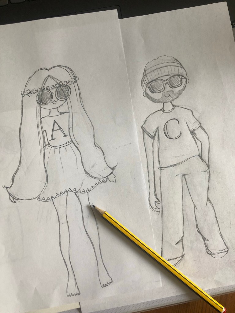
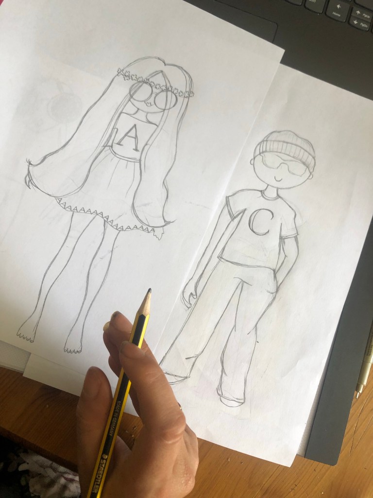
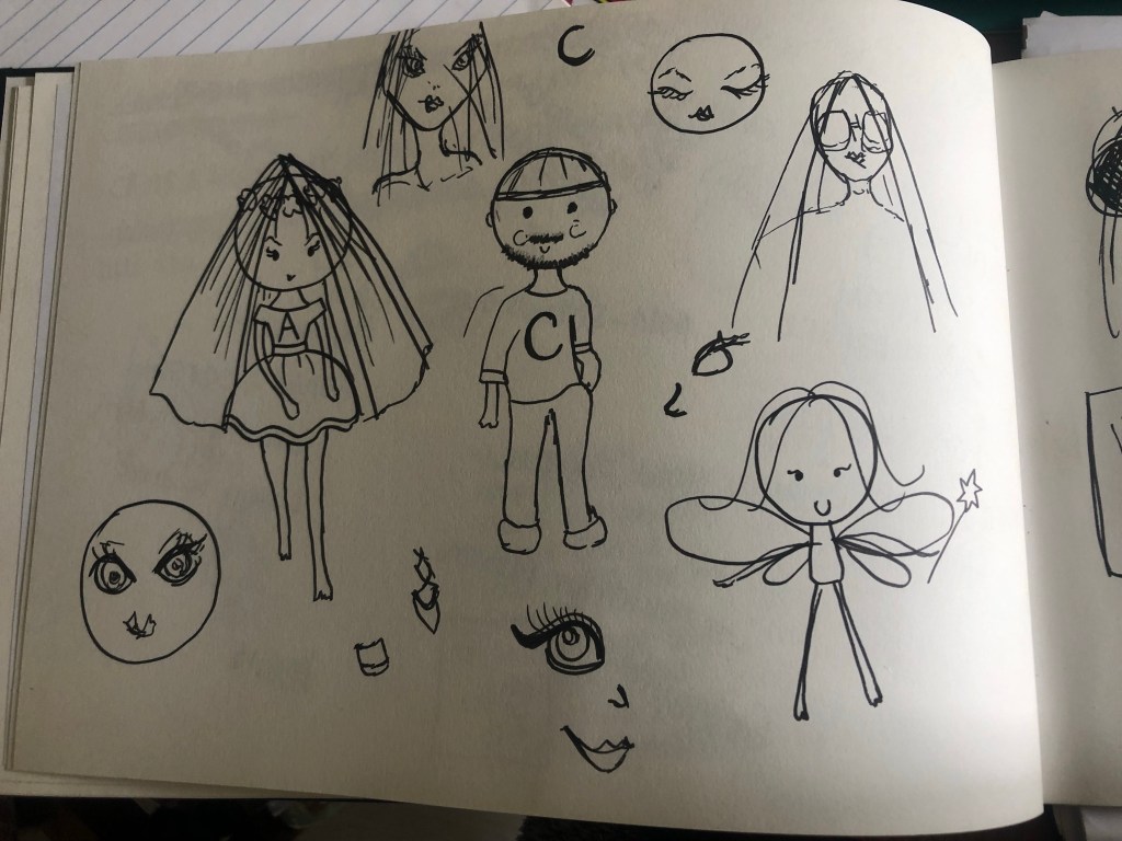
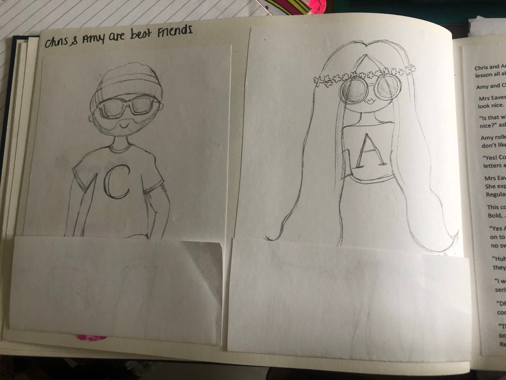
In the end I decided to use real people (cartoons) and get them to go on magic adventures with type. I kept asking Chris his opinion on my ideas and what characters I should use and then I had the idea to create the characters around me and Chris! (“A is for… Amy and Typography Adventures!!”) I looked on Pinterest again for some ideas on cartoon characters and then drew up a character for both of us. I based the characters around how we really look and our key features/personalities.
The storyline I originally thought of was that the characters could be typefaces like “Amy typeface” and “Chris typeface” Chris has a very laid back personality and simple taste in clothing so he would be a Sans-serif typeface whereas Amy is the opposite and would be a serif. I need to explain what a serif is though and the only way I could think to explain a serif would be to compare it to fancy shoes… To then try and explain the terms Bold, Italic and Regular I could dress the characters up in different clothing that best represent these terms. I came up with the storyline of the 2 characters walking around their town and Amy is very plain with bare feet.. she wishes she could have serif feet like all of the other fancy serif women – that is when a fairy godmother shows up and offers 3 wishes, 1) to make them both bold 2) to make them italic and 3) they wish to go back to their normal “regular” life. In these wishes to be bold Amy would get her bold fancy serif shoes and Chris would have a different approach of being Bold by the cars he drives. (Bold would be like a Bold, big car and Italic could be like a streamlined, lightweight sports car for example)
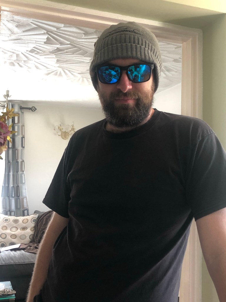
I got Chris to pose for his drawings on one of the hottest days of the year! HAHA! He is known for wearing his hat and shades so I needed to draw his sunglasses and hat to see what they looked like:
I was fairly pleased with the illustrations. They are not representative of human proportions but they are cartoons and most of the cartoons that I researched are very childlike and simple to appeal to children. The long hair on Amy with the flower hairband was supposed to represent a capital A and the A cross bar.
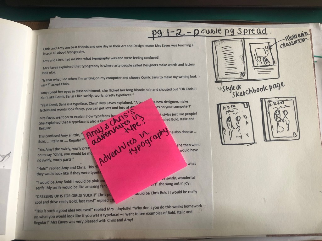
I then decided that I would create the introductory pages first and create the cover last of all using illustrations from the double page layouts. The problem was now how to create the introductory pages and how to get enough of the storyline and the information that is needed onto the pages.
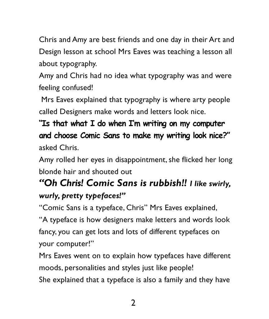
The storyline I was thinking about was quite long winded and would take a few pages to get the plot started without even touching on the Typography storyline. I needed to cut the story down or simplify it to make it suitable for the introduction. I decided to change the storyline and make it a story about the 2 characters in a Design and Technology lesson in school learning about Typography. I used a dialogue between the teacher and the 2 characters to explain in simple terms what Typography is. At the end of the story the characters go away and imagine what there lives would be like if they were typefaces in a Bold, Italic or Regular world.
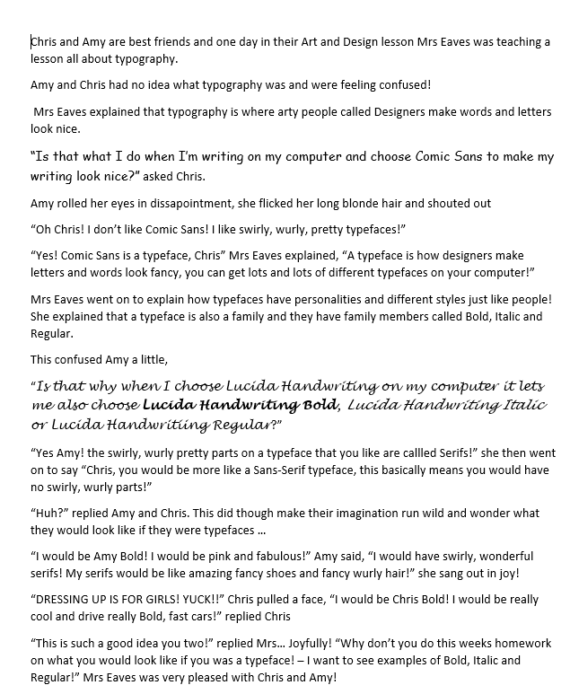
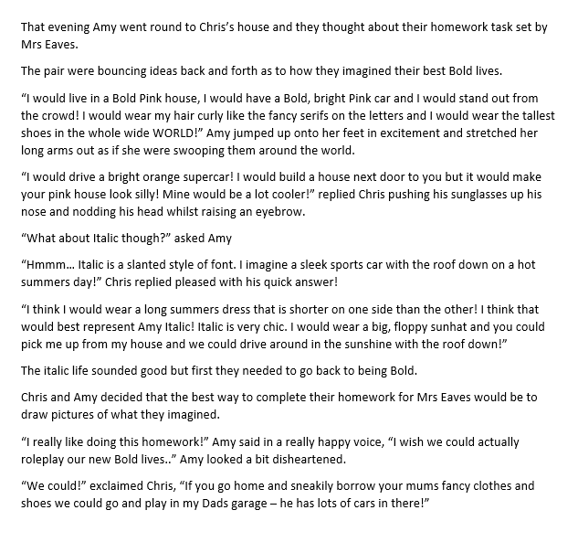
Creating the illustrations
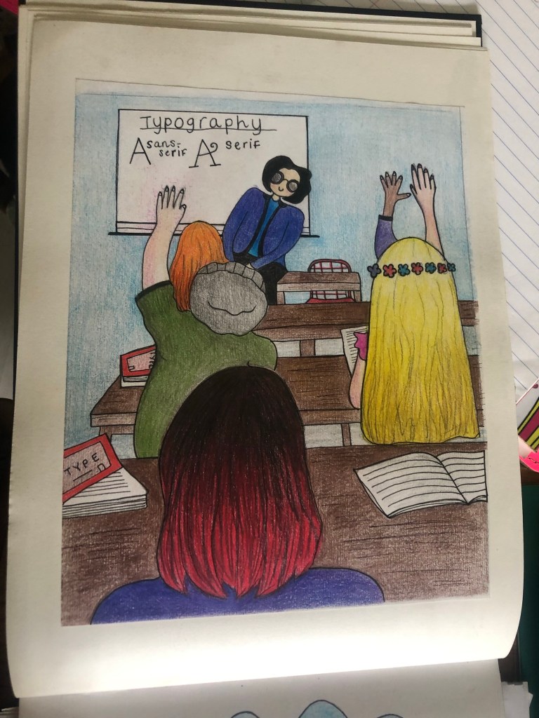
I decided that I would do a very similar style and layout to the Biff and Chip Magic Key books, they are simple and easy to read and the simple illustrations are easy to engage with. Once I had the storyline it was then time to create the appropriate illustrations to match. I had an idea of what I wanted to do in my head but I can’t draw from imagination, I need something physical in front of me to draw from. Even if I find images and just use parts of it to create other images, I prefer something to work from. I had the idea of the page for the school lesson in Typography as a view of the classroom from looking at the back and the characters sat on a workbench or table with their backs to the readers watching what is happening on the board at the front and asking questions to the teacher. I work in a school so know what a school classroom setting looks like, however I still wanted a physical photo in front of me to take ideas from.
I searched Pexels which is fast becoming my favourite site to download free images from to use in your work. I searched “classroom” in the image search and found one that might be good for my drawings. I had no intentions to actually use the photo in my book, but to copy the photo and adapt it for my illustration.

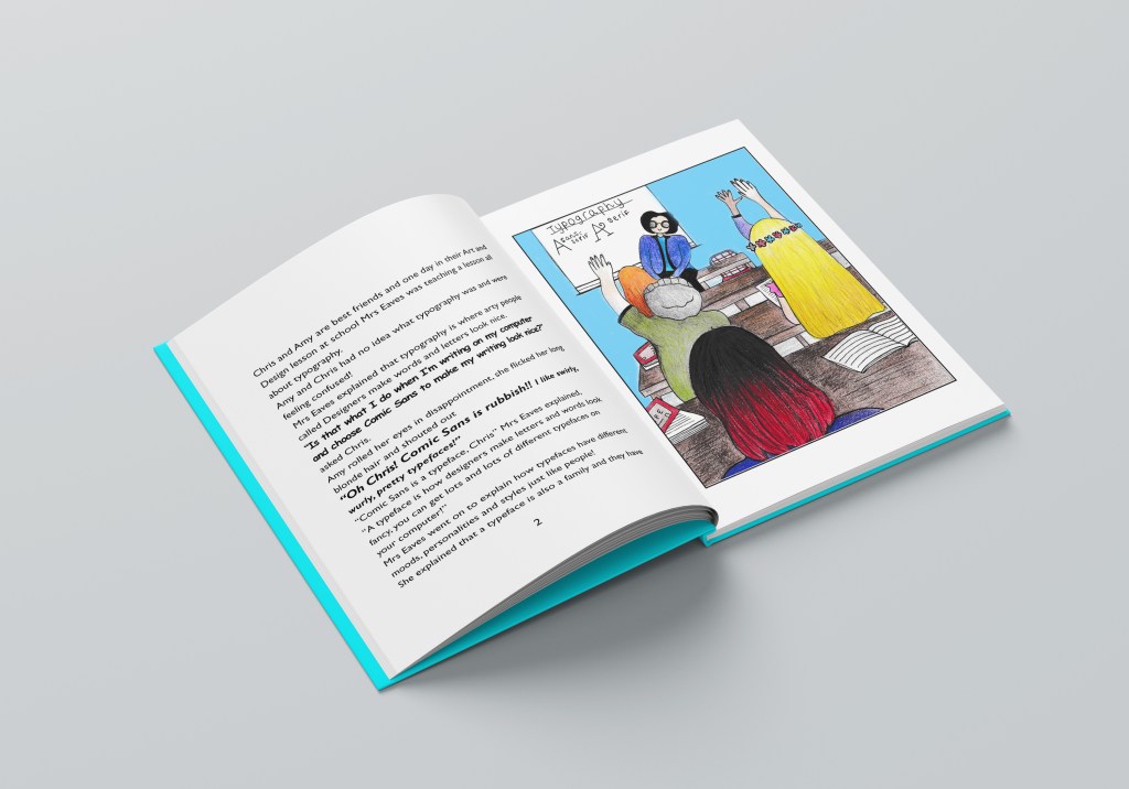
I went on to draw this:
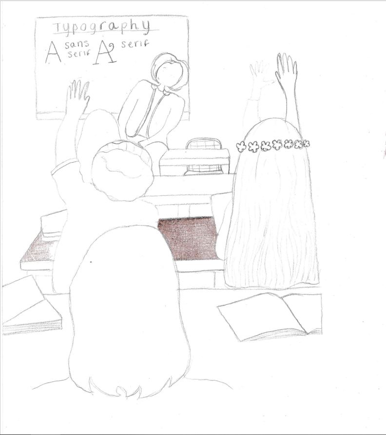
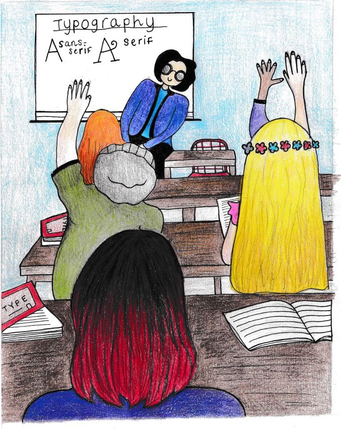
I then scanned it and imported it into Photoshop to adjust the levels and brightness/contrast. I then ended up with this version (below!) I was pleased with how it turned out, although it is drawn with mixed media (colouring pencils) I have still imported it to change digitally. I also like the textured effect the colouring pencils give. The illustrations are still very childlike to appeal to that clientele. I saved it as a JPEG to import into InDesign when I designed the layouts.
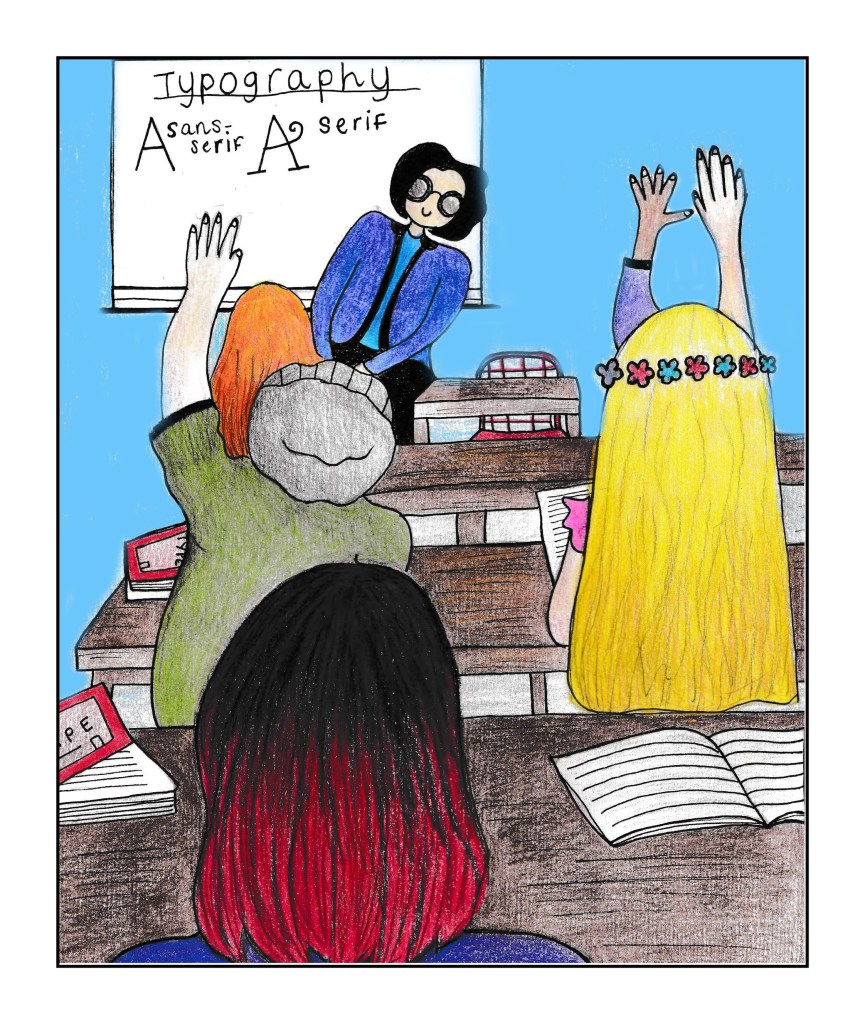
Before I moved on to create the other 2 illustrations for the other pages, I thought it would be a good idea to create the my book document in InDesign and design the layout for the text and drawing.
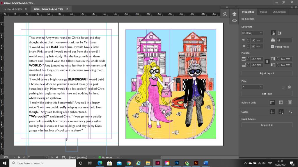
I created a new document to the size that was given me in the brief – 190 x 225mm in InDesign with facing pages.
I wanted to keep the pages simple. I did have a lot of text for the pages though, I did not want the text to fill the entire pages edge to edge though because it would be too intimidating for young readers to look at. I remember when I was little, if a book had too many words in them I chose less intimidating books!
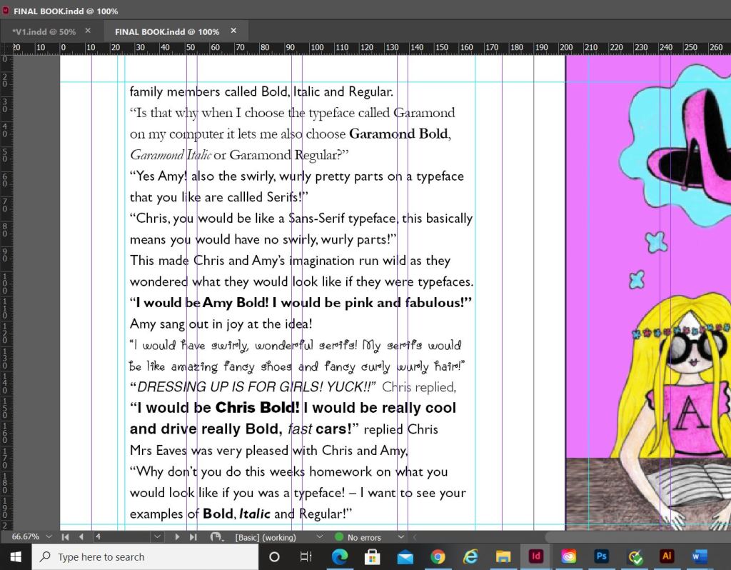
I also needed to choose an appropriate typeface and point size for the text. Rounded typefaces are best for young children; they are friendly to look at and easier to read. I googled “Best typefaces for children” and the search returned with an educational page and a list of typefaces best for children’s publications. One of them was the typeface I used called Gill Sans Infant. I am obviously familiar with Gills Sans by Eric Gill but never knew there was a “child friendly” version! The typeface was perfect! To keep the text page interesting though I did emphasise words on the page by making them larger or bolder and I did use a selection of the actual typefaces that match the typefaces they talk about in the story. I think it just adds an element of interest to what would normally be a dull page and also it adds an educational element to it showing typefaces literally. I chose to use Comic Sans as one of the featured typefaces because this is a typeface that children should be familiar with. If I used Helvetica they would have absolutely no idea!- however, I have added a twist to Comic Sans (and educational again for future young designers!) by saying that it is a rubbish typeface – but in a fun way! ;p I used size 16 for the body text which is far too big for most printed publications but it actually works in a children’s book because it makes it easier and friendlier to read.
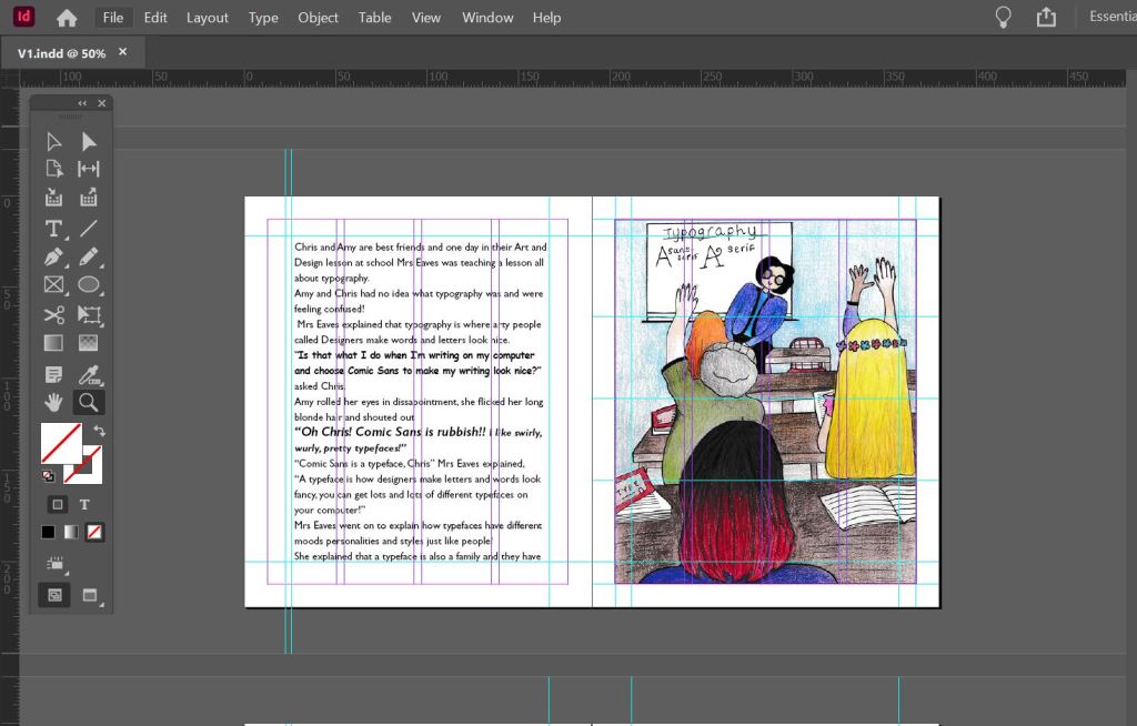
I included the use of white space in my layout. There looks like there is a lot of white space with the borders around the edges but again, this is to make the pages look less intimidating to the younger readers by making them think that because there is a lot of white space there is not much text on the page. I had to adjust the kerning and tracking accordingly to make sure that there was no hyphenation on the page – you can turn this off but then there are far too many gaps (rivers) on the page. I was feeling quite confident and happy with the layout!
I then went on to further create the next 2 illustrations for the next 2 double pages..
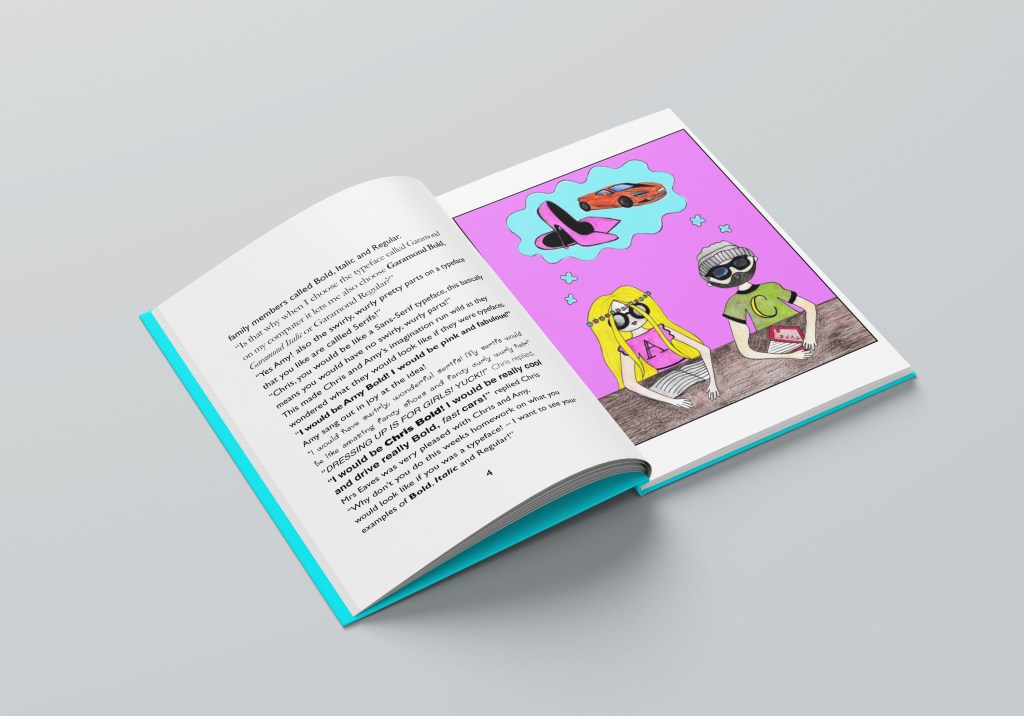
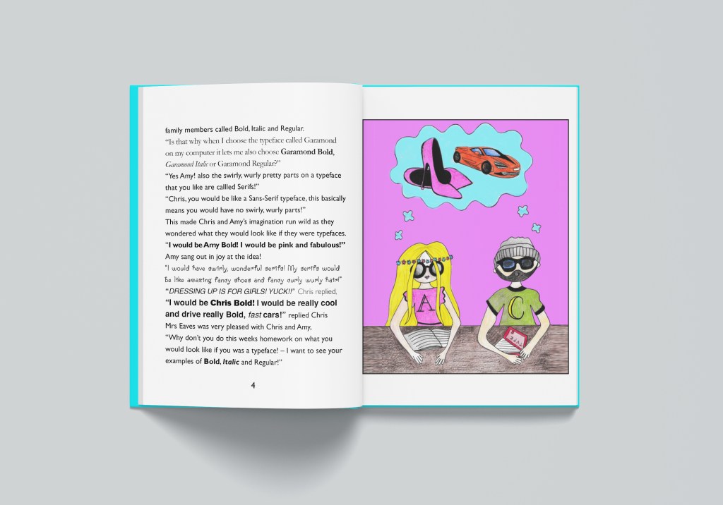
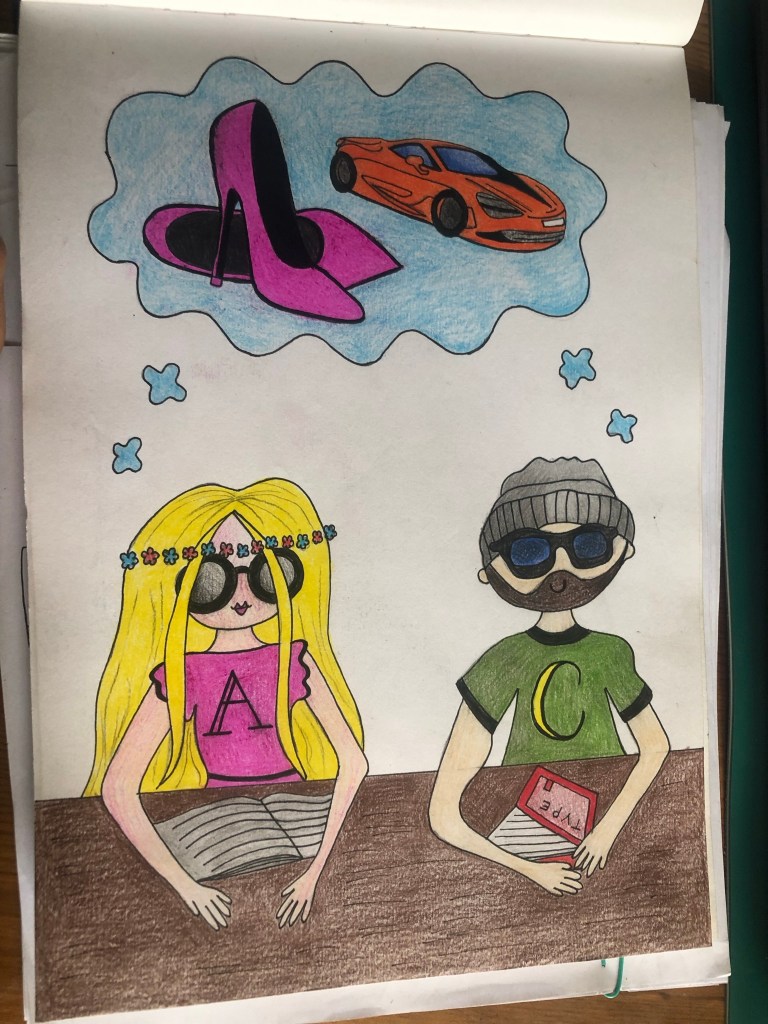
The next illustration I knew would be a scene in the classroom again but this time showing the characters daydreaming about what their lives could be like as Bold, Italic or Regular. I could draw this without needing any resources:
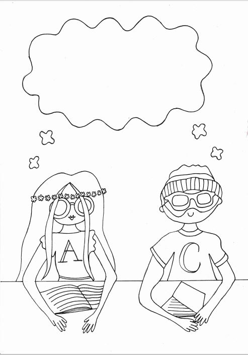
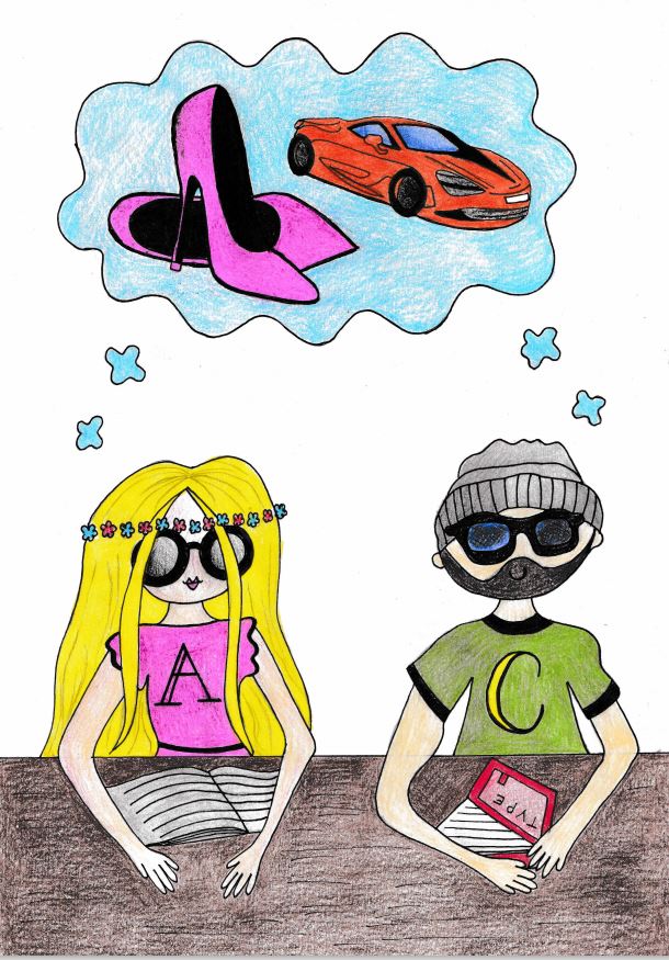
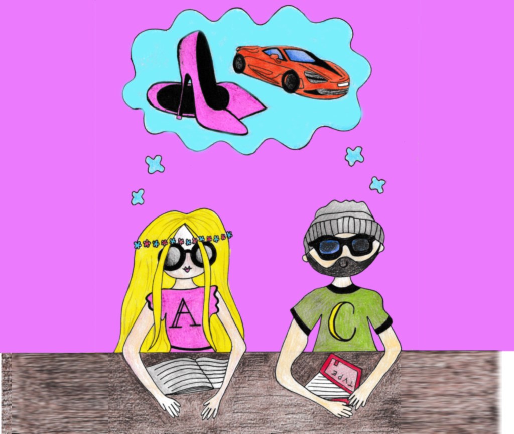
Once I had drawn and coloured it, I once again scanned it in and imported it into Photoshop to adjust and tweak. I had to add a section to the desk just so it fitted the size of my InDesign document without making it disproportionate. I did this with the clone tool:
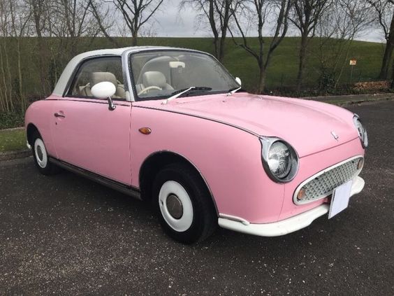
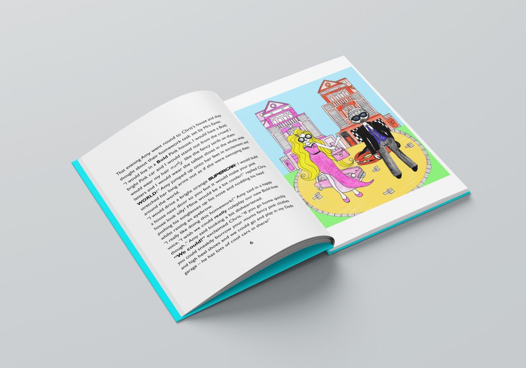
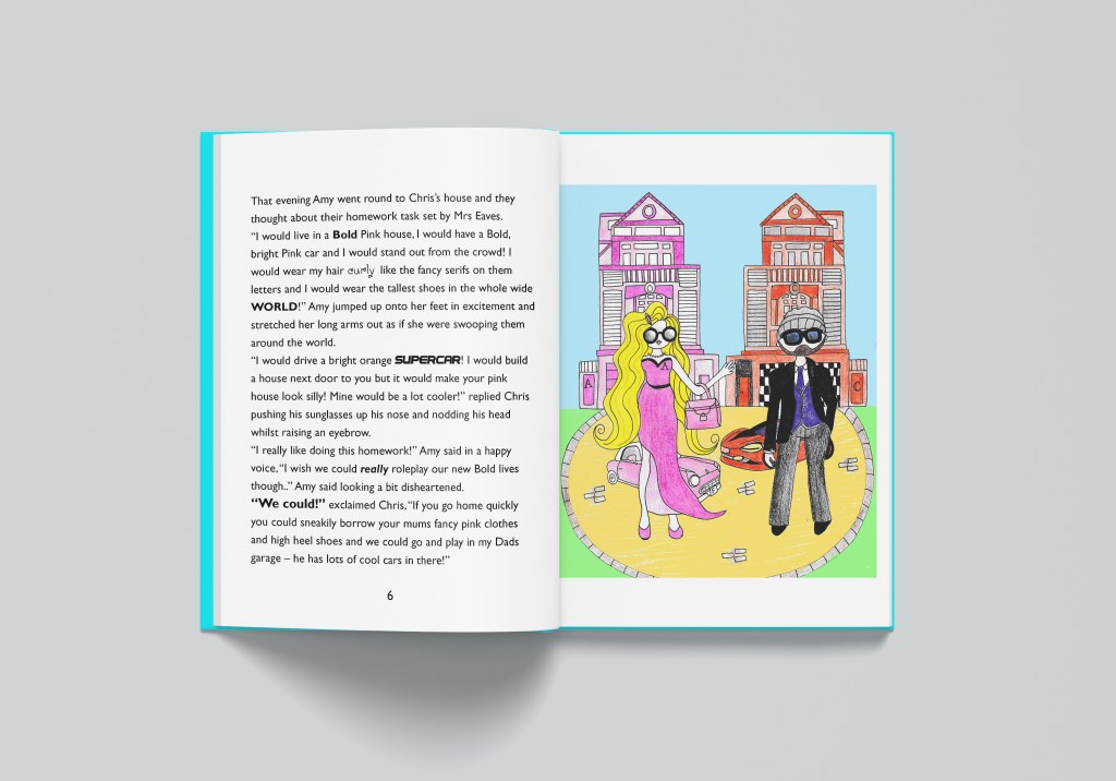
I then went on to draw my final illustration for the last double page spread. This one I needed to find some resources for; I knew I wanted to portray the pair inside their imaginations dressed up in their bold lives. I needed an image of a fast car to copy and a pink car for Amy’s character. I found the images I needed from a quick google image search. I also needed a “Bold dream house”
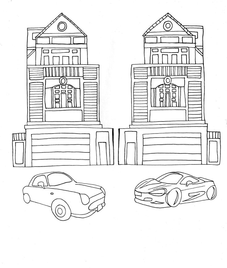
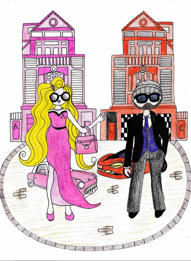
Again, I scanned and imported it into Photoshop to adjust and alter:

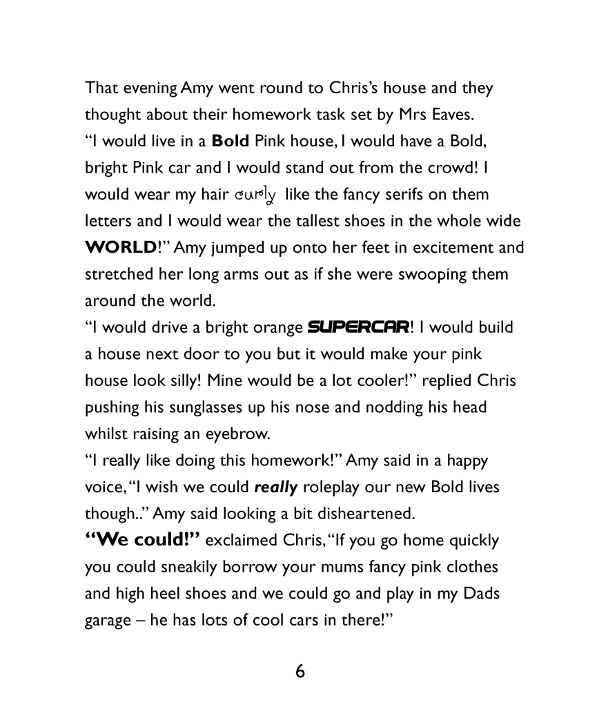
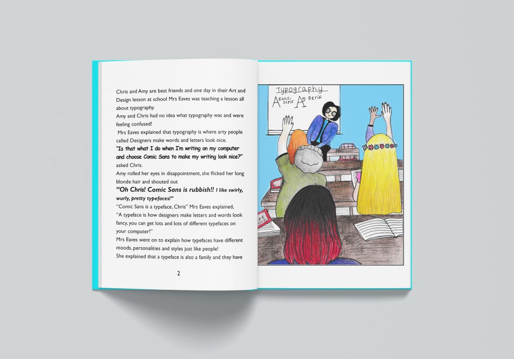
I then went back to my InDesign document and added the next few pages:
The book pages: Digital Development


The front covers
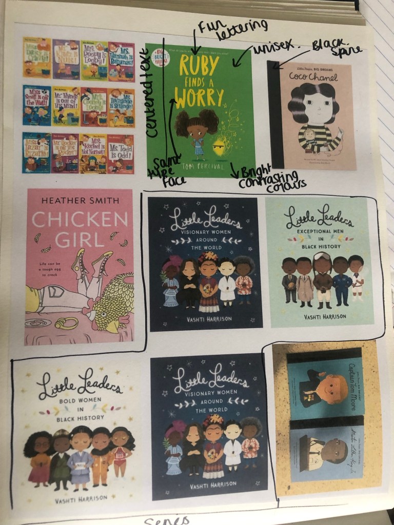
The next steps were to design the 3 front covers for the books. The brief states that they needed to be in a series so I started to research books that already exist that are part of a series.
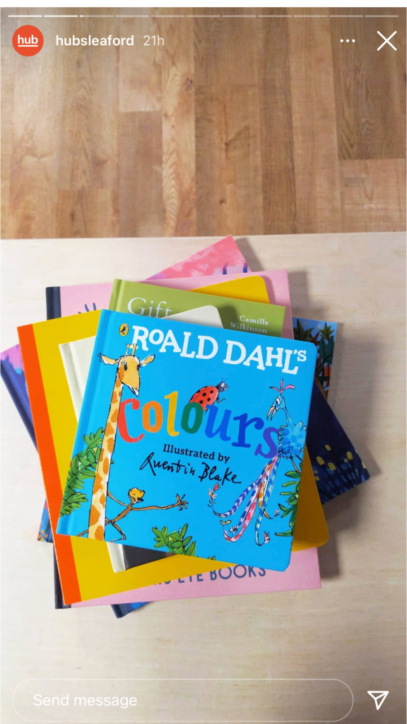
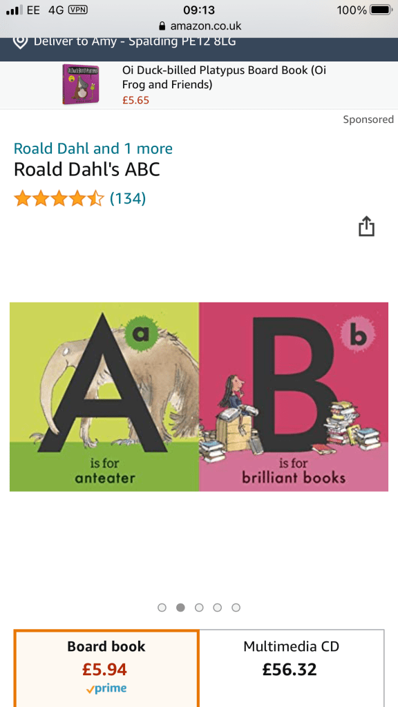
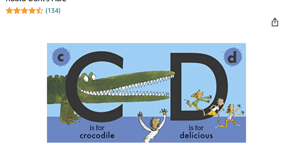
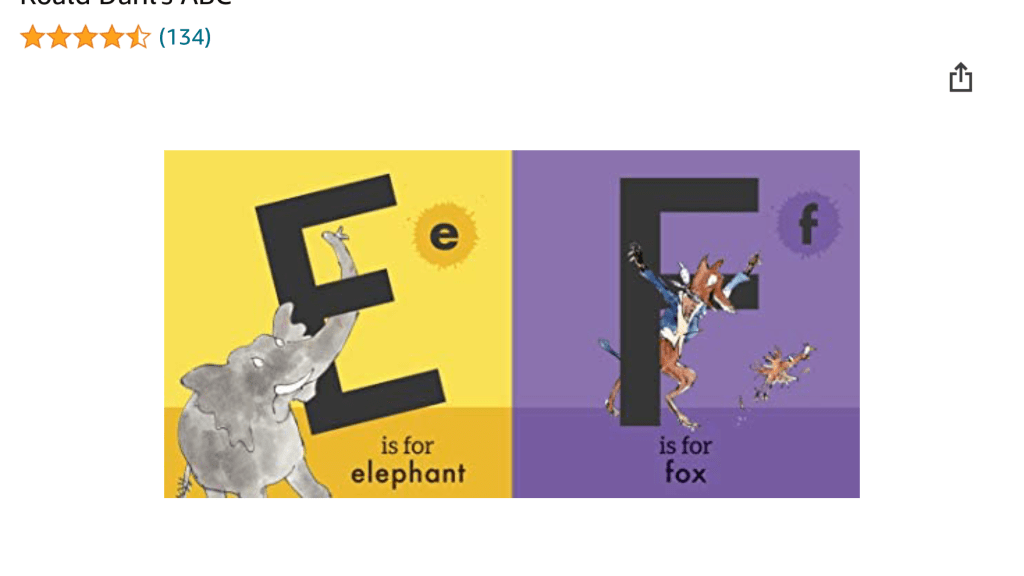
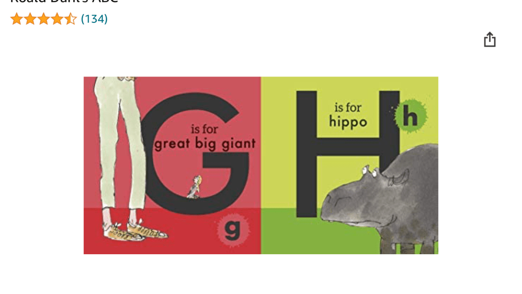
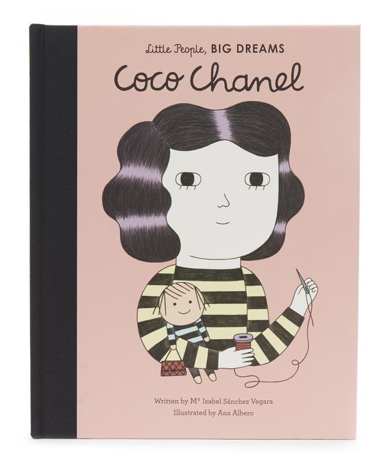
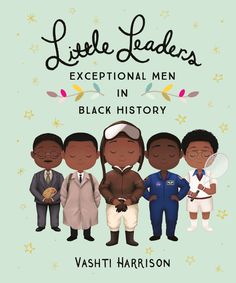
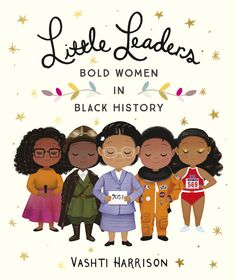
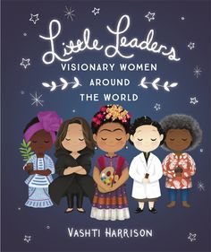
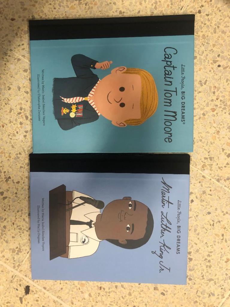
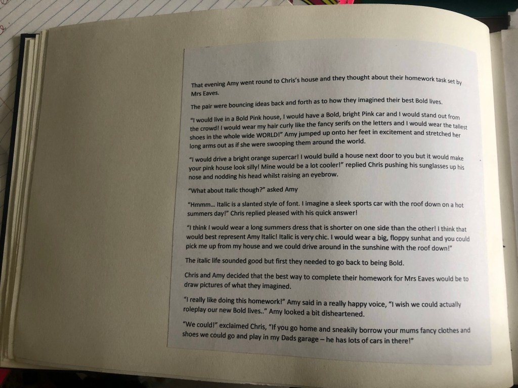
These are some of the children’s books that I found in a series. The Roald Dahl ones illustrated by Quentin Blake are very simple and easy to read and understand but it is the illustrations that make the book special. They are all brightly coloured and follow the same design layout throughout.
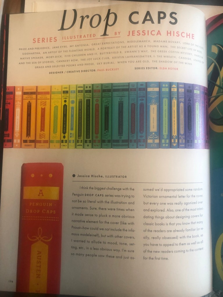
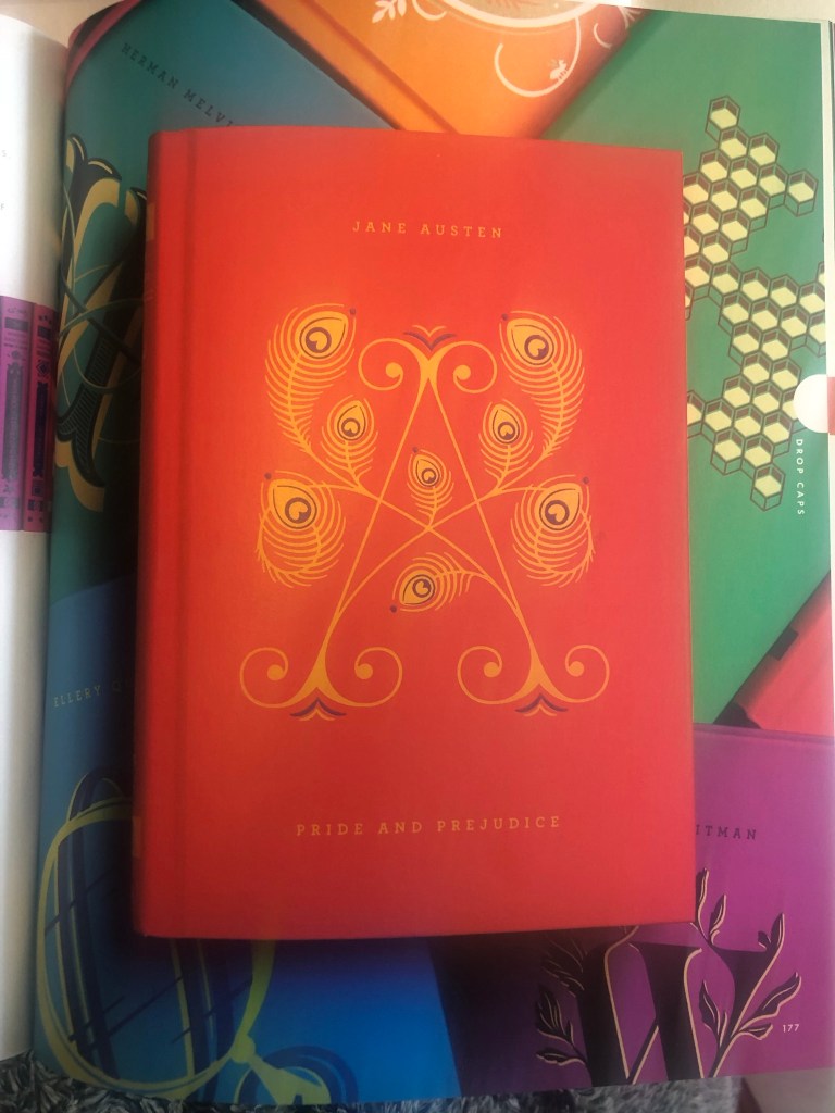
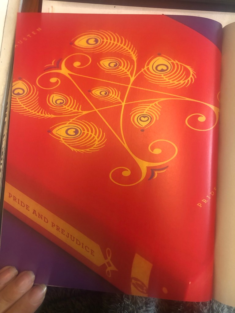
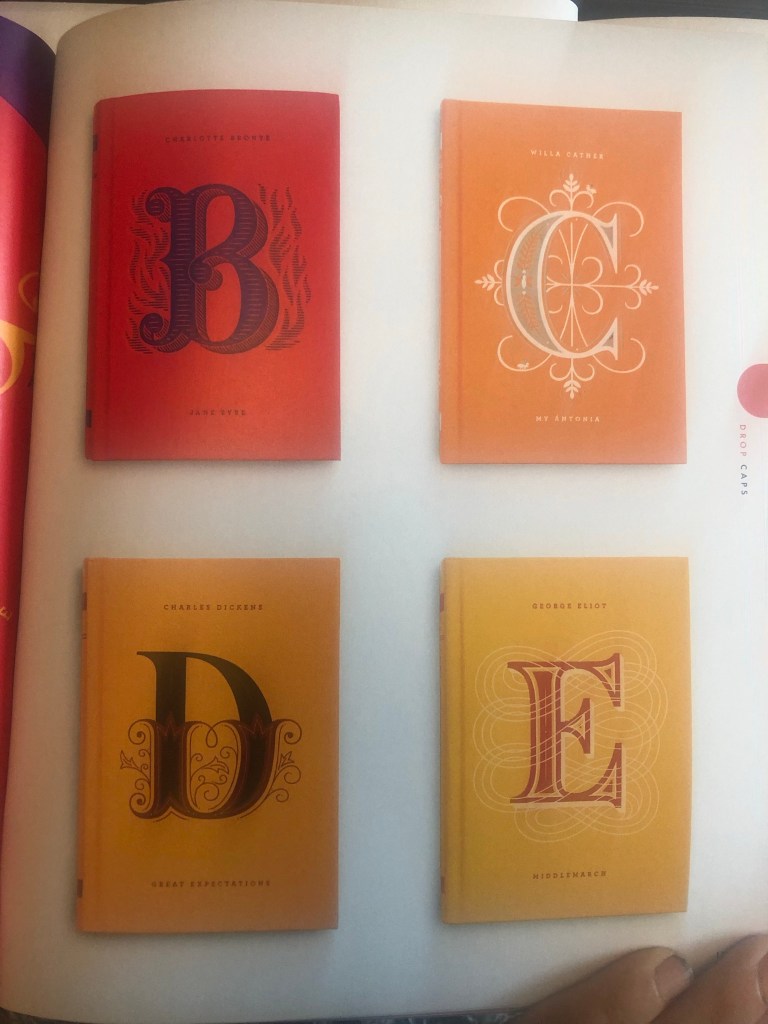
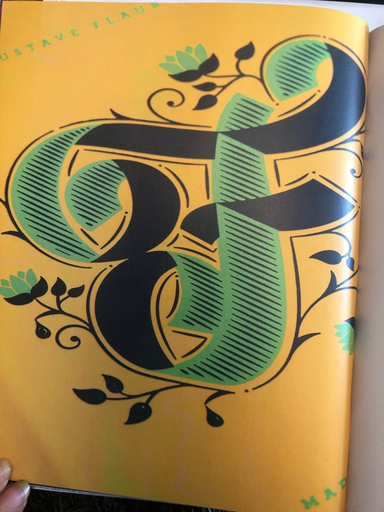
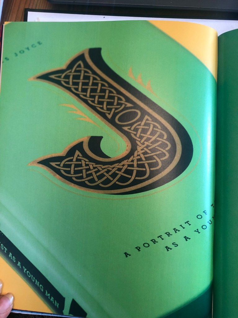
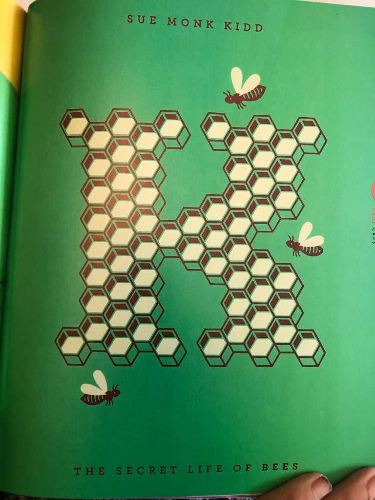
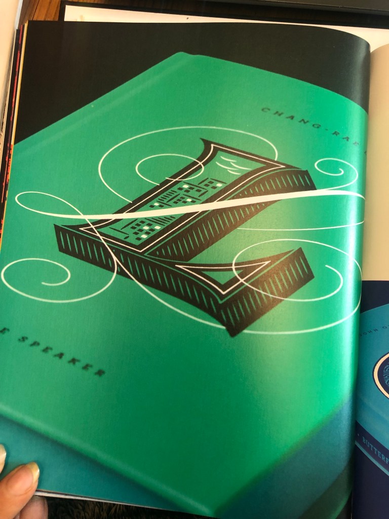
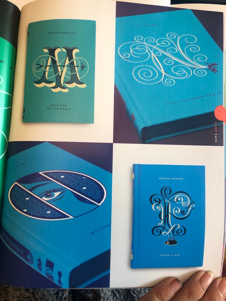
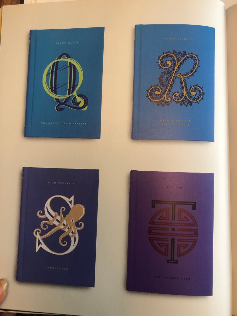
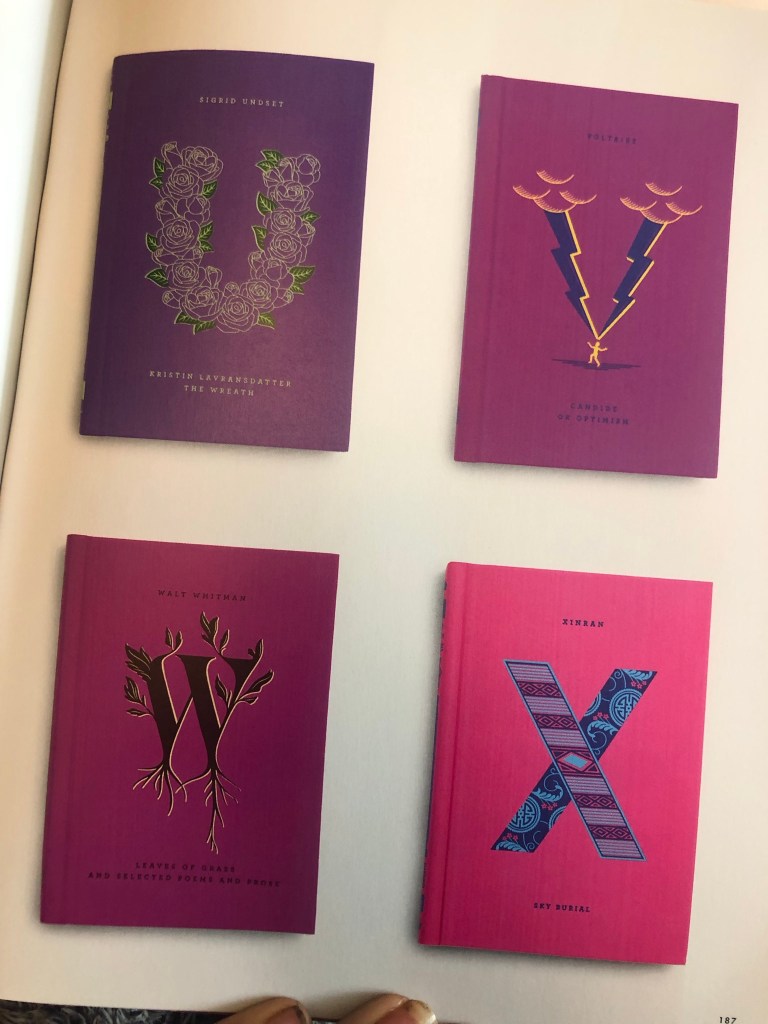
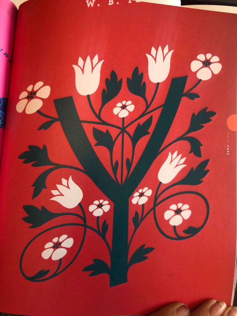
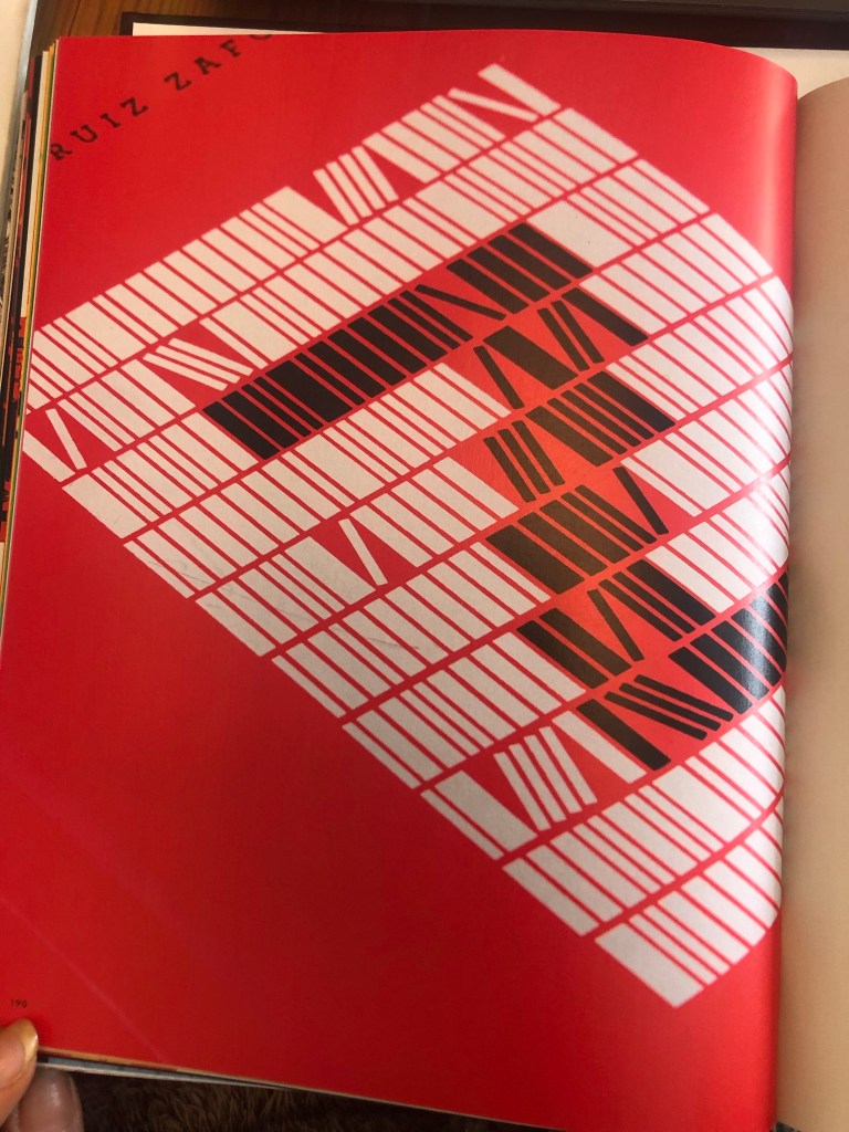
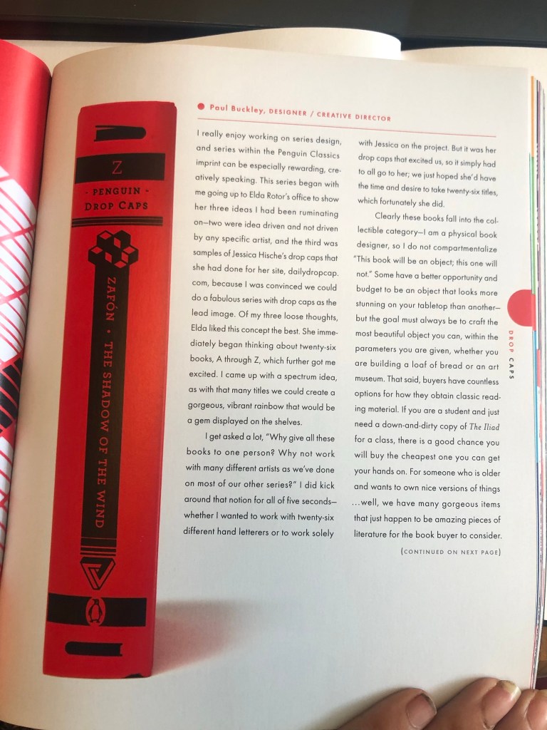
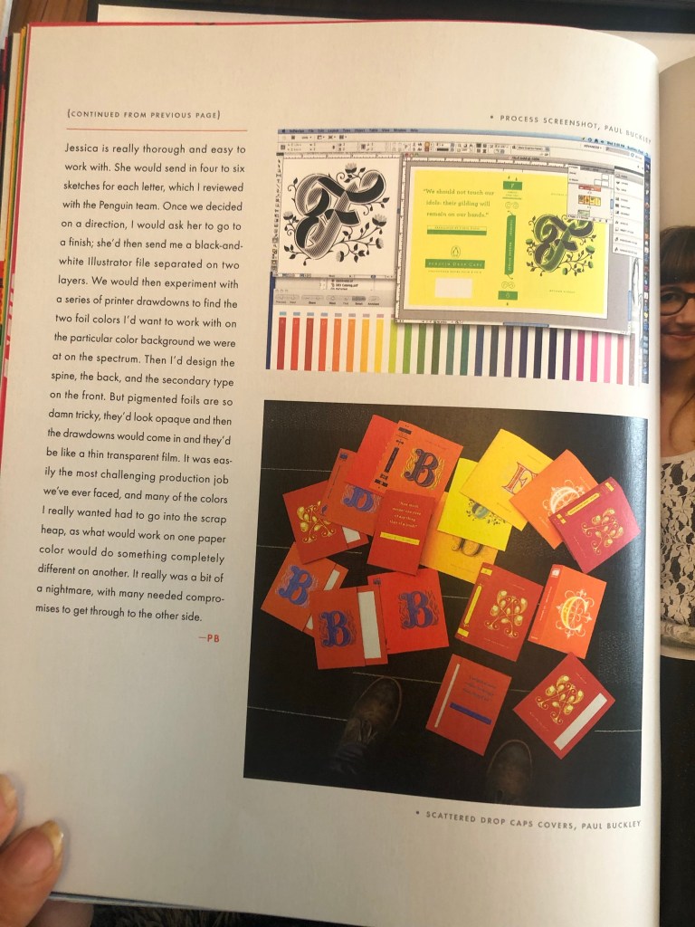
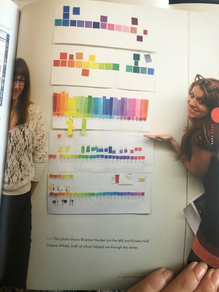
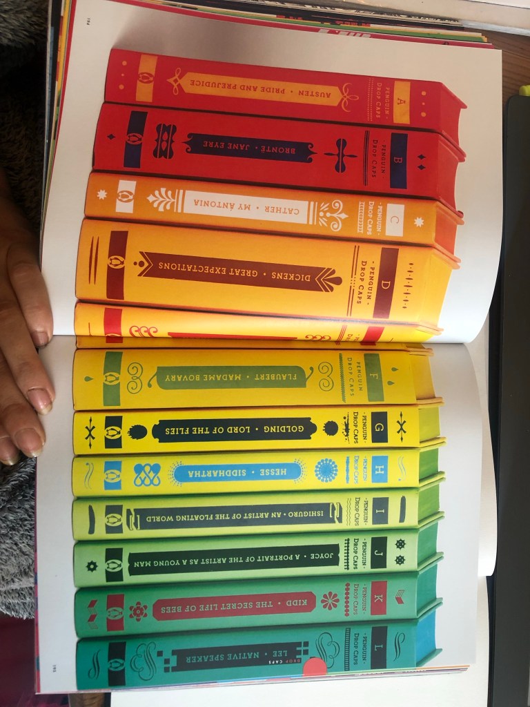
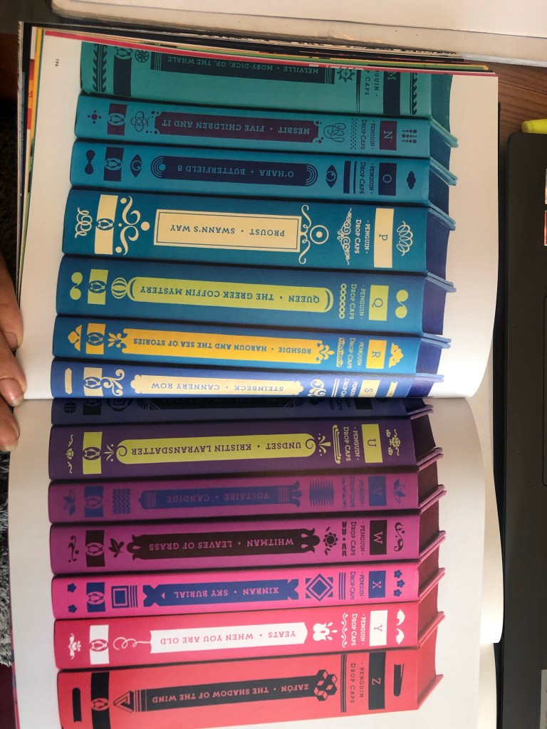
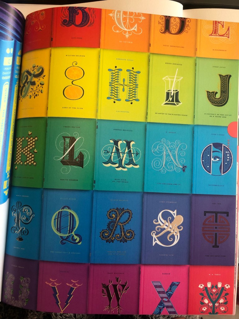
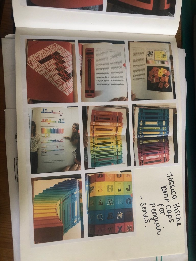
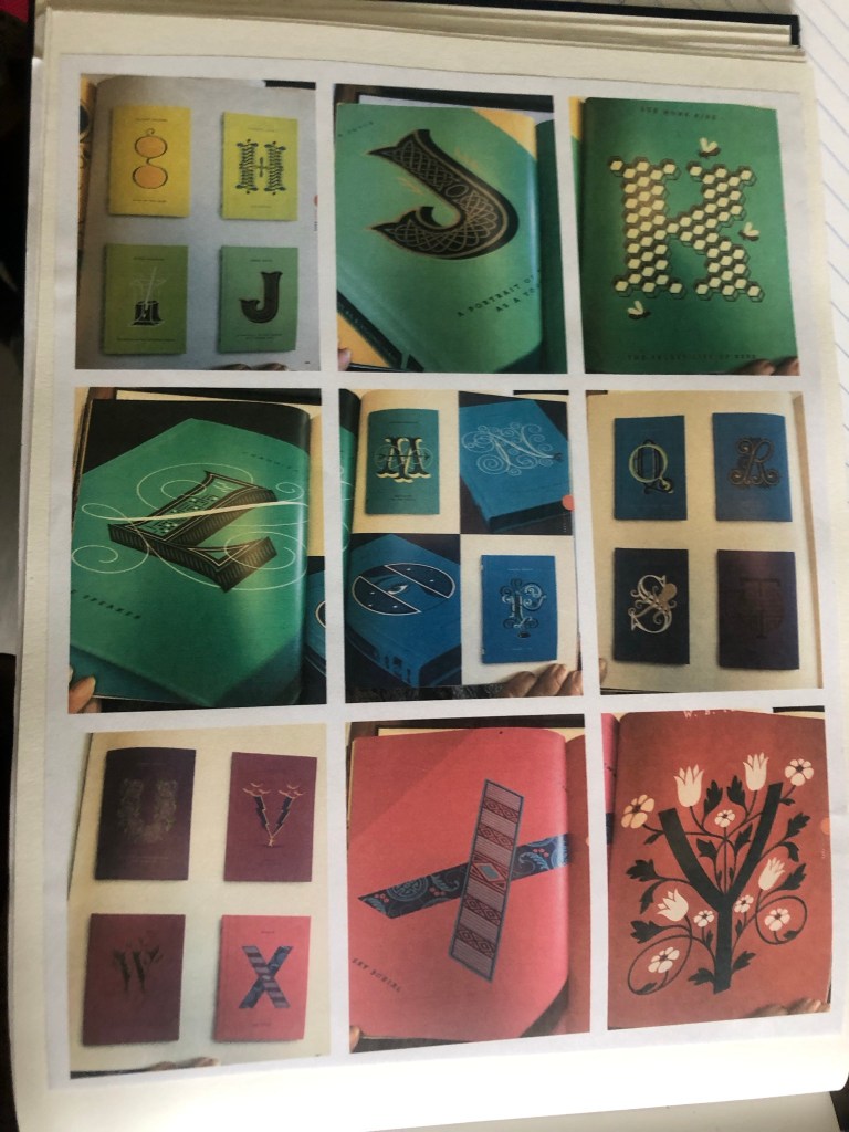
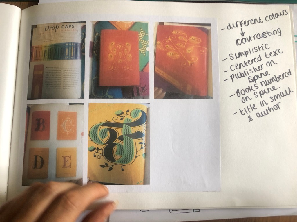
The books below I photographed from my “Penguin Classic covers” book. They are illustrated by a designer called Jessica Hische who does hand lettering. They collaborated with her to create a whole series of drop caps books for all the classic titles from A-Z. Each book has its own caps for the name of its title. They are also all colour coded.
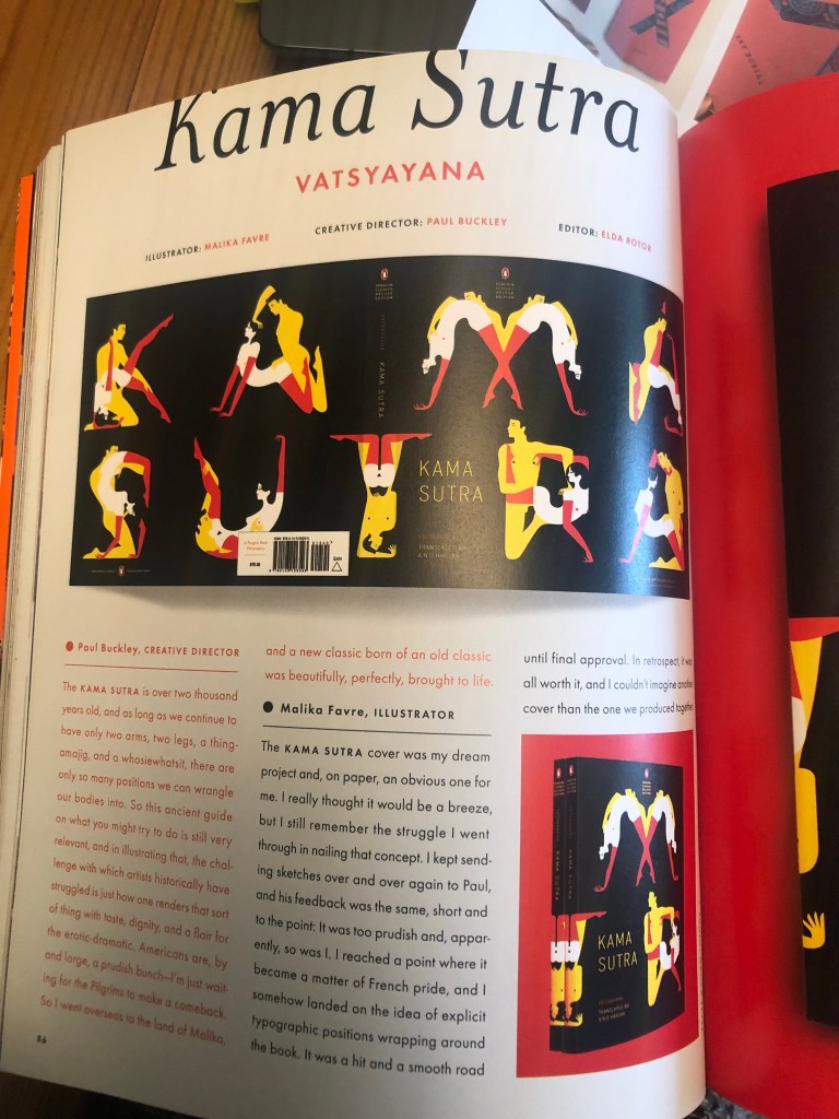
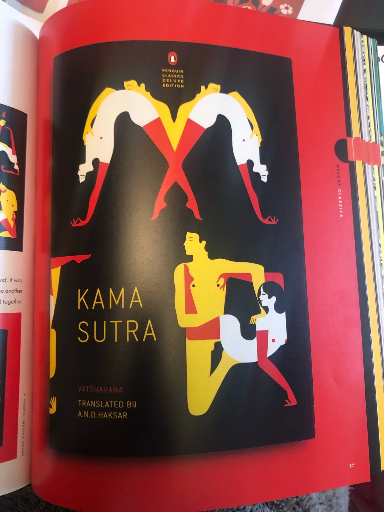
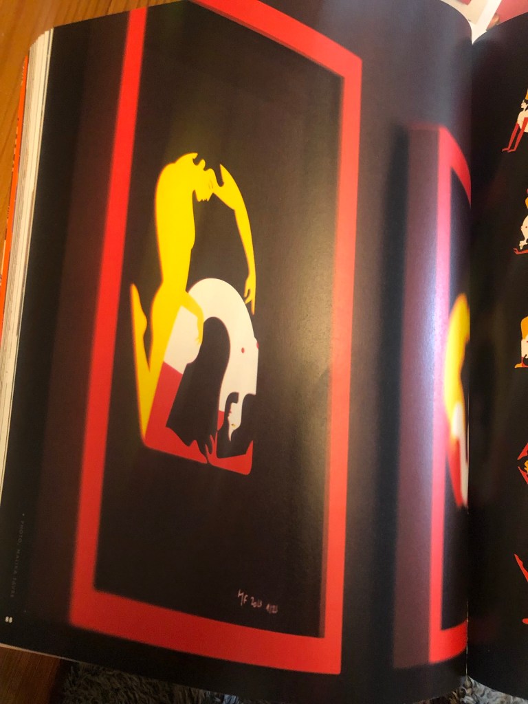
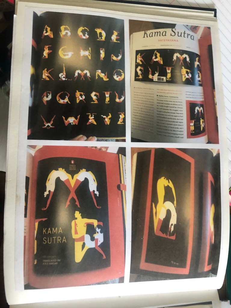
This next series is interesting! – but they really do work!
I decided that for my series of books I needed to:
- Keep them all the same – “A is for..” “C is for…” “P is for…”
- Use bright colours for each one but a different main colour background so that they each have their own colours
- Use the same layout on the front
I decided to start with “A is for..”
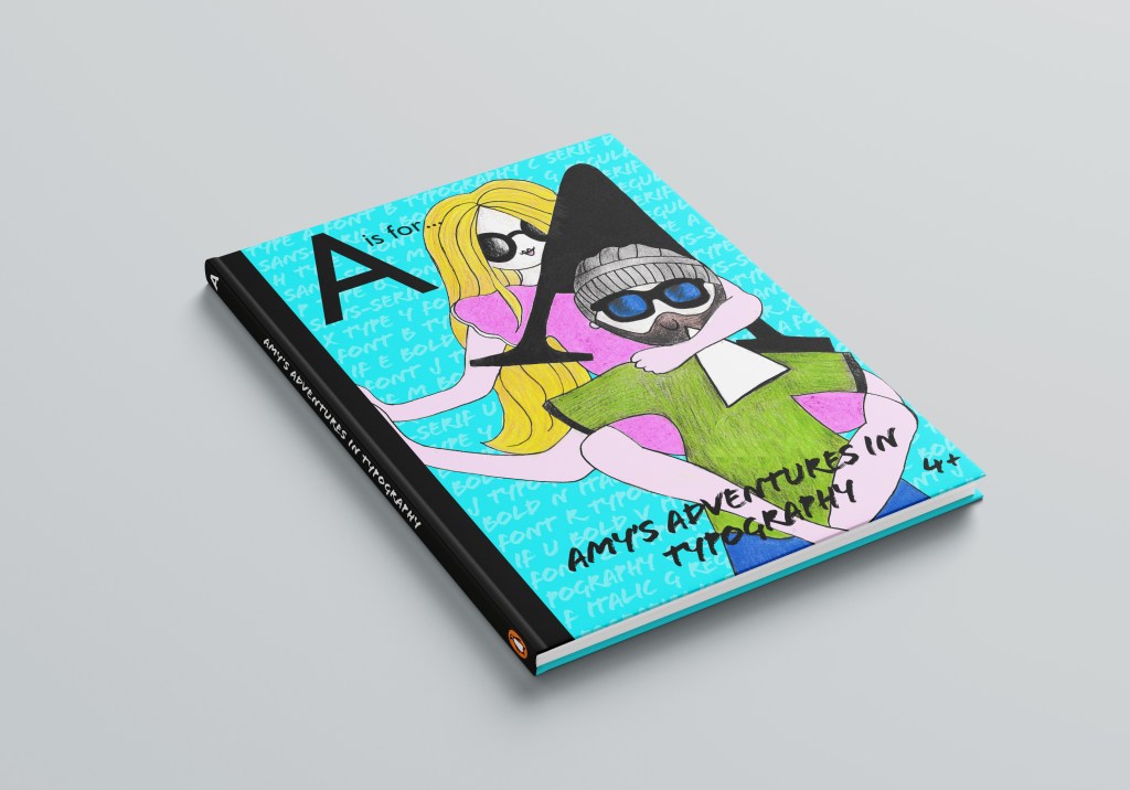
Cover 1- “A is for…”
I am a massive fan of negative space in designs but this time I wanted the image to fill most of the front cover. I wanted the image to be bold and stand out and immediately grab attention. Ideally I wanted the image to do most of the talking.
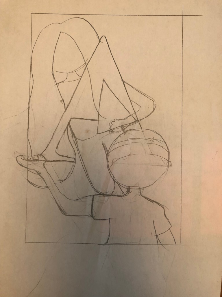
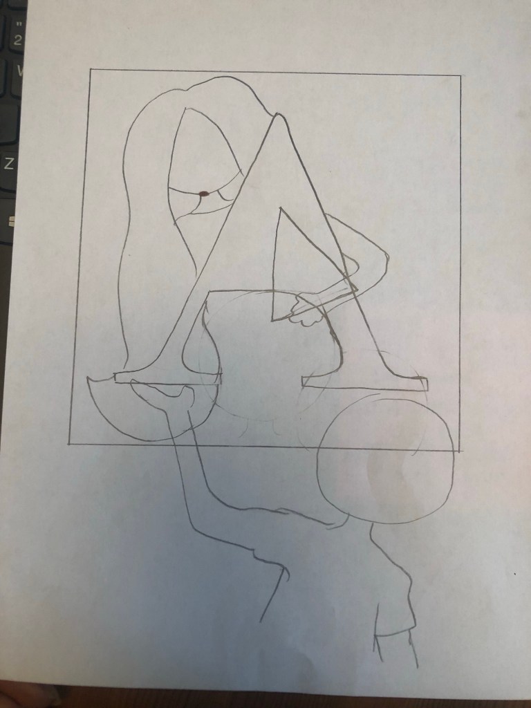
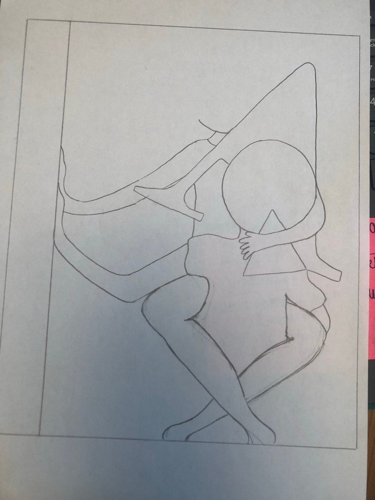
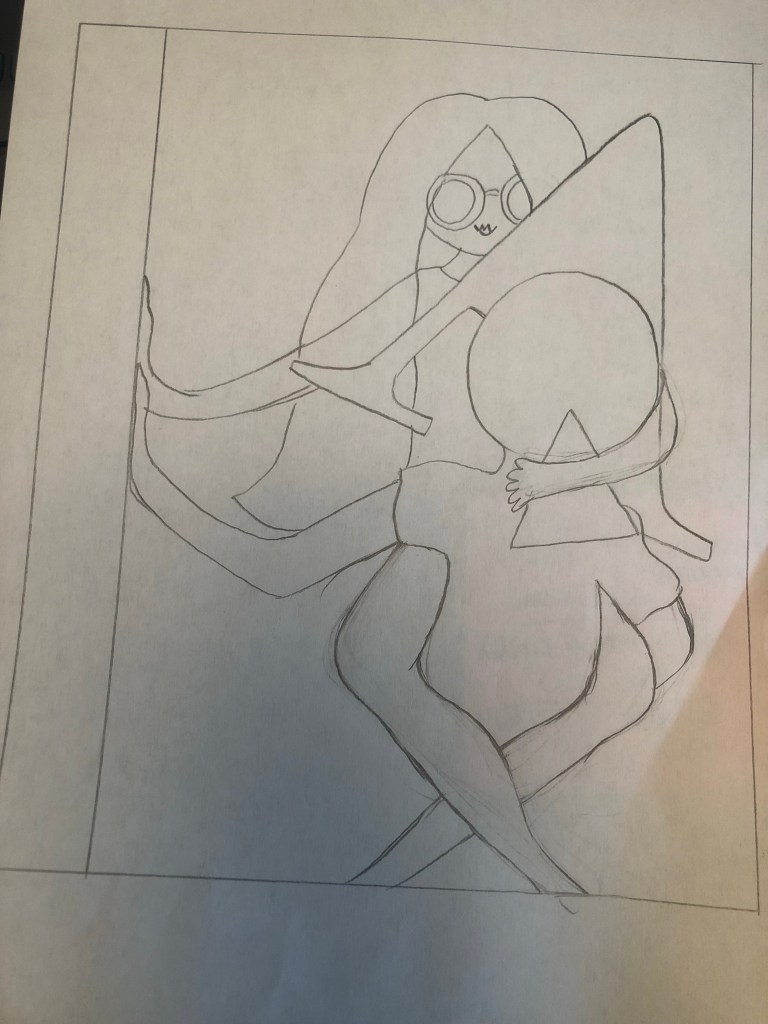
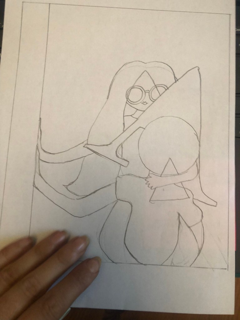
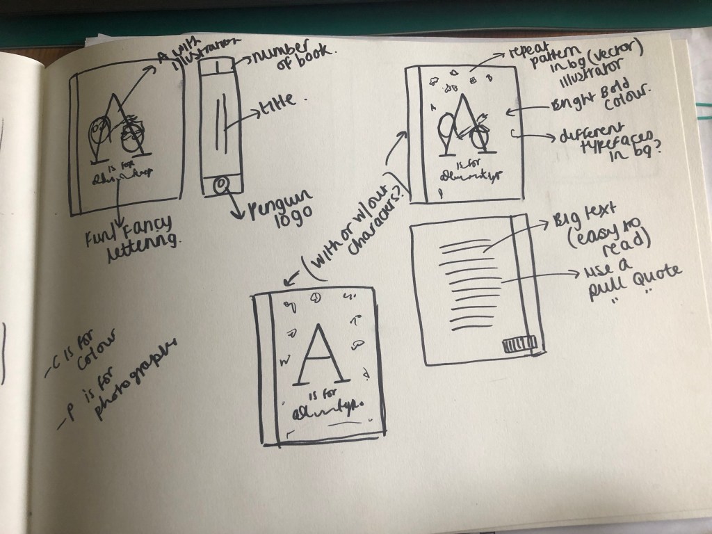
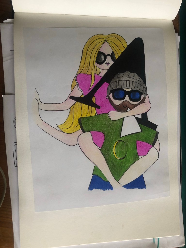
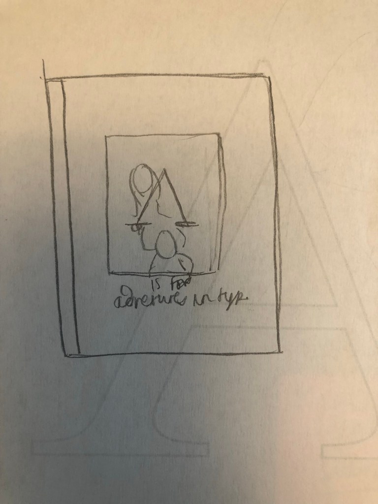
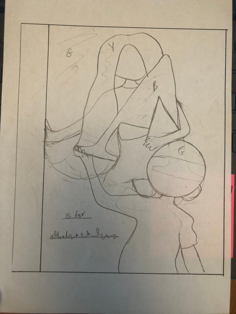
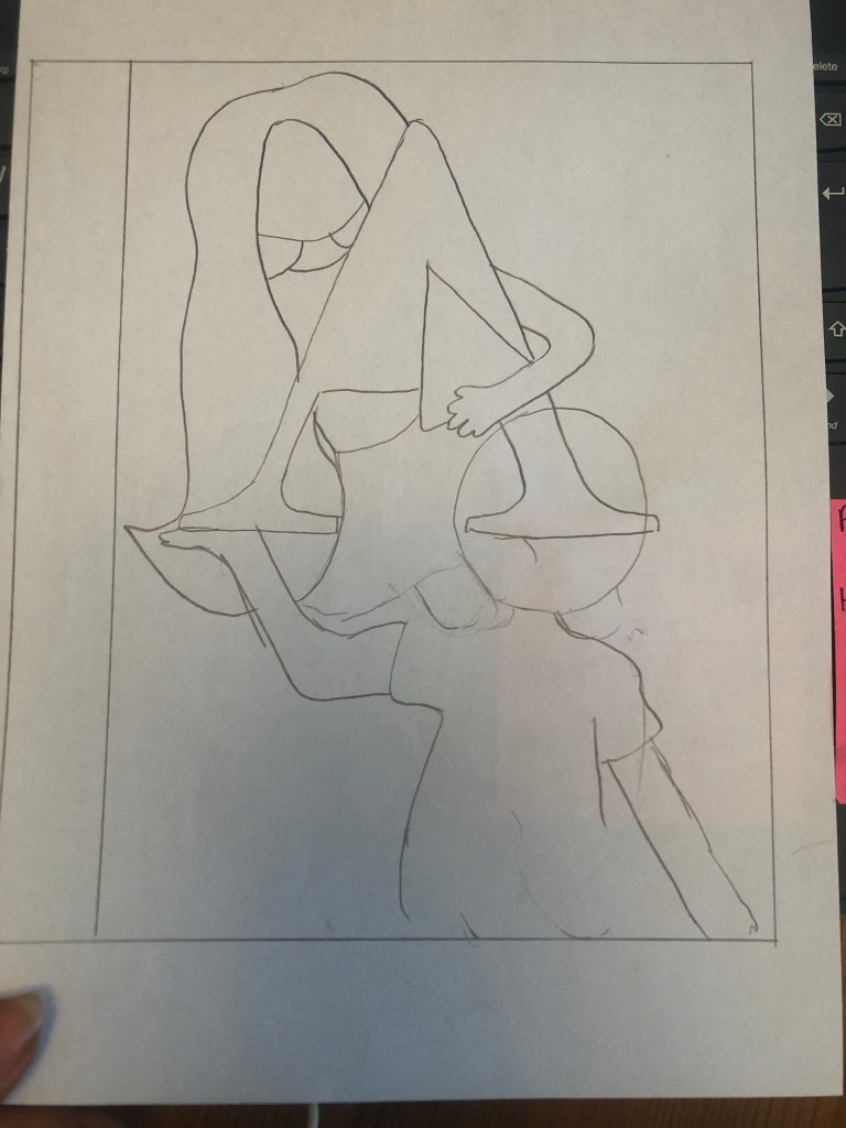
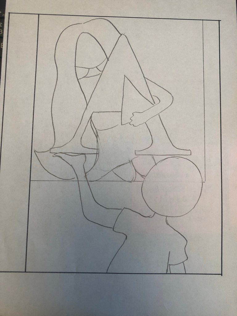
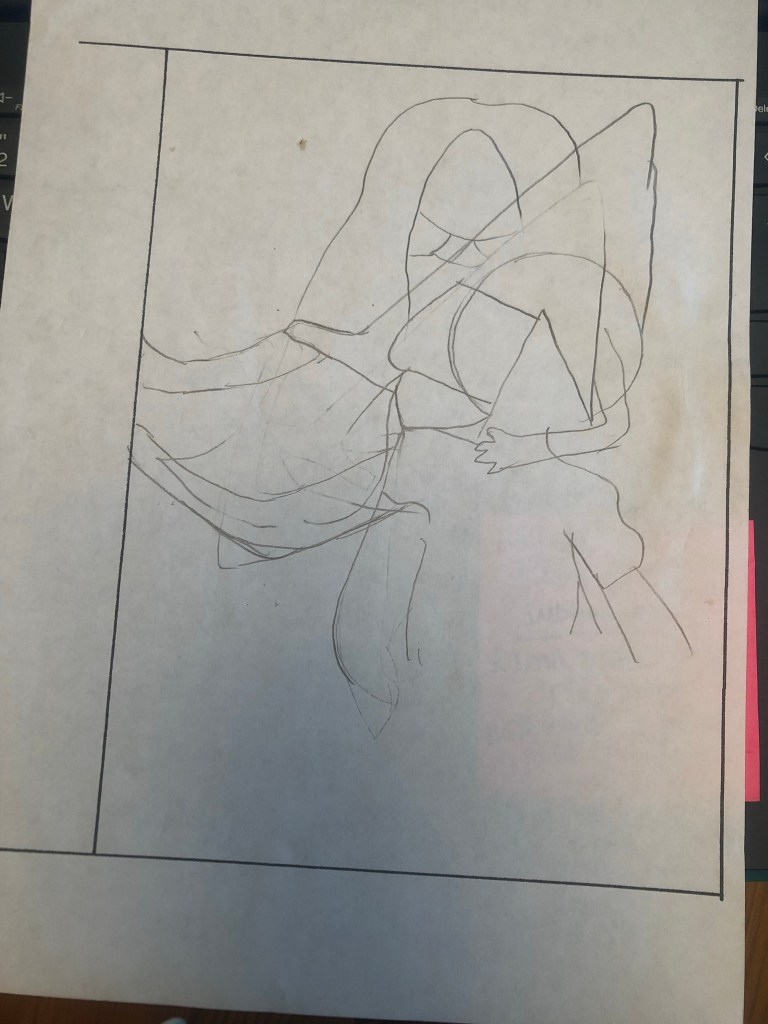
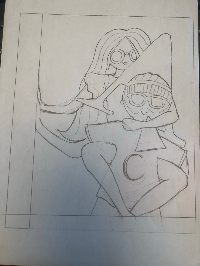
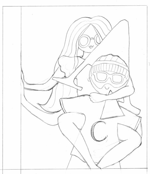
I started coming up with ideas and sketching some drawings of what I wanted. My original idea was to have a box in the middle of the cover with the A inside and have the 2 characters peaking around the outside of it. This idea then changed to the characters holding the A… It then changed again to the main character Amy holding the A and Chris supporting the lift… again! I changed my mind, I then thought about kneeling Amy on Chris’s shoulders holding the A but then eventually decided on the piggy back idea which I went with. Amy is carrying the A but the middle part of the A is separate which is the bit in front of Chris’s face!
I used photo references to help me draw out my characters and get the position of their arms and body in the right place!
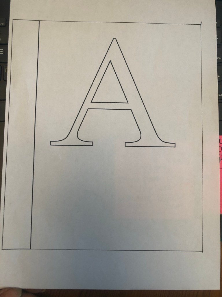
The images below are all the drawing development I did for this cover! – The typeface I used for the A was Mrs Eaves! – ties in nicely with the story and also that Mrs Eaves was designed for use in books!
I then had the decision of whether I took my drawing forward digitally to turn into vector art or whether I carried on in the same style as the pages and created it by hand and then tweaked it digitally. I started off creating it digitally to see what it would look like but then I opted to keep it all in the same style. I drew it out again neatly, coloured it in and then scanned it in to tweak digitally.


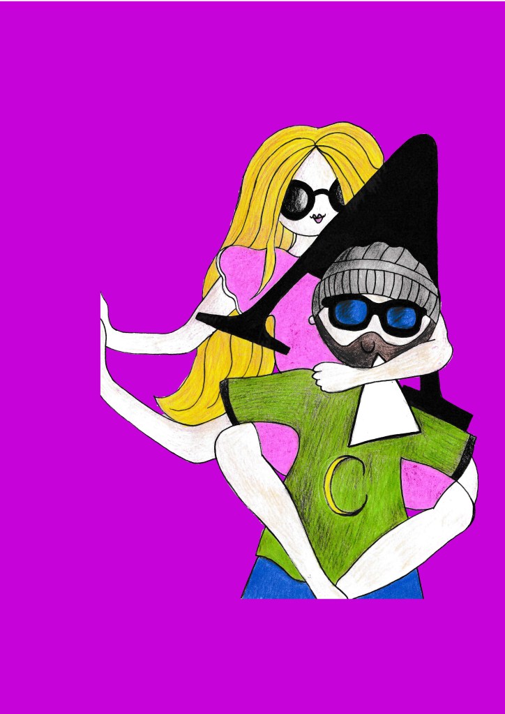
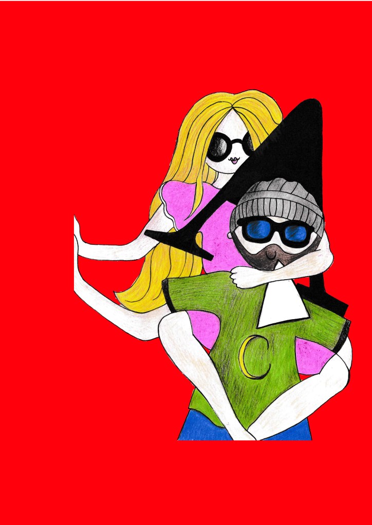
I messed around with the coloured backgrounds to see what would look best on the front cover:
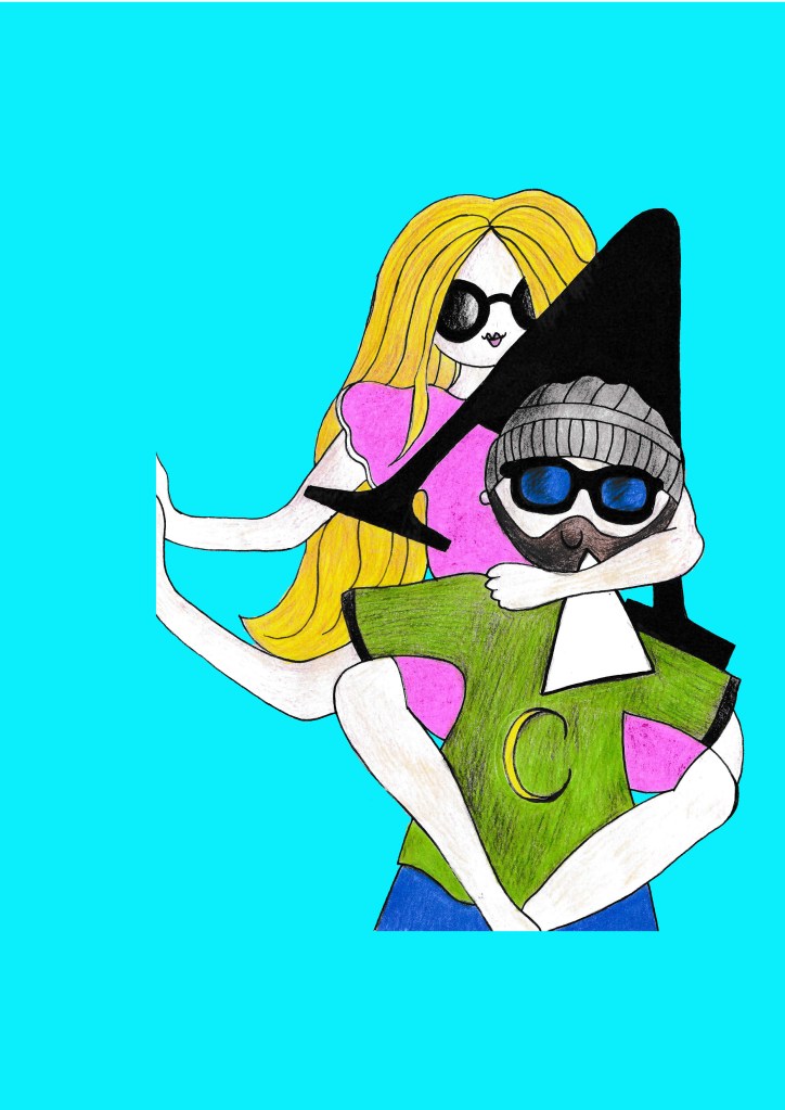
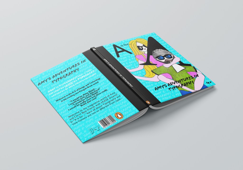
I decided to use Turquoise as the background for this one. It contrasts nicely against the Pink and yellow and does not get lost in the green that are already present on the design. It is a bright, happy colour too.
I then started work on the layout of the book. I decided to use Gill Sans Infant typeface again for the “A is for…” this needs to be simple and easy to read still. I used Flood for the title – it is fun, modern and looks like a child’s marker pen – most importantly though it is still legible.
I did think that the background was a bit too plain though, I decided to create a background using key words in Typography and lower the opacity right down so that it sits with the image on the cover to just add a bit more level of interest.
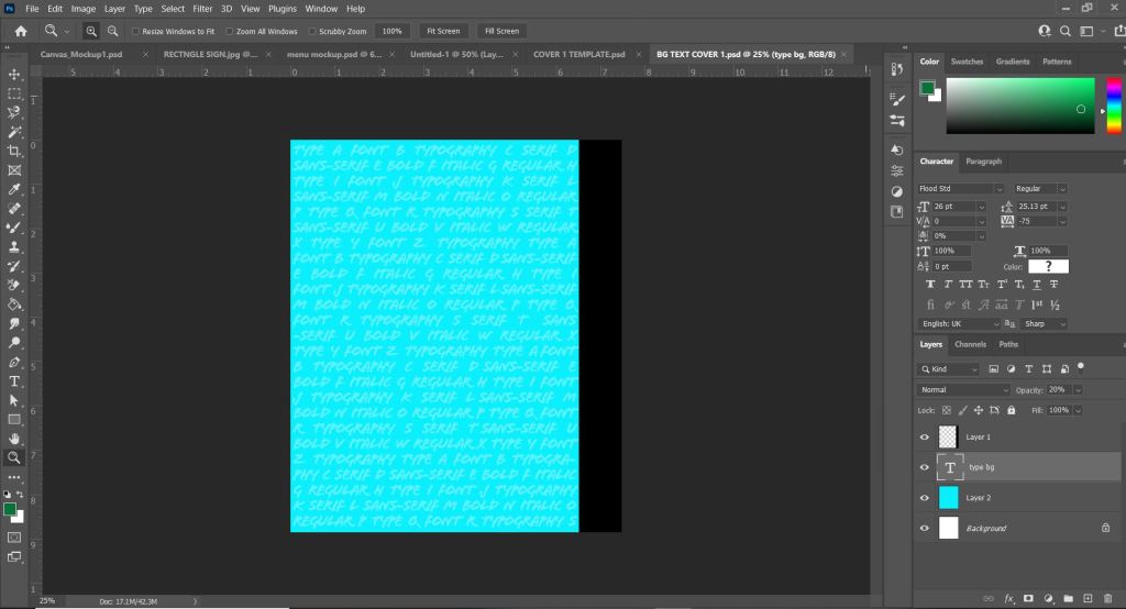
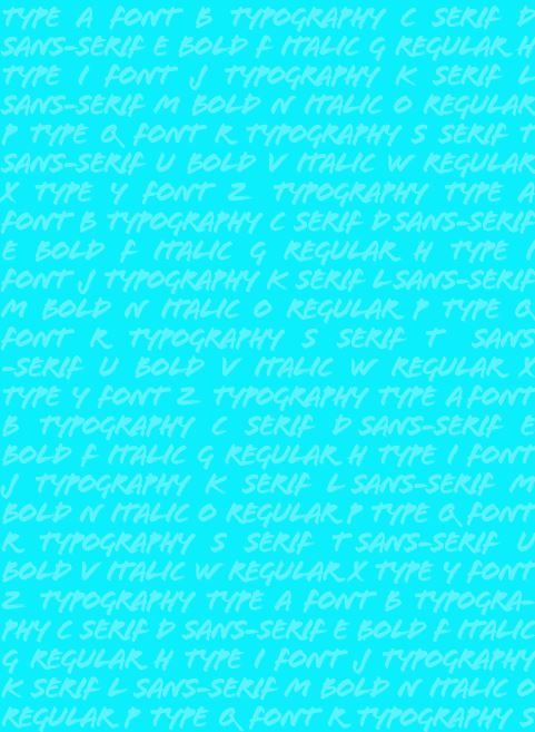
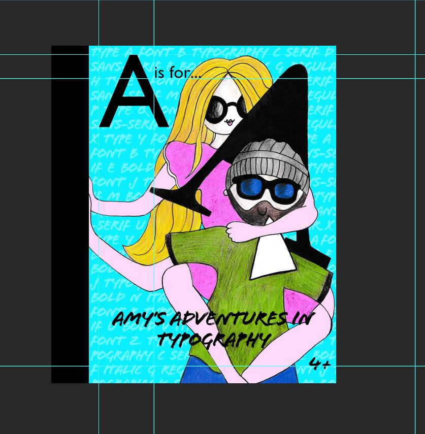
I was fairly happy with what I now had! I added the Black wrap around spine because I just felt it breaks the design up a bit and adds contrast against the blue but also matches the typography on the page. I did wonder if I should put the publishers logo on the front of the book, but having looked at the Drop Caps series: they didn’t. I decided to place it on the spine and on the back cover. I decided to put an age on the front of the books – the text is possibly too much for a 4 year old to read alone – but supported by an adult it could be a book that would be read together.
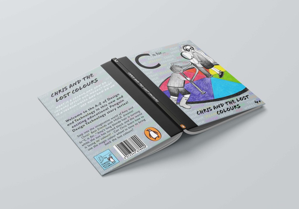
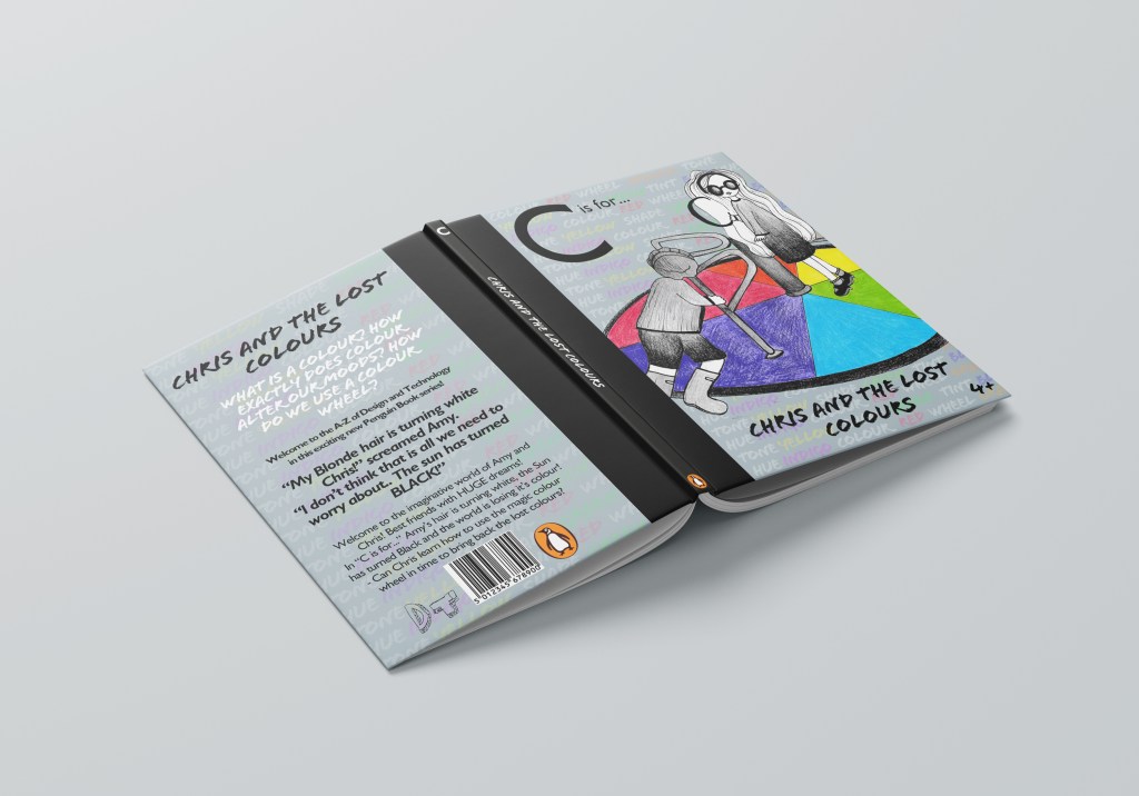
Cover 2 – “C is for Colour”
For my second cover I had the idea of a colour wheel – this is possibly the first thing that is taught in primary school in colour theory. I only needed to design the cover for this one but to be able to know what I was designing for it I still needed to come up with some kind of narrative for it.
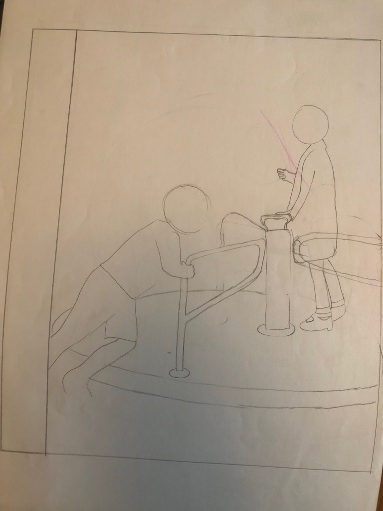
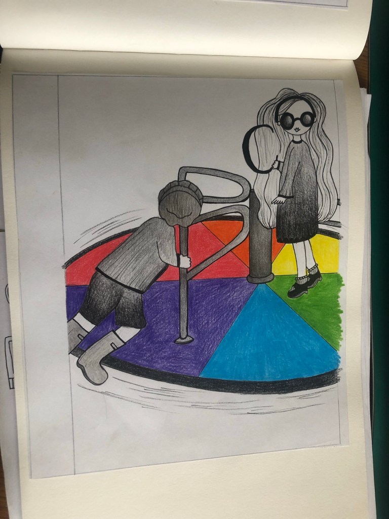
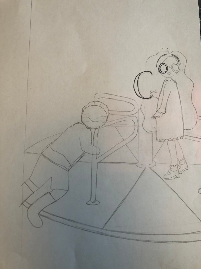
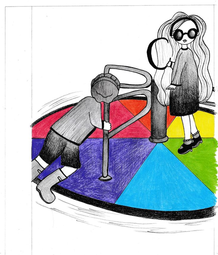
I had the idea of them turning on a colour wheel and messing around with the colours… but what looks like a colour wheel that children play on?… A playground roundabout! I could then create sections for the colours on it. The only issue is that I needed a photo of children on a roundabout so that I could draw from it!
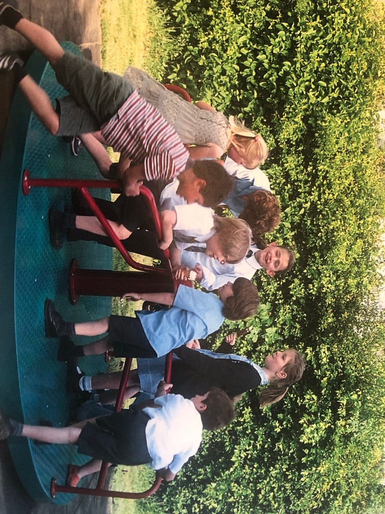
I searched Pexels again and found a perfect image that I could draw from!
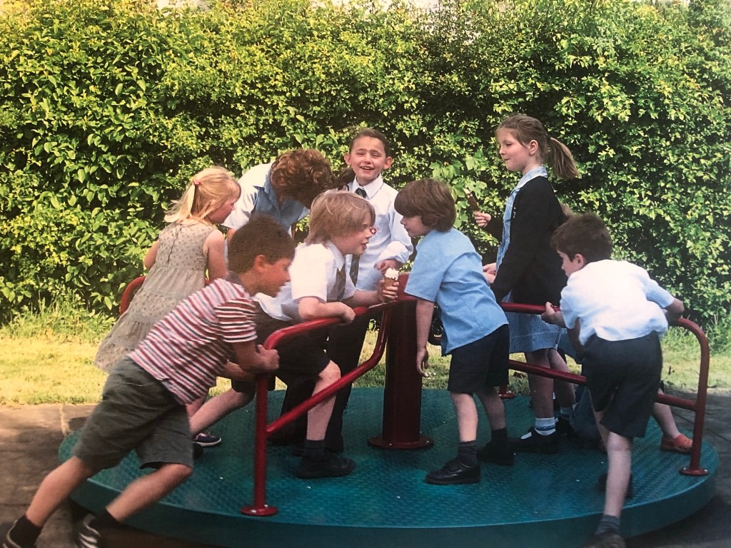
I would use the boy pushing the roundabout as a base to draw Chris and use the tall girl in the middle as a base for drawing Amy.
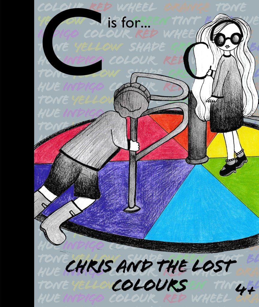
The title of this book would be “C is for Chris and the lost colours” I had the idea to make the characters black and white as though they are living in a world where the colours have disappeared. I had the idea of Amy’s hair turning white as the start of all the colours disappearing. This is why her hair is white on the cover! Chris would have to learn how the colour wheel works and spin the colour wheel like a mad man to bring the colours back!!
Once again I drew it out neatly and then scanned it in to adjust in Photoshop.
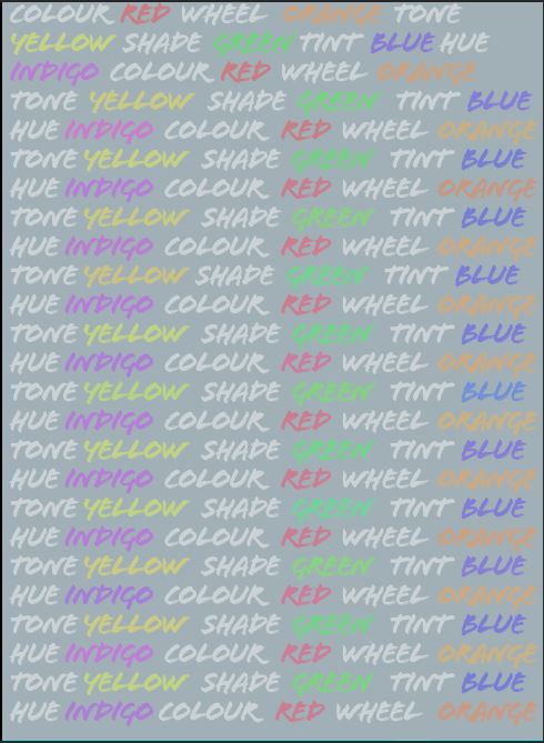
Again, I did a similar background using key words in colour:

I then used the same typefaces and layout as the first book and created my final cover! I used Grey as my background because it ties in with the lost colours and also because it allows the key words in the background to stand out – it brings more emphasis to “colour”.
Cover 3
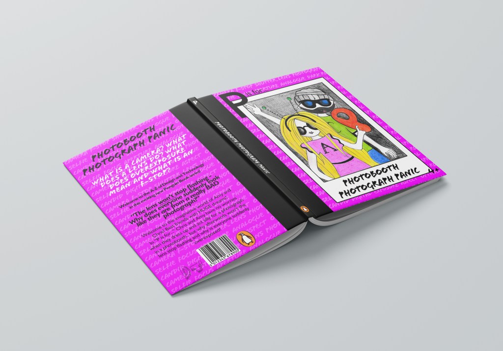
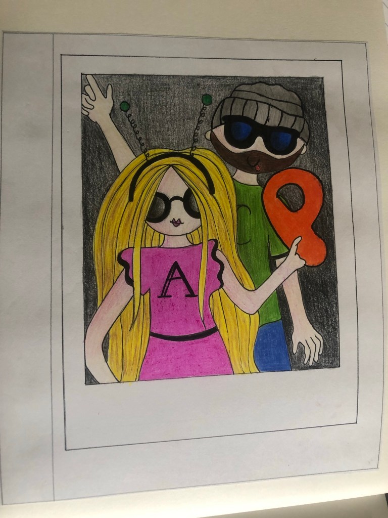
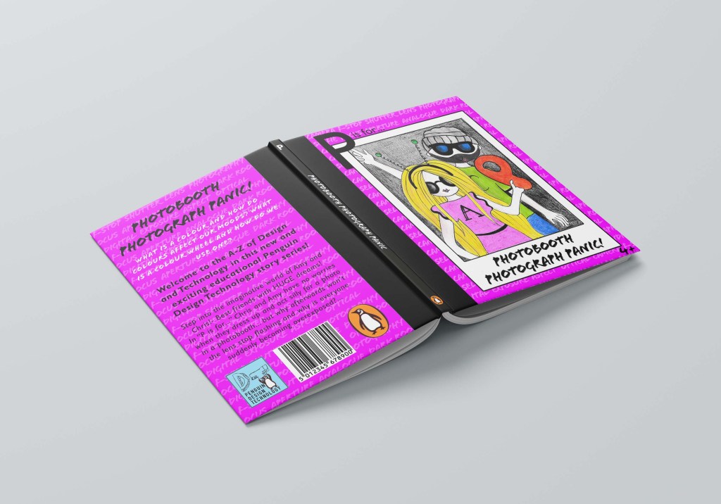
Cover 3 is called “P is for Photobooth Photograph Panic” The idea behind this was inspired a bit by Stephen Kings Christine! – instead of the car turning evil, the photobooth goes crazy taking everyone’s photographs which then turns them into overexposed frozen photographs! Once again Chris and Amy must learn the theory behind a camera to try and work things out! The photobooth was just a fun idea and a lot of children would be familiar with it… using props etc and dressing up for silly photos!
My idea was the cover to be a polaroid photo and the 2 characters in the photograph being silly for the camera:
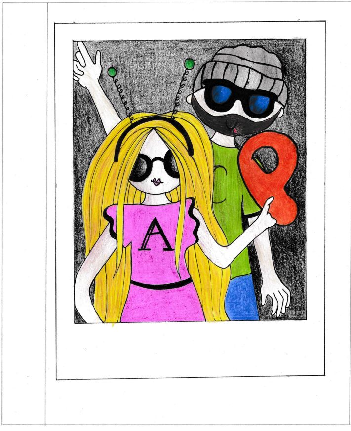
Once again I then scanned it into Photoshop to adjust:
I also did the key words background again to match the other 2 titles.
I used the same typefaces and layout again as the other 2 books in the series.

The Back covers
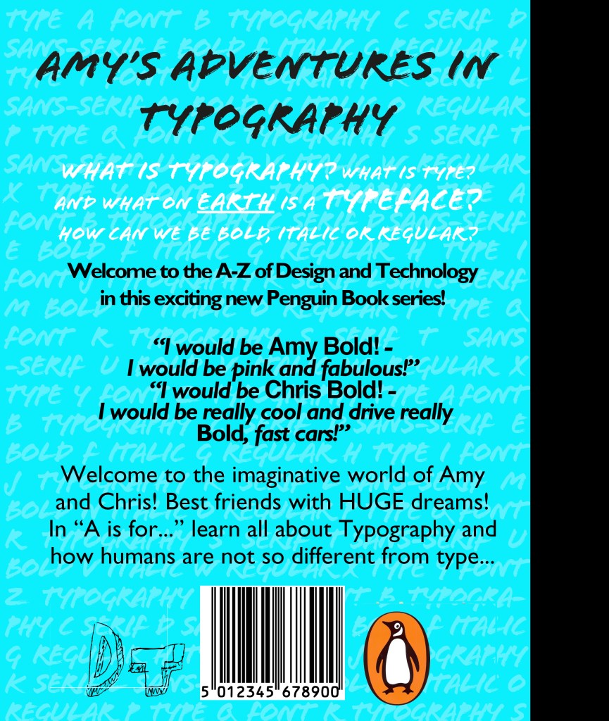
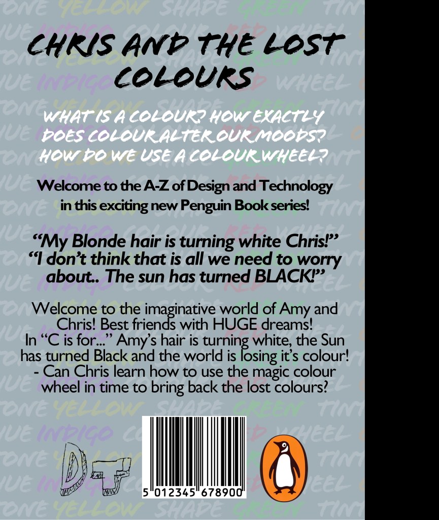
I followed the same layout for all 3 covers. They all had the wrap round spine, the ley word backgrounds, the same typefaces and each back cover has a barcode and the Penguin publishers logo and also a DT logo I made to show that it is a series of educational Design Technology books. The typeface I used for that is Mati. I used this typeface because it looks very childish but creative. It looks like it has been designed and made.
I used pull quotes from the book pages to give the reader an idea of the kind of dialogue that is inside the book. I made this slightly bigger and bold to stand out.
I centre aligned everything which is something I would never normally do and the text is very big just so it is legible and “fun looking” for young readers… again, this is something I would never usually choose to do.
The spine I kept very simple. I used the letters in the book series at the top of the spine, the tile in the same typeface “Flood” along the middle and the Penguin logo at the bottom. I kept the spine Black to match the wrap around spine.


The Final Mockups
Final Thoughts
I am pleased with how this has turned out, also when I uploaded it onto my social media it had a good response!
This was definitely different to what I am used to designing, I struggled with using big type, lack of negative space and using a lot of gimmicky typefaces that I would usually avoid! I pushed myself out of my comfort zone and I am pleased with what I have ended up with. Each book works as a stand alone title and all 3 work together to create a series. The house design I created for these titles was the key words backgrounds on each one and the DT logo that features on the back.. this is the style of the DT books A-Z that would be designed. The illustrations I feel work although I struggled with not making the characters realistic – my style of drawing is more fine art than illustration and I had to take a more laid back, easy going approach to creating loose childish illustrations. I feel that they work for the target audience of these books though, they are also drawings that children could take inspiration from themselves and draw their own versions.
The Sketchbook Pages
Responding to tutor feedback –
Reworked designs
“On the back, the leading is a little tight at times, which affects legibility.
Juggling the length of text within the page /book grid is tricky and can be
addressed through text edits, or type size.
Do you feel the DT series logo is prominent enough?
Might there be photocopiable pages to colour in for the typographic book?”
Reading through Bee’s comments I did agree with the leading on the back of the covers, this is something that I found tricky when completing this assignment and something I will have to work on moving forward. I was conscious that I didn’t want any hyphenation occurring in my text or any widows so I really tried to adjust the leading to allow for this.
I have reworked the covers slightly also adjusting the logo that I originally used. I did not spend too long on the logo because I was running out of time at the end of my course and also because the cover designs were what I felt was more important. The logo I originally used was the letters DT for Design Technology and they were using Mati typeface. It was simplistic and looked childlike. It is something that a child might produce if they were in a design technology lesson. I have kept this original logo but changed it slightly to include the Penguin logo as this is a series of books by Penguin Books. I have made the penguin hold the letter T and in Din typeface I have included “Penguin Design Technology” They now sit inside a blue box; I have used the colour Blue because it is the colour most associated with learning as it is relaxing and calm.


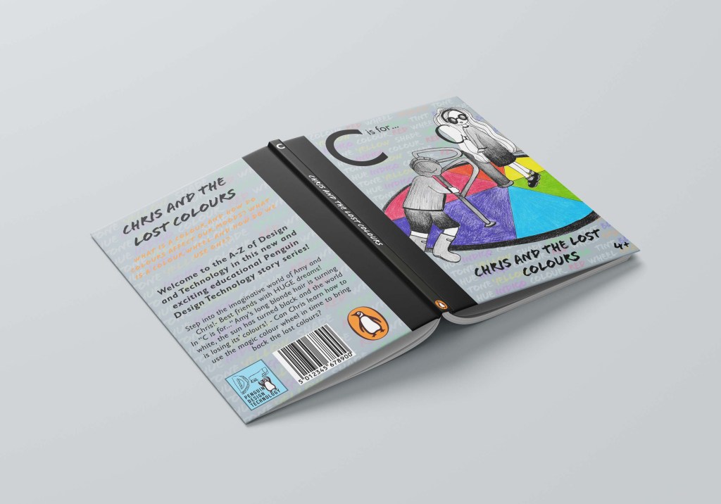
On “C is for…” I could not decide which colour to have for the text at the top; White or Orange. I created a mock up of both to see. I still think i would go with the bottom White as it mirrors the theme on the spine and it also reflects the theme of the story being in black and white. I still also think that the white is more legible on the grey background than what the Orange is.
