“What did you do in half term Amy? In your time off from the day job?”
Welllllll………
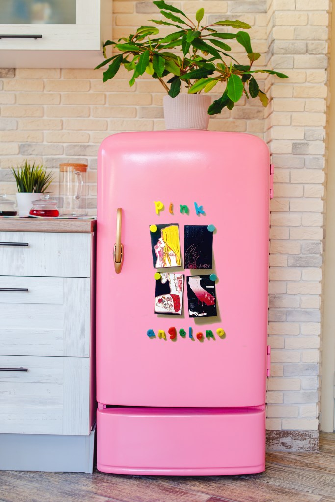
I decided to photograph my final postcards on a… fridge. Whenever you receive a postcard in the post where is the first place you stick it to? The fridge. of course.
I then got the amazing idea in my head to order those kiddie alphabet letter magnets and spell out “Pink Angeleno” whilst they proudly displayed my finished postcards. £8 spent on Amazon later, one next day prime delivery and here I was sat on the floor of kitchen (as you do!) arranging the letters into their letter categories on my freezer door! (FYI the alphabet letters are perfect for spelling out expletives when you cannot seem to get the perfect photograph for your blog!!)
p.s. These magnets from Paperchase are hilarious and cute for the fridge!
I then had what I thought was another brilliant idea…. why use a plain boring white fridge when I could go into a home electronics store and photograph them on a PINK fridge! easy peasy of course… one trip to John Lewis later, (my sister promised me there was a pink fridge in that store – there really wasn’t, it was BLUE (*eyeroll..)
its amazing… expensive and BLUE!…look at the shine on that handle tho!
The assistants in John Lewis thought I was an absolute mad woman trying to stick magnets and postcards to a blue (non magnetic by the way!..) fridge door that I told them like the pro I pretend to be “Its ok! I can photoshop the door Pink!!” (**cue another eyeroll!)
Admitting defeat I returned to the internet in search of a photograph of a beautiful pink fridge. Disappointed as I like to take my own photographs I was swayed by the fact that I found what I thought was THE perfect fridge. The perfect fridge was on Adobe stock photos for £20 a month.. although the first month was a free trial period. Perfect! sign up, get perfect fridge photo, cancel trial!….. Nope! signed up to Adobe stock with not just the wrong but non-existent email (really must learn my uni email addy!)… one rather expensive phone call to Adobe in America later (I’m still not convinced she understood my British accent enough to cancel that wrong account!)… my EE phonebill… through the ROOF! (thank you to the nice EE man for giving me a £30 goodwill gesture refund!) #FAIL. BUT!… It did magically download the desired fridge image..somehow?!
here she is!
Next step was to use my epically bad photoshop skills (I am learning!) to try and mock up something that might look half decent! 3am in the morning later and I kinda have something ok ish that I can work with!
I got so caught up with designing the fronts of the postcards that I forgot totally about the backs!! oops!…. so here is my development process for the backs!!
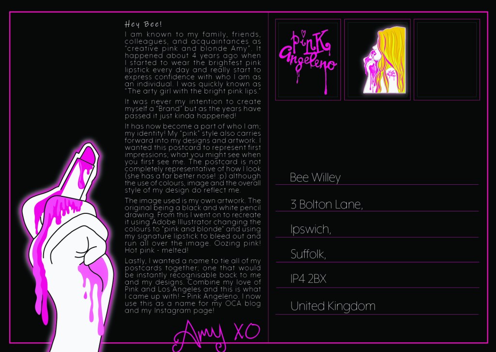
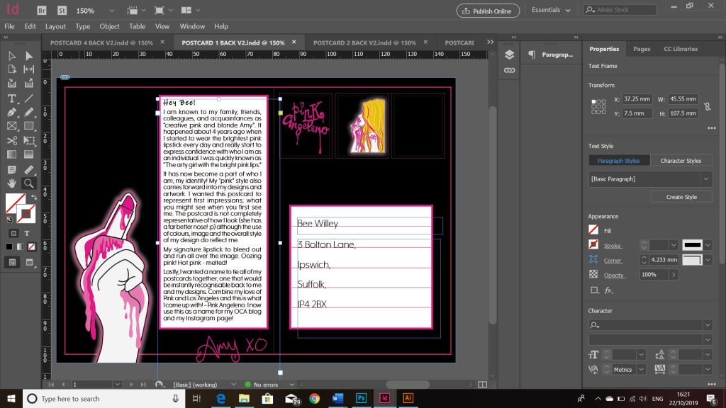
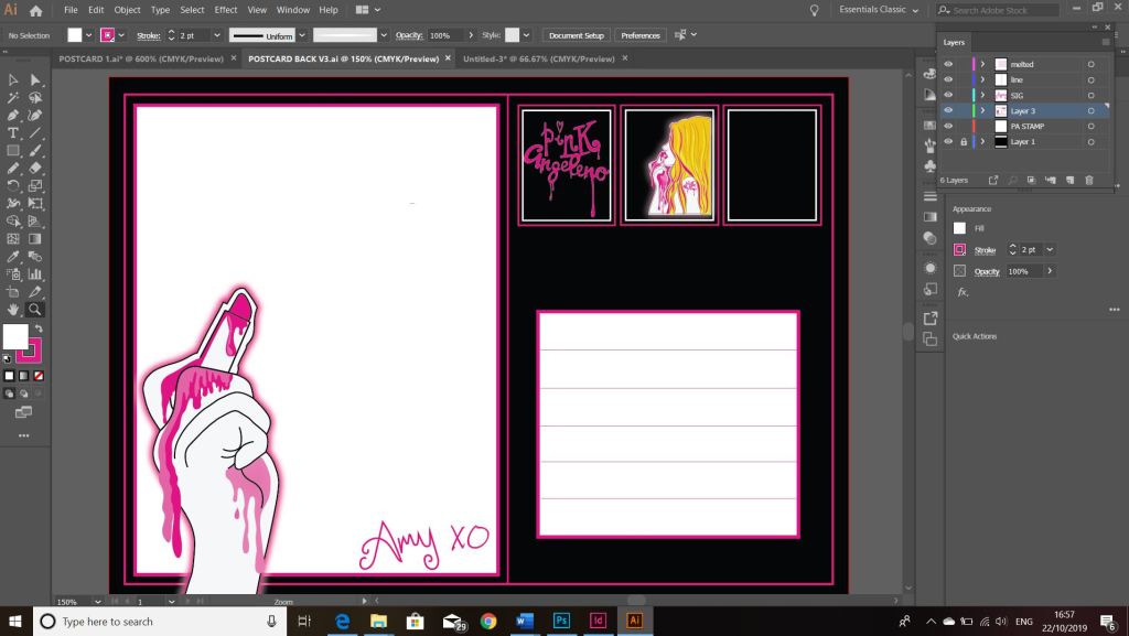
I decided that I didn’t want a plain and boring back, I wanted the backs to all be the same but tie in with the front designs. The usual layout for a postcard is a split down the half of the postcard; the right side for the address and the left side to write the postcard. I decided to use this layout for mine.
I carried on the pink and black colour scheme and included the image of the hand and the lipstick, it looks like the lipstick is writing the message on the postcard.
I included a space for a real postage stamp and used my designs as part of some fake stamps alongside that one.
I have written my name in my signature handwriting and made it hot pink.
I decided to type my message on my postcards using InDesign. I messed around with a typographic grid and justified text and overall what I see on screen I like the look of. However, when I printed it out the text is very small and the legibility is not very good with the white against the black. I thought this would work well with having some contrast but with having to have such small text to fit into a small space the legibility is lost.
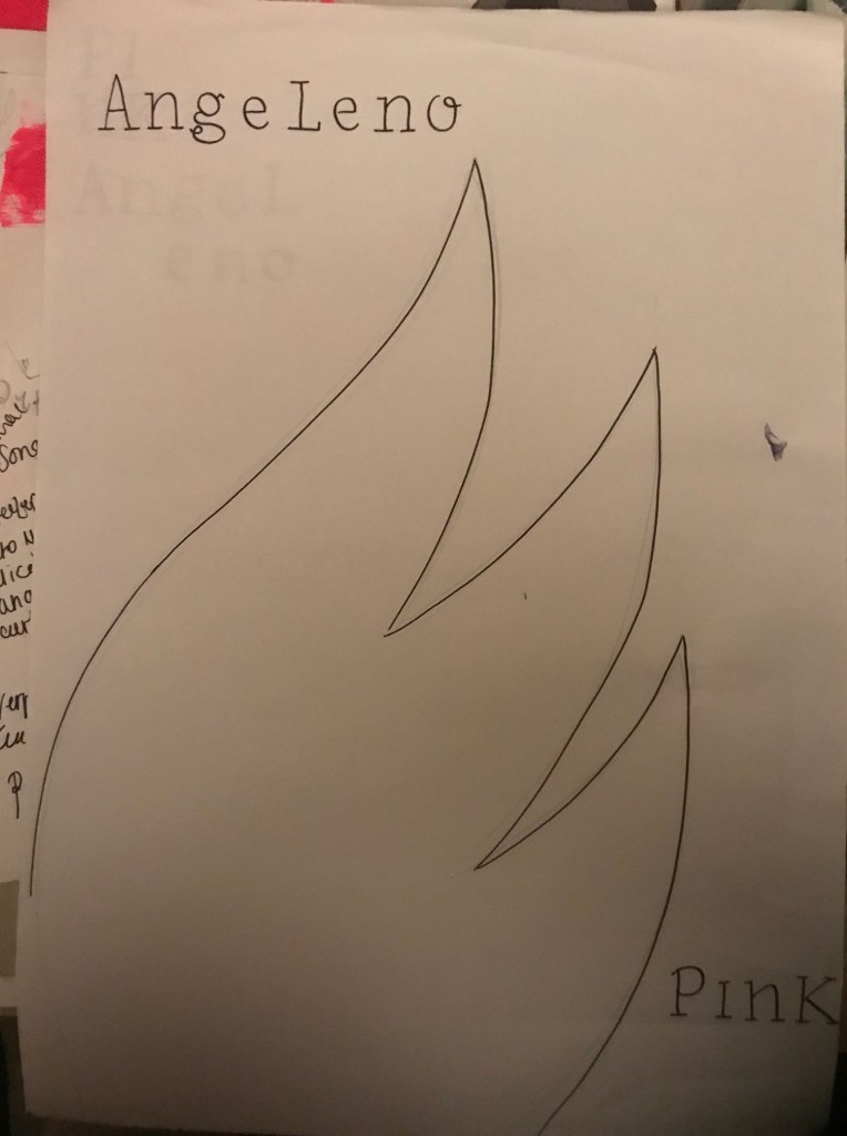
This is the first postcard.The First Design process
I then decided to change it to try and make it more legible. I created white squares for the text to fit into and reduced some of the text.
This is more legible than what it was. This would also work for if the postcard was handwritten also.
I think that this design would work better if the postcard was hand written. There is a bigger white space to write in. The text would be bigger and it would be more legible.
The blank space however does look too blank… the lipstick is there but isn’t writing anything.. I decided to write something coming from the lipstick; the best thing I could think of is my signature XO which I use when signing off any of my blog or emails.
These are what I ended up with. The blank white space is now great for handwritten or typed postcards and still has the personality that I wanted it to have.
It has been a while since I wrote my last post but since my last post I have actually completed (I think!) the fronts of my postcards!!! 😀 (I still have the back to design however).
I changed a lot on my design since the last post. I completely reworked the final 2 postcards – still keeping the same idea and concept but just completely changed them around!
I was feeling frustrated on my last post that I could not find a way to include the wing onto the design, I spent days trying to think of ways and then decided I needed a break from seeing it and did some other illustration side projects! By the time I went back to it a few days later I was actually surprised that I actually knew instantly where to go with it and what needed doing! I completed the final 2 postcards in 2 days! This was good but it also made me feel silly because I have spent so long on this assignment in general!
These are what I have for the postcards!
Postcard 1 and 3 have not changed, They are still the same illustrations that I did.
Postcards 2 and 4 however have changed a lot!
I shall start with Postcard 2! – This one is the postcard that I wanted to express emotion and feeling through. I wanted it to be raw and honest and show who I am on the inside. In the last post what I ended up with was a very dark and spacious design; I decided that it did not tie in all too well with the other pink, bright and girly postcards so I needed to find a way to keep it edgy but also bring it back a little bit!
I am interested in typography; I have stated before though that I feel It is not one of my strongest areas. My original ideas for this design were using the typewriter and using mixed media and raw type for the design. This changed though to me finding a suitable font which looked like typewriter type and using that instead. In my last post the placement of this text was set in the middle of the design, I have also changed this. One of my original ideas was for the text to “fall down” I decided to position the text along the top of the postcard and reflect it so that the text is backwards. You can still read it from left to right except that the text is backwards now. This makes it more believable for it to fall down to the bottom of the page. I then took the last words of the sentence and dropped them down the page. The idea for this wasn’t to be legible or easy on the eye to read. It is supposed to be messy and confusing and more of a visual impact than being legible. The mind is a messy place and this reflects in my type. The content of the text is still the same, it is still my original poem writing that I did.
The next problem was getting that wing in!… I decided that it needed to be simplistic and not too big so as to not take the attention away from the main design and also so that the negative space was not lost. I drew an outline of a wing in rough with the pencil tool and decided to keep it because it actually looked alright! In theme with the other designs I made it pink and put a neon glow behind it. I then wanted to get the “get lost” heading in there somewhere but decided that the original “get lost” that I designed worked better with the LA themed postcard (being that it is about Angeleno and “lost” Angeles etc) I needed an alternative heading for this postcard. I still wanted it to be about getting lost in your head so in the same style as the wing I took the pencil tool and drew an outline of “lost” I then tidied up the curves, put a neon glow behind it and I felt like it worked.
In the theme of a “messy mind” I thought I would add some pink scribbles into the wing.. this would add some detail as well as highlight the messy mind. After I had finished this I felt like I liked the effect and the overall design but that also it reminded me of the “mind” logo that already exists. I hadn’t thought about this existing logo at all prior to this design so a part of me was dissapointed that it resembled it slightly but there was also another part of me that was reassured that my thought process thinks in a similar kind of way to the professionals! 😀
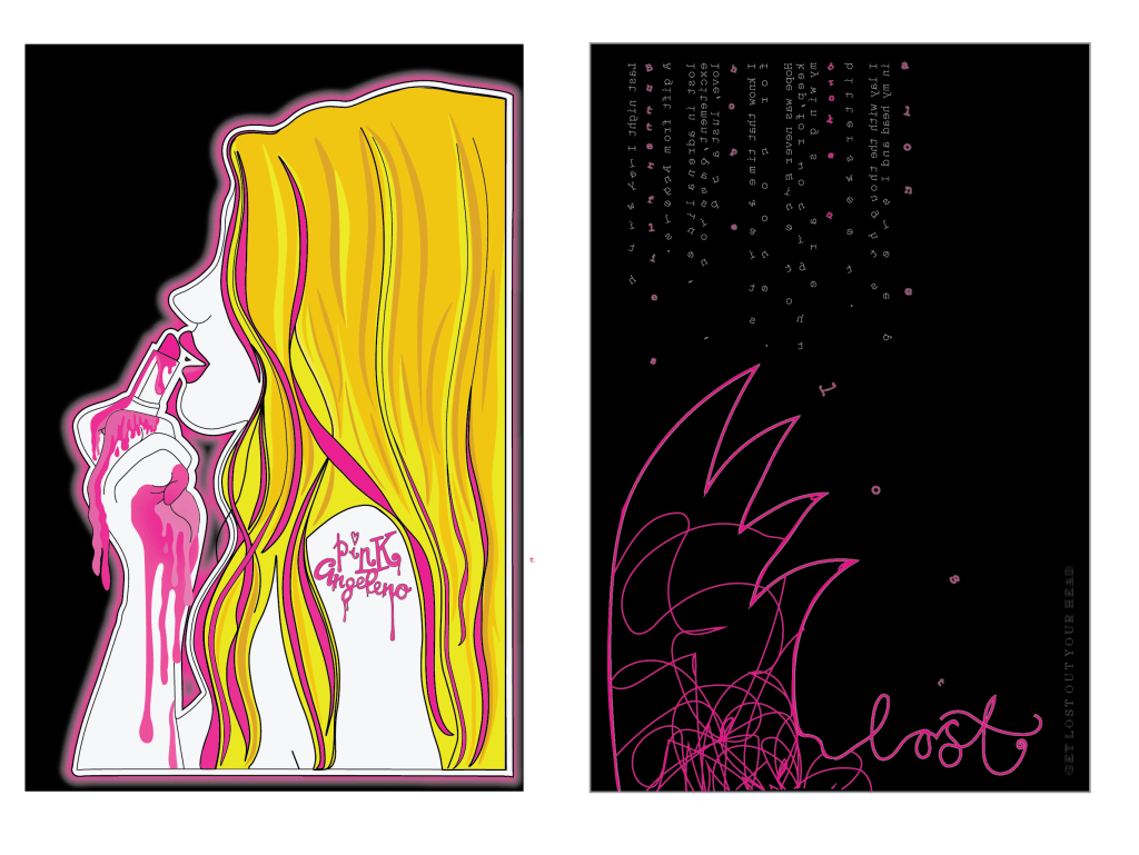
The above images are postcards 2 and 4. Again, 2 has not changed. The idea for 4 however stays the same but the style has been changed! This postcard represents my love for LA. I wanted to also though keep it similar to postcard 3 with the edgy rawness of it.
I decided that I wanted to try something different for the inside of the wing; I still kept the shape of it to look like the Californian west coast but I felt like I wanted to try something a bit different with the inside of it.
I visited LA 5 years ago and while I was there I took a fair few photos! I browsed through the photos trying to find something that might look appropriate. What I found was a photo of the LA skyline from up in the Hollywood Hills. The photo looked murky and dull (even though it was a heatwave of a day!) from the haze of the sun and the smog from the city down below.I felt that this looked raw and edgy enough for my design. The original photo looked good but I felt it needed to tie in with the pink theme so I took the original photograph and altered it in Photoshop to make it completely pink. This is what it turned out like:
I then imported it back into Illustrator and clipped the photograph to the shape of the wing.
One of my really early ideas was to include bands I like or lyrics into the design. One song that stands out to me as LA themed in particular is “Under the Bridge” by the Red Hot Chilli Peppers. It is a song where basically he explores loneliness and isolation (mainly through drug use however!) but explains how he felt like the only reliable thing he had in his life was living in LA and just moping around the city. I decided that these were good lyrics to include. They tie in well also with postcard 2. I used a grid system but also lined the lines from the pylons in the photograph to my text. I decided to place the text into what look like white torn pieces of paper. I felt this gives a more alternative look.
There are still elements of Illustration on this postcard as the illustration from postcard 2 crosses over onto this one with the hand. (I have also realised from looking at it that the foot should also cross over, I will need to fix this!)
I have again dropped some of the text on this postcard to look like it is falling and most importantly have used the original “Get lost – Angeleno” logo. I have also used the drip effect which I drew in Illustrator and used in the first 2 postcards. Overall I really like the look of this postcard!
Let me know what you think! – I am pleased however with what I have achieved so far! 🙂
So.… my last post slated the grid. F**k that grid!… I take all of that back! I thought I could take my normal approach to “playing it by eye” but my eyes suck on this design!
I decided firstly to work on the text design I put on my previous post. I messed around with a whole load of ways for it to appear! (I think I saved 10 layouts for it in total!) changing the colours, adding dripping text, taking away dripping text, adding ink splats, making it blurry, taking the blur away!….. exhausting!
I reached this version and decided this worked. However, the problem was then getting all the text I wanted to appear onto it with the typewriter type. There was a massive bulk of text!
How to get all of this into a small space?…
The photos above show how I tried to mess around with the layout and getting the typewriter text into such a small confined space! This was a trial run really to see what it could look like.
I then imported the photo of the text into Photoshop and adjusted it to then bring into Illustrator. This is what I ended up with. I didn’t like it. There is too much going on.. it looks cramped, nothing particularly stands out on it. I came to realise that my typewriter idea was nothing more than a good idea. I can not make it work on this design. My next idea was to use “fake” type written text… use an existing font which looks like typewriter text. I chose Courier New as it seemed the closest. The next step was to change the text because there was just way too much of it to take in! I sat and thought for ages about what I could use in its place; What shows the thoughts and emotions that run through my head? What shows who I am deep down inside? What could show my vulnerability and “raw” me….
A few months ago during a bittersweet moment in my life, I documented this late at night in my sketchbook (I write things that I feel in poem form in my sketchbook at times when I feel I need to vent! – It’s like a visual Bridget Jones’s diary! ha!)
Even though I wrote this piece after several glasses of vino (potentially whiskey too!) I actually really love the sentiment of it. It means something to me and it is still something I am dealing with.. so I decided to alter the wording slightly to fit in the theme of the “angeleno” and see how this might work on my design instead..
Does it show who I am? Check! Does it show raw feeling and emotion? Check! Is it vunerable? Check! Does it run deeper than just aesthetics? Check! Can I tie it in with the theme of the design? Check! Has it 100% been created and written by me? Check!
I did make a typo in “adrenaline”
What I ended up with was this. At the time of designing this I thought I had got it spot on… the next day however, hated it! Loved the poem.. that makes the piece in my opinion! Hated the layout, colours… The background colour needed to be black to tie in with the rest of the postcards so I knew I would have to alter a lot of the design to reach this outcome.
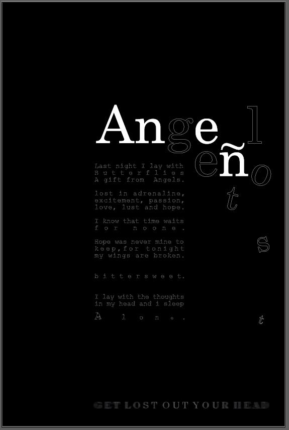
This is when I realised that despite my “f**k the grid” I actually needed the grid. I then spent time splitting this piece in a 3×3 grid. What I then ended up with was a million times better! This is also the part where I experimented with a million different ways to display the “Angeleno” part. The eye was drawn to the “Ange” but nothing else.. I needed the hidden “get lost” part to be visually visible more. These are some of the layouts I tried out!
This last photo is where I am currently at. Using the grid has definitely given it more structure and made the design visually work better!
The black background works better than the white and now ties in with the other 3 postcards. I chose to use white for the “Angeleno” text. I think that the transparent cut out part on the “Get lost” works because it is not tying to be as visible as the rest of the text and also part of the letters are getting lost by being cut up.
I have justified the text.. I did think against this but I feel it works well. I have altered the kerning on some of the sentences to stretch some of the words out. I wanted to emphasise the “bittersweet” and the “for no one” and “alone” these were the most important feelings in this piece of writing. “Alone” is in its own space and getting lost into the rest of the design.
I have yet to add more pink into the design. I also need to try and incorporate the wing into the design. I am not sure how I am going to do that just yet…I also want to put some words getting lost floating into the background.
I am pleased with where I am at with it at the moment, it is certainly a lot better than it was!
I hate grids. I feel like a complete amateur to admit that they are so confusing and half the time I get totally lost wondering what on earth is going on with them.. so many lines, so many rules to follow… so many rows, columns, gutters, boxes….F**k the grid! Many times I have found myself quite literally lost in my copy of “making and breaking the grid”. I choose to break it! – literally f**k the rules! I am not saying I won’t ever learn and use the grid in future though; it is more than important but yet one of them frustrating things I shall eventually one day I am sure master… I mostly (as bad as it may sound!) work from what I feel looks right by eye or feels right. Negative space I CAN however abide, appreciate and understand…
As I wrote in my previous post I wanted to look at an existing font and then bring it into my design rather than just using my hand lettering which could look again… amateur! I chose Century as it matched my hand lettering the closest.
I then attempted to experiment in InDesign with the layout and appearance of how it might/could look. Making sure that I tried to make that “Get lost” element GET LOST!
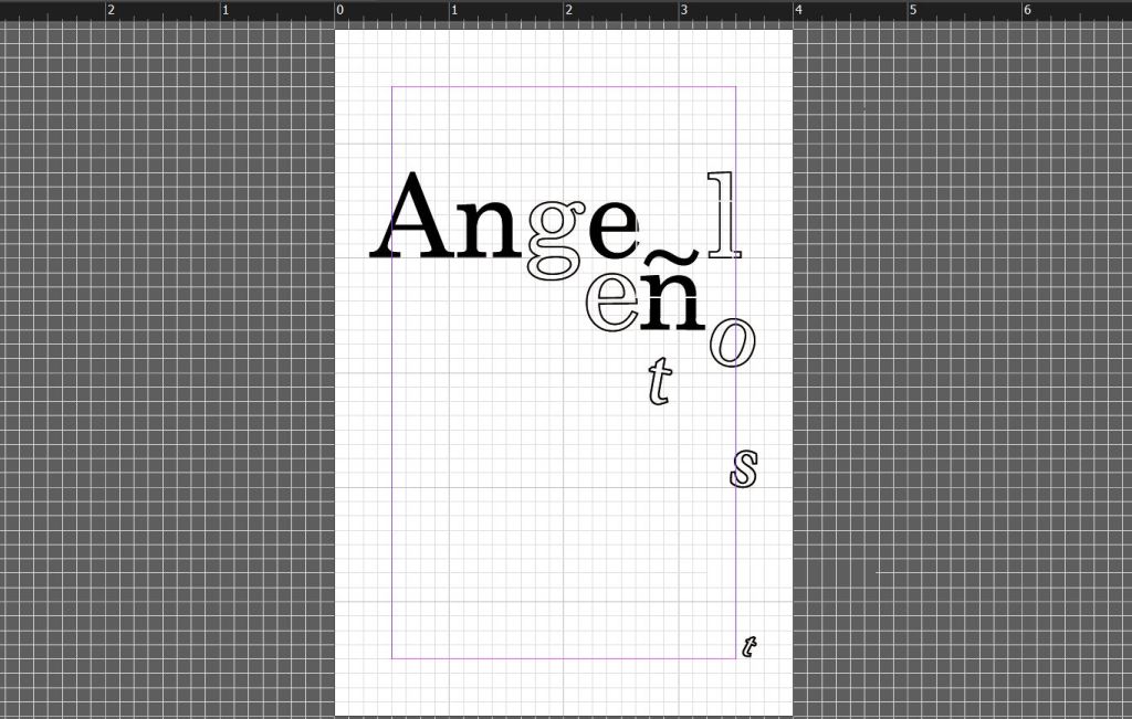
I looked at the way I could use black and white on the letters, I feel the middle one works the best with this – it highlights the N which is important in the history of Angelenos. In the history of LA and Angelenos it was a debate whether to get rid of the accent above the N. It was assumed at the time that careless Anglo typesetters left it on there as an error. I feel this is important in the history of type, print and the history behind my design.
Overall I quite like the appearance of it. It is now just figuring out everything else around it; the mixed media experimentations and ideas that I had to make it appear more “grungy”. I need to get the wing onto it somehow to tie in with the whole design… again, it is how to do this without ruining the spacious, simplistic look that it has evolved into. I need to bring the typewriter art into it also..
Working some more on my Cherub design idea I decided to scrap the Angeleno Cherub and just concentrate on the Typography aspect of the design only.
I have ideas in my head of how I want the type to look but it is taking some time getting it right. Typography; although I am interested in it the most, it is the one area I have always struggled to get right.
I need to interlink “Angeleno” with “Get Lost” cleverly, to try to make the two work together and to be easily redable to the viewer but also visually show the “getting lost” element.
I drew up some thumbnail sketches again to try and visually get my ideas down on paper:
Mostly on the left hand side page; Trying to work around the positioning of the type. I need to create some kind of grid system for the layout of the type.
Here I was trying to experiment more with the colours of the page. I need this one to match the other 3 postcards and to do that I need to have elements of pink and yellow. I was thinking about a yellow wing and making the pink a part of the type somehow.
I have done some research into some of layouts and ideas that I really like:
This page is from David Carsons book. I like how you can visually see what the name is although it has partially disappeared. This kind of idea would work well with the “getting lost”
This is also from David Carsons book. It cleverly shows elements of text missing. It is combining type and making it visual. Visually conveying what it literally is saying.
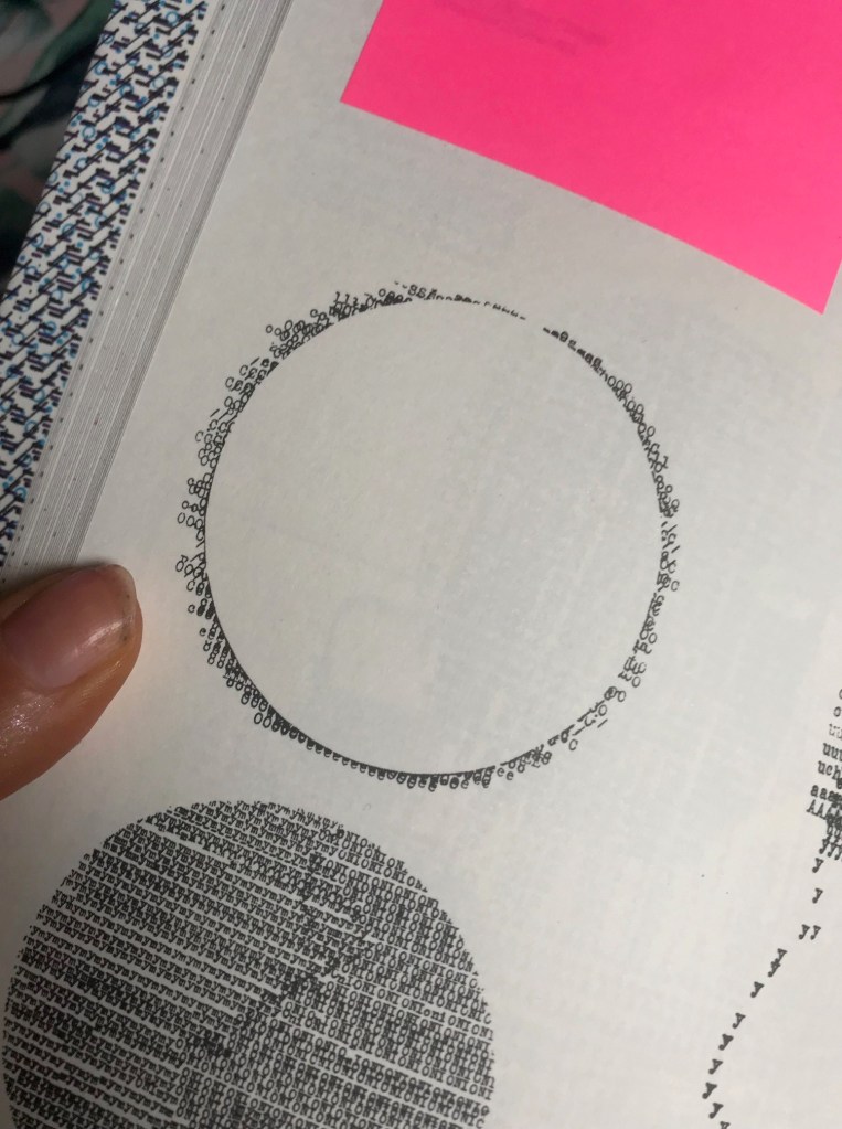
These are from “Typewriter Art” by Barrie Tullet. In my head I want to make the wing from typewriter type but it is difficult to line up the words perfectly to the shape of my design. Having studied these images closely I think I have now figured out a way to do it more flawlessly.
Moving away from the typewriter element for a moment, these are some of the ideas for the get lost type element. I have experimented with ink, Styrofoam block printing and just a simple plain style. I originally wanted the grunge look to appear on my design, I need to think of ways to still bring this in without making the design too much.
Experimenting with Styrofoam block printing.
It didn’t go too well in all honesty. This is the simplistic version; some of the letters are partially missing to show the “lost” element. I feel Like I need to space the letters out a bit more to show them getting lost. I need more negative space for them to get lost in. At the moment I think the design idea has too much going on with it. I think I need to sit down and find ways to make it more simple yet still effective.
The ink version; just to give a rough idea of what it might look like. The ink ties in well with the typography idea and with the typewriter art.
Moving forward I think I like the idea of this but the current lettering is hand drawn so is not as professional as what it could be. I think I am going to choose an existing font and then use it as a starting point to mould into my own type. I then need to work on the layout and spacing of the lettering.
Some more design inspiration that came to me this morning however was from a book called “Show your work” (I might write a blog post about this book at a later date). I was pulling it out of storage for a friend to borrow and flicking though the pages gave me some inspiration for type layout.
I like the cool, spacey, chilled back vibe of these pages. They have the sort of feel I am aspiring for in my designs at the moment.
Following on from my last development post about the fact that I needed a cherub on my design; I designed what to me after much thought looked more like a fairy than a cherub.. I decided after seeing a trend for cherubs at the moment (my last post on “Be inspired”) that it would be relevant to try and recreate my own for my piece.
I did some research on Pinterest into the styles of Cherubs, I am not a fan of them in all honesty… So I wanted to find a more modern take on them.
I came across one which I found amusing, it reminded me of Banksy’s style. I am a fan of his work. I had the idea of trying to cut a stencil design of one and then spray paint it or just paint it over the top of the type on my postcard.
After researching into a few more styles I decided to have a go at making my own version and this is what I ended up with:
I decided to add a dress (which I originally thought I would make pink; or I still might!) and added the pigtails to give it more an edgy/modern appeal. I might change this yet also.. The idea I have is that the type will go above the wings and then I shall make the letters fall down onto the wings and into the palm of her hand. I quite like the hand lettering and the style of it with the ink smudges.. It gives that more rough/grungy look.
I tried to make the separate parts of this design into a stencil using acetate but it just didn’t work well.. The different parts of the design were far too small and fidly to cut out.
All the different development stages.. lots of paper!
I started typing the type above the design to see how it would work.. I decided I need to make the letters start falling a lot earlier than what I did on this original piece.
This is what I am left with at the moment. A page full of changes that I need to do. I am also aware that this postcard will look a whole lot different to the other 3 so I need to find a way to try and make this one tie in to the other 3. The other 3 are very illustrative with Illustrator but this one is very traditional in the sense everything is done by hand.
Also from one of my previous posts I need to add the “Get Lost” element into it somehow.
Kinda feel the last week or so that I am losing my way slightly..
I have had such a busy work/social schedule that in all honesty I haven’t had time to sit down and do a great deal of work… It had been a case of dipping in and out of it whenever I can!
I have so many ideas and visions in my mind of what I want for this design that I feel like they have all become jumbled, mixed up, developed and maybe a little lost along the way. I need to get back to what my original message is for this postcard!
I was thumb nailing some layout ideas for postcard 4 to try and see visually where my idea could go. The above photo is the evidence of that. I have illustrated the typewriter wing, the black background to tie in with the other 3 postcards, the pink paint and the grunge style type.
I want to carry on with my original idea that I had for this postcard and make this design edgy, alternative, rough around the edges and full of my own thoughts, values and morals to give a deeper meaning of “me”.
From my research and looking at the LMU magazine, they used a cherub to symbolise the “Angeleno” I wanted to do similar but using one of my own illustrations. I feel like my illustration ties in more with the feel of the other 3 postcards.
I then wanted to experiment with the type more… I feel like the idea that I had wasn’t edgy or grungy enough. I really want to step outside my comfort zone with this idea and really try to make the type visual as well as just simply communicating a message.
My original idea for the type on this postcard was “Lost Angeleno” I felt though reflecting on this that it does not tie in with the theme of this postcard. The theme is me opening up and exposing my thoughts, feelings, beliefs, morals and values as well as showing an interest and influence from magazine design, David Carson and “grunge type”. I felt the feel was also too “girly”.
I had the idea one night earlier in the week of still using the “lost angeleno” but in a different context. Earlier in the week I felt pretty lost in my thoughts… My friend told me to “get out of my head” the theme of this postcard is very much all my thoughts so I had the idea of “getting lost” in thought. “Lost in my head” and then the idea of “lost Angeleno, get lost” came about. I then realised I could join “Get Lost” into the letters of “Lost Angeleno”. My only issue was that I couldn’t seem to find inspiration to make the “Get Lost” stand out from the “Lost Angeleno” I went to bed that night stuck on the idea….
I woke up early hours that morning weirdly having dreamt about this idea!… In my dream I used brown paper as collage to separate the letters slightly and stand it out from the rest! I decided to give it a go!..
I then developed the idea further to try and bring out the “grunge” more.
On this one above I experimented with trying to make the “lost” look like it was getting lost. I had the idea of the S and the T fading into the background and getting further away from the rest of the type.
This one I messed around with ink, I quite like this effect…It definitely gives it that dirty, grunge feel. I am not sure though how I could make the “get lost” stand out from Angeleno using this effect. I wanted the ink to rub and run at the end of the letters so that was legibility and readability is poor. This represents an idea or message being lost. It also gives a nod to Carson who says the quote “Don’t mistake legibility for communication.”
This is the whole double page of my learning log sketchbook with the mixed media experimentations.
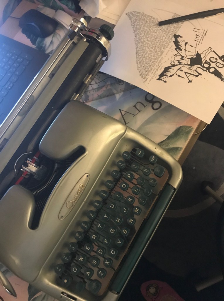
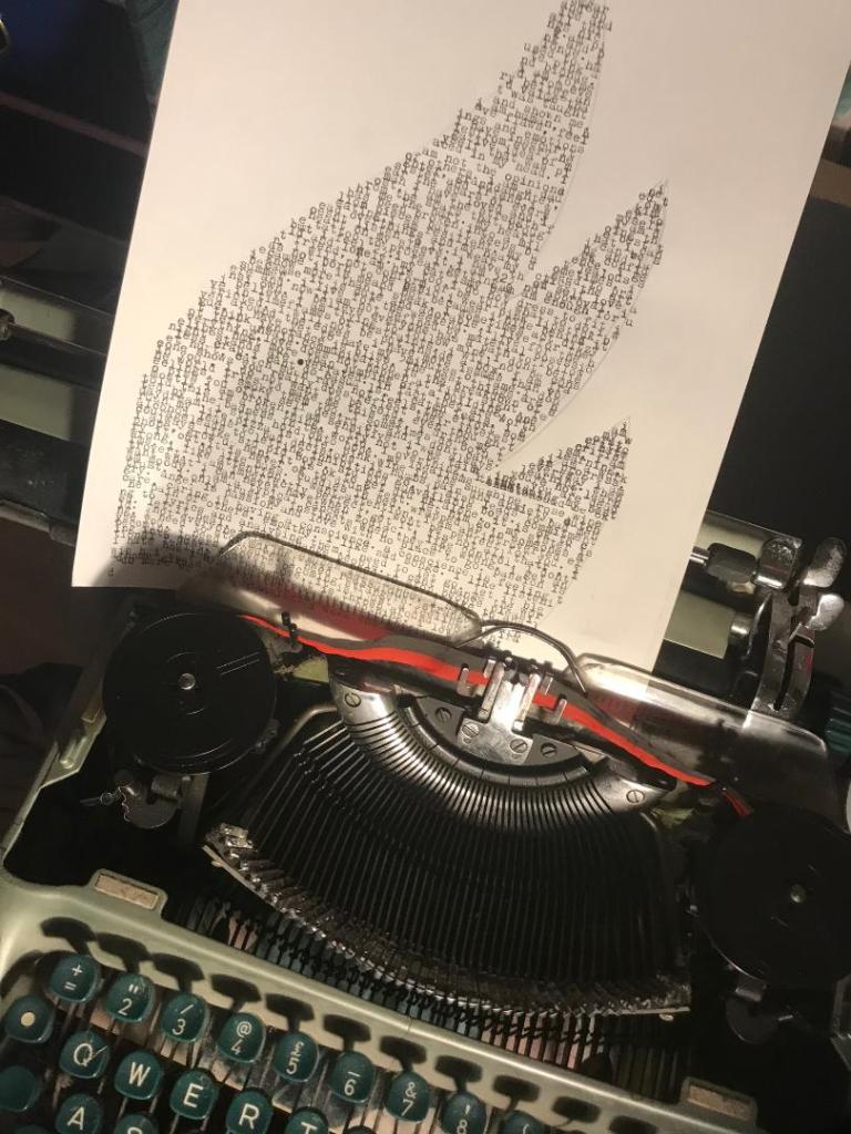
Last night I decided to experiment with some typewriter art!
I have an old Oliver typewriter that my friend gave me a few months back (I just thought I would write my weird quotes or poetry on it!) but after I visited the NCCD Typographic exhibition at the weekend it gave me inspiration to try out some art with it.
For postcard 3 I have already explained that I want it to be mixed media with paint, letterpress, stencilling, lino etc.. I want the wing design to be on this postcard so I had the idea of putting the type into the wing design.
I have never used a typewriter before; after struggling with the ribbon and wondering why it originally wouldn’t print (I had it on the wrong colour setting!) I messed around with a couple of sheets to try and get the hang of it! I was quite pleased with the outcome for a first attempt! I do however want to have a few more tries and see if I can make the text more legible and experiment with the appearance of it more so that it is not just block text.
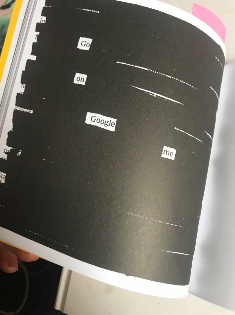
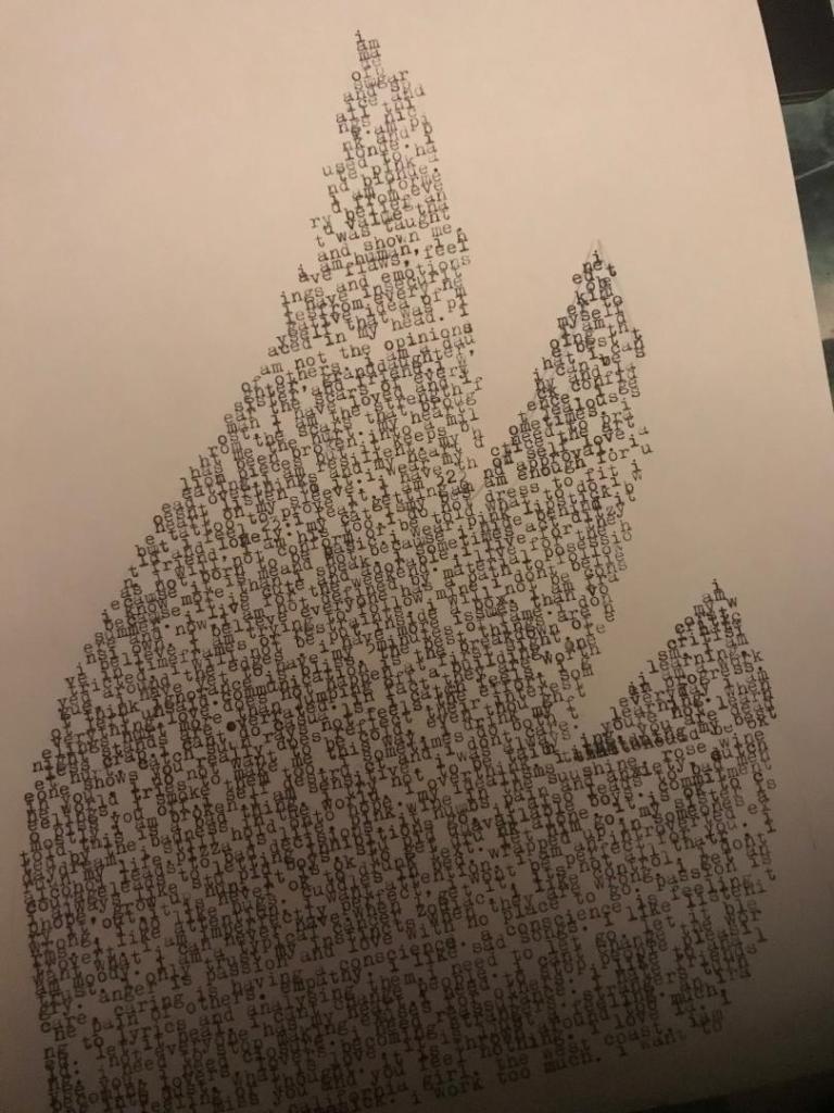
The text that I have used is not random. I listed out a list of things that are my morals/ beliefs/ thoughts/feelings/ affirmations.
I am made of sugar and spice and all things nice, I am pink and blonde. I used to hate pink and blonde. I am formed from every value and belief that was taught and shown me. I am human, I have flaws, feelings and emotion. I have insecurities from every negative idea of myself that was placed in my head. I am not the opinions of others. I am a daughter, granddaughter, sister and friend. I wear the scars of every man I have ever loved and lost. I am the strength from the scars that have brought me hurt. My heart has been broken into a million pieces but it keeps beating. I am resilient. My head overthinks and my heart doesn’t listen to it. I wear my heart on my sleeve. I have the tattoo to prove it. I am 32 but feel 23. I fear getting old. My cat is my best friend, I am his too. I do not dress to fit in. I will not conform. I was not born to be basic. I wear pink lipstick because it is me, not because I hide behind it. I know more than I speak. I sometimes act ditzy because it is cute. I live for the summer. I live for the weekend. I live for the here and now. I am not defined by the material posessions I own. I believe everyone has a path to follow. I believe I am trying to follow mine. I don’t believe in timeframes or restraints. I will not be constricted to a box. I am frayed around the edges. I have more issues than vogue. I have yet to have my time. I don’t think ignorance is bliss. The best things are not left unsaid. Communication is the breakdown of everything. Love does not happen at first sight and Feelings hurt more than jumping off a tall building. One night stands are overrated. In fact they are crap. I can’t do casuals. I catch feelings. I get hurt. Catch sun rays, not feels. The effort someone shows you really does reflect their interest in you. I do not want to be cold even though the world makes me feel this way. I drink my feelings. I smoke them too. Sometimes I do both to piss you off. I self destruct at times and I don’t care. I am sensitive. I was taught this is a bad thing. I try to not be tainted by the badness in the world. I overthink. I daydream. I still hold onto hope. My idealisms ruin my soul. pizza is life. Pink wine in the sunshine. Alcohol leads to bad decisions, it numbs pain and anxiety, dutch courage leads to letting inhibitions go..Bad men too. I always like stupid boys. I like stupid unavailable boys. Commitment phobe? Grow up hun. It is ok to get drunk alone. It is ok to cry it out. It is not ok to drunk text. Let him go. My sister is wrong, I do like hugs. I like cuddles in bed. Wrapped up in arms. I do like attention. I am an introverted extrovert. I am imperfectly perfect. I wont be perfect for you. I want what I can never have. When I have it… it’s not all that. I am moody. I like control.I get angry. Anger is passion. Passion is care. Caring is having a conscience. A conscience is feeling the pain of others. Empathy. I like sad songs. I like listening to lyrics. I like to analyse them. I need to let go. Let it bleed. Let it hurt. Let it heal. I need to trust my instincts. I need to not give benefit of the doubt. I need to stop making excuses for people. I need to cut myself some slack. I am doing the best I can.
This runs quite deep, some of the feelings and opinions on this are quite raw and honest. They delve into matters of the heart mostly. I wanted it to represent elements of Design and inspiration from designers but also include who I am in with that. This explores typography and the history of old print but does it in a way where it is still conveying who I am.
It is not particularly legible or easy on the eye but this is purely creating pictures out of type. If you wanted to read close enough into the words and really study what is written then you still could.
(From my unreleased book; “Things I’ll only ever say when drunk”) 😀
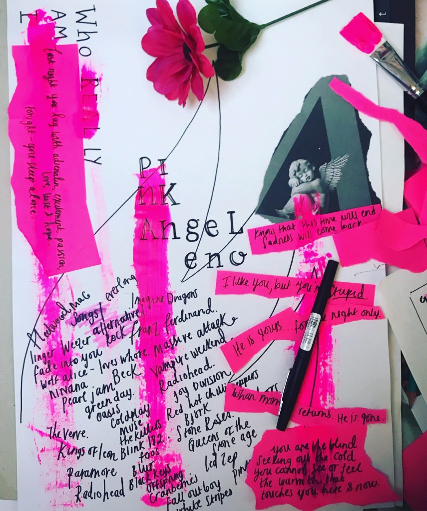
From my previous post I started to look at sketches and ideas for postcard 3. As I have stated I want postcard 3 to be raw, honest, and an insight into who I am underneath the “aesthetics”. As I previously wrote, I haven’t included so far in my designs a reference to Graphic Design, an era or any particular designers. What many people do not know about me is that I love alternative/rock music and this links in nicely to my interest in the grunge type movement of the 90s. I want this postcard to still tie in with the other 3 but show rawness, sensitivity, a deeper vulnerability and a sense of who I am underneath. Again, As I stated in my last post I found on pinterest some ideas which have helped me in my first few rough drawings.
From these first thumbnail sketches I started to experiment with the type, paints, post-its… I am waiting for a typewriter ribbon in the post for my typewriter input on it and I need to lino print some letters when I get some more free time.
Starts off with a simple hand drawn type writer text and the basic wing shape that I want on my designContinues on to break rules; Making the text a part of a design and not just to be legible and easily read.Introducing “who REAL ly am I.experimenting with some neon pink acrylic paint. Literally just getting a brush and aggressively running it down the page.I sat and thought that the “Pink” didn’t look very “Pink” and “fun” so tried to use my hand lettering from before to make it more appealing… I decided it wouldn’t work.Instead I just opted to splash it with the pink paint and incorporate some of my favourite alt bands. This was a rough list I used to write down my list of bands and then actually decided to use it for the actual piece. It is raw, edgy, grungy in appearance.One of my vunerable moments. I write my emotions/moments/how I feel at certain moments in my life in my sketchbook. I wrote this randomly one night – It just poured from my mind. I decided to use some of these moments in this piece. An insight into the real me.This is what I have so far.