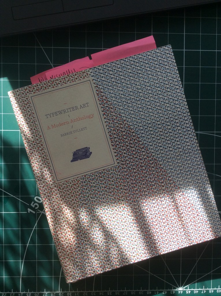
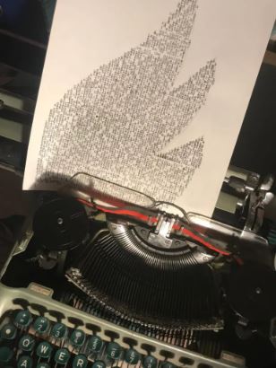
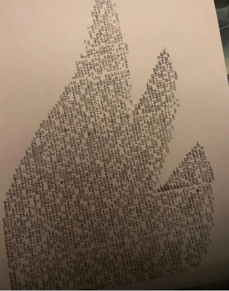
Although I haven’t got much knowledge of Concrete Poetry, I had heard of it because briefly in my first ever assignment for the OCA (about 3 years ago!) I created some typewriter art after visiting a local exhibition about typewriter art by Barrie Tullet (who coincidentally was also one of my tutors when I studied my degree first time round!…) I also purchased his book which I still have and have referenced back for this exercise!
http://www.creativereview.co.uk/barrie-tullett-the-typographic-dante/
I feel really sad because I took a lot of photographs at this exhibition when it was on at the National Centre for Crafts and Design in Sleaford and now I cannot find them anywhere! The above link directs you to an interview with him and some of the photographs of his work which were in glass cases at the time and were inspiring to look at!


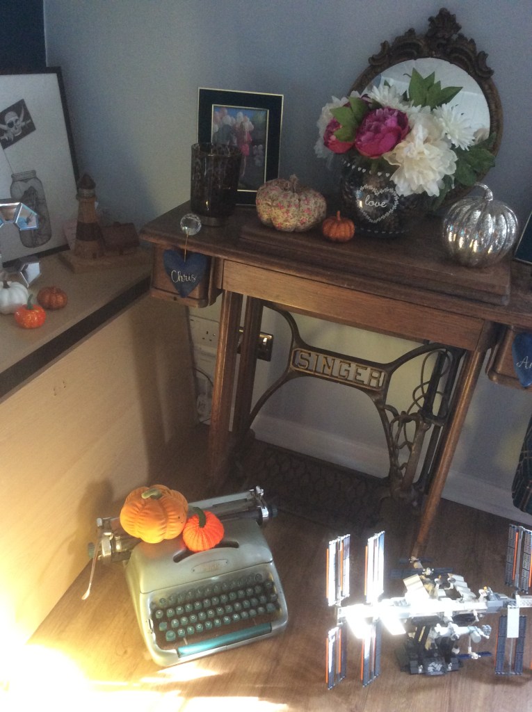
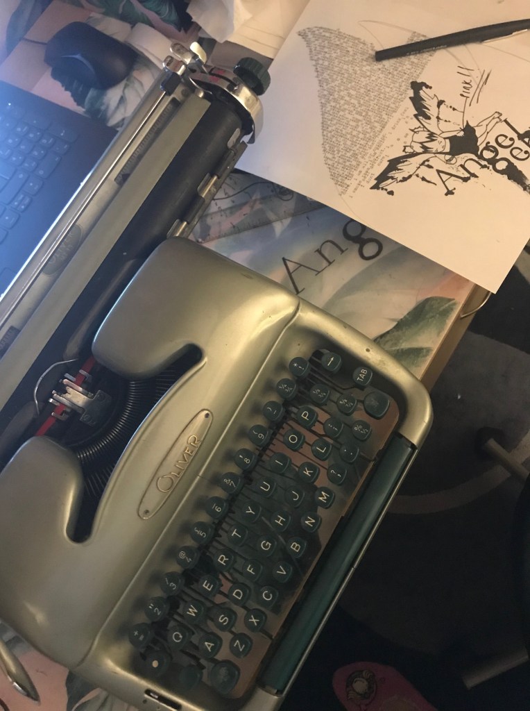
As I mentioned in my previous exercise I have Oliver my typewriter who might have to make a comeback further on in this exercise!
These were what I produced in my first ever assignment!

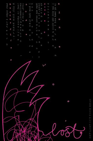
In my design above I wanted to illustrate the words falling down like light snow flakes.
It takes some skill and effort let me tell you! Plus it really hurts your finger tips after a while!
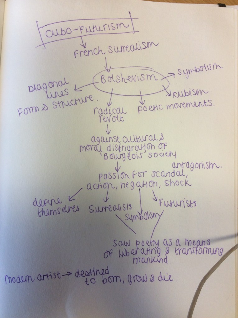
Taking a closer look at the designers of concrete poetry
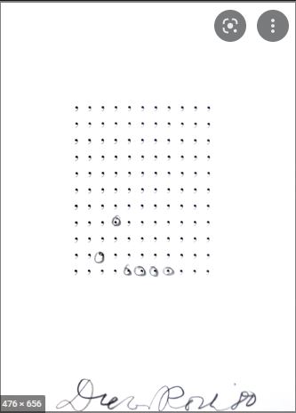
I had a Google of some of the designers that are given as examples in the brief and had a look at some of their work; some designers work was much more explanatory than others! Having had a look at a few I much prefer the more obvious designs compared to the ones that leave me questioning what it is all about.. such as the commas by Dieter Roth. I just did not understand it at all- especially as I read that the designer didn’t like the use of commas.. why also is he highlighting only a few? very confusing! The only thing I can see is form and structure! A nice grid structure!
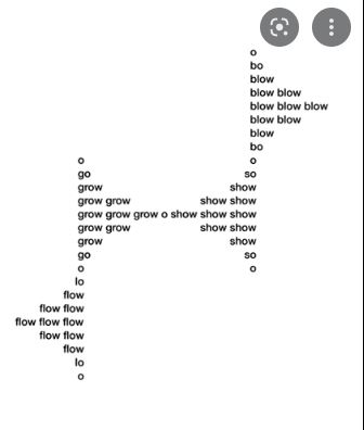
The one below by Eugen Gomringer reminded me of a DNA cell, I thought initially that was what it was all about! As it goes it is referring to the direction of wind. I can see that but why use the words grow and show? Still confusing!..
So far I wasn’t enjoying this exercise! – and I thought I was pretty good with poetry as well as designing!..

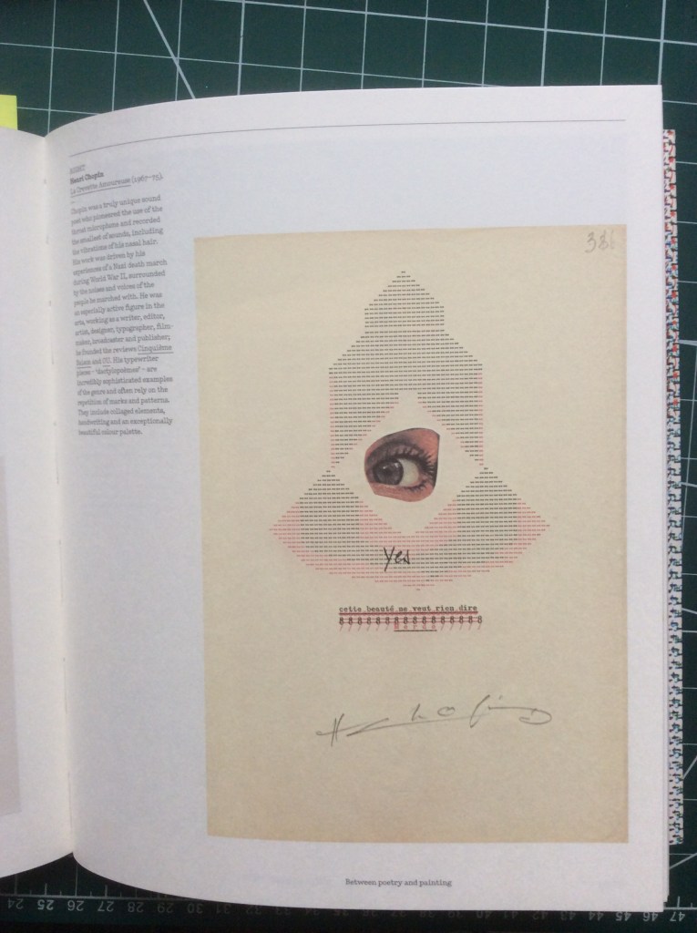
Henri Chopin just looks like he was an early David Carson or Chris Ashworth, although once again I can’t really make much sense of his work, I do like the experimental look and feel of it.
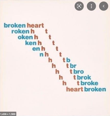
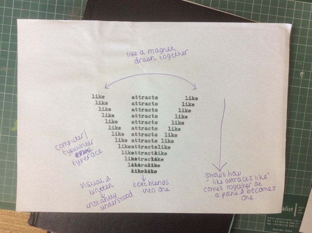
The only work I could actually see and makes sense of was the work of Emmett Williams; I thought that his work was quite clever in how it delivers the message visually as well as written.
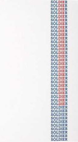

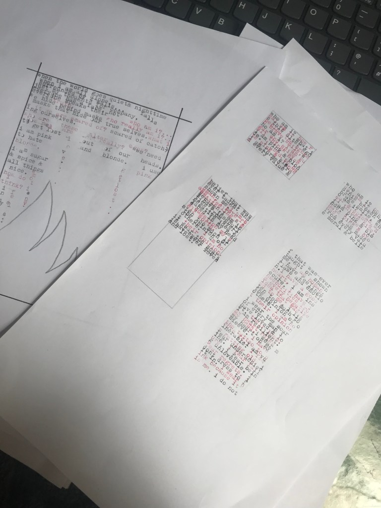
I printed out “like attracts like” and analysed it!
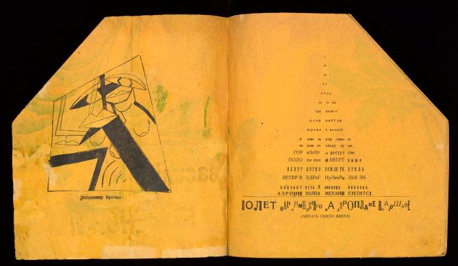
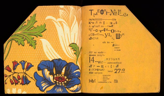
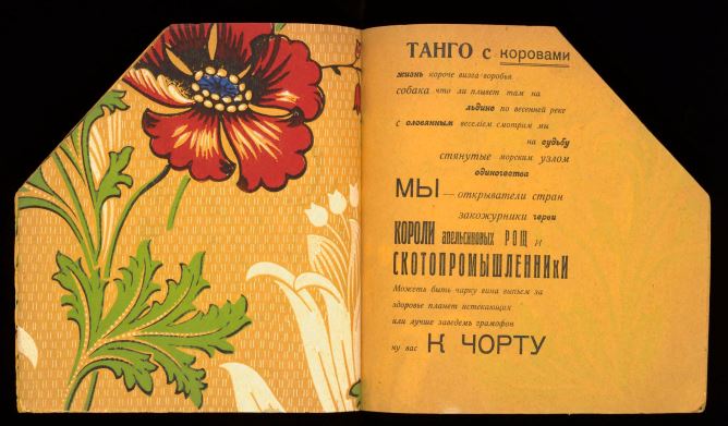
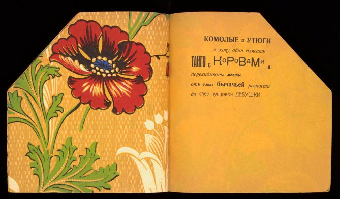
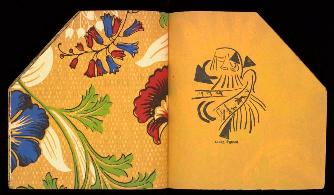
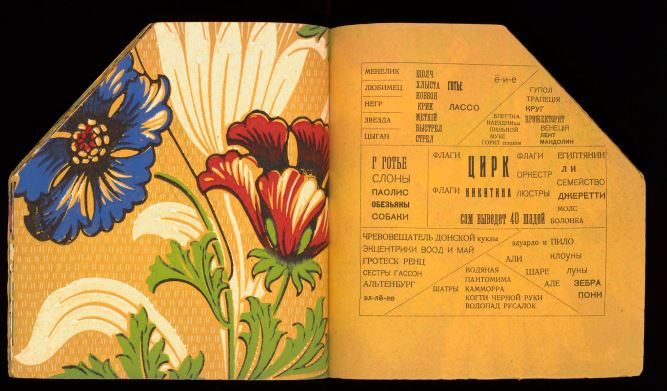
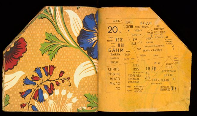
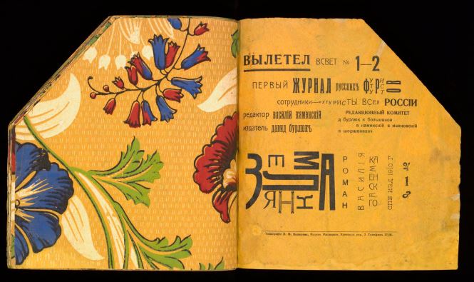
Tango with Cows
Tango with Cows is an artists book by the Russian Futurist poet Vasily Kamensky featuring additional illustrations by Brothers David and Vladimir Burliuk. It was printed in Moscow in 1914 as a limited work of 300 books. The work has become famous for being made entirely out of commercially produced wallpaper. The book consists of a series of concrete poems made visual that use unusual typographic layouts.
Life is shorter than the squeal of a sparrow.
Like a dog, regardless, sailing
on an ice floe down the river in spring?
With tinned mirth
we look at our destiny.
We – the discoverers of countries
conquerors of the air
kings of orange groves
and cattle.
Perhaps we will drink
a glass of wine
to the health of the comets,
expiring diamond blood.
Or better still – we’ll get a record player.
Well, to hell with you!
hornless and ironed!
I want one – to dance one
tango with cows
and to build bridges
from the tears
of bovine jealousy
to the tears
of crimson girls.
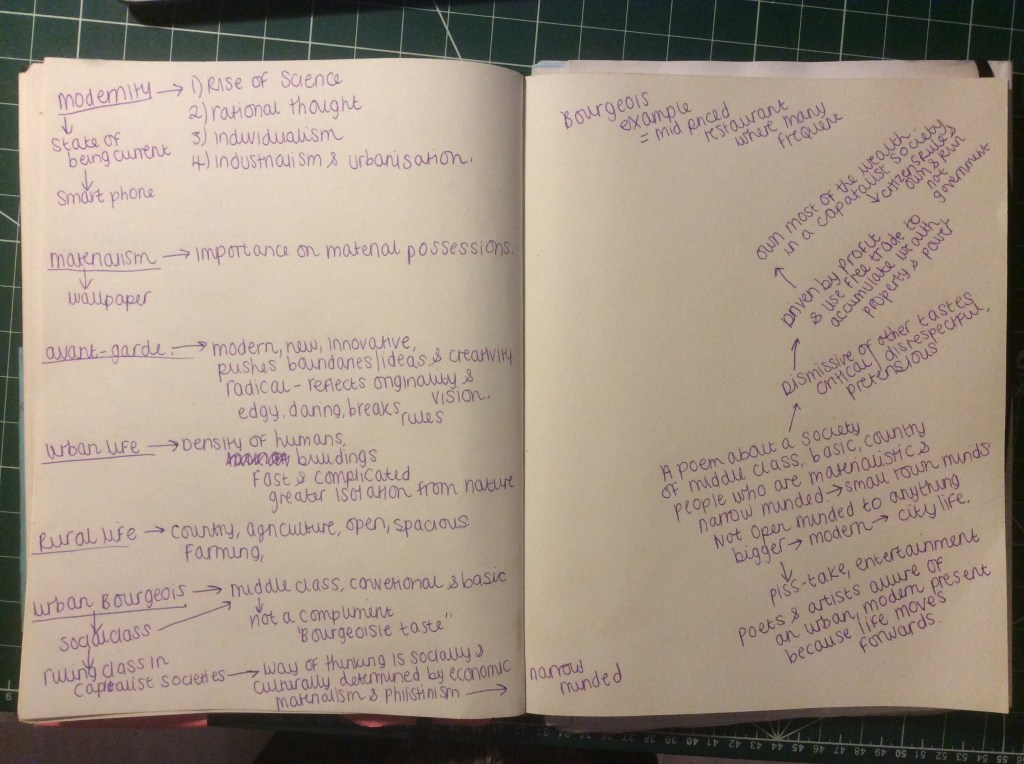
I had never heard of this work before I researched into it. From doing my research a lot of people have the image of cows dancing a literal tango in their heads but I think the whole poem is one big metaphor! It is embracing past and present but using metaphors to convey it. The cow represents the urban old life and the sexy tango represents the modern daunting yet exciting new times. The poem is a playful take on how they approached modernity. They were disillusioned by it due to spiritual, social and cultural crisis and famines, new technologies and the outbreak of WW1. It was a tension and a feeling of apocalypse. people were not ready for what the future had to bring or offer.
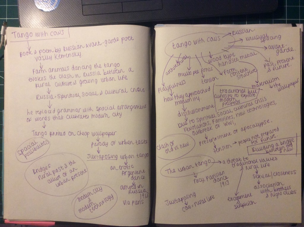
The poem is about being traditional but at the same time a curiosity to explore and be open minded to modern prospects. They have used the Urban Tango as a metaphor because at the time in 1913, this was a controversial threat to urban life- with it, it brought sex and association with brothels and night clubs, to some it brought excitement and suspicion. It is a contrast between tradition and what was known to modern and the unknown. The poem relates to bridges- this is a bridge to connect old vs new. I believe the bottom half of the poem is the artists saying “Dam it! we’ll give this modern thing a go!”
I pretty much dissected the poem (see below!), I couldn’t design for this exercise without first properly understanding what it is all about! It took a while to get my head around it, it almost felt like I was back doing my English Literature GCSE!
I worked out that the poets and artists were all in favour of moving forwards and seeing what the future holds but they were ridiculing the middle class, country folk who were all pretentious living a life that was all for show and and stuck in their traditional ways. Driven by profit and the desire to create wealth and accumulate property and power and dismissive of new ideas, approaches and modern changes. Not aware not life is short and life must move forwards. The wallpaper was to make fun of the fact that middle class could not afford William Morris but just for show bought something similar. It is a bit like me buying genuine fake handbags!!
Why though was it a Cow and not Sheep?… Sheep follow crowds!
The annotations below took me absolutely aggessss to crack! Chris very almost contacted one of our work colleagues who is an English teacher to see if I was close with my dissection of it all! – He didn’t in the end because as it turns out it was way past 10pm!
This was what I interpreted the poem to be! –
“Life is short – like really short!
Loyally, you drift along and head nowhere
With nervous laughter you look at your destiny you try to overlook and suppress within, you’re happy in the “now”
We, who have fought, discovered and achieved the unthinkable and have gained riches and profit
sit on our laurels and disappointedly celebrate “impending doom” that might never happen and remain ignorant and try and talk ourselves out of buying into the materialism that finances conflicts
Or better still we shall stay materialistic and ignorant and get something so insignificant like a record player and live middle class rural heaven to keep up with the Jones’s,
Well, f**k that!
You have no balls and you’re set in your ways!
I want the daring and the open minded to join the traditionalists to build a bridge from old to new, I’d rather have tears of uncertainty for a new, modern future than those of much sameness”.
Resting on your laurels is the phrase that resonated with me the most from reading this poem; people were happy to rest on their laurels and were content with what they had achieved in the past and were not bothered or inspired to see what the future held. I wondered how I could use this message somehow in the design… I had an idea for how I could use it when it came to print the design out (which I shall go into later!)

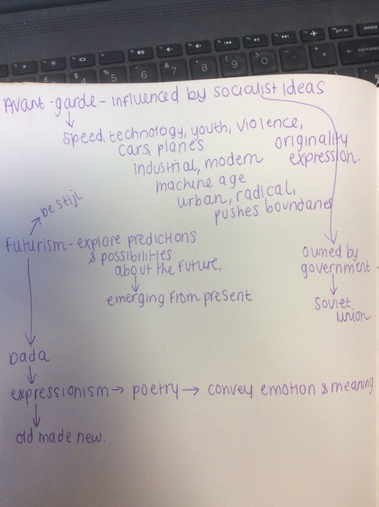
I then had a closer look at the Art movements that inspired this poem; this would give me a better understanding of how to design for it later down the line!
The artists printing onto the William Morris inspired wallpaper was also because it was cheaper than using actual plain printing paper. It is a sarcastic nod to materialism and commercialism.


https://rosettaapp.getty.edu/delivery/DeliveryManagerServlet?dps_pid=IE537641
How could I best convey this poem? I did not want to use a cow as there are no cows in the making of this poem (the cow is a metaphor!) and also I can promise that 90% of people given this exercise will produce something with hoofs!! I wanted to create something that represents the deeper roots of what it represents – it would also be cool to present it in a modern day way too as if it were written today! If I were to take this poem and design it in such a way that people today could relate to it, would it still be seen in the same way or would it have a different meaning and message?… Also the brief did not mention that I needed to include all of the poem, Doing my research I found out that a lot of concrete poems just use part words, part sentences and parts of a poem that are most relevant.
Designing the Concrete Poetry
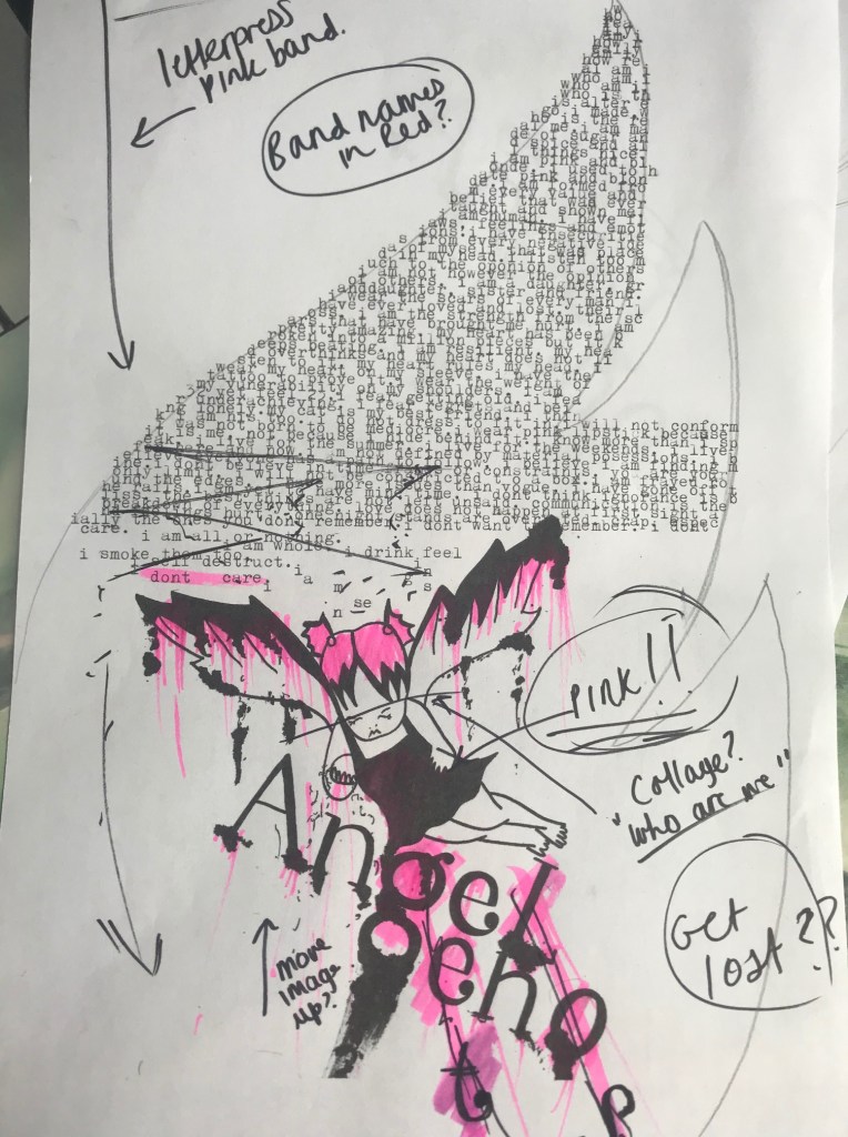
I’ll be honest; even after dissecting the poem and making sense of it the best that I could, I still felt completely lost at where to start designing for it! I decided not to use all of the poem but to only use parts! I started off with a sketch and worked from there!..
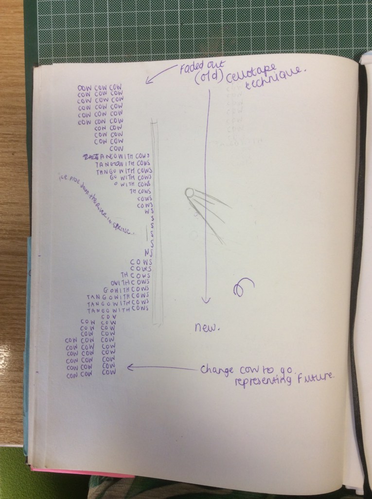
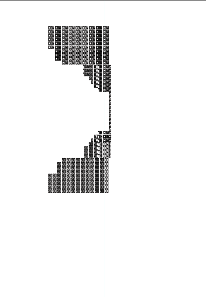
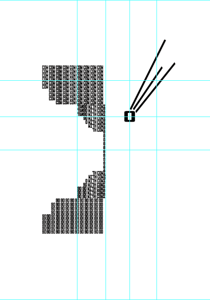
From researching concrete poetry, I liked how words blended into one block to create different meanings – this is what I tried with my version. I created a bridge for the “cows” and the futurists to join together. The O is a comet that is plummeting towards the bridge (the impending doom that the “cows” think is the future!)
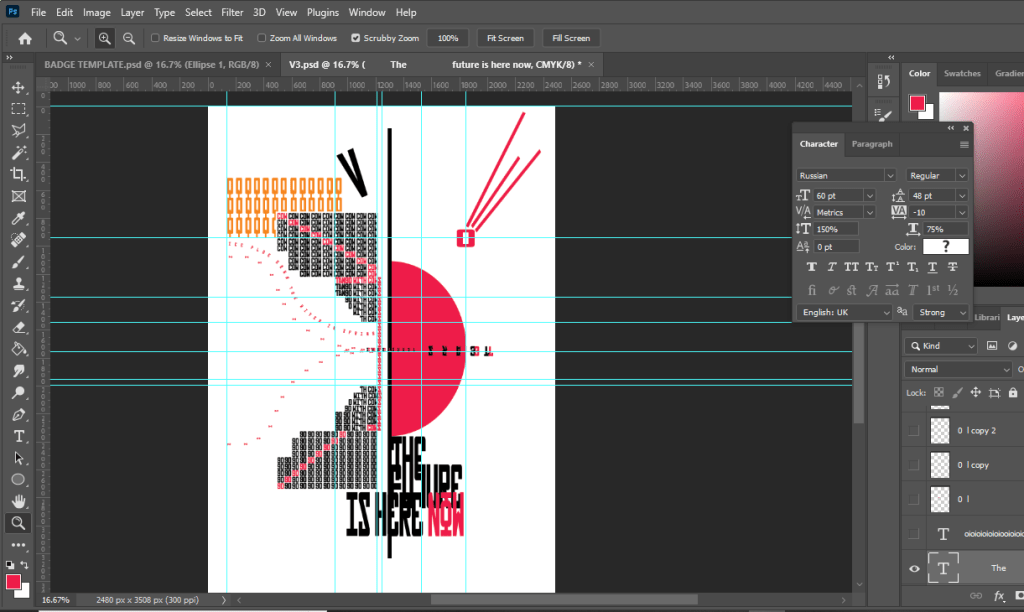
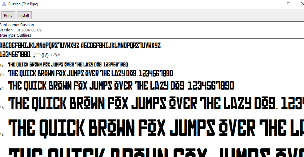
Using influences from art movements such as Constructivism, Futurism, Dada and Russian Propaganda posters I came up with this for my final design. I also searched for Russian typefaces online and found a free one called “Russian” that I used for the text.
The design shows the bridge that builds the gap between middle class, surburban life and the urban, new and modernist life. On the side of the middle class “cows” I have used Orange Os and Ls to illustrate the Orange groves. There is also a V which is to represent “conquerors of the air”. I have highlighted red Cows in a diagonal line (diagonal lines were prominent in Futurist designs) which then leads to the name of the title “Tango with cows”. The S’s allow the design to join over to the other side of the bridge where the message is telling the Cows to “Go” – this means to leave the middle class rural life behind. My only complaint with this typeface is that “Go” looks like 90. Over the bridge is the sun setting over the horizon line of the bridge. I have used Red as this represents Constructivist, Futurist and Propaganda Dada designs. Plummeting towards the bridge is the comet which represents the impending doom that people felt towards change and the future happening. Flowing underneath the bridge are the tears of “bovine jealousy and Crimson girls”, the tears flow together to join.
The whole design is structured to a grid, I have tried to make the hierarchy quite balanced. I have tried to include negative space as much as I can as “spatial awareness” was particularly important in concrete poetry. I have kept the design away from the edges of the bleed so that there is room for the design to breathe and it isn’t constricted to the edges.
“The future is now” is very tight and the readability isn’t great but I wanted something quite edgy and experimental looking – the future is unpredictable and I wanted the text to represent this. “The future is now” doesn’t appear in the poem; it is purely my take of what I think is happening.
I quite like that I haven’t restricted myself with including the full poem in my design; there is a lot of text in the poem and it would really restrict what I could do in the design – space would be massively compromised… plus! It is a different modern approach with the poem, I have stripped it down to it’s simplest form without entirely taking the poem away.

Printing the final!
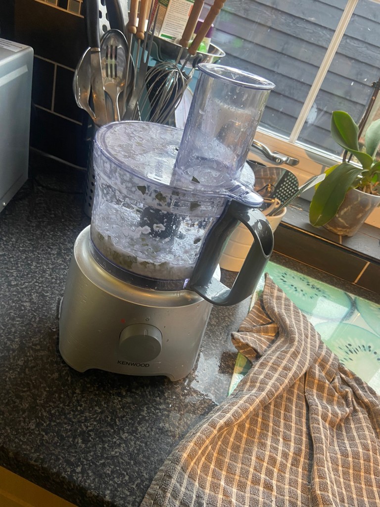
I really liked the idea of how the original poem was printed inside a book printed on wallpaper! I also refer back to the phrase “resting on your laurels” which is one of the main messages I took from the meaning of this poem. I had the idea of making homemade paper using leaves from a laurel bush! It sounds absolutely crazy and when I mentioned my idea to Chris he did look at me vacant as if I had lost my mind!- “How are you going to make paper, Amy?” Turns out it seemed quite simple – it requires a blender, some mushed up white plain paper mixed in with a jug of water, some Bay leaves (would also make the paper scented!), a tub full of water to create a “pool”, a wooden frame with mesh netting within it and a dry sponge.
From looking at a YouTube video it showed how the leaves and paper would be mushed up to a pulp inside the blender and then the wooden frame laid to float on a “pool” of water, (a shallow large storage box with some water) and then the paper mix poured in. By letting it float on the pool of water allows for the paper to be rearranged and organised how it would wish to look and then simply when that is done the frame is removed from the “pool” placed onto some newspaper, patted dry with a dry sponge and then left to dry!
https://www.minerbook.co/blog/making-handmade-leaf-paper
I ordered a wooden frame and a massive bag of Bay leaves from Amazon!
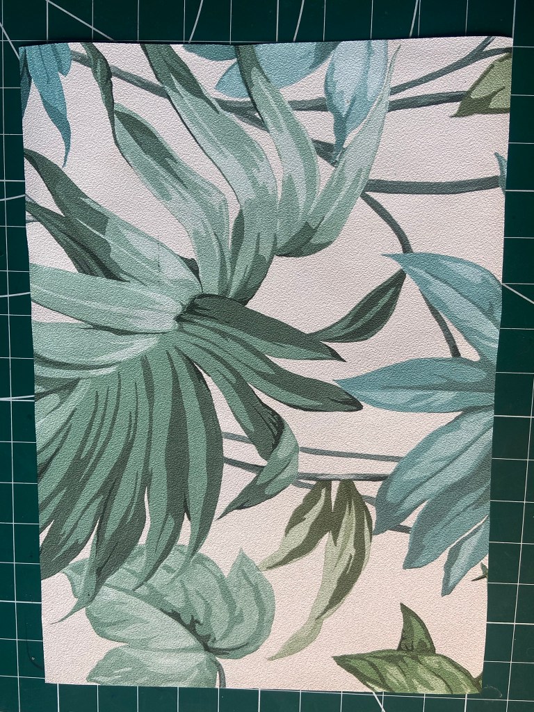
I also decided that I needed a Plan B just in case the handmade paper didn’t go to plan! As I mentioned before I really liked the idea of the wallpaper, (although this wouldn’t be very original now and a bit of a cop out because the original used that!) I decided to have a look anyway as we are renovating our house and we had to go to B&Q for paint. I found some leafy wallpaper that brought me back to the “resting on laurels” meaning. I picked up a sample and then tried printing it at home to see what would happen.
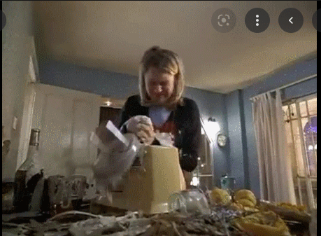
What happened – Making the homemade paper really didn’t go to plan! I got a brand new blender for Christmas last year and this was the first time I used it. Imagine the scene from Bridget Jones where the soup goes everywhere!… that was me!
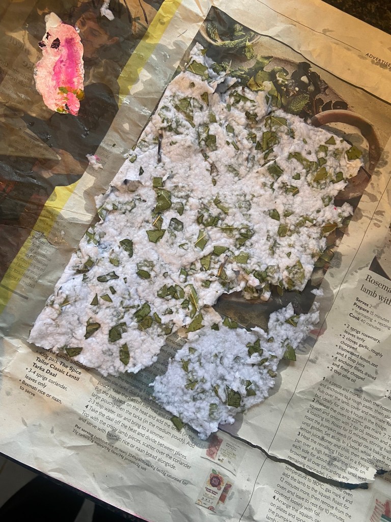
I blended chunks of white paper, the Bay leaves and water and then sat it in the frame in a water bath and it just came out as absolute mush!


I decided to go for my plan B with printing it out on the back of my leaves wallpaper (resting on laurels) and fortunately this worked much better!