When it comes to decorative/ fun or “gimmicky” typefaces I am not very knowledgeable! In my work I mostly use Sans-Serif which is why I have made my specimen book “Sans heavy”! For this section of my specimen book I had to do my research and look into different typefaces that I could use for decorative fonts. I started by looking at Adobe fonts on Typekit. I found this one called Chantal which from first sight gave me lots of idea what I could do for the design for it in my specimen book!
Chantal was designed by Rian Hughes in England, other than the designer there is limited other information about the typeface so I designed the layout for the pages how I thought the typeface should be used and interpreted the typeface in my own way.
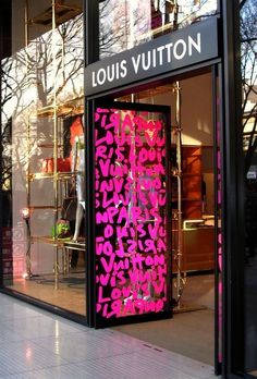
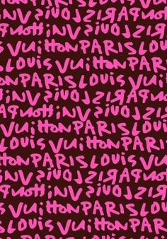
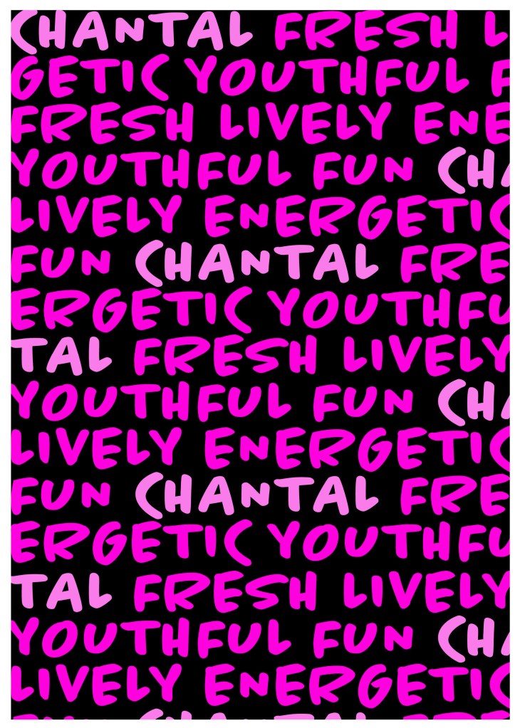
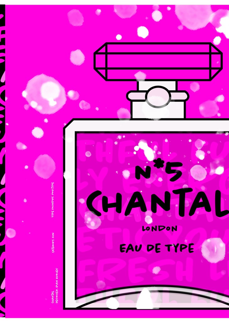
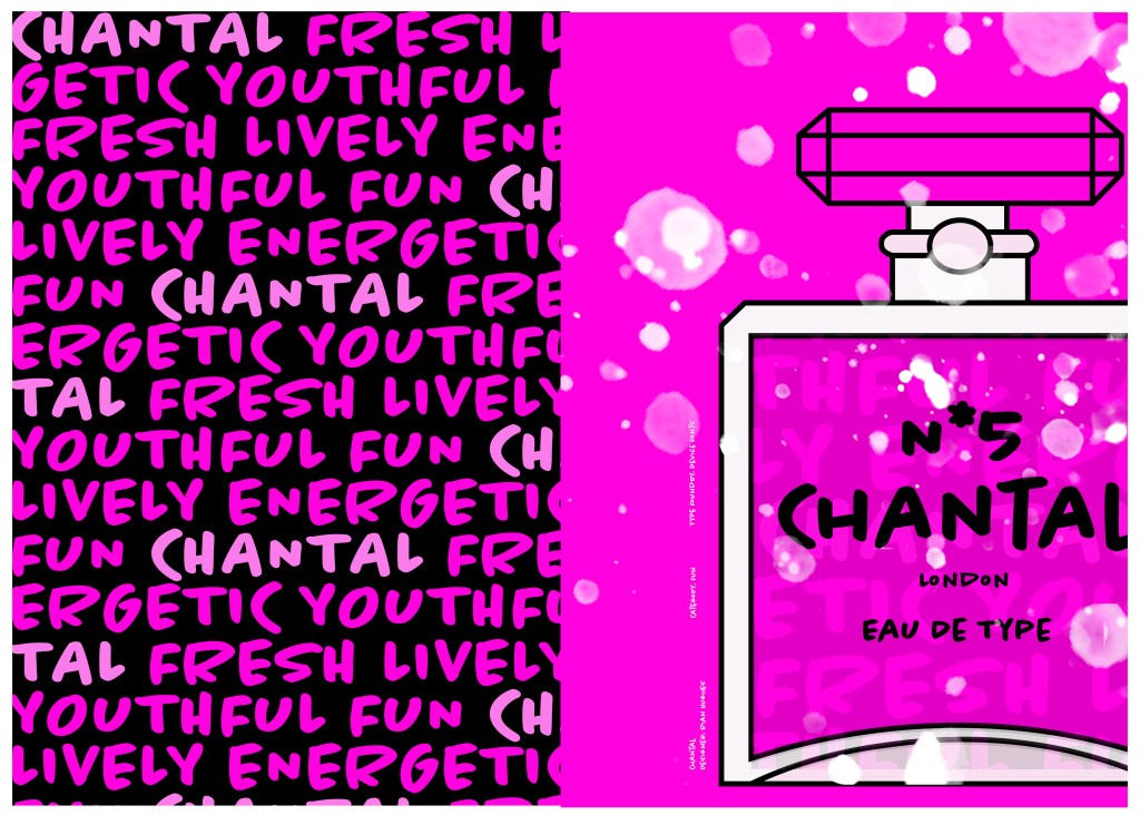
From first sight looking at Chantal it instantly made me think of a Louis Vuitton design that was used on handbags a few years back and also on some of their shop displays, I thought I could recreate a similar thing for my design. As well as reminding me of the Louis Vuitton designs it also reminded me of some Chanel bottle designs that I have seen and pinned on Pinterest, luckily Chantal is a play on words with Chanel so I chose to do a fun, gimmicky play on Chanel with Chantal!
Chantal seems to me to be a typeface that doesn’t take itself too seriously! It looks like it has a lot of fun! I really enjoyed designing these pages for Chantal, it is probably one of y favourite layouts and it is definitely a typeface I shall use in my future designs!

Digital Development
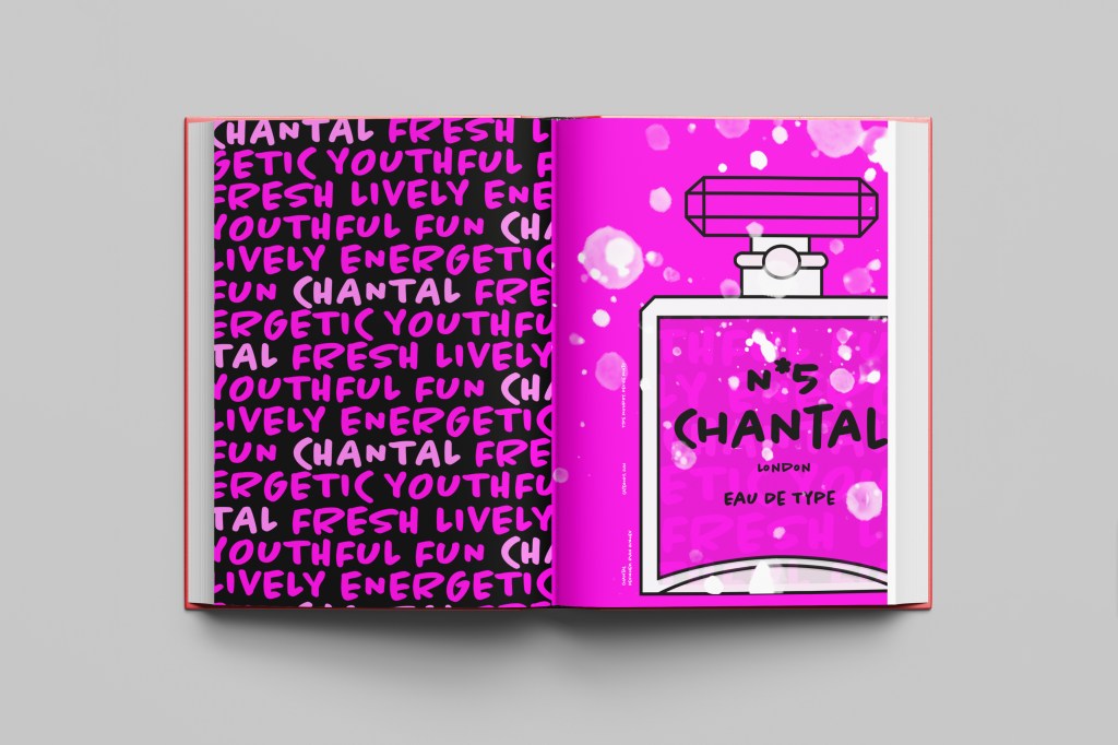
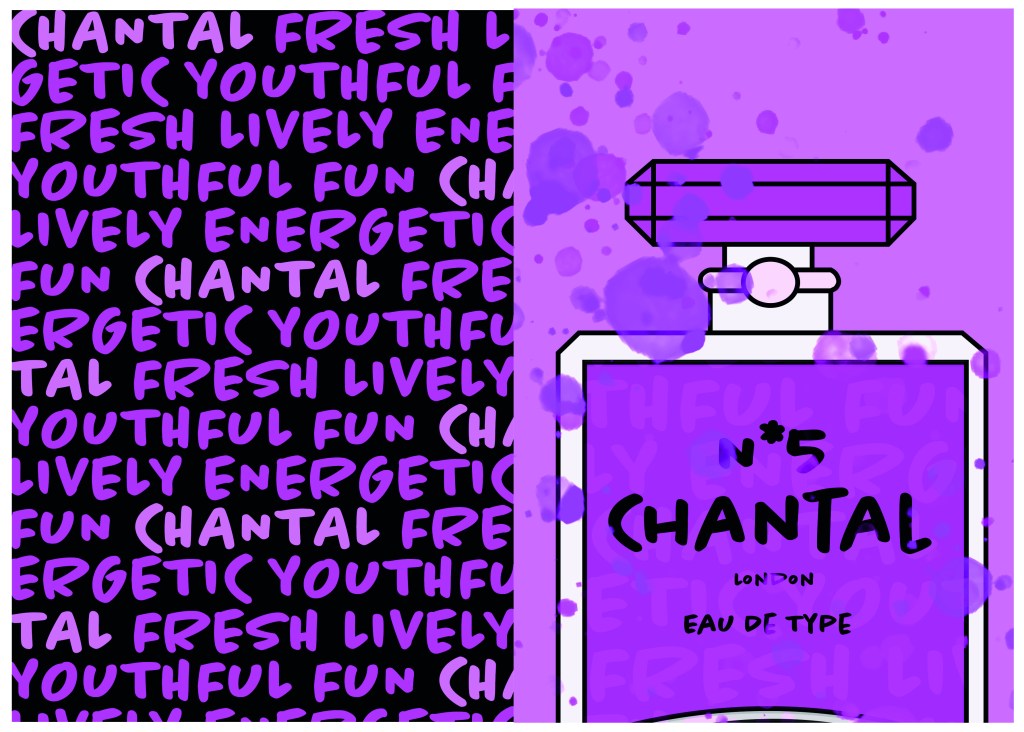
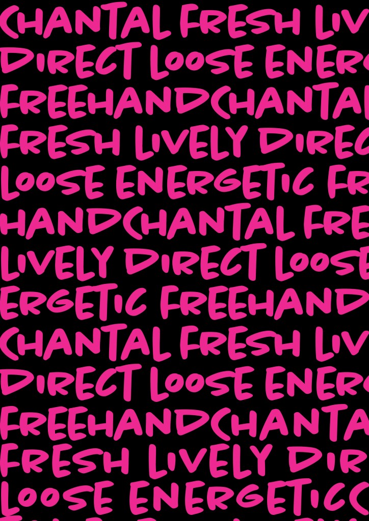
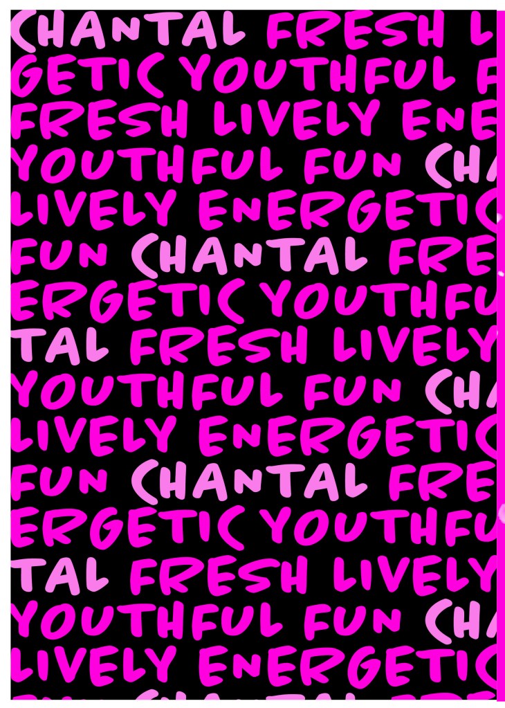
I designed and created most of my design for this using Illustrator and Photoshop. I started off by designing the left side page first. The first page was inspired by the Louis Vuitton design and I had the vision of the first page filled with pure type. I typed out my text how I wanted it (I used the words Fresh, energetic, youthful, fun and lively as this is how the typeface was described on Adobe Fonts) and I repeated the words across the page, I converted them all into shapes so that I could adjust the colours further and move elements if I needed to. Using a black background and a vivid hot pink gave the design contrast and made it look really modern and eye catching. This design is clearly going to be aimed at women, I am not sure that the typeface is aimed at Females specifically but that is how I have interpreted it.
The next stage was to design the “Chanel” play on words part of the design. I decided to draw out one of the famous Chanel No5 perfume bottles in Illustrator but change the name to “Chantal no5”, London (where the typeface was made) and Eau de Type. I really liked how it came out! I then added some effects to the bottle; I used the paint brush tool to create like bubbles of the perfume spraying out and I used part of the type and lowered the opacity to place it behind the perfume bottle to look like the bottle is filled with type. I am really pleased with how it all turned out!
I only came across one problem while creating this design (one that I was able to sort out easily). I accidentally created my Illustrator document in RGB which was good because it gave really vibrant colours but it is not suitable for print; my InDesign document was set to “Print” which meant that when I imported the Illustrator document over to InDesign it came out really dull. I changed the settings over and it soon fixed itself and the colours came out looking lovely again!
When I had created the pages in Illustrator I then exported them and imported them into InDesign to create the final layout. I added the text in white on the right hand side which gives information about the type and the designer.
Design Development


The Final design
The separately designed pages 
The Final Mockup