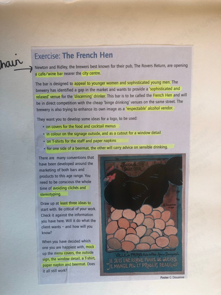
The Brief

First Thoughts…
When I started this brief I was actually quite worried! I have tried before to create logos for myself and have always failed miserably! My first thoughts were how on earth was I going to get a chicken on a logo and still make it look legible and understandable!
From what I know of logo design – simple is better! logos have to be reproduced on absolutely every kind of media: from Web design, emails, social media, advertisements, phones, TV, billboards, stationery, signage.. the list is endless! All of these medias are different sizes and the quality would vary for each. For web design the logos would need to be very small in size to be uploaded.. this means that the logo must be easily legible and brilliant quality at a really tiny size! Logos need to be reproduced for any size basically!
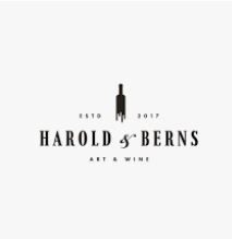
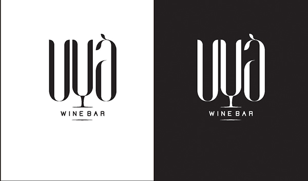
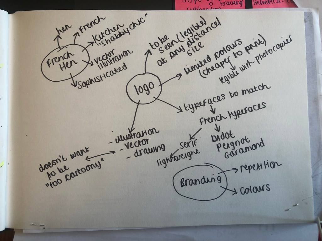
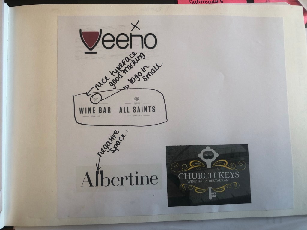
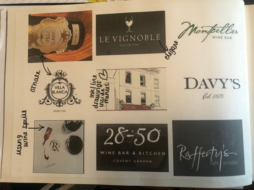
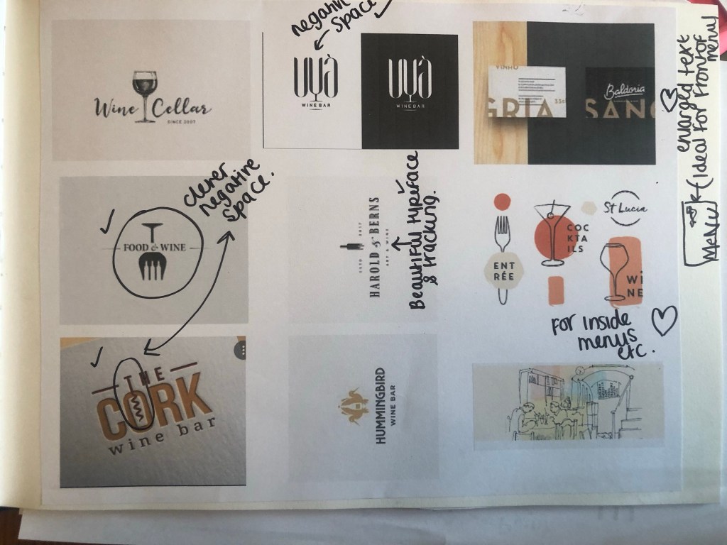
I started research by looking up existing logos for wine bars – some that I already knew of and some that I had ever heard of. The brief asked for sophisticated and classy. In my head I imagined a city bar in the UK but with strong French roots; taking inspiration from French typography rather than having something French actually in the logo. In Paris all of the little cafes and boutiques have fancy serif typefaces and it all looks very romantic and beautiful. This is what I imagined for my logo.
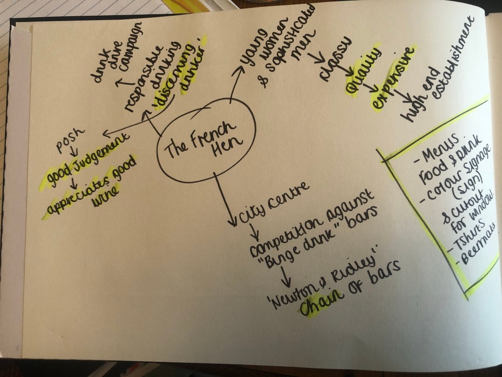
I started to mind map ideas:
From looking at examples of Wine bar logos I came to my own conclusion that the classiest and most beautiful logs were in Black and white, were kept simple and used beautiful typography to do all the talking.
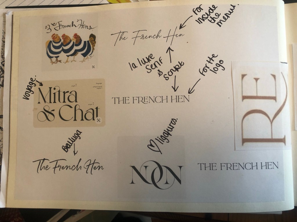
The next step for me was to research into French looking typefaces. I searched Adobe Fonts but to be honest it didn’t bring much back in the way of results. I took my search to Google and fell in love with the most beautiful typeface called La Luxe.
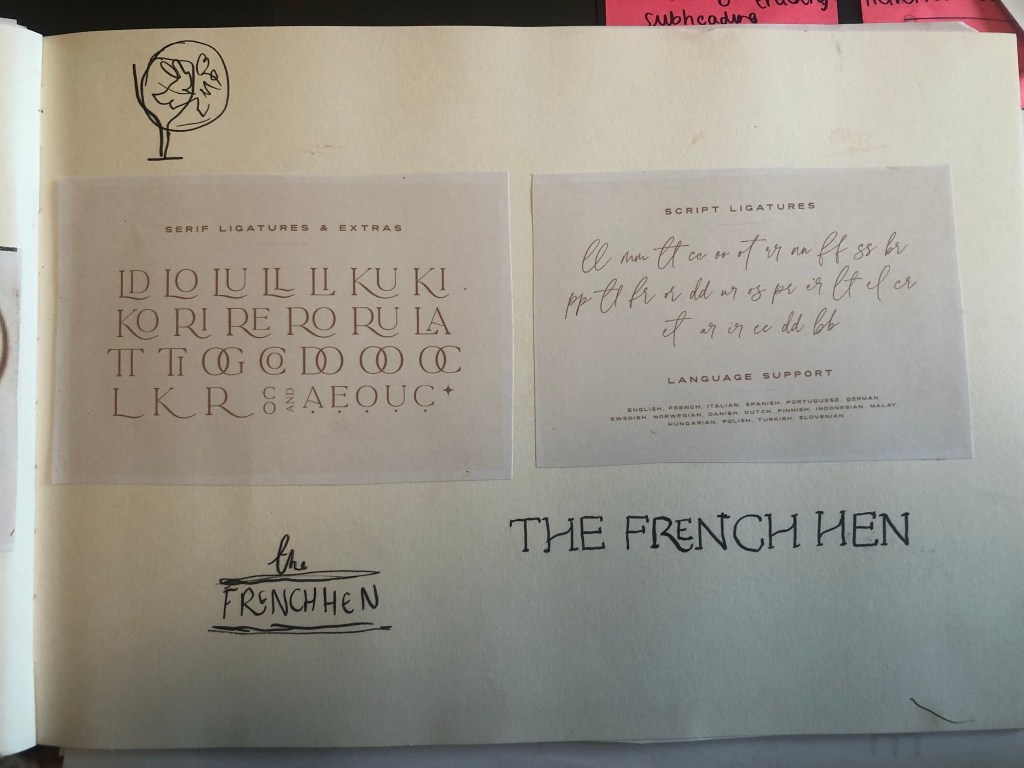
It also has beautiful ligatures, I thought that the “re” ligature would look really good in “French”.
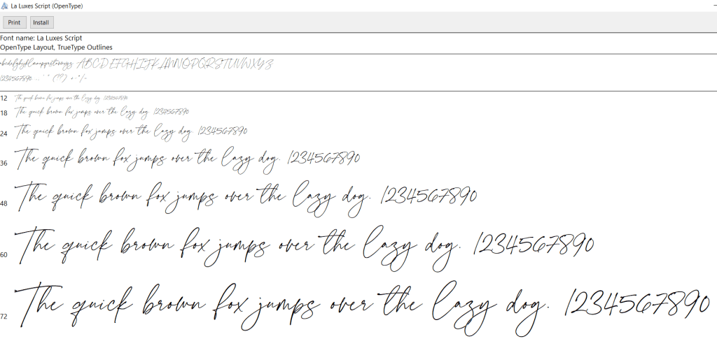

I did purchase it for £20 but it was well worth the money for the results it gave my final logo!
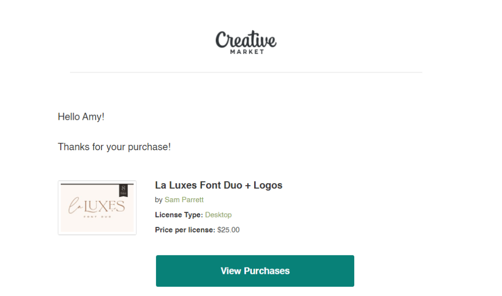
I decided to use La Luxe Serif for the main logo “The French Hen” and to use La Luxe Script for something a little more fancy inside the menus.
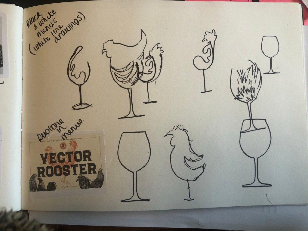
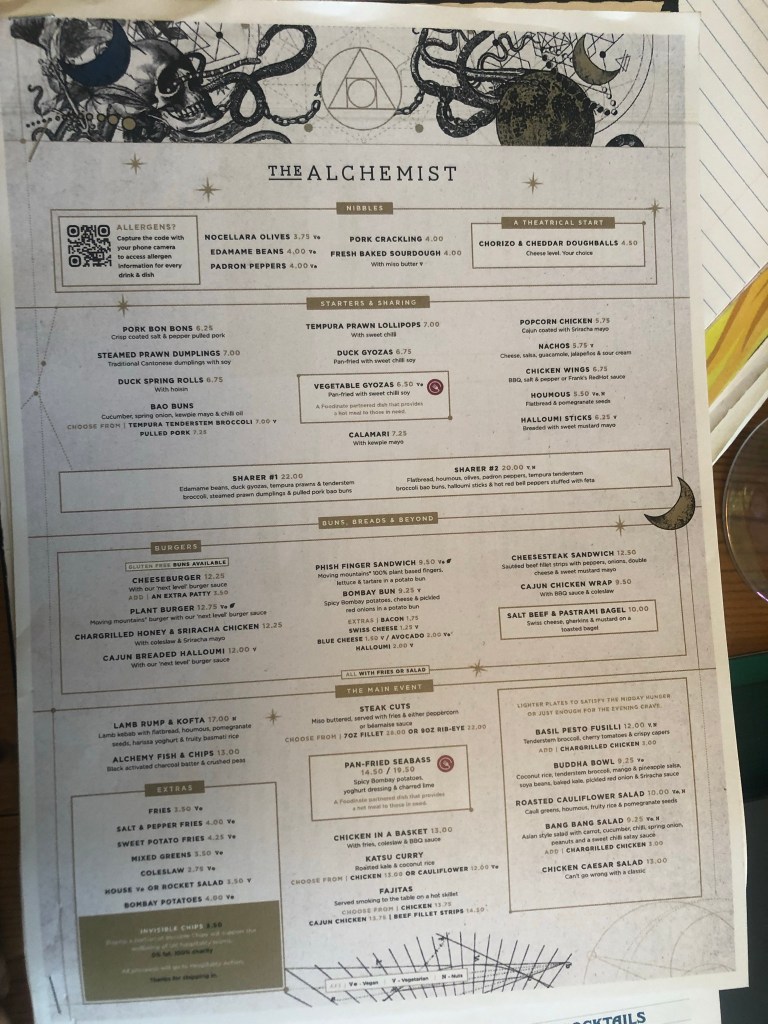
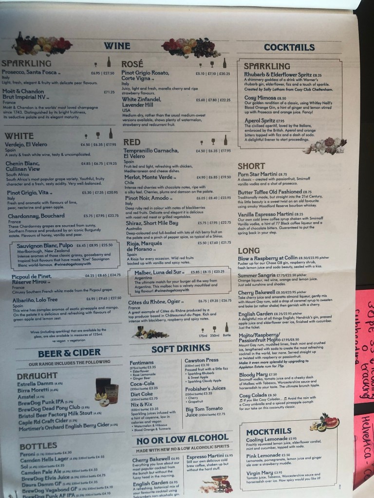
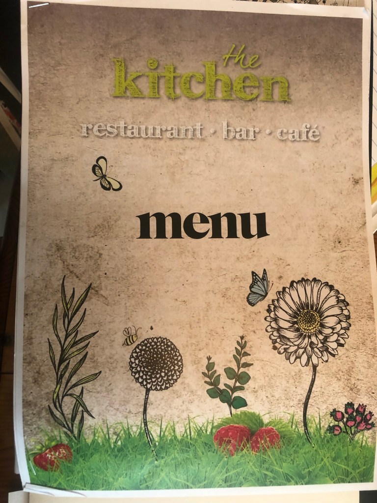
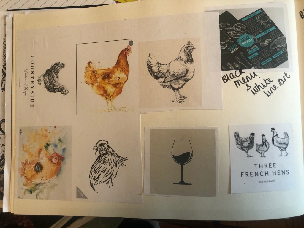
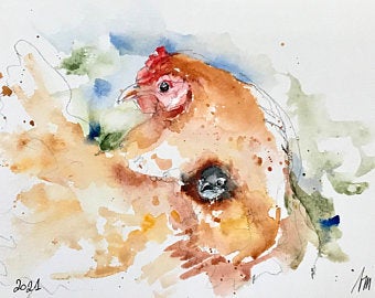
I then wanted to look into Hen designs to see what I could do for my own logo. The black and white illustrations of Hens that I found looked like they would belong in a homely “kitchen” style restaurant. There is a restaurant called “The Kitchen” near me in town which is very shabby chic and country inside – I used their menu as part of my research in my sketchbook. I really like the watercolour hens but they are what would have to appear in the menus or on place mats and the decor of the wine bar because they would not make a very good logo.


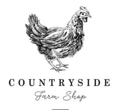



black and white engrave ink draw isolated vector chicken illustration
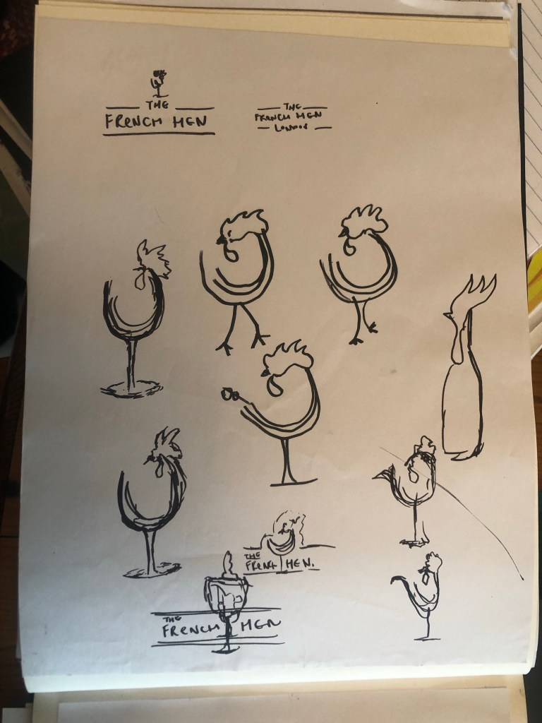
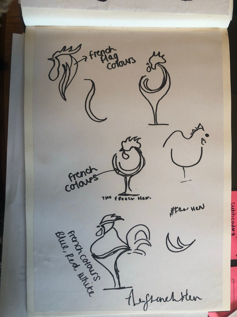
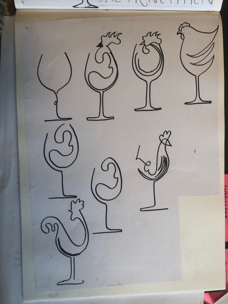
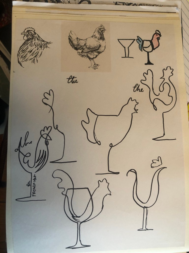
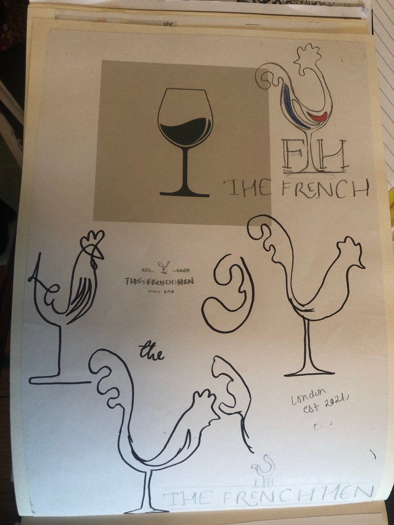
Using these as inspiration I went on to draw some sketches in my sketchbook:
Even Chris got in on the act and drew this little beauty! – (to be honest it’s not a bad idea!)
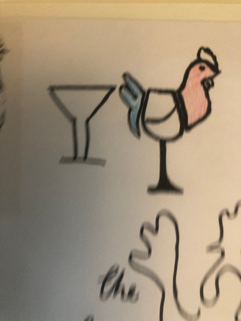
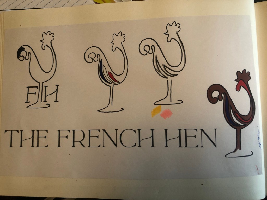
I narrowed my sketches down to some final ideas; using Chris’s idea with the French colours, I put my own take on it!
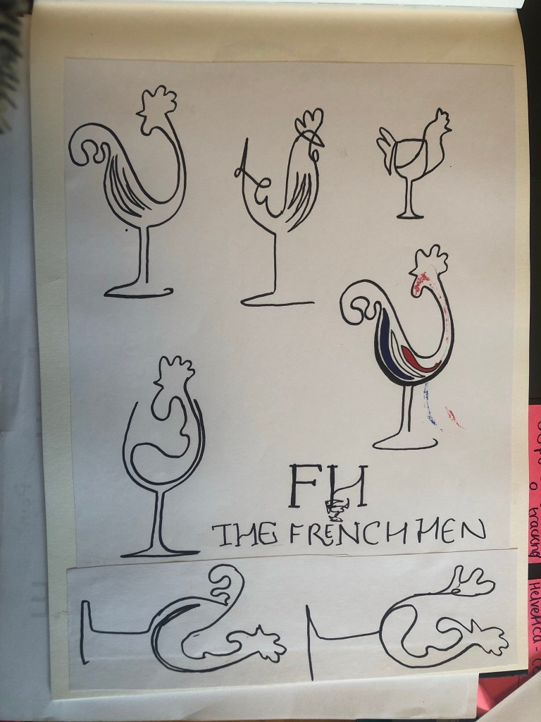

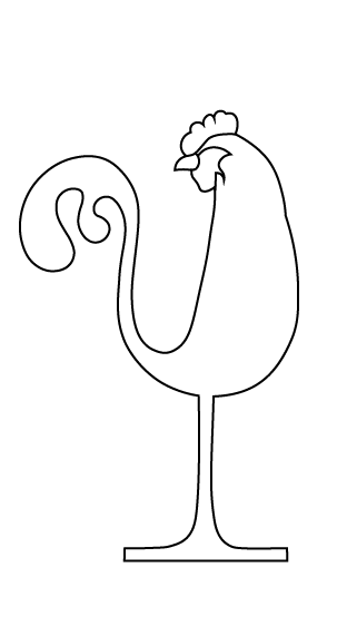
The idea of my drawing is that the French Hen morphs as part of the wine glass. The hens tail also represents wine spilling out of the glass
Once I had the drawing I was happy with, I was able to import my drawings into Illustrator and draw them out.

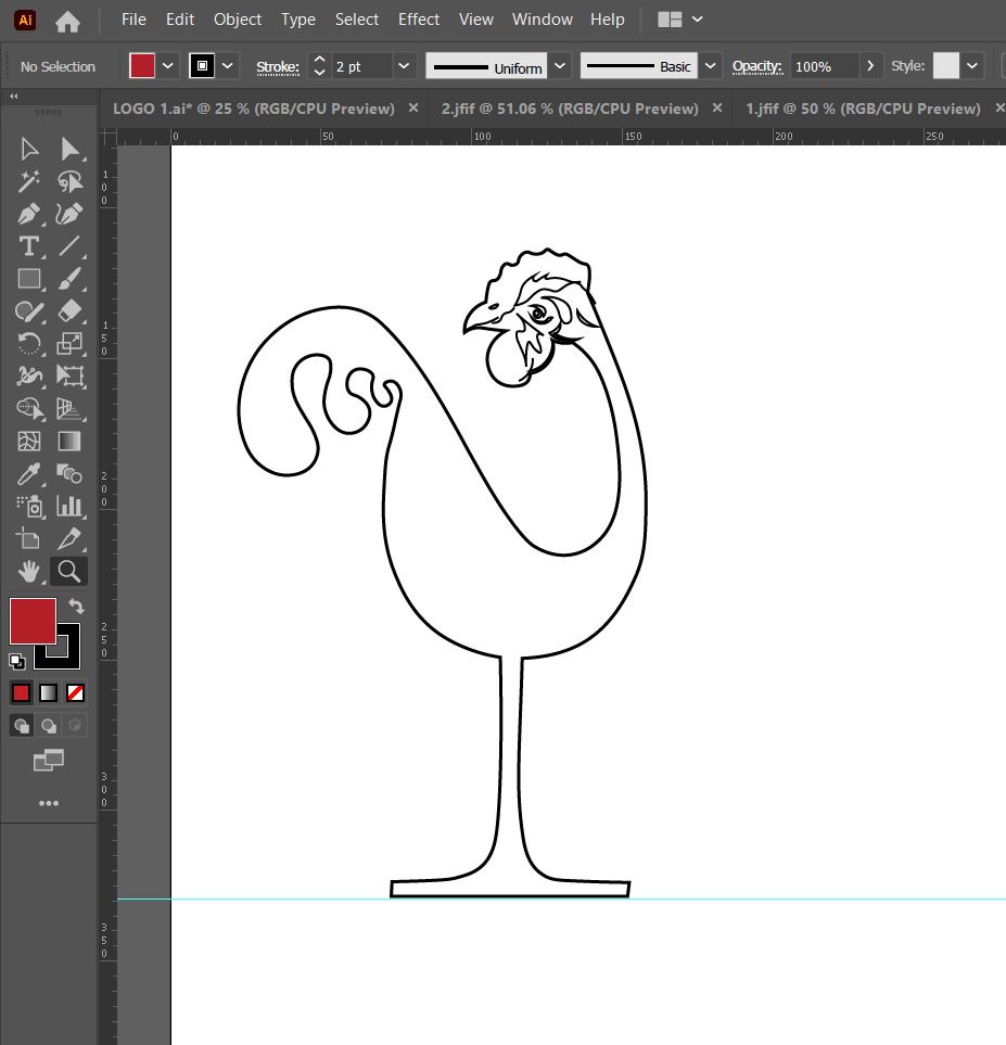
The Hens face was questionable however ! She also looked more like a Turkey! – I later did my research and realised that Hens do not have a big waddle like the one I have drawn… she was more like wine drinking Rooster-Turkey at the moment!
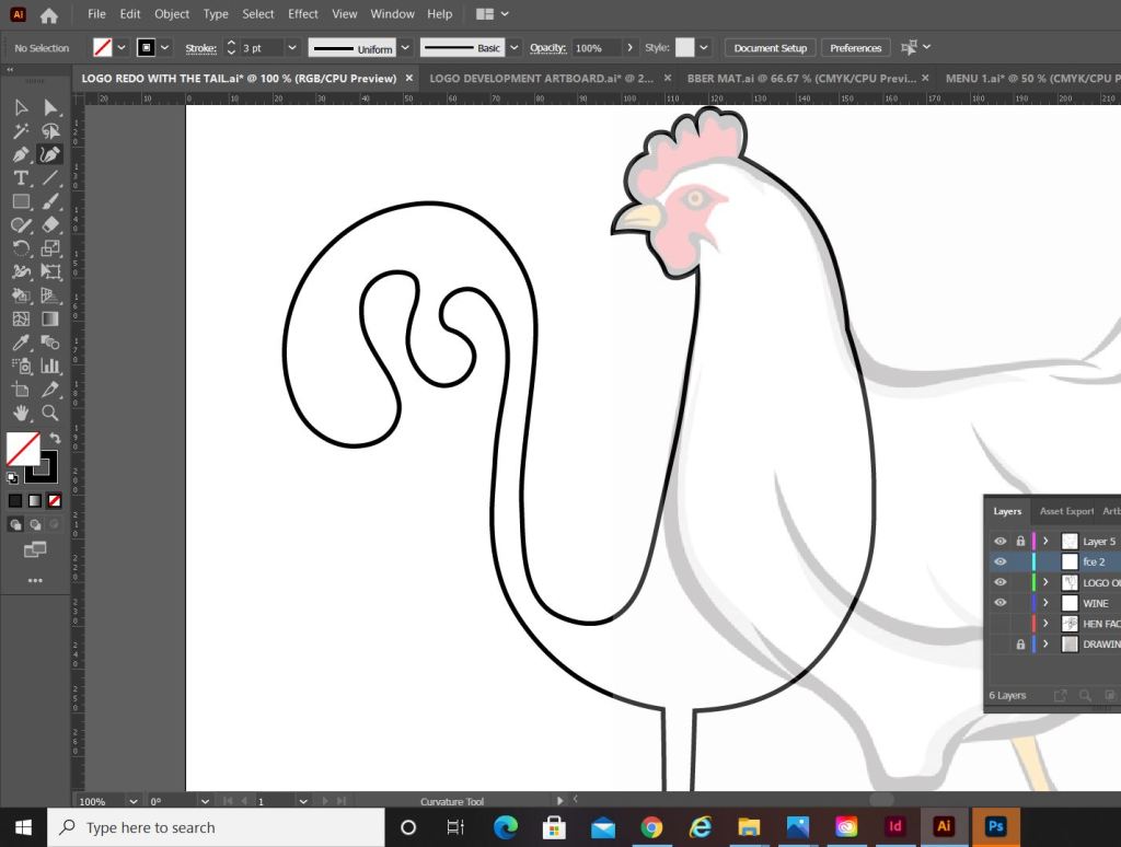
I found a vector drawing on Google and decided to trace around the face so that I had an accurate Hen drawing. She looked much better! I also fattened her up and made her tail look better. I originally drew her tail (or the spills out of the glass) with 3 droplets but I noticed when I zoomed right out on screen, it looked a little blurry and lost and you could not work out what it was. I deleted that out and kept to the 2. (see the image below that I have circled!)
She had some improvements and she looks much better and healthier!
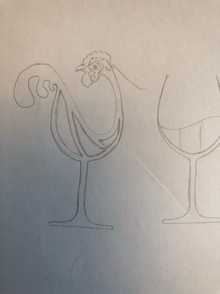
The idea for my logo was the sketch that I drew out below:
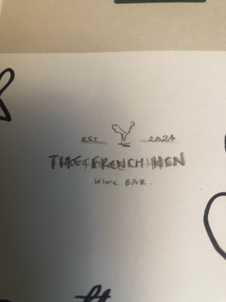
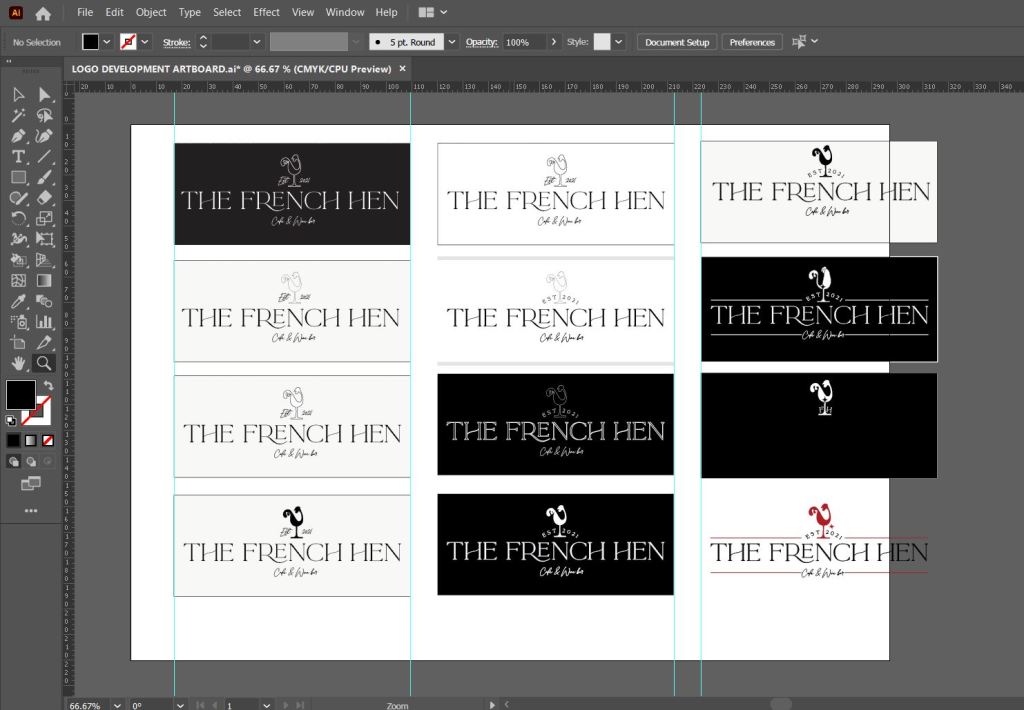
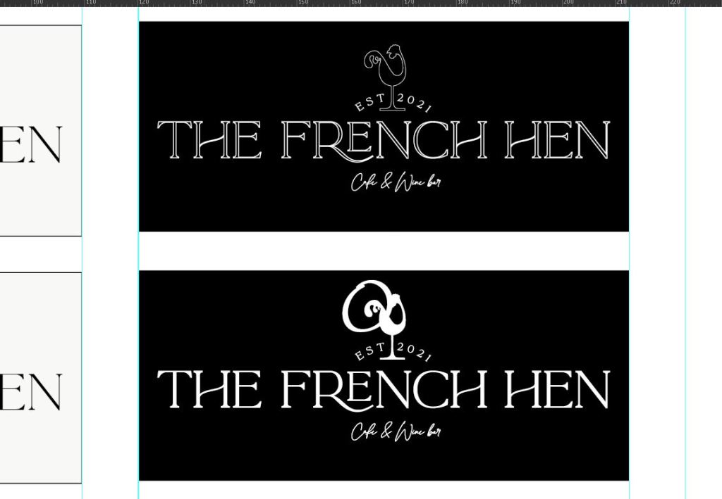
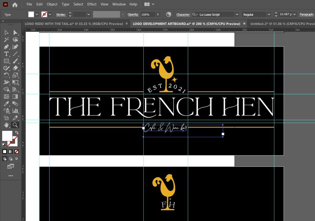
I took it into Illustrator to mess around with different styles and to see what looks best. I really liked the ones with the black background – they stood out better, they looked elegant and classy. The contrast between the Black and White really worked.
This was the logo I decided to go with and develop further:
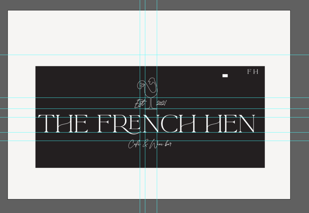
It just didn’t feel complete yet.. I didn’t know why at the time but the “est” and the “cafe and wine bar” just did not sit together right.
I then had the idea to arch the “Est” and this worked a lot better!
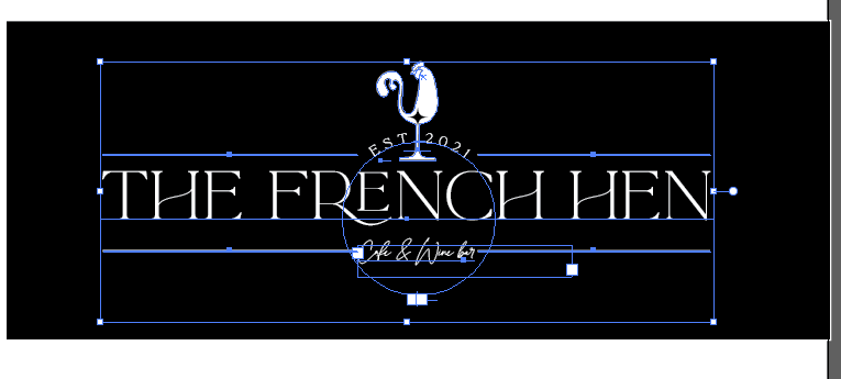
I also tried the logo in Black and gold but this looked too much like a Marston’s pub – which does not scream classy and elegant! It also looked like the colour of beer, whereas it is a wine bar.
I then had 2 options for logos:
- 1) Black box and white text
- 2) White box and black text
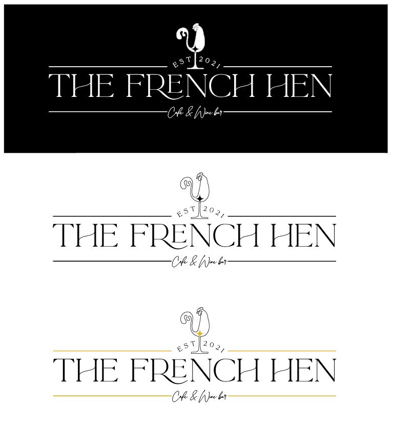
The Black box logo is ideal for on menus and printed material whereas the white box logo is better suited for window cut outs and vinyls.
The Menus and beer mats
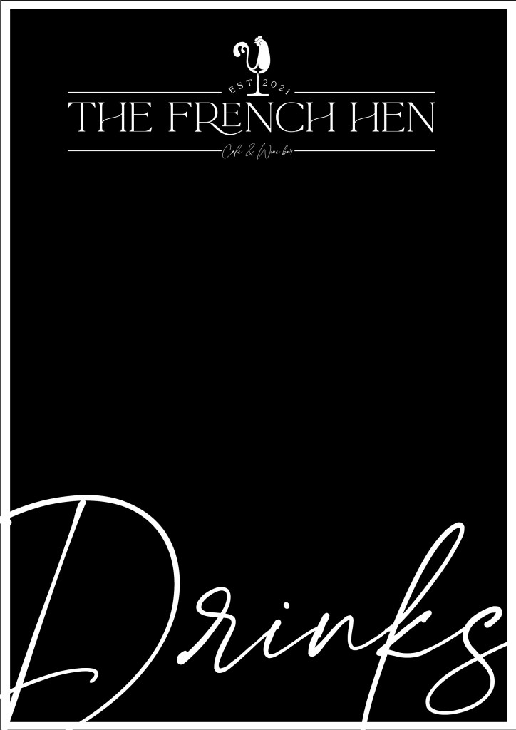
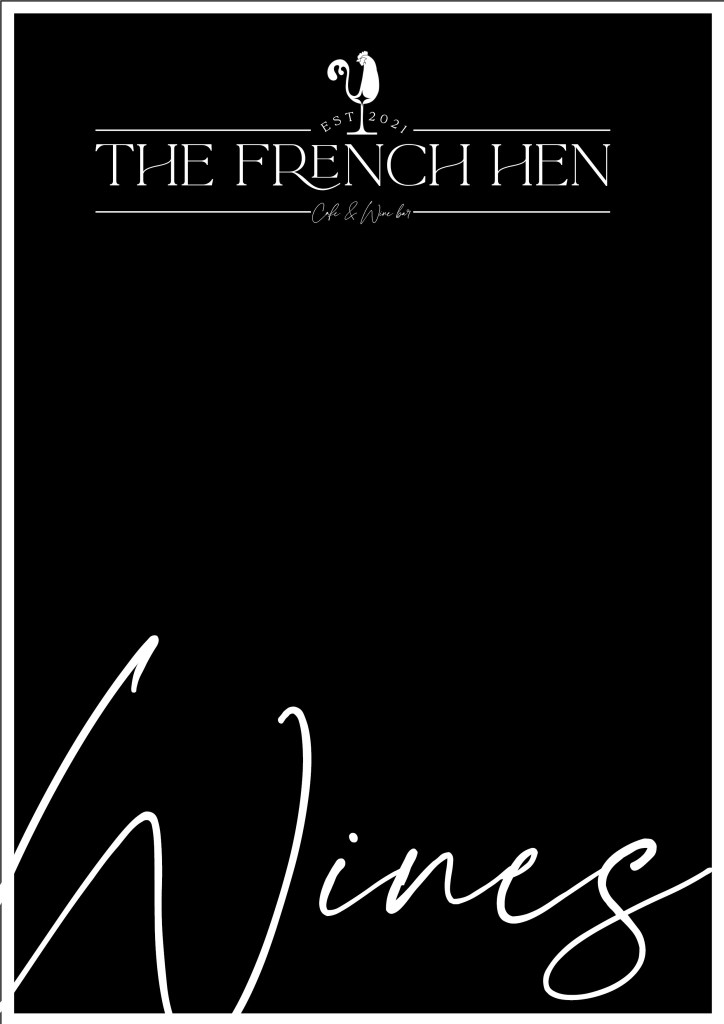
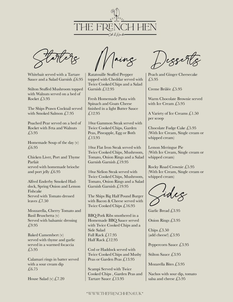
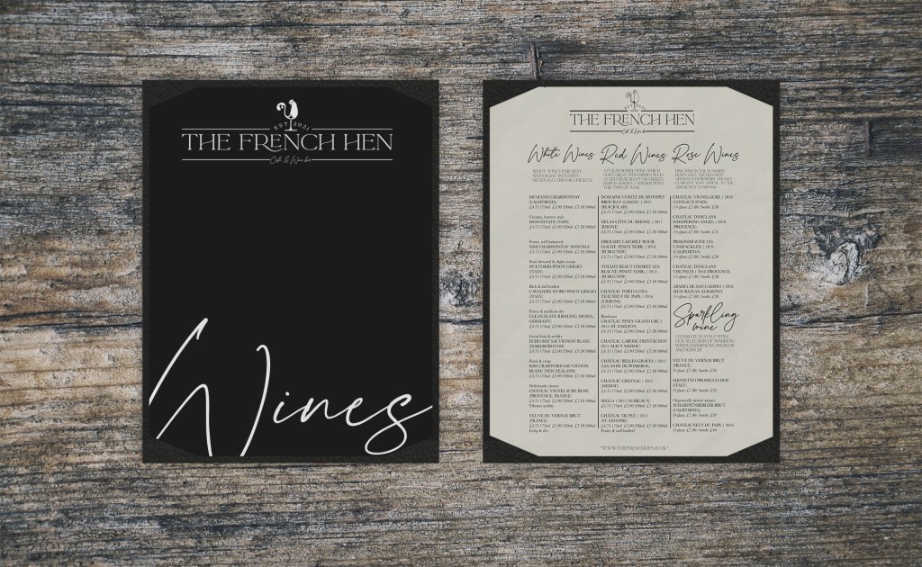
I had the perfect logo at this point for The French Hen and now I needed to create some menus to go in the establishment. I had the idea of quite a plain and simple black and white menu using the La Luxe script typeface to make it look fancy.
These were what I created. I created these in Photoshop and then exported them as a JPEG to take into InDesign to create the text for the rest of the menus.

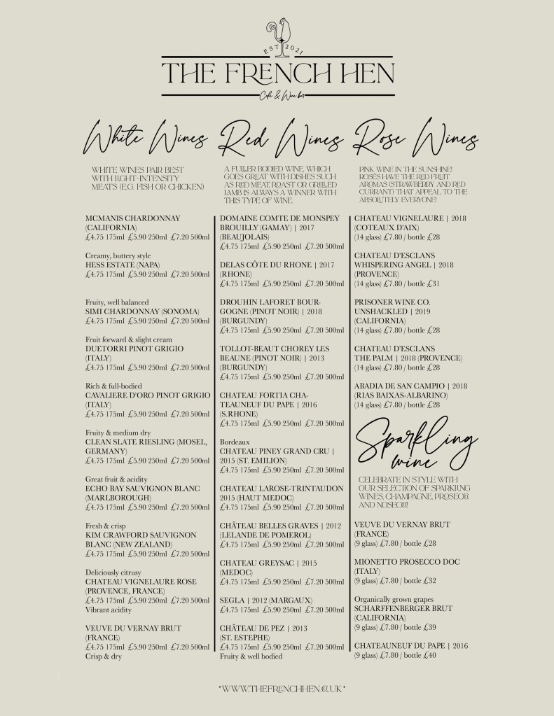
I decided to do the pages an off-white colour, in my head I had an idea of it being like the fancy, high quality cartridge paper menus that some restaurants use. Another reason is that it is easier to read. I used Baskerville for the typeface for the main body copy because it is more legible than La Luxe. Baskerville was designed to make printed books look beautiful so it would work well in my menu.
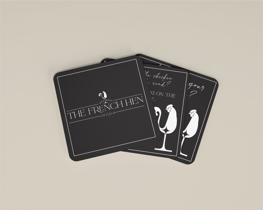
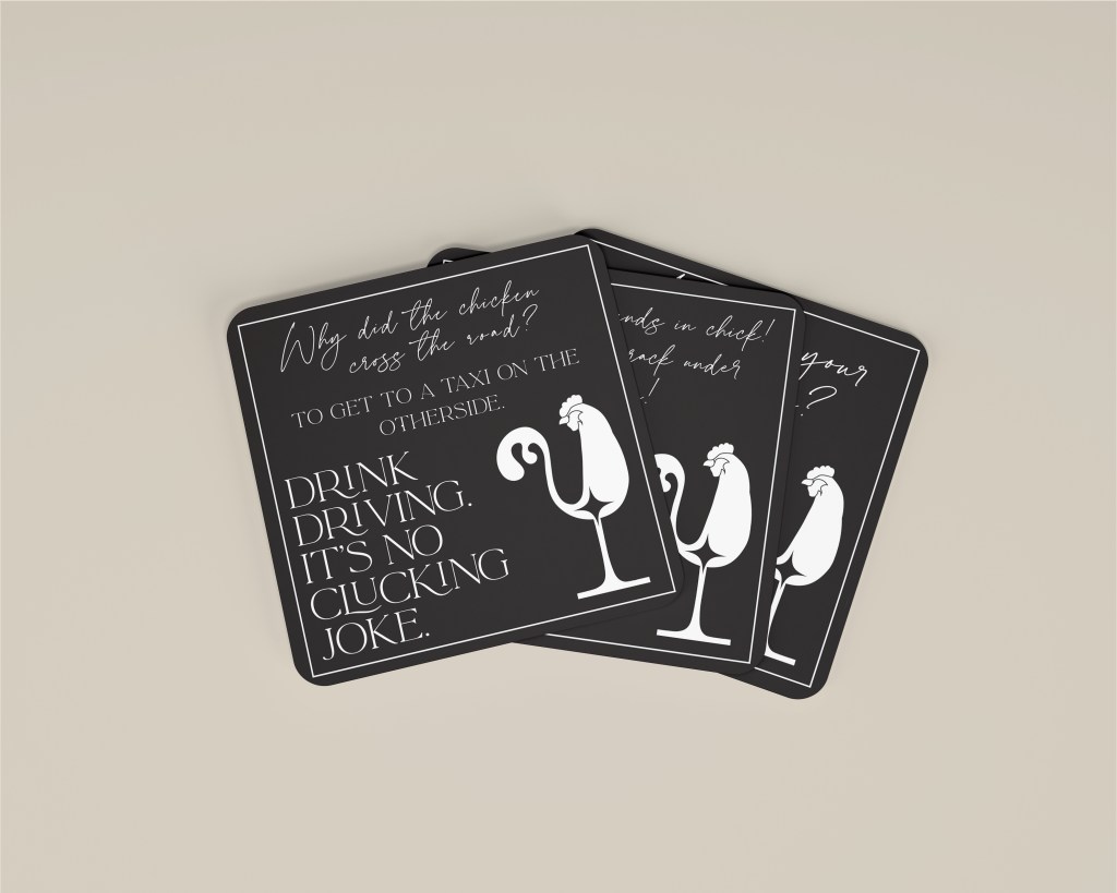
The beer mats I had a lot of fun with! I really played on words with Chickens and the French Hen! The brief stated it wanted responsible drinking advice on one side of the beer mats, I decided to do this in a playful but effective way:
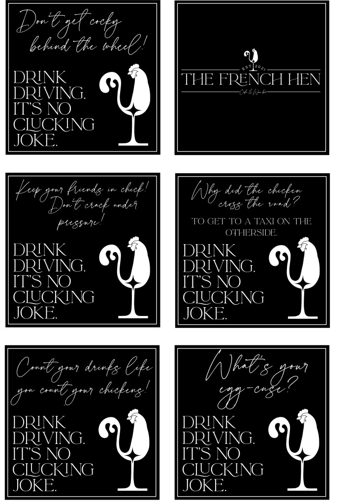
I created 5 different styles so that in the bar there could be lots of the different versions on each of the tables to compare. They feature a joke or a witty slogan all relating to chickens but with a serious drink driving message on them. I have kept them all to look like The French Hen branding.
Signage
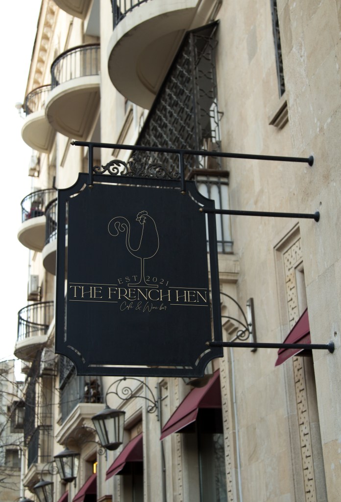
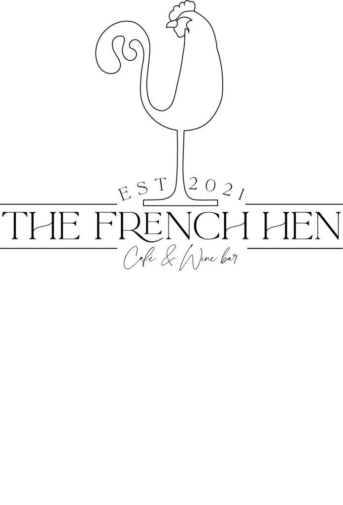
The only issues with my logo that I had were that the hen appeared quite small. I rectified this when I decided to do a slightly different logo for signs. I created the hen slightly bigger.
My sketchbook pages
The Mockups
I then had the task of browsing the internet for the best, sophisticated mock-ups for my logo. It took me FOREVER to find decent one! – and also thank you to anti virus because I had 4 hackers try and get into my system when I was trying to download some of them!
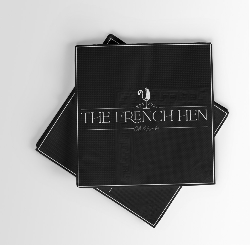
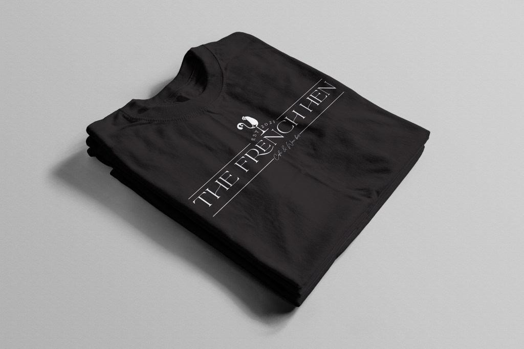
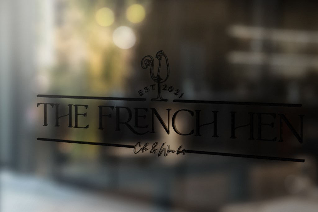
These are what I ended up with!
Final Thoughts
I really enjoyed this brief! If I had more time to complete it I could have taken it a lot further and mocked up wine bottles and more décor for the bar! I surprised myself with the logo design because I actually think it works really well. I uploaded it to my social media too and it was received well; the response was that it looks very classy and elegant! The typeface really made this design though, it was worth sourcing out a more special typeface because it really gives the feel of “french chic”.


