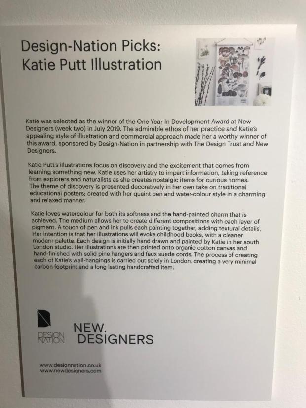
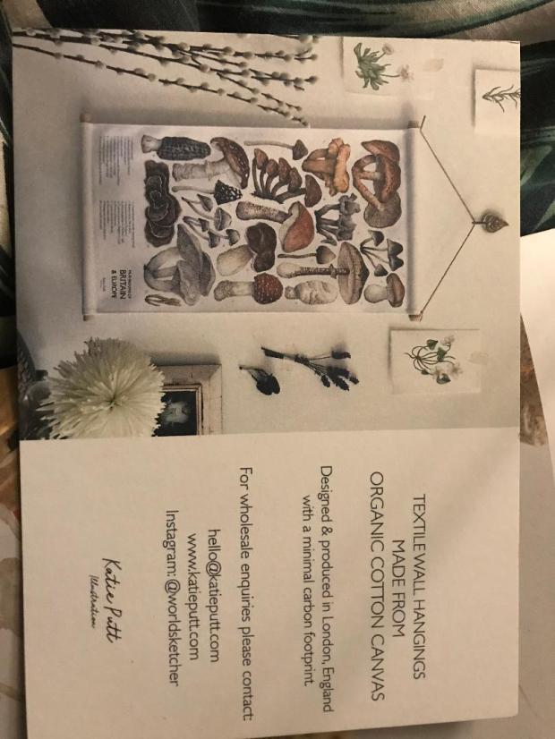
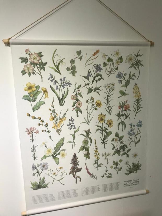
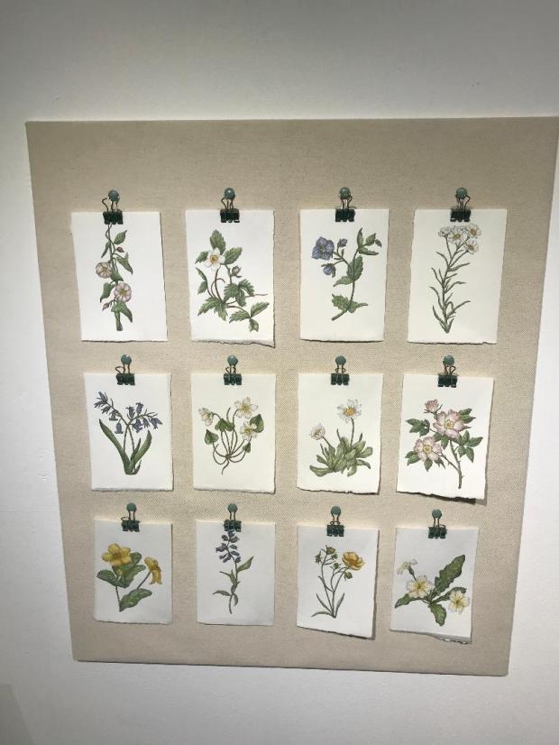
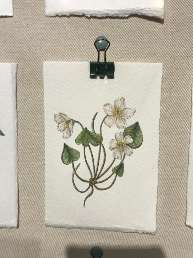
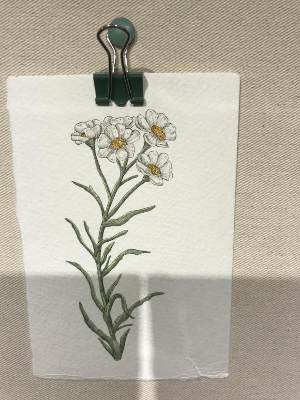
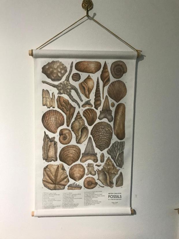
At the weekend I had another look in the NCCD in Sleaford. There was featured work from a designer and Illustrator called Katie Putt. I felt like her paintings and work are relevant to record in my learning log because what I am tying to achieve for my final book covers are very similar.
Katie bases her work around botanical flowers, insects, shells, fossils and Dinosaurs. Her work is based on curiosity and discovery. There were a few of her wall hangings in the gallery and I think her work is beautiful! Some of the paintings were similar to mine in the fact that she had painted them onto ripped, textured watercolour paper. I have drawn my designs so far using Ink pen but I shall also experiment by adding colour and using watercolour to create a washy effect.
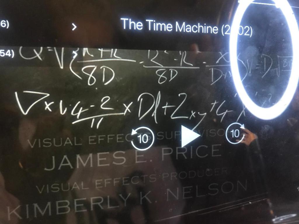
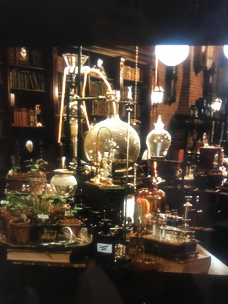
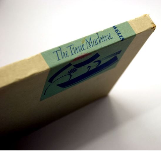
A few people have told me that they made a film based around the HG Wells book so I had a look on Amazon prime and found one that they made in 2002 (featuring a singer from back in the day that we used to listen to! – Samantha Mumba!)
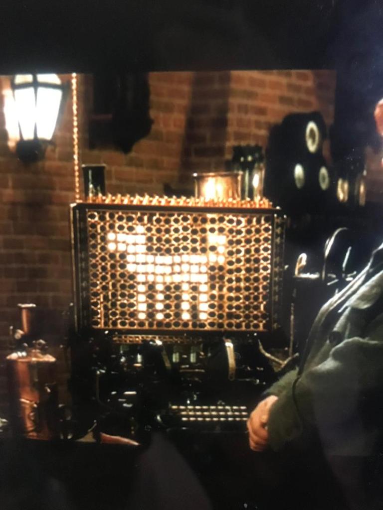
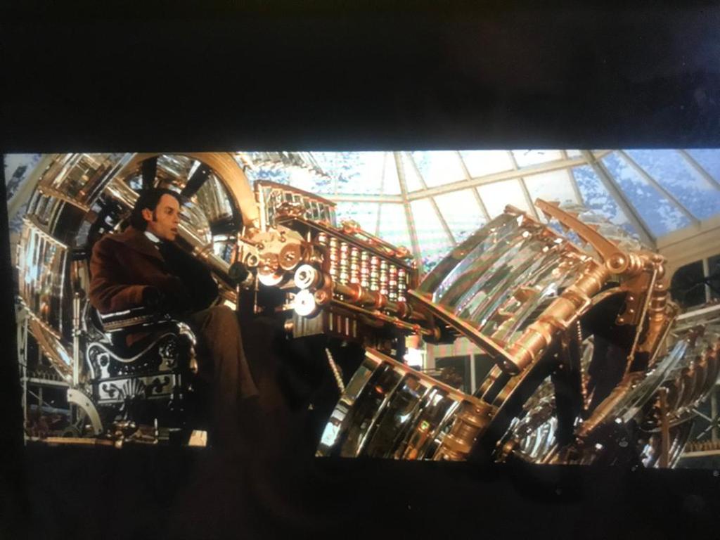
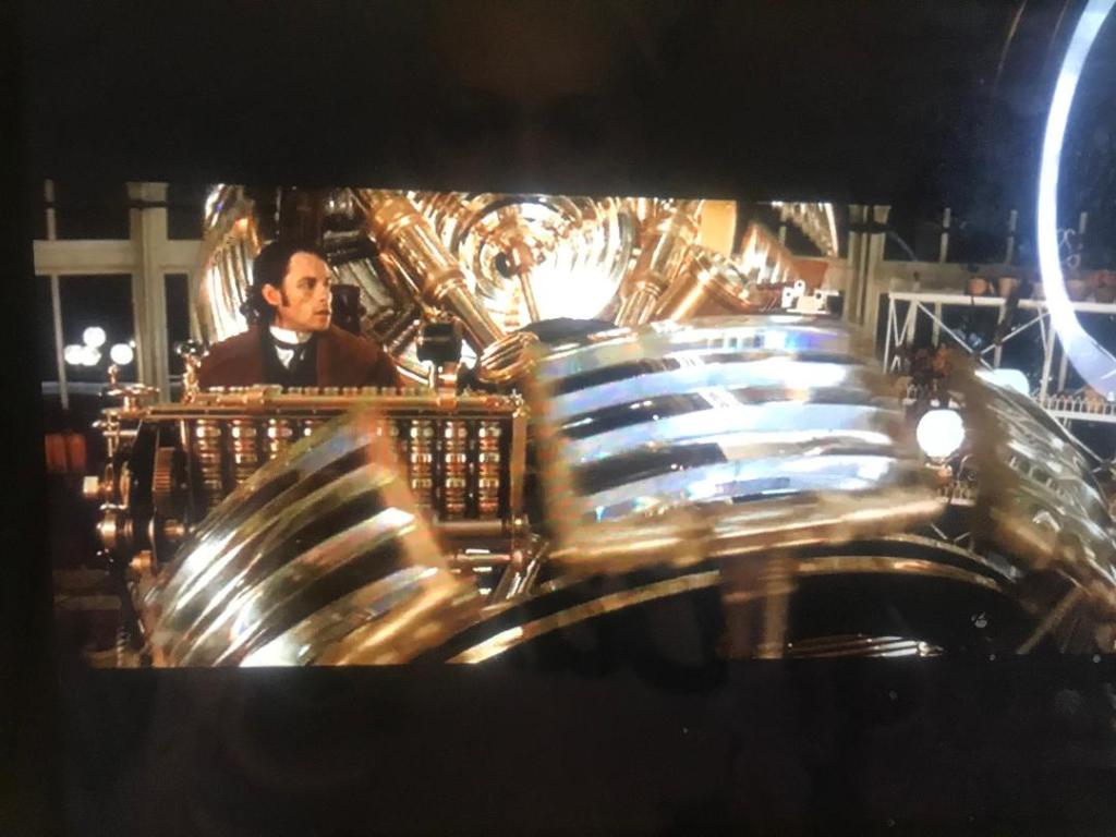
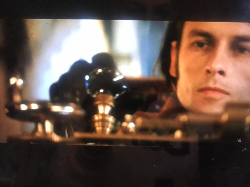
The story differs slightly from the book with the fact that it bases around the man trying to turn back time to get his fiancee back who gets shot but it is still set in the Victorian era. There is a lot of inspiration at the beginning of the film when it shows you his time machine (crystal and brass!) and the area in which he works; all equations on a board, bottles and beakers and lots of Science inspired things!
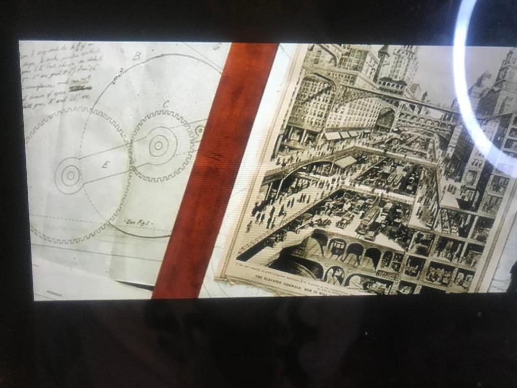
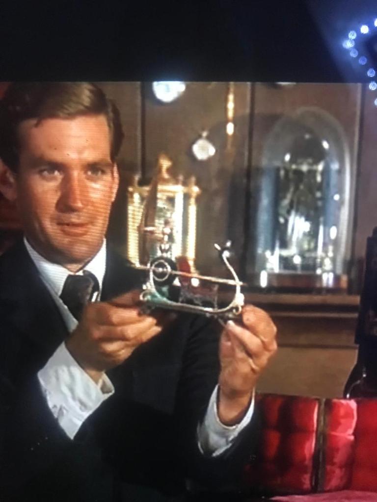
I took some photos of some of the scenes of this film to record on here and to also look back on for some design inspiration. The 4th photo across on the slideshow shows an image that looks very similar to an image I recorded a few posts back that I found in a Futurism book. It is very representative of the Industrial Revolution. There is also a scene in the film where he looks at pocket watches; I included sketches of pocket watches in my sketchbook also.
The film has stayed true to the book in which it has made the time machine brass, gold, shiny and with crystals (the 10th image shows a crystal lever) I can take a lot of inspiration from what I see in these images. There is a massive use of rings, circles, gold and geometric shapes.
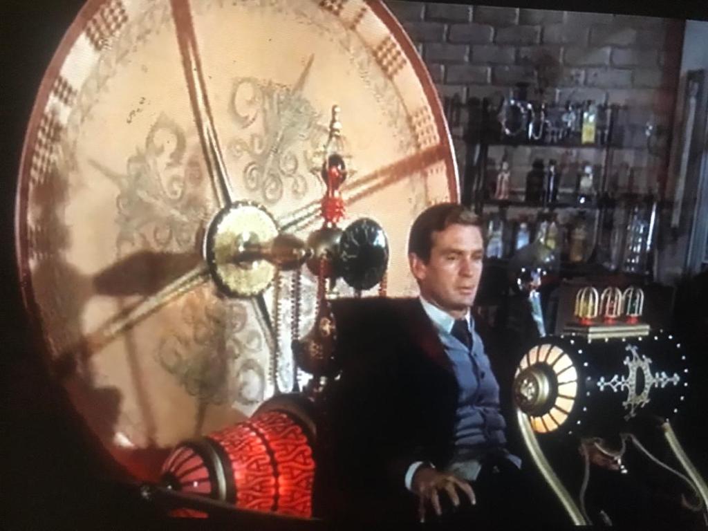
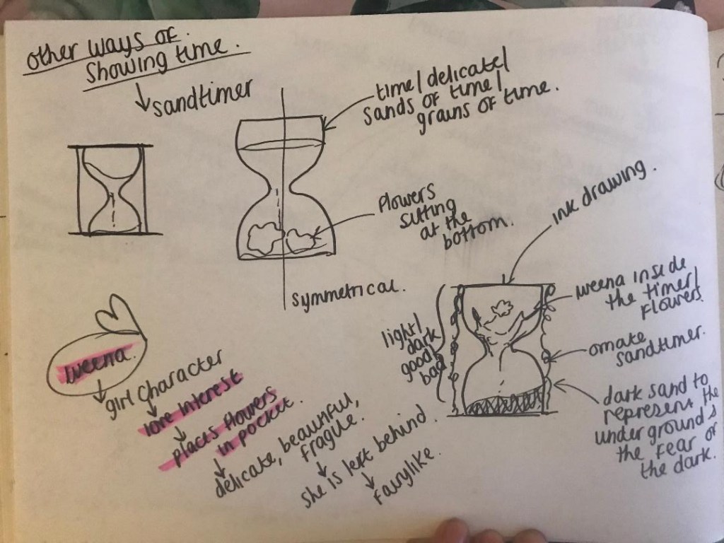
I then went on to watch the 1960 version, this version stays true to the book more than the 2002 version. There is a lot of things in that film that featured in my first sketches such as sand timers, pocket watches…. one thing though which was featured in the film was an ornate sun dial – this is a different way of showing time. Again, I took some photographs that I thought might help and influence my designs:
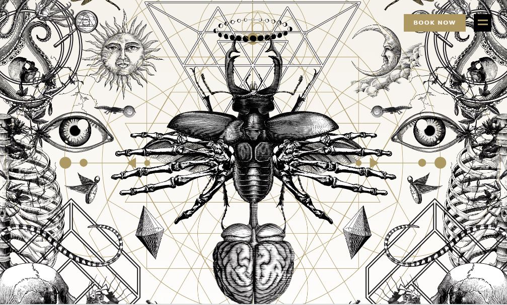
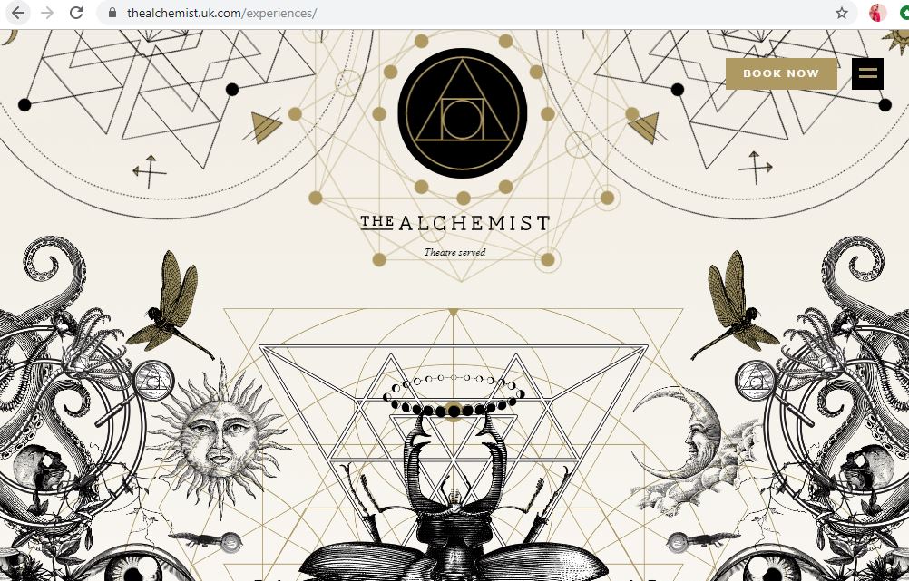
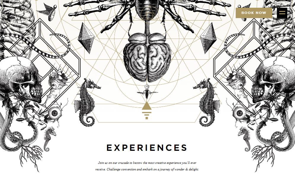
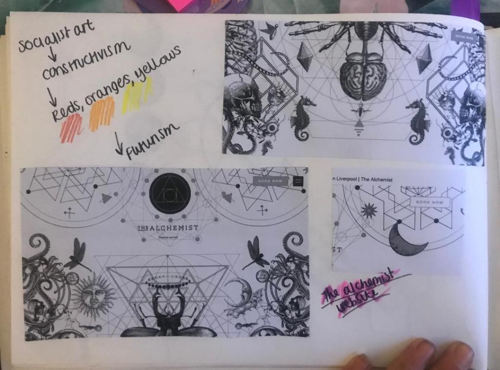
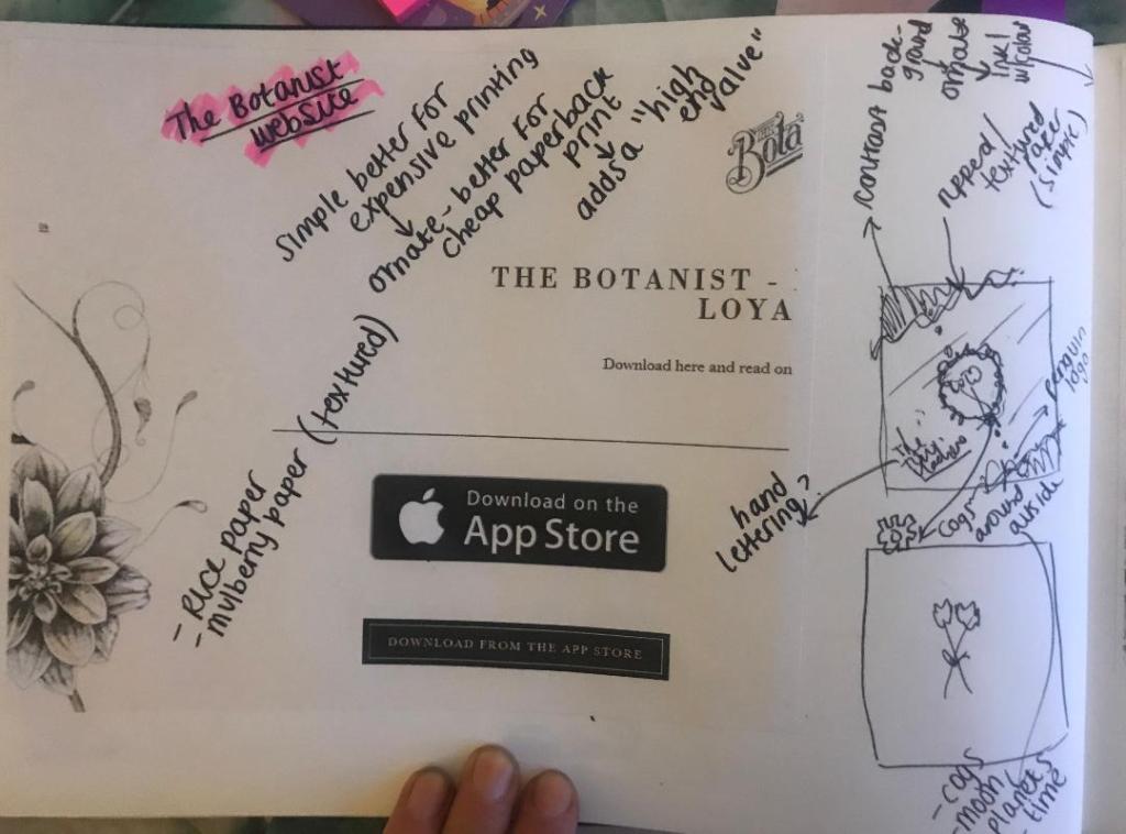
Yesterday I was asking ideas for my designs from our textiles teacher at school who I work closely with everyday; she asked me if I had ever been to two bars called “The Alchemist” and “The Botanist” as these would help me possibly with ideas! – I have heard of them, (I have heard of The Alchemist because I am aware that they do really extravagant looking cocktails!) – however, being from the shire where nothing much goes on, I have never yet been to one! I had a look at the websites and instantly knew that the designs that I saw on there would help inspire me for my own!
The designs that feature on The Alchemist website are monochrome which I love, they have elements of Steampunk as there are cogs and machinery as part of the designs.. but they also have a touch of femininity about them with the delicate flower drawings. There is repetition in some designs and symmetry just like the William Morris ones I looked at.
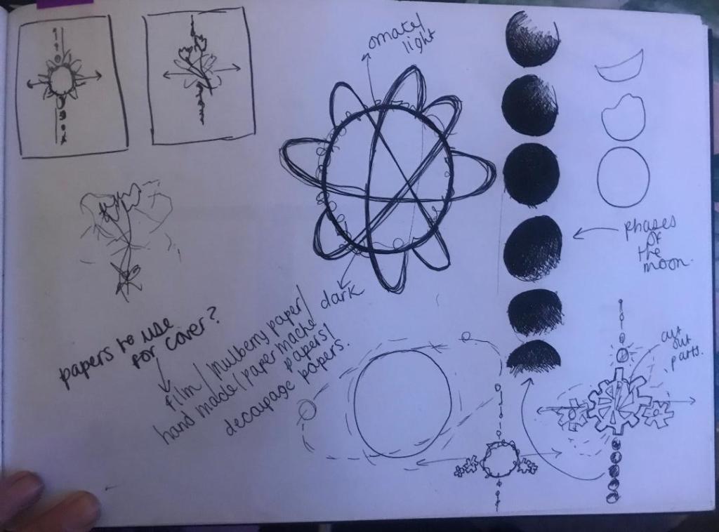
I decided to print some of the website pages out, stick them in my sketchbook and sketch ideas around them..
Whilst sketching these ideas I watched a video on Skillshare by Jessica Hische, a lettering artist explaining how she designs book covers. One of the helpful pointers I took from her was: Make the design simple if it is a costly print job, if it is a paperback book and a less costly print job make it “ornate” this will add a high end value to it.
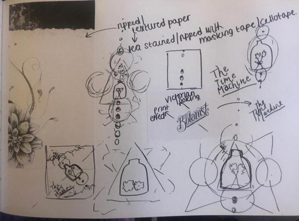
In my sketches I explored around little ideas based around science and space and line drawings of delicate flowers etc.. I brought back the bell jar idea in the later ones though as I feel as much as I was quick to dismiss it for a while, it is still relevant to the book and still a good idea.
I looked at The Botanist Typography and copied next to it in the same style, The Time Machine – I felt the way this looked worked well! Obviously I will make mine look different! (I might even do hand lettering for it)
The slanted positioning of it too made me think of De Stijl and Constructivism art – The way that the work is very geometric and typography at angles… It made me think that I could do the layout of the book similar to this idea… Here are some examples of what I mean:
By the end of this little sketching session I had this idea below which I liked the feel of the most. The design would be on a mottled, ripped sheet with a contrasting background behind it. The centre part would feature the flowers, the bell jar or both and all around it would be mechanical cogs, crystals, ivory.. all relating back to the actual time machine. the typography would be alongside it at an angle which relates back to the Socialist views of the author and the hidden meaning of the book.
I am now going to sketch some more developments of this to see how it could work!
From my last post where I was toying with the idea of a more simplistic cover of 2 white flowers, I have done some more sketches and a bit more research! – I know I go overkill on research but I find that exhausting every avenue gets me useful links between my designs. The more knowledge about the book, the more ideas I get for my designs!
I won’t lie, I have only skimmed this book… flicked through some pages and scanned with my eye for the useful bits. I have also done some YouTube reviews and read what avid fans on Amazon have said about it! – all this is useful because actually everyone focuses on the true meaning of the story rather than the time travelling. The true meaning behind the book is actually quite thought provoking, romantic and sad!..
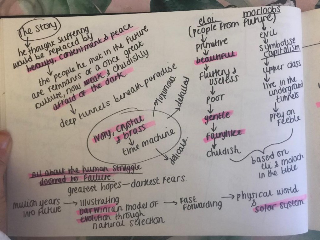
The time traveller (who has no name) travelled in time to the future (in an ivory, crystal and brass time machine – which might be useful in my designs!) as he thought that the suffering of his people would be replaced by beauty, contentment and peace in the future. He was wrong, the people he met in the future were remnants of a once great culture. The people known as Eloi were socialists – gentle, beautiful, kind fairy like people. They were very primitive and only had basic supplies, they were poor. They were however also weak, childish and afraid of the dark. They lived above the ground in fear of the Morlochs. The Morlochs lived underground in dark tunnels, they were the opposite of who the Elois were. They were Upper class capitalists, nasty and preyed on the feeble. These 2 groups of people in the book were metaphors for upper and lower class in HG Wells Victorian times. They symbolised capitalism in Victorian England which was something HG Wells was deeply against. The book is about the human race and how it is doomed to fail.
The first ideas I had for the bell jar and cogs I now feel is too harsh for the design of this book. I now feel that I want to focus on the soft, delicate nature of the book.
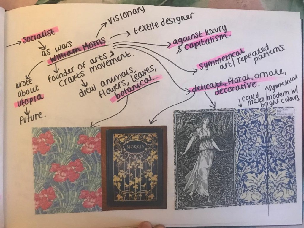
I had a look at the style of William Morris. He was a textiles designer, a poet and he was also interested in Science Fiction and the future just Like HG Wells. He published a book based around Utopia. He was also a socialist just as HG Wells was. He was against capitalism.
His style of work is very ornate and bases around plants, flowers and botany. His work is very symmetrical and repeated.
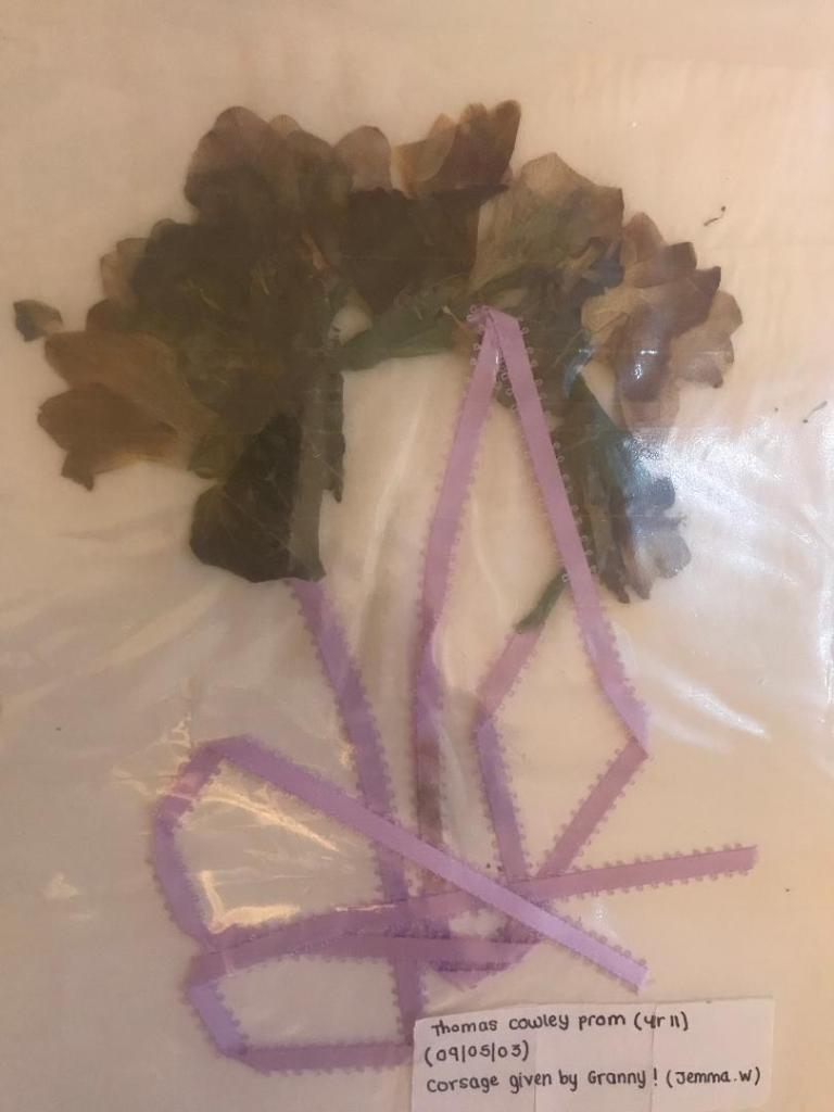
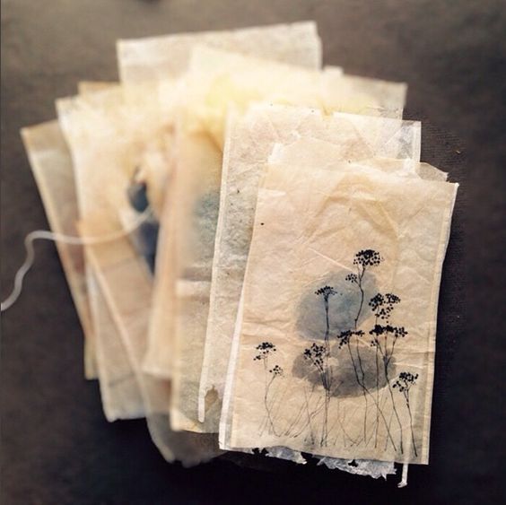
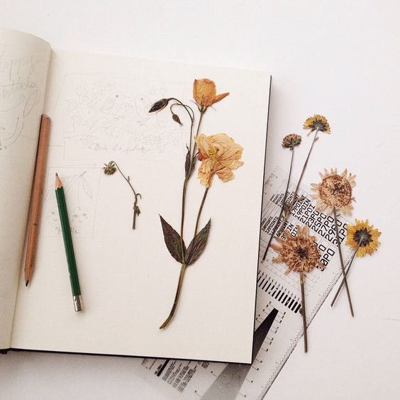
These are pages out of my sketchbook that I have done to explore ideas around this, there is also one of my now really dead 15 year old prom corsage!! (I really didn’t press this professionally!)
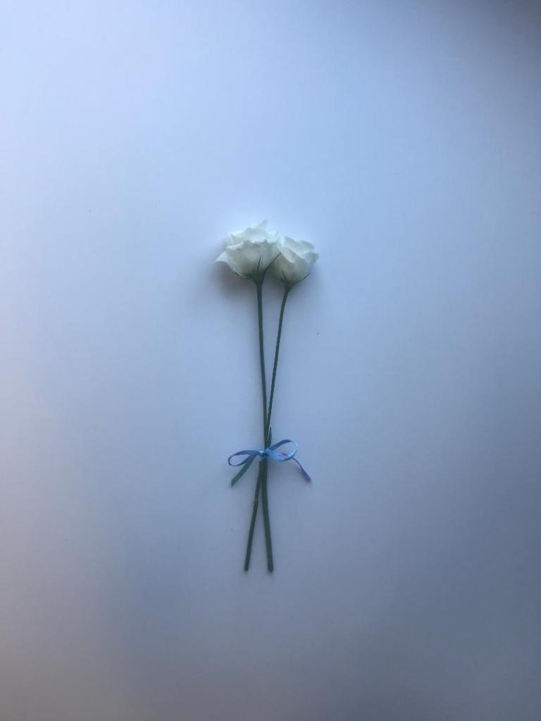
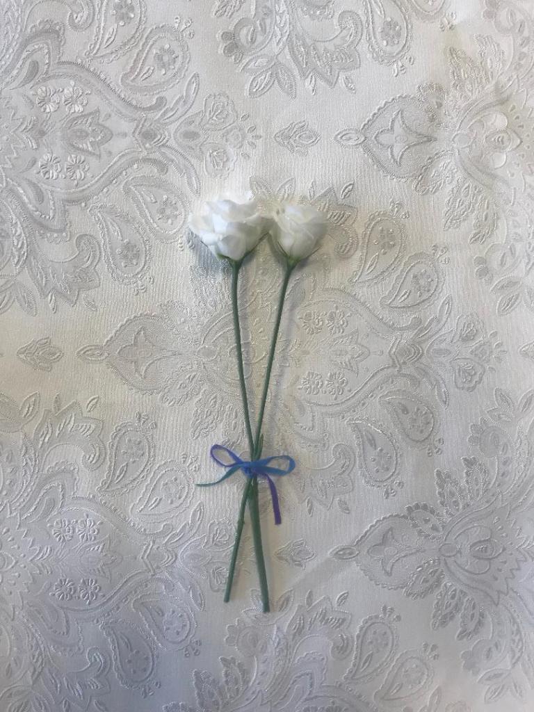
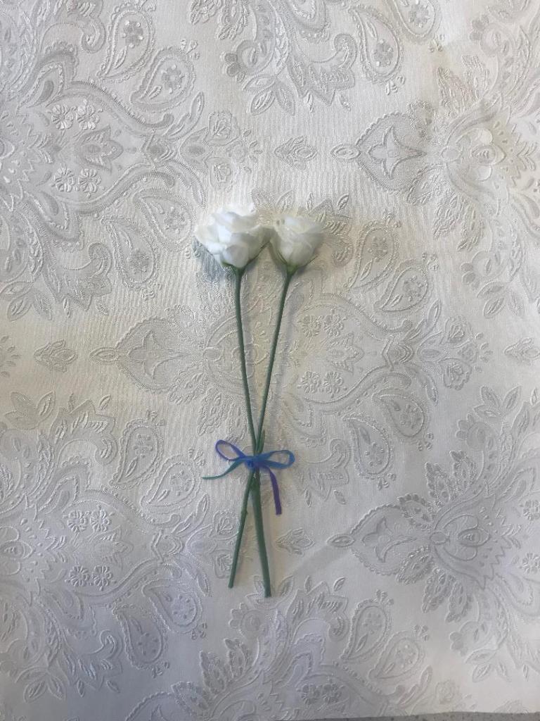
I decided to buy a bunch of white flowers with the idea to photograph 2 of the flowers. I thought that if I photographed them alive first and then dead and pressed I could choose between whichever option looks the best.
looking pretty at my school desk!
Looking pretty in my home office!
I have photographed them on different textures; card, silk and a decorated wallpaper. The silk did not look good, you couldn’t really see the shine of the fabric as I wanted and there were a lot of creases. The card worked the best. I am going to also try and find some mulberry paper (paper for decoupage) as this will really give a textured look.
These are some I have taken so far:
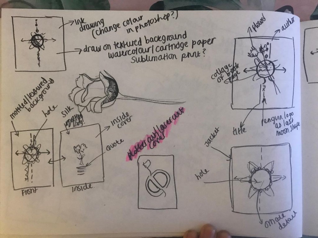
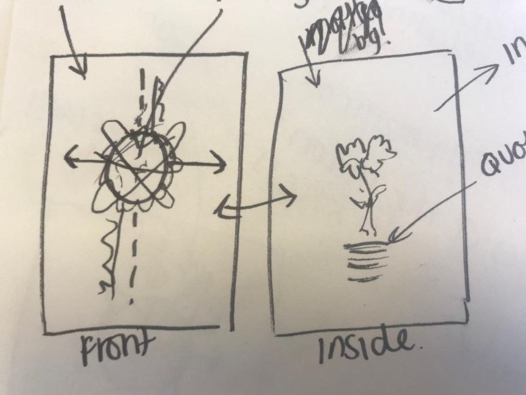
I felt that this idea would work for a hardcover book more than paperback- (I would use the flower photograph for the hard front cover and then make a book cover jacket which would go over the top with cut out parts where you can see the flower through) although I could adjust the design to work for paperback. I explored around symbolism a bit for the idea… The image below tries to show roughly how it would be and look like..
If I was to adjust this to make it suitable for a paperback I would put all the elements together just on one cover.
I shall have a play around again and see what works the best!
Today, as I was sitting googling what the white flowers in The Time Machine might have possibly been and looked like to help me draw them in my designs, I came up with another potential idea…
Flower preserving!…
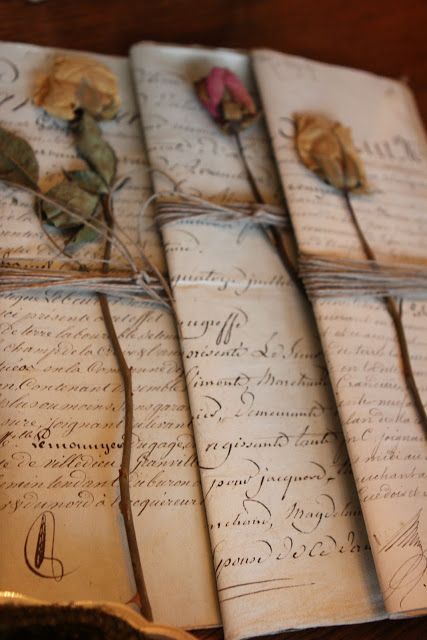
The images of the dead “white withered flowers” that google produced for me reminded me of a prom corsage that I attempted to preserve 15 years ago.. it then made me think that flower preserving is actually an old Victorian pastime! (another link!) I then had the idea in my head of a photographic book cover of 2 preserved white flowers possibly on a mottled, textured background to give the book an old feel, (In Victorian times flowers were preserved onto silk) and then some simplistic typography for the title and author. This design would show how in the story the flowers are fragile and delicate and show a sense of love and kindness.
In Victorian times flower preserving was a popular pastime but it was also a way to collect, record and study different species of flowers. Botany is the study of plants and flowers. This brings the science link into the designs too.
The images above are just a few I found of flower preserving examples.
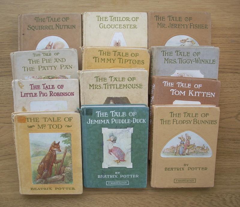
When I was sketching ideas and writing notes for this, some books came to mind that I read when I was younger.. I had a whole set of Beatrix Potter classics (I think they belonged to my mum) The typography style that features on them is something similar that I would envision for this design. The layout of the books and the texture is something that I would want to take inspiration from.
This is a page from my learning log sketchbook, these are drawn at literally the moments the idea came to me!
I think that if I successfully designed and created this cover as I imagine it, it would be a beautiful work of art as well as work as a timeless classic.
From doing earlier research (Chipp Kidd’s video) He mentioned that classic books are usually covered in plastic to protect them and to also keep their value… I then thought about placing the preserved white flowers onto my mottled backdrop and then covering them in plastic and photographing it..
These are the Beatrix Potter ones that came to mind! The stories are classics and the book covers are standing the test of time (I think they have been reused and modernised on reprints of these books in recent years..) The covers here are hardback but the idea behind it is still the same for both hardback and paperback.
How could I make the other 2 covers similar to this design?
The Time Machine – Would have the preserved flowers
Ann Veronica – possibly a photo of a frog or a scientific drawing of a dissected frog
Tono-Bungay – Maybe an old medicine bottle on its side with some coloured liquid pouring out onto the page…
These are just some ideas that I can explore and further look into… I might have a go at preserving 2 white flowers which I could potentially use for a design.
**update 12/11/2019
I did some more sketchbook ideas last night (see below), trying to problem solve around the ideas I have to make them work (I started drawing out a mock sketch for the bell jar idea and I am not sure of it!..)
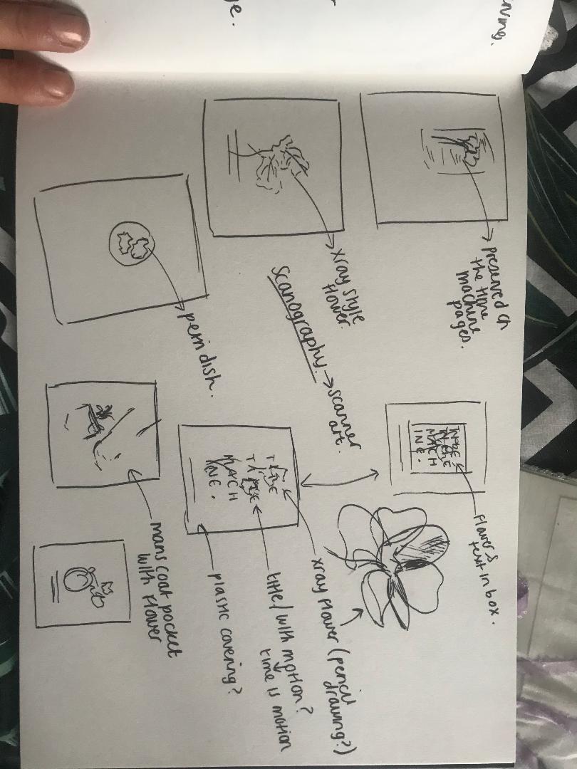
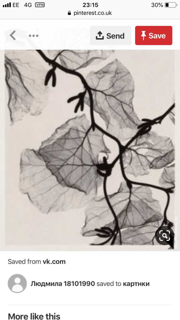
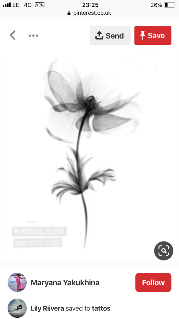
so I looked back at the flowers idea. I found some images that gave me some inspiration; they were mostly of x-rayed flowers, (obviously I cannot x-ray some flowers myself!) I could use this idea though to maybe draw a similar idea in pencil to get the delicacy needed… or I also looked into scanography, which is simply put – Scanner art!
From thinking about ideas on my last post I have now spent some time sketching out some ideas for The Time Machine.
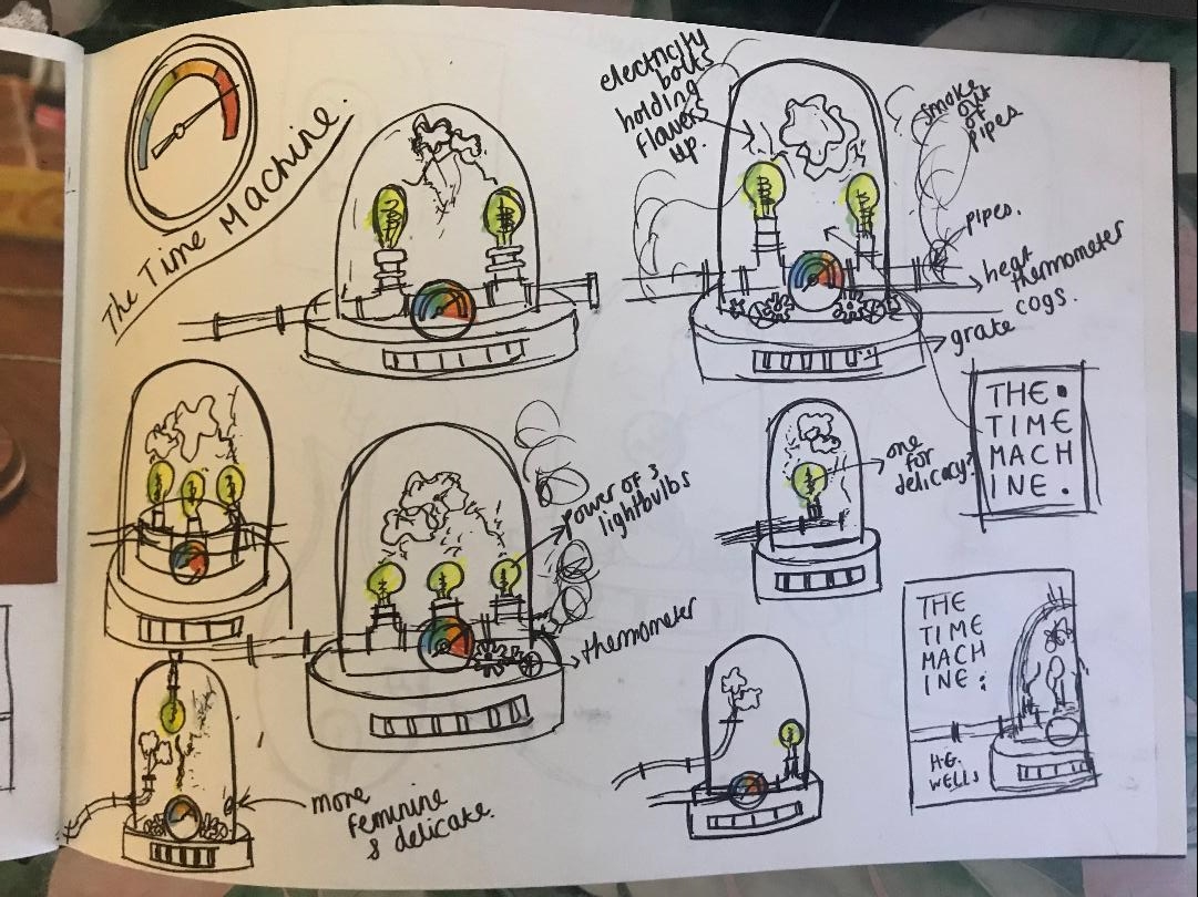
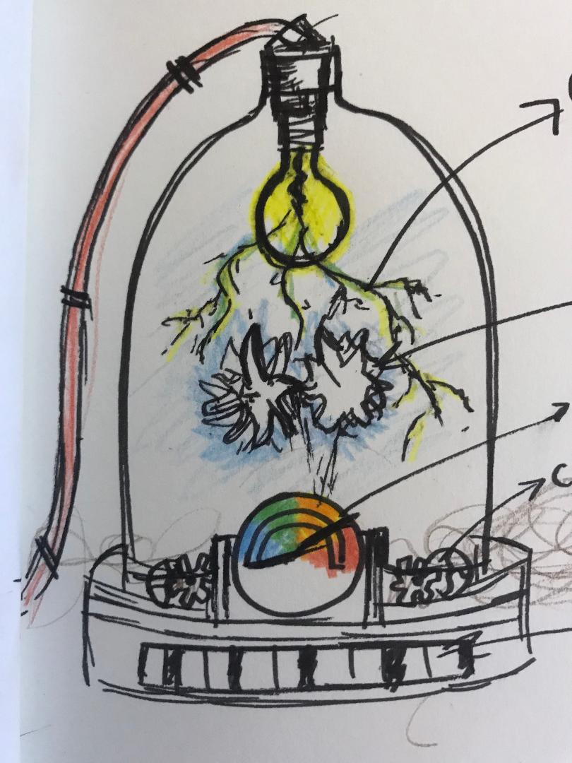
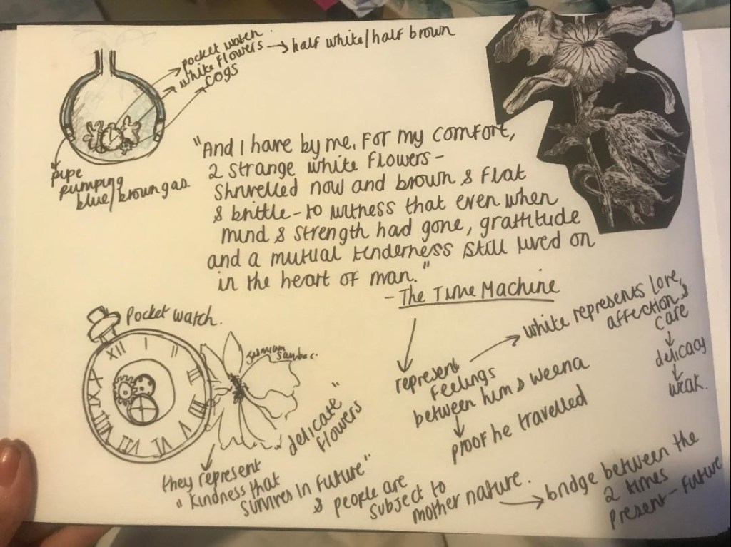
I had the idea for this one of placing the white flowers inside a bell jar and then adding some pipes or smoke to give the Steampunk/Science influence. I wanted this one to be the most delicate out of all 3 because of what the flowers represent (love and affection between 2 characters)
I started off by doing ideas based around lightbulbs shining into the bell jar and heat thermometers.. The idea is that the lightbulb is the hope keeping the flowers alive, the hope of what lies for us all In the future and that kindness lives in the future. The flowers are delicate, we are all subject to mother nature. The heat thermometer controls the levels of smoke being pumped into and out of the bell jar and also is a massive Steampunk influence. I have decided to do electric, static, lightening bolts coming from the lightbulb which are in theory holding the flowers up – I guess this is the science aspect to the idea.
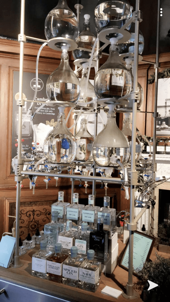
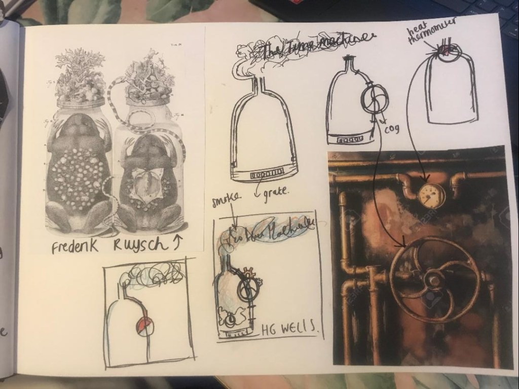
I quite like the idea of bell jars, medicine and potion bottles etc… It reminded me of a photo I took in Cambridge in the summer of the Cambridge Gin Factory. (see below) the bottles and the way the shop was laid out fascinated me. It gave me inspiration for this piece.
The Cambridge Gin Factory
I also today visited the NCCD in Sleaford (National Craft Centre Design) and saw these jars as part of a display in one of the windows.. They are still a thing that is obviously used!
But these are some of the sketches (below) that I have done so far! I think I have the idea for the first book – I now just need to draw out a final drawing and know how to bring typography into it!
From doing my research so far I have come up with some ideas:
I needed something inspired by Steampunk and the Victorian era that would link with all 3 of the books. These are the links I came up with:
Ann Veronica – She keeps a jar with a dissected frog inside on top of her wardrobe in her bedroom… Although this is not an important piece of the story it is still a detail that will help link this title to the other 2, it is the science connection. This then gave birth to the other 2 ideas for the other 2 book covers…
The Time Machine – This story is about a man who sits at a table having a meal among friends and he tells them that he has found a way to travel forward in time – no one believes him but with a 3 hour time difference inbetween his journey there and back he travels into the future. He meets a girl (alien girl) called Weena and when he finally gets back to present day to show his findings to the dinner table of friends, he finds that Weena affectionately planted 2 white flowers in his jacket pocket… At the end of the story he presents these to the people around the dinner table to prove that he did travel forwards in time.
The flowers in the story are important; they represent love, affection and care between the 2 characters. The flowers also act as a bridge between the present and the future.. without these flowers there would be no proof of his time travelling journey. The flowers show delicacy and a weakness – maybe that nothing is ever guaranteed and that the future is never ever certain, that people are in fact subject to mother nature.
Tono-Bungay – This story is about a potion that was formed as a “cure all” miraculous medicine… in fact it was nothing more than a nice tasting liquid. This is the most creative novel HG Wells wrote. The potion was called Tono-Bungay and In the story it was so cleverly advertised which meant that it was a huge financial success for the character who helped create it.
I would like to create this cover (or create some ideas) around the idea of (the book) being advertised to the reader just like in the story how the medicine is successfully advertised.. however my first idea for now is to do a similar cover to the other 2 titles..
So… What ideas have I come up with so far?
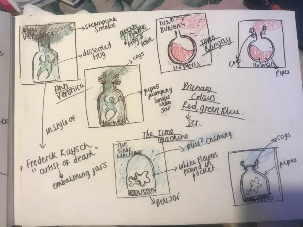
My first ideas from picking out these important key points from the story are to create a set (series) of books based around potion/medicine bottles and bell jars…
The dissected frog would be in a jar
The white flowers would be in a bell jar (similar to one that appeared in Beauty and the Beast)
Tono-Bungay would be in a medicine bottle
Botany and embalming were popular subjects in the Victorian era and these design ideas would reflect that. The three titles would look very similar in appearance to each other and would work as a series.
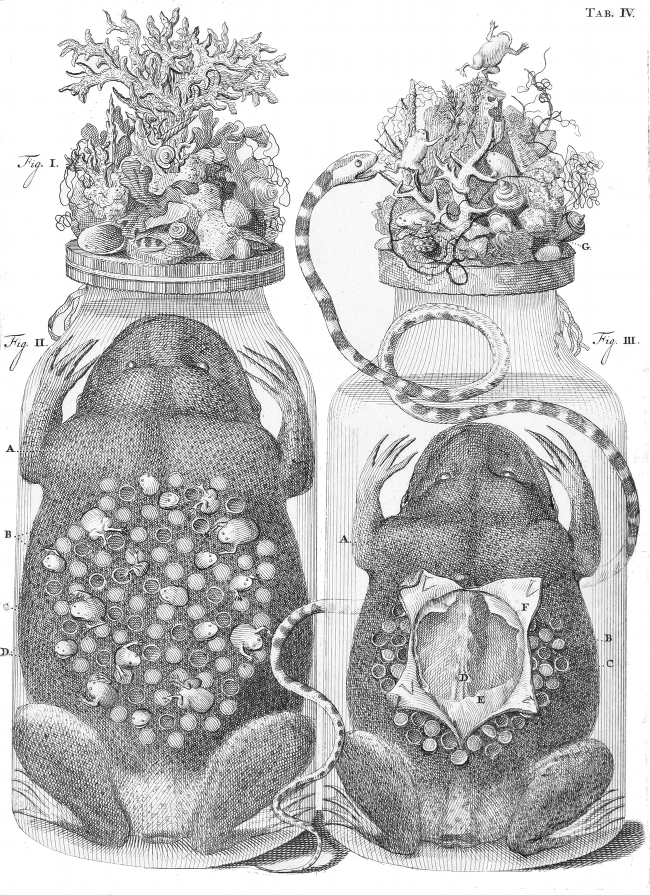
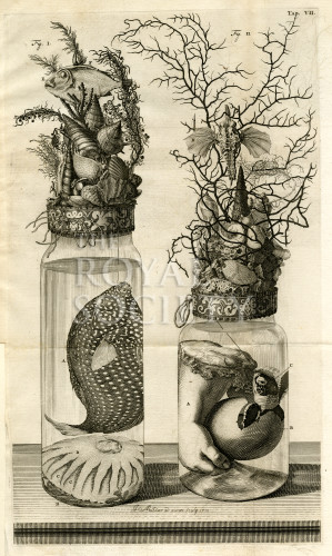
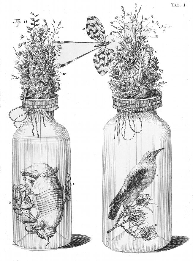
I also googled ideas around this subject and came up with a Dutch artist called Frederik Ruysch who was known as the “artist of death” he specialised in science, botany and embalming.. He is known for developing techniques for preserving anatomical specimens, which he used to create dioramas or scenes incorporating human parts. I like the details in his drawings and the fact they are hand drawn in black and white.
These are images of some of his work.
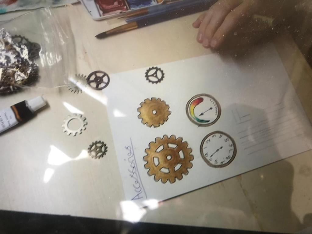
I also then had a think about how I could link some Steampunk into these ideas… I thought about running pipes into the jars with gas and then the smoke coming out of the top. The title of the books could possibly come out of the smoke. I would include cogs also.
I sketched some ideas in my sketchbook for this:
I decided to use a different colour for each one: Red for Tono-Bungay; I felt red symbolised blood and very much being alive… this potion was a miraculous “cure all” for all ailments and illness. I decided on green for Ann Veronica because it symbolises the colour of the frog in the jar and I went for Blue for The Time Machine because of the delicacy of the flowers/ nature. Blue represents to me a calmness and the flowers represent love, care and kindness. They would all create a repetition in design and become a series.
I shall mess around some more with these ideas and see what happens next!
As I wrote in my previous posts, I wanted to look into different art movements from the era that the books were published (late 1800s-1907). HG Wells books are science fiction based and hugely influenced by future events so I wanted to look at art movements which might depict this.
I looked at De Stijl, Art Deco, Futurism and Russian constructivism.
Futurism however seemed the most obvious, appropriate art movement to look at. Futurism was all about the notion of futuristic and extraordinary technological development. It conveys an idea of scientific and technological advance. The art movement was made up of themes of classic science fiction. Futurism also suggests an idea of time, this hugely influenced Victorian writers such as HG Wells.
I bought a book from Amazon to have a look at the style of Futurism. There was one photo which inspired me, it looks futuristic and something that is inspired by the industrial revolution. It gave me ideas for a black and white line drawing type of design. It looks like a technical drawing and a design like this would work well on one of the books such as The Time Machine.
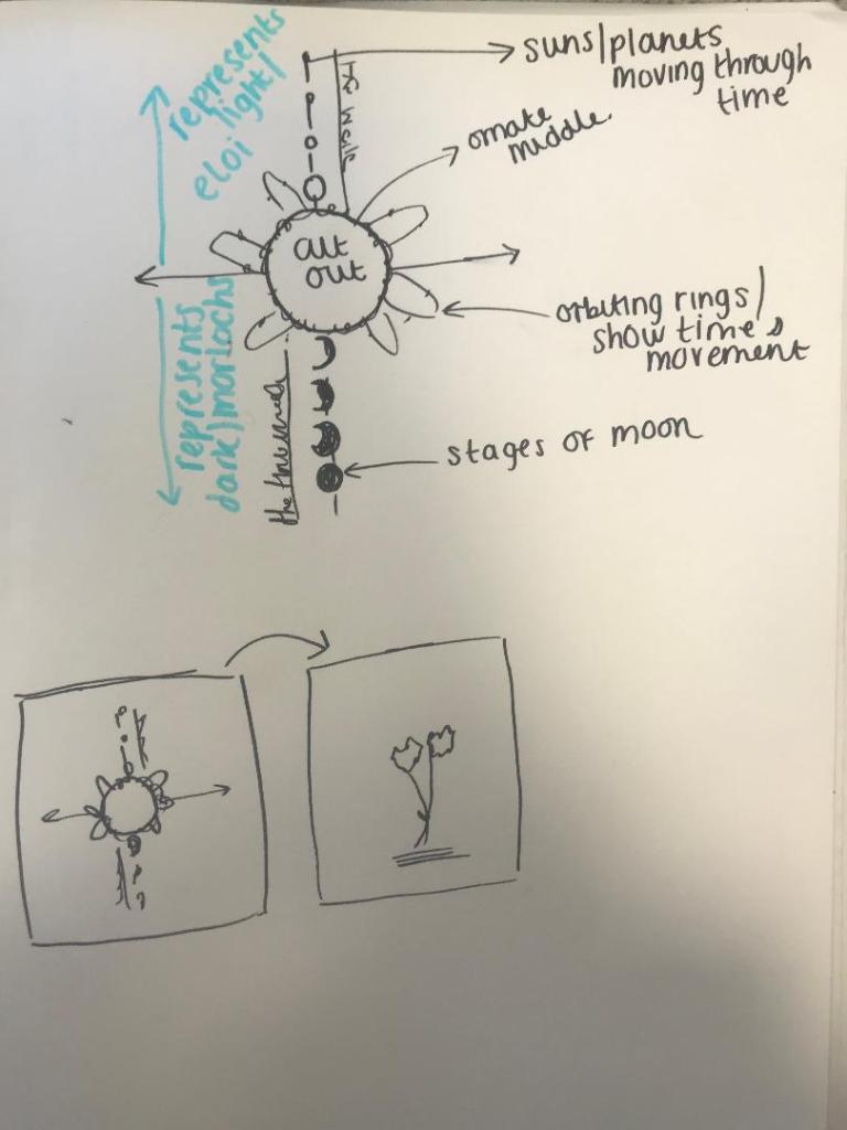
I then thought about how to go about designing for The Time Machine.. I thought about “What is time?” It is a concept of space – the past, present and future.. time zones. Time is an illusion and reality is timeless. The idea of time being a concept of space made me think of negative space in a design, that I could use “space” as part of the design.
I then thought about how to illustrate time on a book cover without using the obvious thing which is a clock itself. Also what style would I do this in?
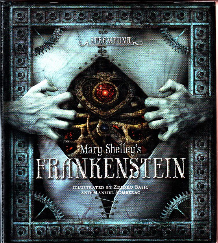
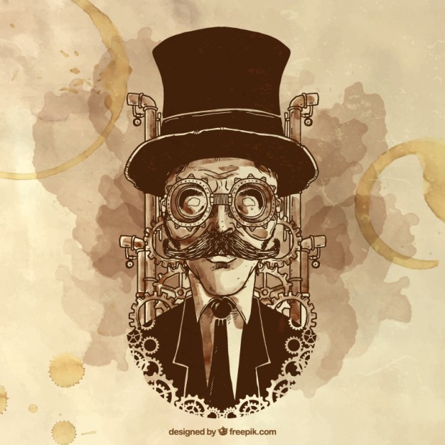
When I think of The Time Machine I think of clocks and cogs and mechanical movements. Another art form came to mind… Steampunk.
I know absolutely nothing about Steampunk other than it is where people rally around wearing Victorian costumes and flying goggles and go to Steampunk festivals! I decided to research into exactly what it is, the style of art it produces and try and find links to HG Wells.. which I did! From researching I found that Steampunk is hugely influenced by Victorian Literature and in particular HG Wells and The Time Machine.
What is Steampunk?
Here are some images which give an idea of the look and feel.
Steampunk is a genre of Science fiction it combines historical elements with Science Fiction. It is influenced by Victorian writers; In particular HG Wells and his classic The Time Machine.
Steampunk features steam powered machinery, clockwork and electricity. It is influenced by cars, planes and machines. Steampunk was very much the Victorian eras view of science in literature and the industrial revolution in Europe in the 1800s. It is the Victorian era reimagined with modern technology that simply runs on steam power.
“What the past would look like if the future had happened sooner.”
It is all about mixing old with new. Steampunk is a visual style. It is machinery and elegance, Gothic Victorian. “Retro-Futuristic”. It is dark, dirty and grungy.
From reading my feedback from Assignment one, I was told to keep experimenting with different media. I decided that for this piece I wanted to go back to what I enjoy most and do some hand drawing. I love doing black and white ink drawings. I wanted to get a feel for what Steampunk drawings and designs look like. I watched a Skillshare tutorial by an artist called Sara Blake, her drawings are amazing. The video shows you how to take your hand drawings and alter them in Photoshop to make several different variations to us on different projects. I think that this is what I want to do. A black and white ink drawing inspired by Steampunk for all 3 of my covers and then take them into Photoshop and alter them, add colour, add effects to make it suitable for digital print such as books!
Here is the link to the skillshare video and some screen shots of Saras work.
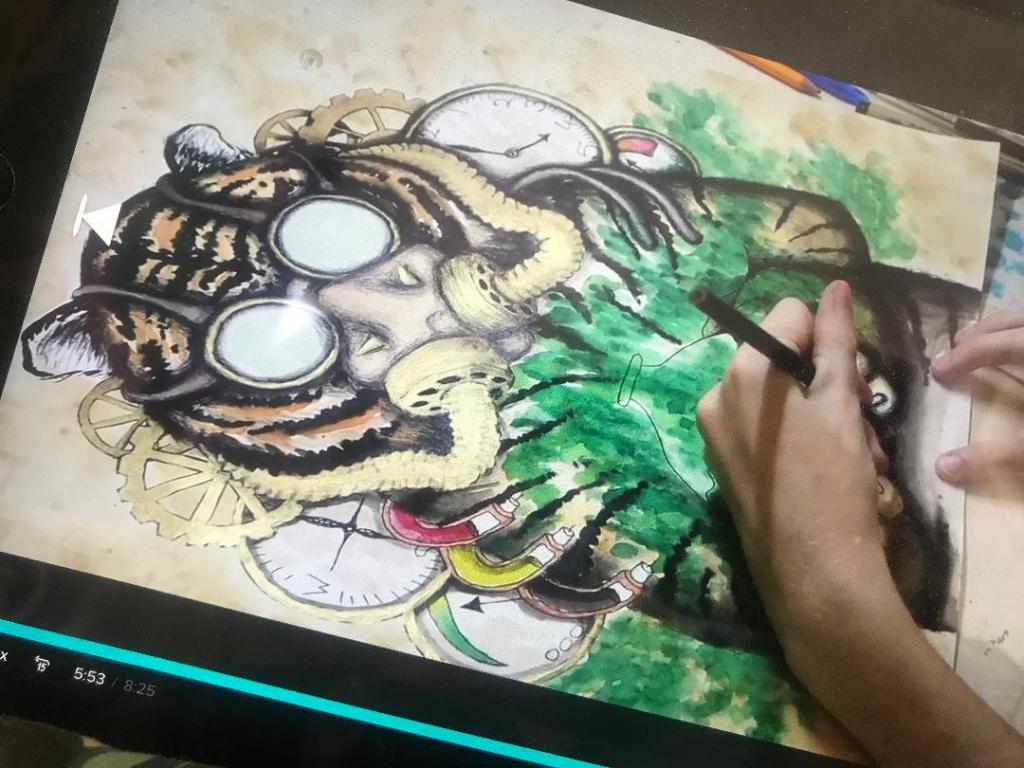
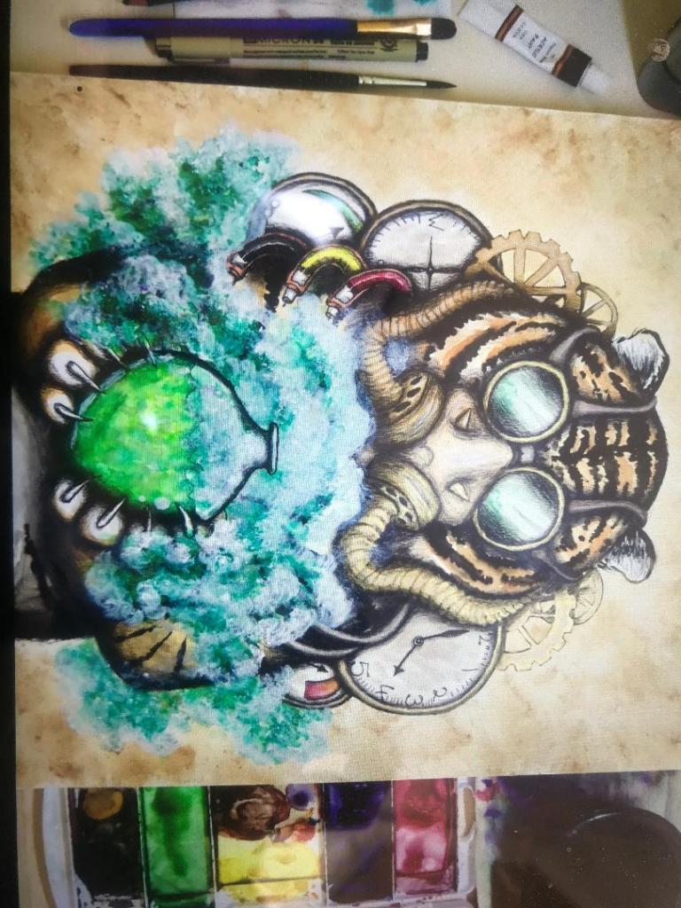
I then decided to look at tutorials showing me how to draw Steampunk inspired drawings. I came across one on Skillshare by an artist called Charlotte Jordan in Florida, she takes you through step by step some of the techniques and methods behind achieving Steampunk.
The above images are screenshots of her class. I love the Tiger piece, I love the smoke and colours from the bottle. This inspires me to try and do similar with my own designs, Tono Bungay for one in particular. Smoke is a big part of Steampunk.
What makes books timeless throughout the styles and years?
Who are some famous book designers and why is their work successful?
These are all the questions I need to answer to help me effectively with my designs.
I watched a video on skillshare by Chip Kidd, an american Graphic Designer and Book designer about what makes good book design. He shared some of his favourite book covers and then showed some of his work also. He shared tips and pointers; some of which I actually already knew about how to go about designing a stunning contemporary cover.
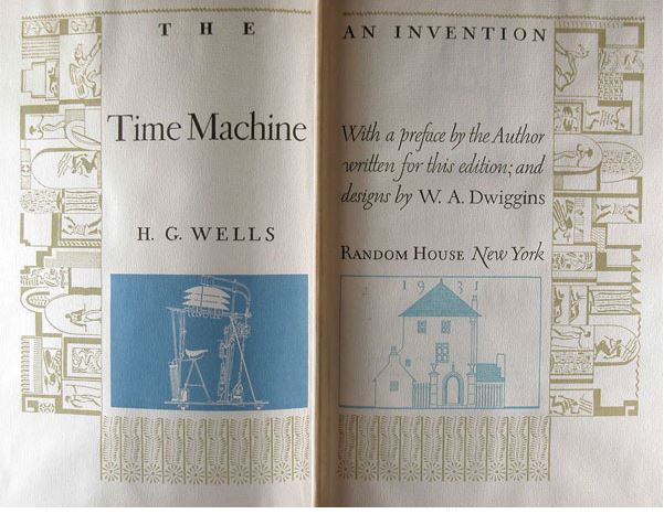
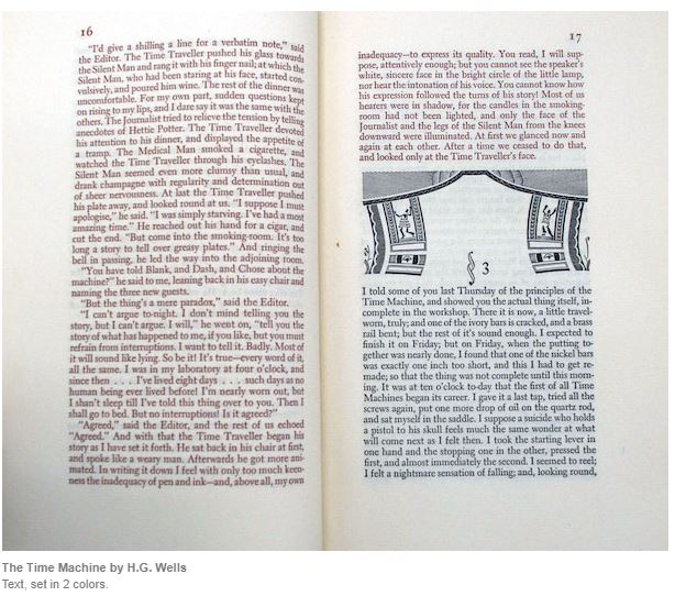
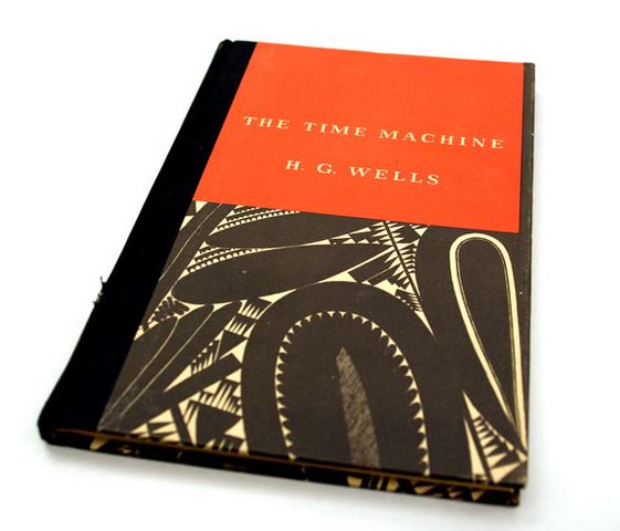
To my surprise one of the first books on his “show and tell” was actually The Time Machine by HG Wells! The design and cover he shared is a rare edition published by Random House in 1931. The designer was William Addison Dwiggins; I shall admit that before I sat down and read about him and his work I did not know much about this designer who first coined the phrase “Graphic Designer”.
I was shocked at this cover though because I actually thought it was modern! When I realised it was designed in 1931 I was thinking “Wow…. this is what a timeless cover looks like!” I then sat and thought about what made it so timeless… the hierarchy, the contrast of the complimentary bold striking colours, the simplistic serif typeface (I believe he designed this himself!), the image used is stripped back to its simplest form…. It is minimalist. I think it works because it is minimalist.
Something a stranger in a shop told me once during light chit chat when I said I was trying to juggle 20 metaphorical balls all at once!! was to “keep it simple”, life in general.. This rule applies to great design I think.
The great thing about this book is the attention to detail. Dwiggins really pays attention and puts love into all the pages. The cover is a masterpiece in itself but then he goes further by adorning the preface page with illustrations and then the inside covers he illustrates what he believes is what the time machine would actually look like. He goes into radical thinking by creating the Random House publishing logo as part of his illustration; he makes it the house from the story in his illustration.
I am now searching for a copy of this book! I want to own a piece of design greatness! It is a hardback version however; I would be designing a paperback cover. At the start of the 20th century paperbacks were brought in, shortly afterwards Penguin came about and this really saw the rise of the paperback as a “lifelong” book. Books that could be used over and over again and stand the test of time.
He did “show and tell” on a few more book designs and designers. Some of the designers he mentioned that I could look more into are:
Jan Tschichold – He designed the popular Penguin book covers. Visual hierarchy is everything with these books. The layout is iconic.
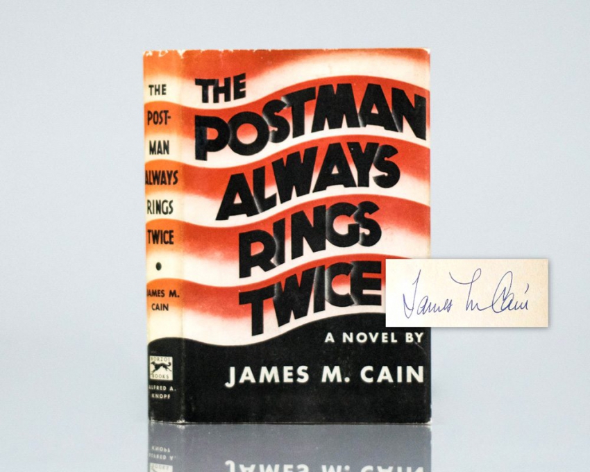
Arthur Hawkins Junior – He designed with Typography – iconically with “The postman always rings twice”
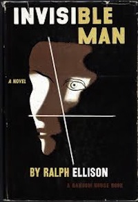
E McKnight Kauffer – The invisible man – He took vintage classics and put a modern, minimalistic approach to them. He designed mostly posters.
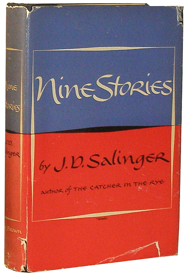
Miriam Woods – nine stories – although I really do dislike the typography on this!!
Shirley Smith
Peter Saville – Minimalism – Designed the Joy Division cover bringing Content and form together.
Jan Tschichold work for Penguin Books. The visual hierarchy is what works here. Publisher at the top, book info in the middle and logo at the bottom – all separated by bands.
Where do you start with designing a cover?
I need to look at previous editions of the books I am designing for and see what could/should have been done differently and what has been overlooked. I have to create something that has not been done before; it needs to be timeless and stand the test of style through the ages.
The cover visually tells the story of the book at first glance, so how do you go about knowing what to put on the cover? what images? what pictures?
I have read pages of all the books to try and pick out details about the characters, places in the books, items… anything that is relevant to the overall story that could be used for the cover. As the books are meant to be a series, I also thought that trying to find a link between all 3 books to tie them together would be a good idea; something that all 3 books have in common to use on all 3 to make them a “unit”. The only thing that springs to mind before I do some initial ideas is science, love and war!
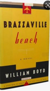
Chip Kidd went on to explain a cover he did for Brazzaville Beach in the early 90s. He said that one of the (possibly) least important things in the story (but one that was repeated throughout the story) was the fact that the main character smoked a brand of cigarettes. Kidd has an interest in cigarette packets and their designs so decided to incorporate this into the design. He made the cover of the book resemble a packet of cigarettes, the type that the main character might smoke. I think that this is an example of radical thinking; he has approached it differently, instead of using the most obvious images for the cover he has looked into finer details and used something that might have otherwise been overlooked.
From doing my brainstorming ideas the other day I did write that I had noted Ann Veronica kept a dissected frog in a jar.. I think that this is similar to what Kidd did with BrazzaVille Beach. I haven’t taken an obvious object or being such as an image of Ann Veronica herself, but taken something that tells you about who she is as a character, her interests, the science link but doesn’t directly tell you what the book is about.
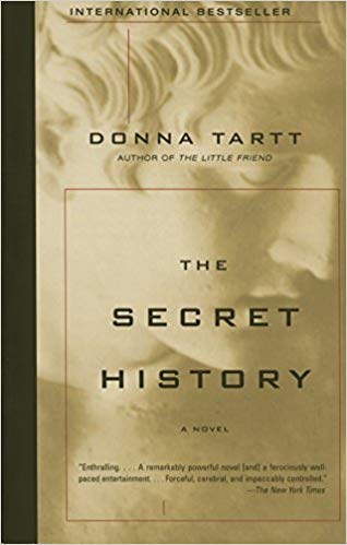
Kidd also talked about book covers. The fact that when timeless books are worthy of being classics they are protected by being covered in a shiny, film like protective cover. (Libraries, classic bookstores do it..) He decided to automatically add this value to one of the book covers he designed without it even having to become a “classic”. The book was “The secret history” it added appeal to it because it already looked like a classic.
Kidd talks about “taking homage” basically meaning find anything that gives you inspiration and draw upon it to help you with your designs. I feel I do a lot of this already but it just reiterates for me the importance of noticing everything around me and using it, recording it whenever possible!
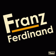
He went into art movements of the early 20th century, something else I know I have knowledge of but that I need to look further into. The movements he spoke about were De Stijl, Art Deco, Futurism and Constructivism. Possibly one of the most iconic (for me anyway as a teenager!) was Franz Ferdinand album art which was influenced by this movement.
Here is a little slideshow of books and ideas Kidd touched upon! I really enjoyed the video and I feel like I have learned about designers and techniques I previously knew nothing about.
Having looked into HG Wells who he was, what he wrote and learning a bit more about his life I now need to decide which books of his to choose and design covers for.
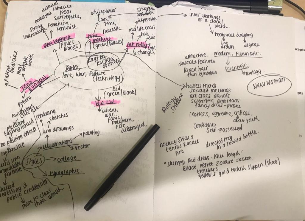
I did a bit of brainstorming around some of his books that caught my attention the most.. I brainstormed around the plot of the stories, key words, events or things within the story which may help inspire my designs. I have come to realise that all his books are based around Science, love and war, a lot of them are rags to riches tales which I quite like the idea of.
The books that I took the most interest from were a mixture;
Ann Veronica
The Time Machine
The history of Mr Polly
War of the worlds
Tono Bungay
Ann Veronica
Strong, independent, feminist, “new woman” middle class, sufferer, suffragette, 1907, ambitious, rebellious, love, science, black hair, narrow eyebrows, attractive, delicate, feminine features, she has a dissected frog in a jar, a pigs skull on her wardrobe, black shiny covered notebooks, hockey and tennis racket in her bedroom. She owns a red (risque) knee length dress, gold turkish slippers and a pair of (shock, horror!) trousers (controversial for the time!) fancy dress ball as a pirate
Tono Bungay
potion, miraculous cure all, pleasant tasting liquid, no positive effects, ineffective, turns into a formidable fortune, was successful due to skilled advertising and public credibility, most creative novel, science
War of the worlds
aliens, war, panic, mayhem, fire, destroyed, war
The Time Machine
white flower, cogs, time, futuristic, technology, love, science, time travel,
The history of Mr Polly
struggle, depression, poor, middle class, mid life crisis, ambition, changes, unfulfilled, smart, hat, suit
Ideally I wanted to choose books that were published around a similar time era so that they would work better as a set and also because the style and art influences would be from the same eras… however I think I am going to choose Ann Veronica, The Time Machine and Tono Bungay.
I started reading the first 90 pages of Ann Veronica an hour ago to give me a better idea of the plot… Who are the characters and what kind of girl Ann Veronica is. I feel like it is important to go into depth in this research because details make better designs! Knowledge is power! (or in my case knowledge=better design outcomes!)
For anyone wanting a cheeky link to a free online version of the book:
I like the fact she is a rebellious, ambitious young girl trying to put her mark on the world. I feel that because I am in a similar situation myself a century later I can try and put a modern take on this!
The time Machine – I have chosen this one as it was his first novel and the fact it is still relevant today – time travelling is still a popular concept today. I felt like with the science and technology background to this I could do a lot with it design wise too. When I think of this title I see cogs and clocks and I got the idea in my head of trying out a futurist style technical drawing of inner workings of a clock as art of the design.
Tono Bungay – This is the title I know the least about; I did look at reviews online though and one really helped me. They stated that the book is basically about a “potion” that was successfully yet falsely advertised and sold as a miraculous-cure-to-all remedy when in actual fact it was nothing more than just a pleasant tasting liquid! This is apparently the most artistic of HG Wells work. I feel like this title gives me more scope for designing more than some of the other titles.
What do we know about these books?
We know that they are timeless classics.. unaffected by time and styles. HG Wells was English and the locations in his books are either real or fictional places in England. I need to combine both of these into my designs to really make them authentic.