
Hello and welcome to my blog post for my Photomontage exercise!
Contents of this post:
- Foreward and final design
- The Brief
- First ideas/sketches
- Research
- Digital Development
- Final mock up and design outcome
Foreward and final design
I felt it important to write a foreward for this blog entry as I made a point of posting a sensitive, censored design on my Instagram account (@Pink_Angeleno). I linked this post to my Instagram so that people could see the final uncensored design and to also learn some facts and my thoughts and feelings behind it. This subject is very close to my heart and it is because of this that the final design for this brief might be considered a little too strong and controversial for some. This is totally OK! Keeping in mind that everyone is entitled to their own views, I respect that there might be differing opinions to my own (especially on social media) so decided to keep this design mostly to showcase on here for the purpose of my coursework and blog only.
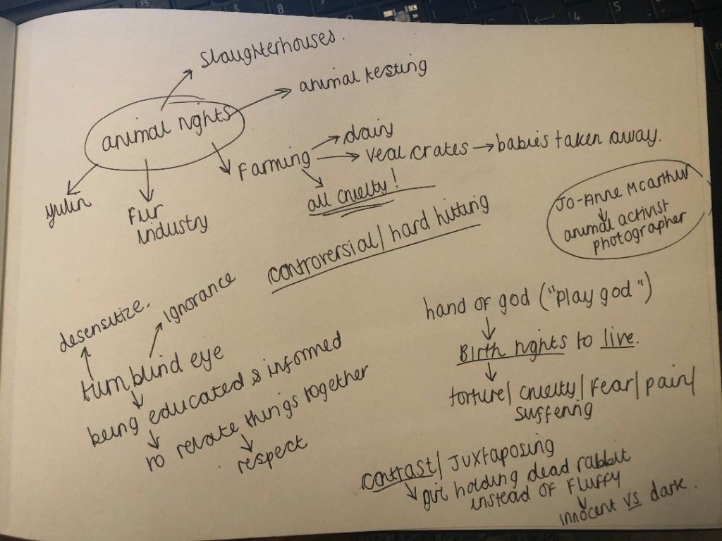
The brief required me to create a photomontage piece around something “political”; animal rights was an option to choose from. I instantly knew I wanted to base my design around animal welfare. Since I was very young I have been aware of the treatment of animals all around the world, (Thanks Mum for educating me with the Animal Action magazines back in the 90s!). I have always cared about animals and I consider to be well educated on where food and animal products originally comes from. It was only though when I started to dig that little bit deeper below the surface that I decided to live a meat free life from the age of 21. The image that haunted me the most from one of the magazines I read as a child (eventually my mum had to stop my magazine subscription because it upset me too much) was a new-born calf placed inside a lorry ready to be shipped abroad for a horrendously long journey ahead, to have a short life (16 weeks) inside a tiny little crate before it would be slaughtered for one meal for someone completely ignorant and oblivious to only be completely forgotten about by the next meal. No mum in sight, nobody to love it – I remember feeling the heartache when my mum explained what long but short journey that little calf was going on and the urge to want to help it. I guess 25 years later this is my way of trying to justify that.
Everyone is entitled to their own views and opinions and I would never shove my opinions, thoughts or vegetarianism down someone else’s throat, this is not what I or this is about. I have friends, family, my boyfriend who eats meat… I mean, hell! I even have to feed my cat chicken with my bare hands!! I have friends who go out shooting rabbits and pheasants just for fun… This is just the way I live though, my journey, my thoughts, my feelings.
In my opinion it’s all about respect. It is about being educated enough to know that every living being has a right to be respected and that every single creature on this earth has exactly the same birth rights to live, breathe, love and to not endure intentional pain or suffering. We all bleed the same way, there is no hierarchy to our intelligence or to mankind being considered a higher species, no one really has the right to “play god”. I think that when we form respect for each other and for the planet and its animals we become more compassionate and build an overall better place to live – we become educated to then make more informed decisions. Whether they be the same opinions or not.
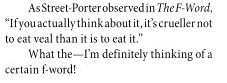
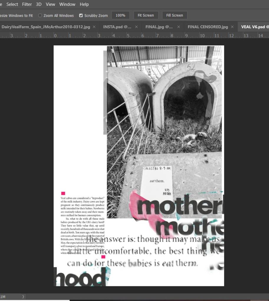
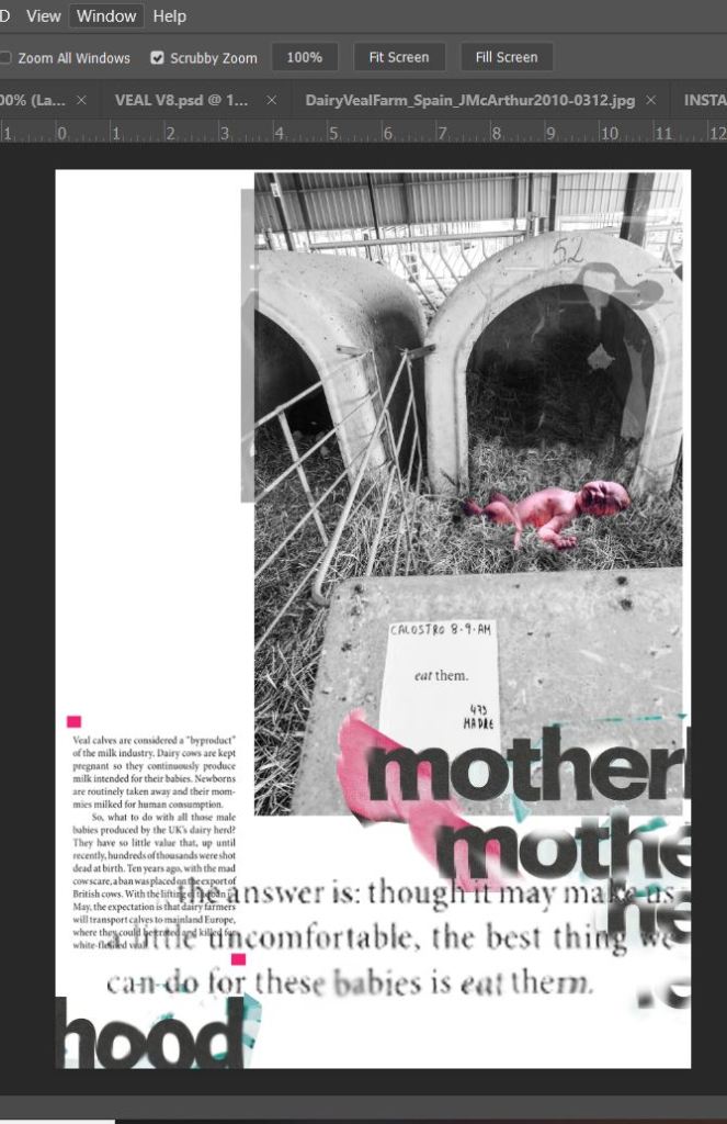
I had to laugh to myself though when I started my research for this exercise and found an article online featuring a celebrity backing the food television programme “The F word” a highly paid, arrogant show which cooks up dishes that no mere, ordinary mortals would ever be able to afford the ingredients to let alone cook (or in my case want to cook!) themselves. I quote “celebrity food fad”. In this particular article the celeb in question claims to have been “educating” people on “good veal”. The views I state I cannot stress enough are entirely my own, but having read this I believe she ironically is the only person uninformed, uneducated and completely in a state of “ignorant bliss”. She obnoxiously does not seem to make a connection between life and food. It makes compelling reading. I have included the shocking, hilariously uneducated snippets from it on my final design, I will put my hands up, she did not write some of these quotes – she clearly wasn’t the only idiot writing in this article.
My particular favourite quote from the article being: “the best thing we can do for these babies is to eat them”. Why?! Can we not just simply leave them alone and let them live?! I am sure there is more to life out there than needing to eat veal.
My second favourite being the absolute irony and p***take that Veal is “especially liked by young children” How funny eh? babies eating babies?.. go figure.
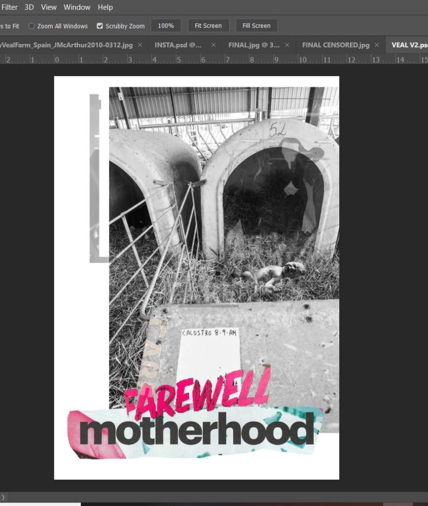
Talking of babies, this is where controversial and sensitive enters my design. Calves are ripped apart from their mums as soon as they are born, the lucky ones are wheel barrowed a short distance to live for 16 weeks in what I can only compare to what look like masses of white war gravestones. A tiny confined crate where they are chained, cannot move, turn around or groom themselves just so that their muscles become tender and unformed for the meat on someone’s plate to be “good, delicate, pink rose veal”. For the unlucky souls they can be shoved onto lorries and shipped abroad as young as 2 weeks old to places like Spain to again have the same lifespan and bleak future. These calves are so young and long too feed from their mother so much that they have been known to try and suckle the very hands of the humans that then go on to torture them. They are babies, babies starved of their mothers and their mothers milk. A baby refused their right to be loved by a mummy and to live. This is where my opinion creeps in, calves are no different to human babies being stripped of their birth right and their mummies… cue my controversial childbirth image replacing a calf in its veal crate…

My design is a nice little nod to Raygun; David Carson, Chris Ashworth and the newbie on the scene -Roy Cranston but more of that fun stuff later in the post! The childbirth photograph was taken from Pexels; a free stock photo website where you simply credit the photographer at the end as a way of thanks.
Thanks Vidal Balielo. A big thumbs up from me.
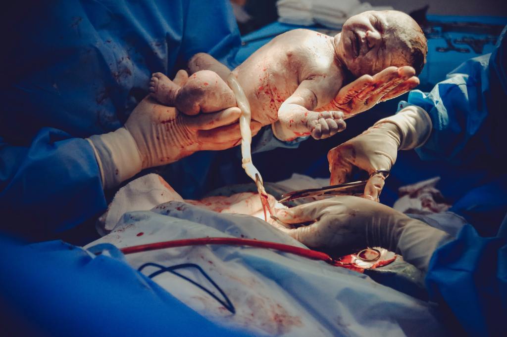

I wanted my photomontage to be strong… to have a powerful message and to push my “safe” boundary. The design is controversial but hopefully not too controversial to really offend or upset people, that was never my intention. My intention was to highlight a connection between humans vs. animals. In the photograph I have used on my final design (courtesy of Jo-Anne McArthur and We Animals) the farmer actually calls the calf Joanne; named after Jo-Anne McArthur who photographed the image, but it also shows how the farmer has made the connection to call the calf a human name. There is no difference between us as humans and the animals at all.
The Brief

When I first read this brief I quite liked the sound of it. I have experimented with type and collage in a similar way before with other exercises and assignments and this was the perfect opportunity to practise further! I am a massive fan of Raygun magazine, I love the style and layout of it and the works of David Carson and Chris Ashworth within it. Roy Cranston is another of my favourite up and coming designers. I think my overall design shows an influence from these.
First Ideas/sketches
As said in my foreward I decided to go along the lines of animal welfare and I did have a lot of ideas as to what I could do for this. I knew that I wanted my design to push boundaries and be controversial. I wanted something to be as strong as my opinions towards it. My first idea was to compare the holocaust to taking animals to slaughter. There are protests where people have called it “The animal holocaust”.
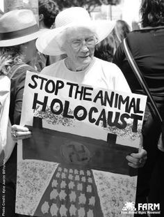
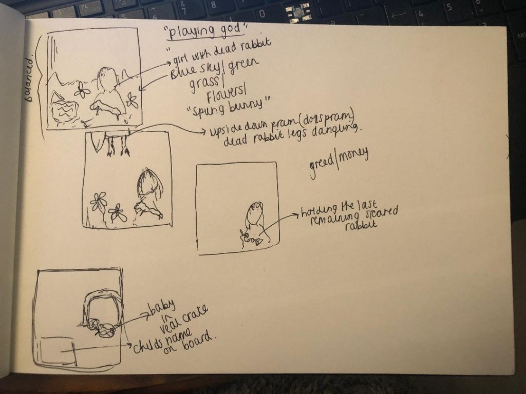
I had no idea though how I would have tastefully and sensitively montaged that together. The whole idea of it seemed too insensitive and distressing. I also had the idea of comparing an image of the 100’s of veal crates to the 100’s of white unnamed war grave stones but again could not find a justifiable link between the 2. I then toyed with the idea of animal testing and the fur industry.. a contrast between dark and innocent. For example one of my ideas was to use a little girl holding her pet bunny but instead of her fluffy friend it would be a dead skinned rabbit.
I drew some sketches out to give me more of an idea where I could go.
Research
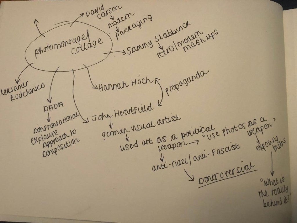
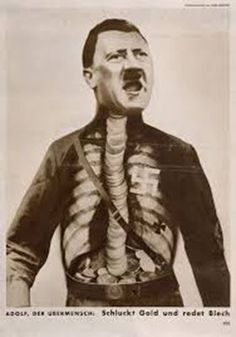
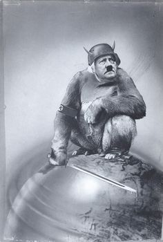
I did some research on some photomontage artists; a lot of the work was produced during the war. Propaganda, Anti-Nazi/fascist material. I created a Pinterest board of some of the images I found along with other animal rights images and then researched further into the people who had made them.
One of the most popular photomontage artists was John Heartfield. During the war he created Anti-Nazi printed material; all of it was quite controversial – controversial enough that the Germans did try and catch and kill him! This is the sort of artist I needed to indulge myself with because he produced shocking media with a message which is something I wanted to do myself with my own design.

Digital Development
I then decided I was going to choose from 2 options; the fur industry – directed towards the cruel killings of white rabbits for their fur in Spanish factories or the Veal industry.
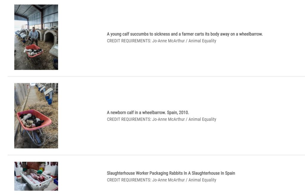
I firstly decided that I needed to get hold of some photos that I could use in my design without worrying about copyright laws. I started to look at animal activist groups that I follow on social media to see if they had any images that I could potentially use. I found a leaflet that Viva send out but the postage would have gone beyond my deadline for this exercise so I decided to venture on and see what else I could find. I searched for “controversial animal welfare advertising” on Google and came across an article about a book called “Hidden” that explores through the use of photographs the horrendous conditions and trauma that animals go through just before the end of their lives. I cannot take my hat off enough to the photographer who captures these events – Jo-Anne McArthur – her courage to put herself in a situation where she cannot do anything other than record what she sees to pass on in hope to educate us all. I then realised that as well as releasing this book, there is also a website called “We Animals”
On this website is a section full of archived photographs which are free to download. They are not easy viewing at any rate. The images themselves are horrific. The reasoning behind taking them is justified though with the fact that it is bringing issues to light and taking them out of the shadows. All you simply do is choose the photos you wish to use (I added some pretty hard hitting images) and then add them to an area on the website called “the light box” where at the end you fill out a form to request to use the images and state what you wish to use them for. There is an option to donate to this great cause too, this enables work to continue to highlight these issues that happen all over the world (which I did!).


Where I went after here was a bit of a mess! – If anyone reading this is familiar with Soundgarden and Black Hole Sun then you might be able to relate to me with the following! –
It gets much worse….. :s

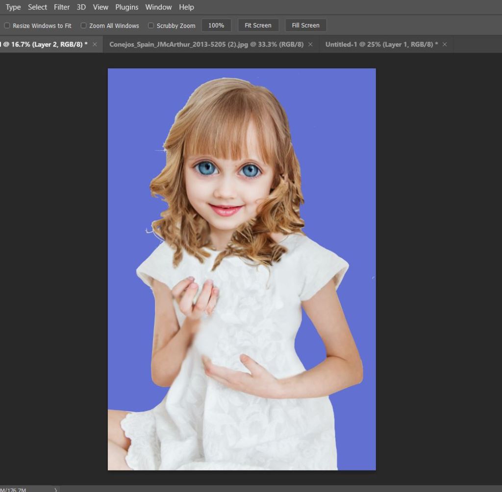
My idea here was to transform this innocent little girl with her white bunny…

…into something a little bit more hard hitting to highlight again how we look after our pet rabbits at home but then there are farms in Spain that savagely kill them for their fur and meat. It was also trying (in my head) to represent “playing god” (I was going to place the living bunny in a dolls pram!) After spending the best part of a day learning how to use the lasso and stamp tools I gave this up as a bad job. The only thing I did learn is that my Photoshop photo manipulating skills need drastic improvement! :S
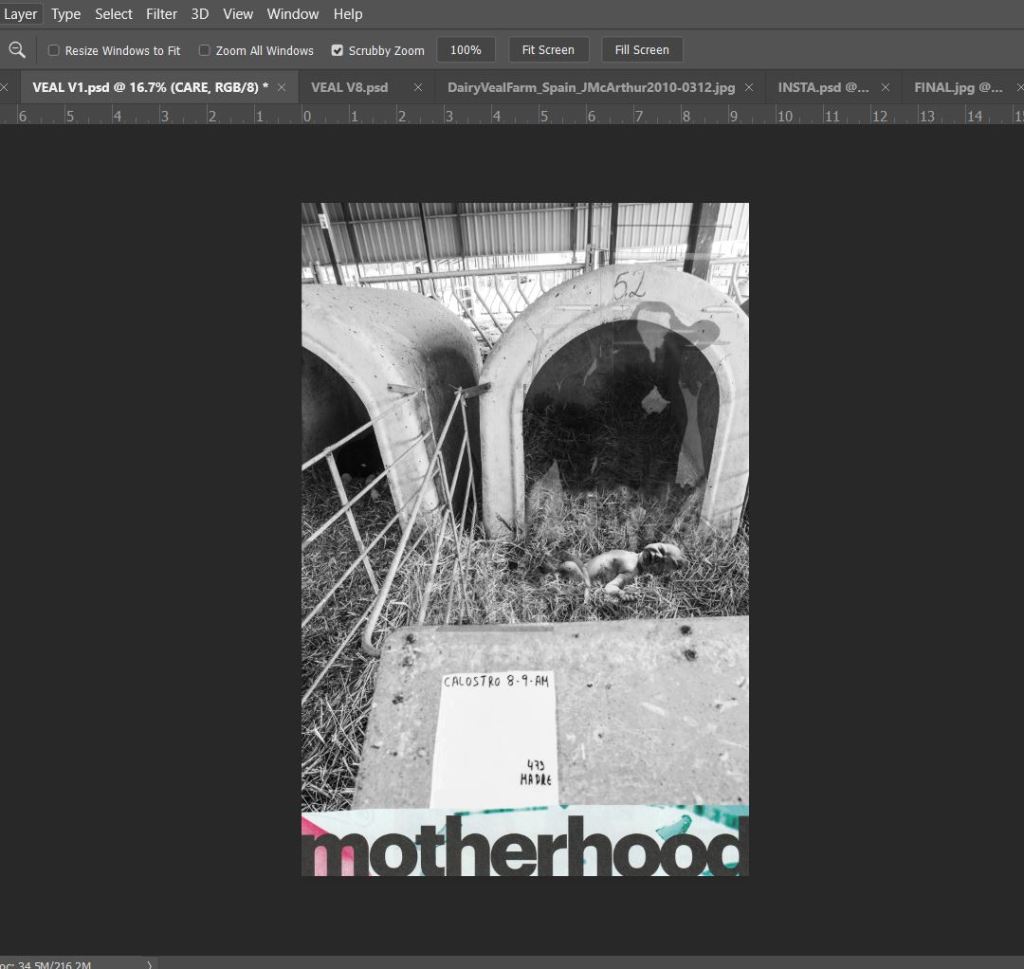
I then moved onto the idea of exposing the veal crates. This was much more successful!
I started off with the photograph I downloaded from We Animals, the photo that I chose was quite heart-breaking in itself – the farmer filmed the calf being born, separated and then placed in this prison. To further add insult to injury he then named the calf as a last attempt to relate or add sentiment to the being as though it was just a child’s soft toy.

I imported the photo into Photoshop with my idea of swapping the calf “Joanne” with a baby.
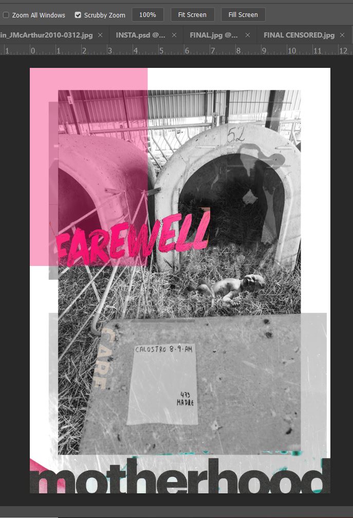
These are some of the development screenshots that I did:


Final mock up and design outcome

I am really pleased with how this looks and how it has turned out! On my screenshots above, I did a version of this but without the use of negative space and it is amazing how much better a design can look with space!! In hindsight though I could have tried a crammed packed design to represent the lack of space the calves get!..
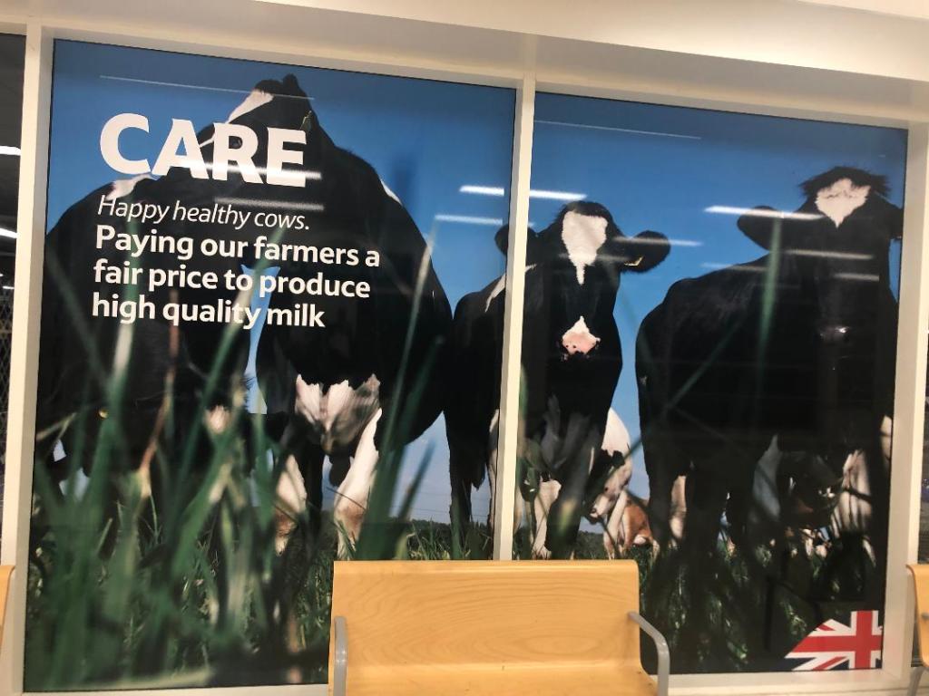
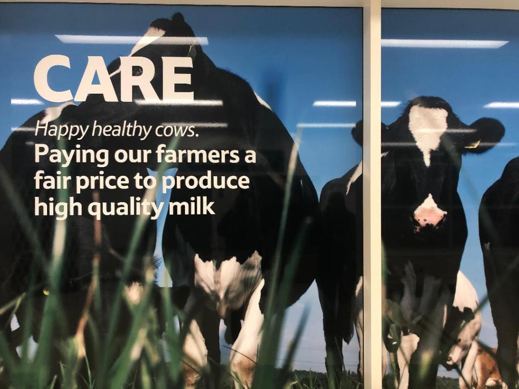
I like how in the back of my mind the work of David Carson and Raygun magazine is very prominent; I feel like this has a strong influence of that with the overlapping and manipulated text. I used contrasting colours – Black and white photography and text with a pop of pink.. why pink? Pink is very feminine and nurturing and caring – maternal. I used a newspaper article online to be the source of the body text and my captions on the front. I did not need to add text, but felt that having some hard hitting facts to support the image wouldn’t go a miss – the image speaks for itself to be honest. The photograph does not quite hit the edge of the page border – this is because I don’t want to restrict my design to a “box” I want it to breathe! I added a pink filter to the baby to show that the baby is very much living and a new-born but also to pop out against the black and white photograph. The “motherhood” text was a title that I found in a magazine as was “farewell” in my original development work. The cow in the vague background on my design was from a trip to Tesco earlier this week!


Overall I feel that I have not done too badly in this exercise. I work more in Illustrator so experimenting with Photoshop was a challenge at times – I had to Youtube and search Skillshare tutorials to know what I was doing with manipulating photographs at certain points, (lasso and clone tool) I think I managed merge the baby quite convincingly into the original photograph. I am pleased with the layout – I am using negative space more and it is making a significant improvement in my designs. I did try and find more “paper media” for more collage in this exercise though, there was not much in the style that I wanted or which covered the subject matter. I still think I have successfully met the brief though with the media ad methods that I have used.
