Part 2 of this exercise was to design layouts for 4 different commissions! – Overall I found this a very long exercise to complete! I loved designing for the typeface specimen book but by the time it got to part 2 I was finding it tedious!
I completed the commissions – but I don’t love them… I think because I was out of my comfort zone with gimmicky typefaces (and the fact I had to use several of them!) and that there was a lot of text for a very limited space. I struggled with the lack of negative space in my designs.
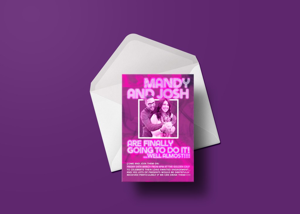
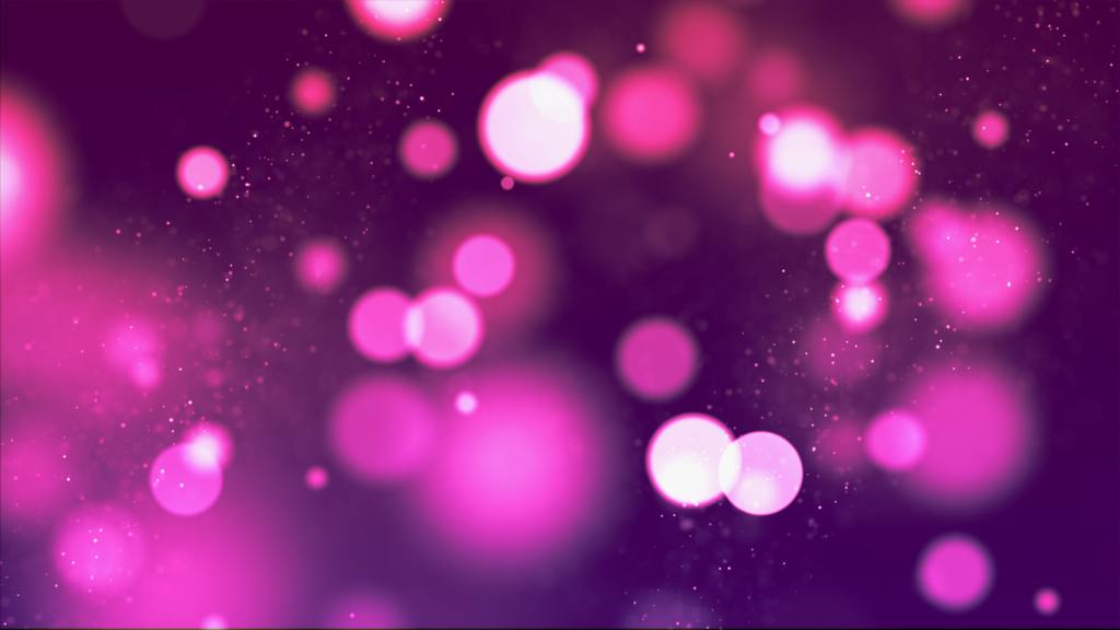
Version 1
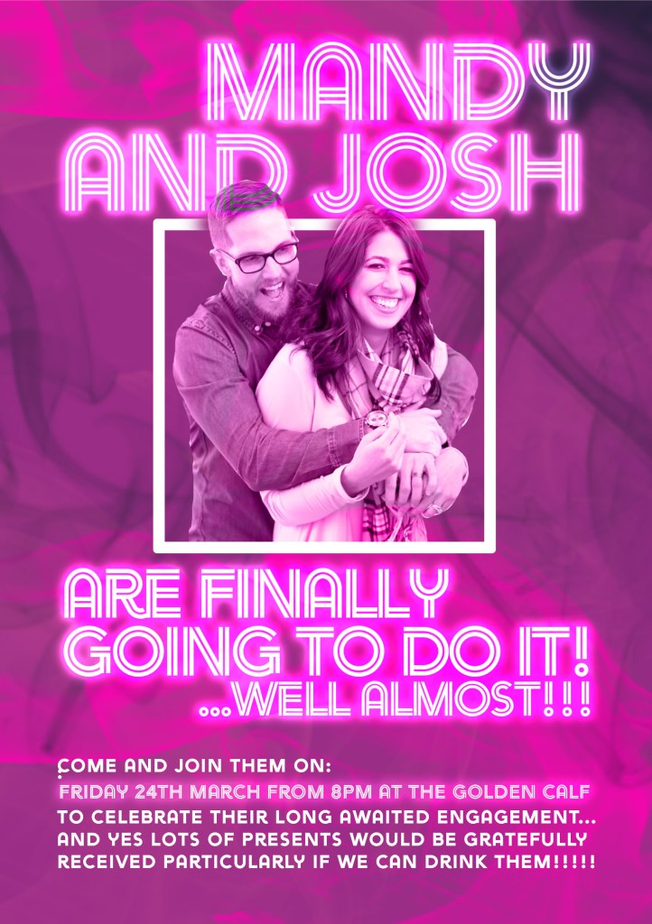
When I read the brief was to make these flyers look like a “club night” I knew it would involve making a lot of the design neon and bright! I firstly started off doing what I always do by looking at Pexels.com for a stock photograph of the happy couple Mandy and Josh. The one I found on there seemed perfect for the occasion.

I then opened Photoshop and started to create the purple background; this was a plain purple filled box with smoke effects which were created using brush effects in Photoshop and then I just enlarged the brush to make the smoke bigger. I also needed to blend the photograph in with the background so I applied a layer mask which allowed me to delete areas of the photograph to blend in with the background.
I went onto Adobe fonts and chose typefaces that would closely match those which would appear on club night posters. The two that I chose were Ayra Double for the main text and Ayra regular for the body copy. The double lettering looks like neon tubing which is ideal for the flyer that I am creating, all that was left to do was to make it look bright like neon. The way I created the neon glow was to add an inner and outer glow to the text and change the levels to however bright I wanted it.
Version 2
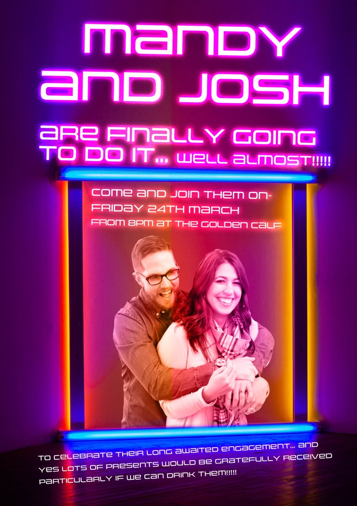
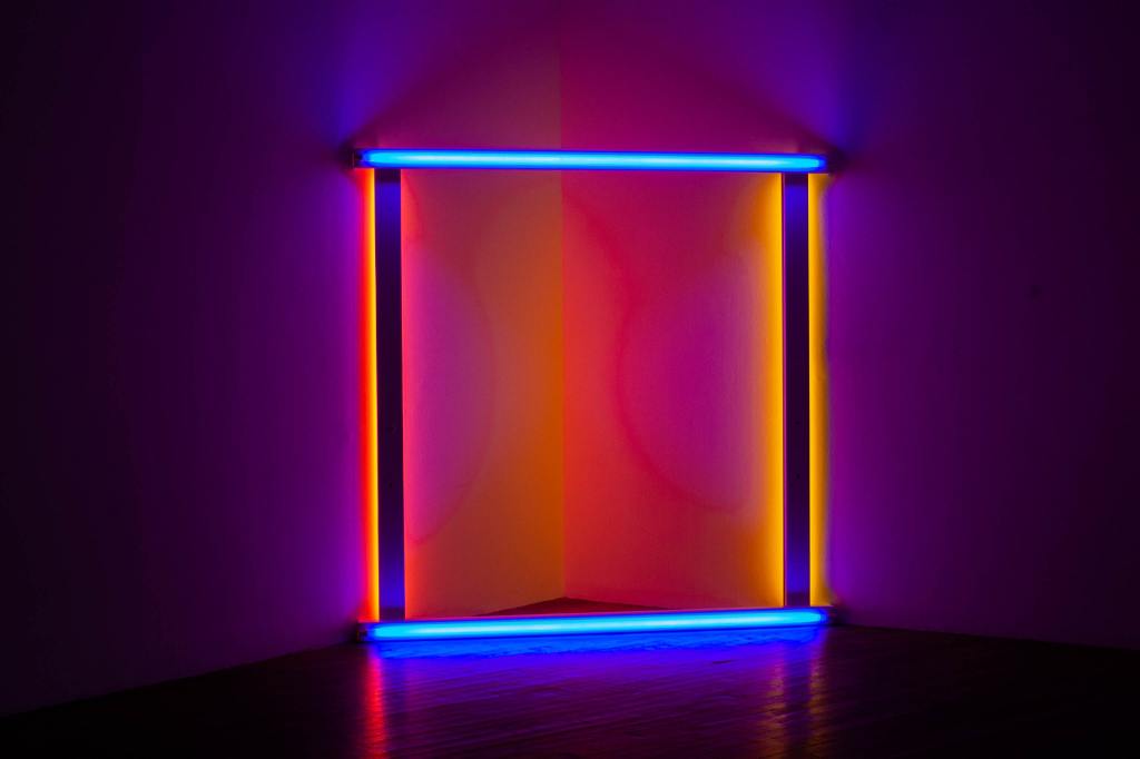
For version 2 I went along a similar club theme, I googled images of club posters and a few appeared with neon frames with images inside. Again, I searched Pexels and found an image of a neon frame which would be ideal to put my photograph inside.
The frame is at a slight angle so I replicated this with the type. I used Uniwars for the typeface of this flyer. Uniwars is very modern/techno and it makes me think of DJ decks when I see it.
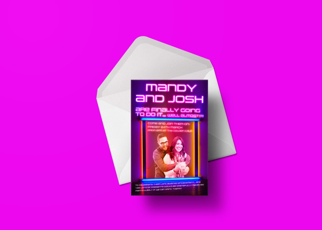
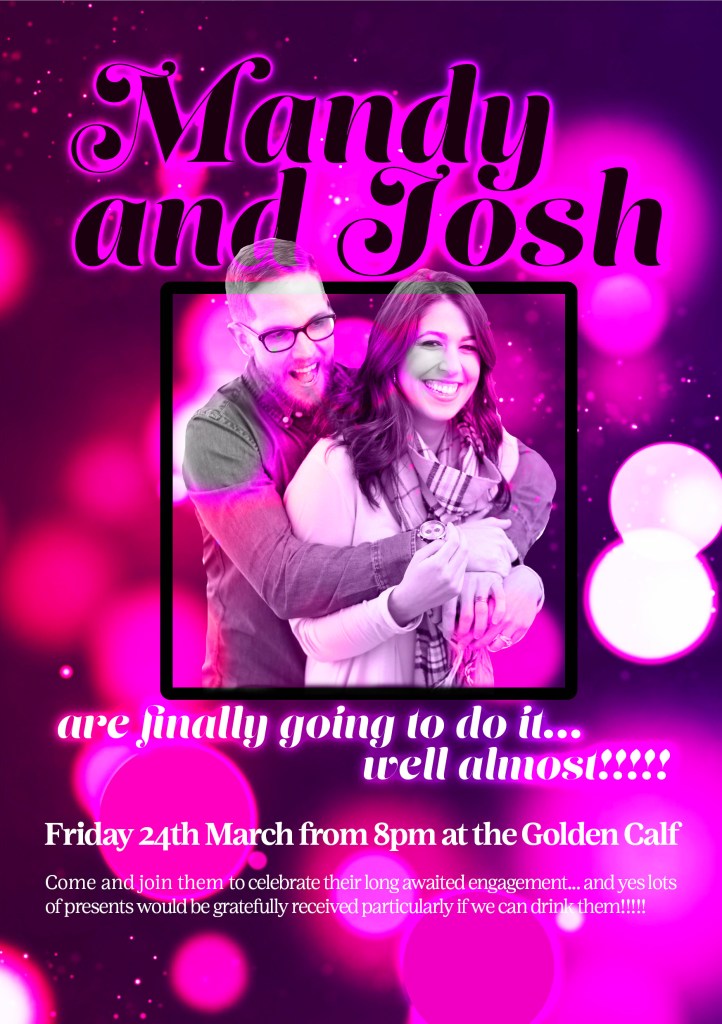
Version 3
For this version I went onto Pexels again to see if there was another “club” background image that I could use..
I found this one and decided that I could use it in my design. I altered the vibrancy in Photoshop and made it the correct size for my flyer/invite and then started on choosing typefaces and putting the photograph on there again. I changed the opacity of the photograph so that it blended in with the backdrop and then placed a black frame around them.
The typeface I used for this version were Lust Script and Lust text. Although they are the same font, they give two very different looks to the flyer. Lust text is suitable for the information as it is legible and easy to read whereas Lust Script is ideal for the attention grabbing headline of the flyer.