For assignment one as part of the first stage I have decided to research into different postcards just to see what is out there, what techniques are being used and the different approaches.
Without travelling the world far and wide to bring back all kinds of postcards I decided to instead travel to Paperchase and raid their quirky selection instead (worked out quite well also as I got a cheeky 15% discount!) Absolutely love Paperchase! 🙂
I bought 12 in total – I bought ones that immediately drew my attention, ones that are very simplistic but get a message instantly across, 2 that cleverly portray a message and a few that are very female empowered!
Here they are!….
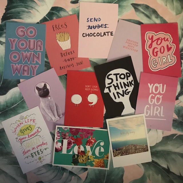
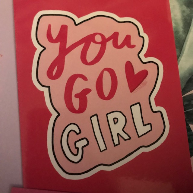
I like how most of them use pink as their main colour, this is what I want to achieve for most of my designs. I like how most of them are based around type and hand lettering; this again is something which interests me. The top “you go girl” postcard reminds me a lot of my Graphically Pink logo which I have done.
Paperchase at the moment have a section of female empowered “sisterhood” and girl power stationery. It has possibly been motivated by the #metoo movement recently, the fact that the Spice Girls have made a comeback! (YAAAAY! :P) or the fact that people (particularly females) are becoming more aware of feminism and not afraid to voice their opinions. I like this range as this is something that I mind mapped in my learning log sketchbook; the fact that my morals and values are very much “girl code” and “girls can be whoever they want to be”
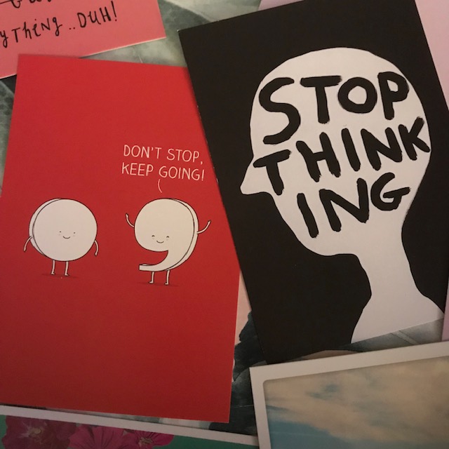
The 2 above I think are very simple but effective. The full stop obviously being the end and the comma being a break, not the end.
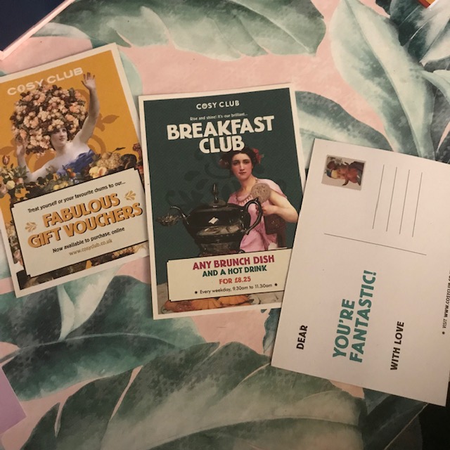
I then went and had lunch at the cosy club in Stamford and picked up some of their examples. As part of the brief it states “series of postcards” although obviously the Cosy Club are not posting these off to anyone they still advertise who they are as a brand and company. They still give you a sense of who they are. Their brand identity is very strong. All the postcards tie in together, they all have the same theme and use the same typography, same logo and very similar layouts. These are perfect examples of a series of postcards. You are instantly able to put them all together and know that they are related to the same company. This is what I want to achieve with mine.

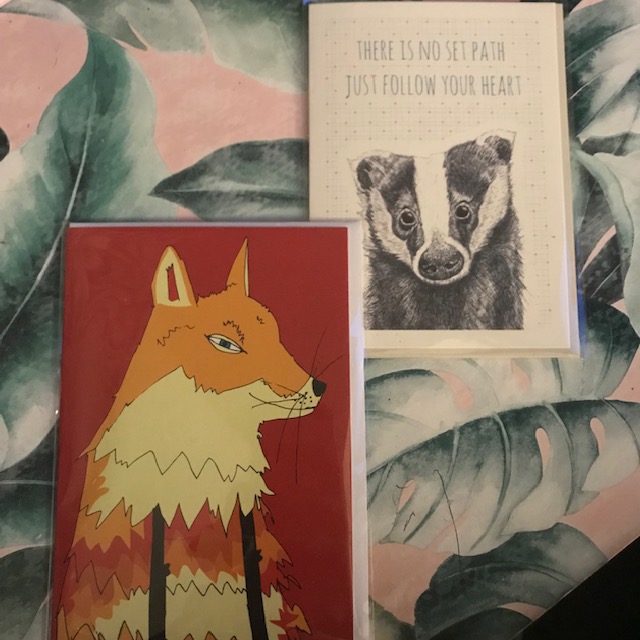
I also found 2 other cards that caught my eye – one is a black and white illustration with a caption to match and the other one is a very loosely drawn illustrator image of a Fox. I like black and white illustrations, particularly hand drawn pen rendered drawings. This is something I enjoy doing and could do for my own. The fox illustration although far from perfect has its own personal style which could be seen as unique and different.