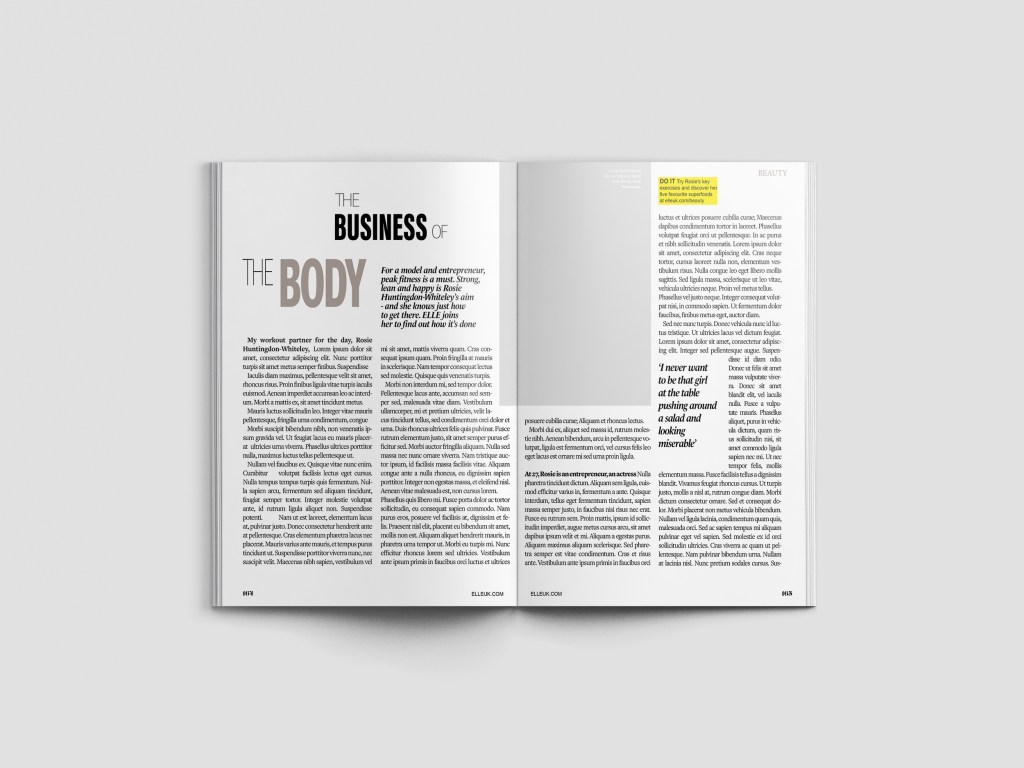
I chose an article from Elle magazine about Rosie Huntingdon Whiteley to copy from. It looked like an interesting article to copy because it has an image, headings, sub headings and uses different typefaces throughout the design. There is also an element of negative space around the title which has been arranged to suit the space. The only thing I dislike about this article is the typeface for the quote below the main title.. I just feel that it closely matches the body text in size and weight. I think that there should have been more contrast between the two typefaces, that the quote should have been written in Bold to stand away from the body text. I want to say that the quote should have used a bigger point size but I think that if the typeface was changed to a bold sans-serif (or even just sans-serif) there would be much better contrast between the two.

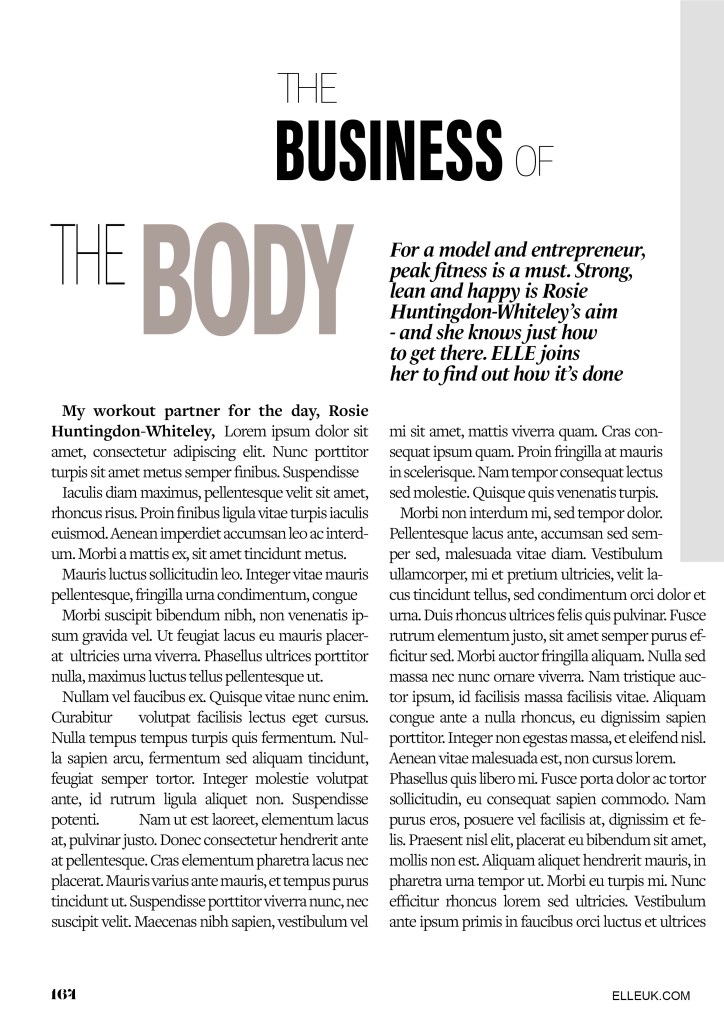
There are 2 different typefaces used for the titles.. one looks a lot like Meta condensed (a bold, condensed sans-serif) and the other is a very light sans-serif. Sans-serif are thee best typefaces to use for headings as they are easily legible and they stand out. I think the designer of this layout wanted to add an element of contrast between the 2 typefaces by making one bold and condensed and the other one light and regular so that they stand out against each other. I did an Adobe font search for all the typefaces on this layout but it did not come up with a definite answer as to what they all were; it came up with similar looking typefaces, one which was Meta condensed which I already recognised.
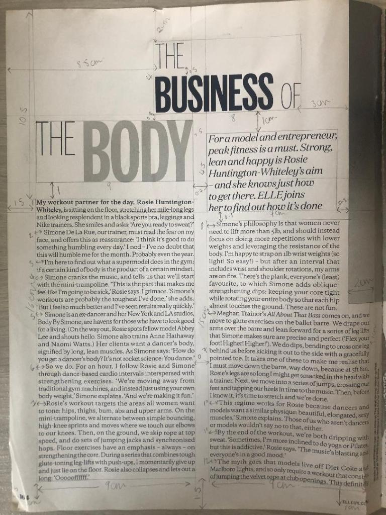
I started off with looking at the first left hand page. I measured the columns and margins, the text box sizes and the distances between the titles and the main body copy. The layout consists of the titles, the quote, the body copy, part of the image, the page number and the website in the lower right hand corner. There are 2 wide columns for the body text which fills up most of the room on the page, they use a serif typeface for the main text. The typeface that they use looks like a traditional book typeface – most high end fashion magazines use a similar typeface (popular ones like Vogue for example use Didot) this typeface in my opinion looks too rounded for Didot and again I tried to do a photographic search for it on Adobe but it did not recognise exactly what typeface it was, it just came up with similar ones. At the beginning of each paragraph it is indented which separates the text up slightly and makes it less “blocky” and more reader friendly. The text is also fully justified which is a brave, bold choice in the world of design as mostly “flush left, right ragged” is the desired choice. It just allows for natural flow and even space between letters and words which make it comfortable to read for the eye.
The quote (“For a model and entrepreneur..”) is a script, Italic typeface. I do not like this typeface although I can see what the designer has tried to do by by connecting to the audience of the magazine by using quite a feminine typeface and making the quote look like an informal, friendly chat but I feel that using an Italic Sans-serif would have looked stronger, it would have stood out and given more contrast to the layout as a whole. It probably would not looked as feminine as what it does now but it would have allowed the eye to pick out the different boxes of text easier and make it more more reader friendly and appealing to look at.
The page number is in a serif typeface; it looks very similar to “Lust” a typeface I used in “If the face fits” exercise. It is a very bold and chunky typeface with a prominent serif.
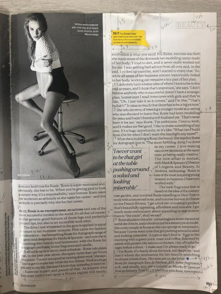
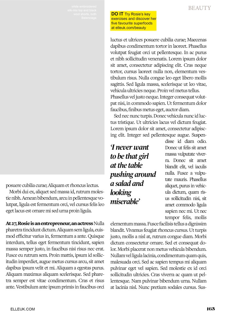
The second page again is a very similar layout; the image though on this page takes over a lot of the top left corner. The main text is again in 2 wide columns with the page number and website along the bottom margin. There is another quote using the same script typeface as before and in the same point size. Again, I measured out all the columns and margins and text boxes etc and they are all exactly the same as the previous page.
There is a yellow speech bubble at the top of the page which uses a regular sans-serif typeface. The speech bubble is in yellow which makes it stand out against the rest of the article, it is most likely in yellow to stand out because it is wanting you to visit the website.
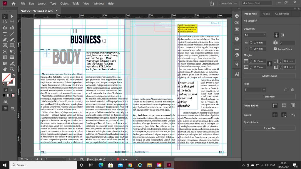
This is what my layout looked like as I was copying it. I had to choose typefaces that closely matched the original ones as Adobe fonts did not recognise what exact typefaces they were. The 2 quote text boxes were recreated using a slightly bolder typeface as I couldn’t find an exact script font like the one that was used in light.
The typefaces I used were:
Ingra Thin (for the title) – 36pt – Leading 60 – Tracking -100
Acumin Pro Extra Condensed (for the bold text in the title) –
Le Monde Livre Std (used for the quotes) – 17pt – Leading 17 – Tracking 25
Freight text pro, Book (used for the main text) – 14pt – Leading 16 – Tracking -50
Arial Regular (used for the speech bubble and website at the bottom) – 10pt – Leading 12- Tracking 0
Lust Regular (used for the page numbers) – 12pt – Leading 14pt – Tracking 0
***