The Brief
My first thoughts on this brief were that it didn’t excite me very much! This was possibly one of my least favourite exercises of this whole unit. However, it still is an important exercise because branding plays a massive part in Graphic Design.
From what I know of logo design – simple is better! Logos have to be reproduced on absolutely every kind of media: from Web design, emails, social media, advertisements, phones, TV, billboards, stationery, signage.. the list is endless! All of these media are different sizes and the quality would vary for each. For web design the logos would need to be very small in size to be uploaded.. this means that the logo must be easily legible and brilliant quality at a really tiny size!
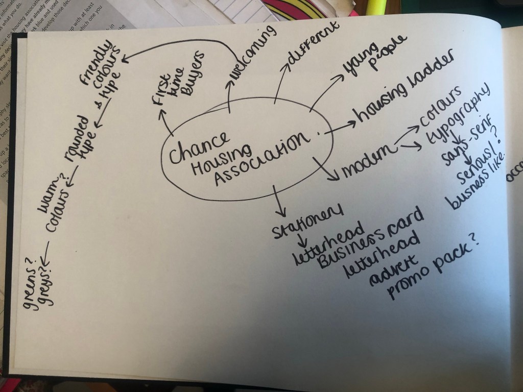
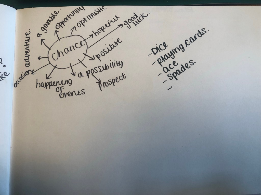
I started off by mind mapping some ideas:


Mind mapping gave me a feel for what I needed to design and where I needed to go next to move forward within the design process.
I needed to create a logo that appealed to young people and was modern in its approach. It needed to have a friendly feel but still remain professional.
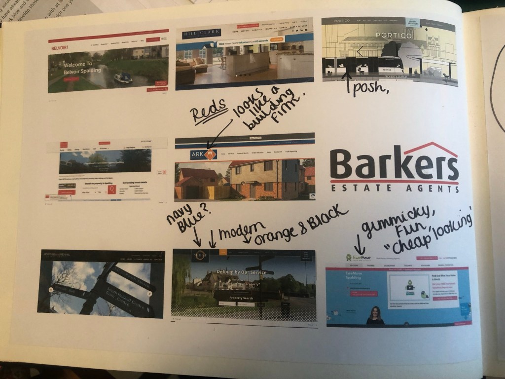
The next step was to see what is already out there; I started to search Google for existing estate agents and what their branding looks like:

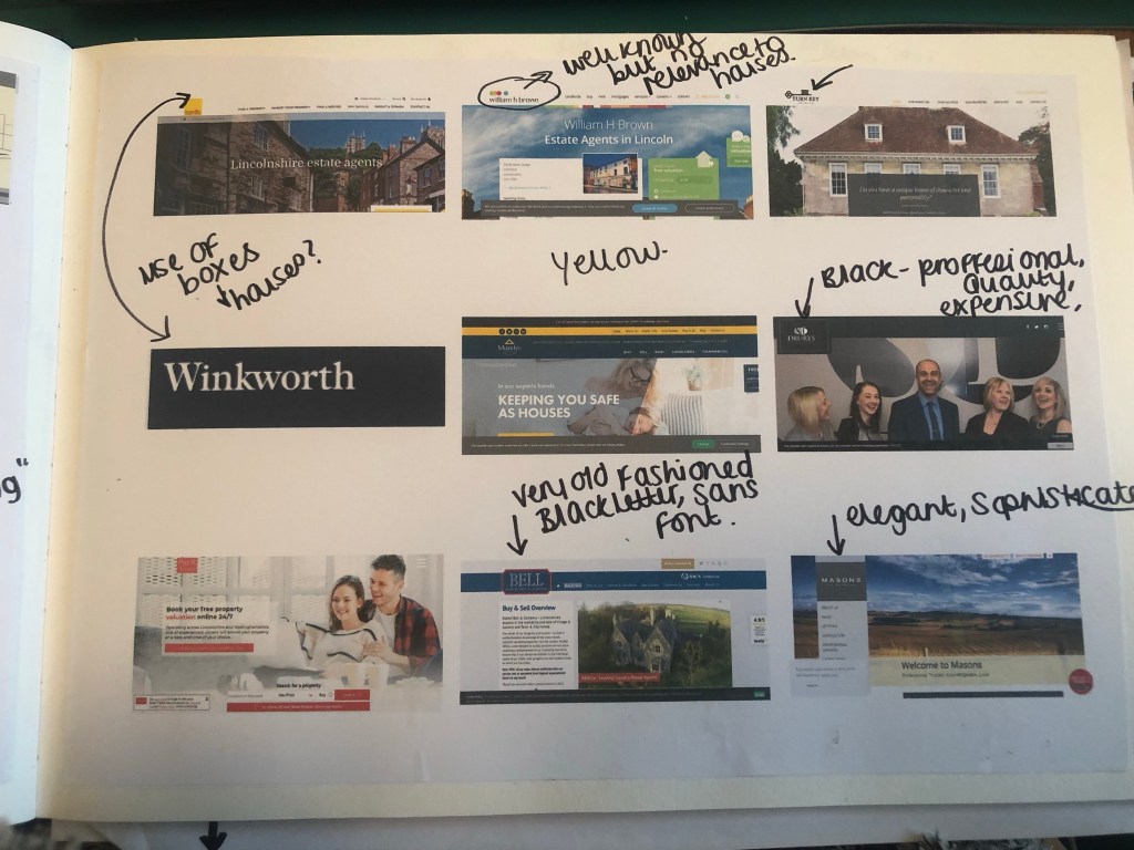
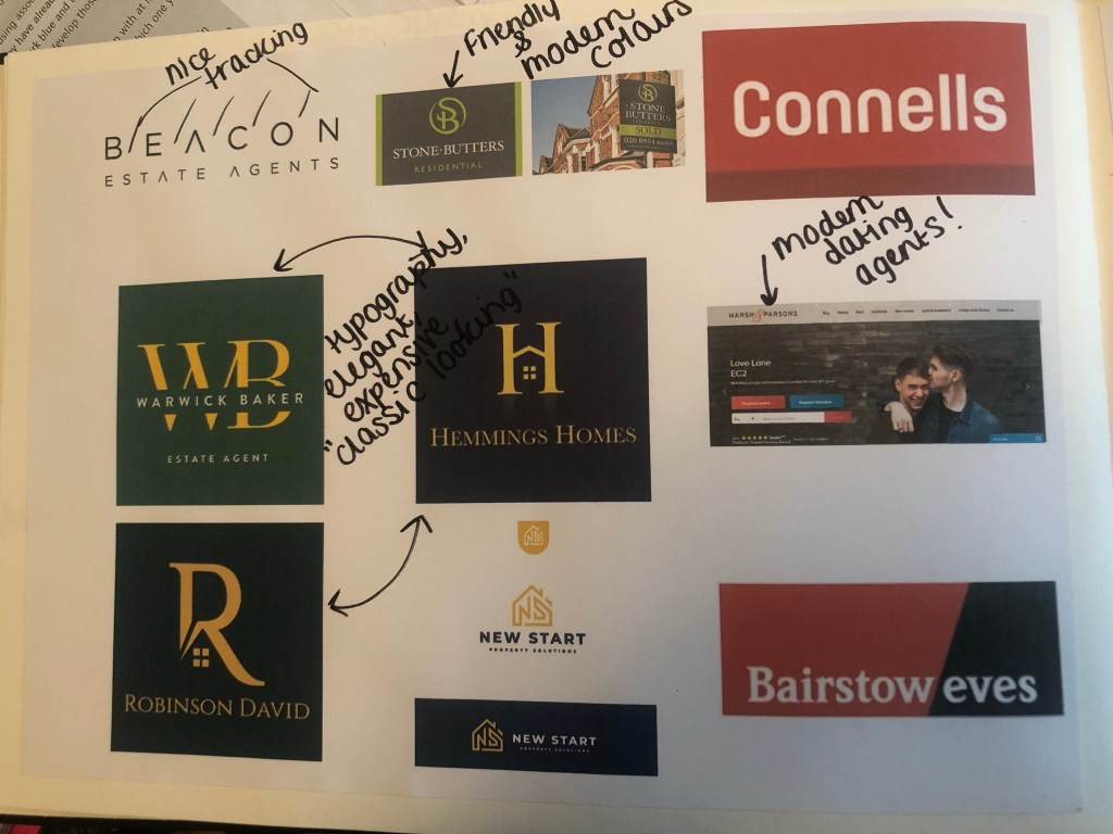
What I took from this research was that most of the logos had red in them! The popular colours were Red, Yellow and green followed closely by Blue. Blue and yellow reminded me of a building company though so I wanted to stay away from that! I decided to move away what I had seen, especially as the brief stated it wanted its logo to be “different”.
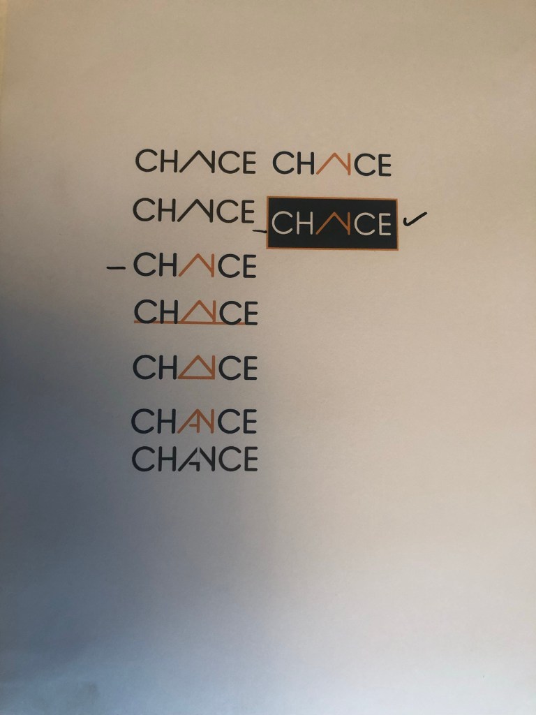
I decided that I wanted to go with Navy blue and orange! Orange is modern, fun and it stands out. Navy Blue -although it is used in other estate agents logos- is still modern but it also remains professional in appearance. They also contrast.
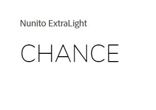
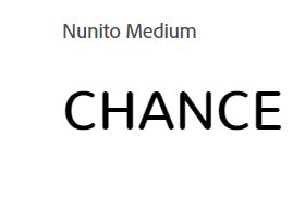
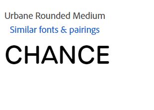
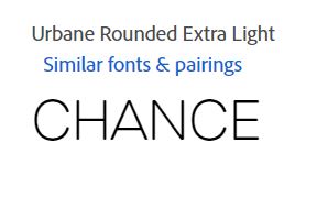
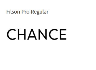
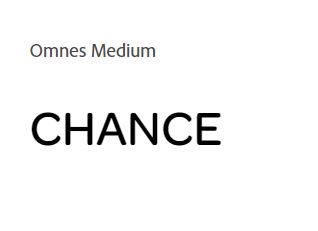
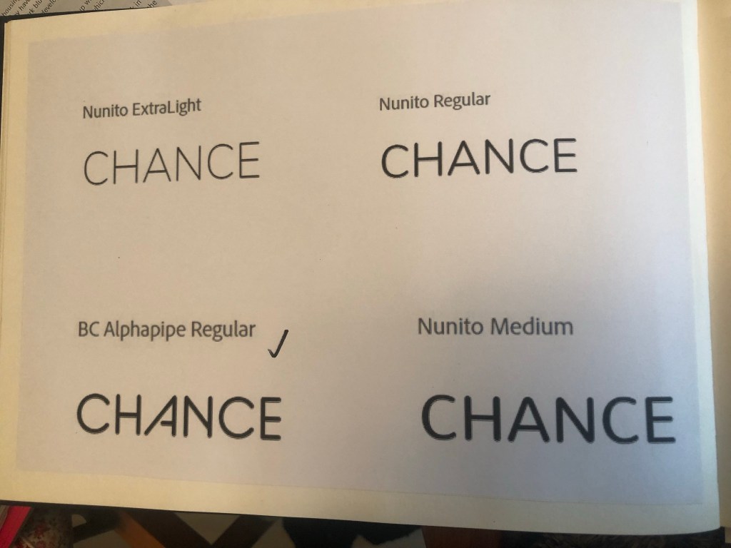
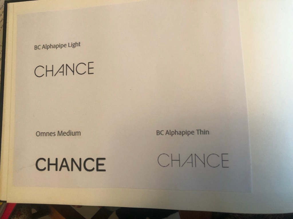
The next step was to search for a typeface that I could use in my logo. I knew that I wanted a rounded Sans-serif; rounded type appears more friendly and a Sans-Serif is legible-easy to see and read. I decided to search Adobe fonts to see what there was. I started off by finding a few that I liked:


but then I struck GOLD!…

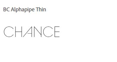
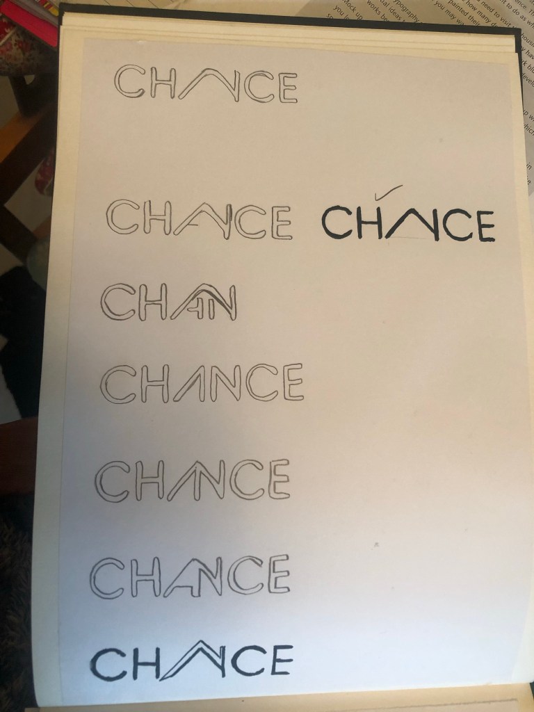
I saw this typeface and instantly saw a house in the middle of it, formed by the A and N being joined together. Excitedly I went into Illustrator and mocked some designs out.

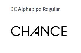
It actually worked! It was simple, used great typography.. the only thing I was worried about was would people be able to tell it says “Chance” but I myself took a chance on that because I really think it works!
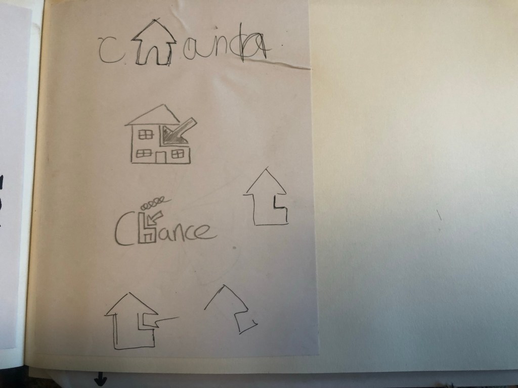
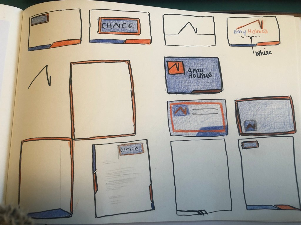
I then needed to work on the stationery for the company, I sketched up some ideas:

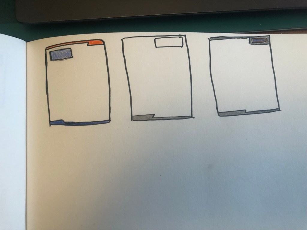
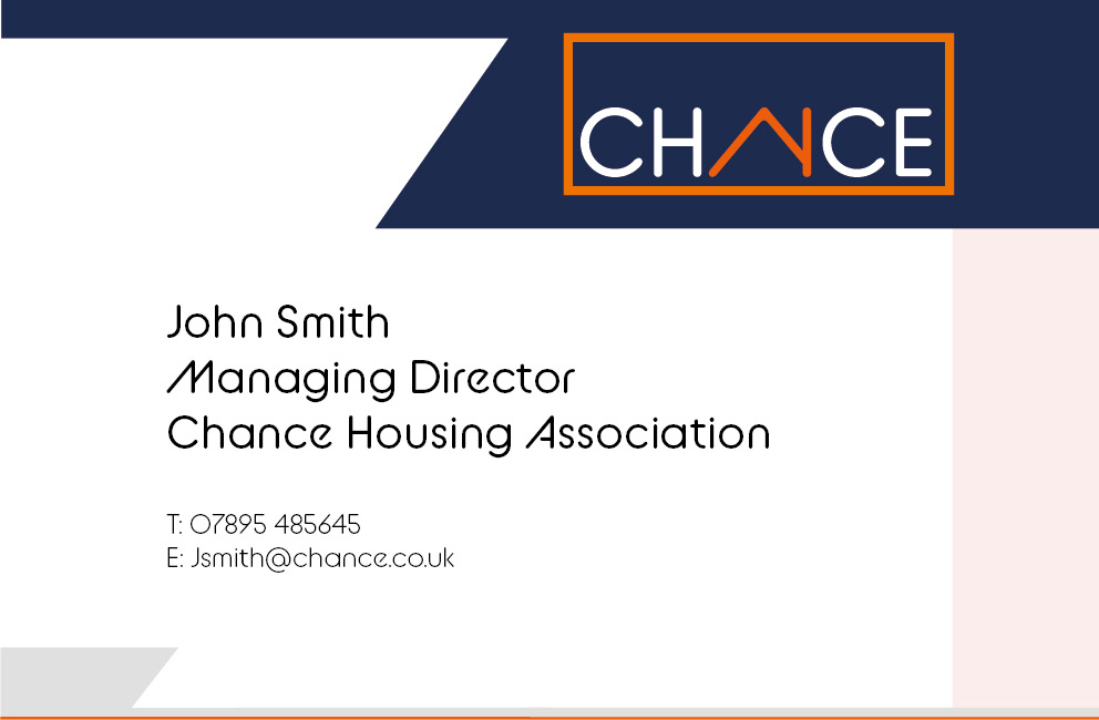
I created the logo and the illustrations in Photoshop and then imported everything into InDesign to create the stationery.
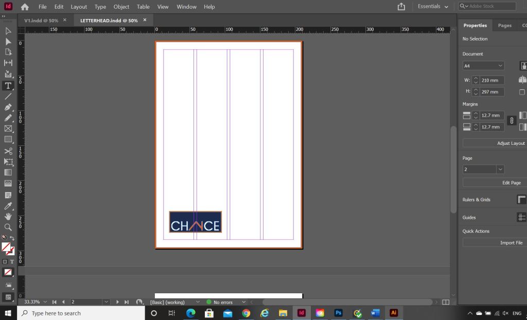


What I ended up with are these:
The top and bottom angled borders are supposed to mirror the angle of the A (or the house) in the logo.


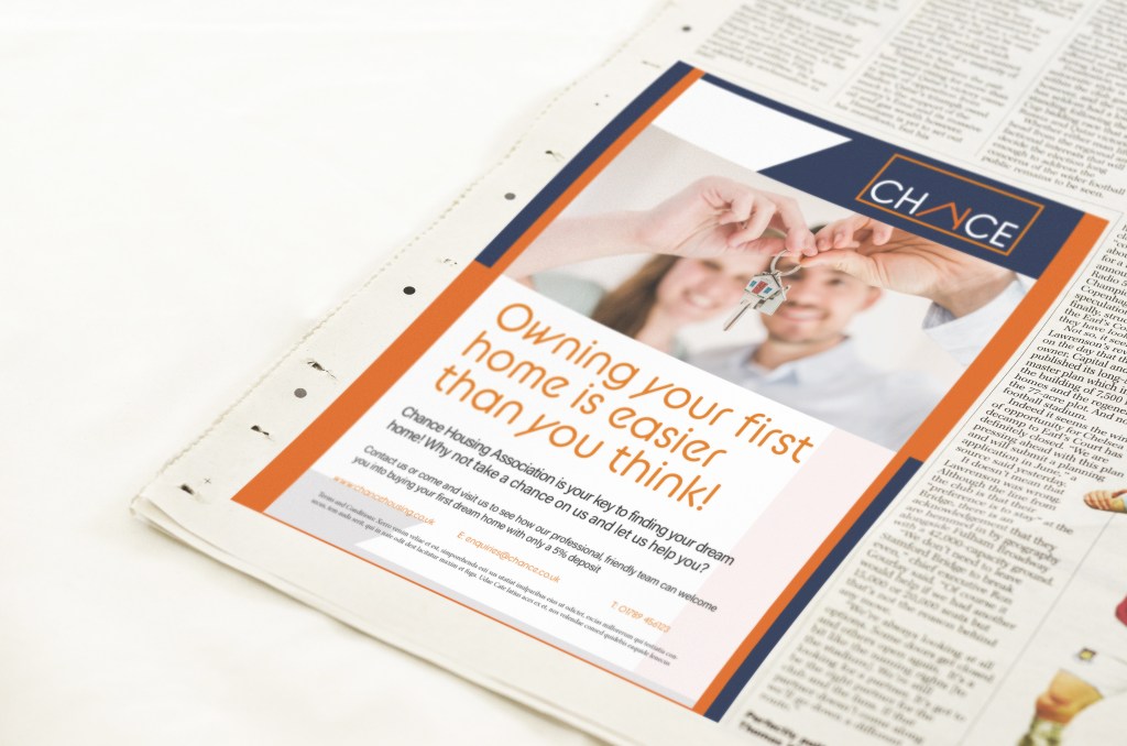
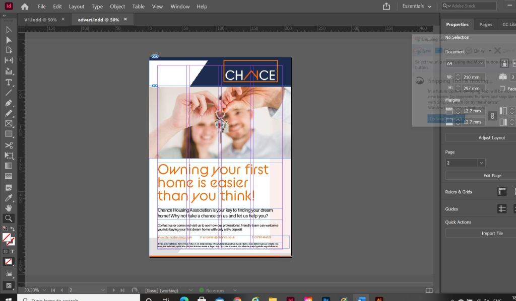
The Advert
I also created the advert in InDesign, I used the same layout as the letterhead but added the extra information that would be needed in an advert. I searched Pexels for an image of first time home buyers and I found these that I thought could be suitable for my advert:


I then imported my chosen image into InDesign and started working on the typography. I used the same typeface as the logo (BC Alphapipe) for the main heading of the advert. I then chose to use a lighter, more legible typeface for the main body text – I chose to use Acumin Variable. It is still rounded, which still gives a friendly feel to the advert but it just works better to read. I think overall the advert looks modern, bright, happy and professional. It is clear that it is aimed at young people and in particular first time buyers. It also carried through the branding from the other stationery. I feel like the stationery and advert work well in colour and also in black and white for when it needs to be cheaply reproduced.


My Sketchbook pages


The Mockups