
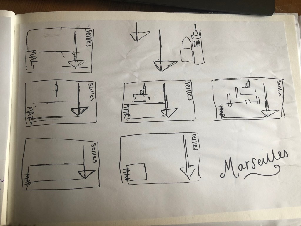
Welcome along to city guidebook number 7! – Marseilles or Marseille ?……..
Marseilles or Marseille was the first question that I asked myself! I pondered at the fact that there might b a typo in the Core Concepts design book because everywhere I looked online it was saying “Marseille” however there is a French and an English version! Marseilles it is!
In my head Marseilles is one of them luxuriously warm places that celebs and people likewise might go and sunbathe their perfectly tanned and toned bodies on the front of a yacht! CORRECT! 😀 but in all seriousness I pictured a lot of blue skies and blue sea, yellow sunshine and boats and yachts everywhere. As usual I started looking for ideas and inspiration on Pinterest.
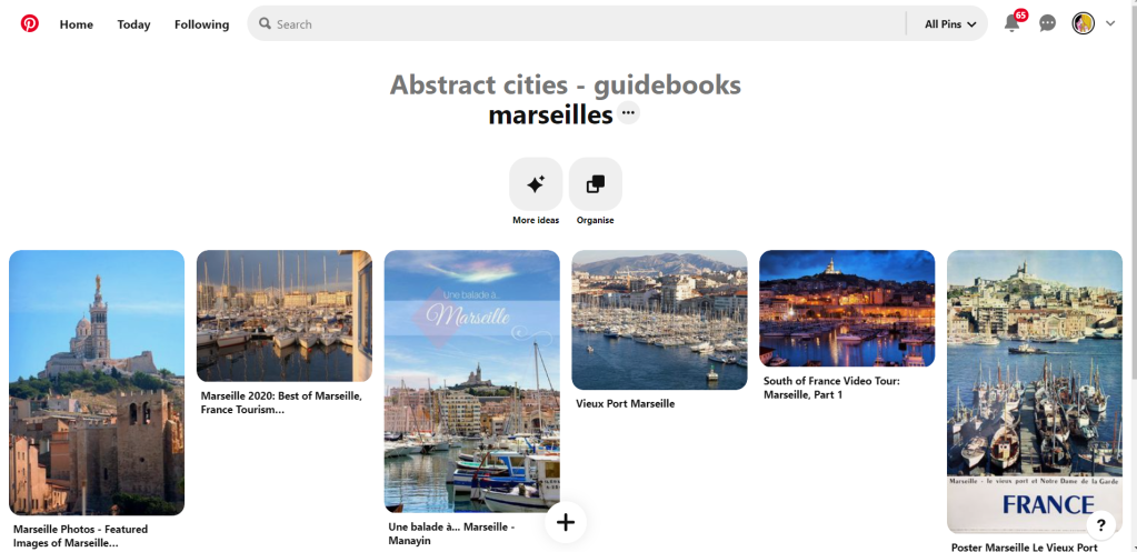
A lot of blue! The other thing I noticed was the port with the church on the hill in the background. I felt I could incorporate this into my design somewhere along the way.
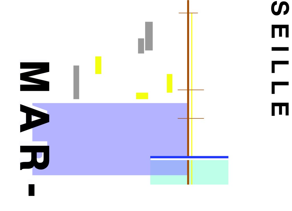
When I look at my design I feel a warm and happy feeling which is perfect for the weather and general feel of Marseilles. The blue represents the blue sky and sea. I have used a block of blue on the bottom left again as with all the other design guidebooks. It makes sure it is in keeping with the rest of the series but it also represents the sea. The rectangular blocks which work their way up to the top of the left hand side represent the hill and the buildings leading up to the 2 grey rectangular blocks at the top which is the church on the hill. On the right side of the design is the yacht or sailing boat with the sail mast. I have used yellow as a warm colour to contrast against the blues and greys. Blue is the dominant colour closely followed by thee subordinates which I believe to be the greys and turquoise. The accent colours in this piece which contrast against the rest of the design is the yellow and the brown of the sail mast.
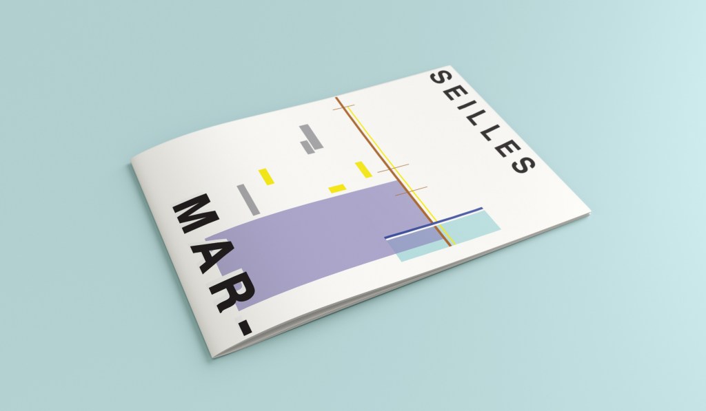
You might notice the typos between the 2! My confusion with Marseille vs Marseilles! This is the final mock up for Marseilles! I am pleased with how it has turned out – It has kept the abstract brief, is open to interpretation but I think portrays what Marseilles is all about! The colours are accurate and there are contrasting accent colours thrown in there to make the design interesting. The layout is the same as the rest of the guidebooks to keep it as part of a series.
