
Hello and thank you for joining me here at guidebook design 6 of 10: Marrakech!
When I think of Marrakech I think of warm sunshine, a lot of warm colours – oranges, reds, yellows, terracotta… I think of souk markets and rich spices and rich, bright colours; purples, pinks..
I started off the same as usual by searching Pinterest for some inspiration. What I found matched the idea I had in my head. The colours were very warm. A lot of terracotta orange appears on the stonework of the buildings. The buildings all look like temples with the arched shapes doors and windows and the intricate patterned tiles and designs that feature on the buildings. I knew I wanted to include the arch designs and some of the intricate tile patterns. The buildings all look luxurious and rich. The ideal colour to represent this is purple.

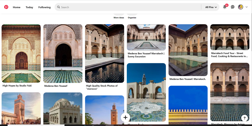
The building that appeared the most was the above: Medersa Ben Youssef. This was a college but now acts as a historical site. I liked the symmetrical design, the arches and the intricately detailed tiles that appear on the walls. I knew that I would try and replicate this in an abstract style for my cover. I had the idea to include the arch into the design, a diamond pattern to represent the tiles and maybe some blocks to represent the water at the front of the building.


I overlapped 2 arch shapes with a different tint of terracotta. I chose a terracotta colour for the building to match what I found in my research findings. The arch designs also overlap the type on the left side which matches the rest of the designs for the other guidebooks I have done so far. Following the rule of 3 or thirds, I tried to split my cover into 3 again to get different design elements in each third. The 2 lines at the bottom represent the water at the front of the building and they also add some contrast against the warm colours. The diamond tile pattern I drew and split up across the negative space on the right side. I did not want to overwhelm the design and wanted to maintain as much negative space as I could. I have used purple to highlight wealth and luxury and a bright accent of yellow to again bring contrast but to also represent the bright colours that might appear on the buildings, the tiles, in the souk markets or in the spices. I think the eye flows naturally throughout this design with the diamond shapes adding a level of interest and also bringing the design to a close.
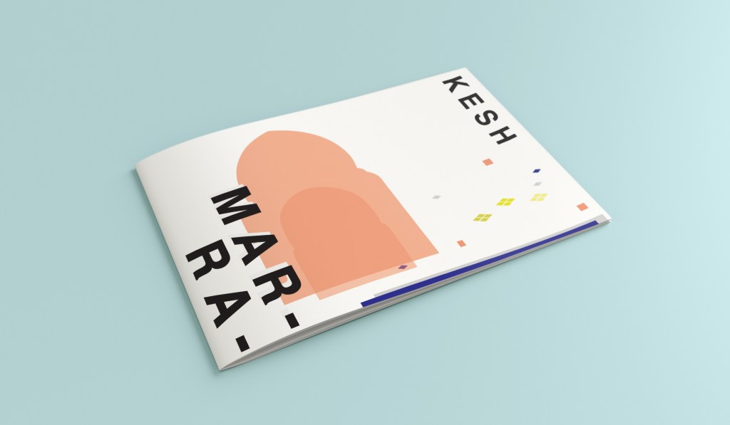
This is the final mock up for Marrakech. I am happy with it! It has kept the same layout as all the other guidebook designs I have done so far, it is keeping with the others and looks a part of the series. I have kept the abstract approach but again, it is open to interpretation but is obvious what it is portraying. The colours match what you would find in Marrakech but also contrast and work well together for the purpose of this brief. The terracotta is the dominant, the blue is the subordinate and the yellow adds a contrasting accent colour trying to fight with the blue for attention.
