The Brief:
Find as many examples of type as you can from a range of sources, including newspapers, magazines, flyers, leaflets, online, and printed ephemera. Broadly classify them into serif and sans-serif groups. Explore your computer to see whether you have any of the typefaces mentioned on the previous page. Find other examples on your computer that relate to these classifications. Print these off and begin to create a collection of type samples.
Document and present
The work you produce for this exercise will feed directly into your assignment, so collate your notes, printouts, traced letterforms and samples of type you have gathered. Consider how these could be inventively and visually integrated, and how your ideas could be creatively developed further for your assignment.
Type Samples – Collected examples
I went to Bristol a few weeks ago and in a charity shop I found some design magazines; one that I found was one called Riposte, (I am still not sure what exactly the magazine is about! *shoulder shrug) but it has some lovely typefaces in it so naturally I had to buy it for £2!
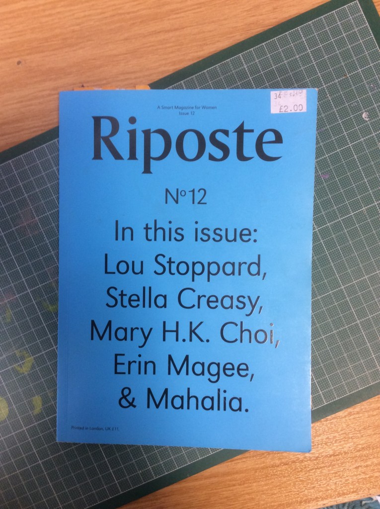
For this exercise I knew I had to use it! Inside I found some typefaces that I like! – This magazine publication is very minimalistic and uses a selection of Sans-Serif and Serif typefaces. As far as other classifications are involved such as script, decorative, blackletter etc there isn’t any of that!

This is an example of a Sans-Serif typeface; The typeface looks geometric in appearance by the way the o,u,s and r are quite rounded. The line weight of this typeface is quite light; the width of the stems on F, T,H,M.E,Y and A is quite thin. The overall look of this typeface is clean, modern and minimalist. Exactly the traits of Swiss type where clarity and readability is more prominent than it’s aesthetics.
As I mentioned above, Geometric typefaces are based on a circle, triangle or square and reflect the modernist movement of the late 20th century and typefaces that closely match this appearance and classification are: Futura, Kabel, Century Gothic and Avante Garde.


This below is another page from the magazine; as well as the typefaces being appealing I also like the quotes and sentences! “Focus on your breath” with a massive pause in between to represent pauses and breaths taken in and out. Even though there is only type on the page and the type that is being used is not particularly expressive, it is very calming.
This typeface is again a Sans-Serif and although both typefaces I have looked at in this publication seem quite inexpressive, this one below looks more unfriendly than the one above. I don’t know if that is because it is a condensed typeface- (it looks as though it has been squashed down slightly!) or whether it is just because it is bolder and the line width is thicker than the one above.
This typeface looks rounded again and follows suite in the footsteps of the typeface from above in that it is minimalist, bold, clean and oozes clarity.

This below typeface is interesting, although it is a Sans-Serif it is trying its hardest to morphe into a Serif! There are not serifs but from looking at the bowl on the lowercase a, b and d you can see that the typeface becomes a lot more shapely and fancy in its appearance and the line thickness changes! The lowercase U shows a dramatic change in weight and line thickness. Similar to the rest though; clarity is the aim of the game and legibility and readability; another clean, bold, minimalist typeface!

The typeface below is an example of a Serif typeface; the articles reflects the potential use of the typeface. The article is relating to “savage” female beauty and strength and to represent that they have used a very feminine yet bold looking typeface. A lot of Serif typefaces are perceived as being feminine because of the beautiful ornate and decorative serifs at the end of the letters. This typeface is particularly nice as the line weights are different. There is a nice contrast between the thick weight next to thin weight on the letters; the perfect example of this is the x. The typeface is also used in Bold and Italic which emphasizes part of the sentence and also adds contrast – this is also classed as a “harmonious combination” where 1 typeface from the same family is used but different versions of it are used alongside each other, i.e. italic and bold.

The magazine cover below is an example I found lying around the classroom I work in; it was in the pile of newspapers that the kids paint on etc… The cover stood out to me as it is really striking! The contrast of the Yellow background with the black and white text and the negative space with the striking, unusual image that is used just make it a impactful layout!
The typeface that is used is another bold, Neo-Grotesque Sans-Serif that looks slightly condensed again, (looks like it has been pulled up!) It looks like a tall typeface! The line weight and thickness of all the characters in this typeface seem to be the same. Just like the other Sans-serif typefaces I have looked at clarity and cleanliness is key and legibility and readability paramount.

The below are examples of typefaces I liked from a paper sample book. I have realised that I do love a Sans-Serif font! Most of the ones that capture my attention are Sans-Serif! I just love Swiss Typography and bold, impactful typefaces! I do prefer the thicker, weightier typefaces though compared to the thinner ones; they just stand out more and grab your attention more!
The stem on Gin looks a lot like the “plugged” in typeface from above; it angles off at 45 degrees! I really like this typeface! – the Red gives it a bold Bauhaus/Constructivism feeling too. The typeface that is used in “killing it” is too thin for my personal liking. “Kind” looks kind – I think because although it is a Sans-Serif typeface, the swoosh on the end of the K makes it look soft and friendlier. This typeface could be classed as Humanist because the leg on the K is showing elements of hand drawn and designed.

The Run/Slow is a good example of how different weights of a typeface can help to portray a message, (as I mentioned earlier Sans-Serif typefaces are not very expressive, if they were a person I imagine they would lack interpersonal people skills and be like a introverted closed book!) but I can almost hear these typefaces talk to me – “RUN” telling me to go quick, fast and loud and then “slow” telling me to take it easy and calmly. The thick, bold letters of “RUN” really emphasise this and the smaller, thinner weight of “slow” portrays a much slower, calmer pace.
Type Samples – Computer examples
I have and use a lot of typefaces that I have got online either through paying for and downloading or through Adobe Typekit:

I also had to download a few of the Swiss typefaces as a lot of these I found were not available on Adobe.
I have a lot of typefaces that I have also installed from Typekit onto my Adobe account:
These are mostly all of the ones I have linked to my Adobe account! There was too many to cram onto one page!

Identify
Choose five different typefaces from your classification collection and now look for examples of how they can be used for reading in different contexts. For example: which typeface would be appropriate for a magazine, science book or newspaper? Have you collected a typeface that might be suitable for all these subjects? As a way of testing out which typefaces might be appropriate for a particular job also consider them as inappropriately as you can – find contexts in which they don’t work, look ugly or feel ‘wrong’ in some way. Do this by experimenting visually with your typeface choices.
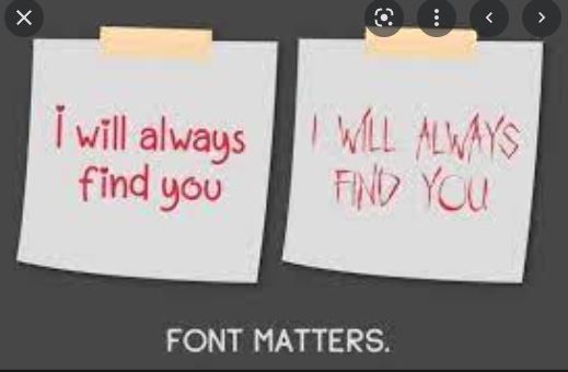
Before I started the next part of this exercise I already have some funny memes and photographs stashed away for how font choice is so important! Type into Google Fonts matter and the amount of funny typeface blunders that come up are hilarious!


Choosing the right typeface is crucial to delivering the right message with the right tone and appropriateness!

The brief was to choose 5 typefaces and look for examples of how they could be used in a reading context.
I decided picked 5 typefaces from my catalogue that I either like or have had experiences of how much font choice matters already!..

I picked Lemon Milk because I don’t even remember downloading it but as soon as I saw it again I loved it! Watermelon Script is the typeface I chose for my wedding Save the dates. La Luxe Serif was downloaded for The French Hen exercise in Core Concepts but I just like the Parisian, chic look of it. Lust because I have had a recent “fonts matter” experience with it!… and Mina, just because it is a beautiful typeface but I am just unsure how well it would work on a lot of publications and designs.

Lemon Milk is a gorgeous Sans-Serif typeface! I would classify it as a Geometric Sans-Serif as the letters are very square. The typeface gives me 1920s vibes which would be significant to the Constructivism and Modernist movements; the typeface is modern in its appearance and has clarity, cleanliness, legibility, readability and minus any decorative features.
I think that this typeface would look lovely used in headings in magazines, menus, invites, packaging (it might make a really good chocolate bar wrapper!) and as display type for advertising. I don’t think the uppercase alphabet in this typeface would be formal enough to be used in a main heading in newspapers; it is quite modern and experimental to be used in a serious publication such as a newspaper. The lower case alphabet in this typeface however would be good for side headings in magazines and possibly in newspapers.
The below image is from Lemon Milk download page on befonts.com and shows how different the lower case letters look in this typeface compared to the bold capitals. The advert they have created shows that the lower case alphabet is very friendly, soft and comforting whereas the upper case is very bold, dominant and intimidating in comparison!
This is a typeface that is quite versatile and can be used for many publications, designs and occasions. The only 2 I might not associate it’s uppercase characters with are a newspaper main heading or headline for its modern less informal look and for birthday cards, (as per Sans-Serif typefaces in general) the typeface is quite expressionless and emotionless and wouldn’t really convey the celebratory feel!

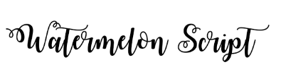
Watermelon Script was a Serif font that I downloaded to use on our wedding Save the dates! I wanted something fancy and romantic and swirly and this is the one I chose!
This typeface would be good to use on invites, birthday cards and personalized gifts. In a fashion magazine if there was an fashion shoot it could be used as a heading for that – I imagine it being used in a Spring/Summer fashion shoot as the typeface has happy, flowy, summer vibes! – It’s name is Watermelon Script which in itself sums up happy, summer vibes! This sort of typeface would not be good on anything with a serious nature; it would definitely not be good to use in obituary adverts or to print onto the order of service cards for a funeral!
The readability and legibility of this typeface is not instant or bold enough for it to be used in anything large scale such as billboard advertising. I would say it is not a commercial typeface but more a typeface for personal and decorative use.
This typeface is classified as Script and I feel that it would come under the decorative/ornamental bracket of this type classification – It responds to the needs of a client who is after personalised, decorative designs. It has an outrageous style that is not typical to be used or liked by everyone in everyday designs and settings.

I bought La Luxe Serif online when I needed a typeface for one of my assignments in Graphic Design Core Concepts; The French Hen. The French Hen was a branding assignment and required me to come up with a whole new logo/signage for it etc… I like the different width strokes of the letters and the curves of the serifs. It is a very elegant, formal typeface.
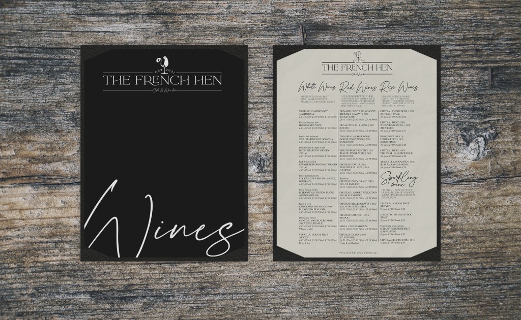
When I came across this typeface I instantly saw a menu of a Parisian style cafe/bar in a tiny cobbled street with tables and chairs outside. It also has a very country kitchen feel to it – a large kitchen with shabby chic table and chairs with puffy Cath kidston-esqe cushions on the seats and wooden worktops and an island with an Aga oven and ceramic sink!
This typeface is ideal for use in the fine dining restaurant/café/bar sector or for anything country home style! I can see this typeface being used in a shop that sells expensive pieces of furniture and décor for the home. Once again, it is not a display font – it is not good for use in advertising because of the readability/legibility and the fact that you need to be able to read and understand a message quickly and instantly in advertising; as for large scale print, it could work as part of a log printed large scale. It could be used for company branding and be a recognizable typeface for a company. It is a much formal typeface than Watermelon Script and could be used commercially for a business.

I downloaded this typeface once again for one of my previous exercises; it was chosen as a typeface that I would have never usually chosen and used in that context in my work. It is quite gimicky but I said that surprisingly I quite liked it and decided to keep it on my computer. I decided to use it the other day as the typeface on a label for some of my zines that I was planning to leave in a few places I was visiting over the weekend just gone. It looked completely fine on my screen…
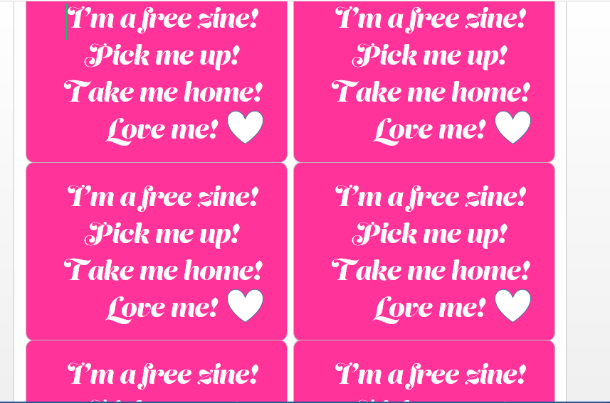
But when I printed them out and stuck them to my zine I realised that the “Love” actually looked more like “lore” just because the line width of the V is that thin that it didn’t print accurately. I thought I could potentially get away with it as I was in a rush printing them out and to be honest I wasn’t particularly too pedantic with them as I just wanted to make it clear to people that when they see my zine lying around they are free to take it! It was only when Chris turned around to me and said “What is lore?” that I realised I had failed in my task!..

This typeface IS a gimicky font that is not very practical at all! I wouldn’t even say it has a lot of use in a decorative sense after what happened with my labels! The skinny line width of the letters make it very hard to read and understand what the letters are from a distance. This is not a display font!- it would be useless in advertising or small printing. The thin line width would not be picked up in small printing, this eliminates a lot of stationery and small adverts from its uses.

This typeface is classified as a script typeface based on the fact it is influenced by handwritten letters. It is a very calm, easy going, easy flowing typeface. It reminds me of summer evenings with a warm summer breeze sitting in a nice summer dress in a seafood restaurant with the white wine flowing. This also reminds me of the high street jewellery shops that I found in Spain in Marbella La Canada shopping centre; not expensive jewellery but reasonably priced glam costume jewellery. It would be good to use as a logo for a fine dining restaurant or wine bar and potentially for the name of a fashionable, young, modern retail shop. It would not be suitable for anything formal; you wouldn’t see an estate agents, bank or solicitors on the high street using this typeface for their branding or in their logo. This typeface might work for an independent creative though such as a jewellery maker/artist/illustrator/florist. It is a very feminine typeface and one which I imagine to be used in a leisurely, slow paced business or environment.
It is not suitable for advertising on billboards or anywhere fast paced for the fact that it wouldn’t have the instant readability and impact that is needed to convey a message in a short period of time. Again, it is not suitable for small print as the legibility and readability would be poor trying to recognise what each character is. It could be used in a fashion magazine though in a fashion shoot layout just like this typeface that I found below featured in Vogue magazine:

Develop
Trace some interesting, unusual and everyday letterforms onto clean paper. This will help you to understand the distribution of weight of line within a particular letterform. Draw over the tracing to enhance the line and fill in the letterform with an even dark grey tone – HB pencil is fine – to recreate the impression of print.


I really like the typeface used for “Wave”! I love the different line widths used and how it makes it look so elegant and clean but at the same time it stands out and it is bold because of the contrast created by using the different weights!
I like drawing type with a fine liner- particularly type with different line weights. I like creating bold strokes but then adding fine details with the different weights! Contrast is key and by using different line weights and thicknesses ensures that contrast is present in a typeface! – The only thing that needs to be paid attention to is that line weights are not too skinny like the Lust typeface above where some of the type cannot be distinguished. My least favourite typeface above was the one that was used for “lips” that typeface for me is just too skinny and distorted! It is difficult to read and looks like it was designed in the space of 5 minutes whilst having a daydream doodle!
The typeface that is used for “Restful” is quite nice; it has different line weights and looks elegant and classical -the f gives me musical vibes – Forte.
This exercise was also a nice reminder of how type is designed and how the letters are composed of lots of different parts.
