The Brief
This is one of them exercises that I 100% understand is crucial in good design and I am always striving to learn more; but due to its mathematical nature and the fact that my maths is rubbish, I dislike this exercise more than any I have done previously!
That said, I have touched on Golden Ratio and the Fibbonacci grid by myself in my “If the face fits” assignment from the Core Concepts unit where I used it to help me create interesting layouts for my type specimen book. Over the last few years of my studying, I have grown to like the grid a lot more than I did! When I first started with the OCA I really did not like the grid!- I just saw it as a lot of unnecessary lines on a page just set out to unnecessarily complicate matters! Whenever I tried to create myself a grid I did not know what I was doing, where I was supposed to put lines, how many lines or what went where! It is only now with having done a lot of layouts that I understand just how important it is to place elements in certain places on a page, hierarchy, how certain things should align in harmony together and the importance of creating space on a page. David Carson famously does not design to a grid and whilst I appreciate his experimental work and like his impulsive layouts, I don’t necessarily agree with him that this method works for everything!
It has been a while since I last looked into the Fibonacci Grid so I shall use this exercise as a refresher to remind me of what it is all about again!…
The Golden Section
“Though largely forgotten today, methods and rules upon which it is impossible to improve have been developed over centuries. To produce perfect books these rules have to be brought back to life and applied.”
Jan Tschichold, The New Typography, 1928
The Golden Ratio, (as it is also known!) is a mathematical (arghhhh!) ratio. It is commonly found in nature and when used in design it helps create organic and natural looking compositions that are aesthetically pleasing to the eye. Getting back to the awful mathematical side of it; The Golden Section exists when a line is divided into two parts and the longer part (a) divided by the smaller part (b) is equal to the sum of (a) + (b) divided by (a), which both equal 1.618. (Yikes!). In design though, it all comes down to aesthetics with creating a sense of beauty through harmony and proportion; the phrase that springs to mind is a certain je ne sais quoi.
The Golden Section has been around for thousands of years; from the Pyramids to Michelangelos “The creation of Adam” on the ceiling of the Sistine Chapel, even Mona Lisa played a part with the Golden ratio and then onto more recently with the Pepsi logo.

Our bodies and faces even follow this mathematical ratio.
So, how do we use The Golden Ratio in Graphic Design and how does it help?
The Golden Ratio helps compositional elements of the design including layout, spacing, content, images and forms. Negative space is very important in a design; it is considered part of the design itself but whereas I usually use instincts to guide me to where to place elements, the Ratio can be used to guide where elements are placed. This will ensure that spacing and proportions are calculated. If there are several elements to place on a layout the Golden Ratio will allow consistent proportions throughout the design.
So whats next? What better way to try and learn it than to physically try it out for myself?….
(*cue my instant regret at achieving an E grade in GSCE Maths!)
Trying out The Golden Section
So the first step is for me to draw a square and multiply one side of it by 1.618 and I should end up with a rectangle of “harmonious proportions”….
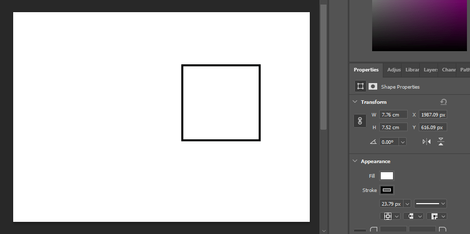

Ok! so 7.76 x 1.618 =

So far so good!…
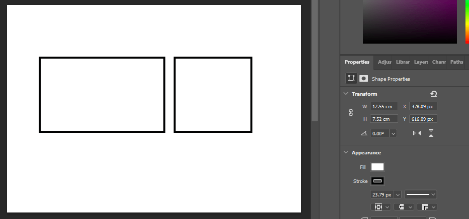
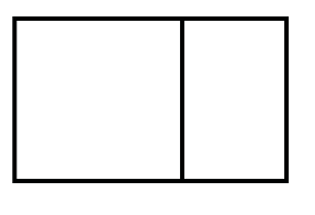
Now apparently if I lay the square inside the rectangle this is the Golden Ratio!..
Now apparently if I keep applying the Golden Ratio formula to the new rectangle on the far left of the image above I will eventually get progressively smaller squares.
(*This is the part where my brain has to deal with numbers and figures and goes into a meltdown!)
Here goes!…

This confused my slightly because I was still trying to multiply one of the sides x 1.618 but I figured I am trying to make the squares smaller so needed to divide a side by 1.618!

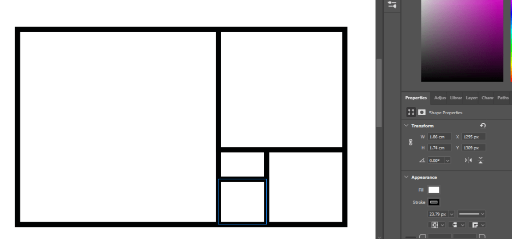
and the last stage!…
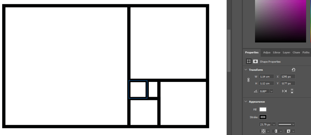
Ok! So I successfully managed that! – but now what happens if I try and have a go at the Golden Spiral?…
The Golden Spiral (or Fibonacci Sequence) is a series in which the pattern of each number is the sum of the previous two numbers (ARGHHHH!) starting at 0 the sequence is: 0,1,1,2,3,5,8,13,21,34,55,89,144 etc! By then adding an arch in each square you end up with the Golden Spiral!

The Golden Spiral features in many natural forms – Ferns, Flowers, Seashells and even hurricanes!

Looking at layouts

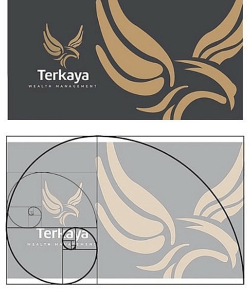
When using The Golden Section to help with spacing and placing elements on a layout, it is always best to place the main focal point of the design in the centre of the spiral as this is naturally where the eye is drawn to – this is shown in the website design below:
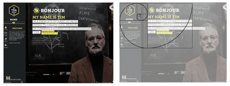
This website design above looks quite content-dense but is organised to the Golden Ratio and the Golden Spiral. The focus is the upper left where the eye is drawn first to “Bonjour my name is Tim” and then travelling past the description and to the menu buttons – it hits the logo and then comes to a stop where the next pieces of information to be absorbed are the negative space with the photography.
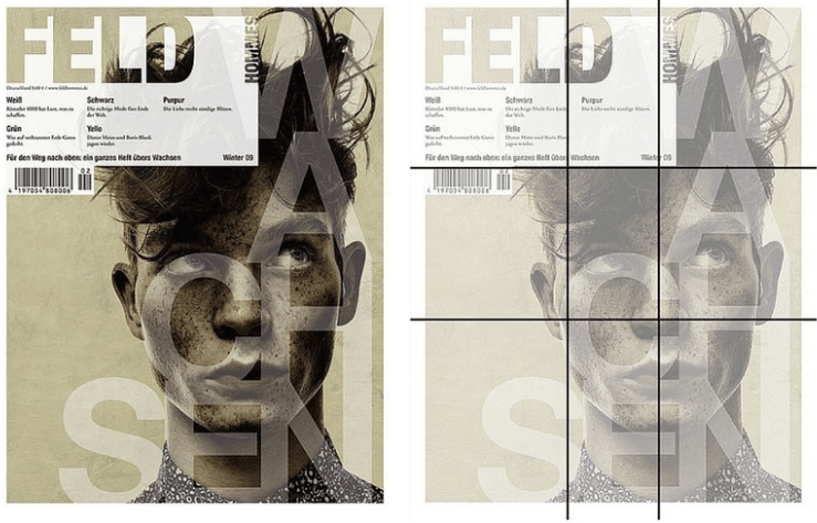
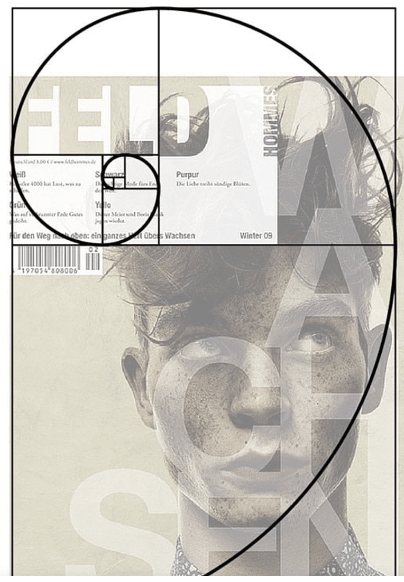
The Rule of Thirds…
I have heard of the rule of thirds before and regularly use it in my designs but I was unaware that this too relates back to the Golden Section. I always referred to it as “the power of 3” and I thought that when creating a layout you made sure that there were 3 elements on the page that the eye could travel in-between. When arranging objects for flatlay photography the rule is “power of 3” organise objects into groups of 3 otherwise the eyes attention is automatically drawn away!
I had experience of this when I went on a free flatlay photography course a good few years back! (See below!)


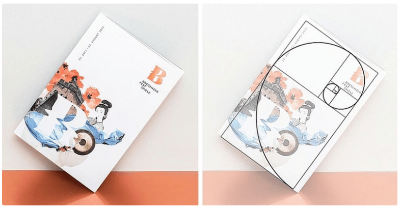
This is a magazine layout which uses the rules of thirds and the Golden Spiral:
Reference: https://www.canva.com/learn/what-is-the-golden-ratio/
The designers who have used the Golden Section…
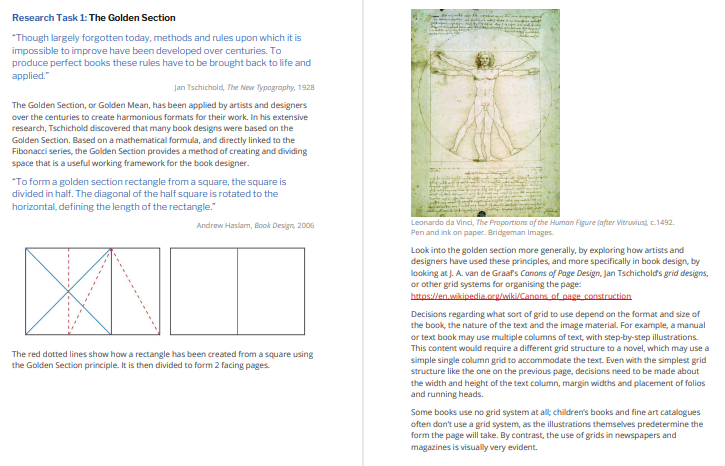
Look into the golden section more generally, by exploring how artists and
designers have used these principles, and more specifically in book design, by
looking at J. A. van de Graaf’s Canons of Page Design, Jan Tschichold’s grid designs,
or other grid systems for organising the page:
https://en.wikipedia.org/wiki/Canons_of_page_construction
The canons of page construction, (also known as the “Secret Canon” used in many medieval manuscripts) are historical reconstructions on the careful measurements of books and the mathematics and engineering methods of the Medieval or Renaissance era. It was used in book design to divide a page into pleasing proportions. Since its popularization in the 20th century these canons influenced modern book design with page proportions, margins, type areas and the construction of books.
The notion of canons (or law of form!) of book page construction was made popular by Jan Tschichold in the mid/late 20th century, he wrote: “Though largely forgotten today, methods and rules upon which it is impossible to improve have been developed for centuries. To produce perfect books these rules have to be brought to life and applied.” Jan Tschichold described his discovery of the use of the ratio as “a method to produce the perfect book”. Tschichold’s Golden Canon’s crowning glory was that it proved that the ideal height for the text block was equal to the page width.
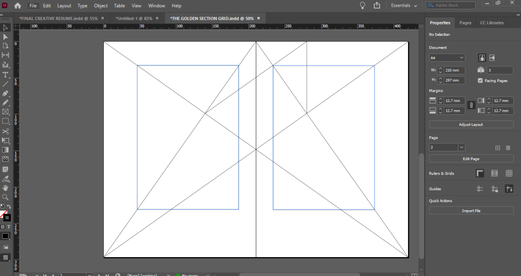
The geometrical construction of Van de Graaf’s canon which works for any page width:height ratio, enables the book designer to position the type area in a specific area of the page. By using the canon the proportions are maintained whilst creating pleasing and functional margins of size 1/9 and 2/9 of the page size.
Too much maths for me to handle right now!…
The resulting inner margin is one-half of the outer margin which to some modern publishing houses might be a different way of doing things! – With the inside margin being a lot closer to the spine when there is a really thick book of over 400 pages, you start breaking the spine to be able to read that closely to it before the text gets lost in the gutter. The modern publishing house approach to this is to flip the gutter and outside margins.

I decided to draw my own to give me an idea of what I was doing and so that I could also use it in my own design work:
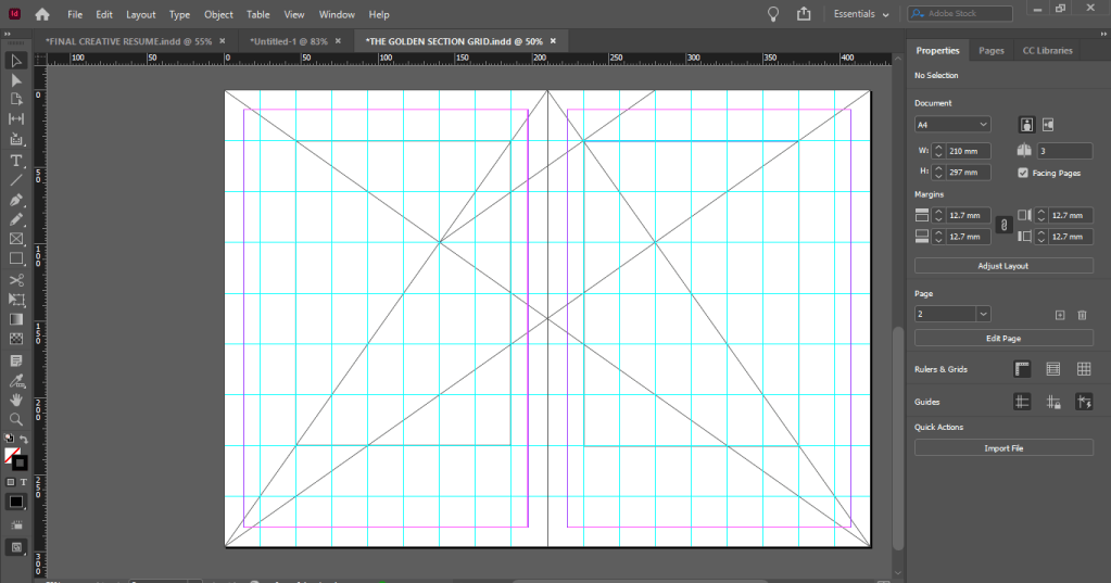
This method was discovered by Van de Graaf, and used by Tschichold and other contemporary designers; they speculate that it may be older. The page proportions vary, but most commonly used is the 2:3 proportion. Tschichold writes: “For purposes of better comparison I have based his figure on a page proportion of 2:3, which Van de Graaf does not use.” In this canon the type area and page size are of same proportions, and the height of the type area equals the page width. This canon was popularized by Tschichold in his book The Form of the Book.
