The Brief

This brief again for me was a bit out of my comfort zone. I don’t really read books and had no idea what book I would even review! I also do not read book review articles so again needed to google some of these for this brief.
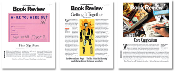
I found most inspiration from The New York Times book reviews. The style of the magazine is very clean, minimal, legible and informative. I would use these publications as inspiration for my article.

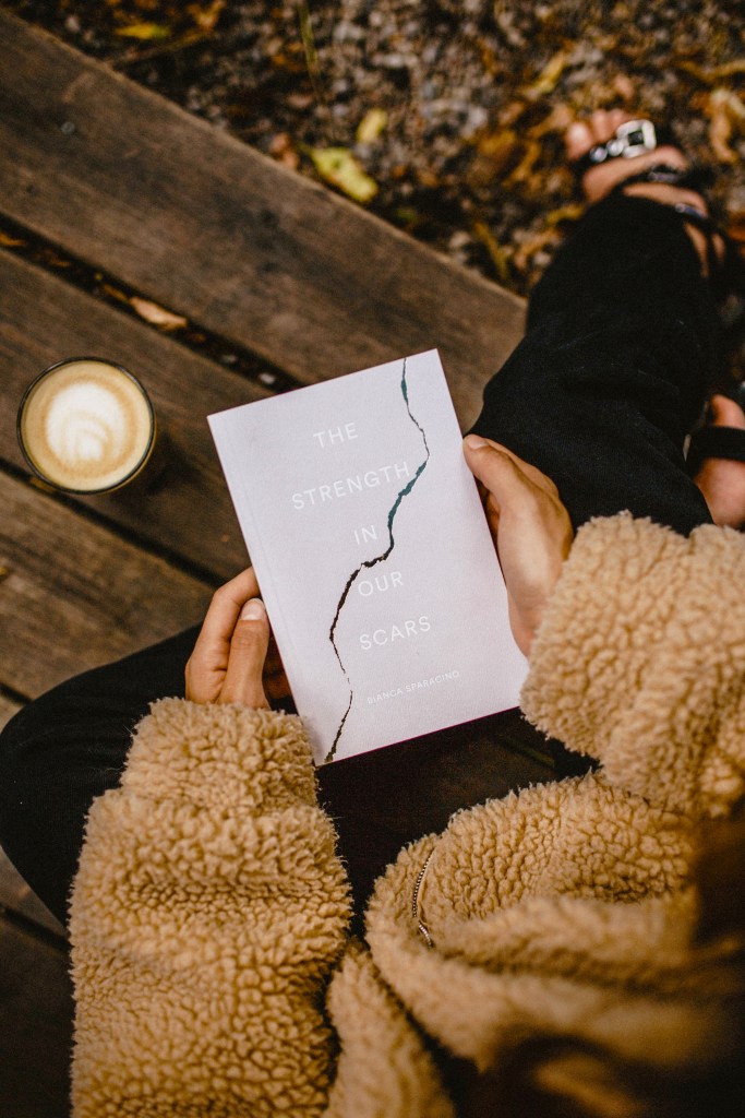
The next step was to choose what book I wanted to use for my review or what image I wanted to use on my article. I had the idea to use a generic book photo for my article such as a someone sat reading a book or books laid on the floor but then came across this one on Pexels.com..

“The strength in our scars” I had never heard of this book as to even know whether it was a real publication but I searched on Amazon and it is a real published book. This seemed the perfect book to use as I already had a perfect photograph of it I could download for free and use in my article. The photograph reminds me of Autumn/Winter and it seems like the sort of book you would curl up in the warm and read. It adds a homely feel to the article.
I started off by designing the layout of my article. The article would be a single page and I took inspiration from The New York Times Review. I noticed how The New York Times has a very bold but attractive looking typeface as their logo. It looks like a typeface you would typically see on the front page of a newspaper, I wanted to achieve a similar sort of style. I found Abril Titling on Adobe fonts and knew that this would be an ideal typeface to use for my article heading. The New York Times is very well known for its book reviews and in their reviews they use the same typeface they use for the newspaper title which is I guess to tie and relate the two together. I decided to do the same for my article and used the same typeface for both my newspaper names and also the main heading. I then added a sub heading of “What we are reading, reviewing and rating this month” which allows the reader to know fully what the content on the page is about.
I took the information for the title of the book I was reviewing from Amazon and also stole the stars review from there and then made the rest of the text for the blurb of the book Lorum Ipsum. I have noticed in other magazines that they rarely review one title and that I would possibly have to include a few more reads on there for the article. I noticed how some magazines highlight their favourite books of the month from the rest and this is what I have tried to do by adding a frame around mine and the title “This month we love”. I used Pink as the colour of the frame and the heading box because this contrasts against the black and makes the whole layout “pop”. It is also a very feminine book which matches the feel of it well.
When I searched for this book on Amazon it came up with related reads and they are what I have used for the other publications on this page. I copied photos of the books from Amazon and then cropped/edited to use on this article.
I used a mix of typefaces on this piece;
- Abril Titling – The main heading
- Mrs Eaves Roman all small caps – Sub heading – (“What we are reading, reviewing and rating this month”)
- Meta Pro Hairline – Introductory paragraph (“It’s self help September…”)
- Meta Headline Pro Comp Bold – (“This month we love”)
- Meta Pro Condensed Normal – (“The strength in our scars”)
- Freight text Pro – The main body text
- Mrs Eaves Roman all petite caps – the bottom running headlines
There is great contrast with these typefaces; there is Mrs Eaves which is a serif typeface designed for use in book design – (romantic books) and then Meta which is a Sans-Serif font and a style of it (condensed bold) which is very bold and heavy. I used light hairline typefaces for some of the softer text again to bring contrast in and also because they are very feminine publications.


