I chose my article for this from a Cosmopolitan magazine.
The article I chose was 8 double pages so it gave me a pretty good idea of the repetition and the layout of the article by the time I had measured and examined each page!
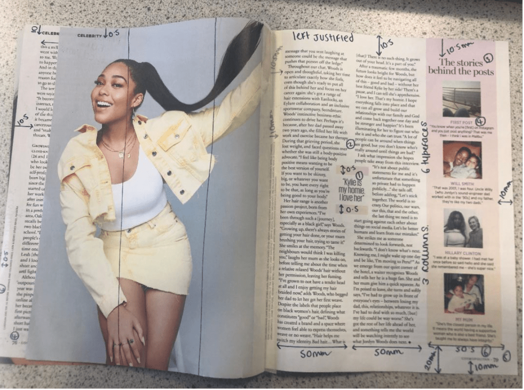
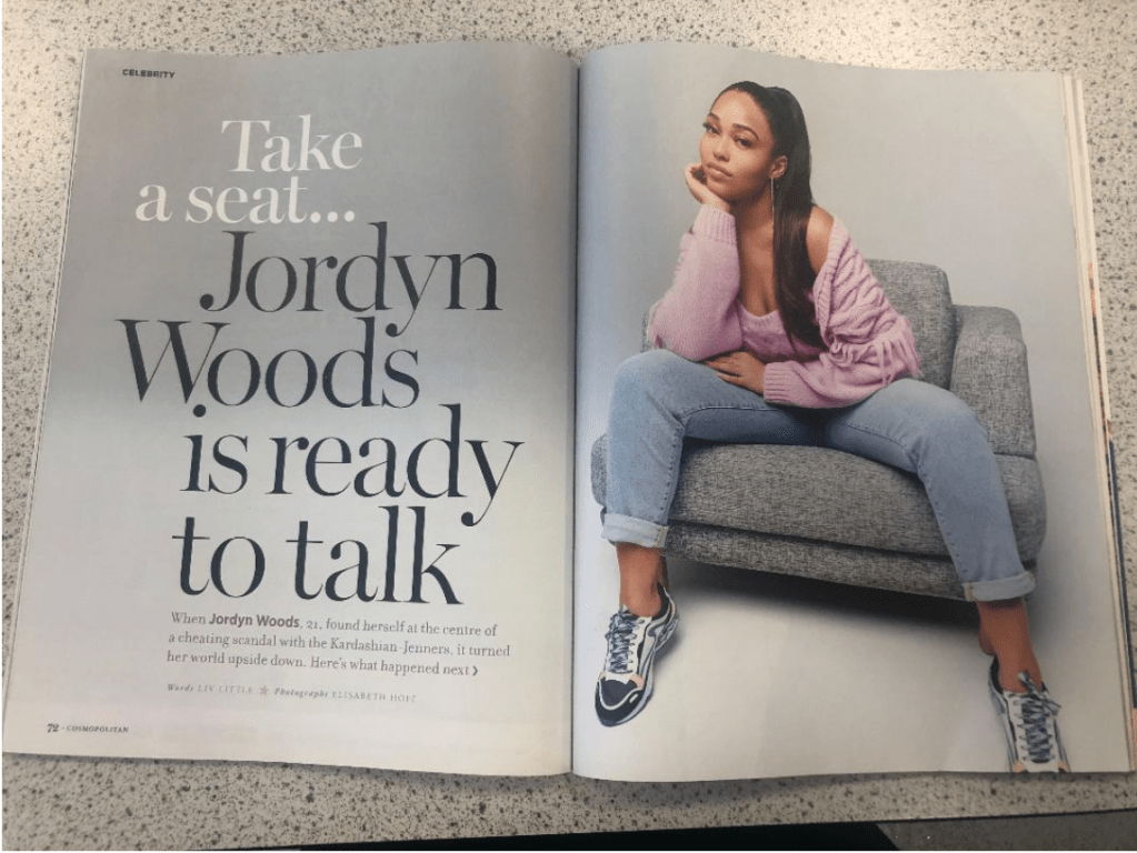
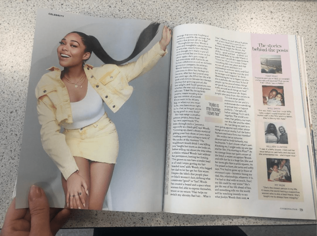
I chose to copy this double page out of the magazine:
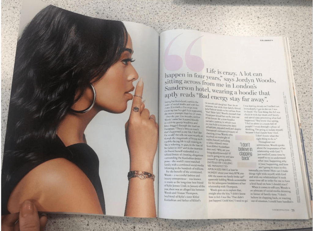

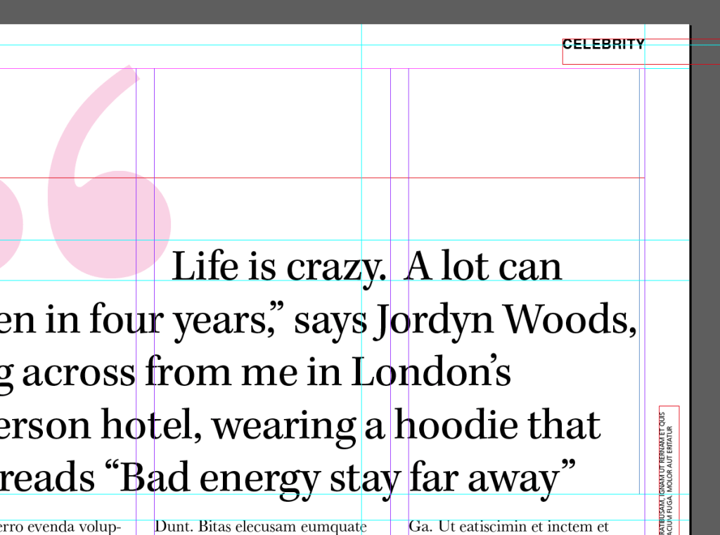
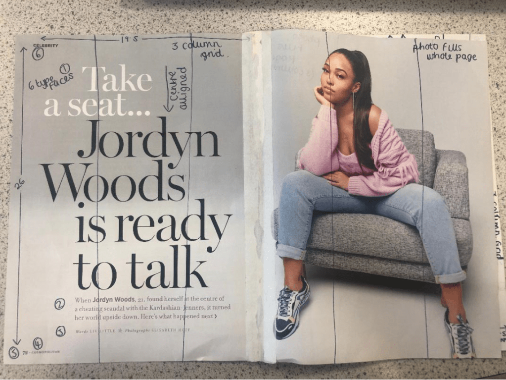
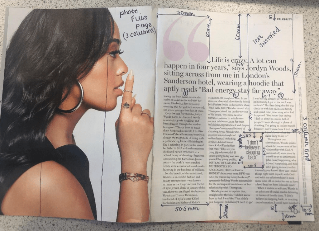
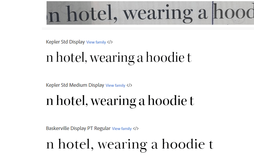
I had a good guess to start with at what the typefaces might be for the headings and the quote and the body text etc… I guessed Didot for the main heading on the page and I used Baskerville as second option for it.. when I used a sample of the magazine to scan into Adobe Fonts that was one of the suggestions for a typeface like it! I am finding that I am finding it easier now to identify typefaces the more I study them and look at them. I had no idea what the typeface was used in the tiny pull quote box in the middle of my layout though, I knew it was condensed; it looked like Meta but it was too light and the bowls on the b, d and p were too big and the stems too short.
I did aa search on the typefaces by scanning the clips of the magazine into Adobe:

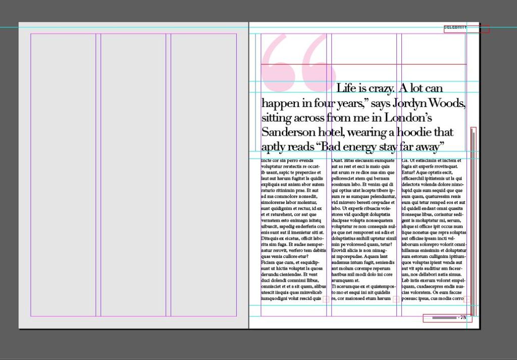
I then went back to my layout and changed the typefaces to what they should be. I guessed that “CELEBRITY” in the top right corner was Helvetica or something similar and the typeface used for Cosmopolitan is Franklin Gothic Book.
The typefaces used in this publication are:
- Kepler Std – big main heading
- Rama Gothic Extra light – “Clapback” quote
- Baskerville – the main body copy
- Franklin Gothic – Cosmopolitan
- Helvetica – “Celebrity”
- I used Lust for the page number because that is the only typeface I know that looks close
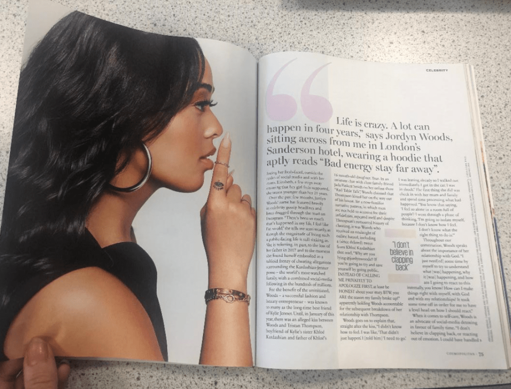
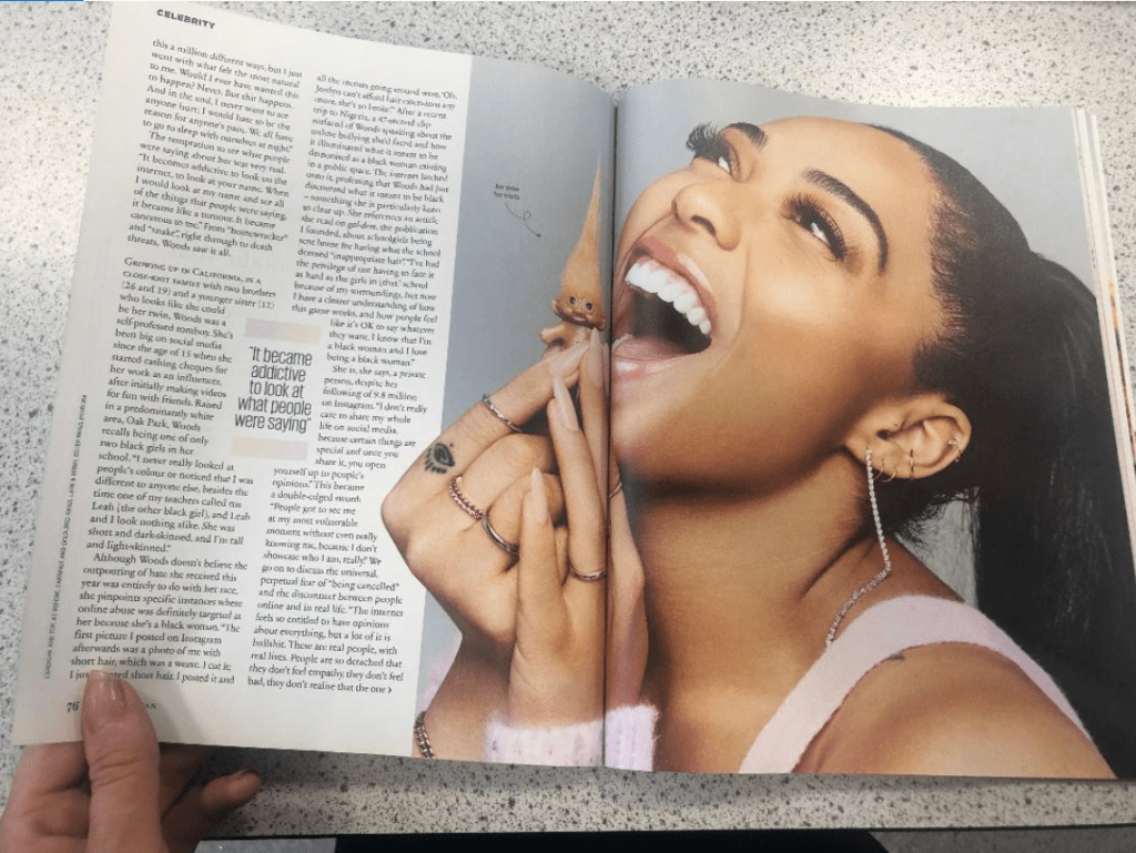
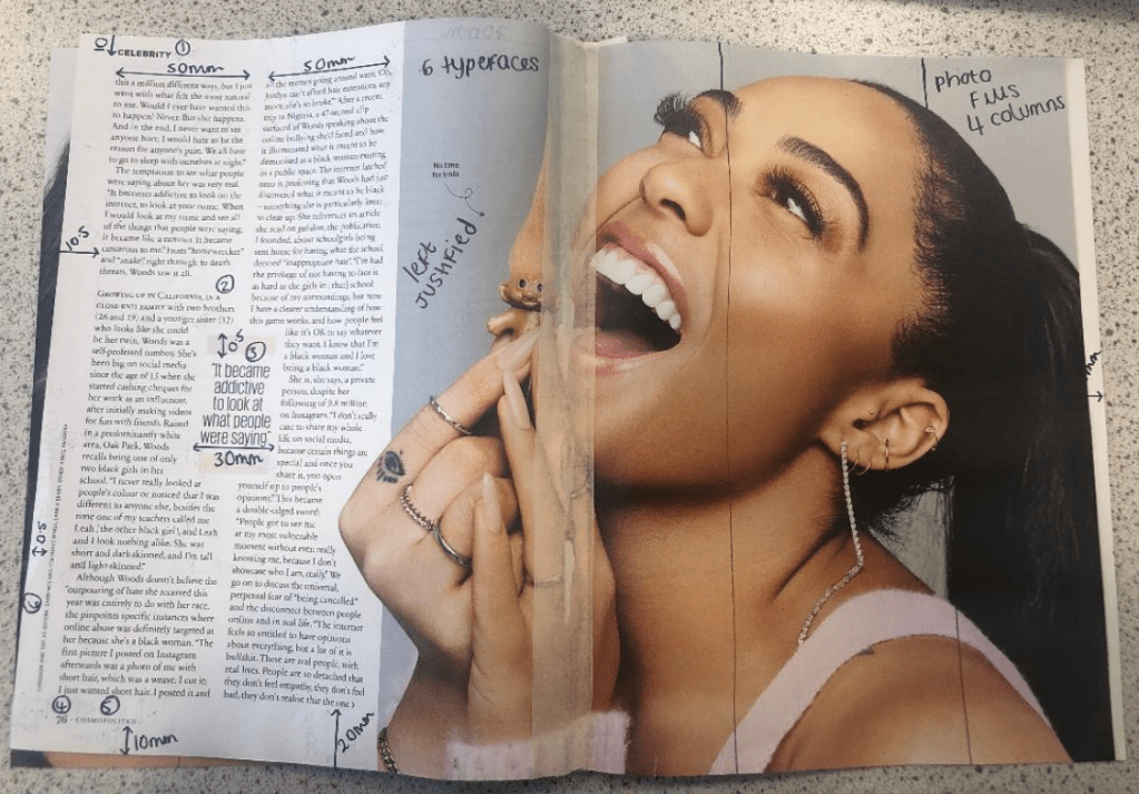
I noticed that throughout all of the spreads Cosmopolitan uses 6 typefaces on each double page. The layout of the grid alters slightly though between each page – not by much, only by about 5/10mm.
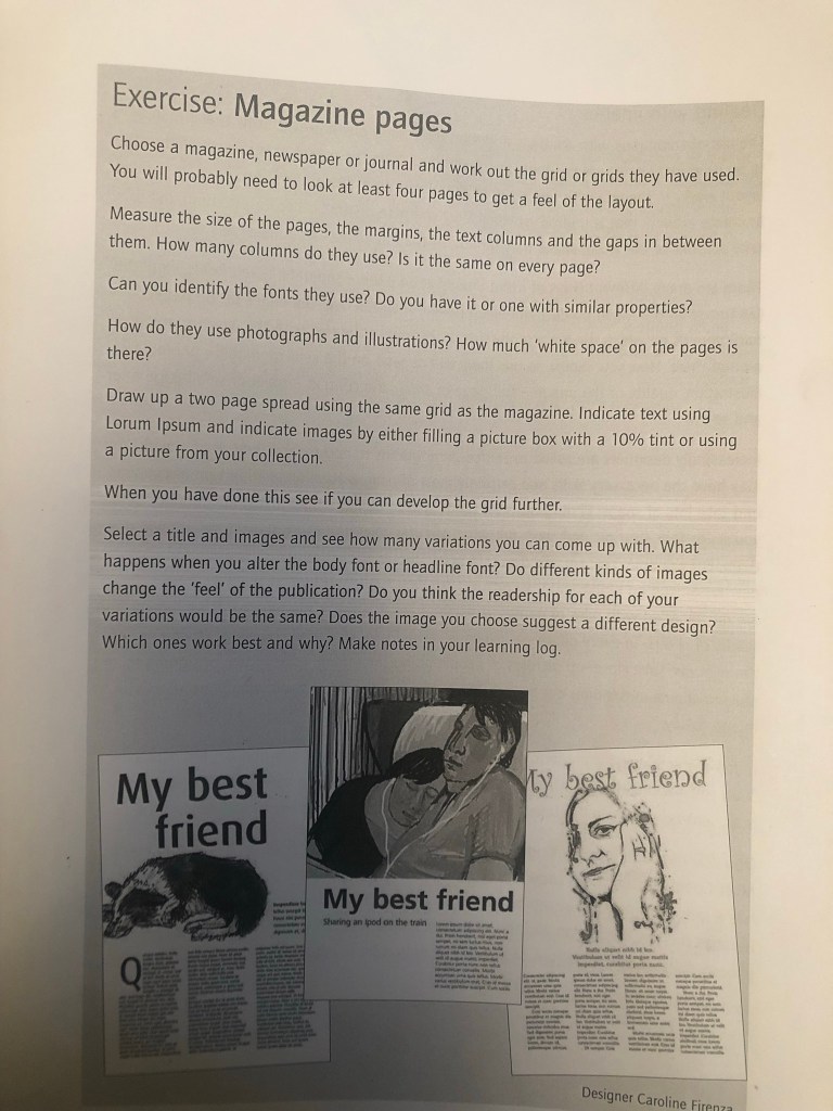
The brief asks me to take this layout and take the heading and the image and change it with different images and different typefaces.
I chose 3 variations and changed the images and typefaces in each one and it was clear that typefaces and images affect the mood of an article and that grid layouts such as this one are only applicable and can be applied to certain articles :
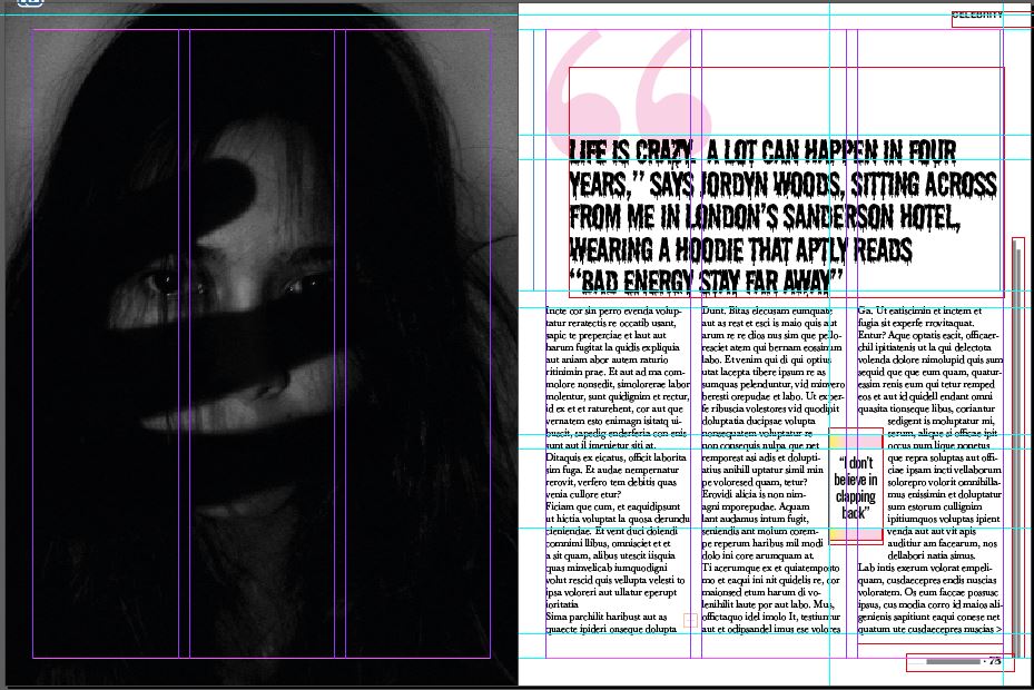
“Happy”

In this example I showed how the heading is quite a positive message with “Bad energy stay far away”. I have used a happy typeface – Holbeaux and a sad, distressing image next to it. It completely changes the feel of the article. It shows that this kind of typeface does not belong with this image at all. It is confusing for the reader because they are shown a positive happy message with an opposite image. Judging by the photograph this would probably be an article best suited for minimal type. The woman in the photo is sad – It probably wouldn’t be a lengthy article – it might be a poem or sonnet or something deep and meaningful with a lot of emotion. This article would not need a massive grid for lots of text like the one that is there.
Serious
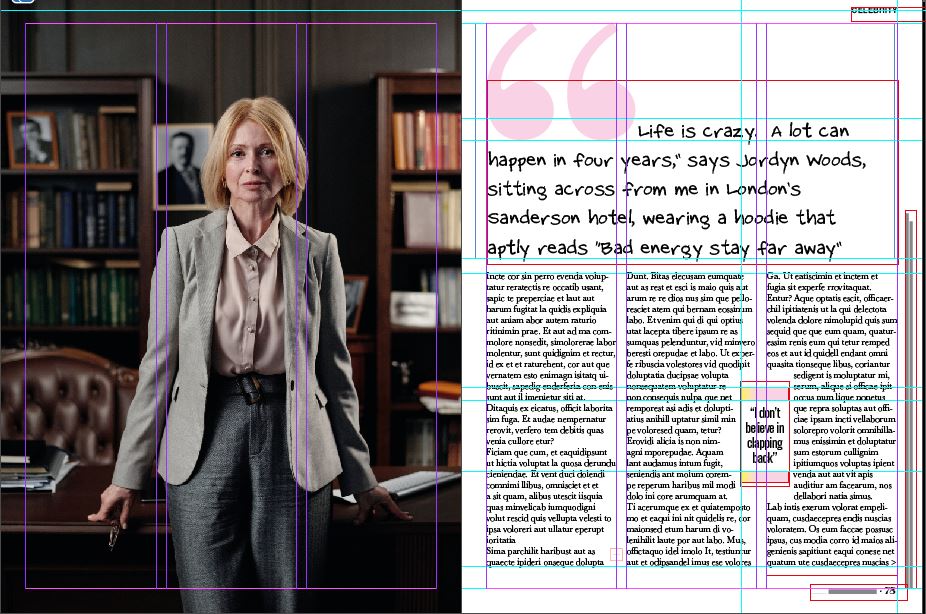
I have switched it up again by using a professional serious image and a fun, gimicky, childish typeface. The typeface is not professional at all and does not reflect the feel of the layout or of the image. The image and the grid layout are similar to what you would find in a country magazine or a posh glossy magazine such as Harpers Bazaare but the typeface, the speech bubbles and the pull quote just do not match the feel of it. The rest of the magazine article is less serious and would suit a gossip/fashion magazine more – a magazine that isn’t political or have a serious audience.
Horror
This layout does not match this type of article at all. The pink colour does not match the dark theme and the layout is too calm and friendly and serious for this image. With this image I would expect to have big, bold, dark type as headings (possibly filling most of the page) I would expect a Sans-serif for the main text too because Sans always comes across as not having much of a personality – it can look quite cold and unfriendly in appearance. I imagine that readers who read Cosmopolitan would not be reading this article!
