- The mock ups
- Critique of my own work
- Customer Feedback
The mock ups

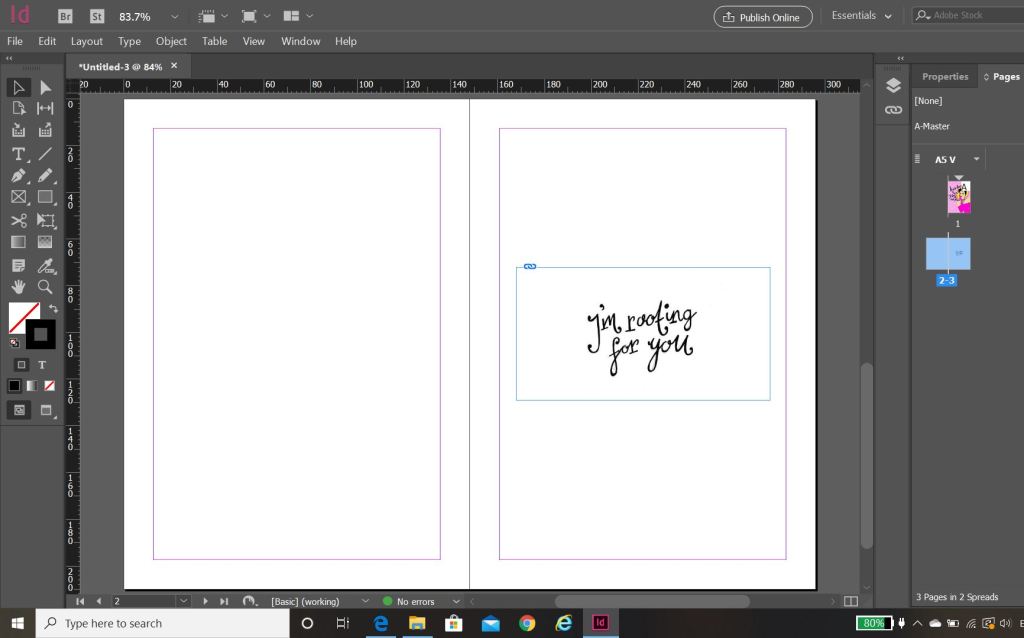
The above is the layout in InDesign for my cards for if they were to be sent to a professional printers.

Critique of my own work
I have enjoyed this assignment but I do not think it will be one of my all time favourite briefs! – The brief was very open; the outcome possibilities for this assignment were very broad and I think that I would have preferred to have been given a more specific, closed brief.
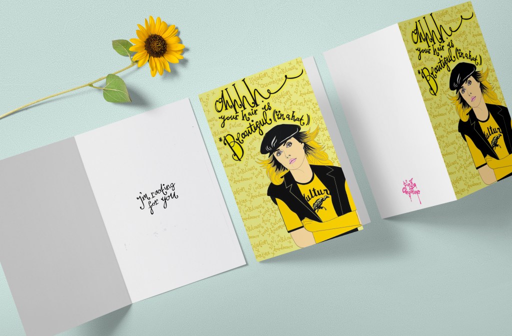
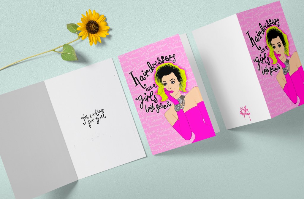
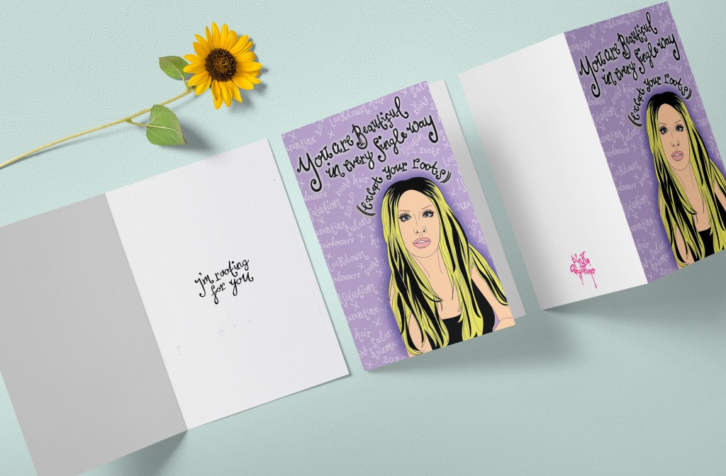
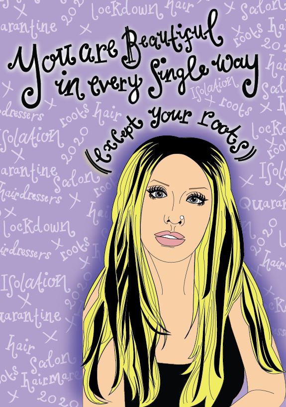
There were so many subjects, events and occasions I could have done for my cards which made the possibilities endless! – I think I went for the right subject given the timing I started the assignment and with all that is going on in the world. It was the obvious choice. I tailored my cards at a specific target audience (platinum blonde females) and the cards themselves could be sent to either your favourite hairdresser who you missed so greatly during lockdown (I actually sent my designs to mine!) or they could be sent to the desperate blonde in your life just to let them know that you are “rooting” for them during the hard times!
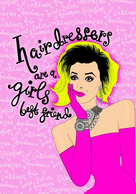
The style of the cards are supposed to be humorous, jokey, young, fun and vibrant! I think I achieved this. I chose 3 of the most famous blondes of our time but I could have chosen more.. Dolly Parton was on the list, if I was to expand the series further she would be another face I would put on the designs. I tried to choose iconic blondes from different decades to appeal to different ages; Marilyn Monroe is relatively well known to all ages, Debbie Harry would be more specific to teenagers of the 70s whereas Christina Aguilera would be more well known to women of my age.. children of the 00s who are now in their late 20s/30s. The cards are aimed towards a target audience of late twenties +.
The messages I have used on the front of the cards relate to film titles or lyrics and I am hoping that this comes across clear to the audience. The Marilyn Monroe and Christina Aguilera ones I feel are the clearest; unless you are a Blondie fan the lyrics to “Atomic” might not be all that clear. I did think of using “Atomic” as the inside message on that card but then decided to keep all the inside messages the same – “I’m rooting for you.” I did originally write the inside of the cards in Helvetica just because I wanted a simplistic, clean message inside, however it just did not look right against the vector lettering on the front. I decided to keep the theme going and make the inside lettering the same as the front. I think this has worked well because it keeps consistency flowing throughout the designs. I also added my Pink Angeleno logo to the back of the cards.
I am hoping that the illustrations and the dark roots I have added onto each of them makes sense to the audience, I think the fact that I have used the words in the background help explain to the audience what the theme is all about (hairmare, isolation, lockdown, roots, hair). I like the illustrations; I am pleased with how they have turned out considering I was worried that they would not look anything like the celebrities themselves!
I have tried to use colours that work together and compliment each other and which work as a series. I like how the dark colours contrast with the bright pastel colours. In regards to professional printing, I have kept a max of 3 colours which would help to keep printing costs down.
My least favourite card however would be Christina’s; I just feel that the writing does not stand out as much as the other 2 when it is by itself – however when it is seen with the other 2 as a series it does work well.
The hand lettering could be difficult to read from a distance; it is not as legible as having an existing font and would definitely not be a good choice for most Graphic Design outcomes; however, I feel that having this style of lettering separates my designs from any others that are or might appear on the current market. The designs and my cards are 100 percent my artistic work; right from the original drawings and hand drawn lettering though to the end finished digital vector art and lettering.
Overall I am pleased with how my 3 designs have turned out. I had a vision in my mind of how I wanted them to look (from looking at existing products and items and finding things that inspired and influenced me) I think I have closely matched that idea in my head.
Feedback
To conclude this assignment and design process I decided to have my cards printed and made professionally so that I could send them out to get feedback and to also see how well they would be received.
I found and used a company that I found online called Snapfish.
It was a simple process of choosing the size/finish of the cards (I chose A5) and then uploading high res jpegs of each of my designs. Although it is not a typical place where designers in industry would go to complete their printing needs, for what I need right now with this assignment the website sufficed. The website at the time was offering 50% off all print costs which actually was a good deal!
When they arrived I was very impressed with the print quality (I chose a glossy finish) and my illustrations turned out really well! I would definitely purchase from this site again for any future print requirements.
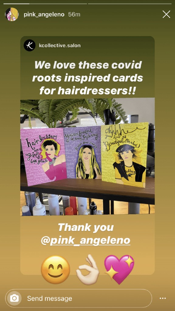
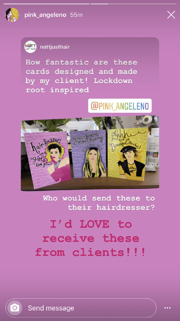
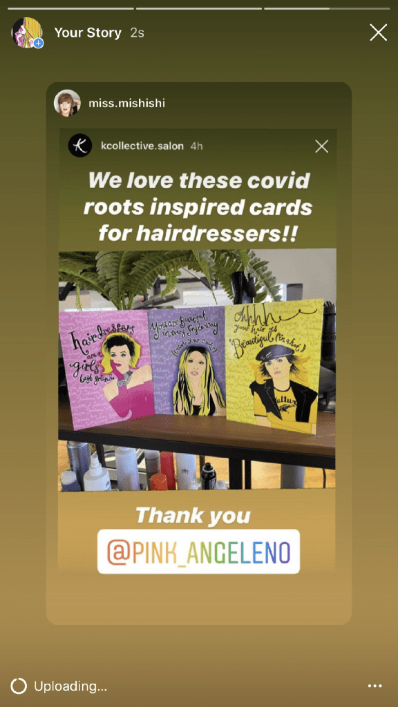
I sent one of each design to my hairdresser and his team at K Collective salon. I posted them through the door one evening and awaited feedback! The feedback I received from them was really good! They were all quite impressed that I had actually drawn out the illustrations myself and designed the cards from scratch!
They featured my cards on all of their Instagram stories. I have reposted the screenshots of them here!