The Brief
Will Sheila tell the naked truth?
I had a lot of fun with this article! I know the brief was to use 500 words of Lorum Ipsum but I somewhat bent the brief slightly!.. I got a little creative with this article and actually wrote out a fictional storyline!
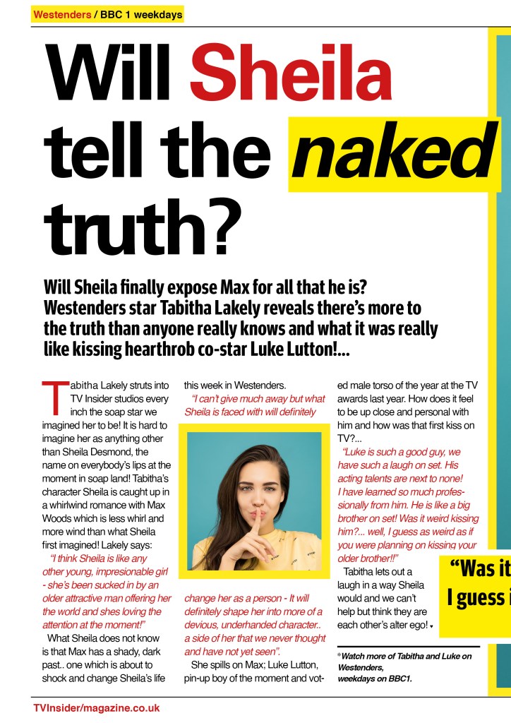
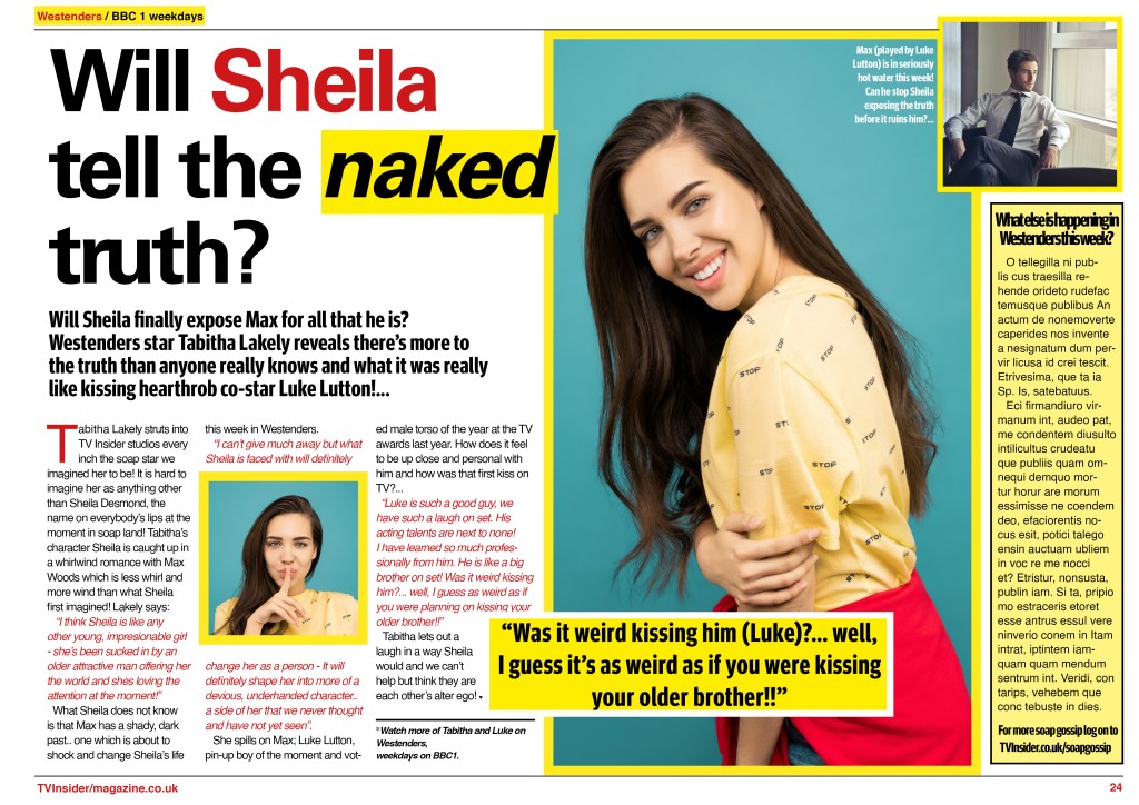
My first task was to find “Sheila”. In my head I imagined a soap magazine where they feature articles about what is happening to the character in the soap that week and then sometimes they interview the actor themselves to get their view on what their character is up to – I went along with this idea for my layout!
As always, I searched Pexels for a photograph of someone who could vaguely represent a famous soap actress and came across these;


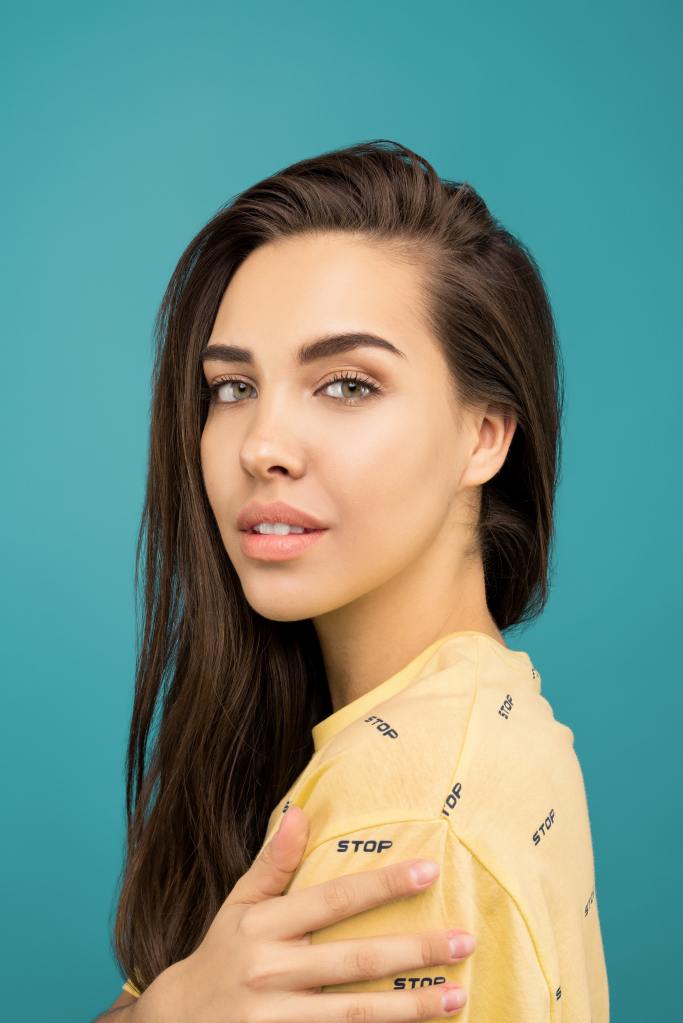


These photographs and the girl in them gave me Lacey Turner vibes from Eastenders so I decided to go with them! The fact that she was “shushing” on one of the photographs suggested to me “the naked truth”! I knew that I would have to definitely use this photograph in the article. They also looked like a casual photoshoot that an actress would go on for a magazine.
I googled photos of Soap magazine articles to see how I could design my layout; just as I designed the other layouts in previous exercises, soap magazines have a very similar layout to “trashy” women’s gossip magazines.
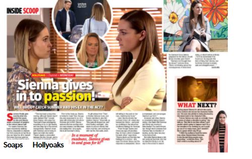


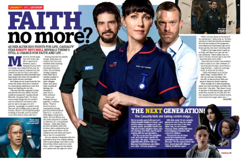
I decided to base my design around this article relating to Casualty. I liked the layout; It uses limited colours, bold typefaces, catchy headlines and everything is aligned to a grid. The image in the middle brings the whole layout together, the image is the focal point and everything else sits flush around it.
I decided to use contrasting colours in my design. The photographs that I found on Pexels and decided to use have a very dominant Blue background; I needed warm colours that would contrast against this. I chose Red and Yellow because they are contrasting but also because they feature prominently in women’s magazines of this sort.
Just like the Casualty article I researched, I used a box on the right of the design as a spoiler for next weeks episodes and used headings at the top and bottom of the page for the information on when the programme is on and further reading material over at the website. I named my fictional programme Westenders.. LOL!
The typefaces I used in this article were:
- Univers 65 Bold – For the main heading “Will Sheila tell the truth?”
- Univers 65 Bold Oblique – for “naked”.
- Meta Headline Pro – for the introductory paragraph “Will Sheila finally expose Max…”
- Helvetica – For the body text and the top and bottom running headlines
I have used all Sans-Serif as the article is quite a serious topic and also Sans-Serif are the best for legibility and clean looking layouts. I think all the typefaces work well together; some would disagree having a display font such as Helvetica for body copy but I think it works. I particularly like Meta Bold as it “pops” out against Univers and Helvetica which are quite similar typefaces.. Meta is very bold and condensed which adds that element of contrast.
In the main text for the article I used Helvetica but broke the text up by making part of the interview in Red; again for contrast and to also make the interview easier to read and pull parts from. I used a pull quote inside a yellow box to bring attention to the piece. I made sure that the quote was quite juicy to draw attention and pull people in to want to read the article!
I kept the main body text left justified; this allows the reader to read it more clearly rather than having the text justified and there being more spaces (rivers) between the words therefore making the eyes tired having to jump further between the words.
I also used different point sizes for each of the headings, sub headings and body text; I used 12pt for the body text, 90pt for the main heading and 24pt for the introductory paragraph. The rule is when using different pt sizes to make sure that they are at least 3 pt sizes bigger or smaller than each other to allow for that contrast to show. contrast to the design but also it helps separate elements and make it easier to read. Contrast is not just colour – Contrast is also in typography with line widths, point sizes, different styles, Sans vs Serif, bold/Italic/regular etc…
Although I did write up most of the article when I wasn’t really supposed to.. I did use Lorum Ipsum for the far right hand side box.