- The Brief
- First Thoughts
- What are subordinate, dominant and accent colours?
- Colour combinations and palettes
- Designer profile – Josef Albers
- Displaying colour palettes
- What is Abstract?
- References
- Moving forward…
Colour is the skin of the world. Colour was the hue of number. One who knows how to appreciate colour relationships, the influence of one colour on another, their contrasts and dissonances, is promised an infinitely diverse imagery.
Sonia Delaunay
The Brief

First Thoughts
Before I even read this brief through properly I had my doubts!.. This is the infamous exercise that I have seen so many other students struggle and feel frustrated by via student chat down email!… It is a bit unfair really but I suppose I had already judged this exercise before I even studied the brief. The brief itself is rather demanding – demanding of my full attention to get it right! Abstract art is not an overly familiar or strong subject of mine and when I sat back and thought about it for too long it did seem like a proper challenge to complete 10 guidebooks all in this unfamiliar abstract territory! I did though push past this initial fear and read more deeply into the brief to see what the most important factors were. The most important really is colour; The whole of part 2 Core Concepts has been purely based around gaining knowledge of colours and colour theory so therefore making sure that I used this built up knowledge by choosing the right colours on my designs was paramount.
I did have a cheeky google search of “Abstract cities OCA” just to see what students (past and present) have achieved with this exercise. I did notice that almost all learning logs that I viewed had taken the route of architecture or buildings, going against the grain as always I decided that I might like to try and do something different. The brief stated “city guidebooks” and this is quite open; city guidebooks to what though?- Architectural buildings of the city? The most popular tourist attractions? City guidebook to food and drink? Guidebook for the fashion aware out there – retail/shops?.. From first glance of some of the cities I already had my “feels” and first impressions of them; for example, Madrid with its warm colours and amazing traditional Spanish food and drink! The challenge of trying to portray something like that in abstract made it even more appealing! I decided I would just let my “feels” design for me and take me to where I wanted to go!
First things first though…
What are subordinate, dominant and accent colours?
What on earth are they?…
After doing some google research and identifying the subordinate, dominant and accent colours on various images I saw, I was confident I 100 percent knew what they were..

- DOMINANT – The colour that appears the most or fills the vast majority of space within a design. It is the most dominant colour! This is the colour that communicates the message of the design. It should communicate key morals, traditions and values and also evoke feelings.
- SUBORDINATE – This is the next colour in line; It usually fills the next largest space after dominant. It should contrast or compliment the dominant colour. For example; yellow and Blue.
- ACCENT – Accent is a small area of colour which is extremely competitive and attention seeking! (Think of her as the youngest sibling of the family! :p) This colour can be sympathetic to either dominant or subordinate and be just as striking but it must be used sparingly so as not to draw attention away from the other 2 main, important colours.
Colour combinations and palettes
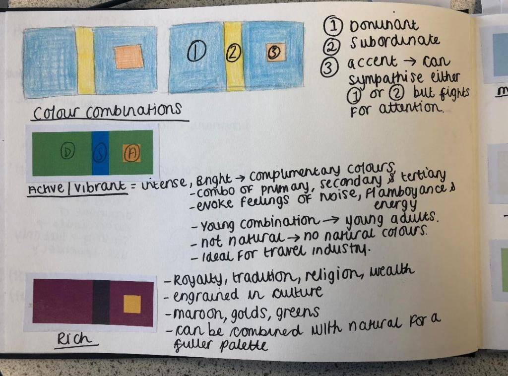

Colour combinations or palettes are extremely important in design, (as I found out in the exercises previous to this one) they can create moods or an atmosphere, evoke feelings, create nostalgia and even control parts of the human body. Creating the right colour palette to cater for what you’re designing is crucial.
The above images from my sketchbook show dominant, subordinate and accent colours on several different colour palettes which cater for different designs and settings.
Active/Vibrant
An Active/Vibrant colour palette is normally made up of bright, complimentary primary, secondary and tertiary colours. This colour palette evokes feelings of noise, flamboyance and energy. It is a very modern “young” palette and because of its energy and its “busy” appearance it makes it an ideal palette choice for use in the leisure and tourism industry.
Rich
A rich colour palette conveys royalty, tradition, wealth and religion. When I think of this colour palette I think of hot, luxurious places like Morocco and Dubai. I think of rich fabrics and I think of rich spices and foods. The colours usually comprised in this palette are maroon, gold and rich emerald greens. This colour palette is engrained with tradition and culture.
Muted/Calm
This colour palette is very quiet, relaxing, calming and peaceful. It is the perfect palette for use in the health and beauty industry. The colours used in this palette are muted down, there is a lot of white in the hues. The colours are very soft and feminine in appearance. In this combination the accent competes against the dominant for attention. Although used sparingly, the accent will make as much impact as the dominant does in this palette.
Pastel
The pastel palette is very similar to muted/calm – the hues contain a lot of white to tone them down, however Pastel does contain more warm tones than muted/calm. Pastel combines warm and cool tones (e.g.pink and blue) which makes it perfect to use in baby products. The colours portray youth and innocence.
Natural
A natural colour palette uses colours from the great outdoors. This makes this palette ideal for anything with rustic charm, outdoor leisure activities etc. One of the most obvious feelings that come to mind with this palette is Autumn with the leaves falling and the changing colours. The colours associated with this palette are browns, reds, oranges, warm pinks and sky blues.
Designer profile – Josef Albers
I decided to add a little bit of a designer profile in here as I thought it was relevant. I was doing some background research on colour and I kept coming across Josef Albers and his work involving colour and his theory behind it. Looking at pieces of his work actually helped me to understand exactly what this brief might be looking for in terms of the colours and the abstract influence. I also looked at previews and YouTube videos of his book “Interaction of Colour” which seem to be a crucial “must read” resource for artists and designers alike.

Josef Albers studied at Bauhaus and then in time was invited to teach colour theory there. Before enrolling as a student at the Bauhaus in 1920, Josef had been a school teacher in and near his hometown of Bottrop in Germany. Initially he taught a general elementary school course; then, following studies in Berlin, he gave art instruction and he developed as a figurative artist and print maker. Once he was at the Bauhaus, he started to make glass assemblages from detritus he found at the Weimar town dump and from stained glass; he then made sandblasted glass constructions and designed large stained-glass windows for houses and buildings. He also designed furniture, household objects, and an alphabet. In 1925, he was the first Bauhaus student to be asked to join the faculty and become a master. At the end of the decade he made exceptional photographs and photo-collages, documenting Bauhaus life with flair. By 1933, when pressure from the Nazis forced the school to shut its doors, Josef Albers had become one of its best-known artists and teachers, and was among those who decided to close the school rather than comply with the Third Reich and reopen adhering to its rules and regulations.
https://albersfoundation.org/artists/biographies/


Displaying colour palettes
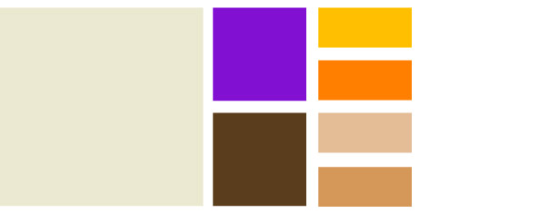
I will need to choose and display colour combinations effectively a) for deciding which colours to use in my designs and b) for how I use the colours on my designs.
This image above shows how colours are displayed according to their relevance on the design they have been chosen for. The grey is the dominant colour; it is displayed using a big block of colour. The subordinate colours are the next block of colours; slightly smaller in size to show their importance in relation to the dominant and these colours are contrasting colours. The accent colours are the smallest blocks of colour. They are just as important as the rest of the colour palette but only sparingly in a small amount.
When I choose the colours for each book I will make a colour palette which looks very similar to this one to show the order of importance each colour will have on my design, it will also be useful for me to see how well the colours work with each other.
What does “Abstract” mean and what is it?
I am quite fortunate in the fact I work in a secondary school and have close contact with the Art department! Zoe one of my friends and the Art teacher is a great point of contact for if I need guidance on anything art based for my work! She suggested a few areas to look into and the work of Henry Matisse massively inspired me… I will touch back on this later on in this exercise…

Abstract art from what I believe, is a non representative visual depiction of something that already exists but uses line, shape, colour, form and gestural marks to achieve an adaptation of it.
In simple “Abstract” is “abstracting an idea or distancing an idea away from its object. Abstract is pulling a depiction away from any literal, representational reference points.
Abstraction can be traced back to Impressionism, Post-Impressionism and Cubism. All three of these helped to realise the idea that art could be non-representative.
Modern abstract art was born early in the 20th century. It was completely radical for its day. Artists began to create simplified objections with little or no reference to the “real” world.
We will never know who started off abstract art but a key artist who is always credited for creating abstract art is Wassily Kandinsky as he created paintings of floating non representational forms as early as 1912.
Abstract art now lives in the art world in many forms. It is two- and three-dimensional. It can be vast or small. Abstract art can also be made with many materials and on many surfaces. It can be used in concert with representational art or completely abstract. Artists creating it often focus on other visual qualities like colour, form, texture, scale and more in their non objective work.


“A thimbleful of red is redder than a bucketful”.
– Henri Matisse
References
Moving forward…
From doing this introductory research I am now more familiar with what the brief is asking of me and can now move forward into thinking about my ideas for my guidebooks. I will start off with the first city on the list which is Madrid.
Stay tuned for my future posts on the ideas and development around my city guidebooks!
