The Brief
This brief seemed like a fairly simple brief from first glance, it is basically a poster of names and their birthdays but in a cleverly designed way. This brief came in handy because in our house my boyfriend used to have a list of everyones birthdays but I accidentally destroyed it – I told him that I could design this for the course and also for our house!
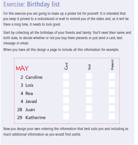
I started thinking about different ways that I could design this. I did not want to create a “simple” design. It is all too easy to list names and birthdays. The example that was given in the Core Concepts book was NOT what I wanted to achieve at the end of it.
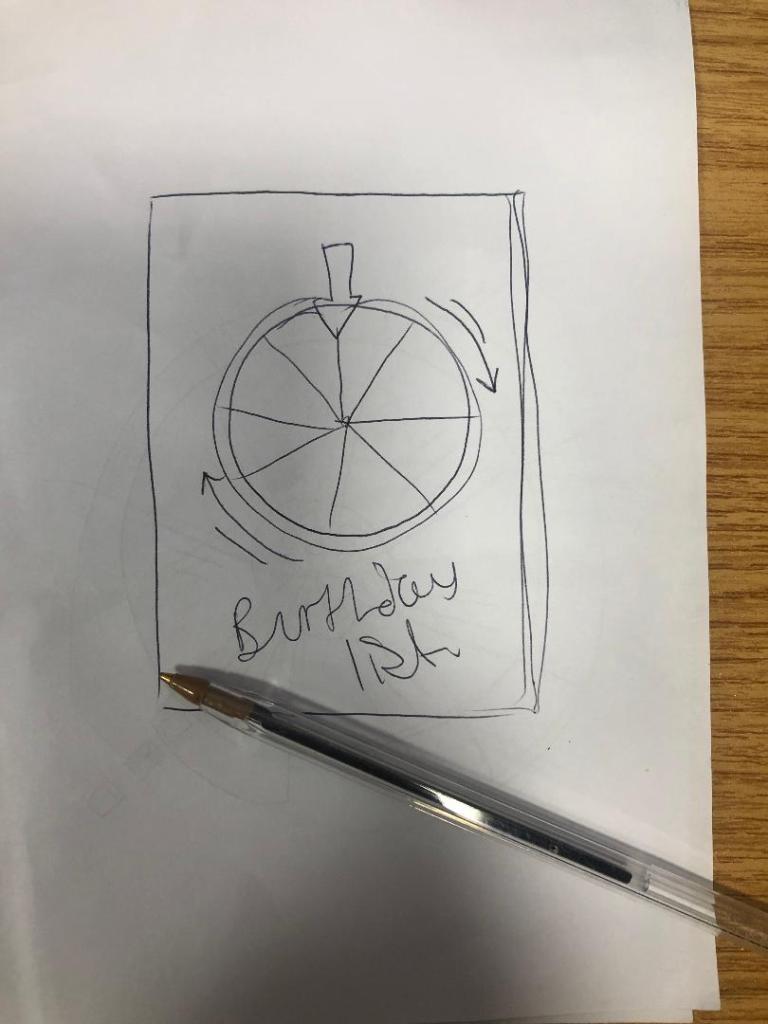
I had the idea of a pie chart but split into 12 segments for the 12 months. I could record the information around the pie chart. I then had the further idea of creating the pie chart into a birthday cake! I knew I would have to draw my pie chart first and measure out accurately the size of each section and then import it into Illustrator to draw in actual size and add decoration etc..

I drew out the circle first (rather quite big actually!) I am rubbish at maths and working out measurements etc so it took me a while to master the art of a compass and a protractor and measure it all out!
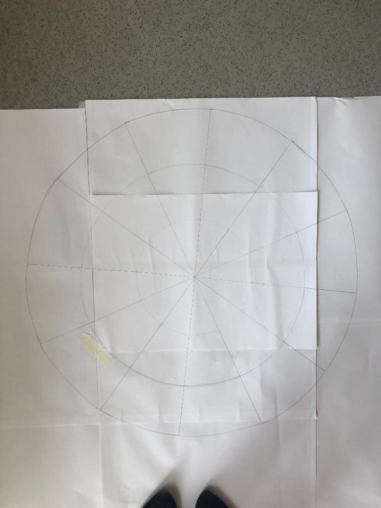
Once I had the circle drawn out I took a photograph of it and imported it into Illustrator to draw around and start producing my final design.
I decided to set up my document in Illustrator and to create my final design in A3 size. I did not want to make it too big to display on a wall (you can still buy pretty looking A3 frames to cater for this size for on the wall of a house) and I did not want to make it too small so that the information would be illegible.
I imported my photograph in and lowered the opacity so that I could barely see it and locked the layer so that It could not be moved. I then created a new layer and started to trace around my pie chart drawing using the pen tool. I created new layers for each section of the pie chart.
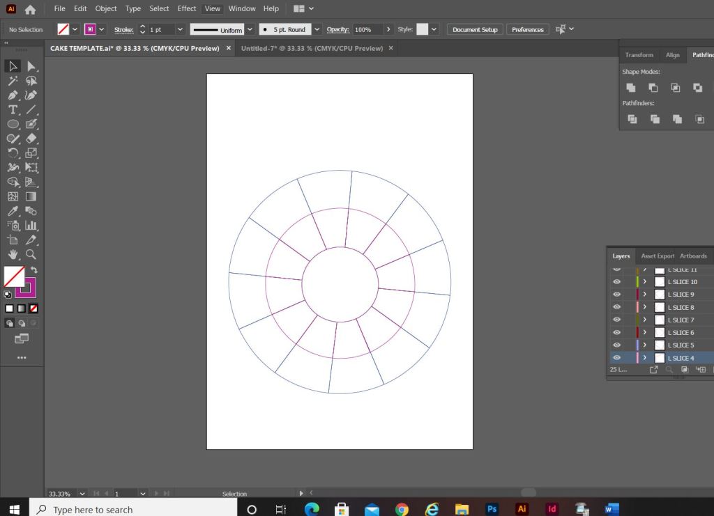
My only issue when I finished drawing around the circle was that it looked more like a mosaic aerial view of a patio in a new build house! How could I make it look more like a birthday cake to make it look more attractive as a wall chart?… The circle in the middle really took away the “look” of a birthday cake. I decided to get rid of it and have the segments meet in the middle like they would if it were a real cake.
I started to research into aerial views of birthday cakes just to see how I could make mine look more “cakey” and less “patio”.
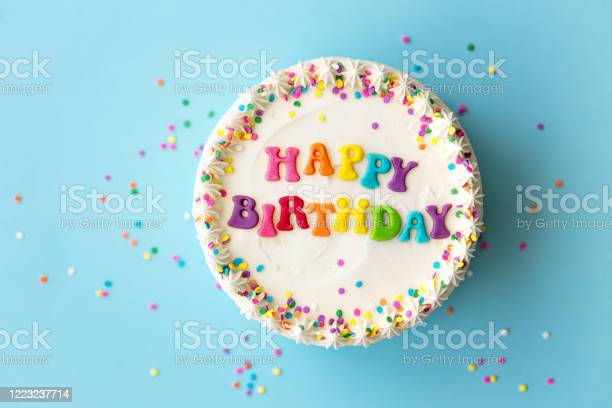
Happy birthday cake with rainbow lettering 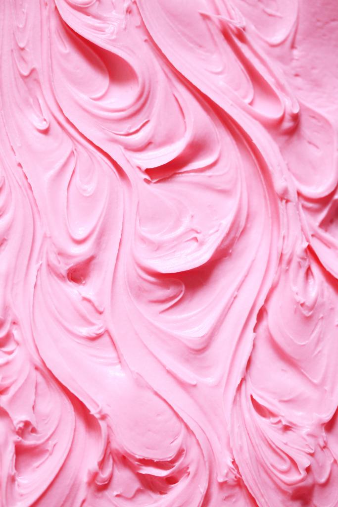

I had a look at how I could create this effect online:
This video shows you how to create mixer brushes for Photoshop that look like swirly, squirty icing. I followed this tutorial but it took me a good few hours to figure out how to do it myself! I did create a mixer brush to use in my design though. This is how it turned out:


When I changed the middle of the cake and the sections met in the middle, it created me another issue of how I would make the months legible as they are supposed to be in the centre middle circle section of the cake that I deleted. The sections now were too skinny to fit the month names. I came up with the idea to make each section a colour. I would match the colours to the seasons and use different shades for each month: Blues for Winter, Greens for Spring, Yellow for summer and oranges for Autumn. For the months where there are no birthdays I decided to pull the slices out as if they were about to be eaten. These are also the only slices that I would put the icing on because if I put icing on the other 9 slices the information would be lost. I also made the background a blue colour and added sprinkles just to make it look more appealing and like a birthday. I mapped out on each slice where each piece of information would go and it was starting to look more like a birthday cake now, although it still looked too mathematical with the lines on the sections and the colours did not contrast against the blue background very well. The colours were too much alike. I needed a pop of colour!
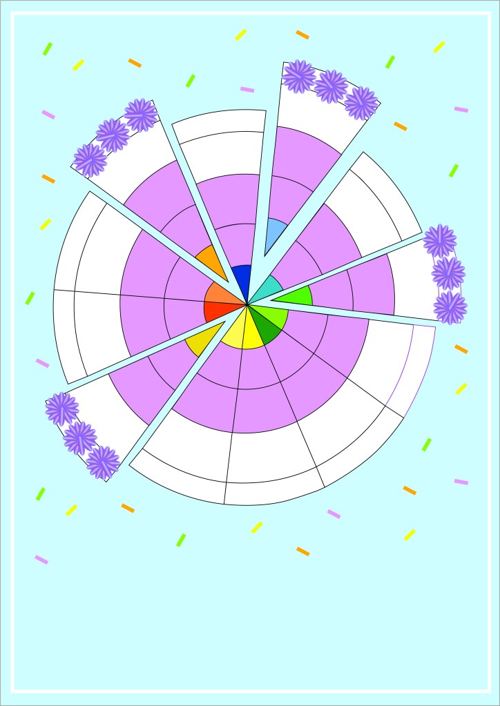
For anyone that knows me well enough the colour I chose to make the “pop” wouldn’t surprise! I used a nice bright Pink! I think it works really well against the cool blue background and the coolness of the lilac icing. It looks far more celebratory, cheerful and happy!

Although I said during my Typography unit that I did not like quirky and gimmicky fonts, I find myself experimenting and using them more now. The typeface that I used for this is called “Flood” I found it on Adobe Fonts and it reminded me of cake being smeared in the form of type. It has that modern, fun feel to it also! It really works in the hot Pink colour too!
I now just needed to add all of the relevant information and the symbols for the chart:
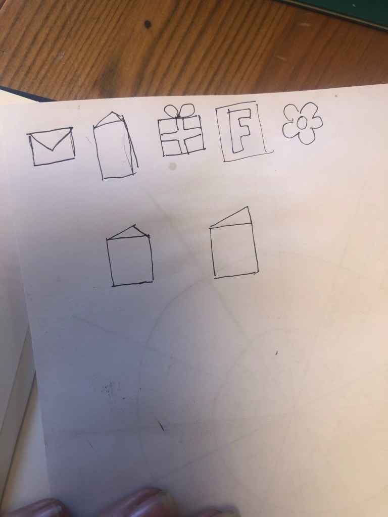
**** INSERT PHOTO OF SYMBOLS
I then took my sketch and imported it into Illustrator to draw around each symbol to place on my chart. I added a key to the bottom of the chart so that people would know what each one means.

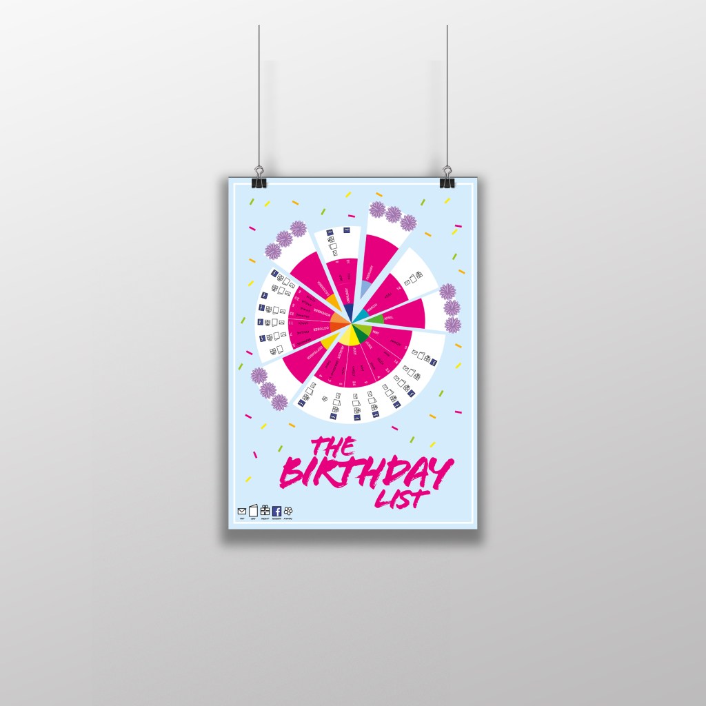
This is how the final chart turned out! I am pleased with the result! I think I have met the brief; I have created a chart that records everybody’s birthdays and what they are to be sent for their birthday as well as making it look attractive and appealing to want to put on the wall.
The only other thing I really questioned was the position of the text going around the wheel. I did wonder whether to flip the text to go the other way when I reached July but then decided against it because there was room to further develop the chart… If the chart were to be manufactured in industry there is room for the wheel to be actually made into a functional, turning wheel. The text would then be positioned just right to flow around the moving wheel. There could even be an arrow made for the top of the wheel to point to the correct month!
The typefaces that I used for my chart were Ayra for the names of the months; It is a fun, thick width typeface that stands out and looks great in white! I used Flood again for the names of everyone on the chart to keep repetition with the design and also because it works really well and it legible.

The final mockup