I completed the commissions – but I don’t love them… I think because I was out of my comfort zone with gimmicky typefaces (and the fact I had to use several of them!) and that there was a lot of text for a very limited space. I struggled with the lack of negative space in my designs.
Version 1: Trashy womens magazine!
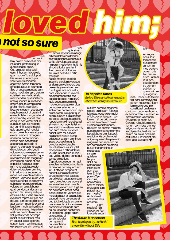
I started off with the short story “I thought I loved him, now I’m not so sure”. This is the first of 3 versions I have done for this article; this version is for a women’s weekly gossip style magazine.
I went to the shop and bought a copy of “Real people” magazine to have a look at some of the layouts in there to see what I could do for my layout. The colours that were used were mostly red, yellow, blue, green, black and white. A lot of the images were placed in chunky, brightly coloured boxes and the typefaces were mostly Sans-serif; again with brightly coloured outlines around the text. The background images behind the layout mostly related to the articles that were being written and that is why for mine I decided to do a broken hearted background. I created this by drawing a broken heart in Illustrator and then repeating it to make a block pattern. I then imported it into InDesign to place behind the text. I then created the zig zag part along the top to represent “broken”. I made the title quite big along the top of the article to draw people in to what the article is about, the “not so sure” part is the second piece of information the reader needs to read so I made that a lot smaller but in white so that it still stands out.
These are photographs that I found on Pexels.com for my articles. I wanted images that showed the couple in “happier times” I chose these photographs that are shot in Paris to pose as like old fake holiday photos of the couple! The first photograph where he is staring at her intently but she just does not seem connected to him felt ideal for the main image! It is in Black and white as well which always seems more thoughtful and moody and they were ideal for my next article which was for a glossy high end magazine!

I struggled to fit 1300 words into my articles, especially when I used a lot of images and quotes in larger text. I created an 8 column grid for the layout which would allow the text to flow nicely throughout it. I had to fit the text to the images to allow the text to flow around them. My images were placed in a chunky box of colour just like the articles I researched. I used Neue Haas Text Pro 55 Roman for the main copy text and Neue Haas Grotesk Text Pro 76 Bold Italic for the title. I also used Neue Haas Text Pro 56 Italic for the smaller pieces of text along the bottom. I know that these are not 3 different typefaces but they are different styles and weights and still make great differences to the look of the layout. I had to adjust the leading and kerning of the text in the article to make sure that I had no hyphenation within the copy and I was wary of leaving widows (although I have left one on the first page, first paragraph!) I was also wary of leaving massive rivers in the text although this was easier to control because the layout is left justified.

Version 2: High end glossy magazine
I researched into magazines such as Elle, Vogue and Harpers Bazaare for this article. The one thing I notice about articles like this are that the typefaces that are used are very feminine, light, delicate and ornate. Didot is a very popular choice for these style of magazines and this is what I used for the body text of this article.
The typefaces I used were: Didot LT Pro Roman for the body copy, Didot LT Pro Bold for the headings
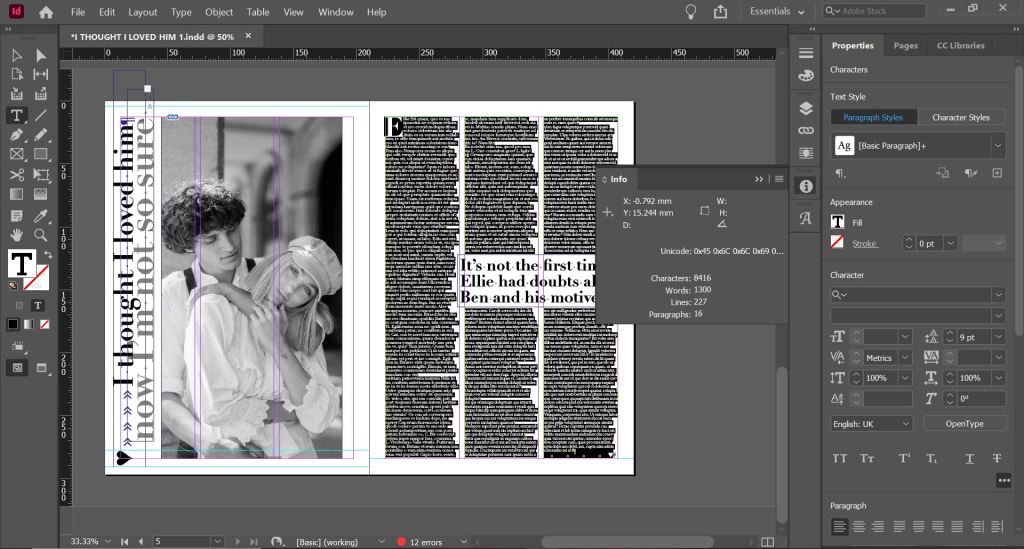
Black and white for photographs in these magazines is also a popular choice. Black, white and greys are very prominent in these style layouts. I also noticed that fancy magazines use glyphs at the end of the articles; I decided to use a heart one to match the feel of the article.

I still have issues and things I would change with this layout; looking at it now as a finished article, to separate the text up slightly I could have indented the text at each paragraph just to make it look less intimidating to the eye. I am also not entirely happy with the side title. I tried to make it large enough to stand out but at the same time still have contrast against the rest of the layout, I made parts of it bigger than the rest to emphasise on them particular words so that they stood out first. I am now wondering if it is trying to hard to compete next to the main image. I also again only used one typeface but with a different style and weight; however, I still feel it brings contrast to the piece.

Version 3: A weekly glossy magazine (such as Grazia)

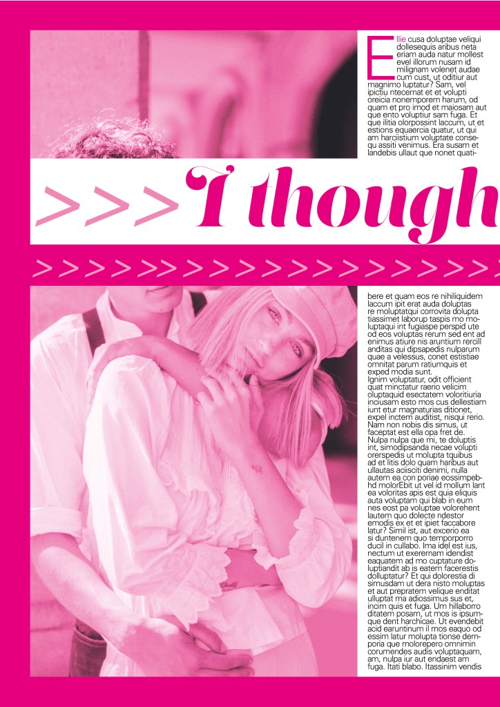
I researched Grazia magazine mostly for this layout. Grazia has a high end feel but also has similar articles to what gossip magazines have. I have tried to design a layout with a combination of both magazines. This article has a similar layout with the grid and columns as what my high end magazine article has but uses more images and “fun” typefaces.
I used more typefaces in this layout, I used Lust for the main heading, Neue Haas Grotesk 56 Italic for the smaller heading and Univers Light for the body copy.
I also noticed that Grazia uses a lot of symbols in their magazines so I decided to break the title up by using arrows. The eye is drawn to the main top line of the title first and then you follow the arrows to read the last part of the title. I wanted to bring an element of colour into the article like the gossip mags but also keep a classier feel like the more top end magazines so I decided to go in the middle by creating a similar feel to black and white but use Pink to replace black. Pink is also feminine which is the target audience for the magazine and also relates to the subject of the story. I put a border around the layout (similar to my first trashy mag article!) and I chose to keep the text justified left, as this is always the desired choice to choose when designing book/magazine layouts but again I wish I had added indentation to the paragraphs to separate the text up slightly so it is less blocky and harsh on the eye.


