
Part 2 of this exercise was to design layouts for 4 different commissions! – Overall I found this a very long exercise to complete! I loved designing for the typeface specimen book but by the time it got to part 2 I was finding it tedious!
I completed the commissions – but I don’t love them… I think because I was out of my comfort zone with gimmicky typefaces (and the fact I had to use several of them!) and that there was a lot of text for a very limited space. I struggled with the lack of negative space in my designs.
Version 1
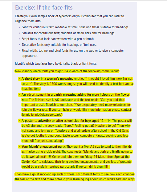
I work in a secondary school so should be familiar with ways to lure teenagers in but sadly when it comes to activities such as after school clubs, many are rarely interested! The common things our teenagers like nowadays is money, phones, food or Gucci clothing!!! BUT! nonetheless I battled on with the start of this brief! 😀
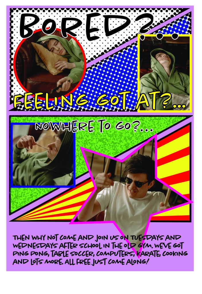
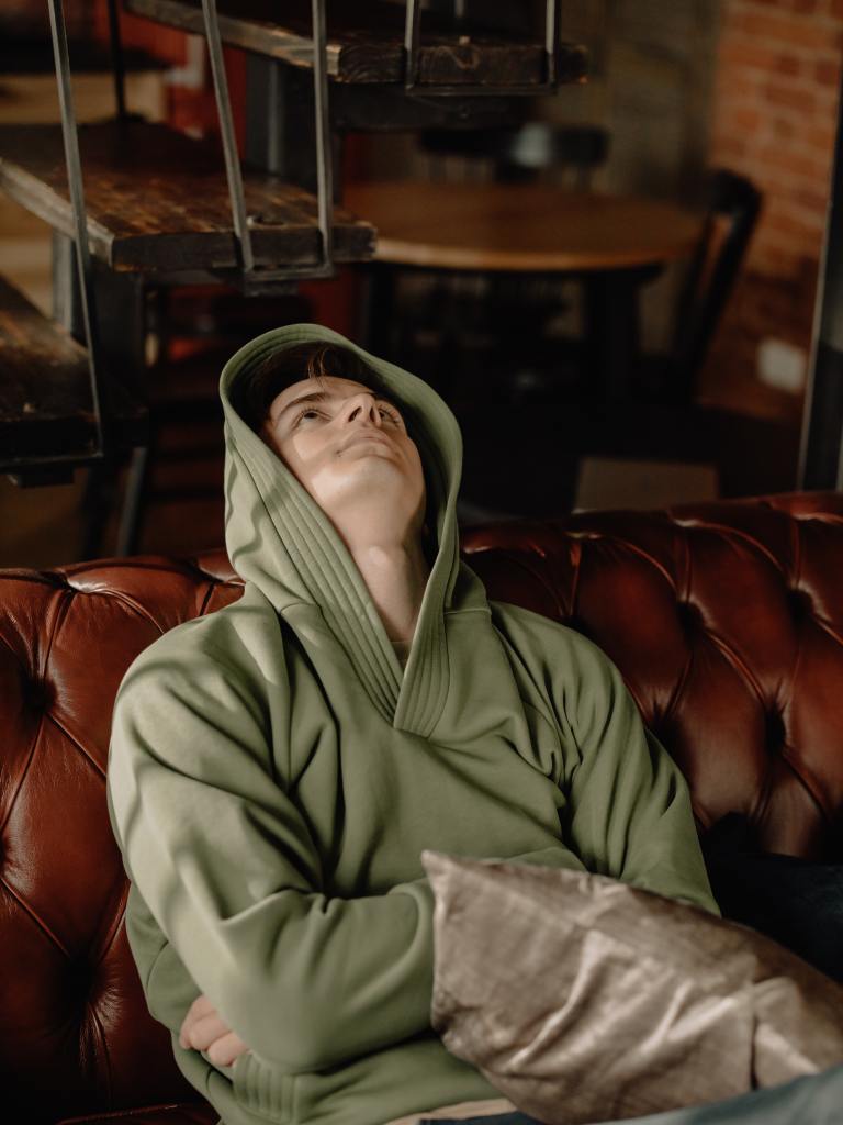
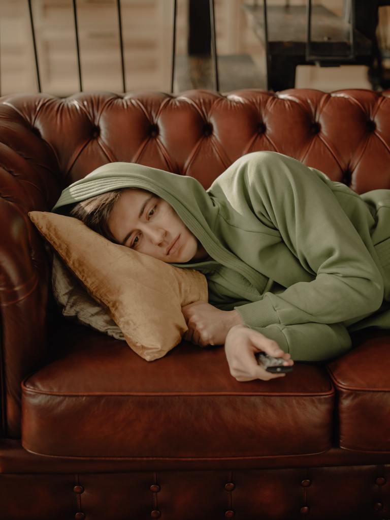
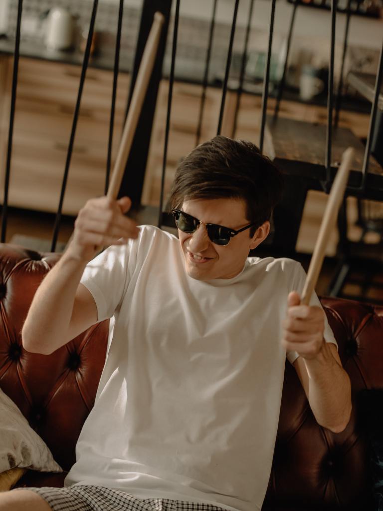
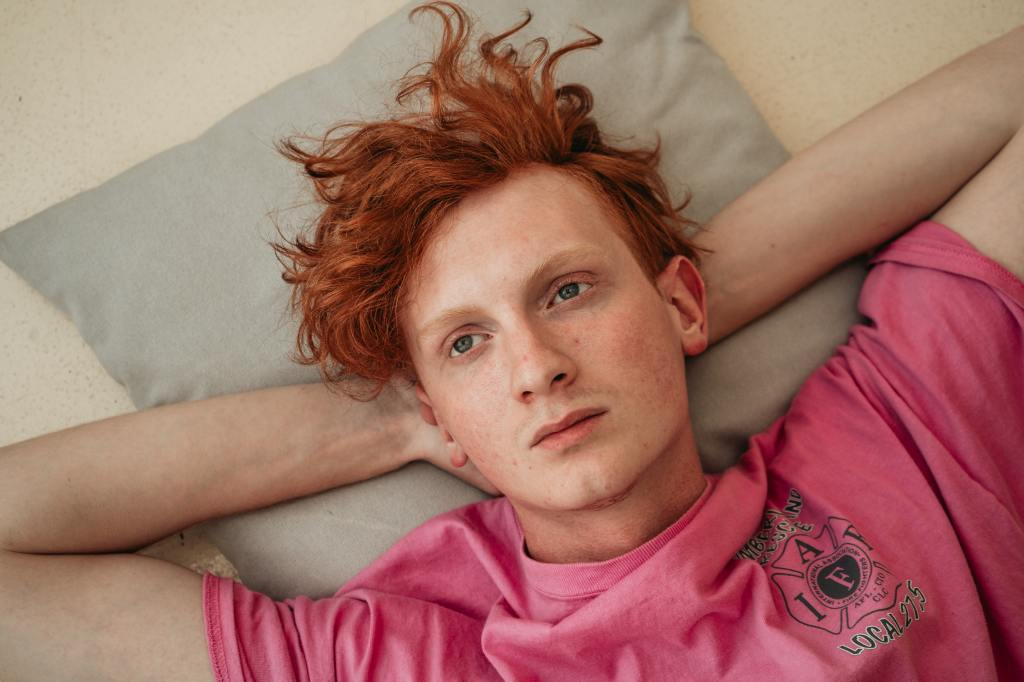
I believed that if I made it look fun and appealing I might be in with half a chance so once again I sourced out Pexels.com and typed in “bored teenager” a host of images appeared and in particular a range of images of the same lad in various thoughtful (or lack of!) bored poses! These were perfect and once again I could adapt them to what I needed!
I also found one bonus photo of the same lad model but this time looking really amused with himself which I thought would be ideal to show that the after school club is ace!


In our lessons at school we do a project based around Pop Art which is the idea I got for this brief. I had the idea of a marvel style comic book with the images in where he starts off bored but then ends up happy and entertained. I also thought that I could use the typography to look like comic book style – possibly in bubbles, shapes, speech bubbles etc.
I started off by designing the poster in Illustrator; all the brightly coloured vector art I drew using Illustrator and then imported into Photoshop to bring the photographs in. The typeface I used; Chantal (which I used in my typeface specimen book) is very “teenager friendly” it is like a mix of handwriting and graffiti. It is modern looking and to be honest it is fairly legible! I tried to use complimentary colours throughout the design for contrast and overall I think this version works really well!

Version 2
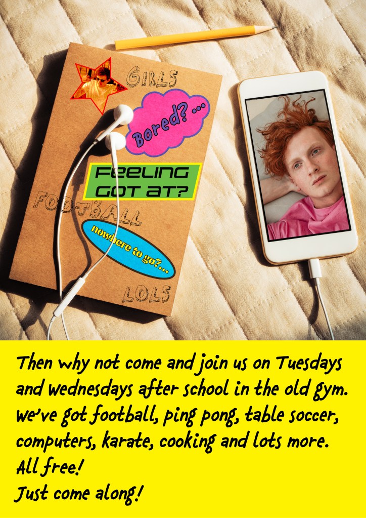
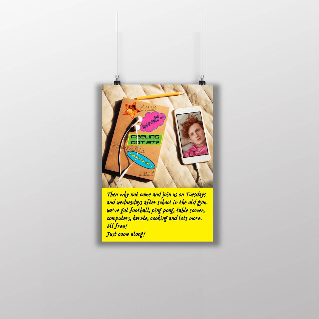
Version 2 has more typefaces used in it which is what the brief wanted.
The typefaces that I have used are:
- Pepsi – (“Feeling got at” sticker)
- Mati – (girls, football, LOLS)
- Felt tip Roman – Body text
- Chauncy Pro – (“Bored” sticker)
- Continuo – (“Nowhere to go”)
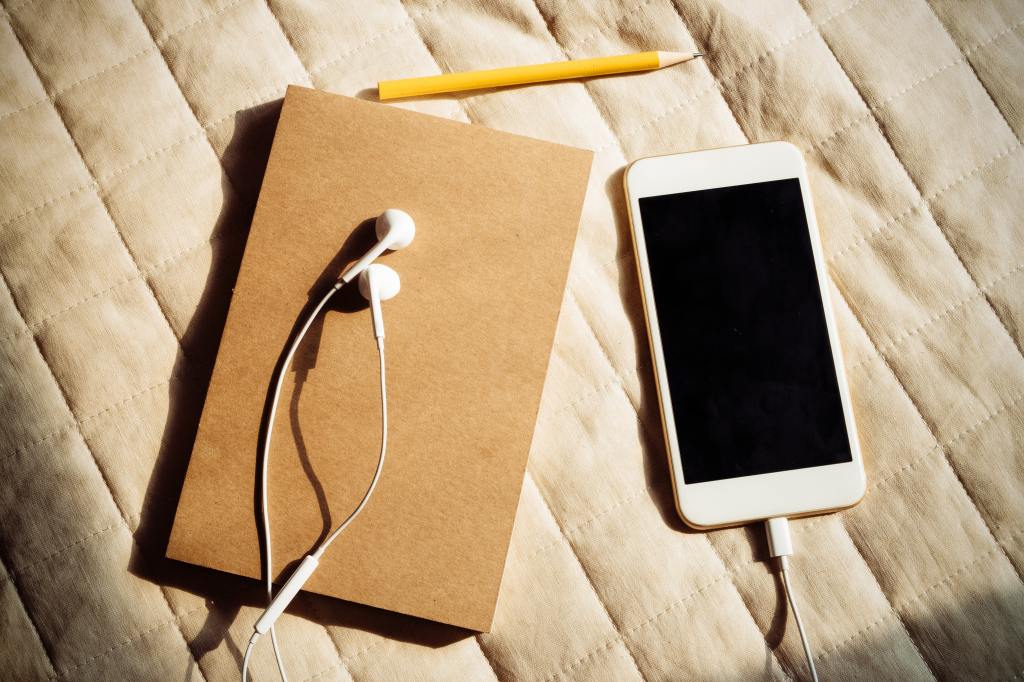
I feel I could use more typefaces in this design using the words and typefaces as stickers on the cover of the notebook and the doodle typeface to look like scribbles on the notebook cover. I have tried to appeal to the youth of today by using an image (again, courtesy of Pexels) of what could be a teenagers bedroom with an iPhone and earphones and school exercise book. Snapchat is a popular app with teens to snap photographs back and forth to each other and that is exactly what I have tried to do with the image of the bored boy on the phone screen. All photographs that I use are free to download and use from Pexels.com.
I have used modern, bright colours again to try and attract the attention of teens and the typefaces that I have used are all fun, gimmicky, young and teenage friendly! I have used what I believe to be the most legible typeface for the information on the poster and I have set the black type against a bright yellow background to make it stand out.
Although this poster isn’t as visually eye catching as the first one I do think it appeals more to teenagers with the use of the IPhone and earphones photograph. The use of all typefaces work really well, especially using the typefaces as the notebook stickers in the design. I like all the typefaces I have used in this design even though they are fun and gimmicky. They all match the feel I wanted to create with this poster. There is a mix of childish handwriting, bubble fonts, stencil fonts and a “speedy” boyish looking typeface which I quite like.
Version 3

This poster is my least favourite. I tried to bring some of the Swiss style to this poster by using Sans-Serif typefaces; Neue Haas Grotesk 95 Black and 55 Roman for the lower information and Uniwars for the top headings. I also used the colour Red which relates to the Swiss style and is also a colour that . I followed the theory of the Swiss typographic style that is the typefaces don’t need to be ornate and fancy to grab someone’s attention; a good Sans-Serif typeface does that itself. With this in mind, I kept the poster really simple with just bold headlines, the one image and the following information in the bottom corner. This version is possibly the least engaging for young people but the bold catch lines might just help to draw them in a bit.

