The Brief

The first part of this exercise brief was to create a book of typefaces that I can refer back to for my future design work.
The brief specifies that I need to organise them into:
- Sans- Serif
- Serif
- Script
- Decorative fonts
- Fixed width, pixel or Techno
I had seen examples of this brief in other students work and I felt really apprehensive starting it! I always thought that Typography was an area in design that I really couldn’t get to grips with so I was really nervous about starting part 4 of Core Concepts with this first real exercise. However, reflecting back now on this finished exercise I can confidently say that I think it is one of the best pieces I have done to date! I have learned so much about typography and the typefaces that I never knew before. Designing the pages for each typeface required me to research in depth all about the typefaces; how they are best used, the history behind them, artists who may have used them strongly in their work… and it also required me to research into type specimen books, layout design and grids. The brief specified to create a book; It did not mention how many typefaces for each category I should do, how many pages it should have or how simple/detailed it should be so I had to go with my own judgement and create a book that I would personally want to read if I was buying it in a shop. I had a snoop online at some of the outcomes that several students had done for this brief just to see whether I was thinking along the same lines. Some of the students had simply listed the typefaces onto one document one beneath another with an example of the different characters beside it but I knew that his definitely was not the route I wanted to take. The brief specified “book” which to me means professionally designed in InDesign with the pages all laid out with the grid system etc. I decided to go down the route of creating a double page spread for each typeface in InDesign. I chose to design double pages for each typeface because of hierarchy. I wanted each page to be easily readable, comfortable on the eye, appealing to read and look at and most importantly I wanted the use of negative space which I would not have achieved with single pages.
Research
I next needed to decide which typefaces to use. I mostly use Sans-Serif typefaces in my work and am most familiar with them so these were easy to choose. I like Swiss design and the International Typographic Style of the 1950s (Swiss Style) and I chose all typefaces to reflect this. I had to research more into Serif typefaces; although I am familiar with some I rarely use them in my work and as for script, decorative and pixel/techno I really had to research! I do not like gimmicky fonts! I also researched into existing old/modern type specimen books just to see what sort of thing should be expected from my own designs and to give me an idea of the direction to go in. The next thing I wanted to do before I started to design my pages was figure out which grid system I would use in my designs. As I have stated on many of my previous posts, I am a big fan of Chris Do and his YouTube channel; The Futur. On one of his videos he explored the Fibonacci Grid. I had never heard of this grid before but decided to give it a go and I was surprised actually by how well everything complimented each other and linked together by using this grid system. In a very early post I stated F*** the grid! I 100% see the error in my ways now! – There is no way anything good can be created without using a grid! When I had researched everything I needed to, I then went on to design my pages. I created the whole book using InDesign and based around the Fibonacci Grid. I used a similar layout for all of the pages so that it is clear that they belong in the same book but I tailored each double page spread around the style of each typeface, how they would have originally been used and their era etc. I am sure that months down the line when I have progressed in my learning further I shall disagree but here and now I am really proud of every page in this book!

My Fibonacci Grid!
The book!
I am really proud of how this book has turned out! The pages are as follows:
· Page 1-2: Helvetica
· Page 3-4: Akzidenz Grotesk
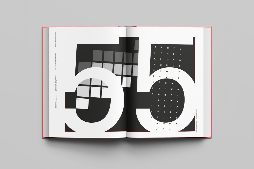
· Page 5-6: Univers
· Page 7-8: Frutiger
· Page 9-10: Futura
· Serif
· Page 11-12: Baskerville
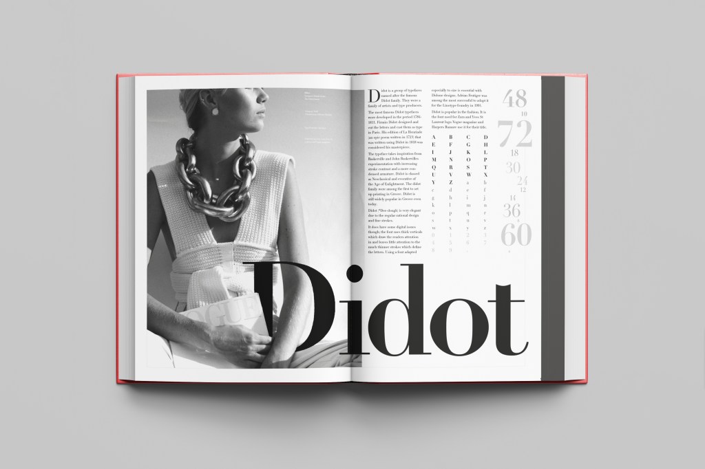
· Page 13-14: Didot
· Page 15-16: Mrs Eaves
· Script
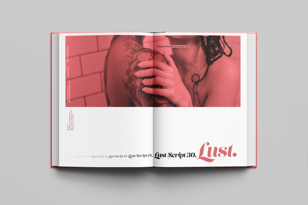
· Page 17-18: Lust
· Decorative
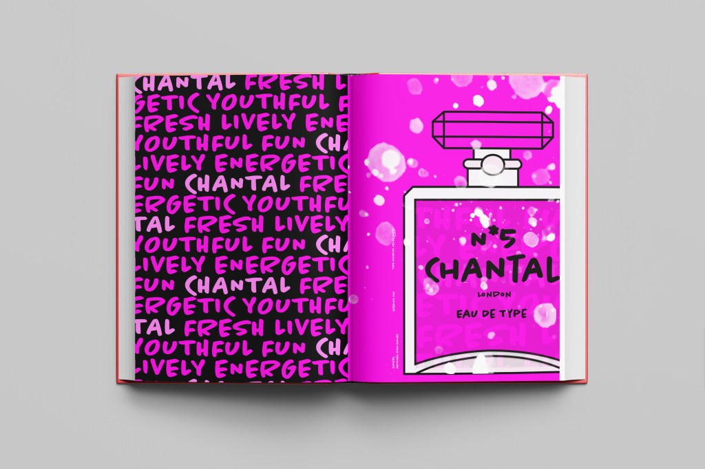
· Page 21-22: Chantal
· Fixed width, pixel, Techno
· Page 25-26: Lo-Res
Here are photos of the final mock ups but on the sub sections to this page is each individual page design and the type and ideas behind it!