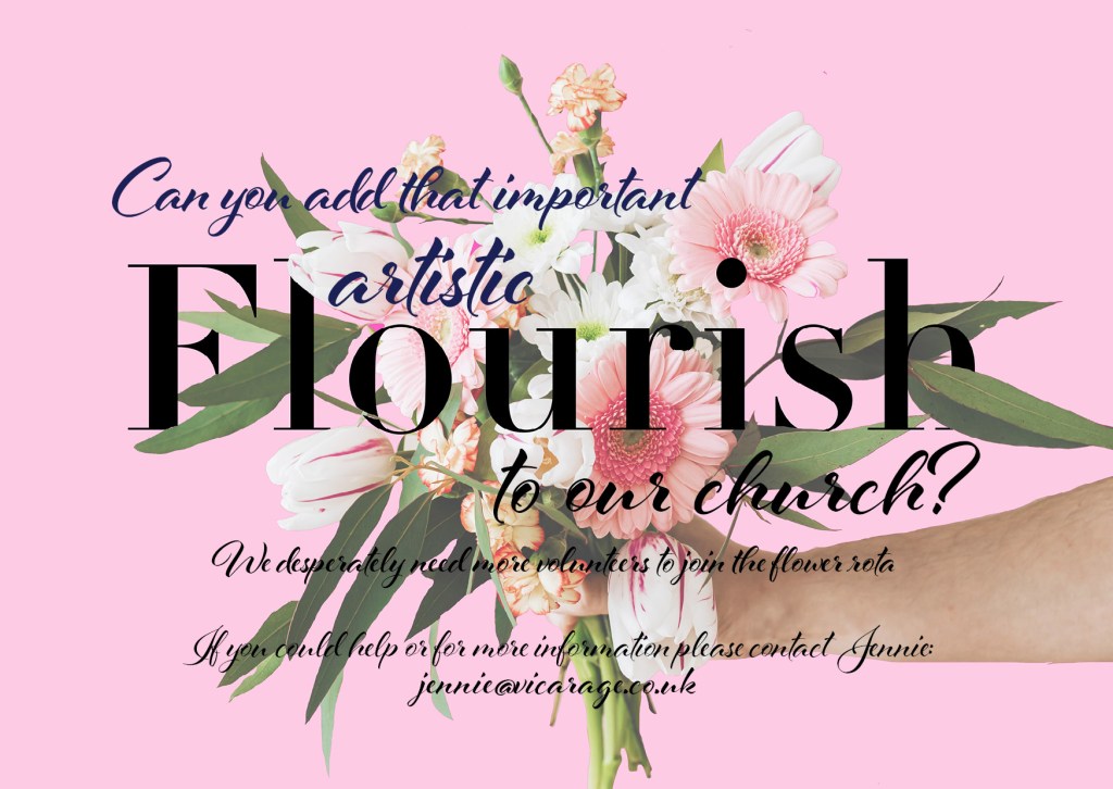
I completed the commissions – but I don’t love them… I think because I was out of my comfort zone with gimmicky typefaces (and the fact I had to use several of them!) and that there was a lot of text for a very limited space. I struggled with the lack of negative space in my designs.
Version 1:


I started off by finding a photograph of flowers off Pexel.com. I figured I could alter this photograph and change the colours etc to fit my designs. For my first version of this advert I kept the colours and the image exactly the same apart from I enlarged the photograph to make it fill most of the space.
The typefaces I used for my first version were:
- Didot LT Pro Bold
- Didot LT Pro Light
I used Didot Bold for “Flourish to our church” because it is very feminine, soft, classy and ornate. It perfectly matches the floral theme of the advert. I added in elements of contrast by using bold against Italic, Thick and thin weights and a mix of serif and sans-serif typefaces. For this particular style of advert Serif typefaces are the best (even as headings).
I tried to keep a hierarchy to this design by making the most important information stand out first because this is what needs to draw the viewer in first and then the secondary information (least important information) comes after. The main heading needs to draw the target audience in first and then if the reader is interested in learning more they will then continue reading the secondary information.

Version 2

This version is very similar to version 1. I have kept the same typeface for the main heading and the same typefaces for the rest of the design. The only typefaces that really suit the style of this commission are Serif because of the feminine, soft and ornate style. I chose to make the background Pink on this one, again, because the style and theme of advert is very feminine and soft and I wanted a colour to best match that. The photograph I kept at its original size this time and centered it in the middle of the advert. I added some pink blocks behind the text and lowered the opacity just so it was more legible against the backdrop and the flowers.

Below is a version I tried out using different typefaces and by changing the colour of the text to try and add some contrast. The typefaces I used were Didot Bold and Al Fresco Bold. It looked nice but for the purpose of the advert which is to try and get people to respond to it, it just is not very legible, clear or easy to read.

Version 3


This version of the advert is probably the most eye catching and appealing with its neon pop of Pink and bright contrasting colours. I have used Didot for the “Flourish to our church” again and Clarendon for the rest of the information. Didot is hands down the best tyewhich work the best for this kind of publication. I used the same photograph but cut around it in Photoshop so that I could add the pink in the background. I also kept the text white so that it stands out against the bright pink.


