I decided to have a go putting my first idea into motion.. “Hairdressers are a girls best friend”
I really found the start of my Marilyn idea difficult. I scoured through to find appropriate photos on google that I could turn into illustrations but I really struggled to make them look like her digitially! These were the images I felt that I could best use:
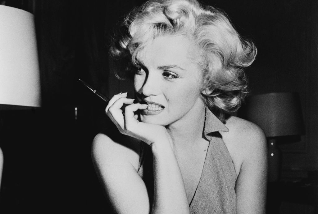

I started off with using the photograph of Marilyn with long hair as a basis for my first attempt. I thought it would be a good photo to use as she has long hair whereas she used to have it short- this could represent during isolation it growing longer!
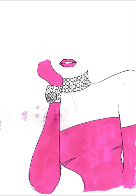
I drew up an illustration using this photograph as the base.. however, as much as I liked it; it did not look anything like her!

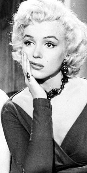
I really liked it though because of her unkempt hair, dark roots and the style I have drawn it in – (I love ink drawings). I used one of her iconic halter neck dresses but did not feel like it really helped distinguish who she is supposed to be. I then looked into “Diamonds are a girls best friend” which I could change to “hairdressers are a girls best friend” and googled her outfit that she wore in that film which was a pink dress and long matching gloves and diamond earrings and necklace. I then drew this to alter the original drawing:
I figured that this would be more recognisable as Marilyn Monroe. I then imported the images into Illustrator and drew around it to create this:

Again, the hair is clear.. but again, she looks nothing like Marilyn Monroe. I then scrapped that idea and went back to the drawing board drawing out countless faces of Marilyn Monroe to try and get it right!
I then went back to one of the other images I found on Google and decided to try and draw her face from that to see if I could draw something that might closely match Marilyn’s face. Finally I settled on something that does not entirely look like her like for like but I think you can tell who she is supposed to be (even with making her hair a little bit more longer!)
Once I had my drawing that I roughly drew out, I then scanned it onto my laptop and imported it into Illustrator so that I could start to trace around it using my pen tool in Illustrator! I used the original photograph as reference to refer to for the different colours and to get the exact details (the eyes needed details!)

This is a screenshot from my Instagram page of the progress I made when I started this design; this is the starting point of the design.
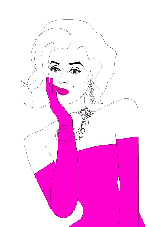
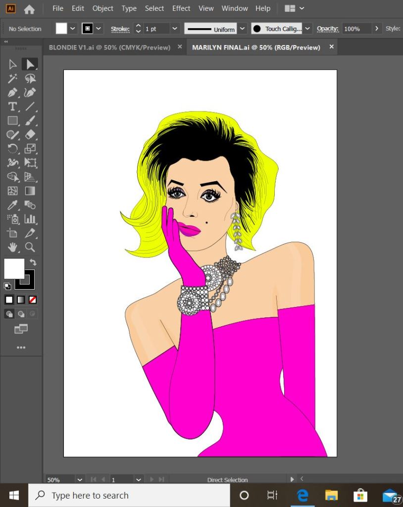
I like the expression on her face in this illustration; it is a look of woe and that she is feeling sorry for herself. This matches the mood of the card entirely. I then needed to work on the main focus of the card which is the dodgy roots.
I also worked on the detailing for the necklace too. I wanted it to appear like diamonds as much as I could. (This is a screenshot from my Instagram page)

This is the finished Marilyn drawing! – complete with very dark roots! Overall I am pleased with the look of her. You can tell it is Marilyn Monroe from the outfit she is wearing which relates to the film. I like the look on her face as well at the fact she is in dismay and misery from the fact she can’t get to a hairdressers!
Now that I have finished the vector drawing of Marilyn the next stages are to complete the other designs in the series; I then need to work on the background and the messages of the cards.
I have ideas of what I want to do for the background and the messages of the cards from things I have collected and seen whilst being out and about. I want to keep the messages and the text of the cards in the same digital, illustrative format. I shall document these and this development on another post!
