Hello! and thanks for dropping by to look at design 3/10 of my abstract city guidebooks- Managua!
I personally had absolutely no idea where this city was! (I am still confused! – but I do know it is on the bit that joins both Americas together!!) with my poor knowledge of geography I attempted to gloss over this and continue with my design ideas. Again, I wanted to keep the design concept and layout etc for this guidebook cover the same as the others so that it continues to form the series.. I was going in again simplistic and minimalist in approach, using architecture and iconic buildings as the basis of my design and taking key elements away to create my design.
I started my initial research using Pinterest again; I looked up iconic landscapes and architecture in Managua and it came up with the cathedral as the main recognisable building of the city.

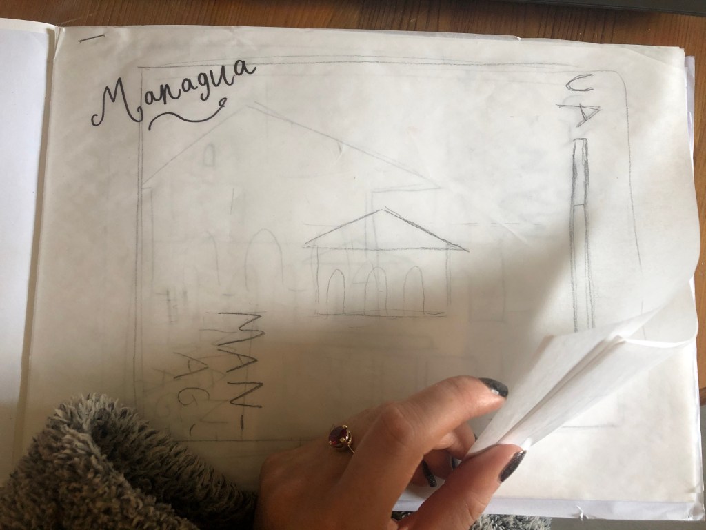
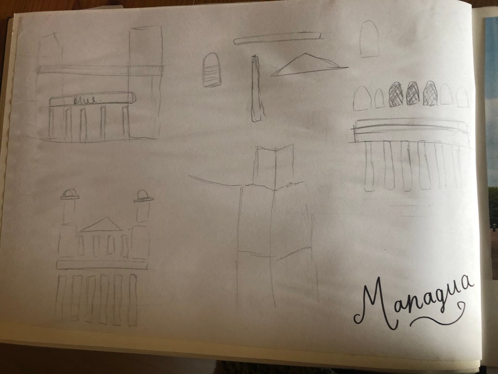
From first glance it looked like a complicated building to try and recreate in abstract! I took the same approach as last time and printed out this image tracing over it again and again simplifying it each time until I was left with the bare bones.
The main key features that stood out to me from the photograph was the intricately detailed stonework of the cathedral, the small cross that features in the middle of the cathedral on top of one of the triangular brickwork and the fact that the cathedral is in beautiful warm weather with 2 palm trees either side of it!
I used my rough sketches to figure out what to include in my final design.
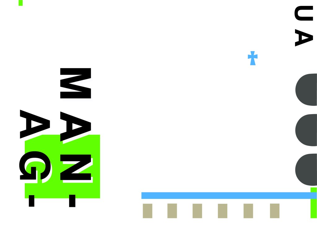
Again, I wanted to try and stick to the rules of thirds for my design and split the design into 3 sections on the cover. I wanted again to let the eye flow naturally across the whole page. Negative space once again played a big factor into the design, I actually base the design around the negative space each time. I placed a lot of the design to the edge of the page which can sometimes constrain the design to a “box” and restrict the design to be able to “breathe”; however, I still allowed for the design to “breathe” by not constraining the design all of the way around the cover. I added a tiny accent of green at the top left side just to give the eye somewhere else to hop to. The idea was for the eye to flow naturally all the way around the design. The bottom green blocks were representative of the 2 palm trees which I have obviously exaggerated and under exaggerated in size – representative of abstract also. The design is not accurate in scale, size or orientation to the building; the grey ovals on the right edge are representative of the arched windows in the centre of the cathedral and the bottom bar and grey small rectangles are a snippet of the pillars that hold the cathedral to the ground and the steps at the bottom. The cross I have kept small, it is always good to have contrast between elements on a design; the eye is drawn more to the cross and its location in the negative space on the cover- it is representative really to how small it is within the great vastness of the cathedral.
The dominant colours on this design accidentally are the black and grey of the text and the arched windows.. I know black and grey are tints but to me they draw me to the design before any of the other colours. The subordinate colour needs to be the green, although to be honest the blue stands out just as much as the green. It probably doesn’t help that these 2 colours are both cool and don’t particularly contrast each other well. As for accent colours… I would say I have designed something that doesn’t have a accent colour as such. In hindsight now looking back I could have added a contrasting colour as a tiny accent to the piece but I honestly just liked the use of these 3 minimalistic colours.

This is the final mock up of Managua! Overall, (apart from I mentioned that I could have used a warmer colour as an accent) I am happy with this design. I think I have met the abstract needs of the brief.


