The Brief
First Thoughts… (and a very “lovely” memory!…)
I am learning to like Typography and to become more comfortable using it because ever since the experience I am about to detail below, I always get worried, doubt my choices, wonder if I’m making the right choices! and basically just stare at a blank canvas for a while frozen in self doubt and lack of confidence!..
I had a bad experience at University in 2007, A fresh faced 20 year old (my first time around doing my degree before they very nicely “kicked” me out.. *eyeroll) when I had to “show and tell” or “critique” my work to my tutor and peers; the work I had to present was a poster about the sound of type? (I did it like The Sound of Music style) using shapes and typography to illustrate it.. Now I know it was by far from a work of art back in the day.. even I am looking and cringing but HEY look! Even today I’m still learning ok! Seriously though, was there really any need for my tutor to absolutely humiliate me in front of everyone, make everyone laugh at my work and by making me sob down the phone in my old little KA (called Biddy, RIP bless her…) to my mum in Iceland carpark telling her my work was shit by his comment of “ER… SOMEONE CALL THE TYPOGRAPHY POLICEEEE!”- what happened to constructive criticism? I mean I can’t even remember his name, all I remember is he looked like Shaggy from Scooby Doo and he was a complete smug, 30 something arsehole! (basically me now.. ish! ;p) All the way through this exercise though I had HIM and that stupid horrendous memory in the back of my mind as the designs I have created for this exercise are very similar to that which I created in 2007. I mean, hadn’t he ever heard of David Carson, RayGun?…
So! Mr. Shaggy, (from a certain university that was mentioned by Mr. Gilbert in The Inbetweeners!!) Get calling the typography police once again because this one is for you! Enjoy it! 🙂

Back to the Brief…
Back to the Brief…
I had heard of the book title but had no idea what the storyline to “20,000 Leagues under the sea” was all about. From doing a bit of research I found that it revolves around this mystery “whale-like-object” that sailors and merchants had seen in the sea and were intrigued to track and find out what it was. They then realise that this mystery creature is actually a modern submarine with people on board. When they go aboard the sub they come under attack by squid and goodness knows what and so the story goes!…
I wanted to concentrate on the 3 important elements from that storyline which is the “whale-like creature” the sea and the squid.
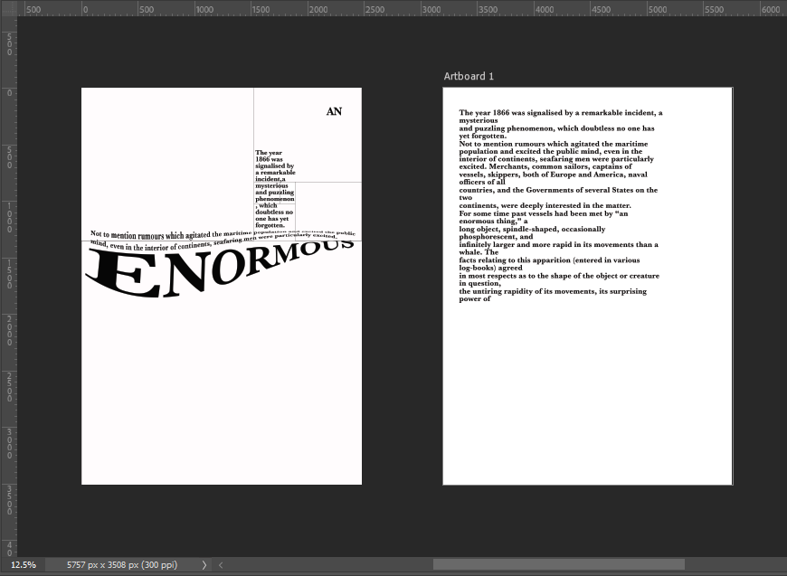
I started off by messing around with some type to look like waves before I properly thought about the layout etc…

I then started off by creating myself an A4 document and then creating myself a Golden Ratio grid which I then also included The Golden Spiral to know where my main focal point was on the layout:
I wanted a nice spacious layout – minimalist and clean. The legibility and readability is important but I wasn’t too bothered about making legibility and readability my main objective because it is pure experimental work! David Carson in his experimental typography always said – “Don’t mistake legibility for communication“, just because something is legible doesn’t always mean it communicates anyway so I might as well be experimental and just see what happens!
I spent HOURS messing around with different layouts for this! I moved type around all over the place to try and best communicate the story!I decided to use Baskerville typeface as this is a typeface that was popular in book design, it is a Serif typeface so is more ornate and decorative than a Sans-Serif to add more interest and was also from the same time period as the story.
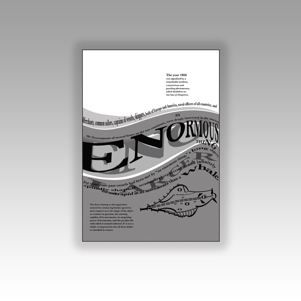
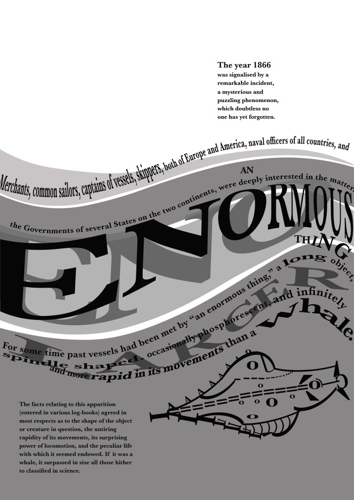
I like the space at the top of this design. I placed the very beginning piece of text in the eye of the Golden Spiral to make it the main focal point and first place the eye goes to when looking at this layout. This is the first piece of information that needs to be absorbed by the reader to know the main subject of the story and also the feelings and vibes that it gives.
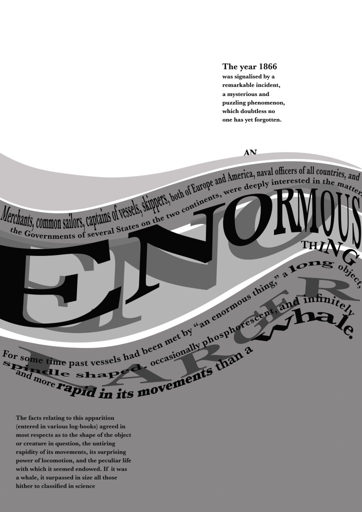
“An enormous thing” is an important part of the extract and story because this is what people called this mysterious “whale-like object”. I needed to emphasize “enormous” and show that it belonged in the sea. I used the wave tool in Photoshop to adjust the word so that it looked like it was in the sea and then adjusted the point size of some of the letters and also the horizontal and vertical scale to (controversially!- sorry typo police!) stretch the letters out! I also adjusted the tracking and kerning to make the letters look more interesting and to add some contrast to the piece!
I duplicated “Enormous” and made the copy the shadow underneath; again, to highlight how big the thing is and also to add some light and shade to the piece. I used 4 wavey chunks of colour to represent the waves and placed the type over the top appropriately.
Could I create an image from letters?…
I then decided that I wanted to create a picture out of type… This was also one of my first ever assignments when I did my BTEC in Graphic Design at college when I was 16! I created a type”face”, a face out of letters! (I wish I kept that because it WAS good!)
I did though a few years back create a very similar one (I nicknamed Brian May because it looked like his curly hair!) for a display board in our Graphics room at work :

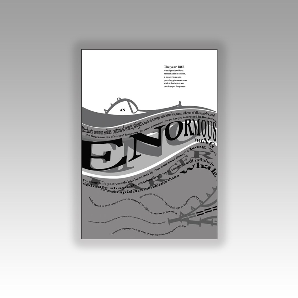
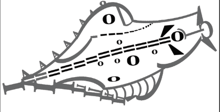
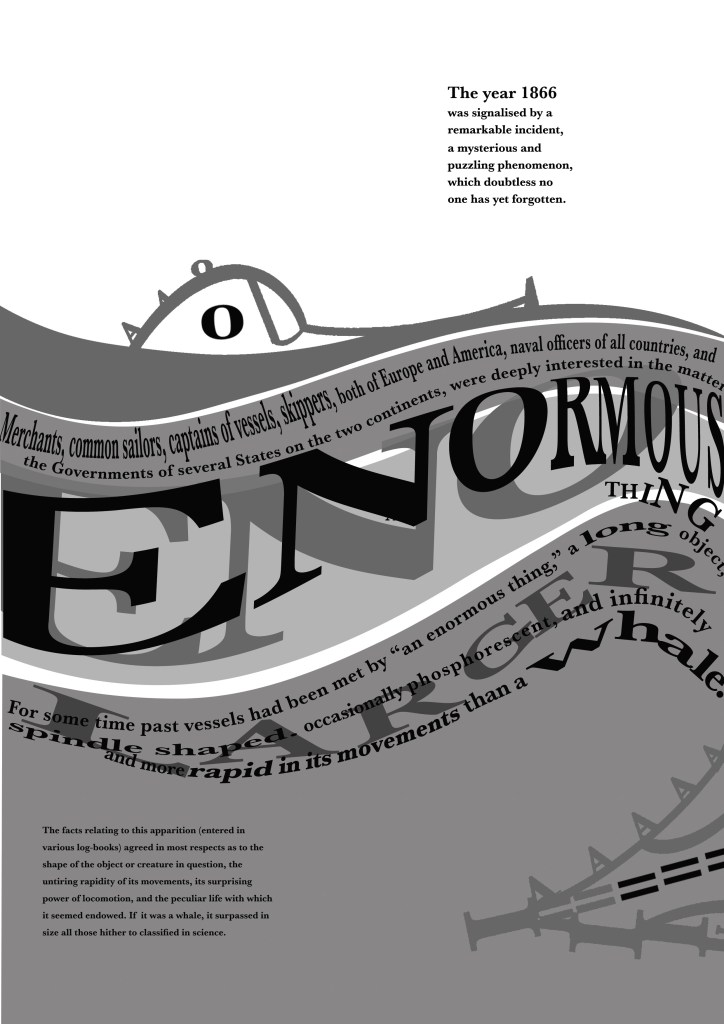
I had the idea to portray the “enormous thing” using letters and characters but I needed to research first what the “enormous thing” looked like according to previous artists/illustrators who designed the previous book covers for this story. I had a look on Google and found this illustration which seemed a good place to start!

I imported the image into Photoshop and reduced the opacity so that I could layer letters over the top of it to try and recreate the shape of it using letters and characters. I ended up with this which was mostly made up of A’s, O’s, ), C, I, =, and a ‘.
I then had a go at positioning it on my layout… I didn’t like it on there much!
I just felt that the layout looked too crowded and full with the image placed on it. It also didn’t emphasize the “enormous” size of the mysterious thing as it looked so small on the page…
I then designed this version below:
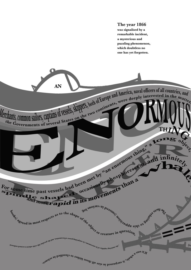
For this version I cut the drawing in half and placed half above the sea (which is where and how people would have seen it in the storyline!) and half below the sea. The way it forms with the wave makes it look like it is circling the sea creating the waves as it moves. The extract is all about the movement and speed of the mysterious being and I feel that this shows this. I haven’t suggested whether the enormous being is a creature or is man-made technology – it is open to the viewer what they interpret it to be! The O on the monster could be an eye or it could be a window… the A’s on the monster could be natural spikes or they could be man-made weapons on the side of a submarine… I also feel that it allowed for more space on the design and it balanced out the layout.
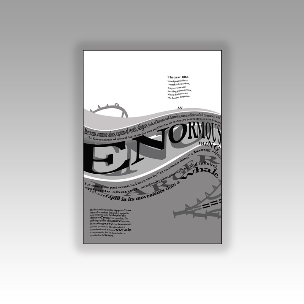
There was still room for development though… time to try and get some squid involved…
In this version I used “AN” as the eye or window of the monster. I wanted “An enormous thing” to stand out to the reader. I used the text in the bottom corner on the previous layouts to create octopus/squid legs which are trying to attack the mysterious being… I have text upside down and then the text below the right way around to ensure that the eye ends one sentence and starts the new one directly below instead of having to drag the eye all the way to the end of the sentences to read. Again, I wasn’t too much of a fan because there was not much space left on the layout – it all looked too crowded and displeasing to the eye.
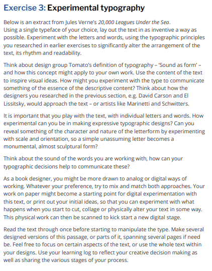
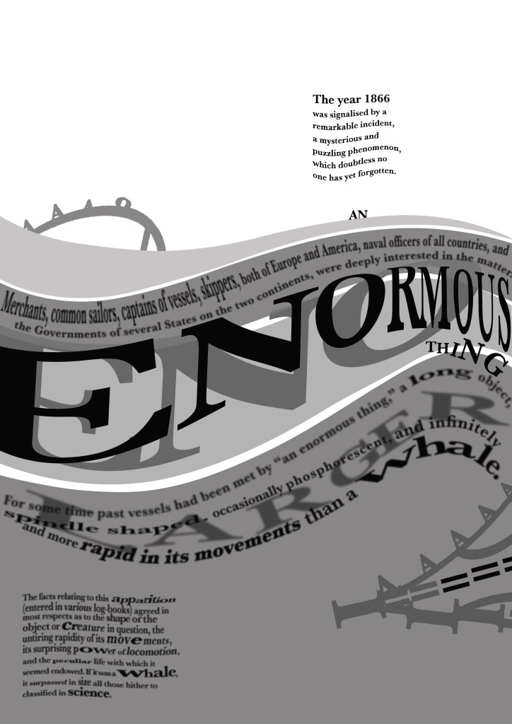
I then moved on to create this new layout below… experimenting more with the blocks of text.

I had created movement in the waves and for the “enormous thing” but the block of text underneath the sea (bottom left side) was very much still and lacked movement which would very much be questionable considering it is supposed to be submerged under water!
I decided to make the text look as though it was floating in the depths of the water; making some wavey, making some stretch and move with the waters push and pull motions and making some text seem larger and smaller to look as though they are reflected in the water. This is more creative and interesting than just being a block of “still” text. I felt like there was still enough space and that the hierarchy of the layout was balanced.
I then went one final step further to create the same layout but blurring the text ever so slightly to look as though it is under murky water:
The mockups!