- The brief
- Who was Johannes Itten?
- Colour theory and the colour wheel
- Colour meanings
- Colour swatches
The Brief

Who was Johannes Itten?
Johannes Itten was a swiss painter and a teacher at the Bauhaus design school in Weimar. Itten developed colour theories which focussed on both the science behind colour and the emotions that the colours evoke. He wrote “The Art of colour” in 1961 and one of his quotes was “He who wants to become a master of colour must see, feel and experience each individual colour in its many endless combinations with other colours.”
Itten was very spiritual; a believer in mysticism, he once explained that colours must have a mystical capacity for spiritual expression without being tied to objects.
Itten was born on November 11th 1888 in Sudern-Linden in Switzerland. He trained as an elementary school teacher in his teenage years where he became interested in exploring the psychology of individual students. In 1916 he was invited to become one of the Bauhaus’s earliest instructors, he left the Bauhaus in 1923 after consistently arguing about which direction the school should take. He went on to open his own school in Berlin until it was closed by Nazi regime in 1934. Relocating to Switzerland in 1938, he spent his remaining years writing books and teaching design courses. Itten died on March 25 1967 in Zurich.

Colour theory and the colour wheel
What is colour theory? – Colour theory is a combination of art and science, colour theory helps to show the artist or designer what colours work well and look best together and this is mostly done using the colour wheel.
The colour wheel was designed by Issac Newton in 1666 and it basically maps the colour spectrum onto a circle, the colour wheel is the main basis of colour theory because it actually shows the relationship between colours.
Colours that loo good or work together are called a colour harmony. A colour harmony can create a look or feel. The colour wheel is used to find these colour harmonies by using the rule of colour combinations. Colour combinations show the positions of all the different colours in order to find colours that work together.
Complimentary colours
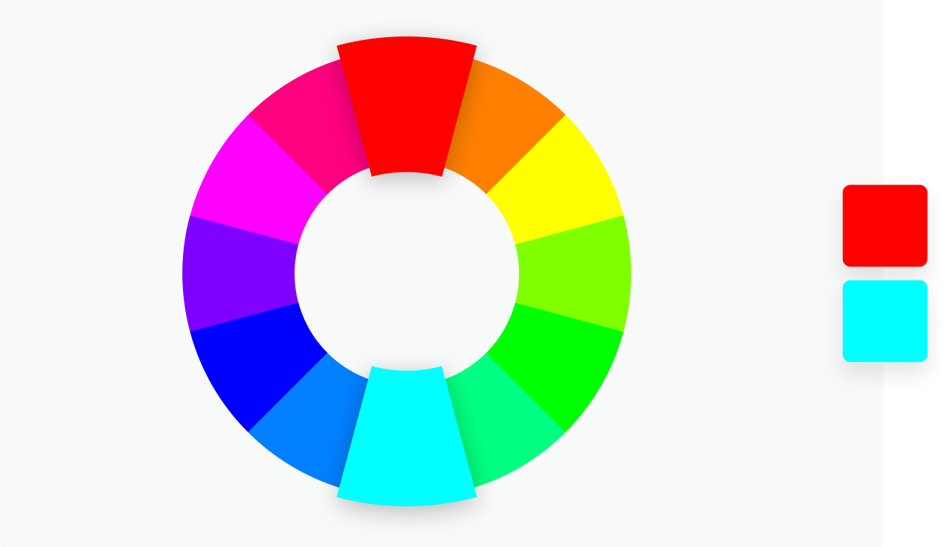
Complimentary colours sit opposite each other on the colour wheel, when put together these colours will have contrast and impact. They will appear more prominent than if they were with a similar colour.

Monochromatic
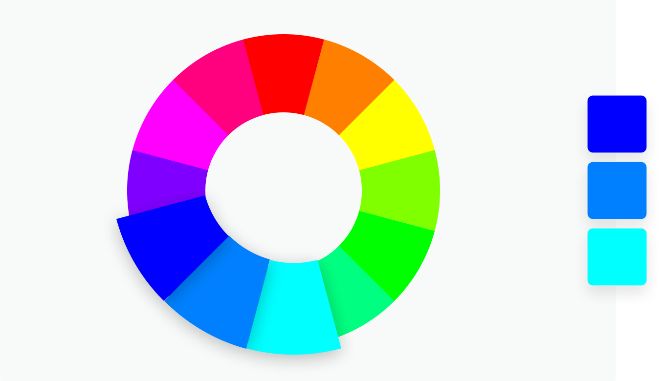
Monochromatic is when colours are split into 3 different shades of the same colour. These provide a very subtle, versatile, harmonious colour combination.

Analogous
Analogous is when 3 colors are side by side on the colour wheel. This colour combination is versatile but can be overwhelming. To balance the colour scheme out choosing an opposite complimentary colour to accompany would work well.

Triadic
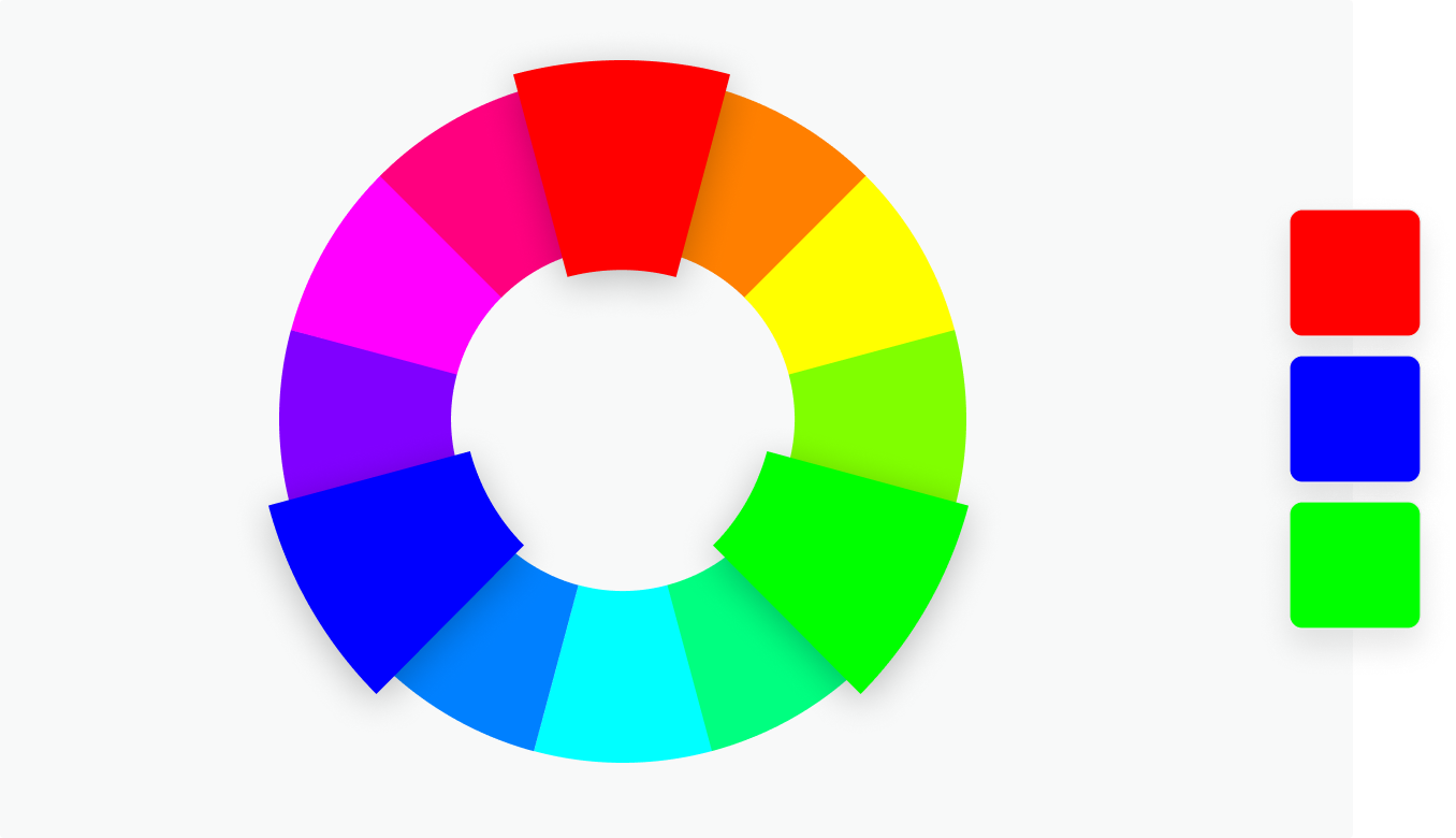
Triadic combinations are three colours (evenly spaced on the colour wheel). which together provide a high contrast colour scheme. This combination creates bold, vibrant colour palettes.

Tetradic
Tetradic combinations are four colours that are evenly spaced on the colour wheel. Tetradic colour schemes are bold and work best if one colour is dominant and the other colours are used as accents. The more colours there are in a palette, the more difficult it is to balance.

Primary, secondary and tertiary colours
There are 12 main colours on the colour wheel. The colour wheel is divided into primary, secondary and tertiary colours.
Primary colours – These colours are red, green and blue. In the RYB colour wheel, primary colours are colours that can’t be mixed from other colours.
Secondary colours – These are colours that are created when you mix together primary colours. There are three secondary colours. In the RYB colour wheel, the secondary colours are purple (red mixed with blue), orange (red mixed with yellow), and green (yellow mixed with blue).
Tertiary colours – These are colours made by combining a secondary colour with a primary colour. There are six tertiary colours. In the RYB colour wheel, the tertiary colours are red-orange, yellow-orange, yellow-green, blue-green, blue-violet, and red-violet.
Warm and cool colours
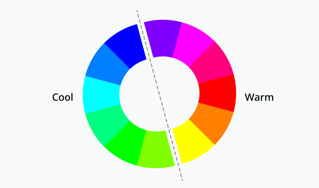
The color wheel can also be divided into warm and cool colours.
The warmth or coolness of a colour is also known as its colour temperature. The colour combinations found on a colour wheel have a balance of warm and cool colours. Different colour temperatures evoke different feelings. Warm colours evoke cosiness and energy whilst cool colours are associated with serenity and calmness. Warm colours are Red through to yellow and cool colours are blue, green and purples. An example of something associated with warm colours is the sun and water for cool colours.

Shades, tints and tones
You can create shades, tints and tones of colour by adding black, grey and white to a base hue (a solid colour from the colour wheel).
Shade
A shade is created by adding black to colour, this will darken it creating a deeper and richer colour.
Tint
A tint is created by adding white to lighten a colour This can make a colour less intense and is useful when balancing more bold, vivid colour combinations.
Tones
A tone is created by combining black, white or grey with a colour. Like tints, tones are subtler versions of the original colour.

Hue, Saturation and Luminance
A hue is any colour on the colour wheel. Once you have picked a colour you desire, you can adjust the saturation and luminance of a hue.
Saturation – The intensity or purity of the colour.
Luminance – The amount of brightness or light in a colour.

Colour meanings

Red
Red is a colour that can be associated in more than one way; it is known for anger, violence, fire, warfare and caution (red traffic lights) but it is also known for being associated with love – love hearts, cupid and Valentines day. Red can also be symbolised in the celebrity world for being glamourous and elegant (think VIP and red carpets).
Red can also have a physical effect on people by raising blood pressure and respiration rates. In interior design Red is not a particularly good colour to use as a paint colour on walls (especially in a bedroom where you relax) as red is such an aggressive colour it has a non calming effect. Red is also seen as a very sexy colour on women. A woman wearing a red dress catches the gazes of men more than any other dress colour.
In China red is the colour of prosperity, happiness and good luck and in other eastern cultures brides wear red on their wedding day. In South Africa red is the colour of mourning and can also be associated with communism.

Orange
Orange is a very bright, vibrant and happy colour. It is associated to the Mediterranean and fruit by the same name; because orange is associated with oranges it also has links to health and vitality.
Orange is also associated with the Autumn season. It has strong association with pumpkins, orange fallen leaves, hay bails and anything else linked to autumn! Orange therefore represents change and changing seasons.

Yellow
Yellow is the brightest warm colour. It’s associated with happiness and sunshine. Yellow can also be associated with deceit and cowardice; calling someone yellow is calling them a coward.
Yellow is also associated with hope which is shown when yellow ribbons are displayed by families who have loved ones at war or the Macmillan yellow daffodils to symbolise support with cancer. Yellow is also associated with danger (think of the annoying, pesky wasps in the summer!) although not as strongly as red.
In Egypt yellow is their colour of mourning. In Japan, it represents courage and in India it’s a colour for merchants.
Yellow is happiness and cheerfulness! Softer yellows are commonly used as a gender-neutral colour for babies (rather than blue or pink) and young children. Light yellows also give a more calm feeling of happiness than bright yellows. Dark yellows and gold-hued yellows can sometimes look antique and be used in designs where a sense of permanence is desired.

Green
Green can represent new beginnings and growth. It also signifies renewal and abundance. Green can also represent envy or jealousy – Green eyed monster!
Green can also be related to wealth, stability, renewal, and nature (green is the colour of money!). Brighter greens are more energising and vibrant while olive greens are more representative of the natural world.

Blue
Blue is often associated with sadness – “feeling blue” “blue Monday” or crying tears. Blue is also used extensively to represent calmness and responsibility. Blue lighting is used in Doctors surgeries and hospital waiting rooms to calm down patients before they are seen and also blue is the most popular colour to be used to decorate the walls in schools as again, it is seen as very calming. Light blues can be refreshing and friendly. Dark blues are more strong and reliable. Blue is also associated with peace and has spiritual and religious connotations in many cultures and traditions (for example, the Virgin Mary is generally depicted wearing blue robes).

Purple
Purple is associated with wealth and luxury. In ancient times the dyes used for creating purple textile products were extracted from snails and were very expensive which meant that only royals and the very wealthy could afford them. Purple is associated with creativity and imagination, too.
In Thailand, purple is the colour of mourning for widows.
In design, dark purples can give a sense wealth and luxury. Light purples are softer and are associated with spring and romance.

Black
Black is commonly associated with power, elegance, and formality. A woman who wears a black dress can be seen as very elegant and sophisticated. On the negative side it can be seen as a very sad colour associated with evil, death, and mystery. Black is the colour of mourning in many Western countries.

White
White is often associated with purity, cleanliness, and virtue. White is commonly worn by brides on their wedding day in western countries. It is also associated with the healthcare especially with doctors, nurses and dentists and their uniforms. White is associated with all things good – Angels being the common image of this.
In much of the East, however, white is associated with death and mourning. In India, it is traditionally the only colour widows are allowed to wear.
In design, white is generally considered a neutral backdrop that lets other colours in a design have a larger voice (negative space!). It can help to convey cleanliness and simplicity and is popular in minimalist designs.
To summarise:
- Red: Passion, Love, Anger
- Orange: Energy, Happiness, Vitality
- Yellow: Happiness, Hope, Deceit
- Green: New Beginnings, Abundance, Nature
- Blue: Calm, Responsible, Sadness
- Purple: Creativity, Royalty, Wealth
- Black: Mystery, Elegance, Evil
- Gray: Moody, Conservative, Formality
- White: Purity, Cleanliness, Virtue
- Brown: Nature, Wholesomeness, Dependability
- Tan or Beige: Conservative, Piety, Dull
- Cream or Ivory: Calm, Elegant, Purity
With all this colour theory in mind, I will now continue to complete the exercise by creating my different blocks of colours.
For starters I made a rough list of colours that I like and dislike:
Colours I like
- Fuschia pink
- Hot pink
- Pastel lilac purple
- Sky blue
- Bright sunshine yellow
- Mediterranean Orange
- Black, white and grey – particularly when I use them in design for nice clean, simplistic design.
Colours I dislike
- Dark green
- red
- Brown
- Mustard yellow
- navy blue
- Baby pink
- dark purple
- maroon
- burgundy
- ivory/cream
I then put these colours into grids opposite each other at absolute random just to see what they looked like together. To do this I created grids in Illustrator and then filled the boxes with swatches of colour.

From doing the 2 grids of colours it was supposed to allow me to see which column of colours worked the best. From reading the brief apparently the column that I dislike the most is supposed to actually look the best; I am not sure I agree! I think both the columns stand out just as much but neither really in a massively positive way! Out of the two columns I still like my “like” column.
I then started on choosing colours for all of the 26 words. Some of these words were easier than others. I also found that without realising I used the same colours for a few words which are similar in meaning; Wonderful and zany and precious and luxurious. Precious and Luxurious I used rich colours which represent wealth and royalty; navy blue/dark purple represents royal luxury whilst green represents money and wealth. Zany and wonderful I used 2 really bright colours which represent to me happiness and fun! For jumpy I used 2 clashing colours which make you slightly uncomfortable when you look at them, I think this represents jumpy. For unhappy I chose blue which represents water and tears and grey which represents grey skies and rainy days. They are very dull colours, however they work together! – A dark blue and a lighter grey which have contrast and work together. For angry and dangerous I chose similar colours – Red and black which both represent anger and danger and black and yellow which represents caution and danger.
This exercise definitely made me think about colour combinations; the meanings behind the colours, contrasting and complimentary colours and what colours really do not work together.