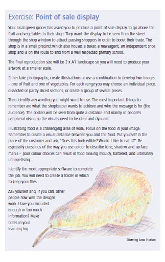
The Brief:
I could not have started this exercise at the worst possible time!… with the ongoing Corona Virus that has hit the world and currently put the UK into lockdown… The brief states to take photographs of fruit and veg which in normal times would not be an issue, however with the state of things at the moment (not being allowed out the house only for essentials and all the social distancing) the shortage of products and fresh produce in the shops I really had to think about this brief!
I started this brief by firstly looking into what point of sale is (POS) I have done point of sale design once before and that was for my GCSE Graphics product where I designed a video display! (showing my age!) I started doing some research by googling point of sale displays for fruit and vegetable shops. The whole idea of point of sale is to be near the point where customers would pay to attract sales more.
Most of the findings were:
- Hanging signs
- posters
- fruit and veg cardboard promotional holders
- standees
- baskets at checkout points
The brief states that my POS needs to be in the window to attract passers by and to go above the fruit and veg in their shop. The brief also states that “the posters will be seen from quite a distance” (which is a crucial part I almost missed!)
I established that it needed to be posters that I was designing. In theory in my head I was thinking that it would be fruit on one side of the shop window and veg over the other side of the shop window. (Uusally fruit and veg are down different aisles).
I then looked into who the target audience would be for this POS. The brief states that the shop is in a small precinct that it shares with a baker, newsagent, shoe shop and is en route to a primary school. In my head this gives me the idea of a very local, warm, family driven community. It also gives an exclusive, elite feel. It seems as though only a small community would use these shops. My initial thoughts were that I should be designing high quality designs to match the overall impression of the precinct.
There is strong emphasis on the primary school. This is where I am led to believe that the brief wants to target parents and their children on the school run. I decided to focus one poster for girls and one for boys. I had the idea to focus the girls poster around fruit – I could make the poster quite girly with summery, pink, vibrant colours. I decided to focus the boys poster on vegetables such as broccoli which make you strong and build muscles etc.
I used my Pinterest to search for different ideas on how to make fruit and vegetables appealing for children:
I decided that the best way to make fruit and veg more appealing for children is to either dip it completely in chocolate (as my friend suggested! *eye roll!) or try and healthily disguise it.
I decided to start off in familiar territory! – designing for the girls!
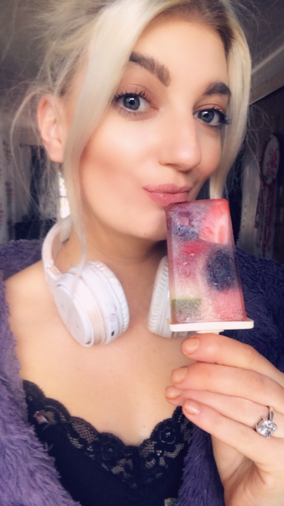
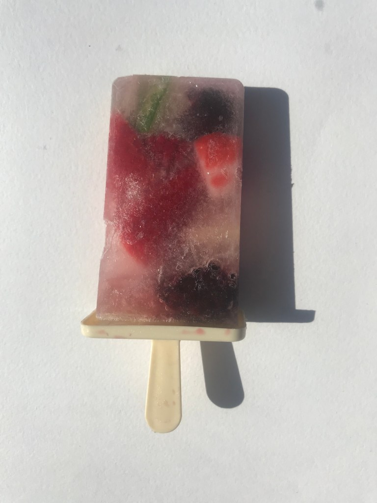
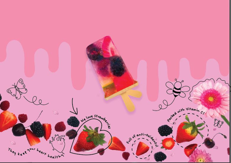
The brief suggests taking photographs of whole, sliced or dissected pieces of fruit or using illustrations to portray them. I decided to try and mix the two together in a “childlike” way. Children like to play with food and after finding an idea on Pinterest for summer fruit ice lollies I got the idea to create my own!..
Ice lollies are appealing to children especially with the upcoming summer months and they are also a healthy way to get fruit into a child’s diet. I had the idea though to use photographs of actual fruit and the lollies but then to add childish illustrations onto them as if a child had drawn them on themselves. I had the idea to make the lolly into a figure – the lolly as the body, the stick as the legs and then I would create an illustration of a girl or something to feature on top of it. I did have the idea to make the figures into superheroes as when I was googling ways to make children want to eat fruit and veg and how important they are to children’s diets, it suggested that they are like super vitamins – real life powers.

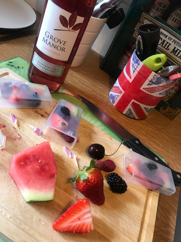
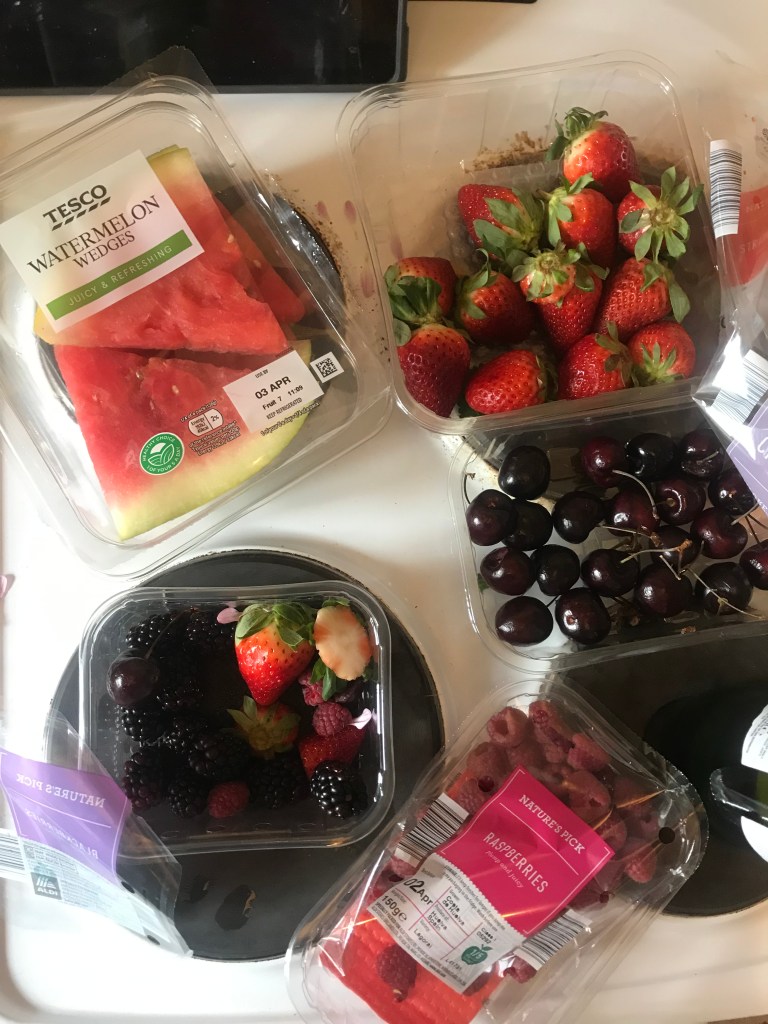
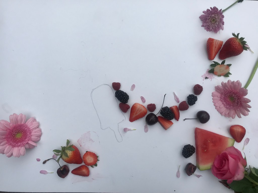
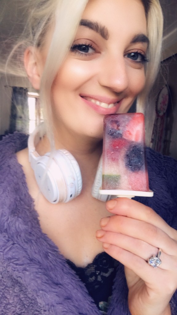
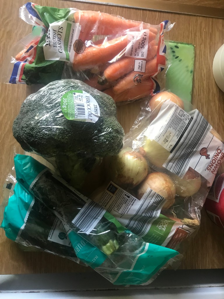
I started off with making the fruit ice lollies… I managed to queue my way through social distancing/isolation hell in Aldi and pick up some strawberries, raspberries, cherries, blueberries and melon slices. I also ordered some ice lolly moulds off Amazon and set to work making them! I also chopped some fruit up to create some flatlay photography to use in the background of my posters!
** Small confession – these are actually not appropriate for children! I did use rose to add colour to the lollies and to make them more appealing for me to eat afterwards!! – especially during lockdown! haha! For actual children’s lollies fruit juice could be used instead!

These are some of my photographic pieces where I had the idea to take them into Photoshop and tweak them up and add the lollies at a later date.


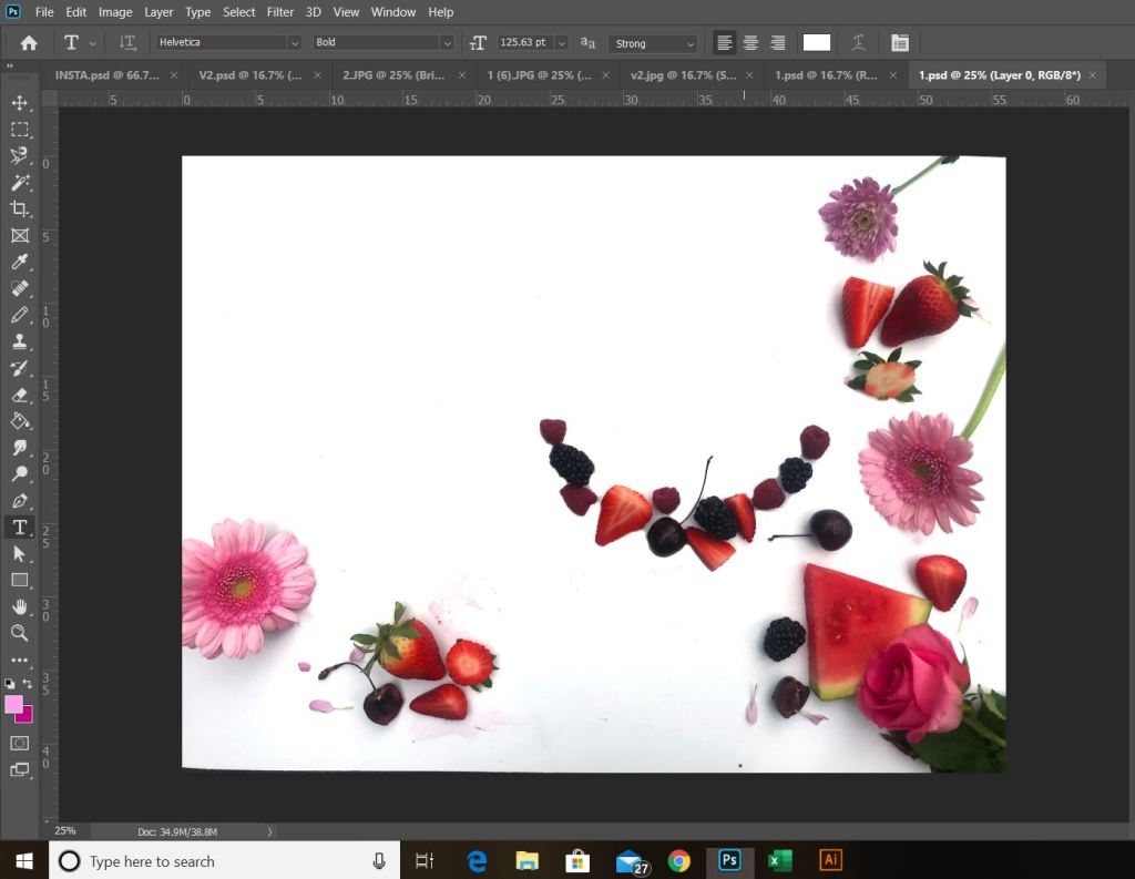
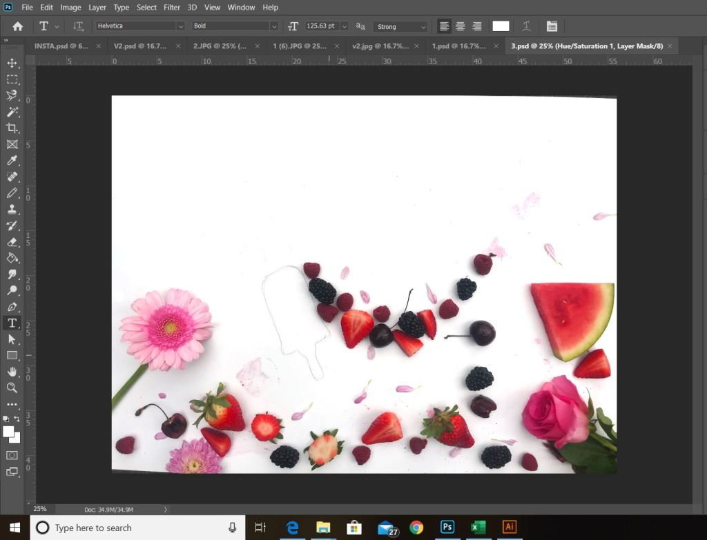
I then uploaded them into Photoshop to tweak and potentially make into the posters! The sizes that the brief specifies are landscape A1.. however, them file sizes would be massive to work on and save so I have downsized my artwork to A3 so that then they can be saved as a PDF or JPEG and scaled up.

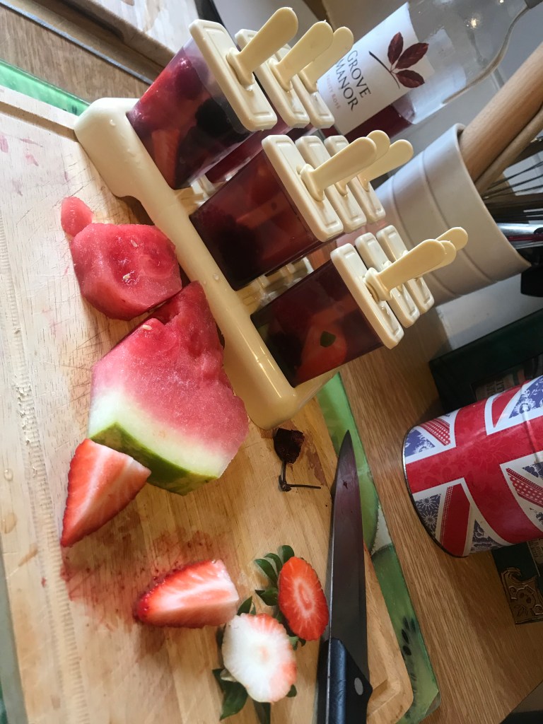
After a few hours of waiting for the lollies to freeze, I took them out and attempted (several times!) to photograph them… Whilst on facetime to one of my best friends (in my lockdown fashion attire! – dressing gown!) who was also laughing at me trying to pull the lollies out of the moulds and watching them fly across my kitchen! FAIL!

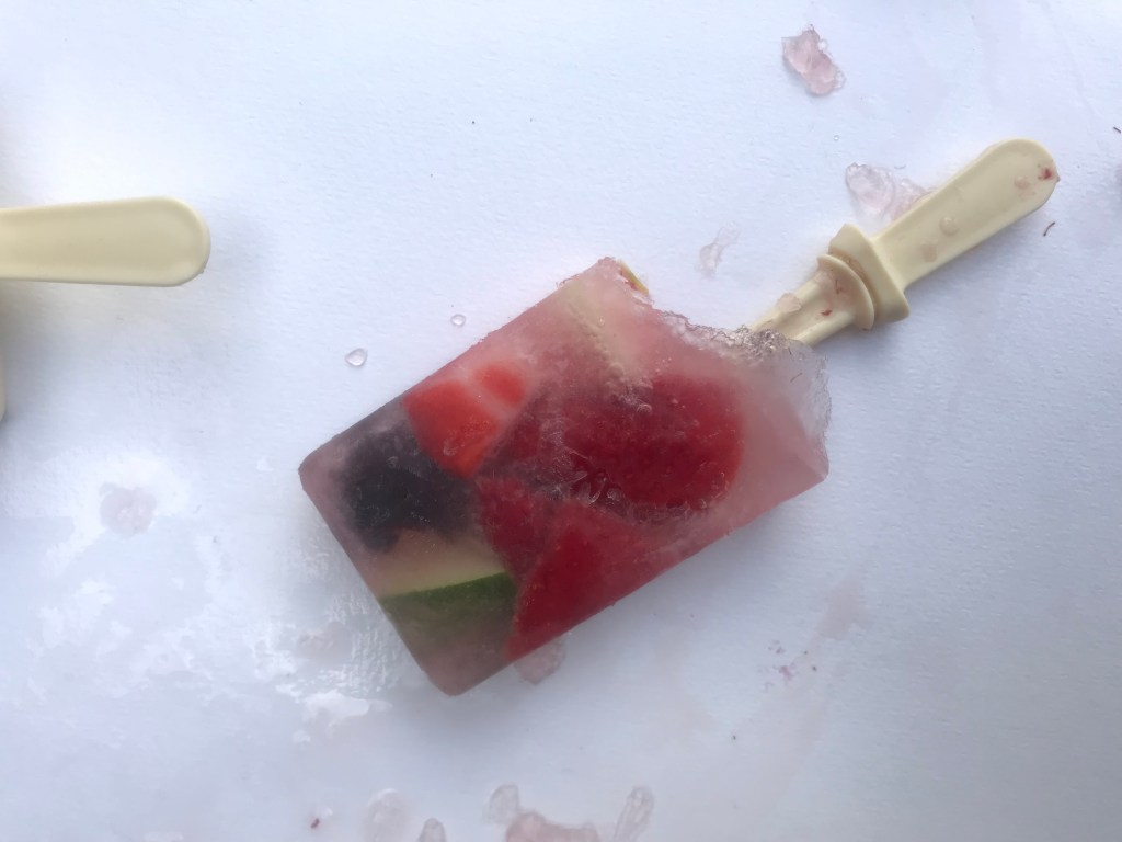
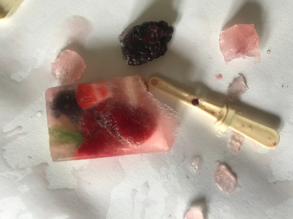
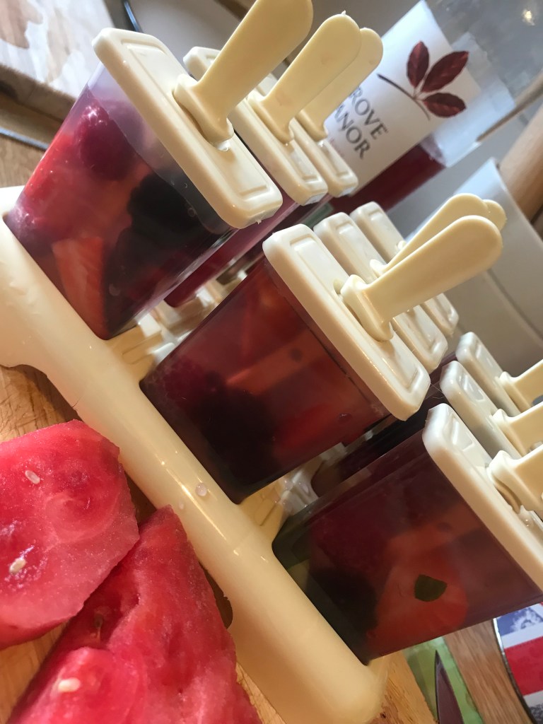
I ended up with these photographs that I then uploaded to Photoshop to adjust the colours and cut around the image etc..

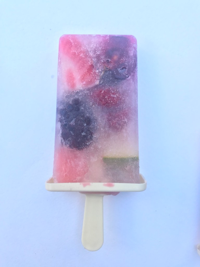
I then altered the colours to make them more vibrant and more tempting in appearance.
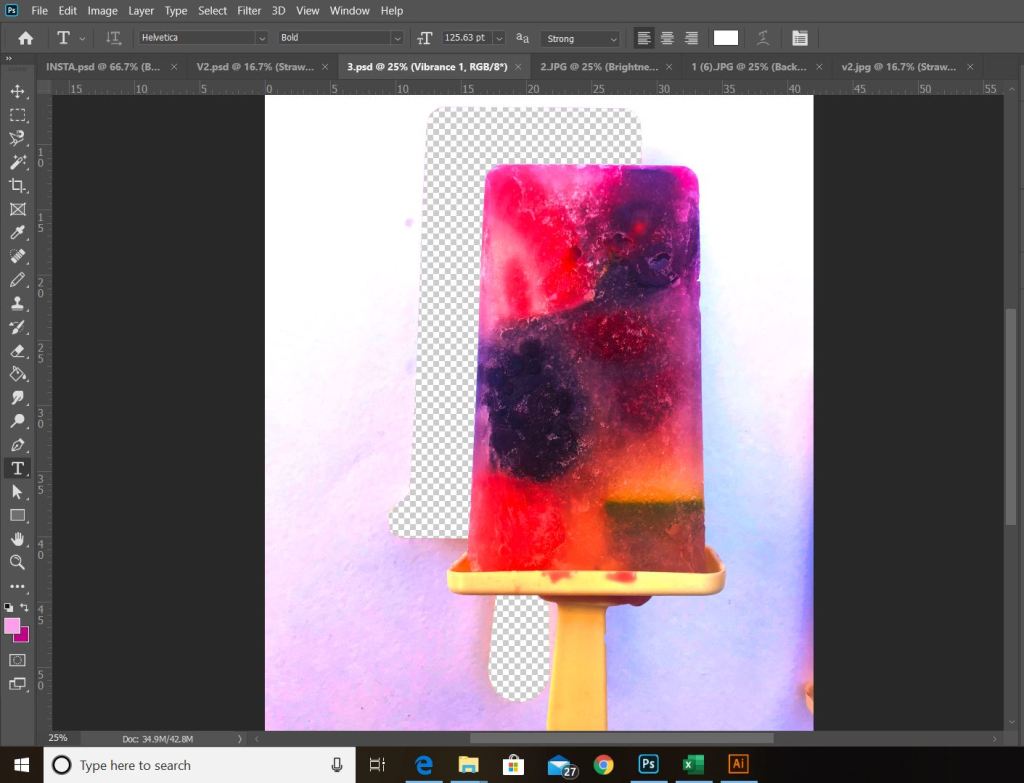
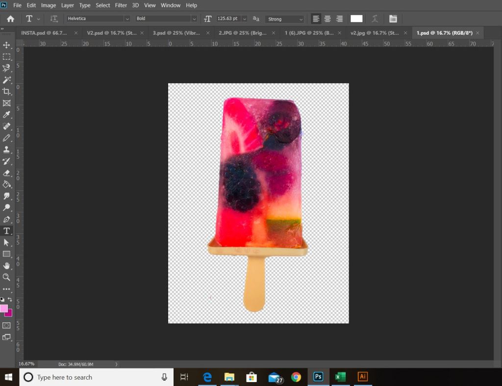
I then added the lolly into my design creating a drop shadow behind it so that it did not look flat, whilst duplicating the stick to create the appearance of legs for my figure. I changed the background colour to pink to match the target audience I was aiming at and to also give the summer feeling that I was hoping to achieve.
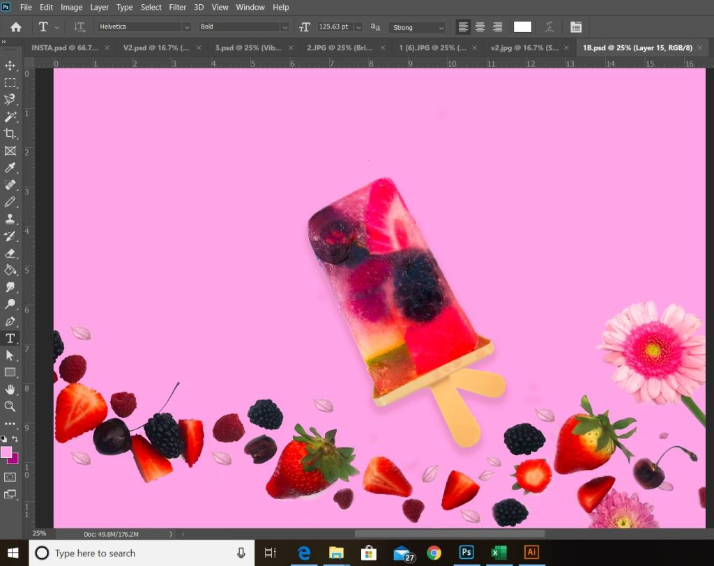
I then had a go at drawing some of the illustrations along the bottom of the design. I wanted to include some facts about the fruit in there to make it factual as well as childlike. I decided to add butterflies, bees and flowers to give a summer vibe to start with.
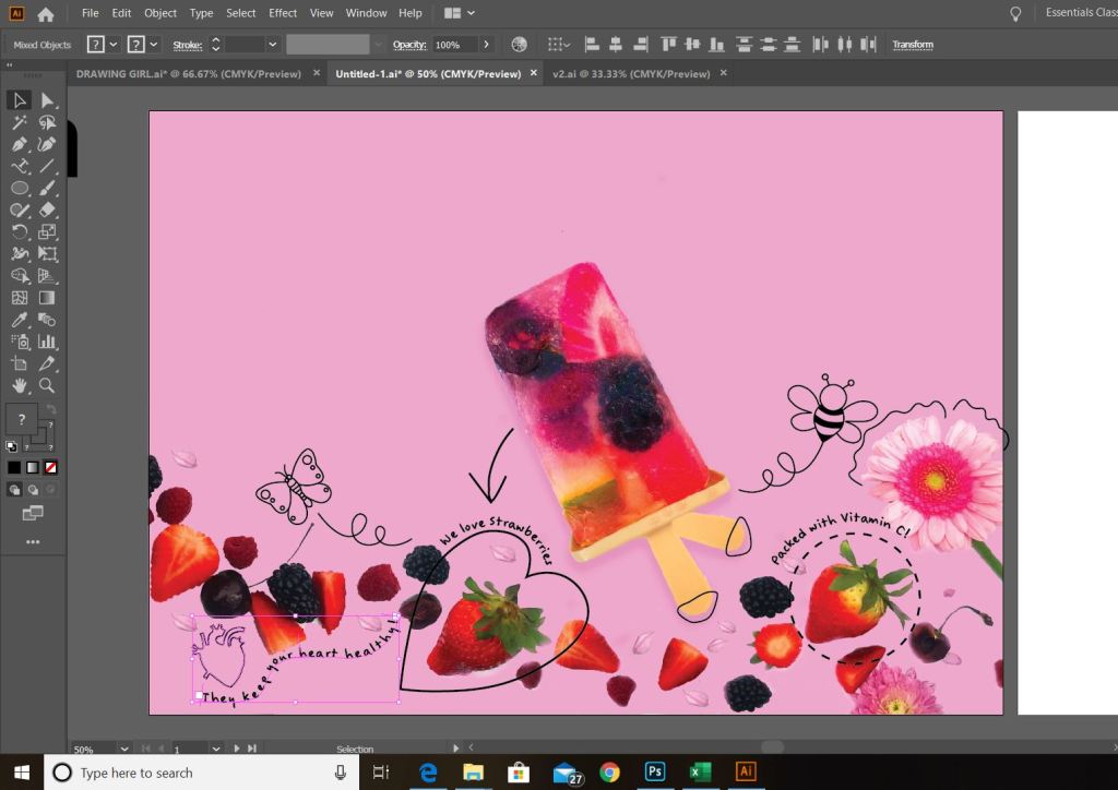
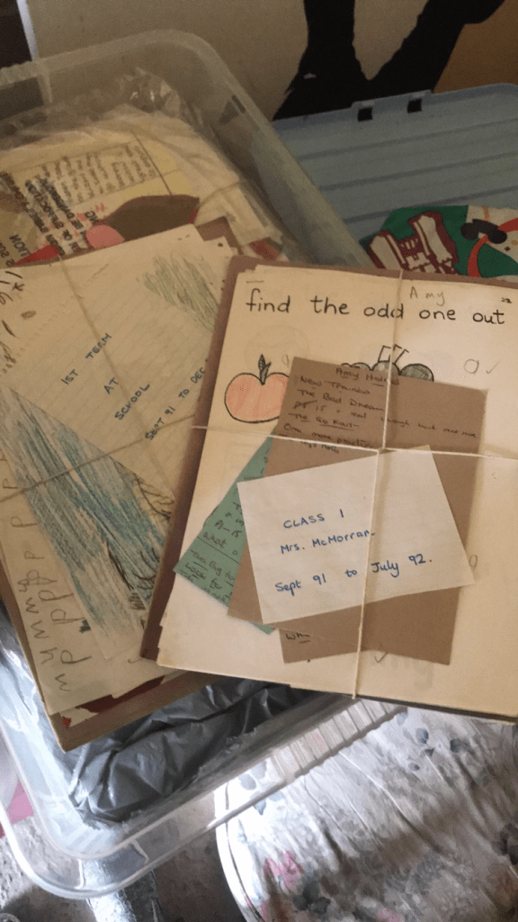
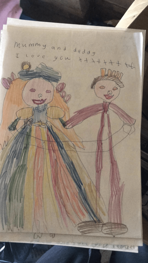
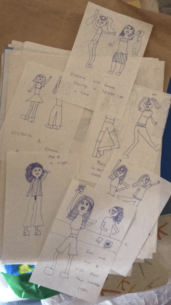
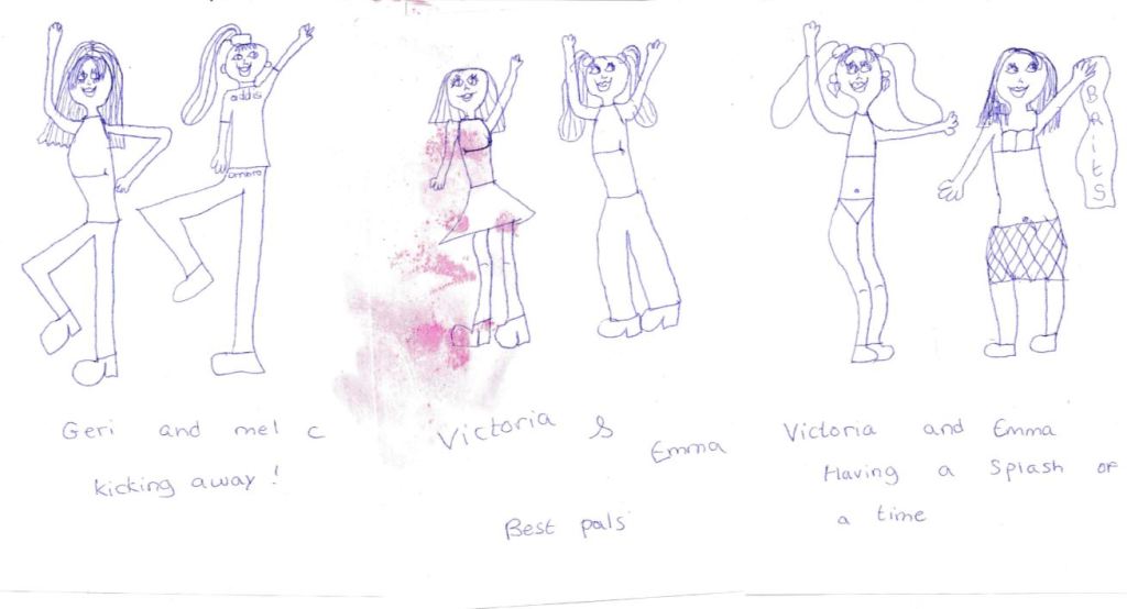
I then needed to figure out what kind of illustration to use for the figure on the lolly. I originally had an idea similar to fashion illustration but figured that this would not really be relevant to young children and they would not relate to it! I then had the idea to actually use a child’s drawing as the illustration – this would then encourage the children to create their own fruit lollies and maybe use the illustrations as inspiration to create their own illustrations for their own lollies. I asked one of my friends if her daughter would be willing to draw me a girly illustration for my piece….. sadly she declined! DECLINED!! lol! I then almost gave up on the idea until I realised that over in the Tarantulas den (my garage!) my Mum kept boxes and boxes of me and my sisters schoolwork and drawings. I managed to fight off my fear of the spiders hanging off the beams in there and find some drawings (which mostly made me laugh at my young, unrealistic views on romance!) but that also that I might be able to use in my design! The ones that seemed most appropriate were cartoons I drew of the Spice Girls back in 1997! I scanned them in and then drew around one in illustrator!


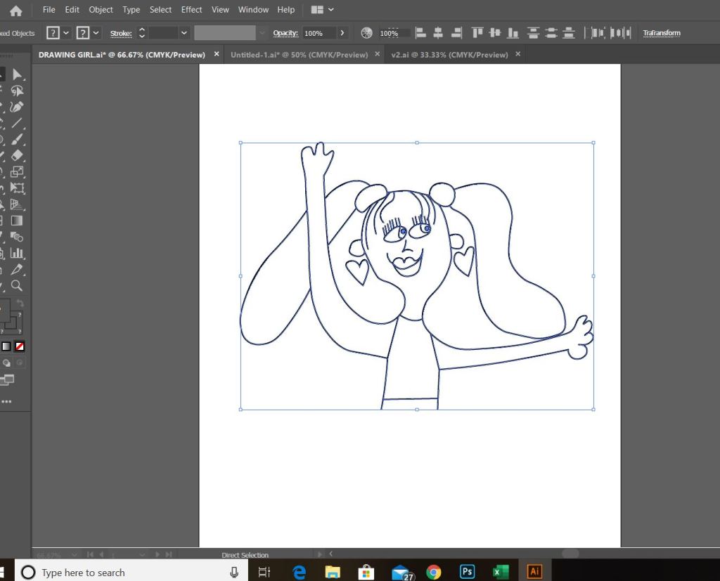
I then went about bringing that into Illustrator and placing it on my design to see what I thought…

I hated it! I did not like it at all! It looked cluttered, all over the place, lack of space and just really amateurish! The idea behind it was good but it just did not come together right in my opinion! I feel as though the attention is taken from the main purpose of the poster. The focal point becomes the illustrations rather than the fruit itself.
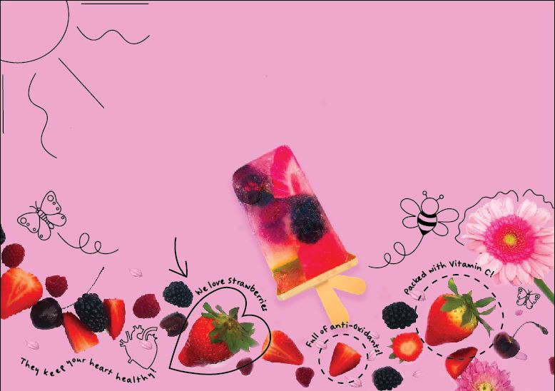
I then stripped back the designs to come up with another route to go down.. I also added in the background lolly drips as I thought this would help to not make the image so flat.. I liked this adjustment.
I really just liked the space that was left on the image… however I knew that I could not keep the design this way as it was not communicating a message at all!
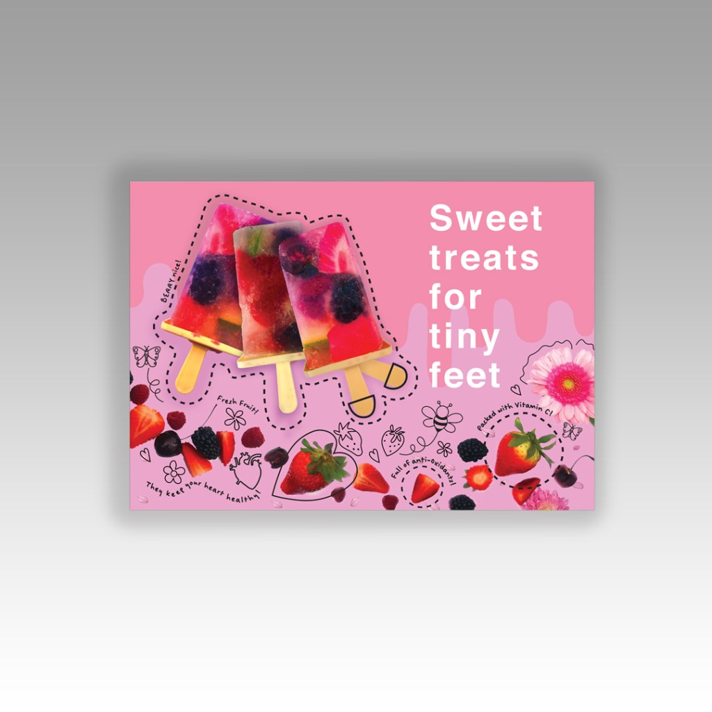
I then decided to bring in the other 2 lollies (the power of 3!) onto the design and make them bigger so that they are the main focal point of the design.
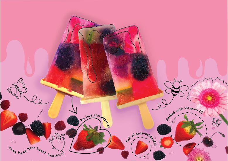
I added drip marks also onto the lollies to give the childlike illustrative effect again. I liked this design a lot more than the previous but it still needed work. There is less negative space now which I dislike and also it still seems quite chaotic… although I don’t know if this is good or bad as it is designed to get the attention of children and for that to happen it needs to be interactive, fun, colourful and “alive!”
I also needed to think about the message that would finally appear on the poster. I needed something witty and fun that relates to strawberries. I also looked into the typeface for the message and decided there could only be one clear, bold, sophisticated one for the job….. Helvetica! Again, I had to think about this because I have already used a different typeface for the childlike text on the illustrations… the rule is really only 1 typeface.. 2 at the most but they need to contrast each other impeccably! The 2 typefaces I used are both sans-serif which do not really contrast and also I chose to align the text ragged right… Breaking some serious design laws there!
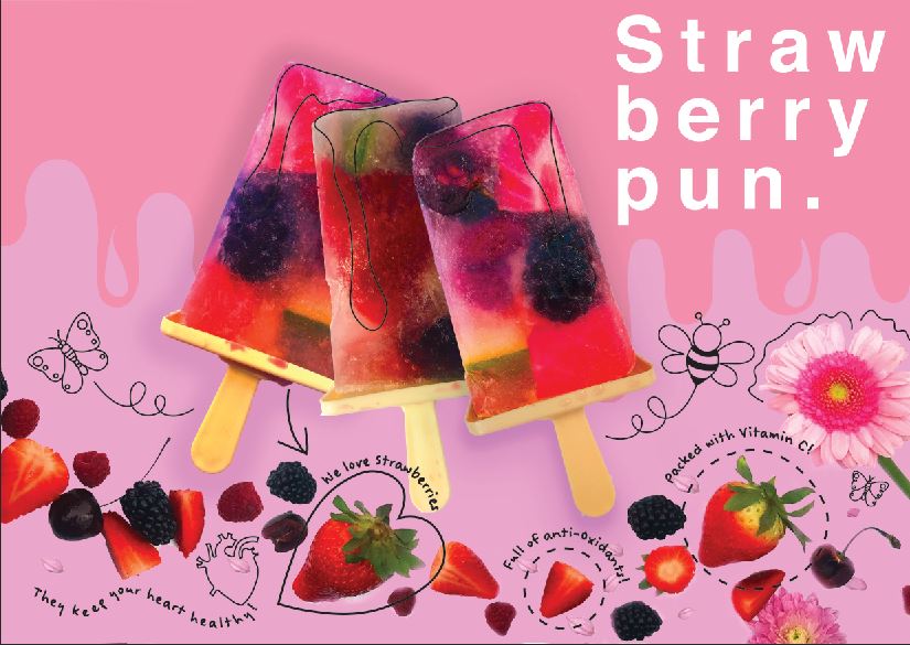
I then decided to put it to the world of Facebook to see if anyone could come up with a decent pun for my poster… my work colleague and her husband came up with “Sweet treats for tiny feet” I quite liked this because it relates to the sweetness of the fruit and the treat being the lolly but also the fact that it is for young children. I then decided to bring back one of my original ideas for the design; the second lolly stick for the second leg.. it relates back to the tiny feet!

I also attempted to add contrast… adding the dashed lines with a heavier weight allows the lollies to be seen more and stand out. I also added shoes onto the lolly sticks to give more the impression of lively little feet!
I decided to stick with Helvetica for the text, It is clear, legible, functional and reminds me very much of a ladybird book for children (in that the letters are childishly spaced and easy to read)
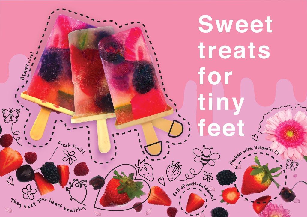
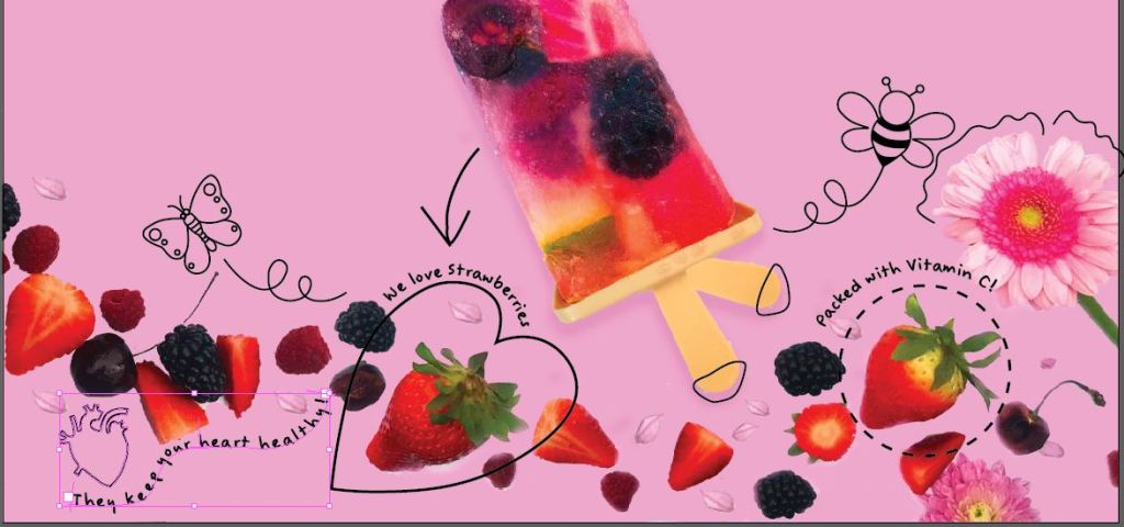
This is my final piece for poster number 1 aimed towards fruit and targeted towards young girls and their families. I am pleased with how it has turned out! I feel that it is bright and engaging for a window to attract attention but also to deliver the message that eating fruit can be sweet and fun! Hopefully it would inspire the idea to create their own lollies at home to encourage getting fresh fruit into their daily diet.
Poster 2
I then went about poster number 2. I knew that I wanted this poster to be exactly like the first in appearance but to have the text aligned ragged left on this one. When they both go in opposite windows they would reflect each other.
This poster was to represent vegetables and I decided to aim it at boys. I wanted to use the same design layout as the first poster that I created. I firstly figured out what I would try and make out of veg to try and appeal to lads!
I scoured my Pinterest again… I found trains made out of peppers and celery.. faces made of different elements of food but I still felt stuck!
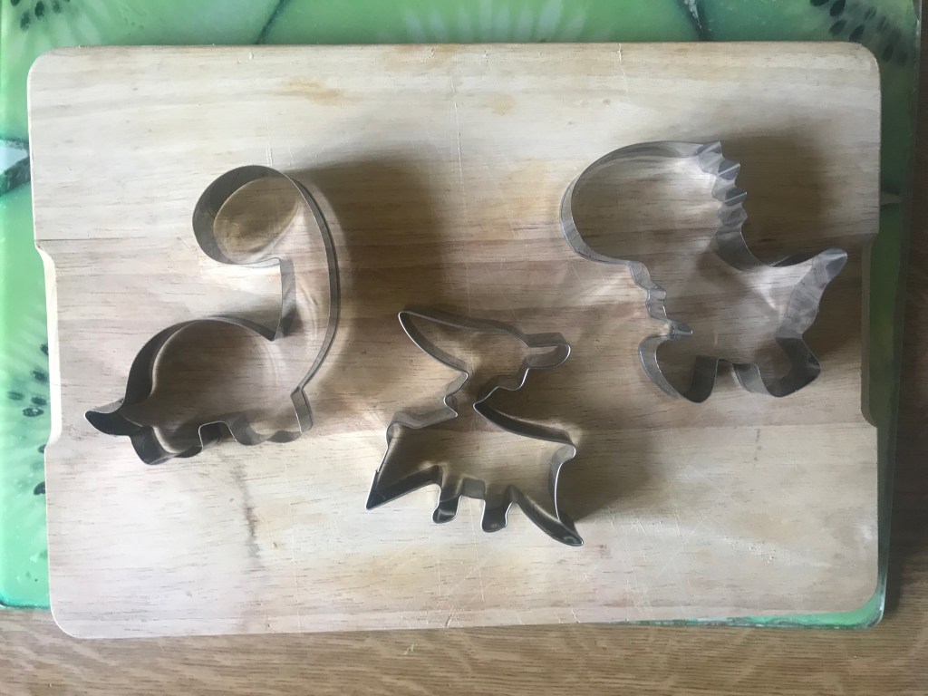
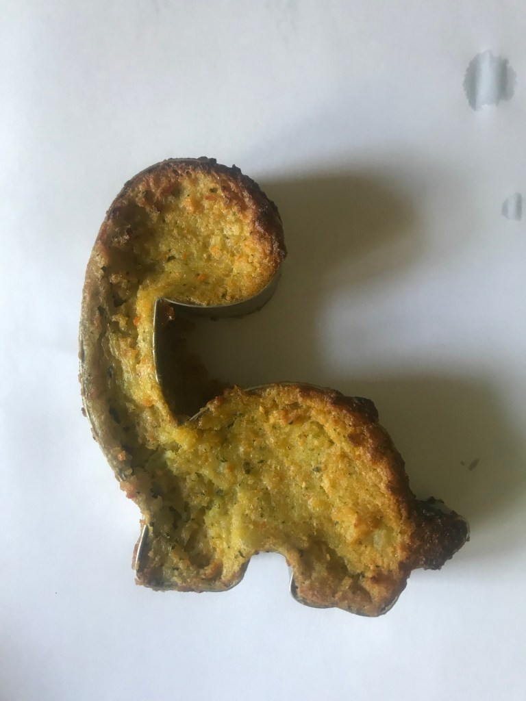
For some reason Dinosaurs stuck out to me… I went on Amazon and found some cookie cutters in Dino shapes that appealed to me.. now what on earth could I make with them that promotes vegetables and eating healthily in a “fun” way?…
What followed was a couple of days in the making! – The first day a complete disaster!…
I decided to make vegetable patties in the pan with the cookie cutter and have it cook to the shape of the Dino! – The thought was there but in reality it was horrendous! It involved a 5 hour facetime chat with my best mate trying to teach me how to make mashed potato to make the mixture gel together! (I am the worst cook EVER! – HATE COOKING! It has just never interested me in the slightest lol!)

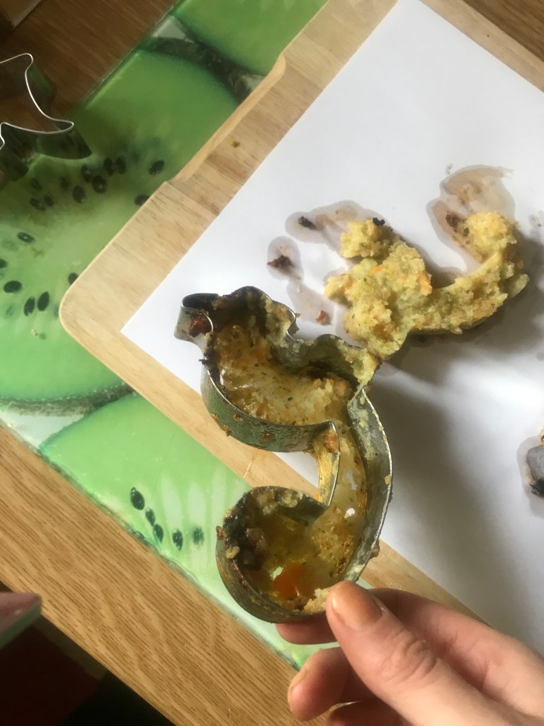
I compared these above images to a meme that absolutely cracks me up! xD

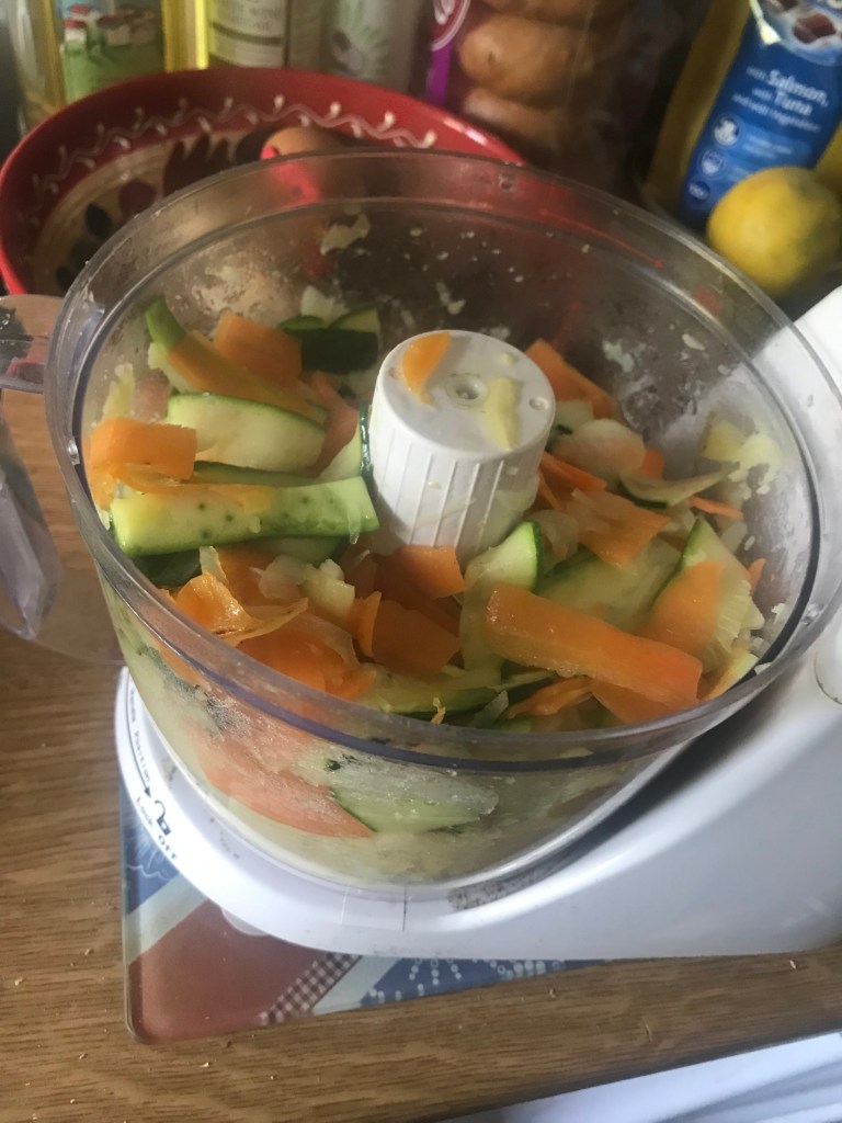
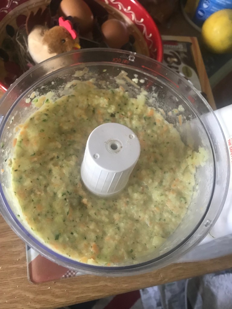
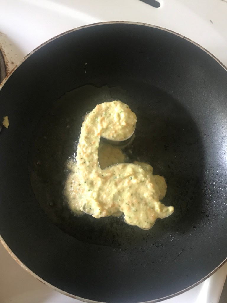
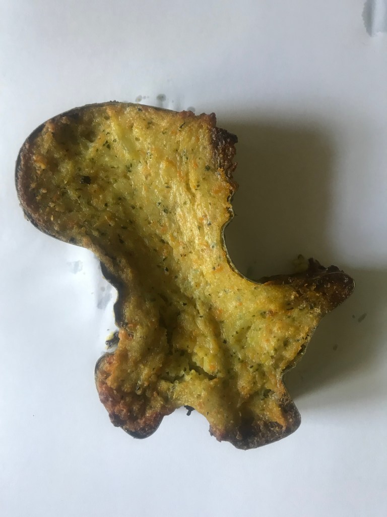
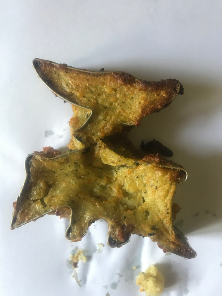
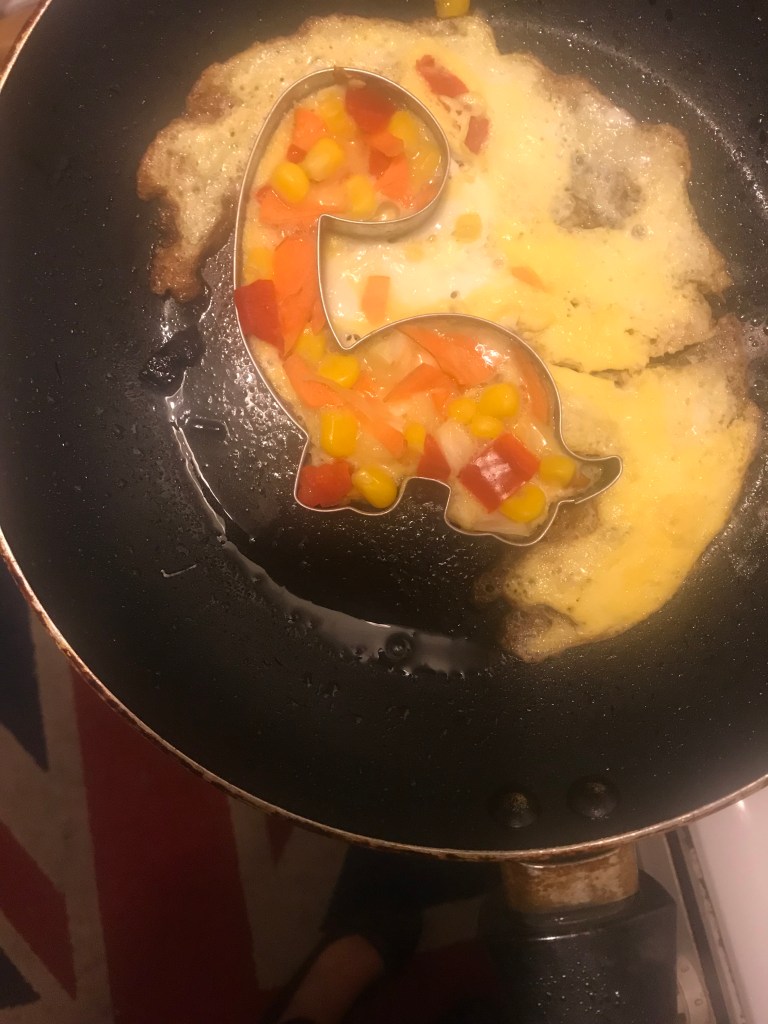
So after a day of making 3 lots of mixture and trying them out in 3 different ways I went to bed deflated and uninspired.. Then came breakfast where I had the idea to make myself an omelette with my leftover salad and veg, I then had the idea to cook the omelettes into the cutters! – this way also you would see the bright colours and be able to visually see the veg in the omlettes!
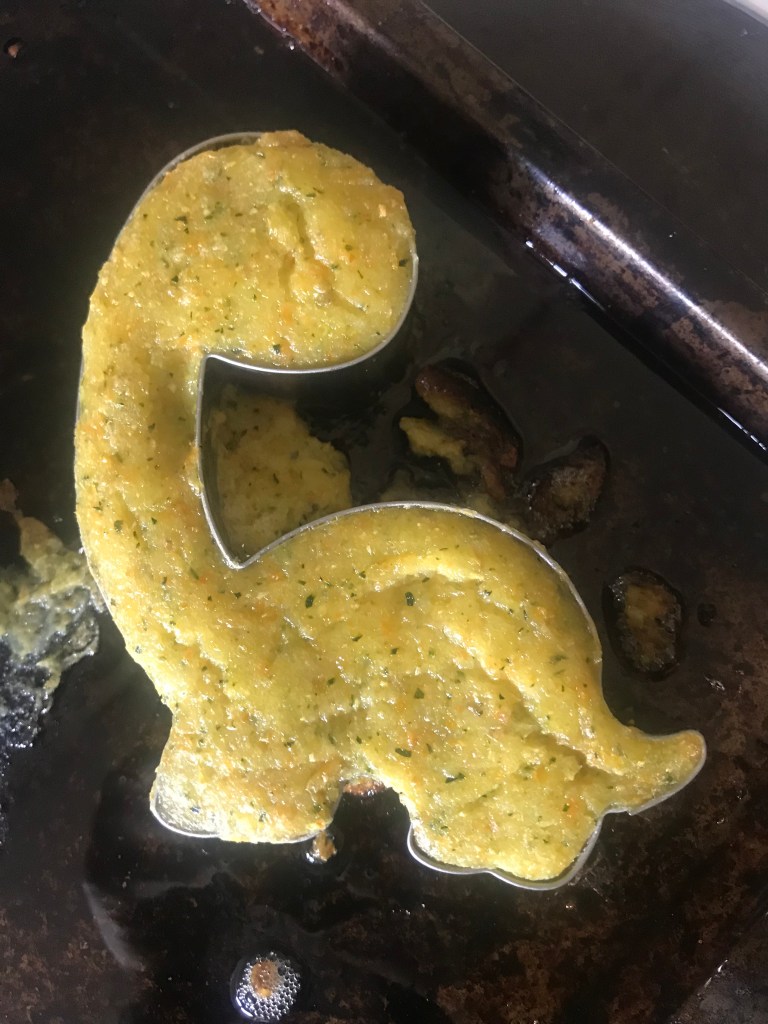
This idea worked out much better!

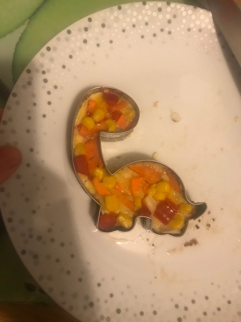


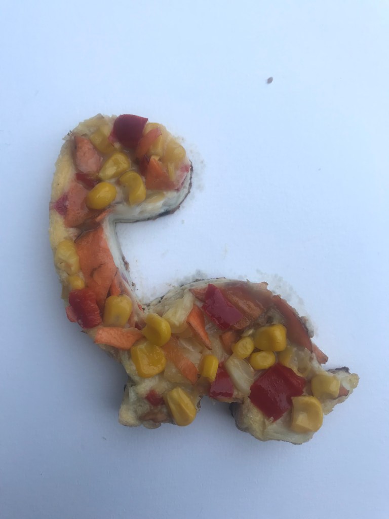
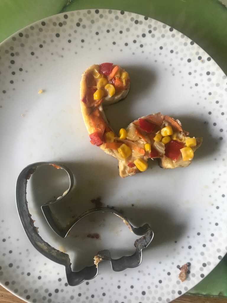
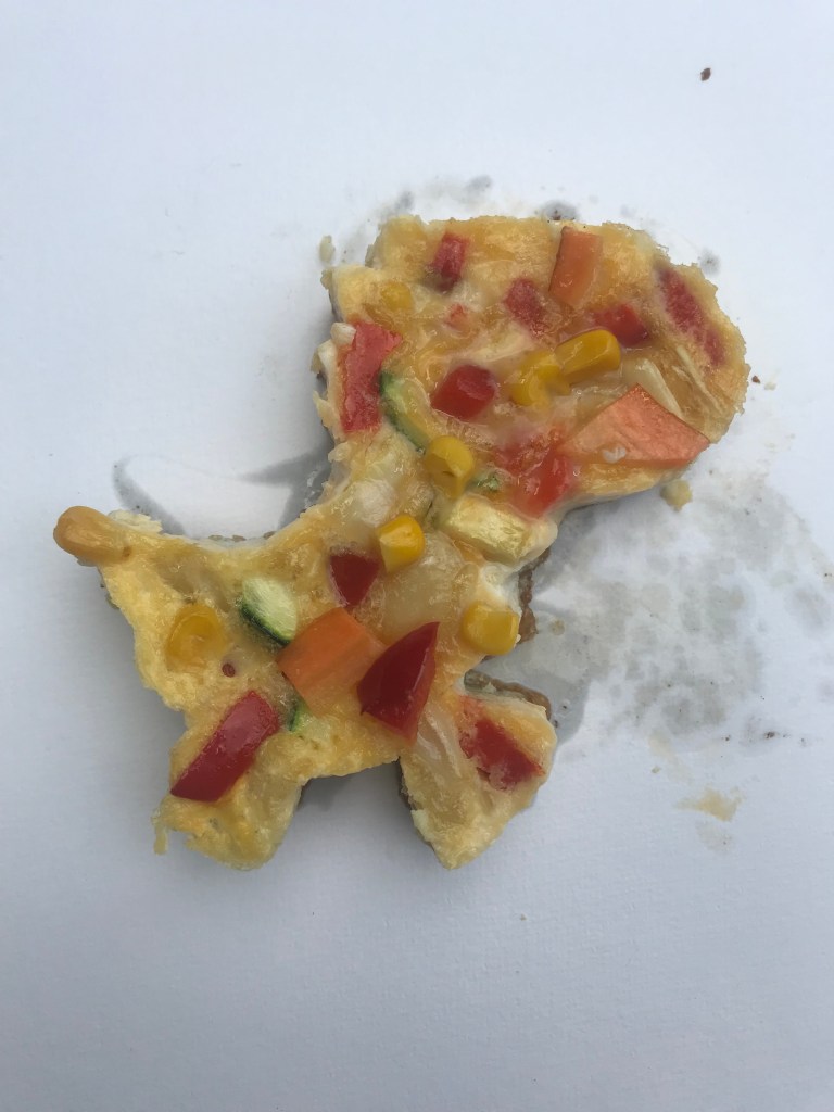

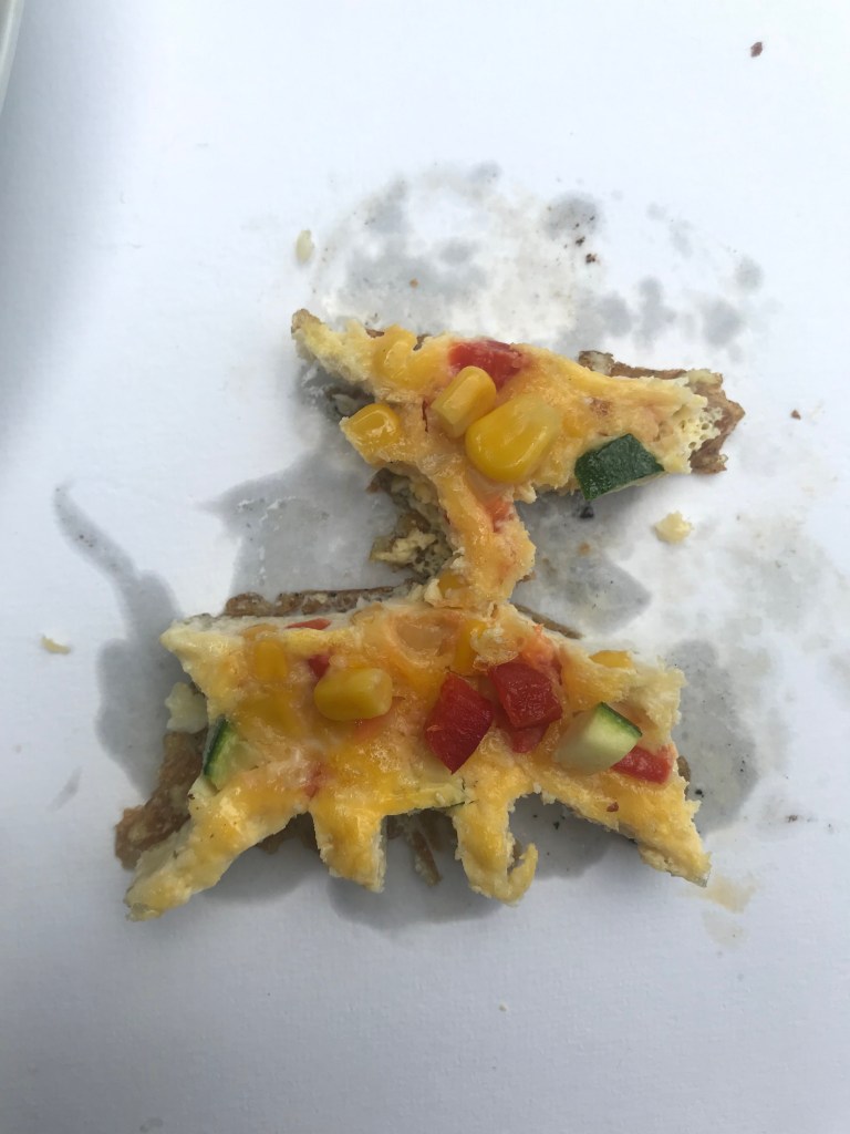
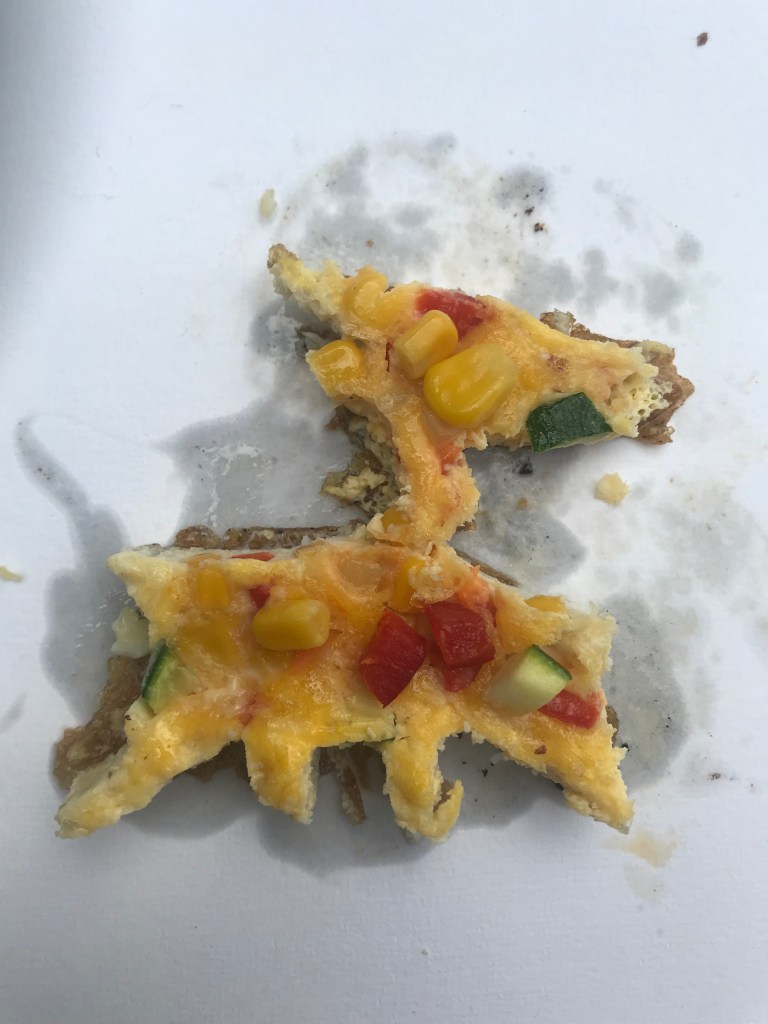

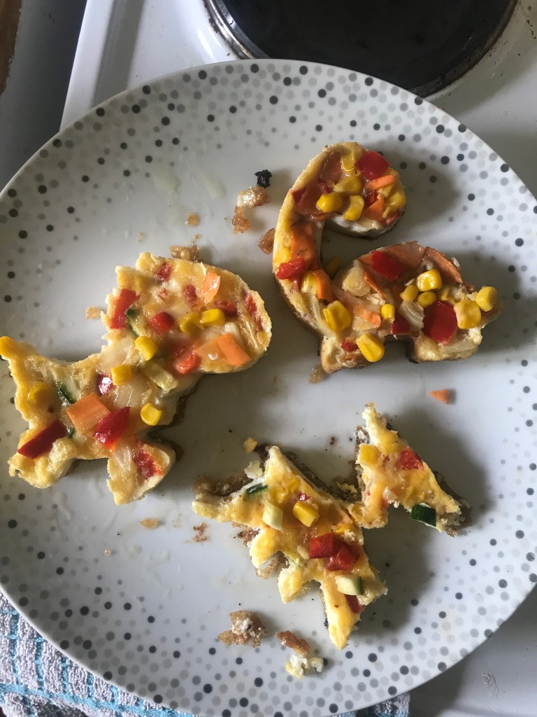
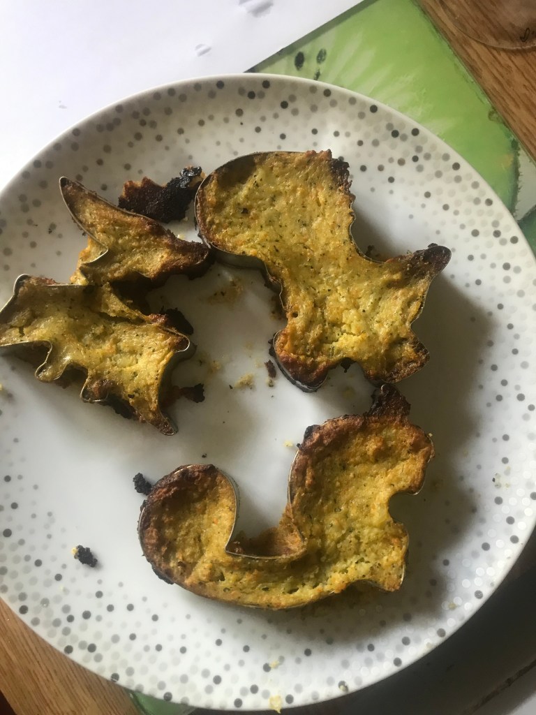
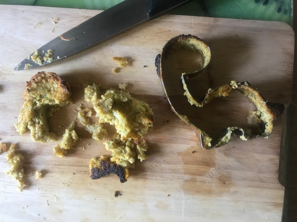
The only one that didn’t turn out great was the pterodactyl! He fell apart at the seams! I did not include him in the finals!
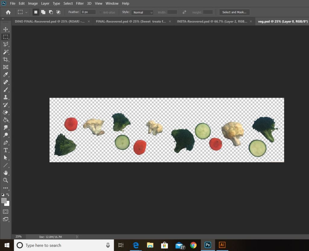
I also took photographs of segments of veg and arranged them in a way that would appear at the bottom of the poster.

I then adjusted and altered it in Photoshop.
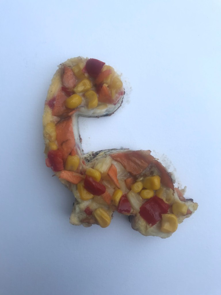
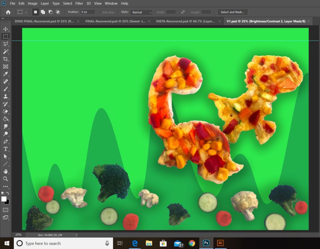
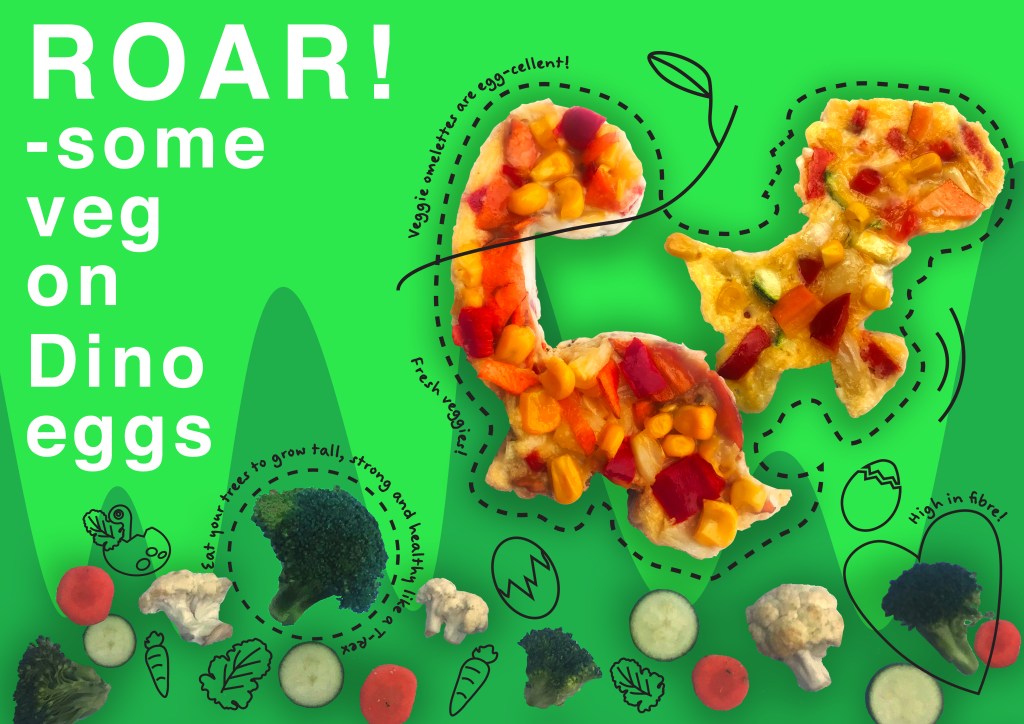
I then brought in the photographs of the Dinosaurs and adjusted and altered them to make them look more visually appealing for the poster.


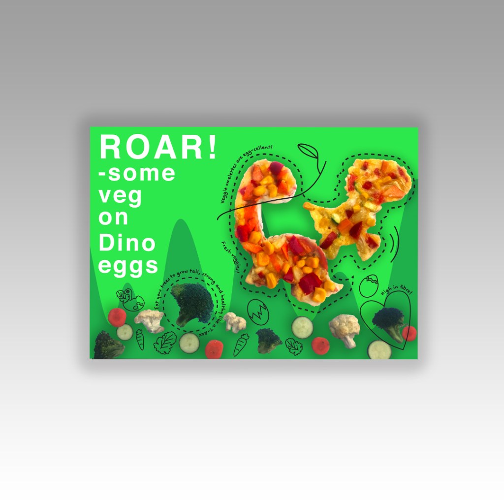
I then started work on the final poster, same format as the first one – A3 in size which is more manageable to work on within the design software and in industry it could be blown up or shrunk down. I went for the same approach, apart from that I did not use the melted lolly drips. I decided to use greens in this design to match the theme of Dinosaurs and in replacement of the lolly drips I used grass instead.
I then took this into Illustrator and worked the same illustrative style on it as the first poster. Again, it is very childlike in appearance and bright and colourful which is ideal for the target audience.
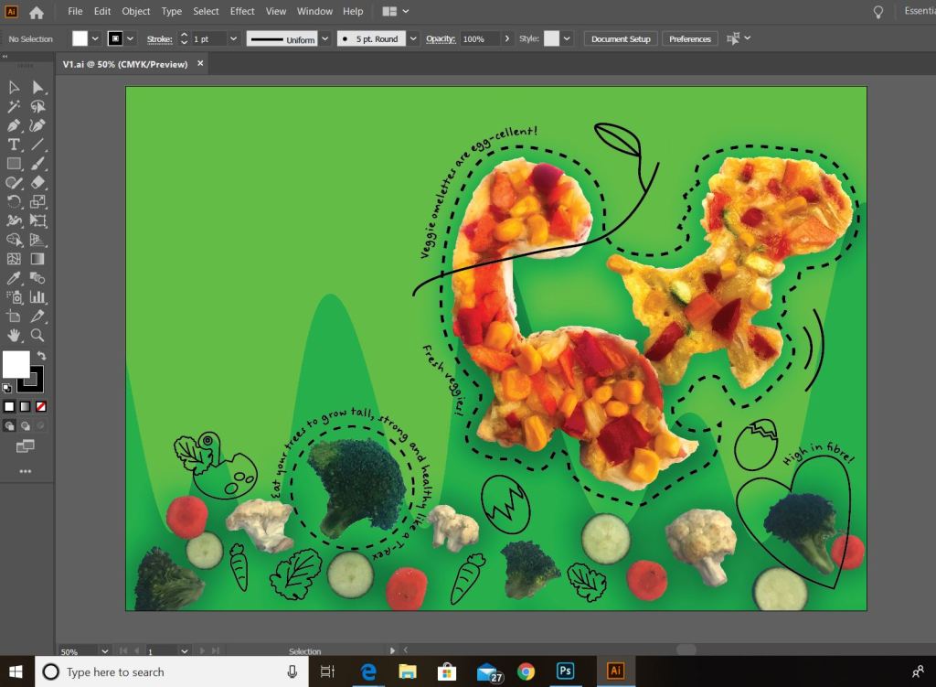
Again, I used the typeface “Felt tip woman Bold” for the little captions around the veg… It works for the childish factor but I am not a fan of using it really in my work! I must prefer to use clear, sans serif typefaces! I also had to put 2 different typefaces together on this piece also and again I am not a fan of doing that.. also as “felt tip woman bold” is also a sans serif typeface.. there is no contrast between the 2. However, it is a fun typeface and would be appealing to children and their families… it gives a happy, friendly vibe.
I then had the problem of finding a pun or a headline for this poster.. which actually did not take me very long at all! I wanted to include the fact that the omelette could have been made using Dino eggs and that the veggies are awesome or ROAR-some.. The headline I went for was “ROAR-some veg on Dino eggs” I feel that this works. It says what it is but in a clever fun way.
I had to play around with the spacing and text size however to get the right feel for the message. “Roar” had to “ROAR” and for that to happen it had to be bigger than the rest of the body copy. I then had to alter the leading of the rest of the text so that it looked right.
This is what I ended up with… I could have gone on with this exercise and tried to further improve it some more.. I was not happy at the placement of the hyphen but I felt it worked better on the second line that what it did on the first.. but I try and remind myself that Perfection can never be achieved and that time is ticking to get through the rest of the unit…
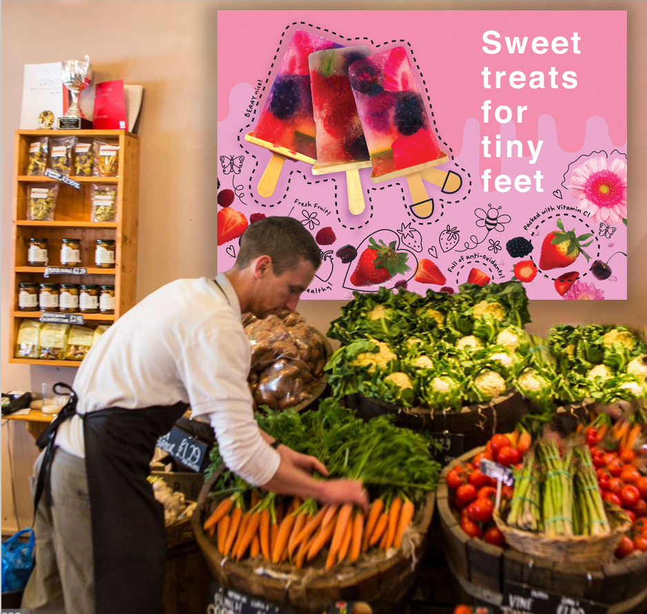
These are the finished mock ups! I tried to find a fruit and veg shop with windows that I could use to place my posters into, however I could not find one at all! I found this stock photo image (in the slideshow below) and imposed my posters onto it to give an idea of what they might look like on display in an actual shop!