
Hello and thanks for meeting me here at city guidebook number 8 of 10- Melbourne!
When you imagine Melbourne you see sun, sea and surf! I found myself getting confused between Sydney and Melbourne though! :s Again, I did a search on Pinterest for ideas and inspiration.
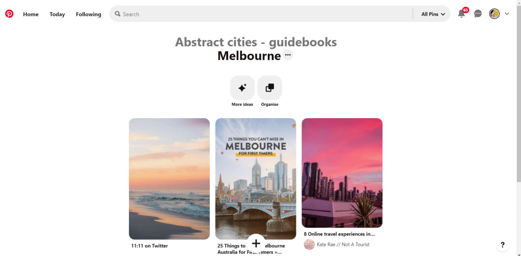
What I noticed was a lot of photos with Pink hue skies. Pink is a colour I know I haven’t used much in my designs so far, so I decided to use Pink and make it a dominant colour in this design. Pink is modern, confident and warm so it would make it an ideal colour for this popular city. An iconic structure in Melbourne is the Princes bridge, it appeared in a lot of the photos on my search. Melbourne is a coastal city with a lot of landscape and structures but there is also a lot of green around the city. This is something else I would include!
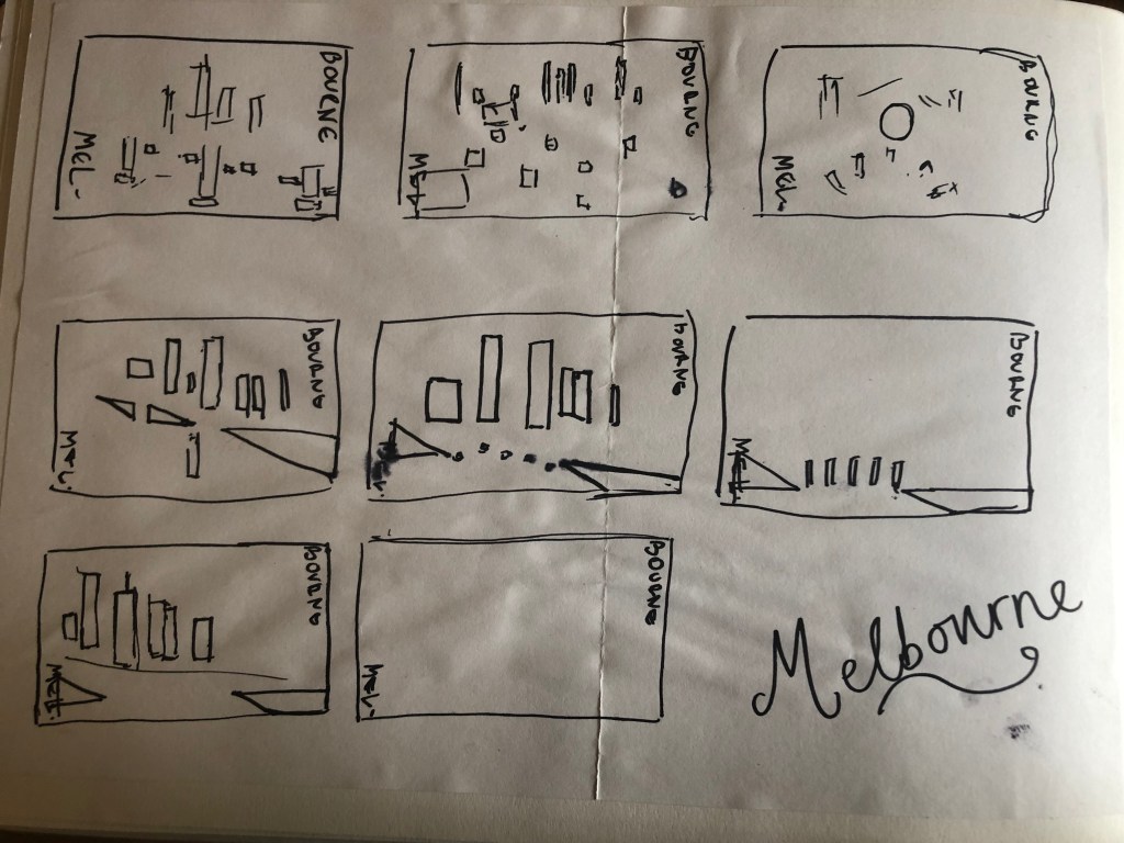
Similar to my design that I did for Manchester, I didn’t want to draw the bridge looking exactly like a bridge.. I wanted to leave it open to interpretation and make sure that the abstract was present with it. I took a photo of the bridge and sketched it out above using only its simplest form. The bridge uses triangles as part of the design so I used this as the main frame for it.

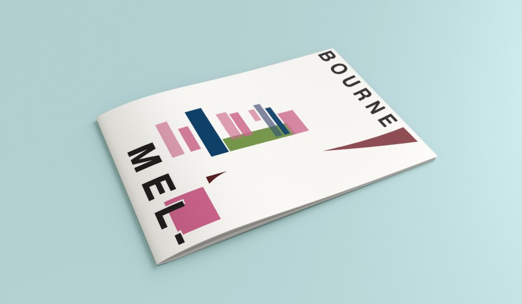
This is the final mock up. I feel like this design is very balanced. The design has a centre point where everything comes together and then there is a lot of negative space and room for the design to breathe. This design allows the eye to travel from the bottom left to the top right. It flows naturally ad comfortably. As I said, I wanted to use Pink as the dominant colour. It is bright and modern and confidently portrays the atmosphere of Melbourne. To break the pink up I used a cool blue, this brings contrast between the 2 colours. A pop of green was used to represent the natural environment which does appear within the city itself. This I feel fights with the blue for attention but it is definitely the attention seeking accent colour of the design. The bridge itself is built from the triangles which appear on the real thing. It is seen to appear in the distance and then come closer to finish at the forefront of the design. It is the bridge in this design which perfectly balances this design. The eye flows comfortably across the design.
