Welcome back to design 2/10 city guidebooks! – Malmo!
I was more aware of time (or lack of!) after completing design 1: Madrid, these guidebooks are time consuming! I decided I needed to try and cut down the research part of things although this first stage is crucial to achieving winning over a brilliant design outcome . I always start my research by searching Pinterest, it is the best place to find and record inspiration I find.
I had never heard of Malmo but after looking at some photos of the place and reading about it online, it now seems like a nice place to visit! I learned that Malmo is a modern coastal city in Sweden. I wanted to follow in the footsteps of Madrid by basing it around architecture and landscapes so I searched Pinterest to see what landmarks stand out in Malmo.
Turning Torso

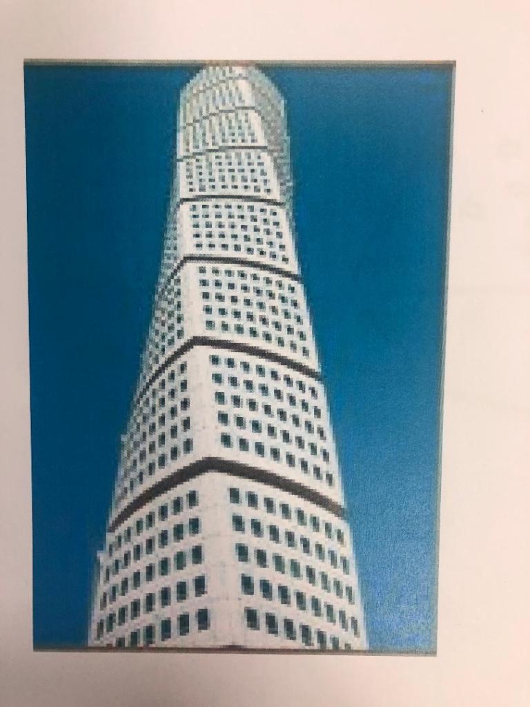
The most intriguing building that I found in Malmo was “The Turning Torso” it is regarded as the first “twisted skyscraper” in the world. It was designed by spanish architect, structural engineer, sculptor and painter Santiago Calatrava. It officially opened on the 27th August 2005 and reaches a height of 190 metres with 54 storeys and 147 apartments within it. In August 2015 the Turning Torso was the winner of the 10 year award from the Council on Tall buildings and urban Habitat. It also won the 2005 Gold Emporis Skyscraper Award.
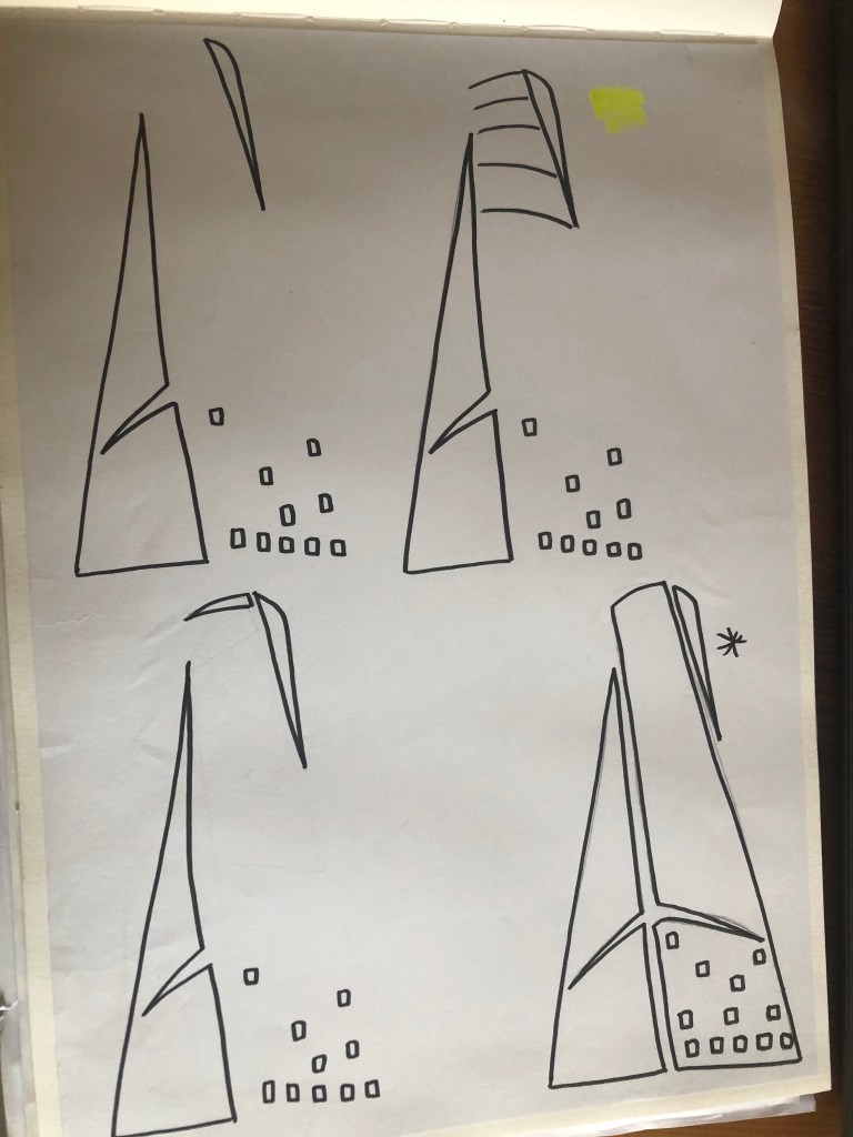
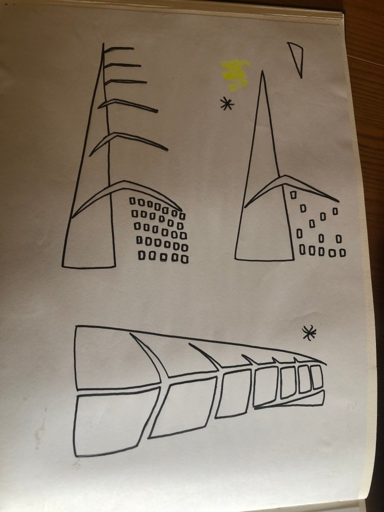
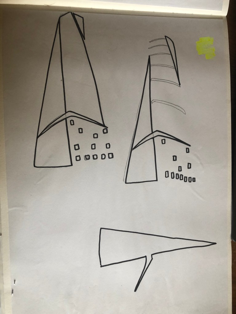
With the brief in mind I knew that I had to keep my design abstract, I was conscious that I didn’t want to make the design too pictorial and obvious as to what it was. I didn’t want to draw the Turning Torso onto my design and it be obvious what it was! The way I went about designing was to take a photograph of the Turning Torso and trace around it several times, each time taking something away so that I was finally left with the bare bones of the building. I then took the whole drawing apart and found clever ways to piece it back together but in an abstract way!
Sketchbook pages: First sketches and ideas
This is the photograph I found on Pinterest, I printed it out and I based my sketches off it:
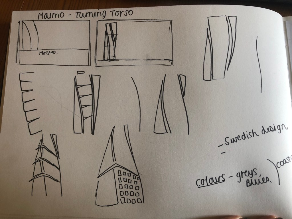
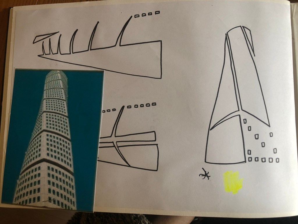
What I ended up with was a simplified sketch – the minimalistic “bones” of the building:
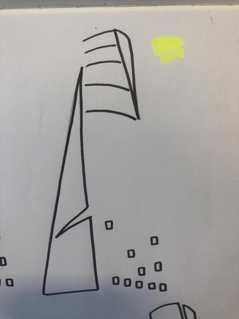
From this drawing it is still obvious what the building is, I took key parts of the building and simplified it down to its simplest recognisable form. This formed the basis of my final design.

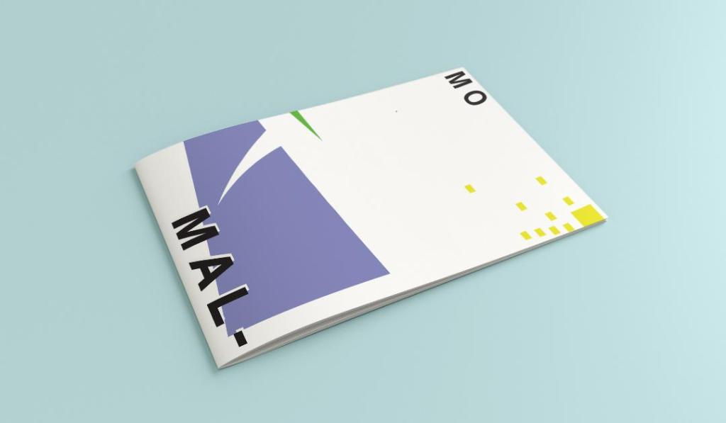
In my final design I kept the same layout as I did with Madrid as I felt that this would make the guidebooks become part of a series and be obvious that they all belonged together. I wanted to use quite “earthy” “beachy” natural colours because Malmo is a coastal town. I used blue for the Turning Torso which reflects the sky and sea and the fact that this tall building is between the two! I used a natural pop of green and yellow which would reflect sun and sand… Yellow being nice and warm also contrasts against the cool blue and green. I wanted to keep the design simple – I decided to split my design into thirds (rule of 1/3s!) and split the design up into each section. This lets the eye flow naturally and easily across the whole design. The yellow boxes allow for a pop of colour, add interest to draw the eye right to the end of the design but also represent the windows of the Turning Torso. The only flaw in my design is that I enlarged the Turning Torso to only show the lower half and a segment of the top… you can’t actually see the “turning” aspect. However, going down the route of keeping it very much abstract and not too obvious, I still really like this design and I think that you would still be able to recognise what the structure is from the key elements I’ve picked out even though they have been moved around and enlarged slightly. Negative space to me is just as much part of the design as everything else so I was adamant I wanted to keep a lot of space around the design but also to not restrict the design too much to its edges. I wanted it as a whole to remain “breathable”.
The location and how I designed the typography of “Malmo” was just as important as the rest of the design. I really toyed with the type layout again and kept questioning myself as to whether it was the right decision to make; I wanted to do something different and for it to look quite modern and edgy. Splitting Malmo into syllables also forces the eye to follow over to the other side of the design to see what the rest of the design is about.
This is the final mock-up of my Malmo guidebook! I am pleased with how it has turned out, I met my own expectations of how I wanted it to be and look like. The dominant colour used on this design is definitely the blue followed by the yellow being next in line as the subordinate colour. The green is fighting against the blue for attention which is exactly what the accent colour should be doing.