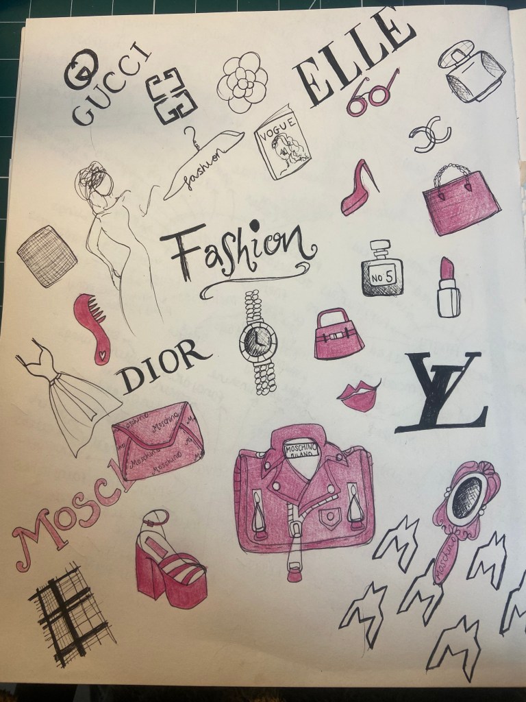
For this exercise I continued on from the previous exercise “Turning words into pictures” and carried on with the word Fashion. In the previous exercise I based most of my drawings on the Moschino Barbie collection and for this exercise I did the same exactly the same but in the form of a moodboard with printed images and photographs.
I did something very similar for when I turned 36 in July just gone, I created a photographic montage of all things Pink and girly for my Instagram post:
It is very rare when I am designing anything that I create a full moodboard of images, textures, colours etc for my OCA work.
When I am in my job at work and I have to present my ideas to my team I will put together a presentation with a range of typefaces and colour swatches and anything that might have influenced my ideas for the design. For example I had to brand our college race car and I used a moodboard of colours and patterns to show my team what influenced my decision for the final design I chose to go with for the car.
This was the moodpboard I created:
From the ideas on my moodboard I was able to develop these into ideas for my design for the branding of the logo and car. Above shows the final Design and logo I created for the BCR Race car for my Graphic Design job at Boston College.
I usually use Pinterest to save and record all images that inspire me and help me to create ideas for all of my designs. Pinterest is so easy to find images and save them for reference all organised in their own folders for me to refer back to at any time I wish.
Here are some of my organised folders for some of my projects!
Here is the moodboard I created for this exercise:
It is a mix of print outs and magazine clippings. When I think of fashion and the Moschino Barbie range I think of LA, Beverly Hills and Hollywood – the ultimate glitz and glam!
The word I chose for this brief is Fashion- I am interested in Fashion and also Fashion Illustration so it made perfect sense to choose this word. I did struggle with drawing images for it though. I don’t struggle with doodling and sketching ideas for design briefs of things that do not already exist but when it comes to drawing things that exist from memory I don’t find it much fun.. For example if the brief was to sketch new ideas for a new handbag I could draw 100s of different versions of new designs I have created! When it comes to drawing things that already exist I don’t find it as much fun.
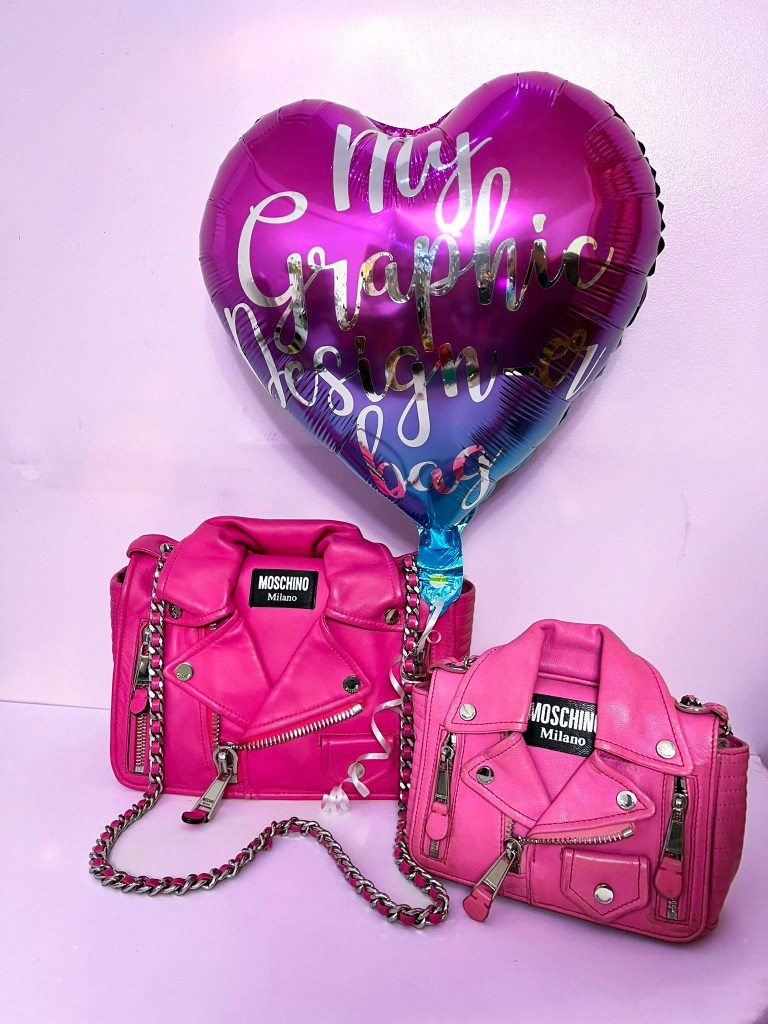
When it comes to Fashion the only collection I have ever fallen in love with and want to own every single piece was the 2014/15 Moschino Barbie collection by Jeremy Scott. Only recently in May when I got my first wage from my new job as a Graphic Designer was I able to go back and buy the bag I have wanted for yeaaaarrssss! – the little Pink Biker bag from the collection. I had a fake version of the bag but never the real deal!
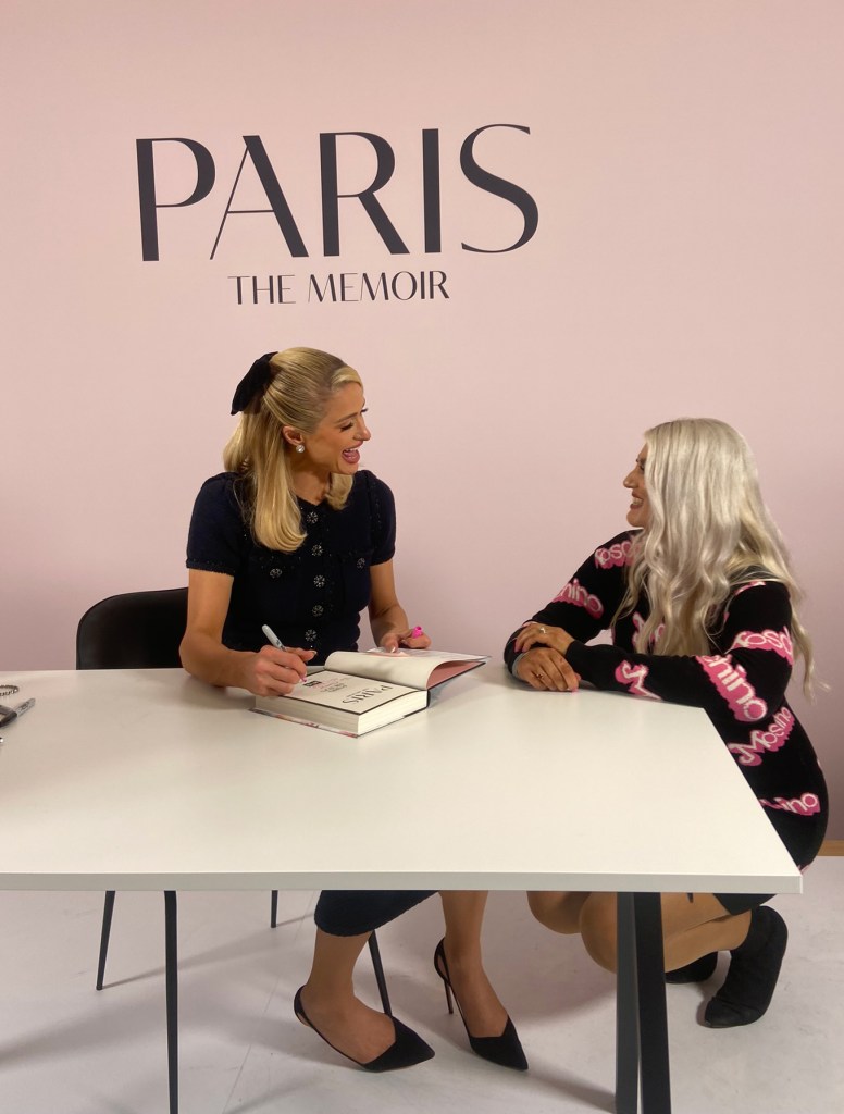
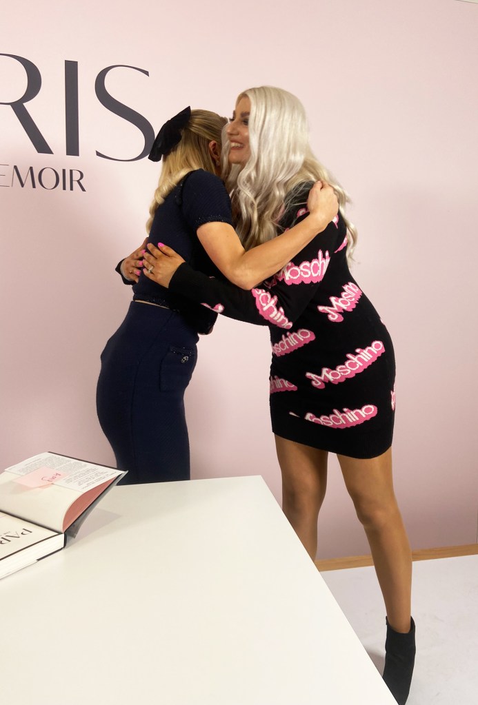
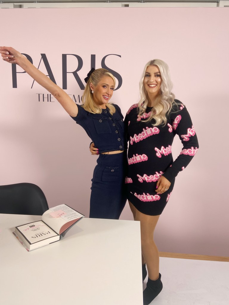
I own a few pieces from the collection that I have managed to get at an affordable price over the years – one includes my Moschino knitted dress which Paris Hilton wore a lot of when it first came out. I was lucky enough to meet her and be able to wear the dress for her to tell me that she loved my dress and she still has hers that she loves wearing!
The first things that I thought to draw were some of my favourite pieces from this collection. I also liked drawing out the designer label logos and recreating the typefaces and the curves and lines that are all different weights. Pink is obviously the main colour for the Moschino Barbie range and also my favourite colour so it made sense!
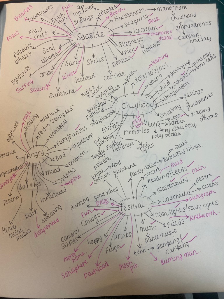
I am no stranger to spider diagrams/mind maps/brain storming or mind mapping as I call it.. I work by lists and mind maps with all of my design projects that I do to help with the research into what I. am designing for and to mind map any ideas that might help me with the final design outcome.
This mind map was no different to any of the others I do, I started off with each word and then mapped out anything that came to mind from the original words – I worked off the most obvious things you think of and see in your mind when you think of the word and then worked off that to think of memories, colours, objects, smells that I would associate with the words.
I then asked my Husband to think of his answers for each of the words and they are listed in Pink, I also ticked in Pink next to my answers if we both thought of the same words. My Husband struggled with this more than I did! – particularly with Childhood; not that he had a bad childhood at all – far from it! but just that he recalls not going on many family holidays and that he just spent his time outside working with his Dad or playing with Lego!
I struggled most with Anger. Anger is an emotion that is very strong and there isn’t much else to it really! – if you are angry, you’re angry! It’s not a word that can be explored In great depth other than words around how it makes you feel, what may anger you and “seeing red”. Childhood for me was the next difficult word – they are both words that are very subjective, they can differ from person to person dependant on their experiences and how they grew up. I had a lot more ideas to mind map around family caravan holidays at the seaside whereas my Husband who never went on family holidays would not have put these ideas down as he never experienced them. All mind map ideas are subjective – there is no right or wrong answer, it is purely the ideas we have perceived in our own minds of places/objects/people and subjective of our own life experiences.
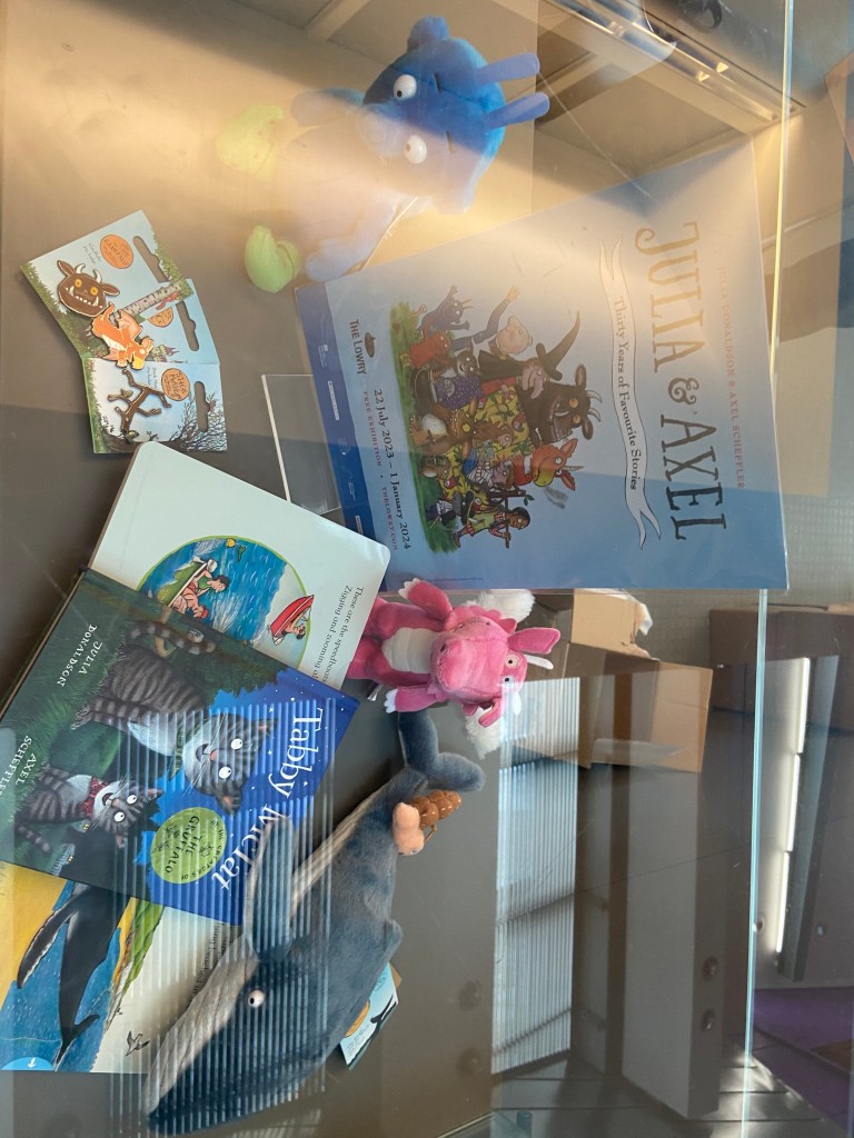
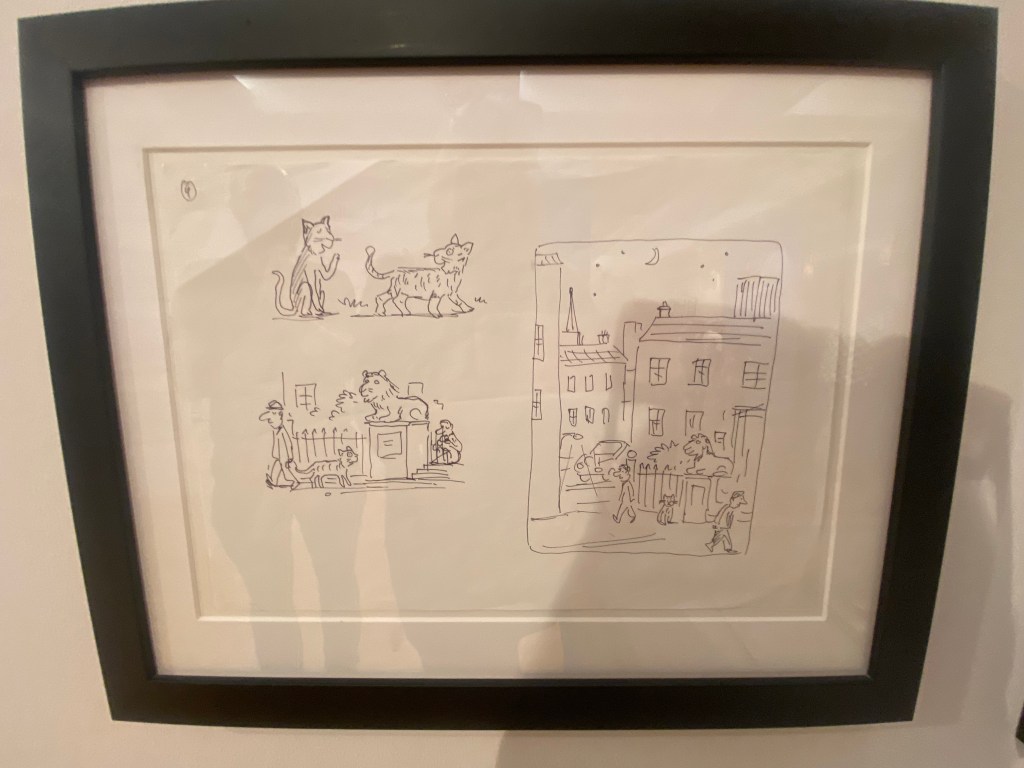
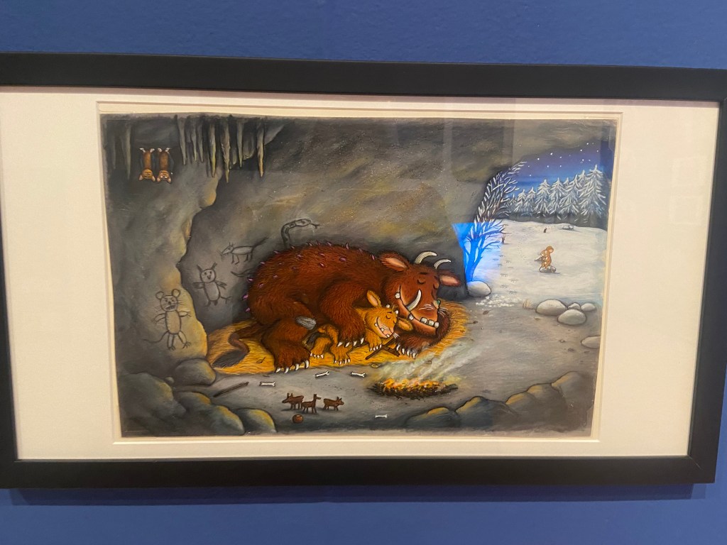
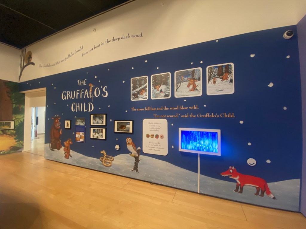
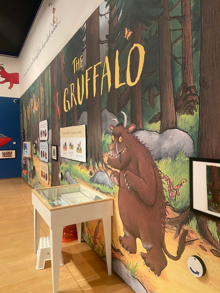
The hardest part about this exercise was actually trying to find an illustration that I was interested in using for the Brief. I did think about this exercise long before I started to write it up as I visited Manchester in August and while I was there I decided to see if there were any Art and Design events on locally that might help me with my course or any of my exercises and assignments. After doing a Google search, I found that there was an exhibition on at The Lowry in Salford for Julia Donaldson and Axel Scheffler who wrote and illustrated The Gruffalo and other various Childrens’ books.
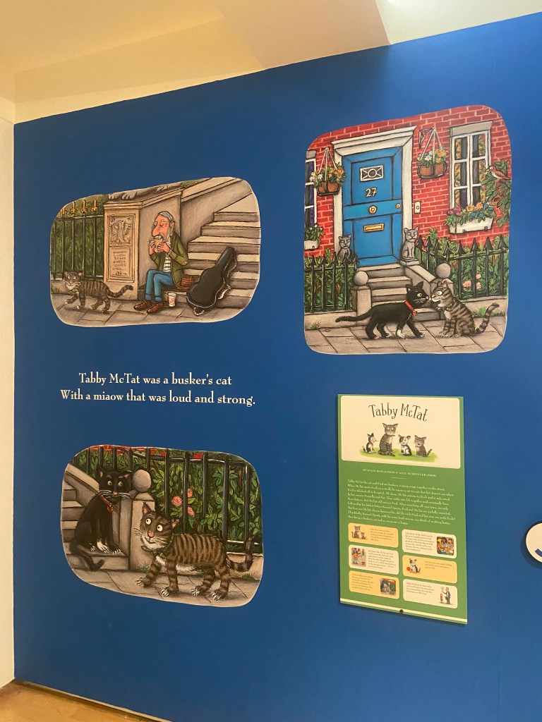
The Gruffalo is a well known Children’s picture book that was first published in 1999 depicting the story of a Mouse taking a walk through the woods and cleverly deceiving and avoiding predators – the main predator being The Gruffalo that the Mouse made up to protect himself against the other predators bt then realised actually exists! He then had to deceive The Gruffalo into believing he is the scariest animal in the woods.
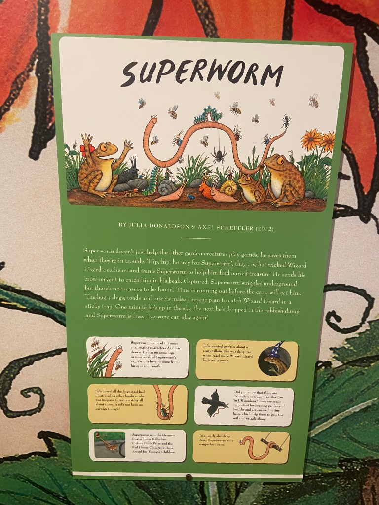
The story is 700 words long and is written in rhyming couplets featuring repetitive verse. The story has been adapted into plays and an animated film for TV which is hugely popular on Christmas Day! There is also a ride dedicated to the story at Chessington World of Adventures and a series of Woodland Trails. The Gruffalo has also expanded to merchandise such as soft toys. In 2004, the story continued with the sequel The Gruffalo’s Child.
The Gruffalo is such a fun character – he looks very dopey and innocent in appearance despite his menacing demure to the small mouse! The Mouse manages to deceive him and escape from him I believe because of this! Scheffler altered the look of the original Gruffalo to make him less scary for young readers as he had sharp eyes and teeth and a more scary appearance and this is how he came about the cute, friendly, dopey character he is today.
The Lowry, Salford
After my Google search to try and find local Design exhibitions in Manchester, me and my Husband quickly realised that we only had an hour to make it to The Lowry and to quickly look around the “Julia and Axel” exhibition. I knew it would be a really good exhibition to go and see and that it could be helpful in my current Illustration unit.
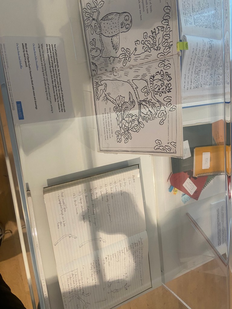
We needed a time slot to be allowed into the exhibition so when we got there with 45 mins to spare we quickly filled in the entry form and showed email confirmation at the door to which we was told they had already let the last group in of the day.. I explained that we were not local and would not be venturing that way anytime soon and that I was a student studying Illustration and that I only needed a few minutes to take some photos to evidence the trip and for me to refer back to In the future – they let us in to look around! This probably worked out well as they told us that it had been heaving with parents, families and children all day and at the time we walked through the door it was practically empty! The exhibition looked into the lives, work and careers of the author and illustrator but it was also an interactive playful exhibition for children to explore the characters from the books. I particularly liked seeing the original notes and sketches – the sketches were bright, bold and vivid Pro Marker drawings on a layout pad and sketchbook pages.
What questions need to be asked/what needs to be instructed in a brief?
I decided to write some rough notes to help me remember what I would need to include in a brief.
I then managed to bullet point the basics of what I think makes up a design Brief:
Overview
What is the story about?
Who is the author?
Who is the reader? Where is it to be read and when?
Supporting information for the Designer.
Client
Who is the client?
Concept
What is required to be produced/represented/communicated?
Any visions/missions/morals/values/life-lessons it needs to represent?
Educational?
Target Audience
Who is the Target Audience?
What is it communicating?
Are there any problems to overcome when communicating?
How does the target audience need to feel? Is there an emotional response that is needed?
Is there a call to action required for the audience?
Inspiration
Any stylistic aspects to be included/researched?
Design
How many concepts are needed for final critique/presentation? What are the requirements for final presentation?
Technical requirements – sizes, dimensions, large/small scale, print or digital? What file formats does it need to be saved as? PDF? PNG? High res?…
What medium is to be used? (hand-drawn, pen, paint, mixed media, digital etc..)
Does any text need to be put on the illustration? What content needs to be included?
Key themes for visuals?
What is the end use? Further advertising/publications/Merch etc…
Timescale
What are the timescales for the design/s and any final deadlines/presentation dates?
Budget
What is the budget for the campaign?
Contact
Who should be contacted during the design process?
Requirements
Accessibility – fonts and any information must be clearly legible and accessible.
Inclusivity – Celebrating everyone as an individual and being inclusive to all faiths, religions, cultures, race, backgrounds, beliefs, colour etc…
Be age appropriate for the target audience given – nothing to cause offensive/sexualise.
Competitors
Any competitors to be made aware of?
I bought this above poster from the gift shop after we had looked around the exhibition – it is the artwork that they used to advertise the exhibition; it has been used in posters, adverts, banners, social media and now as merchandise to be sold in the gift shop. The illustration depicts all of the characters that feature in the books but also in the exhibition – it gives the target audience an idea of what Is being shown and what to expect. The Gruffalo being the main character is centred in the middle. The artwork appeals to all ages but primarily targets young children and their families, (maybe illustration students like myself too!).
The illustration Is fun, bright, happy, innocent, friendly and inviting.
The hierarchy of the poster is simple – top to bottom informing the viewer of the most crucial information. It lures you in with the featured names and then once it has your attention it gives you the crucial dates and information at the bottom. The illustration supports the posters content and further adds appeal and the need to go and see the exhibition. I did want to use this illustration for the brief but it had to be taken into account whether the Illustrator drew the illustration and also designed the poster or whether an independent designer was brought in to do that.
As my brief for this exercise purely concentrates on the illustration alone, I shall write my brief an illustration alone.
I therefore decided to write my brief for this illustration that was in the exhibition and also features in the book itself:
The illustration depicts the moment when the mouse has come to the realisation that the Gruffalo does exist and he is trying to cleverly persuade him that he as the mouse is the most scariest animal in the woods to prevent himself from being eaten on a slice of bread! The look of confusion and complexity on the Gruffalo’s face as he struggles to understand how this tiny little mouse is the most feared animal in the woods, the look of terror on the face of the snake who is visibly terrified of the Gruffalo and oblivious of the mouse and the look of confidence, strength and cunning mischievous playfulness of the mouse who is deceiving all of the predators!
The illustration is very bold, bright and vibrant – it has been drawn by hand using what I believe to be pro-markers and then it has been manipulated digitally for use in the books/film etc…
The primary focus is the characters and what is happening – the theme of the illustration is based in the woods with the snakes home (the logpile), there is a fast moving river or stream in the back of the illustration which could be a metaphor to suggest the flow of the pages and the storyline or show the journey of the characters moving along on each page within the story.
The characters expressions are key to the feel of the story on this illustration – the characters are also drawn to the target audience in mind – they appear cuddly, friendly, fun, innocent, playful and engaging. The colours used are very earthy and down with nature and have the theme of the woods in mind – Browns, Greys, Yellows, Greens, Blues…
Here is my brief for this illustration!….
The Brief
The Gruffalo by Julia Donaldson – Illustration Brief for page 6 of the book
Overview
Julia Donaldson is the author of a new children’s book titled “The Gruffalo” that is predicted to be one of the best-selling children’s books of our time. The story will be aimed at young readers between the ages of three to eight years. Three to five year olds will appreciate the elements of surprise and repetition in the story whilst the six to eight year olds will enjoy the rhyme and rhythm of the text. The story is aimed primarily to be read at nighttime as a bedtime story or to be used as a picture book for younger readers to engage with the characters, colours, theme and emotions of the characters before learning to read.
The Gruffalo is a story which uses repetitive words and rhyme. The storyline starts with a mouse who walks through a wood and encounters three predators – A Fox, an owl and finally a snake. Each of these animals invites the mouse into their home for a meal, the implication being that they intend to eat the mouse. The mouse declines each offer, telling the predators that it plans to dine with a “Gruffalo”. The mouse then describes the Gruffalo’s frightening features, such as “terrible tusks, terrible claws, and terrible teeth in his terrible jaws”
The mouse tells each predator that they are the Gruffalo’s favourite food. Frightened that the Gruffalo might eat them, each animal flees. Convinced the Gruffalo is fictional, the mouse says:
“Silly old fox/owl/snake, doesn’t he know?There’s no such thing as a Gruffalo“
After getting rid of the last animal, the mouse is shocked to encounter a real Gruffalo which has all the features the mouse thought that it was inventing. The Gruffalo threatens to eat the mouse. Instead, the mouse insists that they themselves are the scariest animal in the wood. Laughing, the Gruffalo agrees to follow the mouse. The two walk through the wood, encountering each of the three predators again. Each predator is terrified by the sight of the Gruffalo and escapes to their home, but the Gruffalo believes that they are actually scared of the mouse. Exploiting this, the mouse threatens to eat the Gruffalo in a “Gruffalo Crumble”. The Gruffalo flees, leaving the mouse to eat a nut in peace.
The Design Concept
Our client Julia Donaldson would like you to create an illustration for one of the pages of her book. The page of the story that she would like you to illustrate is the moment the Gruffalo and the Mouse meet the snake. The mouse at this point has realised the Gruffalo actually exists and in a last attempt to try and not be eaten by him, he tricks the Gruffalo into believing he is the scariest creature that lives and exists in the woods by making him follow and see for himself how scary he is to the other animals. At this point in the story they meet the snake who is visibly petrified of the Gruffalo not the Mouse, however the Gruffalo has been convincingly tricked and believes that the snake is afraid of the Mouse and not by him. He is very confused and complexed. The Mouse with a newfound confidence and strength is happy that he is deceiving his predators. The illustration must be bright, bold, colourful and engaging and depict the Gruffalo and the Mouse walking through the wood to meet the snake at his home by the logpile. The colours that need to be used on this illustration need to reflect the theme of the story, (the woods) and reflect nature. The client would like to see a range of Brown, Grey, Yellow, Green and Blue colours as well as texture and an eye for detail with intricate detailing of the characteristics and appearance of the characters particularly the appearance of the Gruffalo –
He has terrible tusks, and terrible claws.
And terrible teeth in his terrible jaws.
He has knobbly knees, and turned-out toes.
And a poisonous wart at the end of his nose.
His eyes are orange, his tongue is black.
He has purple prickles all over his back.
The younger readers will mostly be engaging through the illustrations alone. The illustration must depict the characters emotions and body language. The story has flow and rhythm throughout the book with the rhyming text and the journey that the characters walk in the story – a metaphor would be optional to include in this illustration to show flow, movement and a journey that is being walked throughout the pages by the characters – this could be shown by something in the woods or something that reflects nature.
Target Audience
The target audience for the book is children aged three to eight years old. The story aims to be educational whilst also being engaging for creativity and imagination. Three to five year olds will enjoy the bright, bold, colourful illustrations and appreciate the elements of surprise and repetition in the story whilst the six to eight year olds will enjoy the rhyme and rhythm of the text. The book can be used during younger years as a picture book to promote creativity and imagination, read alone or be read with family members and the child.
The story is communicating a playful, cunning plan to try and survive. Although the Gruffalo is portrayed in the story as being the scary monster he is, he must be illustrated in a playful, cute, funny, dopey and innocent way so as to not scare the young readers. The young children who read the story and look at the illustrations on the pages need to feel safe, engaged, inspired, curious and excited to see the characters and read the story over and over again. There is a possible opportunity for potential new ventures leading on from the success of the book; there might be room for advertising, film/TV production and merchandise to accompany the book and the story in the form of soft toys, therefore the characters need to have strong characteristics and be soft, cuddly and loveable.
The client would like to see three concepts presented for critique/presentation for discussion and feedback. A concept shall be chosen and then time to finalise, changes to be made for final presentation at a later date for the publishing house.
The client initially prefers a hand drawn approach and would like to see drawn concepts specifically using Pro markers as this allows for bright, bold and vivid illustrations. There is then chance to manipulate the illustration digitally for publication also. The client would like the illustration to be no larger than A5. There is no text content needed on the illustration itself.
Timescale and Deadlines
The client would like to finalise plans with the publishing house for a book release date in May 2024. The concepts need to be presented to the client on the 20th December 2023 with hopes that the final illustration can be finalised and completed by February 2024.
For any queries/resources/assetts that you might need and find necessary to help with the illustration process you should contact the client at Julia.d@thisisntreal.co.uk who will be able to provide these for you and assist you further in the design process.
Requirements
The client wishes the book to be inclusive to children of all backgrounds, beliefs and race and would like the illustrations to feel like a “safe place” to spend a few minutes of their day absorbed in the fun, and engaging pages. The illustration must be age appropriate for the target audience with nothing that promotes an offensive or sexual nature.
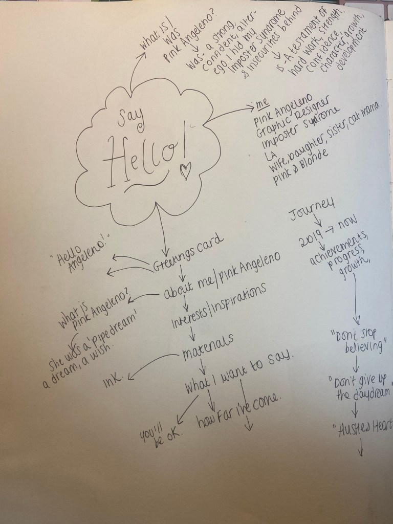
For this assignment I wanted to introduce myself through Pink Angeleno as this is how I brand my work on social media and on this blog and I know that my tutor already knows who I am and what my work is like, but many people always ask me why Pink Angeleno is Pink Angeleno.
Pink Angeleno was born in 2019 when I first started my course, I needed a brand name that represented me and my work and I was really struggling because I had no idea if I was actually good at Design or whether it was just a pipe dream. I had no idea who I was at that point, where I was going, what I was doing or whether what I was producing was any good. I felt absolutely lost and just dreamed of running away to live a happy, sunshine-unicorn-rainbow life in LA! I do love LA and California and held on to the dream that I might make it back there one day.. I was like an Angeleno that was just lost and living elsewhere! I also loved the colour Pink and this is the colour that everyone associated me and my designs with. it only seemed appropriate that the original name I chose – “Graphically Pink” morphed into Pink Angeleno. I wanted the energy, the fast pace, the colours, the vibes, the excitement and adventure, the street art, the hidden places and the glamour of that lifestyle. I wanted Pink Angeleno to showcase my OCA work but I also wanted it to represent this “pipe dream”. As it turned out though, Pink Angeleno has served me well as I have returned to LA and I know where I am going as a Graphic Designer.
I wanted to come up with a design that would be suitable for this assignment but something that I could also use moving forwards to represent my brand.
I explored in my mind the boundaries of the brief… The brief stated “greetings card” but I wondered whether a post card could class as a greetings card. After doing some research and searching Google for some one sided “post card style” greetings cards, I realised that they are two very separate things and that I should stick to what the original brief wanted.
The brief allowed any type of media but I decided to do this assignment digitally using Illustrator.
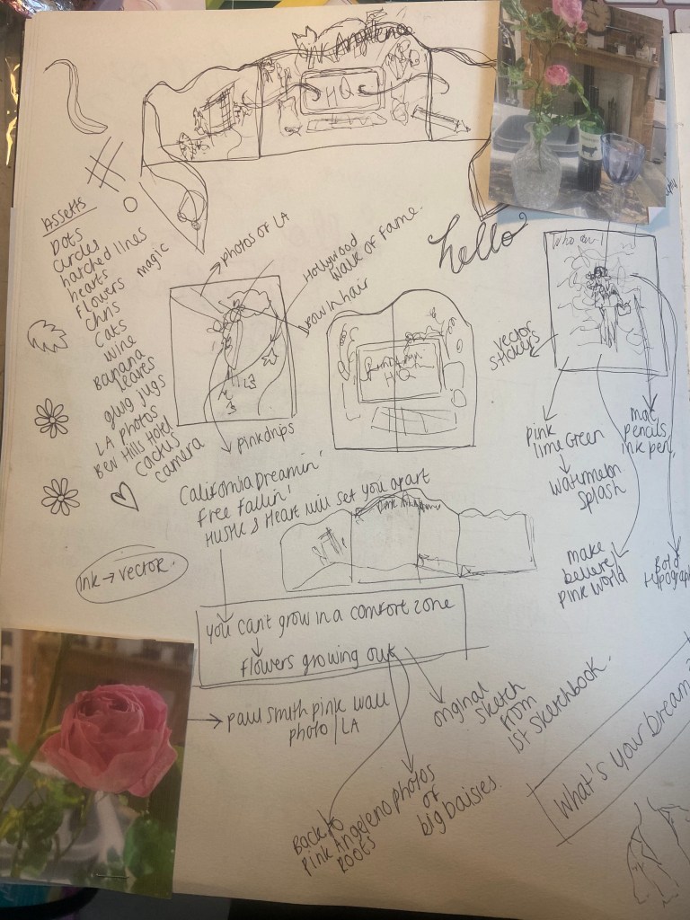
I started off with brainstorming some ideas in my sketchbook about what I might want to include on my design:
*The photos of the Roses on the page are nothing to do with this assignment but I am trying to document as much as I can in my sketchbooks – I had a lovely evening of dog sitting my Dads dogs and he lives in a countryside 1600s house with a big garden full of amazing flowers and I sat down on this night with a glass of wine, cut a rose from the garden, lit the fire and sat down to sketch. It was bliss.. so I decided to document the moment!
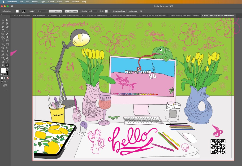
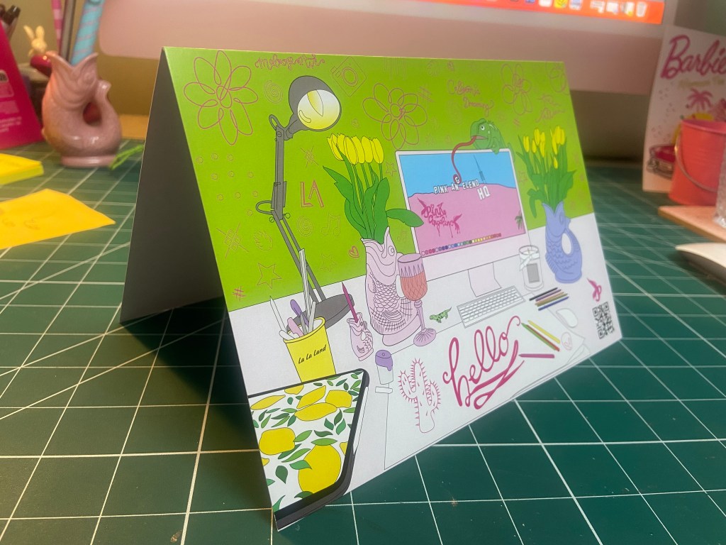
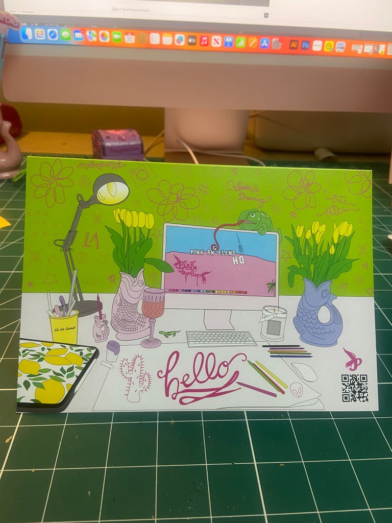
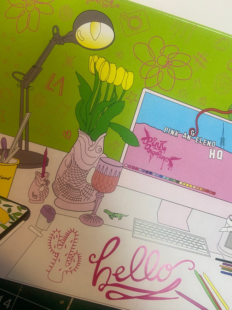
I sometimes on my social media post a photo of my desk space with the caption “Greetings from Pink Angeleno HQ” SO I decided to move forwards with this idea. I had the idea to illustrate my working space on the front of the card. I then had the idea to make the card have a design on the front and the inside and allow the design from the front to flow on the inside of the card. How I imagined this was to have my Mac on my desk space have a wallpaper which would then continue onto the inside. The wallpaper I had in mind was the Hollywood sign and then on the inside of the card I would illustrate more of the Hollywood Hills from a photograph I actually took whilst I was hiking the Hollywood Hills and include some little illustrations around the outside of other things in LA that I liked which would sum up my interests and why I called Pink Angeleno “Pink Angeleno”.
I also explored the idea of pop up cards and more complex designs – I later decided to keep it simple though as this is an introductory, simple brief and I felt it didn’t require the complexity. It would also be easier for the print process being one sided and a simple A5 tent-fold card.
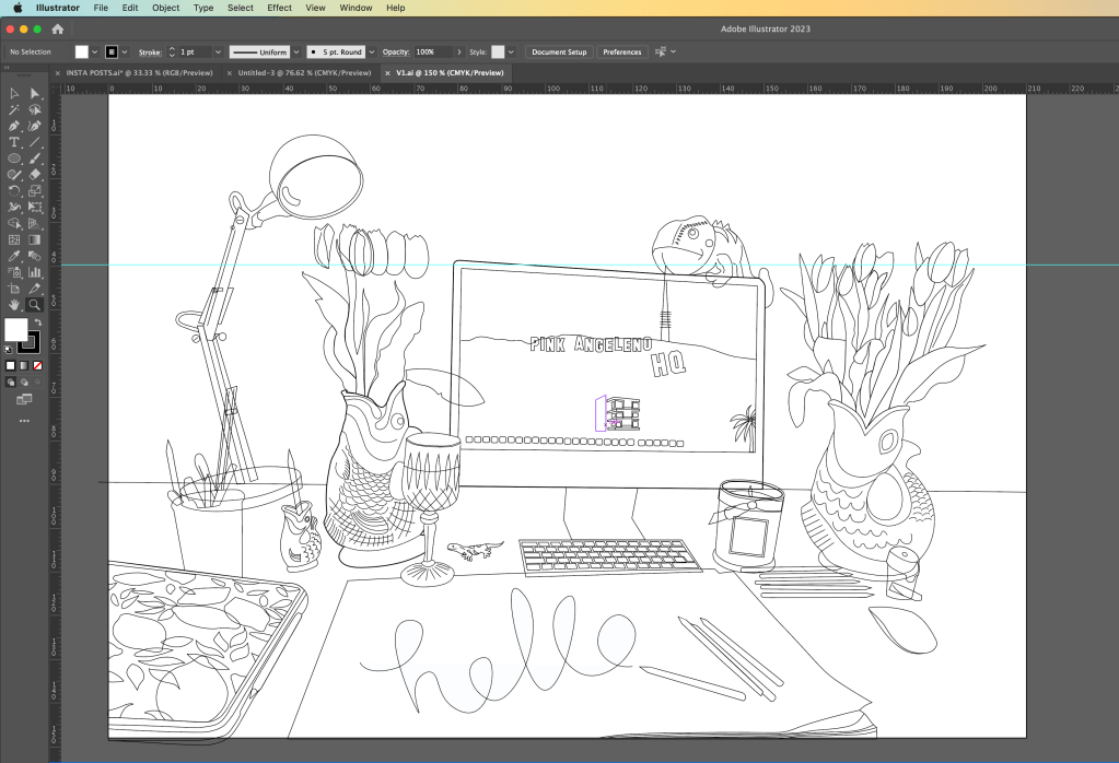
I took a photograph of my desk space:
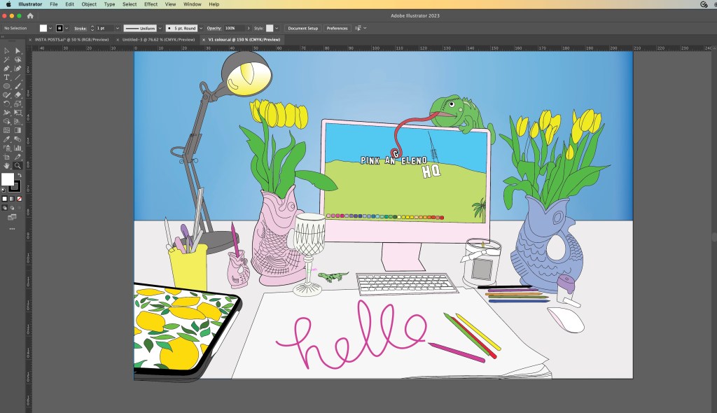
From the photograph I then drew out the first initial drawing of my desk space in Illustrator. I missed out the non important “clutter” and kept the essential items from my desk space. Once I had the basic drawing I could then go about adding colour:
I added colour and I just didn’t think much of it. It had everything in the illustration from my desk space but it didn’t show Pink Angeleno… there was nothing pink truly about it and the only element that hinted on LA was the wallpaper on the Mac. I have my cuddly toy chameleon (George!) sitting on top of my Mac and thought it would be fun to make him interact with the screen in the illustration!
I then sat and thought more about Pink Angeleno and how to best illustrate this on my greetings card. My current Pink Angeleno brand was neither here nor there.. I had a drawing I drew for my first ever OCA assignment which was a similar one to this… Create a postcard sharing who you are and the illustration I created for this I have kept as part of pink Angelenos identity all the way through. it is significant as this is how people identify my design and work and it is how It all came about:
I knew that I cannot reuse old work, but I then wondered if I could update Pink Angeleno which would help with my assignment and also create more of a solid brand for my work moving forwards.
Pink Angeleno is very vector based, a lot of my work are illustrations that I have drawn and then created into Vector art using Illustrator so I knew that my work for this assignment would be the same.
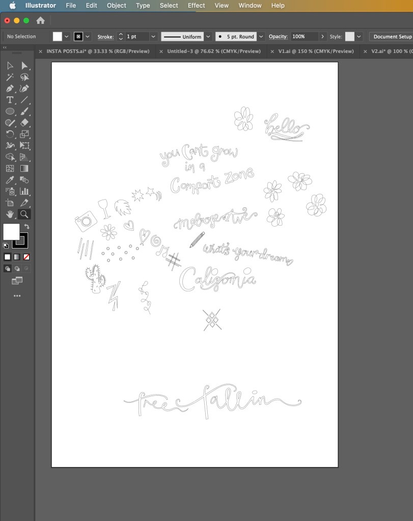
Once again, I turned to my sketchbook and started to sketch out little ideas that I feel sum up what Pink Angeleno stands for.
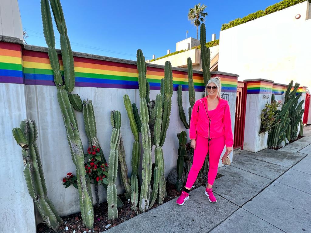
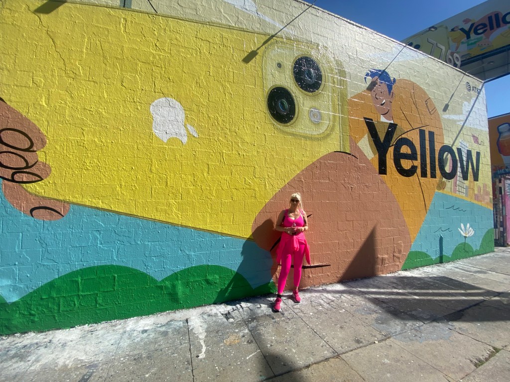
“You can’t grow in a comfort zone” is pivotal to me – it is what made me jump out of my seat and go for it in the first place. in my first ever sketchbook I drew a random doodle of this so it was only relevant to use it as part of this. Free Falling, a song by Tom Petty describes the emotion of wanting to fall off the top of the Hollywood Hills – it is I believe a song about getting out of a relationship but I associate it more with a feeling of escaping reality – that is very much the basis of the origins of Pink Angeleno. Melrose Avenue is just a cool place – shady in some areas I guess- but just a cool place! It is full of street art, graffiti, bright colours, thrift shops, unique bars and everything quintessentially LA!
Here are a few snaps I took of Melrose:
Cool right?… oh… also, here is my husband enjoying it too! – (with my Barbie bag!) 😛
“What’s your dream?” is an iconic line from Pretty Woman the film that I just had to include.
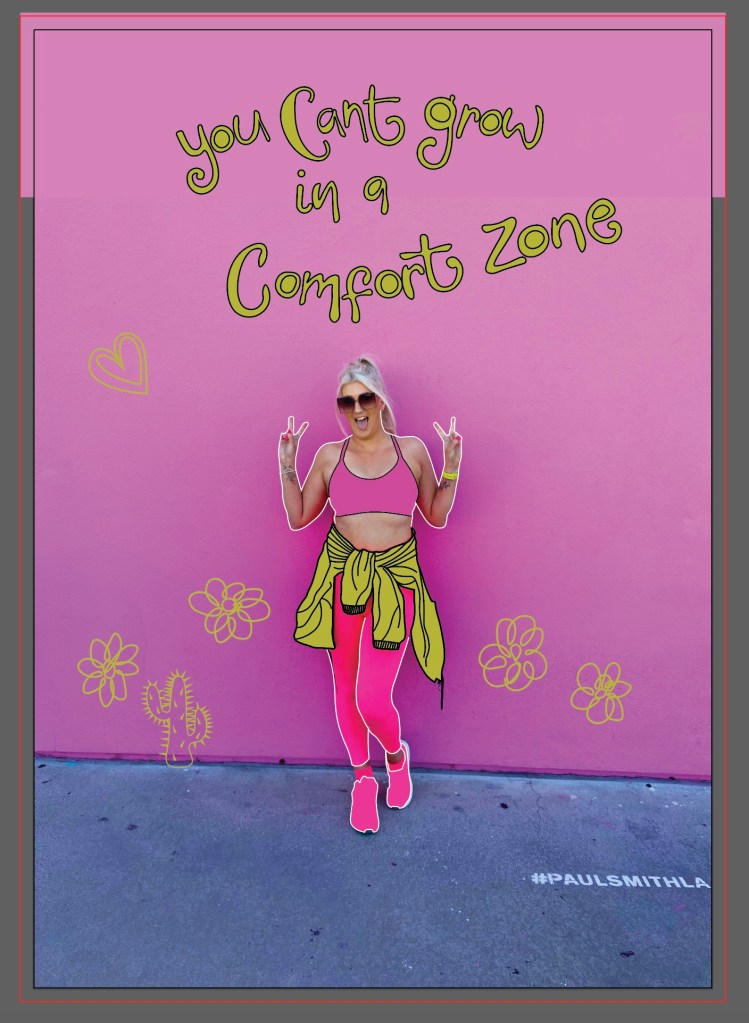
From drawing all of these I then had the idea to scrap the original idea and use the photograph of me in front of the Paul Smith Pink wall as a basis for a completely new idea..
I thought about using the photograph to create something like this:
I put both ideas on the back burner until I had drawn out my illustrations:
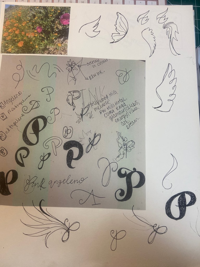
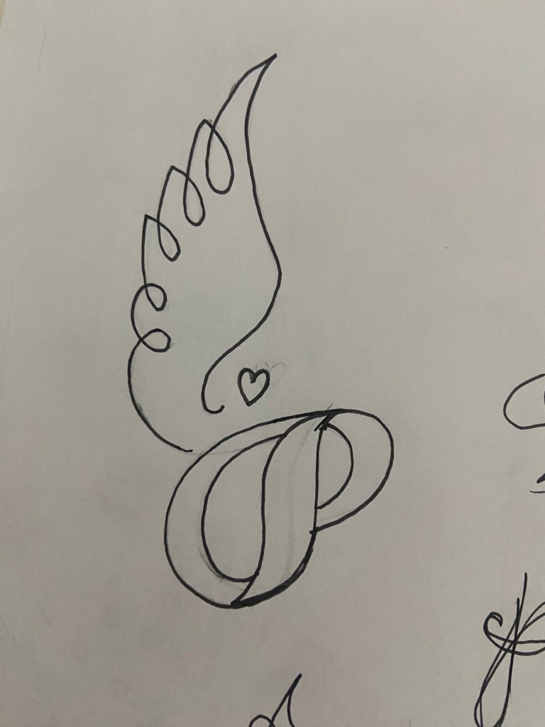
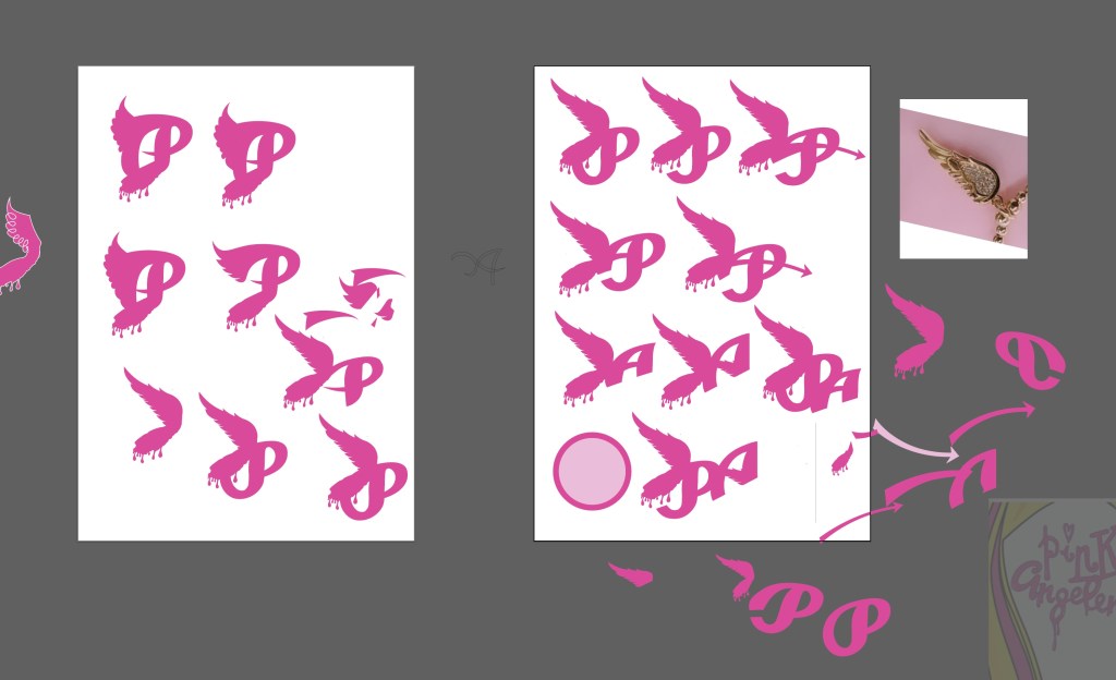
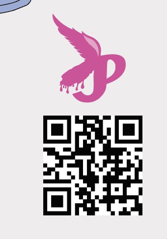
I then figured I needed to rebrand my Pink Angeleno logo ever so slightly.. the first ever original drawing I did for it was back in 2019 and I didn’t know or take into consideration then the readability and size of it when making it as part of a logo..
After a lot of thought though I didn’t want to lose the original identity of it as it means a lot to me so I went to work adapting it and making it as part of a basic logo.
I sketched up some more ideas for a logo – these manifested as a simple letter P with angel (or Angeleno) wings:
This was the final logo that I settled on and I quickly made it as part of my social media!
I also gave my original drawings a “glow up” and adapted them with my illustrations from my sketch book.
I then went back to both of my ideas for my greetings card and decided to go back to the first original drawing and idea but just to include the recent illustrations I had drawn. I used the colour combo of Pink and Green just because I love the colour pop and the colours remind me of a Watermelon, summer splash combo!
The colours of it here are extremely bright and vivd because I have saved it as a RGB PNG suitable for screens; however the file format I saved for print was a PDF format:
I also added a QR code onto it.. What better way to show who I am than a card with a direct link to my website? Instant promo and info on who I am.
My document was set up in Illustrator to an A5 size with a 3mm bleed.
I have never sent anything off for professional print before, but as I now work as a Graphic Designer in my new job, I have experience of sending artwork off to print with various print companies. One of the companies we use is printed.com. I only wanted 1 printed card which not many companies can do without a minimum of 10 prints but printed.com were able to print just 1 of my cards which was ideal and saved me unnecessary, added expense.
For this exercise the article that I chose to draw my illustration from was an article I found in Psychologies Magazine titled – “How Nature calms the mind”. It focussed on how doing little things daily outdoors can help reduce anxiety and spiralling behaviour. What I found from completing the exercise was that the main focus of the article was that spending 20 minutes in the garden daily can work wonders for the mind and soul.
I went through the article and highlighted the key words that I found to be important helping me move forwards with my illustration:
For some reason whilst I was reading this, all I could see in my head was a free, chilled out, easy-going woman gardening in the sunshine in the style of one of the Grecian goddess style garden ornaments. I thought this would be very fitting for my illustration – The Grecian Goddesses wear very minimal clothing and this could reflect being in touch with nature and going back to nature. Thee statues are very feminine and this article is very much aimed for the female target audience. The Grecian Goddesses also belong in the garden which is the whole message of this article.
I sketched a rough idea in my sketchbook of what the idea was in my head – even though it was only really sketchy, I really liked it! I drew squiggly hair which reminded me of an Afro hairstyle – I then wondered if I should make my figure dark skinned but I then decided that my figure should just have a dark sun tan from being outside in the garden each day. I then had the idea that the squiggly hair could be flowers blossoming – this would represent the garden in the article but it would also represent self development, growth and the fact that the mind is now clear enough for life to grow.
I drew this sketchy illustration with a large trowel balancing in her arms and a watering can in her hand and I contemplated making the illustration look modern and relatable by letting her wear garden Wellies.
I looked on Pinterest for some further ideas; I needed a photo of a Grecian Goddess statue rework my sketchy illustration around and I needed ideas for the 20 minute aspect of the article.
I wondered how to get the 20 minutes into the illustration and I instantly thought of a Sun Dial in a garden. Whilst I was searching Pinterest for ideas for this, I also came across a pop up advert for B&Q which had an image that seemed perfect for my illustrations hair. I could copy these flowers and draw them onto my illustration:
I then started to draw out a few variations of my garden Goddess to decide which one would work better for my illustration:
I also took photographs of me holding items in the way that I wanted my illustration to, so that I could accurately draw from the photographs and make my illustration as realistic to a human pose as possible:
When I think of 20 minutes I think of a clock face and how 20 minutes looks on it. I drew this out and then realised that I could turn the clock drawing into sun rays to represent nature and the warmth and happiness of being outside. I drew out my chosen design for the Goddess and drew the 20 minutes into it and I liked how they worked together.
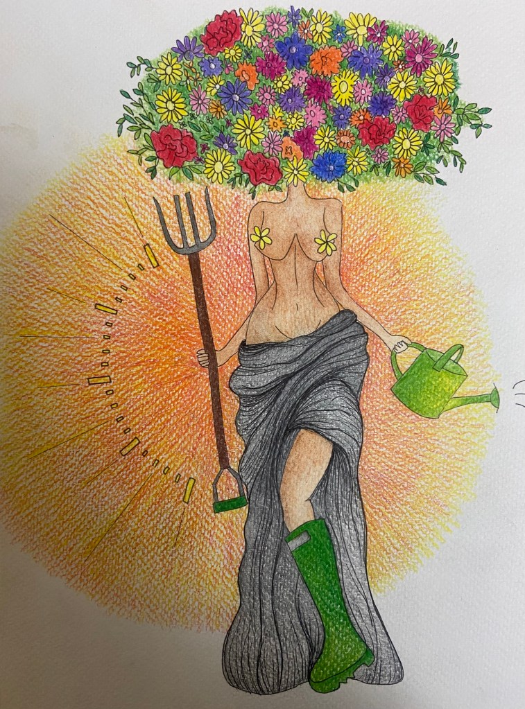
I then drew my final illustration out onto mixed media paper and decided to use ink, Pencil and colouring pencils to create the final piece.
This is the final piece. I am pleased with the tonal value and shading on the piece to give it some depth. The flowers are very simplistic and I feel with more time and practise I could have made them more realistic.
I then digitally manipulated it to put on my social media and changed the colours to brighten them up slightly for screen.
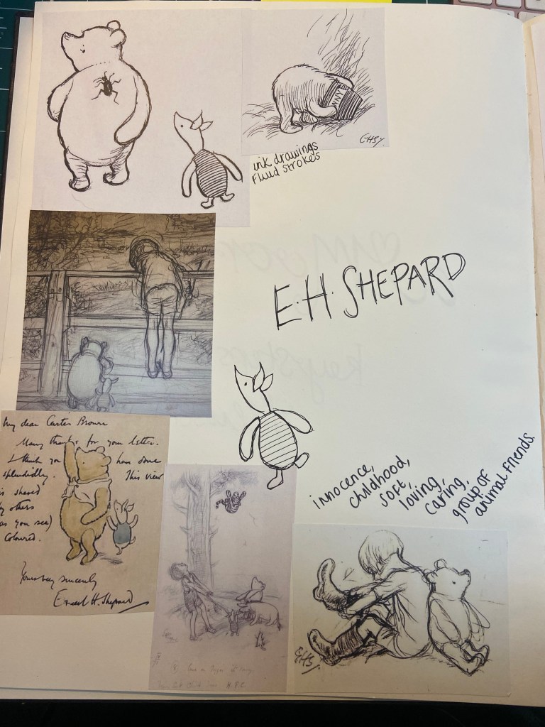
For this exercise I decided to look at the work of E.H Shepard; although he seems a popular obvious choice to pick from the rest of the artists’ I hadn’t particularly heard of. E.H Shepard is famous for his illustrations of Winnie the Pooh; I have tried in the past to search for the first drawing of Winnie the Pooh which is held in the Wren library in Cambridge but it was during the Covid days and sadly I wasn’t able to see it.
I like the sentiment behind Winnie the Pooh and this makes the drawings and the stories more personal and more “real”. Although, I never realised until I researched E.H.Shepard that Winnie was drawn from a Bear called “Growler” belonging to E.H.Shepards granddaughter, not in fact from A.A. Miles son’s Bear, (Christopher Robin). It also reminded me of a collection of “odd” stuffed toys I have in my house from when I worked in my previous job in Textiles In a school. A group of students passed down their work to me (the collection of “odd” bears!) which I kept in my classroom until I left. They now sit in my home on top of a vintage typewriter and I have always joked that if I was to ever go on maternity leave or have a long break from work (very unlikely!), I would create a children’s’ book and illustrate it just like E.H Shepard did with Winnie the Pooh. The Tales of Old Bear also comes to mind, a blast from the past in the 90s when I was growing up! Researching E.H Shepard and my stuffed toys gave me the idea for this first brief before I had even started.
Although Shepard is a Painter, the works I mostly looked at for inspiration for this first exercise were his works in pencil. His initial first sketches for Winnie the Pooh were drawn in pencil. Shepards work has a lot of energy, movement and playfulness which I like – His drawings brought inanimate objects to life. His work was very “sketchy” and his pen work was “scribbly”- combining pencil and ink and this is particularly what draws me to the work of the illustrator as I like to draw in pencil and ink. Shepard drew a lot of rural scenes and when he used colour in his work he was very expressive; later illustrations of his that were remade for newer books using washes of colour over the top of his existing ink did not work as well as the original watercolour that he painted with his ink.
So… Who was E.H.Shepard?
Ernest Howard Shepard was born on 10th December 1879 and died on the 24th March 1976. He had two children; a son and a daughter. His son died during the World War and his daughter went on to become an illustrator too. Shepards first wife died early on in his life and therefore he remarried for the remainder of his life. Growler the Bear in question belonged to his granddaughter Minnie but was destroyed by their Dog. It seemed that Ernest resented his work that he did for Winnie the Pooh, or that “silly old Bear”, as he said it “overshadowed” his other work. As well as illustrating Winnie the Pooh, he also illustrated another famous book known for it’s soft, cuddly characters – The Wind In The Willows.
Shepard’s original 1926 illustrated map of the Hundred Acres Wood from Winnie the Pooh, (which features in the opening pages of the book and also appears in the opening animation of the first Disney adaptation of Winnie the Pooh), sold for £430,000 in London which set a world record for book illustrations.
Shepard was a painter; his Mum was the daughter of a watercolour painter and his Dad was an architect. He was very much born into creative genes! Shepard attended some Fine Art schools and by 1906 he had become a successful illustrator having worked on and illustrated editions of Aesops Fables, David Copperfield and Tom Browns’ Schooldays. He also worked as an illustrator at Punch – a magazine that would later be edited by the husband of his Daughter. He exhibited at many exhibitions -both traditional and radical but his favourite was always The Royal Academy on Piccadilly in London where he showcased 16 times. His first wife Florence was also a painter and as Ernest was a Londoner, they found home in London’s West End for her 25 year career.
In his mid-thirties he was assigned to World War 1 and was assigned to sketch the combat area within the view of his battery position. He served briefly as an acting Major and was awarded the Military Cross. He continued to observe and send back information in spite of heavy shell and machine gun fire.
Throughout the War Shepard had been contributing to Punch where he was a regular cartoonist. In 1945 he was promoted to main cartoonist. It was here that Shepard was recommended to A.A.Milne, Milne thought that Shepards style was not what he wanted to pursue but he used him to illustrate one of his books of poems and then once he was happy with the work Shepard had produced he commissioned him for Winnie the Pooh. Milne also shared royalties from the book with Shepard.
Milne inscribed a copy of Winnie the Pooh with a personal message to Shepard which read:
When I am gone, Let Shepard decorate my tomb, And put (if there is room) Two pictures on the stone: Piglet from page a hundred and eleven, And Pooh and Piglet walking (157) … And Peter, thinking that they are my own, Will welcome me to Heaven.
A. A. Milne
Shepards work is so famous that 300 sketches were exhibited at the V&A Museum in London in 1969, Shepard was 90 years old.
Megan Hess
The second part of the research in this exercise was to find a modern, contemporary illustrator and explore the differences in style and imagery.
I chose to use Megan Hess as my second illustrator. I have always been interested in fashion and fashion illustration from a young age – my primary school teachers used to say that I would grow up to become a Childrens’ book illustrator as I loved drawing illustration of fashionable older girls wearing cool clothes that I would have never been allowed to wear!- influenced massively by The Spice Girls and the fashion of the 90s! Later on when I studied my BTEC in Graphic Design I had to complete a project on 1960s fashion and once again I was asked if fashion was more of what I was suited to rather than Graphic Design! I do believe though that all areas of Design are under the same creative umbrella and they all overlap and intertwine some how. This exercise seemed like the perfect opportunity to put that to play!
Megan Hess has a lot of similarities to Shepard, it’s just that her work is from modern day and her chosen subject is Fashion illustration for books. Megan writes her own books focussing mainly on fashion icons of times gone by which she illustrates although she has written and drawn her own range of Childrens’ books which focus more with young people in mind and cuddly characters (similar to Shepard) but still making them fashionable and modern.
I own a couple of Hess’s books – one about Coco Chanel and one all about the most iconic dresses and figures from the last 100 years.
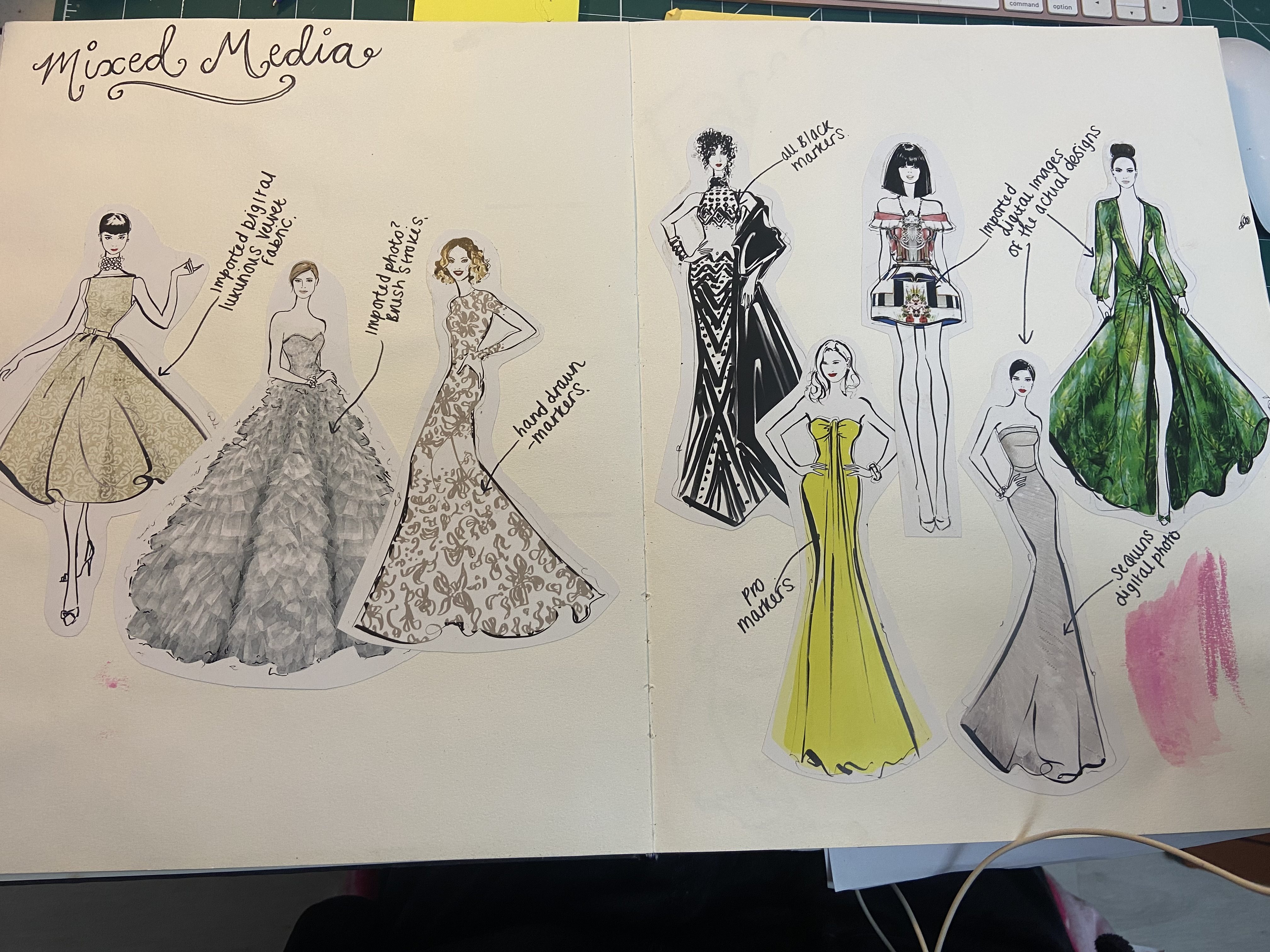
Megan Hess famously illustrates using her Monte Blanc ink fountain pen that she fondly names Monty! Hess has a very fluid, freehand, free-flowing effortless style which I love. The majority of Megans work is Black and White ink but when there is colour present on her drawings it is mostly in the form of mixed media digitally manipulated onto the illustrations.
I had a copy of her book which used to rip out pages for a display board at work so I used this to glue some examples into my sketchbook to show how she manipulates mixed media digitally onto her work. Designing digitally is definitely something that would not have been possible in the early years of E.H.Shepard.
First Ideas..
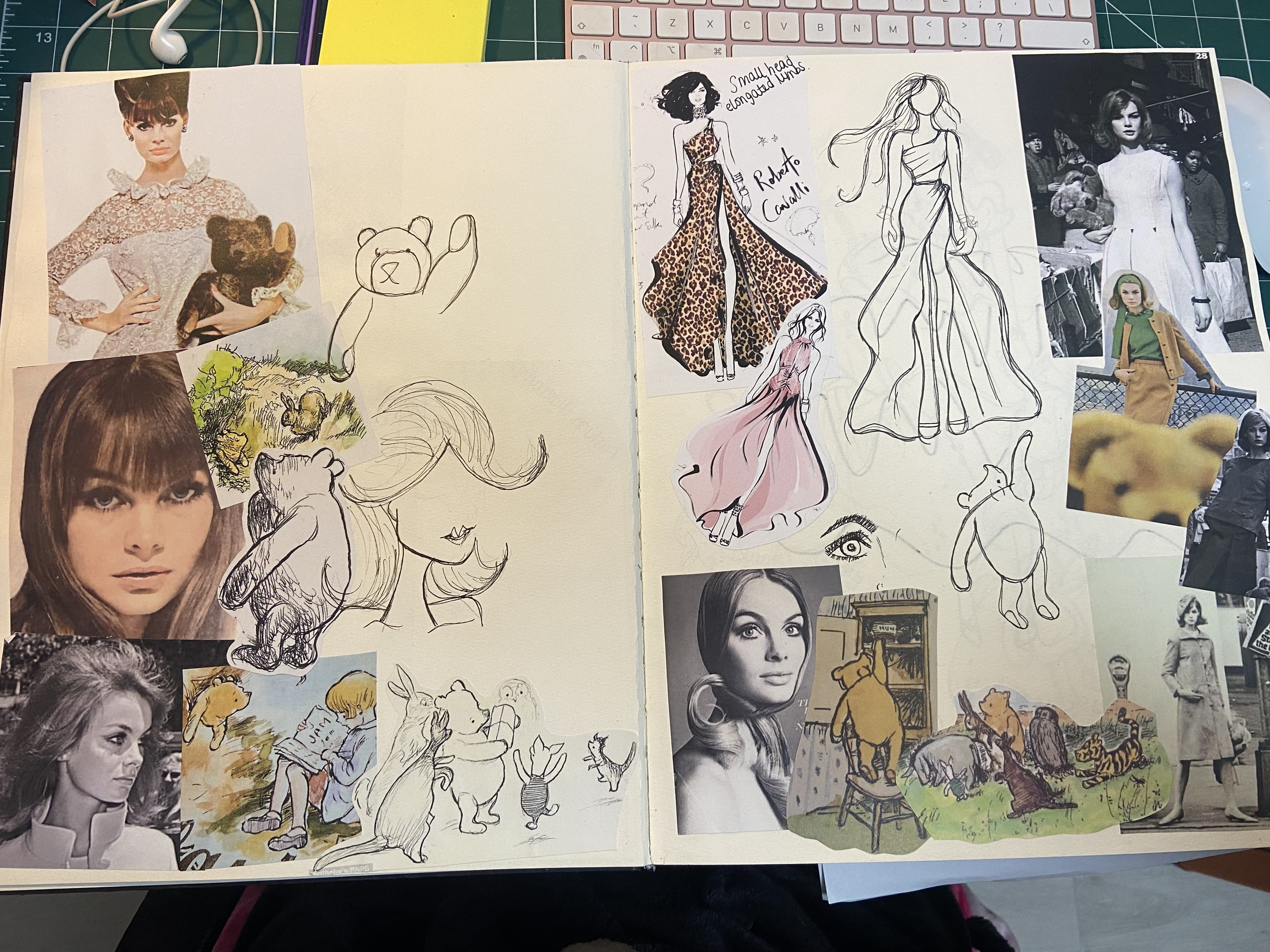
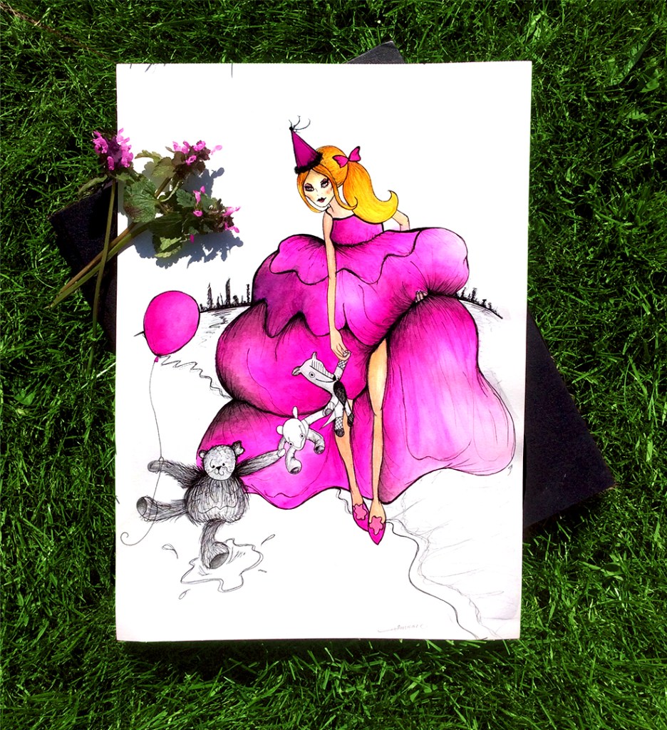
For my illustration I was about to do for this exercise using inspiration from both illustrators – I knew I was going to be making a modern piece for the fact that I was using such a modern day illustrator as part of the process. My piece would need to have a nod to Fashion but still maintain a childlike, imaginative story. There is such an air of innocence with Winnie the Pooh – it is very soft, gentle, innocent, warm and happy. I needed something modern and grown up to clash with a subject very childlike. The instant thing that came to mind was a Teddy Bears Party – not a tea party and a picnic in the park though! I was imagining an elite Cocktail party at a posh Cosmopolitan Hotel in London or New York, two very unlikely pairings! The image of a glamorous, Designer clad, waif woman being walked home late one night after a party after a few too many cocktails guided back to rural home by the streetlights from the city with Teddy Bears to hold her hand… or in this occasion my “odd” Bears! I would draw my “odd” Bears in a similar style to E.H.Shepard; give them personalities, bring them to life and then pair them with a contrasting chic drawing of a fashionable, 9-5 woman who works in a fast paced Fashion industry in the city. Bringing childhood and imagination back to the grown up.
This idea also made me think of Jean Shrimpton and her time in New York with David Bailey where they were photographed for the first time for Vogue in a very controversial manner – Bailey insist that she have her photograph taken with a Teddy bear that she was carrying around the city much to the Editors dislike at the time. I also thought that maybe my illustration could have some 1960s influence – a babydoll nightie which were very popular in the 1960s but create a modern-day, going-out version of the dress for my character to be wearing to the tea party.
I needed to try and sketch some drawings in the style of the illustrators and research into my ideas first though:
I really liked this illustration; it is very free-flowing, loose, fluid and sketchy and I really liked the 1960s style of dress. The hair reminded me of an advertising poster I found in some of my Mums old stuff about 15 years ago that I loved and I now keep as inspiration for any of my future work:
I wasn’t sure though if it resembled too much the work of Megan Hess; The dresses she normally illustrates are very voluminous, dressy, big and Princess-y.
I found a YouTube video by Megan Hess where she gives a tutorial on hoe to draw in a similar style to her, I gave it a watch and redraw again but this time with a bigger dress.
I then needed to start drawing up some of my characters for my piece – My “odd” Bears! Well, I only have 2 “odd” Bears and then I made the third Bear up in a similar style to Winnie The Pooh.
I felt that I wanted my fashionable woman character to be holding the hands of the Bears but she would be too tall for this – I envisioned her to be holding the biggest Bears hand and then for the others to be holding on like a chain link. I photographed my Bears in this way so I could draw them more accurately.
Below is a rough sketch of the idea I had in my head of her holding the Bears hand and a few illustrations I sketched out in a rough, free-flowing, care-free style of E.H.Shepard.
The illustration below is a more detailed yet still a rough sketch of how I wanted my final drawing to look. I added a party hat onto her head to bring the childish element into my drawing. This illustration represents grown up Fashion but it also shows the softness, kindness and child-like play.
Usually I never like drawing faces! I used to when I was little – but I would always draw my characters with massive heart-shaped cupids bow lips, big eyelashes, perfectly arched eyebrows, little cute commas for a nose and some freckles or a beauty spot!
I knew that my character would need a face; I needed to be brave and try to draw some facial features and expressions. Below are my test pieces in the style of Megan Hess!
(I think a few of them resemble Megan Fox with the high cheekbones!!)
I decided that my character would have a ponytail in her hair with a big Bow – it is modern, chic but timeless and also a lot of Megan Hess’s illustrations have similar hairstyles.
I then had to think about trying to draw an accurate representation of a Woman leaning over holding Teddy bears hands whilst holding her long dress from trailing on the floor in the other arm. To do this I knew that I needed to draw from person and enlisted my husband to help me pose for some photos and take some of me in various poses that I could draw from them to get a close representation for my drawing. I also needed the Bears to be holding hands and needed to hold them in a similar position to draw from. I also massively struggle drawing hands and needed a visual representation to draw from.
I was trying to use the quilt cover on the bed as a a representation of a puffy dress but it just didn’t work! I also tried with my Wedding dress but it was too fitted to my body!
I also needed the correct representation of how her hands would look on the drawing, so I used myself holding a stapler to represent how she would hold her dress in my drawing!
I wanted to use Ink and Pencil to draw the main illustration but I also knew I wanted to use another media that both the illustrators use – this was Watercolour. Shepard and Hess both use a wash of Watercolour over there sketchy ink drawings.
I am not very good using Watercolour so I knew that I firstly I would need a practise piece:
In my final piece you can see that the city landscape is in the background and that they are walking back home along the shore line. The bigger Bear of the 3 is having fun stepping in and out of the sea as it washes in and out carrying a balloon from the party they have just been to.
I liked the washy Watercolour over the ink but it just looked a bit flat; for my final piece I would need to add more depth and tone.
The Final Illustration
Looking back on my finished illustration I think the idea for the narrative of the illustration was good, (I would have liked to have created a series of prints storytelling the whole party!) but the illustration still needs some work. I am not pleased with her face, it looks very alien! Her hair is also not very lifelike. I like how I added tone and depth to the illustration though. The colour of the dress is very rich and bold and I tried to emphasise the size and shape of it with tonal value.
Overall I think I captured the style of both illustrators in my illustration through the techniques they used with their chosen media but also through the narrative and story of the illustration.
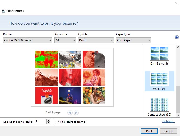
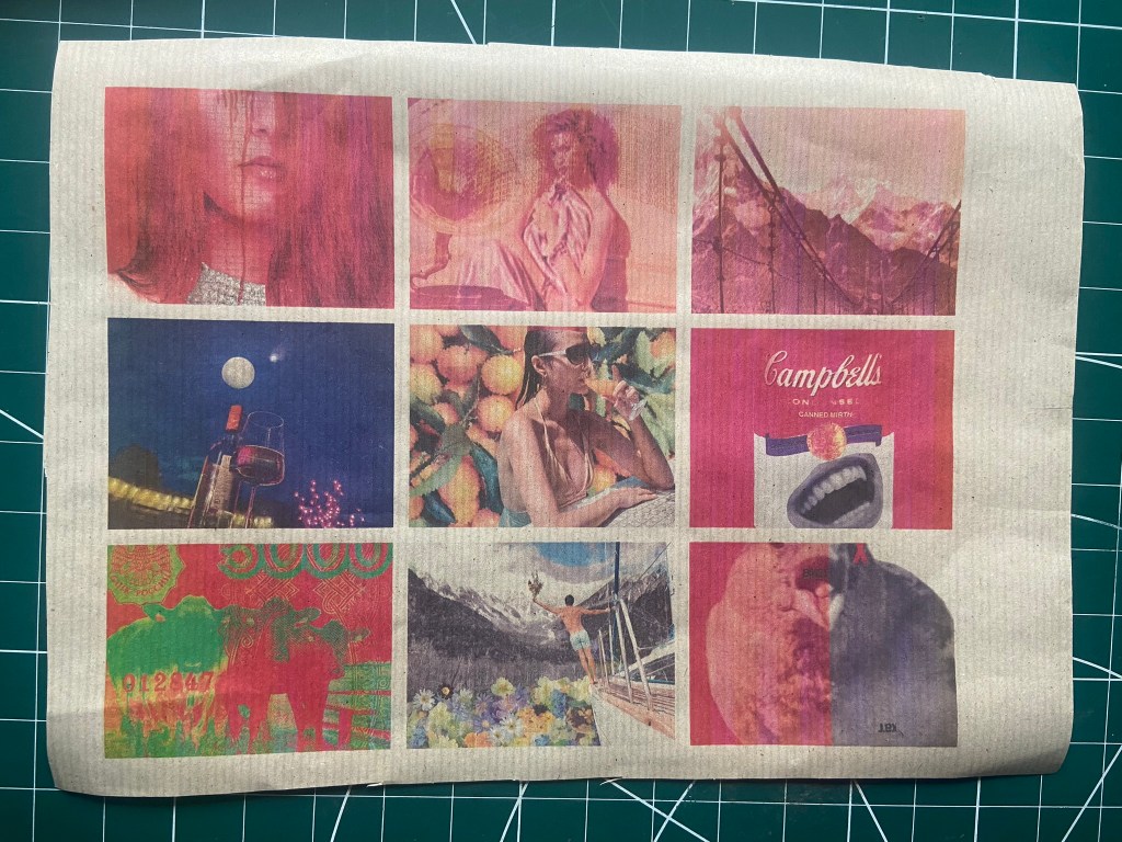
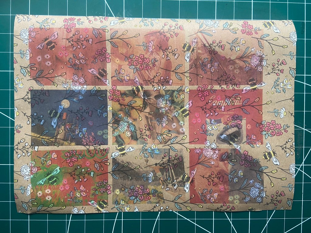
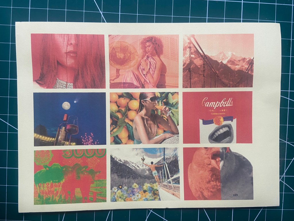
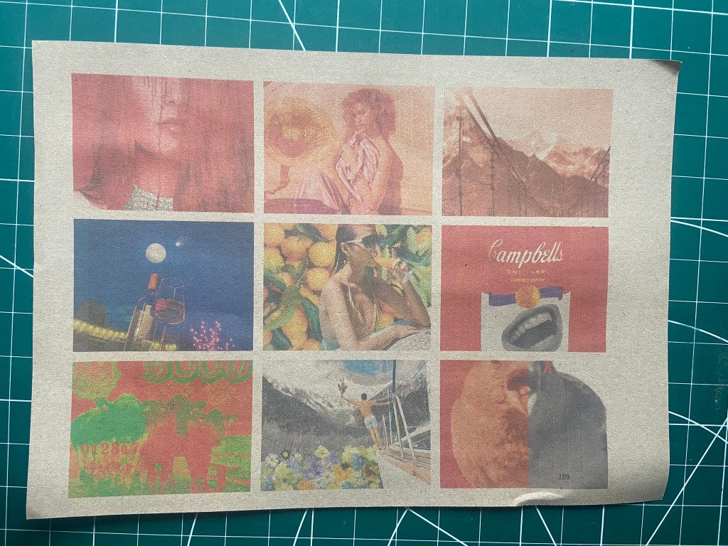
For this exercise I thought that it would just be easier to use the images I used for Tango with Cows, they are all the same size as well which made it easier. I wasn’t worried about the order of them now though. The home inkjet printer I have lets you print so many images to a page and because I am stuck at home poorly at the moment with no access to any other printer and my inks are low, I decided to be resourceful and print 9 to a page.
I can then print all the images onto one page and print them all onto different paper sources to see what each image looks like as supposed to picking certain images for certain media.
I raided my big bag for life once again to see what materials were in there:
I cut some papers to the size of A4, I used:
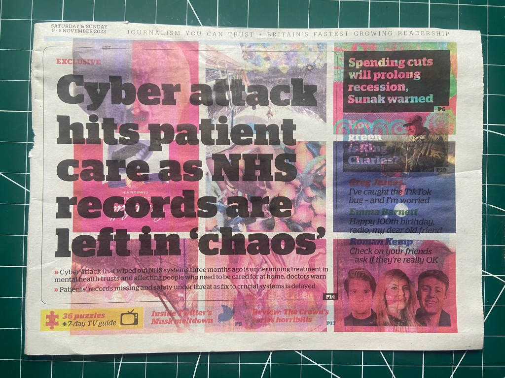
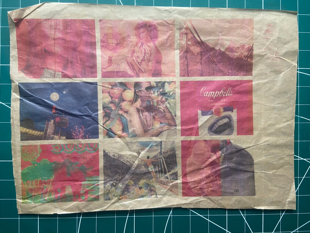
Newspaper
the back of an Amazon cardboard envelope
wrapping paper with a beautiful bee design
greaseproof paper
tracing paper
brown paper
orange coloured card
yellow paper
the back of a banana bag from the supermarket
a firm ish grey board packaging paper
The winner for me was Tracing paper! Not only does it have that really nice crinkly sound when you move it about! It also printed out the most vibrantly! Baring in mind that I am using an inkjet printer and the results I got using a colour Laser printer would have been completely different again, but the colours are really bold and striking on tracing paper. The inks took a little while to soak into the paper and dry but once they did the colours popped! I have to revisit Tango with Cows in my feedback so I think once I do I shall rethink about how I make the book for them and consider trying out tracing paper for it. There is not only a visual aspect to this paper source but a sensory one too!
The Amazon parcel backing was difficult to feed through the printer which is why it has clipped part of the images off! It also printed out really faded which is great if you wanted a muted design to print text over the top with but for striking images it is not the right choice. It does give a nice textured effect though for if it were to be scanned in and used in a design.
The newspaper was just too overpowering for the images, Possibly because I used a main headline to feature on this one.. maybe if I just had a page of full print it might look better (I’ll try that one out again in a bit..) The images all bleed into one and you cannot make any of them out.
Although it is difficult to show on camera, the shiny, banana paper bag that you put your bananas in to weight them at the supermarket printed out quite nice and glossy! This is very similar to the tracing paper in that you are getting a very sensory experience as well as a visual one. I imagine it is also sustainable for the environment! The images are not as glossy as they appear on the tracing paper though.
The brown kraft paper was very similar to the greaseproof paper which is below it. The brown paper is matte though and the greaseproof obviously has some sheen and gloss. The colours popped out ever so slightly a little bit more on the greaseproof paper. Neither wowed me though.
The wrapping paper, although it is very beautiful with its lovely Bee print, it didn’t go very well in the printing stakes.. it suffocates and smothers my images. I think it would be ok to layer over the top of solid colours and black and white images possibly but definitely not for these!
The orange card definitely is a non Photoshop version of giving my images a filter! Ideal for the Orange groves image! A lot of my images already have a red tint so the orange just deepens this. The image that stands out most is the comet one which has the deep blue colour, I think because this is a contrasting colour it works against the orange to pop out more.
The yellow paper is a very muted yellow and is almost the same effect as white paper.
This was a heavier weight version of brown paper, it is somewhere between brown paper and the Amazon packaging.. Either way, it doesn’t work. The images are really faded and muted.
It was interesting to see how tracing paper was the best paper as I thought that the ink would not absorb into it and the images wouldn’t print at all! To see that this came out the best and the colours were really vibrant even with using an inkjet printer was surprising! I shall keep this in minf for the next time I am producing a hand printed and handmade book!
For assignment 5 I won’t be using any of these papers though because I plan on having photographs in my book and I want them to be printed to a high quality glossy finish professionally. If I were to print them out myself I would be using the laser colour printer at work and some 160gsm glossy photo printer paper which prints them out to a glossy high standard.
When I look back over the last year (and a little bit!) of this Creative Book Course the one thing that I wish I could have managed better is time!! This year has been crazy busy in my personal life and I have really struggled to juggle it all! I have been renovating our house, planning our wedding which is in 3 months time, I have been designing and creating everything for the wedding, trying to stay fit and lose some lbs for my wedding dress! Working my full time job and then maintaining a social life throughout..I haven’t had the healthiest year, again, I put this down to my body running on stress and lack of sleep! I know a lot of my friends have children and are always joking that I don’t know how it feels to be busy but this course is full on when you have so much else to concentrate on also! I felt like I struggled more for time this time around more than Core Concepts but that was possibly because I lived alone then and I didn’t have the commitments and social life that I do now! My only regret with this is that this tail end of the course has been rushed slightly more than I would have liked it to have been but nonetheless I still try and put 90% of my effort in… I’d like to think even more.
Despite the time constraints and having to have an extension and then barely reaching the end, I have thoroughly enjoyed this course and I feel I have grown and developed from Core Concepts. I feel really apprehensive about putting my work forward for formal assessment as I don’t feel I have done as well as what I did for Core Concepts and I know I shall be very frustrated and disappointed with myself. Core Concepts I knocked out of the park despite everything I had against me at the time. I am always proud of the steps I have taken and for how far I have come since starting with the OCA. I even started applying for design jobs recently which is something I never had the courage to do before, I never felt I was good enough or up to scratch digitally. Everything considered though, I have reached the end and the work that I have achieved in this unit I am pleased with and I am proud of.
I have improved my skills using design software, my typography has improved and I have more knowledge in the subject, I had no idea really of the print process or creative process that happens in book publishing and I have learned much more about this. I have become more comfortable with using grid systems and creating layouts.
Part 1 – When I saw the assignment to create a zine I had no idea what a zine was and the idea of producing a WHOLE book scared the sh*t out of me! I was not confident in using the software efficiently yet, I had no idea what kind of content I needed to create, I was so far out of my depths. By the end of this assignment though I absolutely LOVED what I had produced and created! I did drag this assignment on though for much longer than I should have done – partly because I was frozen scared for a big part of it and secondly because everything I was creating I wanted to be perfect. Paginating the pages to print myself was a nightmare for this assignment and this followed me all the way throughout the course. Designing and making zines definitely interests me though! If I have any spare time at any point in the future I would love to make some zines for fun and try and take them to fairs and try my luck to see how well they do! I love that now looking back I have a stack in my living room of my printed zines that are so personal to me and my childhood and the books I read. I love how I now have this to look back on forever, it is like I have recorded history forever.. I even buried a copy in the new walls of our house before we plastered the stud walls! There was so much creative freedom with this assignment, although the brief was to create a zine based around influential books there were no constraints on the media we used, what content we included etc.. my creativity and imagination went wild with this assignment and I loved it!
Part 2 – Robinson Crusoe was my least favourite assignment in this course. I just felt that I couldn’t get it right! I jumped straight in designing for it without really sketching many initial ideas and it showed later on down the road where I ended up going back and completely reworking all three designs because I just was not happy with them. Even now I can’t sit back and feel like that was my best work. It didn’t help that I was far out of my depths with the story, I had no idea what the story of Robinson Crusoe was and had to do a lot of research before I could really sink my teeth into designing for it.
My tutors feedback has always been helpful and helps guide me to the right outcome and suggestions, there have been many times where she has suggested things I could have done differently and I have sat there and thought “…oh yeah!… why… didn’t… I… think… of that?” This was one of the reasons why I went back and realtered Robinson Crusoe completely! I have a lot of feedback to work on for all the units before my formal assessment of this course! There are a lot of suggestions that have given me a fresh new mind on an exercise or assignment and that I want to improve on.
Part 3 This was typography and grid based and even though I had experience of this topic in Core Concepts, this was on a higher level than I had gone into depth with before! I was a little bit scared to complete assignment 3 which was designing the books for the good and bad typography. I really enjoyed designing these, I have pinned these at the top of my Instagram because I am so pleased with how they turned out. This was a moment for me to reflect on because when I first started Core Concepts I would look at work like that and wonder how the hell I could ever create anything like it, I imagined my old self looking at them books and probably passing out at the fear of not being able to do it! This is growth! My only regret with that assignment is that stupidly I created the whole book in Photoshop and imported it over to InDesign which meant that the grids were not as accurate.
Part 4 was the altered book assignment and it was one of my least favourites.. not quite as much as Robinson Crusoe but it did throw me once again out of my comfort zone, I can’t say I didn’t still enjoy it in a weird way though. I have been so used to designing digitally that it threw me off having to get practical and sit surrounded by all messy materials! Again, I would have liked to have had more time to spend experimenting with even more mixed media and altering more pages than I did. I do like experimenting with different mixed media though, I would have perhaps preferred to create a digital book on mixed media; I could have done more with it – importing and scanning medias in and manipulating them digitally etc…
Part 5 was the book on typography, I really enjoyed this assignment even though I only had a 48 hour window to complete it! I cringe when I write that… time hasn’t been on my side. I do feel though for the limited timescale I had that I have managed to create something good. I am anxious of the outcome of it with my grading though, I am worried that I might have gone too far out of the box and am scared that OCA will see what I have done as not meeting the criteria. This is a risk I was willing to take though because I really believed in what I was creating and I feel that what I have come out with is a piece of history, culture and recordings of typography and art in an ever disappearing urban environment. I feel that the book will make people look for typography when they go out on the streets and make them more aware of their surroundings and taking in what they see. I reflect back on what I was like in assignment 1, scared to move and scared to make mistakes and spending ages constantly redoing over my work and this last assignment was the complete opposite, partly because it was taken out of my hands with the deadline looming but also because I feel I have grown and am learning that things do not have to be perfect, perfection does not exist.
As I mentioned in my previous posts I am really short on time in this assignment and the turn around between completion of my book and it being professionally printed won’t be enough time before my final course submission. I will though have my book professionally printed with a printing company in time for formal assessment where I can showcase my printed work and show how I have gone through the printing process in industry.
The company that I have looked at for professional printing is Solopress;
I have one of their paper sample books that they sent me in the post for one of my previous exercises which I refer back to for paper samples and I really like the size and the style of the book. I think that for my book for assignment 5 I would like to do something similar to this.
I would need to take into account the size of my book, the paper that I want to include on the insides.. would they be silk, glossy.. would they be a lightweight paper or would they be heavier.. lightweight would be 160gsm but a heavier option would be a 200gsm. Would I want the front covers to be matte, glossy, silk? It would also depend on how many pages my finished book is- if there are under 50 pages the printing costs would significantly less than if I were to have a 100 page book. It could all depend on how many colours are being used in the printed document too, usually it is cheaper to use minimum colours.
What is my role in the printing process and what might feed into my creative decisions for designing and creating my book for assignment 5?
The size and format of my book, I anticipate that my book shall be A5 size and landscape, similar to that of their own paper sample book.
Will I choose colour or Black and White? I shall have my book printed in colour, I know what I want to do for my book and it will mostly be an informative photo book so the images need to be bright, colourful and glossy.
How will the professional book be bound? I have researched Solopress and they do perfect bound brochures which are ideal for books with a lot of pages! It ensures that the pages are glued into a spine like a proper book rather than just a pamphlet style.
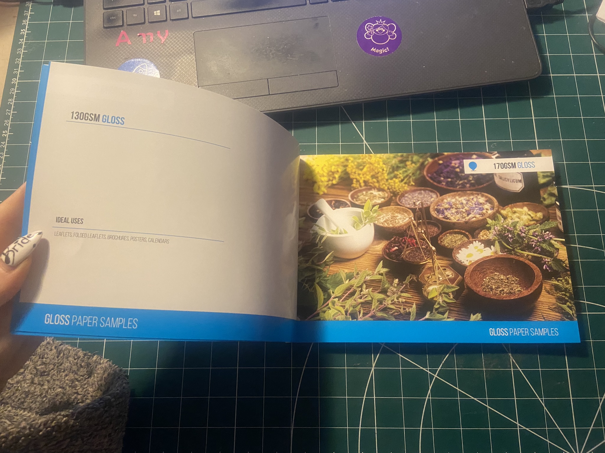
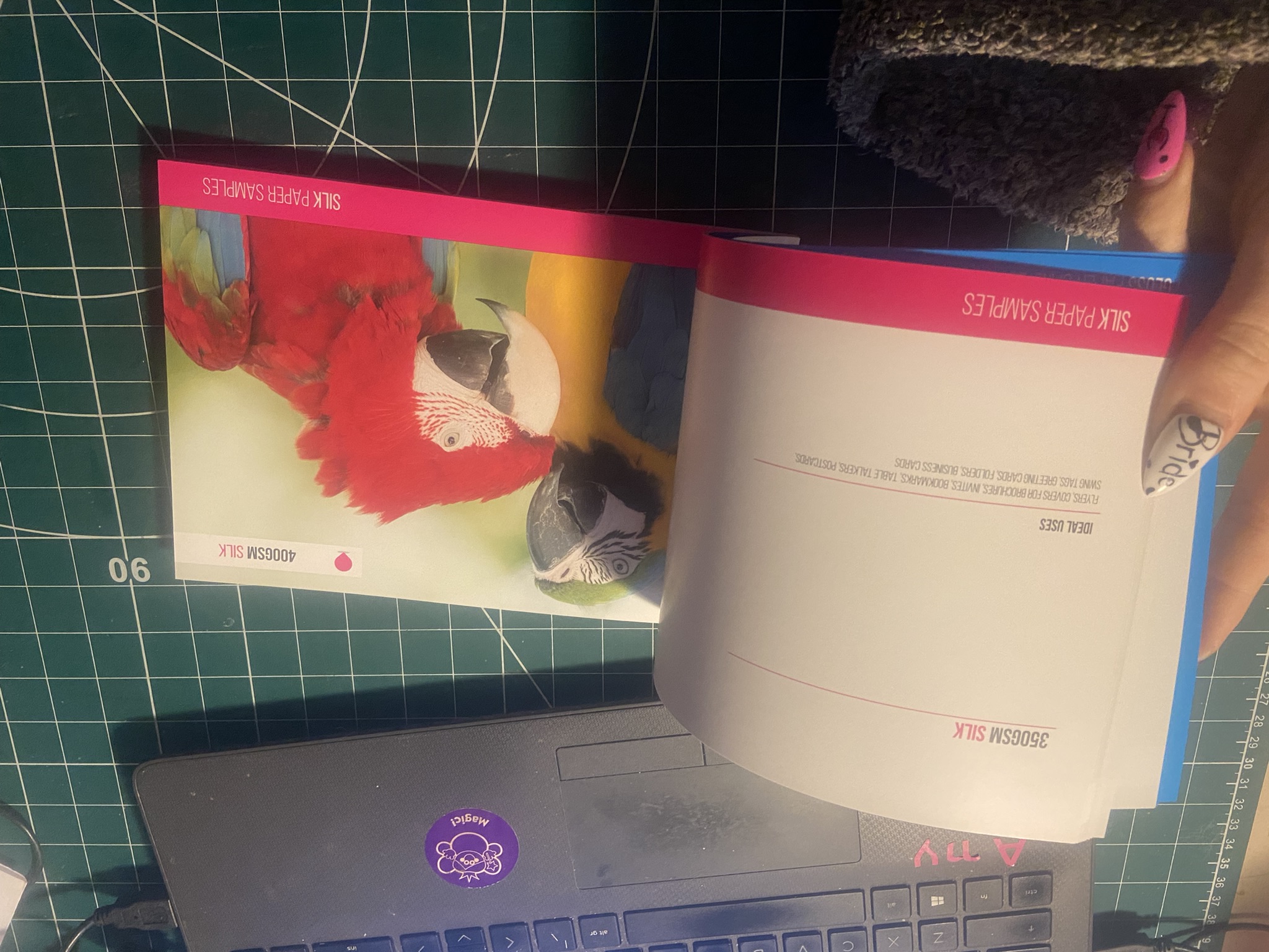
What papers do they have for me to choose from? There are lots of options on the website for this. There are so many options to choose from for the inside papers and covers. Silk, Glossy, pulp, bond.
Do they have any other specialist paper? They do some gorgeous specialist papers such as Gold dust iridescent and Gold haze iridescent
How will the book be finished? How will it look when it is printed and almost ready to be sent back to me?- There are a lot of finishes that you can choose from for your books too including creasing, matt lamination, spot UV, gloss lamination,
What is primarily my job and nothing really to do with the printers? Making sure that I correctly upload any files; PDF is the best option to choose when sending to the printers