The Brief

This is an area I thought I would struggle on! – I love magazines but have absolutely no idea when it comes to anything technical or computer software etc! I borrowed a lot of techy magazines from the library in the school I work in but to be honest none of them inspired me!
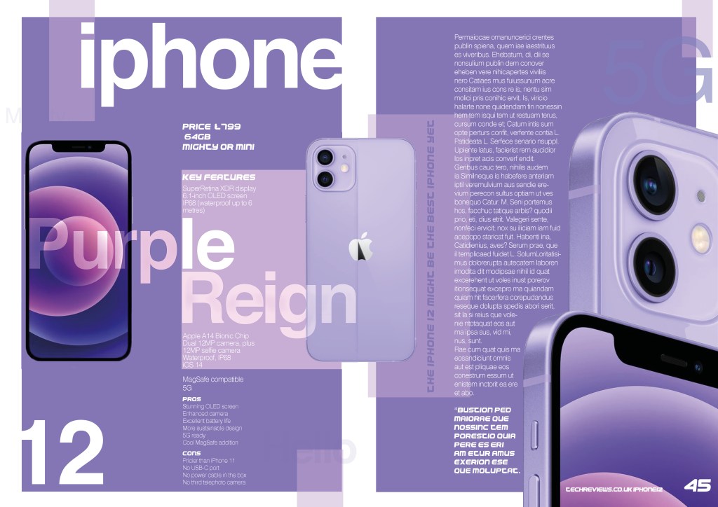
However! My boyfriend shouted out to me one night from in the living room that the new Iphone 12 was on a TV advert and it was in purple, TADA! This is what I would do for my article!
The images that I got for the article I found on Google images and just saved as JPEGS and then cut around them and tweaked them up in Photoshop.


I wanted the article to best reflect Apple as much as I could. They have a very distinct, simplistic, minimalistic “clean” style of branding. Obviously, Apple use Helvetica for their typeface in their branding and I looked very closely to see what the tracking was between the letters in their words (I worked it out at -50) to best match how they write “iphone” in their advertisements.
I knew this article needed to look modern, clean, legible, eye catching and bold. The idea I had in my head was a play on words with the use of the colour Purple and the Purple Rain song by Prince. I combined the two of them to form “Purple Reign” (implying that the iPhone rules). I knew that to use one solid block of Purple in the background for my article would be too harsh and that I needed to break up the design a bit. I had the idea of using purple blocks to a) break the colour up on the layout and b) to navigate the eye across the piece. I think it really worked! I am pleased with how this turned out!
I knew that I could not just use Helvetica in this piece; Helvetica is Apple’s brand and this is a completely separate magazine I am supposed to be designing for so I knew I needed to find some more appropriate typefaces that would work with Helvetica but also bring in that element of contrast. I did use Helvetica light for the body text though because it gives the layout a soft, clean, legible feel and it is still contrasting against Helvetica.
When I was designing my “If the type fits” specimen book I found a gimmicky typeface that was used for Pepsi (called Pepsi) I used this for the Key features piece on this article. Although it was designed for Pepsi, it looks very modern and futuristic which matches this article ideally! It also brings in contrast against the soft type that already features in the design.
I used Lorum Ipsum dummy text for the whole right hand side but added text of my own on the left hand page just so the reader knows what the article is about. I found the key features of the iPhone 12 online and then wrote them on this page.