
The Brief

Visualising, editing and critiquing:
I might have jumped the gun and covered most of this exercise in my previous post!
*”Visually explore how your artwork sits within the format of your A5 pamphlet – how it frames the artwork, how different pages sit together or how you might begin a narrative”
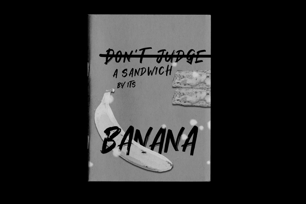
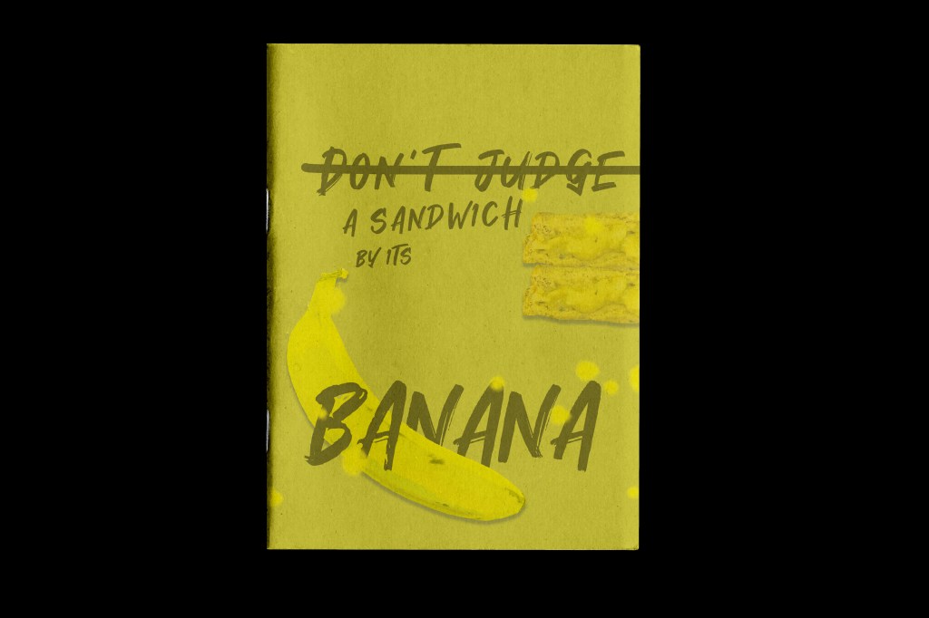
I created 2 front covers to choose from (as I pre-read the course material and knew that I would need to relate it all back to Assignment 1 and making my zine!) and then I mocked them up onto a zine mockup that I purchased from a designer on Behance:
https://www.behance.net/gallery/113005839/Zine-Mockup

I then mocked the covers I designed onto the zine front cover:

As it turns out my mock up zine was well received on Instagram when I posted it to my design page:


An Instagram page called “DeZiners” messaged me to ask if they could feature my work on their page! They also asked me if I had anymore content for them to show but I told them that great things are in progress!… *cue Assignment 1! They told me to be in touch when I have more content for them to publish to their gram.


I could expand on this though!… I could show what this could potentially look like as a double page spread in a zine!…
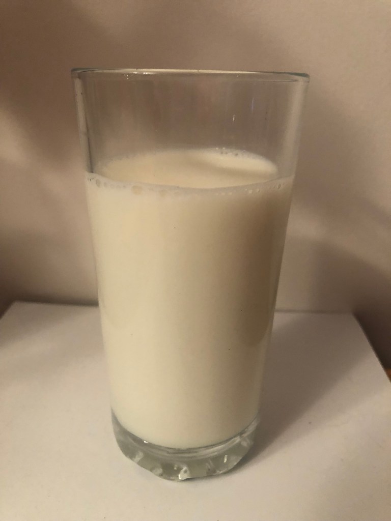
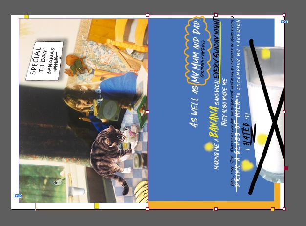
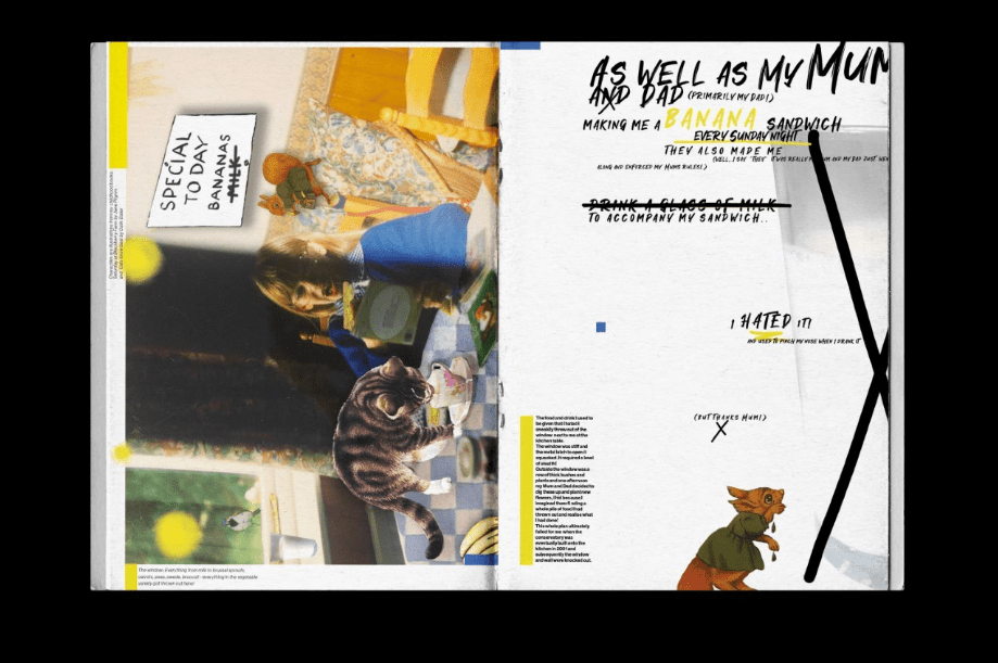
As well as My Mum and Dad, (primarily my Dad!) making me a banana sandwich every Sunday night (as I explained in my previous post!) they also made me (well, I say “they” it was really my Mum and my Dad just went along and enforced my Mums rules!..) drink a glass of milk to accompany my sandwich.. I HATED it! – I still hate pure milk – my fiancé drinks a glass of milk and I honestly think he is a weirdo! ;p anyway, I was a skinny, anaemic child and this was my Mums way of getting calcium and “goodness” into me! Thanks Mum! ;p BUT I could collaborate this as an extra page next to the design I have just designed to make it a double page spread!
For this I need to find a stock photograph of a glass of milk.. or better yet ask my weird fiancé if he fancies a glass of milk at 21:09 hours!… to which he said yes! ;D………..


… and I mentioned the weird light that my fiance uses to access our loft in my previous post that I use to take all my “professional” blog photos…. see below! ;D

I also remembered and found a hugely embarrassing photo of myself at the kitchen table having my lunch or supper or something… I had new glasses and I remember I was reading to try them out! – funny because I’ve never needed or worn glasses since!? Anyway, the photo was from the same time era as the banana sandwiches and I thought I could try and include that somehow in the designs! – I am also reading “Saturday on Blackberry Farm” in the photo which I wrote about in exercise 1!

I took the photo and collaged into it a collection of images taken from some of my childhood books which reference bananas and milk; “Saturday on Blackberry Farm” (which references Milk and Bananas) and “Cats know best” which relates to milk.
I then exported it as a JPEG to import into my InDesign layout:
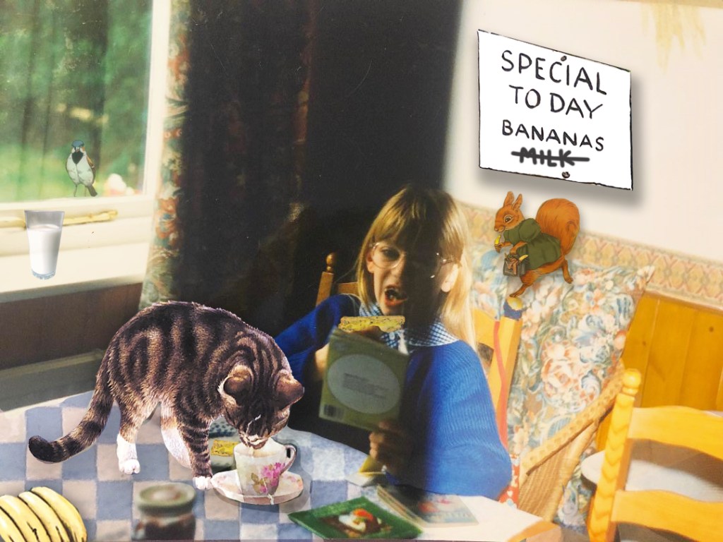
In this piece I have tried to make it look like a digital “cut and paste”. It is like I am reading at the table and being totally consumed by the book and letting my imagination go wild, It is like I am imagining that these animals are real. The animals that appear at the table are all from books I read as a child and reviewed in my first exercise.
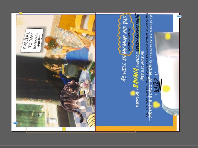
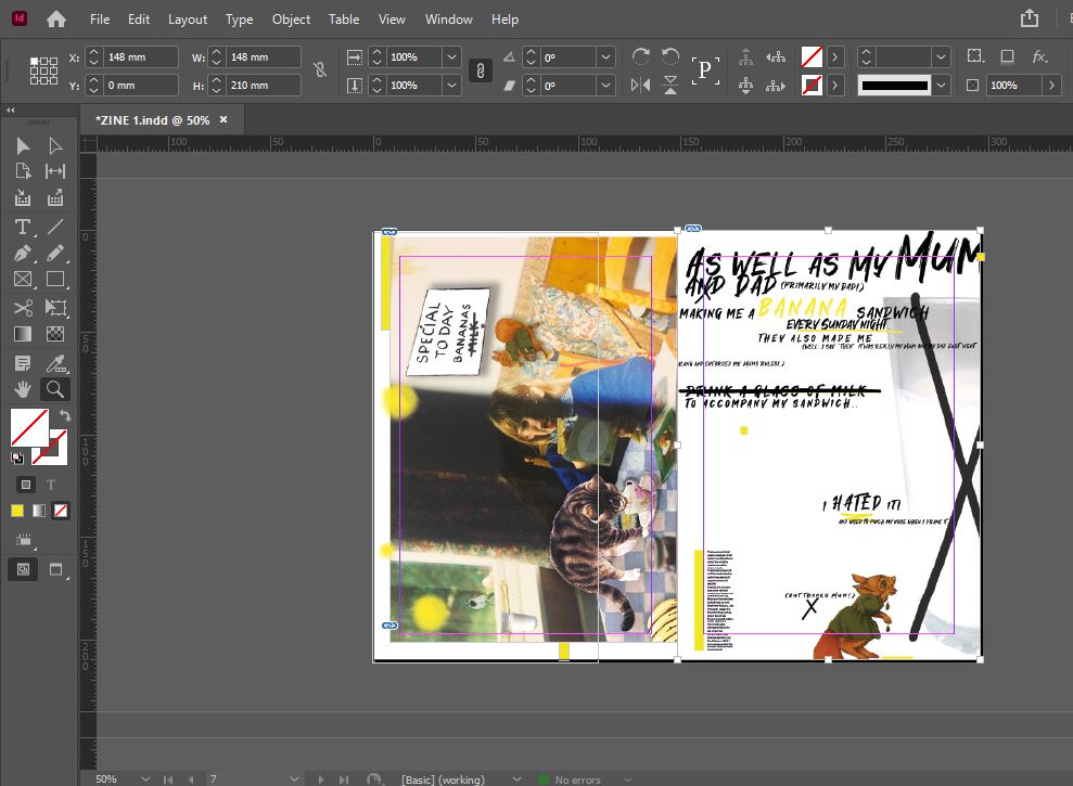
I then decided to do some practice layouts (below); I have included the glass of milk to create a new narrative but these layouts at the moment make no sense really, they are purely just to mess around with different layouts and placement of objects and text within the layout.

I like layout 1 and 3 best. It has been at least half a year since I last did some layout design and it took me a while to get back into it. I created the bottom 3 first of all and by the time it came to designing the top 3 I had relaxed, I wasn’t overthinking it too much and I loosened up my creative process.
I then chose the layouts from above that I liked the best and expanded on my double page spreads to try and create more of a narrative and so that they made sense to actually read and look at.
I wanted to do this; 1) To show how my design fits to a layout, how I will present my work and to create a narrative 2) to use in my zine and 3) to send to the DeZiners to post on their Instagram page and to get recognition for my designs!
(** DeZiners did not contact me back or use my spread for their Instagram… *eyeroll!**)
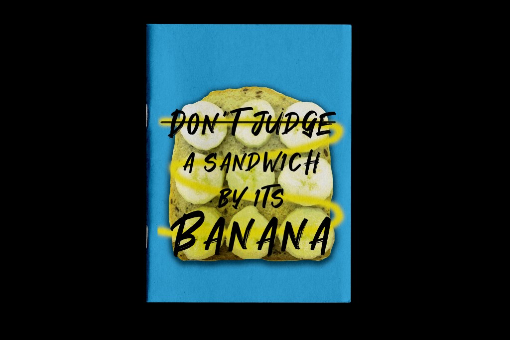
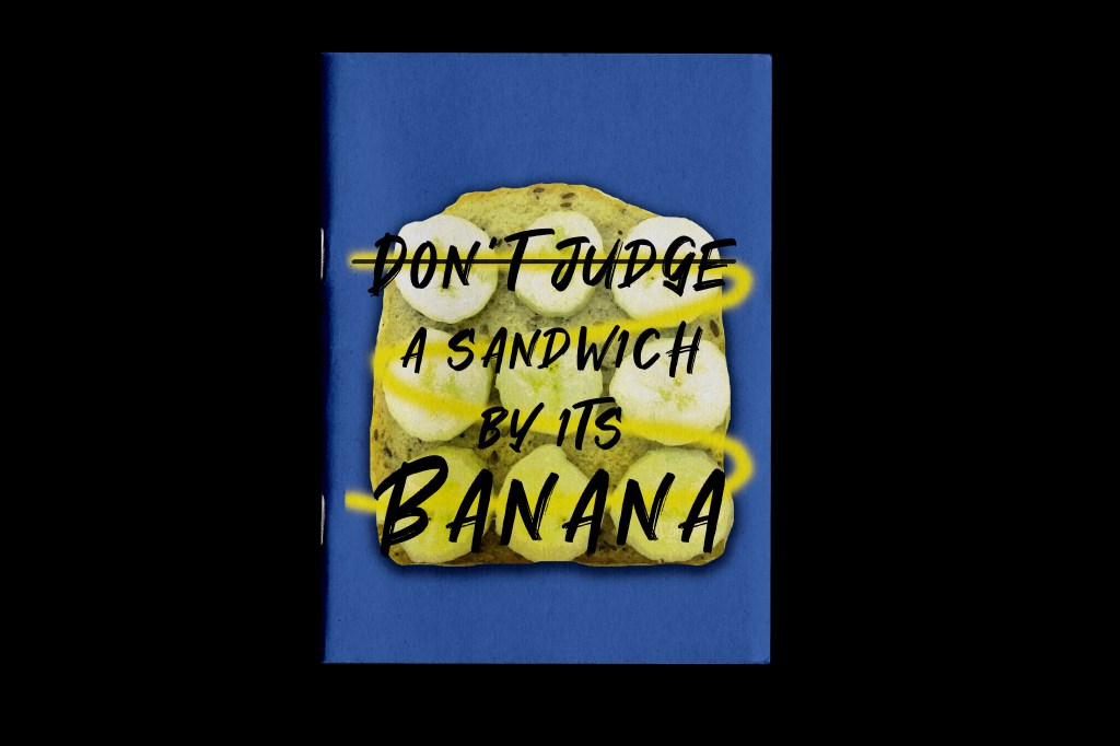
The narrative for the cover of the zine is “Don’t judge a book by its cover” and I have explored that through the use of my food combination- Banana sandwich; In a few pages I went into more depth with this subject explaining what significance it has to me personally and to link it to the subject of books and in particular my childhood books.
I am massively influenced by the work of David Carson and Chris Ashworth particularly the “grunge style” typographic work that they produced for Ray Gun magazine in the 90s, I decided to try and use some of that influence in my layout.
The screenshots below are what I started with. These developed significantly later on, but my initial ideas for these to start with were to use colours that link to the title cover page but be playful in the placement, style and size of the typography. The end screenshot showed that I loosened up my approach after a few layouts but also made me feel that I wasn’t “grungy” enough in my approach. I didn’t feel that there was enough contrast either in the colours used and the weights and size of my typography. The bright colours all clashed together and made it hard to distinguish between the 2 pages; they both blend together.

What I ended creating next is what I went with in my final layout;


- The colours are toned down but they still marry up with the colours used on the title page
- There is much more negative space, the layout has room to breathe around the outside
- The “rule of 3” is present in my design (There are 3 crosses on the right hand page which have relevance to the design but also lead the eye down the design. There are also coloured blocks; 3 on each side to lead the eye down and across the design but also to bring an element of colour from the title page)
- It has a Carson/Ashworth/Ray Gun influence to it
- There are influences from my childhood books in there which also relate to the theme of “milk”
- It is personal to me; Zines are personal, artistic pieces of expression
- It uses a mixture of my own photography and digital collages from other sources
- It has a narrative; it tells the story of the saying “Don’t judge a book by its cover” which ties in with my own personal story behind the Banana sandwich and my childhood.

Production
For Assignment 1 I will be creating my very own zine with the brief strictly specifying that it should be A5, 16 pages, simple folded and stapled.
For the production I need to consider:
1. How to print or reproduce my content
2. what sort of paper to use
3. How to bind it (although the brief does specify staples)
4. How many copies I will create.
Below I shall carry out some research into the best methods to achieve the above points.
Printing and reproducing:
There are 4 possible ways to print my zine:
- Home inkjet printing
- Photocopying (from a black and white photocopier)
- Laser printing (from a bigger industrial office printer)
- Commercial printing (sending designs to a professional printers)
How my zine is printed depends on whether it is a “short run” or not (small amount of copies produced). My zine will be a short run because really I only need to create one zine for the purpose of my course and to be marked and to photograph for my blog (unless I create an absolute masterpiece and attempt an experiment to see how well it would do if I tried to sell it on Etsy!). This gives me options; all of the above except for commercial printing; this would only be a good option if I was printing vast copies of the zine.
The other thing to take into account when printing is how many colours I will be using in my zine. If I were to use commercial printing, the more colours that you use in your designs the more it would cost. To try and keep printing costs down to a minimum I would need to be using a maximum of 4 colours to keep costs low. With commercial printing the more copies you print the cheaper it would be.
My options for my DIY zine are home inkjet printing, photocopying or printing from a laser printer (sneakily at work!) The cheapest of them options being to photocopy but then that stops the use of colour in my zine. Home inkjet printing can be pricey; my Canon printer costs £45 for both B&W and colour inks and it really does not go very far!- it is also a slow method of printing. Inkjet printers are a better option for less frequent printing or for only a few pages at a time. Inkjet printers have more tonal value and are better at blending colours but I much prefer using the laser printer when I can even though inkjet printers are the better choice for artists and designers for this reason! The laser printer prints out really high quality and glossy pages whereas I mostly get a dull, “liney” look from my inkjet. Laser printers also hold much more paper in their trays which allows the job to be quicker not having to keep refilling up. They have a high printing capacity.
If I were to make a handmade zine completely from pen or pencil or some other mixed media medium I could scan the pages in or take photographs and then make them into a PDF to print in the same way as I would if I were to design it all in digital and then print accordingly. This would be an option if we are moving with the future and creating digital zines!
It all depends on the images I am to use in my zine too. If I was photocopying the pages, the use of photographs in my zine would be poor quality. If I was producing a Punk inspired, newspaper style zine, photocopying would be exactly what I would need. There is always the option to photocopy onto coloured paper or use different papers for the inside of the zine to add colour in that way. The photocopier would be great for the first test piece prototype; just to print out and make sure that the pages match and the layout, borders and bleed are all as they are intended to be.
There is also the option to just make a complete handmade zine!- The thing is with choosing this option is that it would not be easy to reproduce. There would never be one the same.
I also explored in my previous post about printing my zine in b&w… this is how it can be done:

Paper:
The paper that is used in a zine would make a difference to me as to whether I wanted to pick a copy up and read it or not! From my research the best zines I have looked at have different papers for the “guts” (the inside pages). I own magazines that use different textured weighted paper and it always adds interest to the publication. The pages could use different coloured paper, textured paper or materials. The choice might be to have regular paper on the inside and then a heavier weight of paper for the front and back covers. For a photographic zine glossy, thick paper would want to be used for the guts and for the covers. There are different weights of paper too; again, photographic zines might require a more thicker, heavier, glossier option whereas for mostly text zines the use of a thinner, lighter paper might work well.
Zines are DIY and the cheaper option would be to just use white, copier paper throughout to keep costs low and also so that it can be printed by any means. The thickness of the paper that I decide to use will also depend on what printer I use to print my zine out. Some printers work better with different textured/weighted paper than others.
I also explored in my previous post about printing my zine in b&w but using coloured paper… this is how it can be done:

Binding:
I could look into all kinds of fancy binding for my zine but the brief specifies that it will be based on a simple fanzine publication with simple binding. My choices are what I explored and wrote about in my previous exercise:
- Staples
- machine stitching
- hand stitching (saddle stitch)


I would choose staples as an option or the straight machine stitch just because they are quick and easy to do and easily accessible. However, to people who don’t have access to a sewing machine this option might be the last option to choose! The hand “saddle” stitch is easy to do although it would take longer to complete this method on a lot of copies! If a decorative look is what is being desired though, this would be a good option to choose as you can change the colour of thread, add beading and sequins and make it a piece of art!
Copies –
I shall only need to create 1 perfect zine for the means of my study and to be assessed! – of course I shall be printing some test copies out to make sure that everything prints correctly- but as I wrote previously, I might decide to reproduce a few more copies and try my luck to see if I could sell any online!
https://www.hp.com/us-en/shop/tech-takes/laser-printer-vs-inkjet
https://www.vice.com/en/article/d3jxyj/how-to-make-a-zine-vgtl
