
Over the weekend I completed the design for book design number 3 which is Tono Bungay. Again, it did not take as long as the first design because it is basically repeating the same style and appearance. All 3 are pretty much exactly the same apart from the original drawings.
I started researching into Tono Bungay the book as I knew what the plot was about but again wanted to pick up on the more detailed facts and details from the story which might help me in the design process. I found a free PDF version online and began reading for key facts and details. The novel is written in a autobiography style; the key character is telling the story as if it was true. It is the most creative of all HG Wells book; it focuses mainly on advertising and selling this “miracle cure all” to the people.
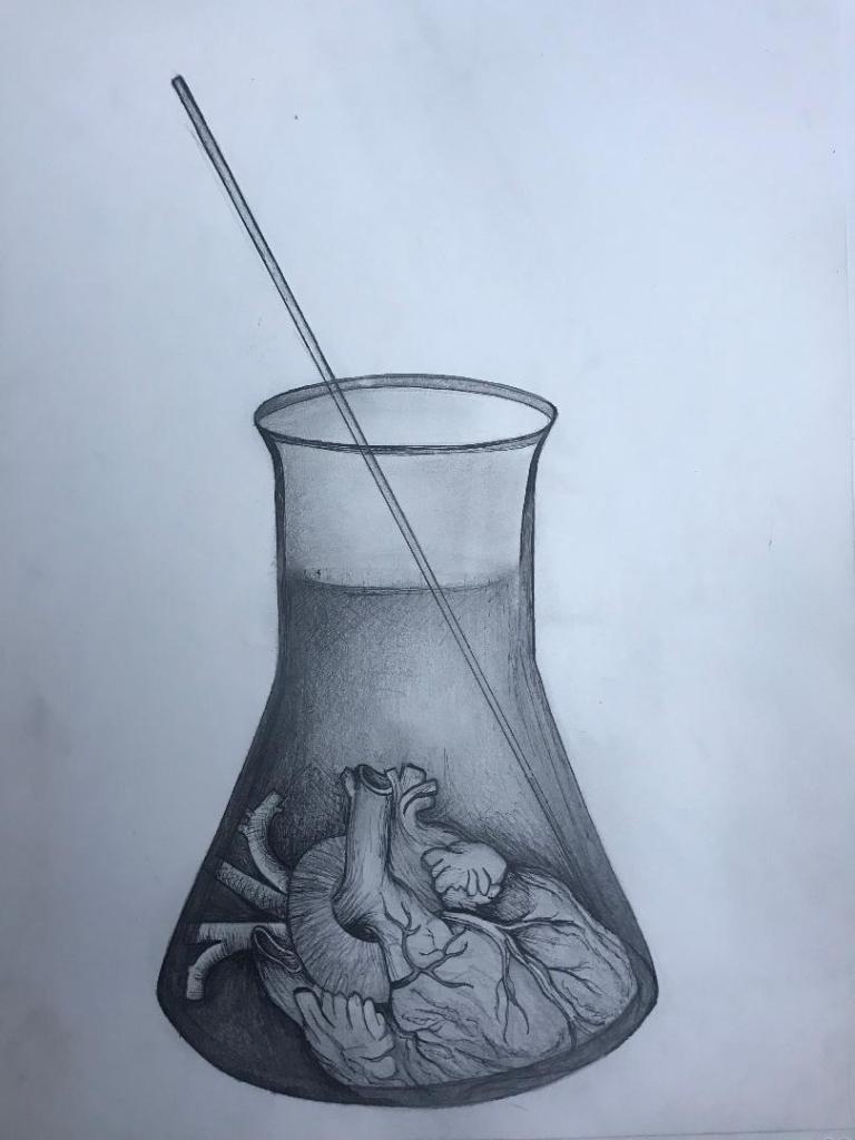
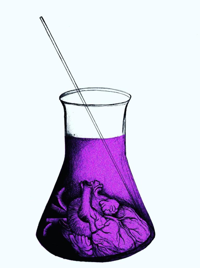
It is a socialist novel, HG Wells was trying to convey how easily it was to dupe people into a naive way of thinking. It is all about money and greed and selling a cheap product for ridiculous amounts. In the book the character referred to Tono Bungay as “The sickness at the heart of society” This is what I have played on within the design. I have used a human heart in a potion beaker to convey the heart in Tono Bungay.
- The heart represents “the sickness at the heart of society”
- The heart represents the scientific element
- The beaker glass represents what Tono Bungay was made in within the book
- The purple I have eventually used in the colour of my design reflects wealth and richness (even though the medicine was phoney)
I started off with an original sketch and then continued from there;
I then took the image into Photoshop and adjusted the brightness/contrast/levels etc and changed the colour of the liquid.
I think the colours work well. I then did a mock up of all 3 covers together to see what they would look like. I think they all work very well together. It is obvious that they are a series of books that link together, the simplistic colours work well and help you see which ones link to which book. The covers relate to the Science Fiction genre of HG Wells but also reflect elements from the stories which might have been overlooked by other designers who have designed previous books and also by people reading the books who possibly wouldn’t necessarily see these as important factirs within the story. Chip Kidd always said “See what other designers are doing and then do the opposite.” This is what I have tried to do in these designs.
I now need to work on making them “timeless classics” by mocking them up into actual book covers with spine, author, title and publishing house.
My next step is to sketch some layouts to see how I can effectively do this.
