This post is dedicated to my initial ideas and thought process through to the final art development of the text that appears on the front and inside my greetings cards.
This post consists of:
- Ideas
- Research
- Text artwork development
Ideas
The hardest part of this assignment was knowing how to display the messages of the cards and getting the typography right.
I did not want to use simplistic text – I did not want to choose a font and type the message out onto the card and that be that! To choose a typeface or a font and use it effectively would require me to choose an appropriate font to match the feel of my cards which I knew would have to be fun, vibrant and humorous. I knew this would possibly turn out to be a disaster because I definitely did not want “fun” “gimmicky” fonts on my cards! – (think Comic Sans!) The only way forward was to create my own vector lettering using Illustrator – although this could also be a challenge!
Research
I started to look around to find inspiration. I found it in several places.. random Instagram posts, quotes I had seen online, products I found in shops.. These are some of the images which helped to inspire the text on my cards;
This was a post on Instagram that I stumbled upon. The style of illustration is very similar to my own. I like the appearance of the text in the background. This is the sort of thing I had in mind for my own design. It looks like a brush effect has even created this style of text.
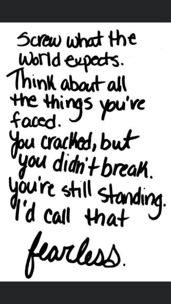
This is a quote that again I stumbled across, I was not even interested by the quote but the style of lettering on it. It looks like someone handwriting, which gave me the idea that I could too hand write the message and then import it into Illustrator and trace around it to create some vector type.

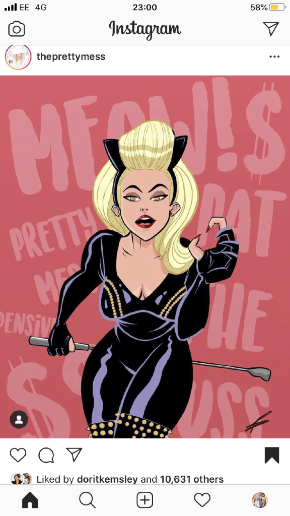
This image above again I found on Instagram; what is relevant about this post is that they have used Dolly Parton as the main focus on some postcards who is one of the blonde icons I had in mind for using on my own designs.
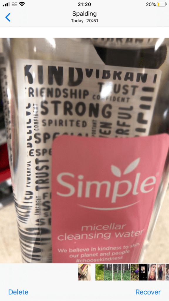
The above image I took a photo of whilst I was at work. My “double life” or my second job is within the retail sector (I work toiletries!) I saw this Simple bottle and the black background text on it gave me an idea as to what sort of style I could do in my own designs. The text is very much like bubble writing – at a guess it is vector lettering.

This image above is the image that inspired me the most for my card designs. It is the cover of Debut magazine that I own and I liked the style of writing and how it looks. Out of all the images I have found I shall try and replicate this image within my own designs more.
Development of vector lettering
As I stated at the beginning of this post, I did not want to use an existing font because I thought I would struggle with finding a suitable one to match the feel of my cards and to also give a professional appearance. I decided to create my own vector lettering from my own style of hand lettering…
I created 2 pieces of text for each card:
- The main card title
- The background text of the card
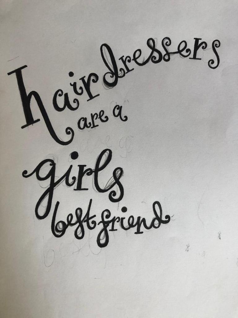
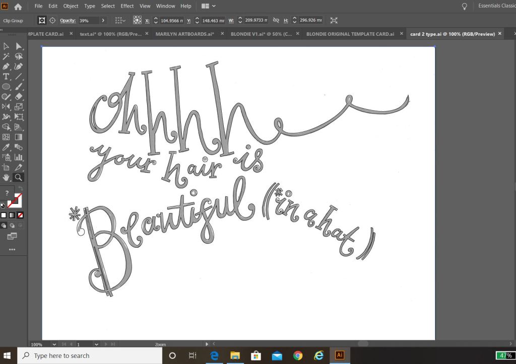
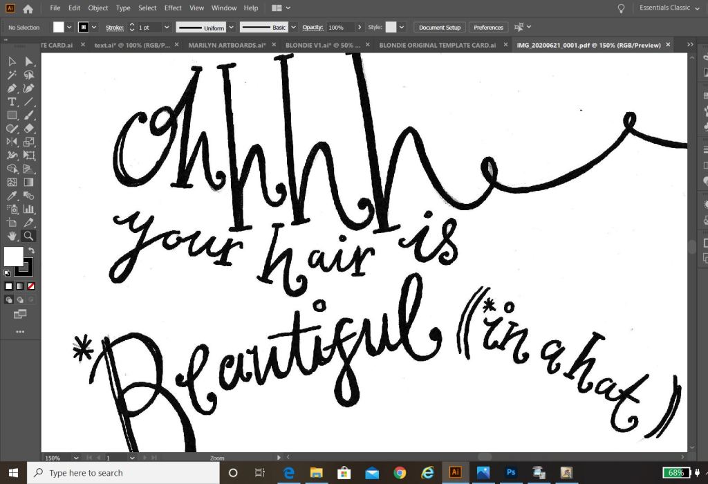
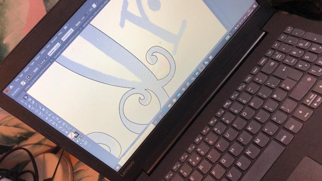
I started off by drawing out on paper the original text I planned to use for my main card title. I drew out my text using my papermate flair pen (these are ideal for ink drawings and lettering!) and then imported them into Illustrator via my scanner to trace around using the pen tool to make into vector lettering.
These are my hand drawn original lettering drawings that I then imported into illustrator to trace around:

These are the beginning stages of the main titles of each card:
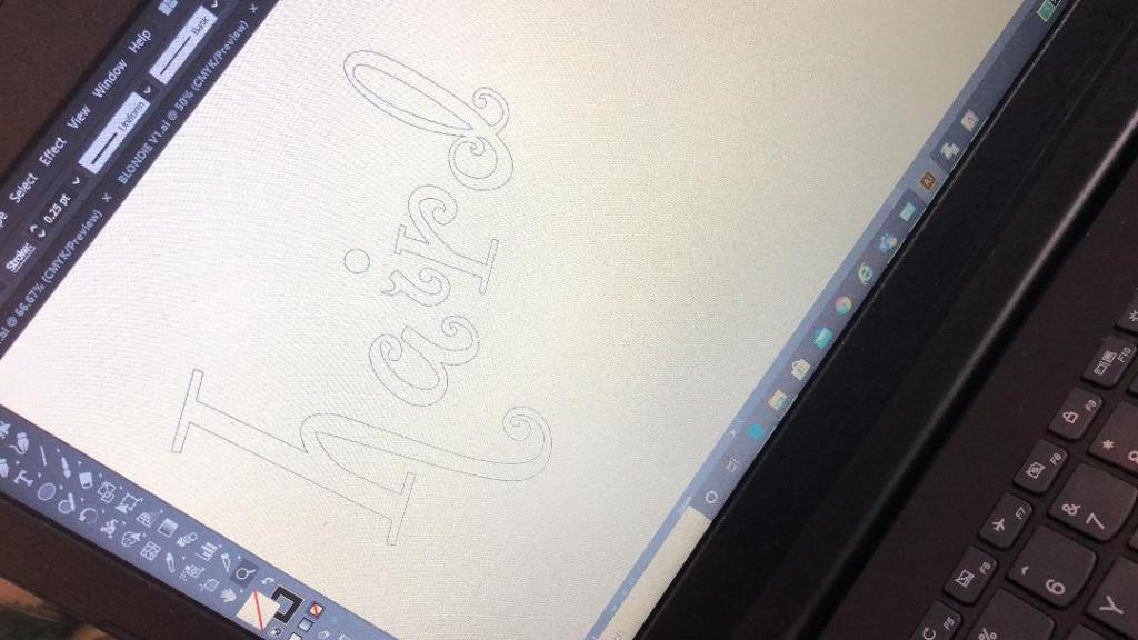

The last thing to do was to create the background text for the cards.
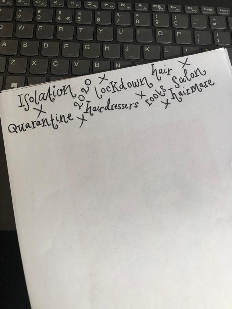
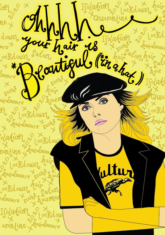
Most of the inspiration for the background lettering that I used on my designs came from the Debut magazine cover; the cover is full of words that relate to that particular magazine which I decided I could bring forward into my own design (apart from I have used words that relate to hair, roots and lockdown)
Again, just like I did for the main text of the cards I drew out by hand the lettering for the background text and then imported it into illustrator to trace around. I chose to use the words: lockdown, Quarantine, roots, salon, hairdresser, 2020, hairmare, isolation and hair. I felt that these words best summed up the lockdown hair nightmare best!
I then imported it into Illustrator.

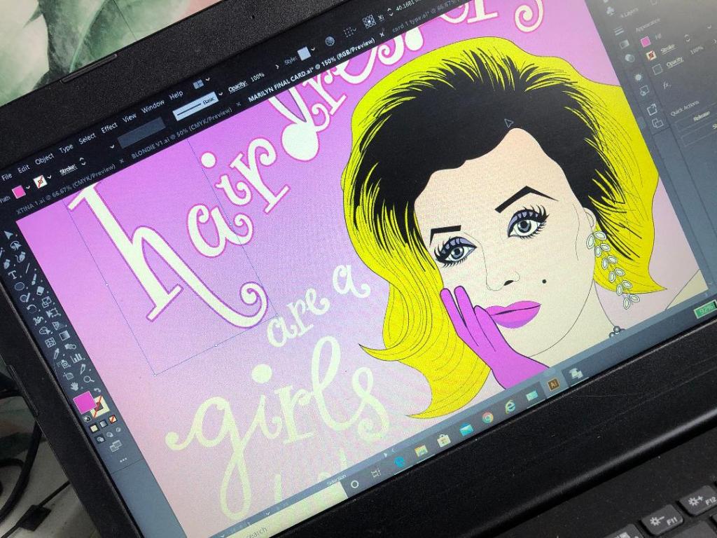
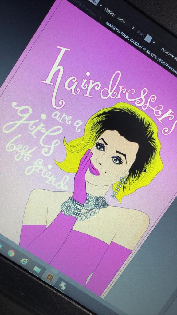
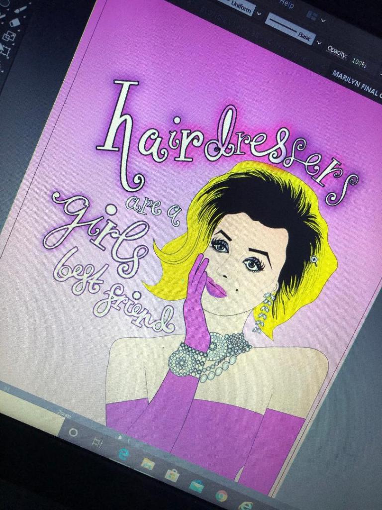
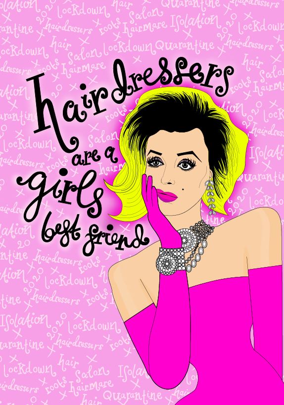
I then changed the colours of the text to match the cards and changed the stroke of the lettering and copied it over to the card documents to place behind the “blonde icons” (Marilyn, Debbie Harry and Christina Aguilera). I then cropped out any words that I did not need or that were out of the print border.
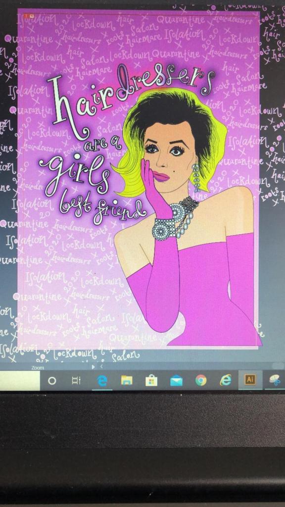

I then saw an inconsistency within my series of cards with the colours that I used for the text. On the Marilyn card I used white as the main text colour whereas on the rest I used black, black works a lot better. The black stands out much more and it also shows a pattern within my designs; they all follow the same colour scheme. The following images will show my development in this stage:

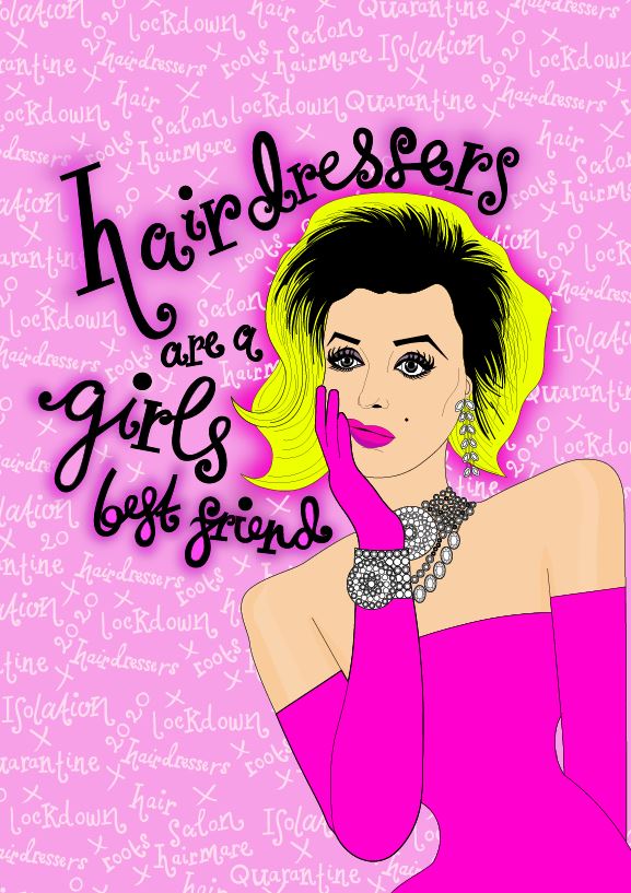

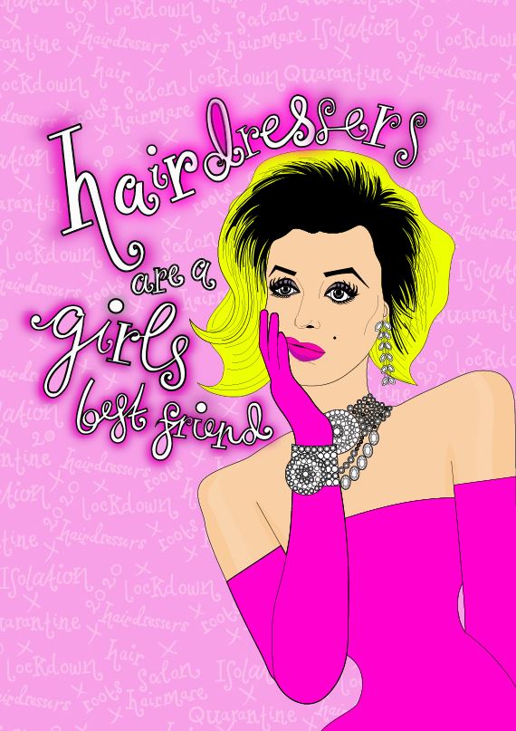


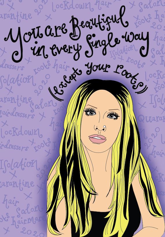


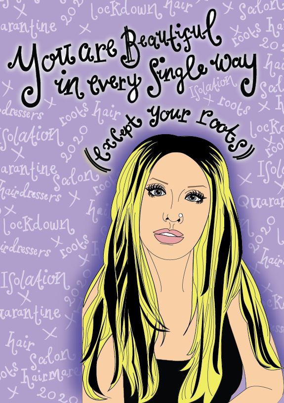
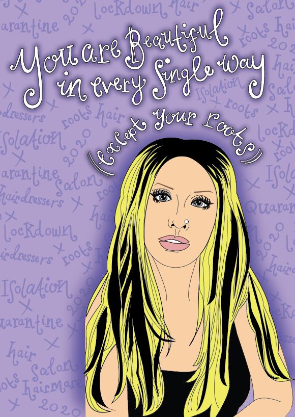
I then finally reached the stage where I was relatively happy with the front of my 3 designs!
Here they are in all their glory! 🙂

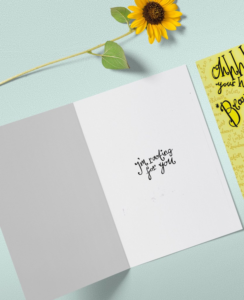
The next stage was to write the inside messages of the cards. I was unsure as to whether I wanted to use the same style of hand lettering that I had used on the front of all my designs or whether I wanted to use a more simplistic approach. Most greetings cards that are on the market use simple sans-serif fonts to feature inside the cards. I tried this out for mine using Helvetica. I also toyed with different messages for each of the cards; “Atomic (blonde)” for inside Blondies, “Don’t look at me” for Christina (the starting famous lyrics to Beautiful) and finally “I’m rooting for you” was the message I originally thought of with Marilyn’s.

This is what I ended up with. When I put it next to the designs it just didn’t look right. It looked like it did not belong with the cards. I decided to use the same hand lettering that I used in the rest of my designs with the same message –
“I’m rooting for you”

Again, I drew it out and traced around it in Illustrator to place on the inside of the cards.