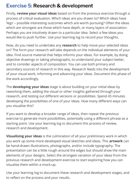
The Brief –
My ideas from the previous exercise:
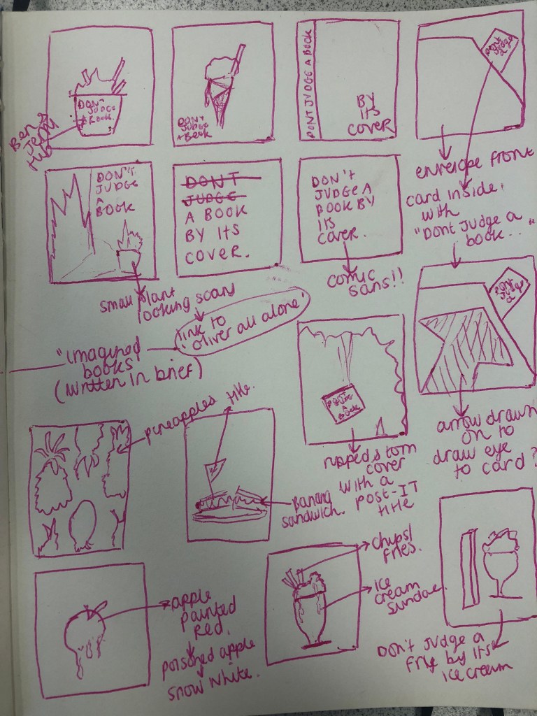
The brief states that I must find and develop the ideas that “have legs”, I had never heard of this phrase before but I quite liked it! The idea that a design has the potential to “walk” and grow!
The idea that I liked the most from this page of sketches was the ice-cream and fries. The idea I had of unusual food combos that shouldn’t work together but do and that people might grin their nose up without first trying was inspired by “Don’t judge a book by its cover”. The idea that someone would look at the book cover with the ice-cream and fries photo/drawing/digital vector art on the front and immediately have an opinion.. There would be 2 types of people to form an opinion; the first person that is intrigued as to why there is ice-cream and fries on the front; intrigued enough to open their minds to look and read further.. or the second person who might instantly decide from appearances and first glance that ice-cream and fries is weird/yuck/unappealing and why would they want to read a book about ice-cream and fries?! The ice-cream and fries is supposed to teach the lesson of “don’t judge a book” with one image. I decided to change the saying to “Don’t judge a fry by its Ice-cream”.
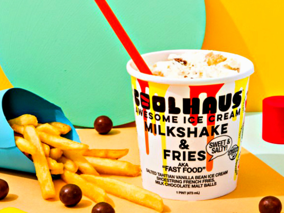
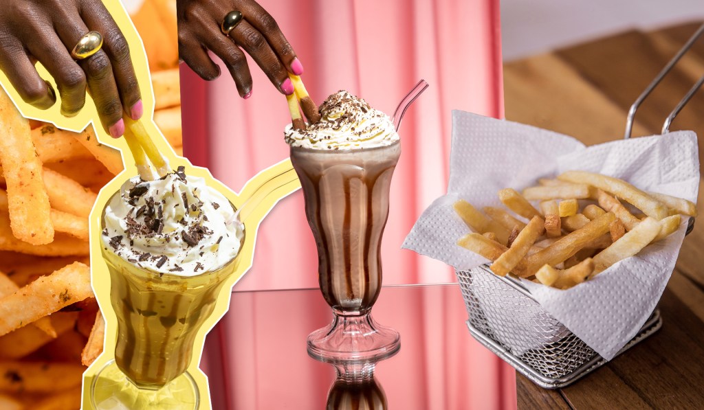
I researched on Google and Pinterest to see if I could find some images that might inspire my designs:

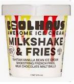

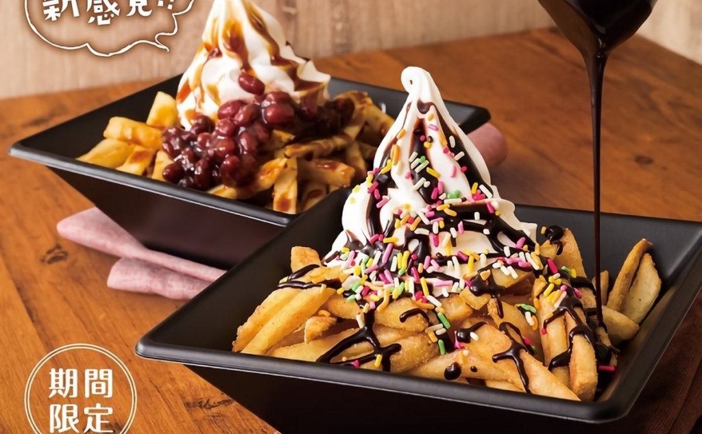

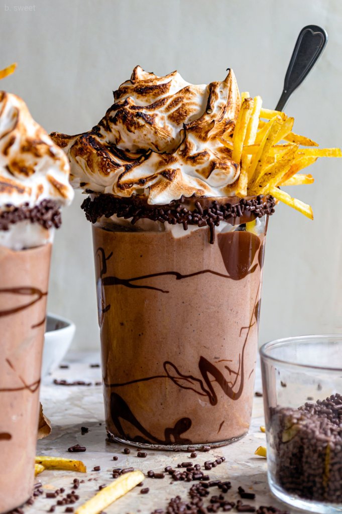
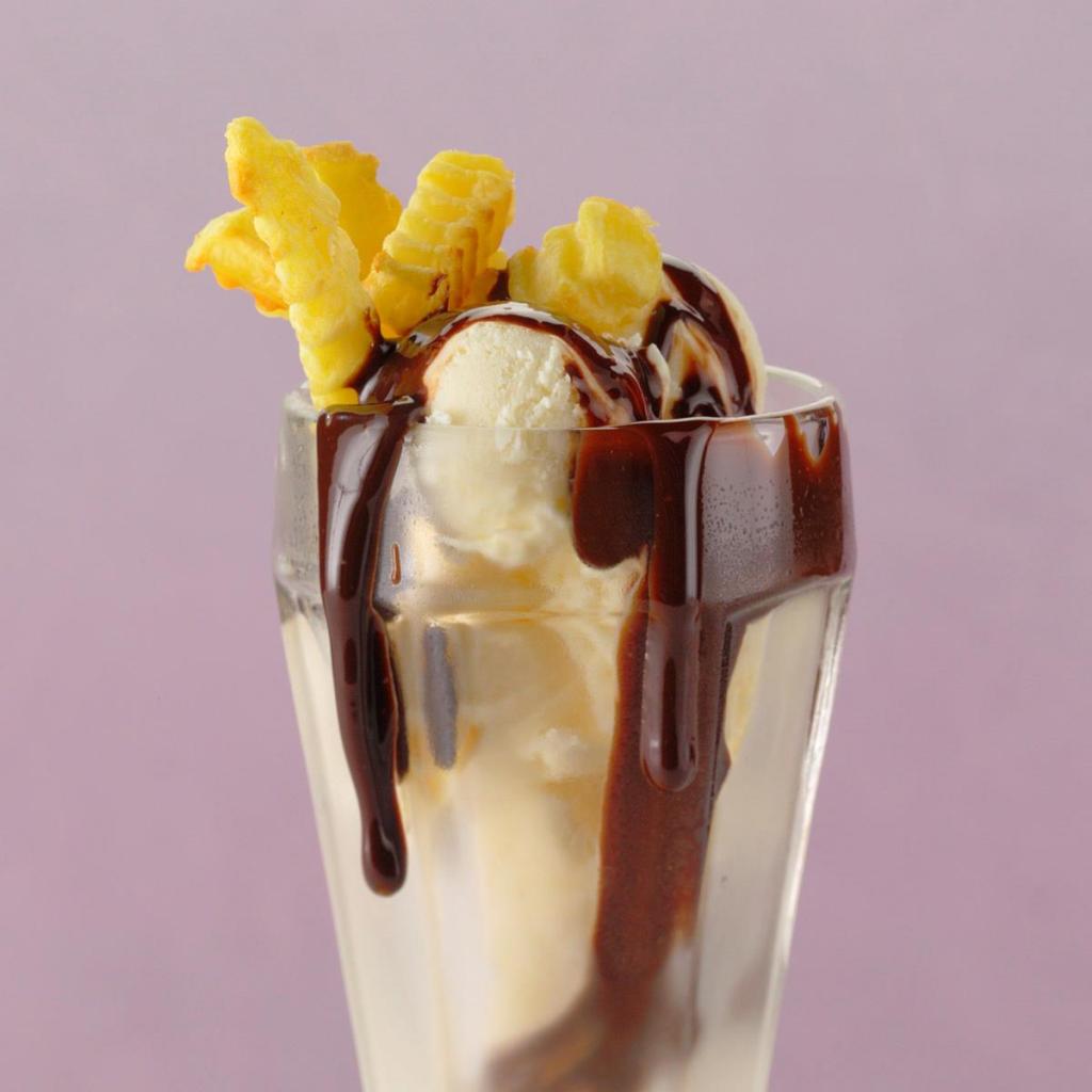
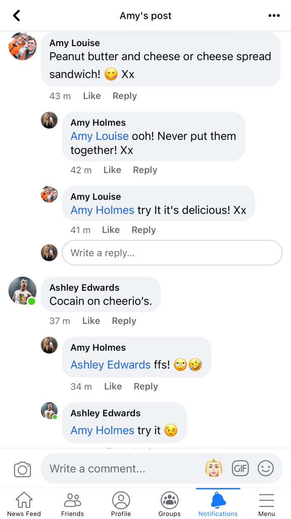
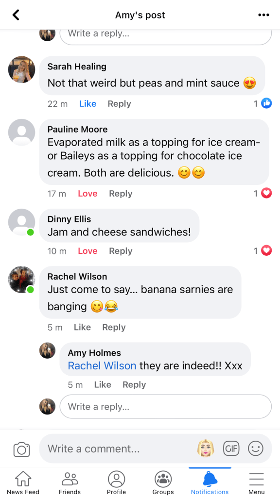
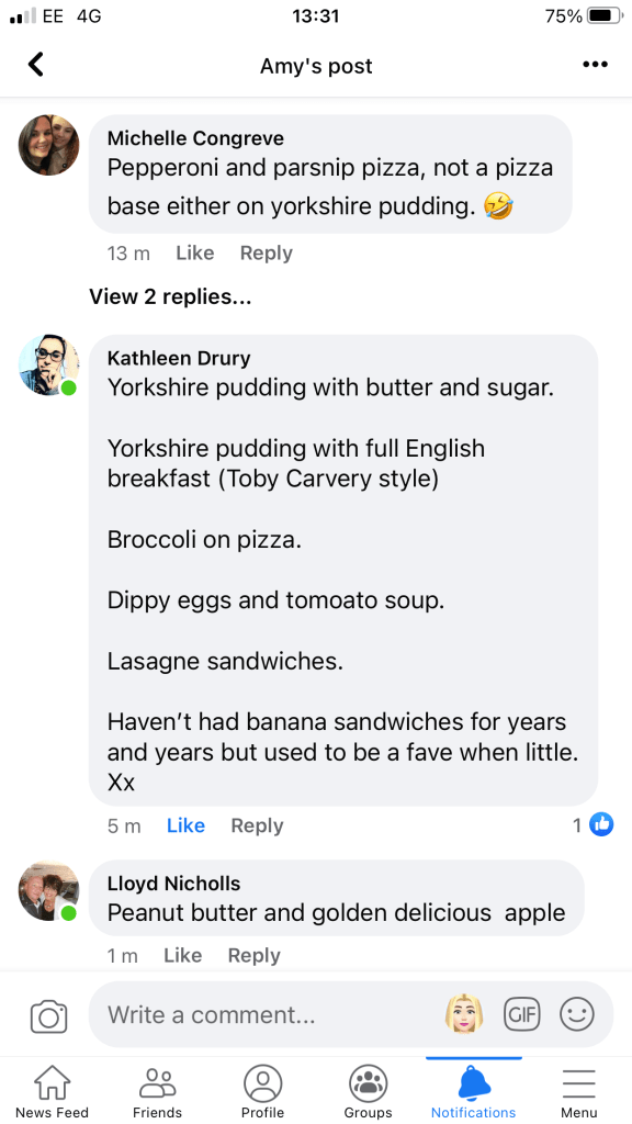
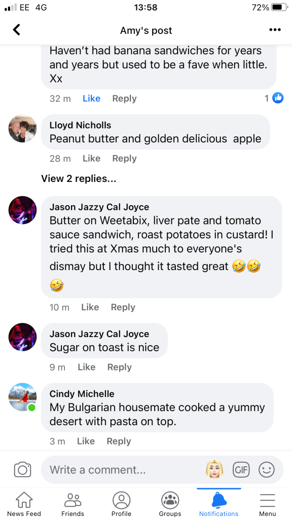
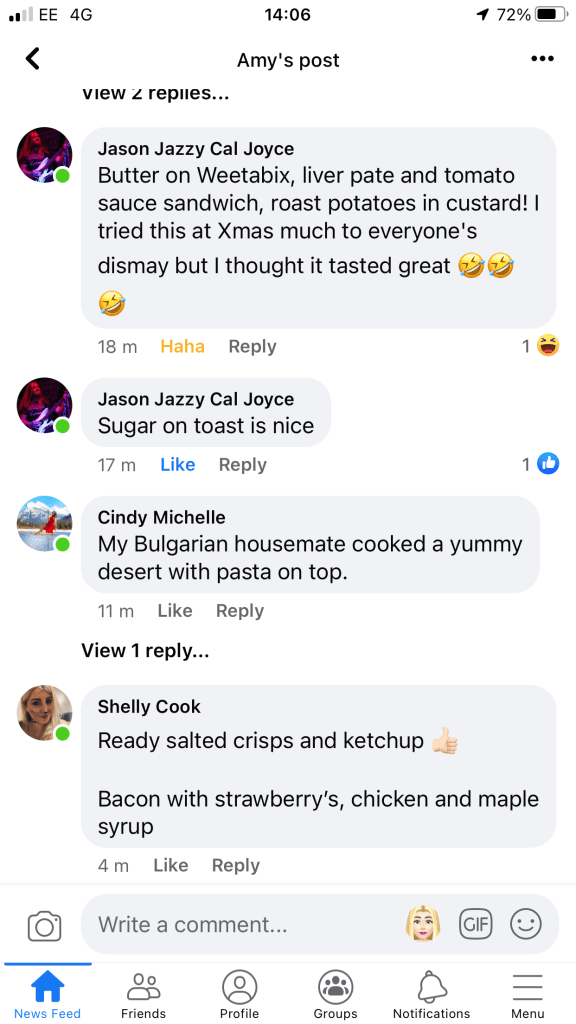
I also decided to conduct my own survey to see if anyone else had any good ideas for weird food combos that work.. To be honest the answers that came back were not particularly imaginative or helpful (particularly the joke drug reference!…) Tuna, Cheese and Mayo ?? I thought that was just normal? I don’t think people truly grasped what I was trying to ask!



I was that certain on my Ice-cream and fries idea that I went out and bought a sundae glass especially to stage my own photos for it:

BUT!..
I then read further into my course book and read the brief for Assignment 1: the brief specifies that I need to “creatively respond” to my chosen saying (Don’t judge a book by its cover) and to use the fanzine to present my ideas and whether any of the text or ideas can feed into my cover designs. I know that I want to make my zine personal to me and that everything I am putting in it will relate to me. I knew that Ice-cream and fries doesn’t.. I have never tried the combo and I HATE ice-cream! The next best alternative idea from my sketches that follows the same theme would be the banana sandwich; this does relate back to me because when I was younger (primary school – early secondary) my Mum or Dad (mostly my Dad though!) used to make me a banana sandwich every Sunday night for my tea (for some reason my Dad always seemed the best at mashing up the bananas!). My Mum used to cook meals for us all every night of the week and this was the one night that her and my Dad used to sit down just the two of them and have an Indian supermarket ready meal at the table in front of the TV. Me and my sister used to have this quick and easy tea before they sat down for their tea and then during their time we would get ready for school the next day. I still have mashed banana on toast even to this day. As before I decided to change the saying to: “Don’t judge a sandwich by its Banana”.
I decided to again have a look on Google and Pinterest and see what I could find:
I particularly liked the hot Pink with the yellow of the banana and the blue background with the yellow banana. If I was to use this potential design idea to create an actual cover, I could potentially use it as the cover for my zine. It relates to the course material, it relates back to me and it would definitely hopefully intrigue people (well, creative like minded people hopefully!) to pick up the zine and investigate further! It is telling people who don’t know me or my zine to not judge a book (or me!) by its cover.
With this new idea in mind I then went on to sketch some further developed ideas:

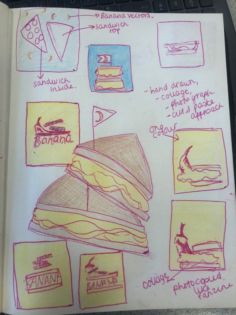
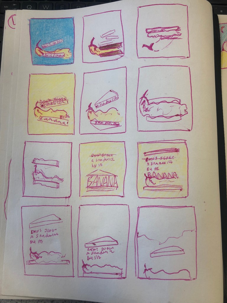
From these developed ideas I had the design idea to create a banana sandwich for the cover; the question now though was how I created this design… should it be a photograph? drawing? illustration? Vector drawing or abstract piece? What medium do I create the design out of?
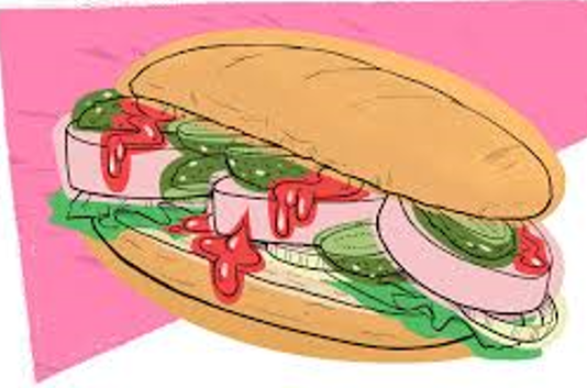
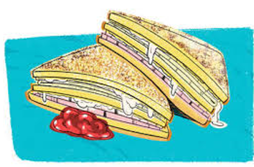
I really liked this style of drawing that I found, I had the idea to try and recreate something similar to this for my design:
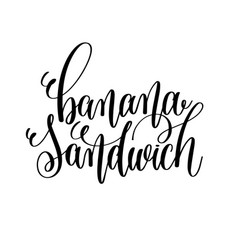
I needed to also think about the typography I would use; I found some hand lettering on Google- “Banana sandwich” and I really liked the look of it. The idea that I had in my head for the typography was something bold and modern but that looks like its been written or painted onto the cover.
I went onto Fontspace website to see if there were any free typefaces which I could download. I found quite a few that I liked:

I then again selected the best ones from the list which left me with the ones below:
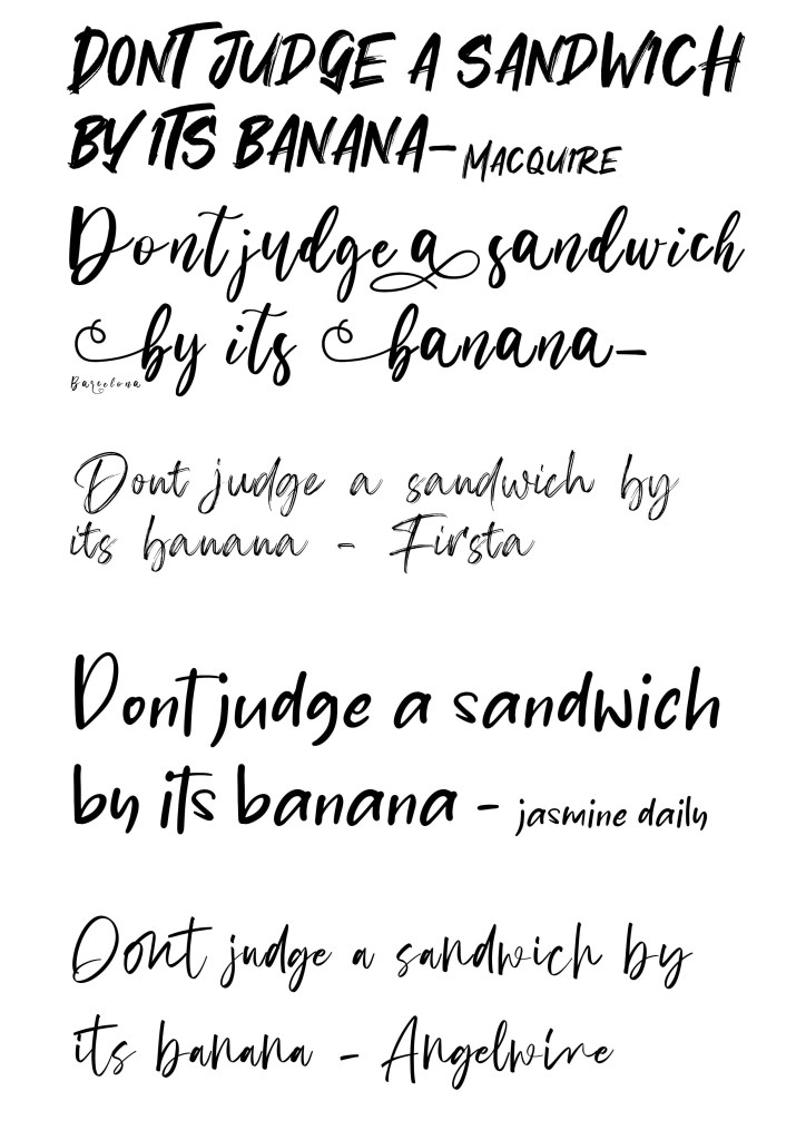
I love the curls on Barcelona but I am drawn to the style of Macquire.
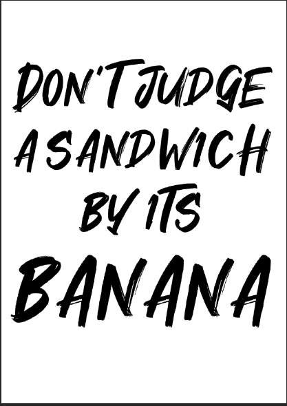
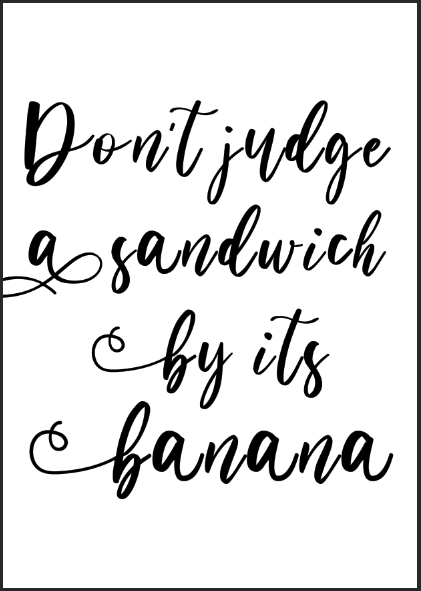
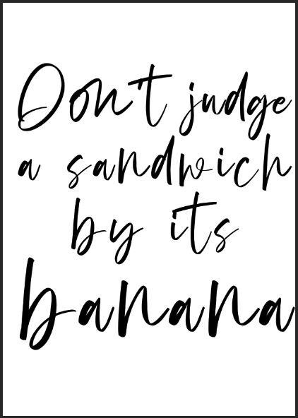
I did some rough mock-up covers in Photoshop of the typefaces I found just to see how they could look on a front cover. I can see Macquire being the strongest choice.
To design a cover with a banana sandwich as the main subject, I had to find some stock photos of a Banana sandwich or make a Banana sandwich myself and photograph it. I searched the internet for stock photos but could not find any- I then decided to go down the route of photographing my own!
These are the photographs I took:
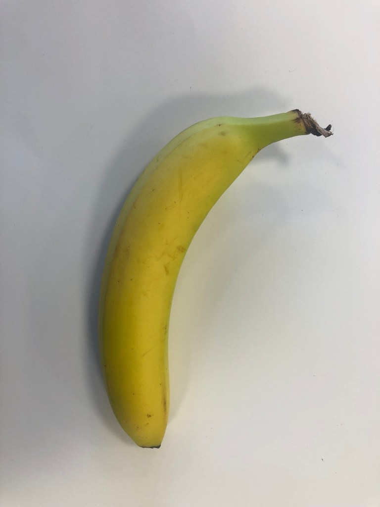
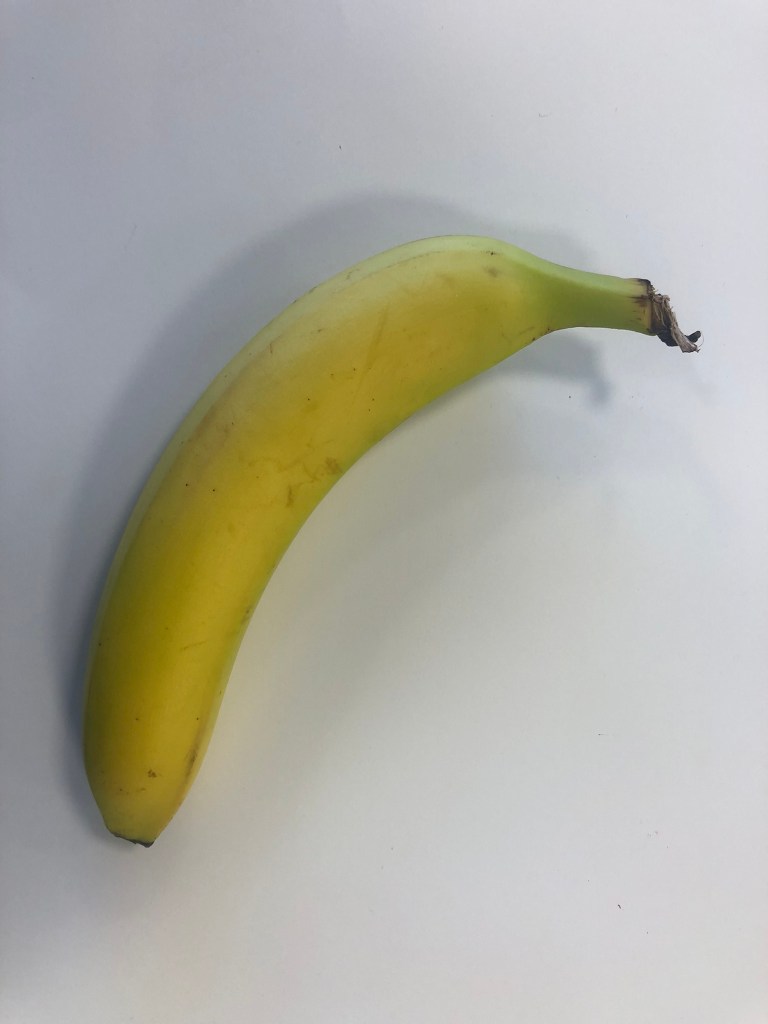
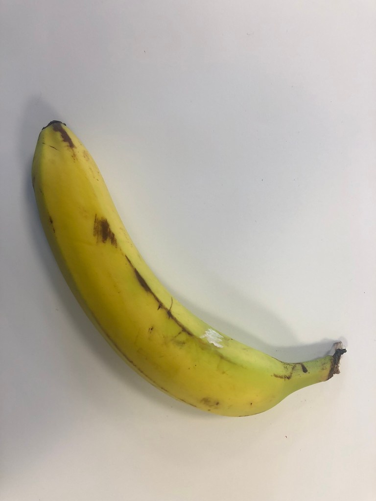

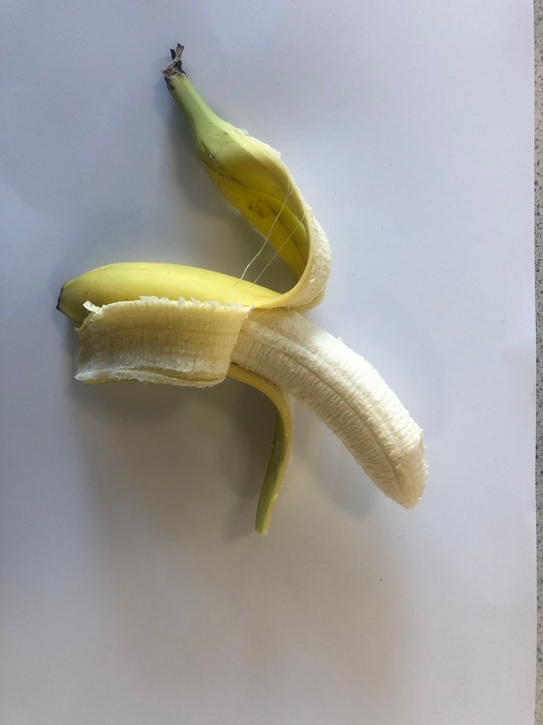

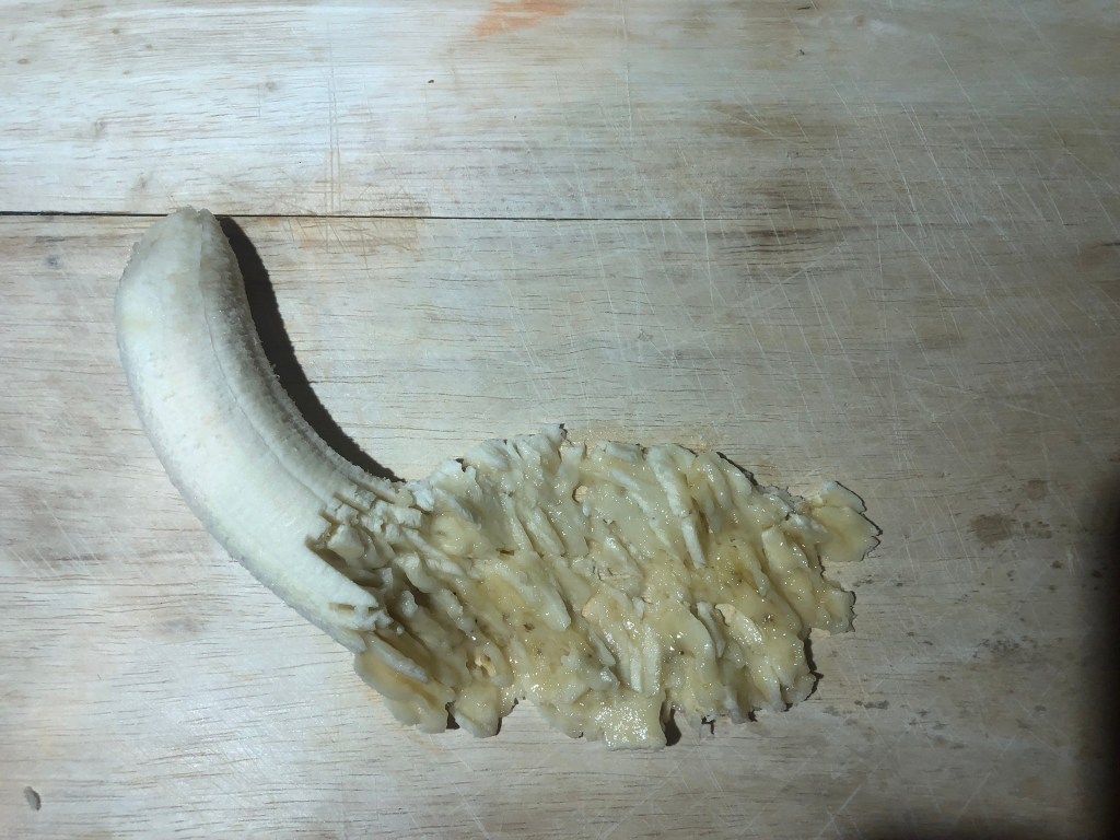

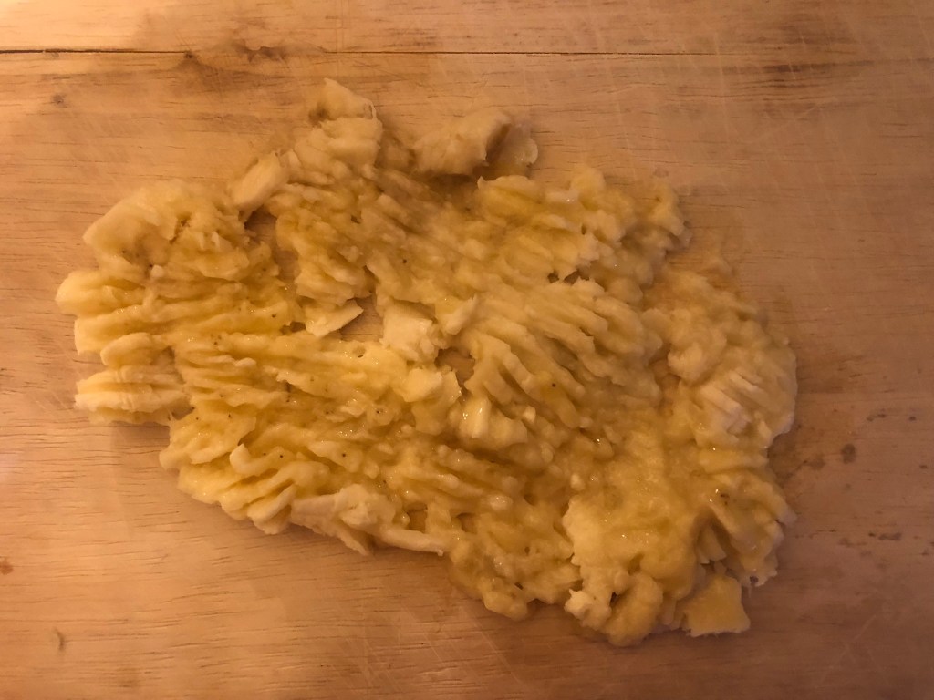
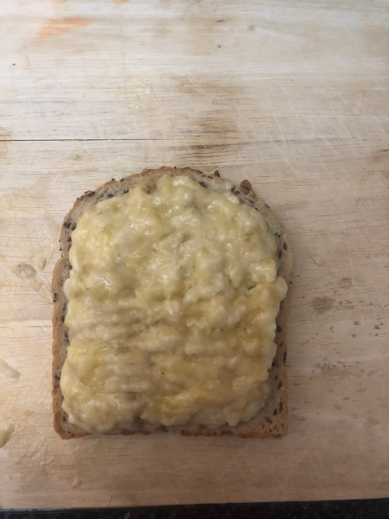
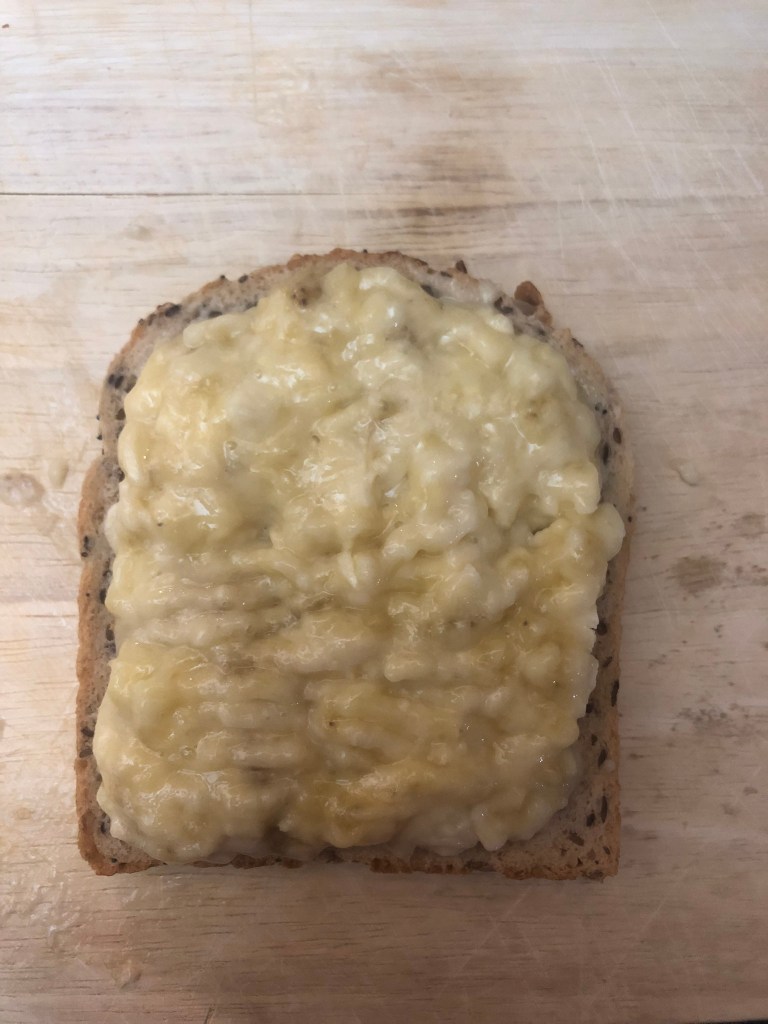
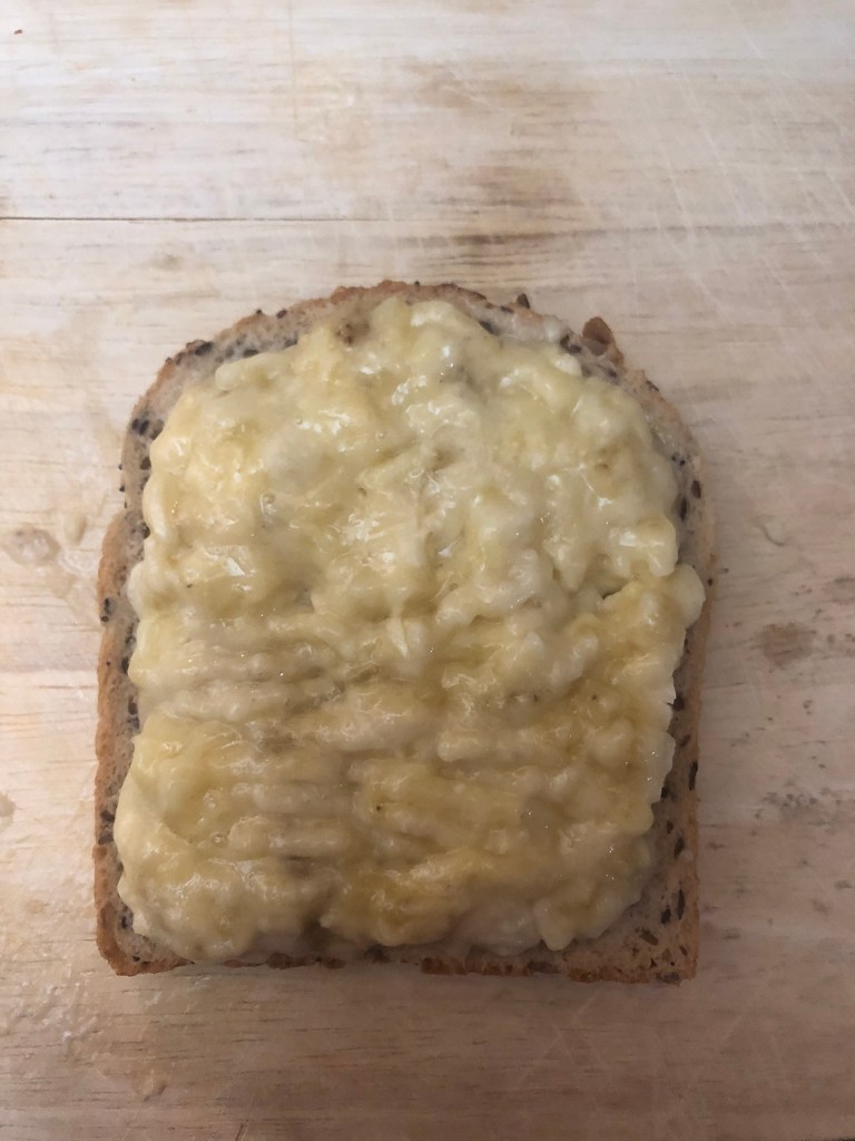
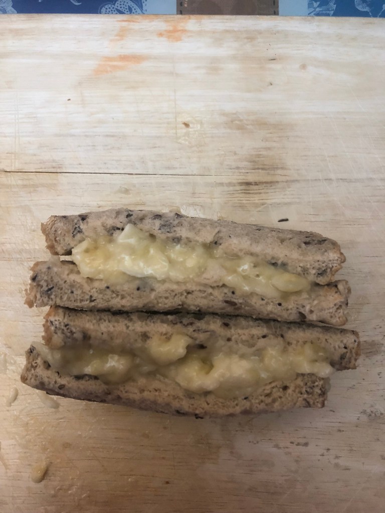
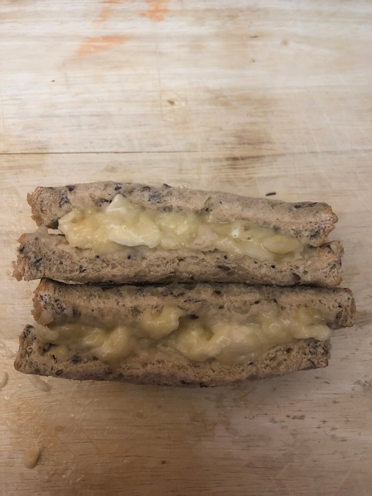
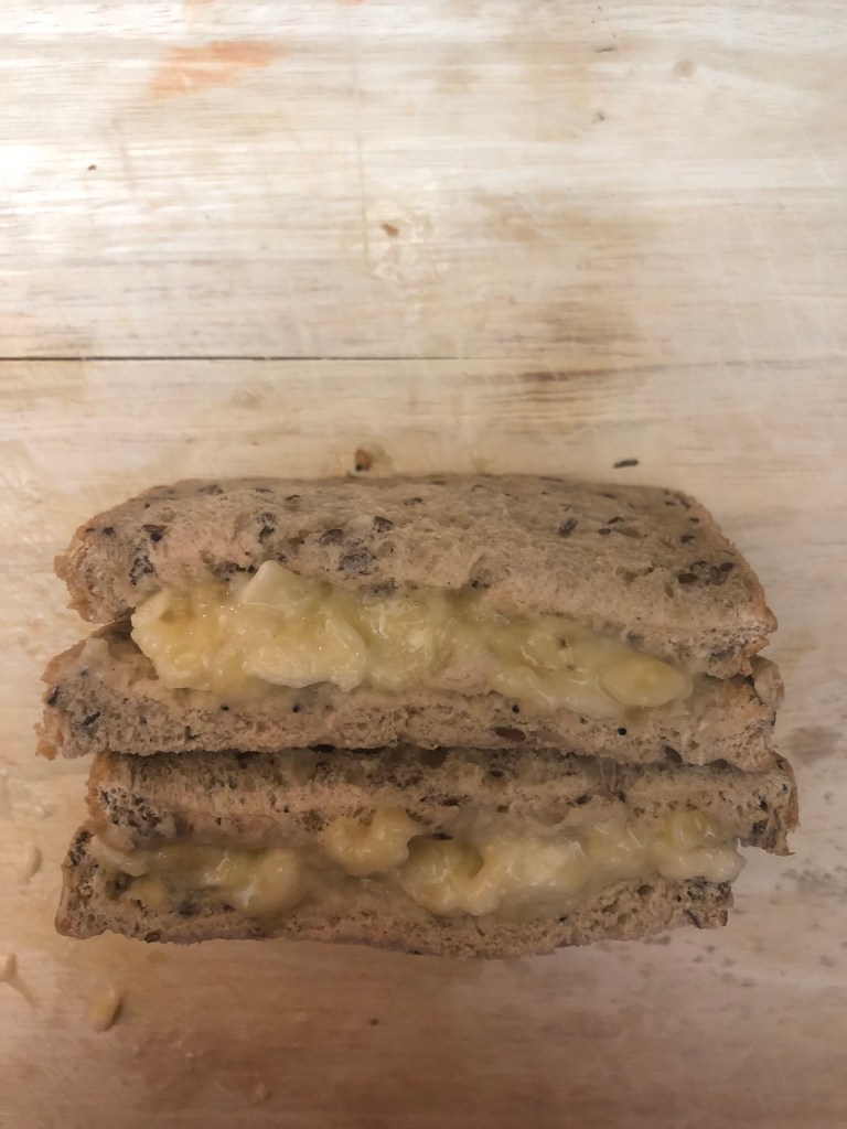
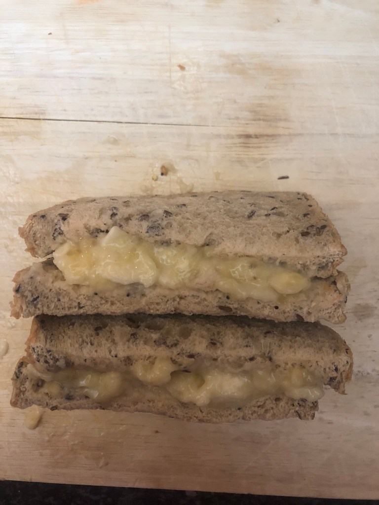


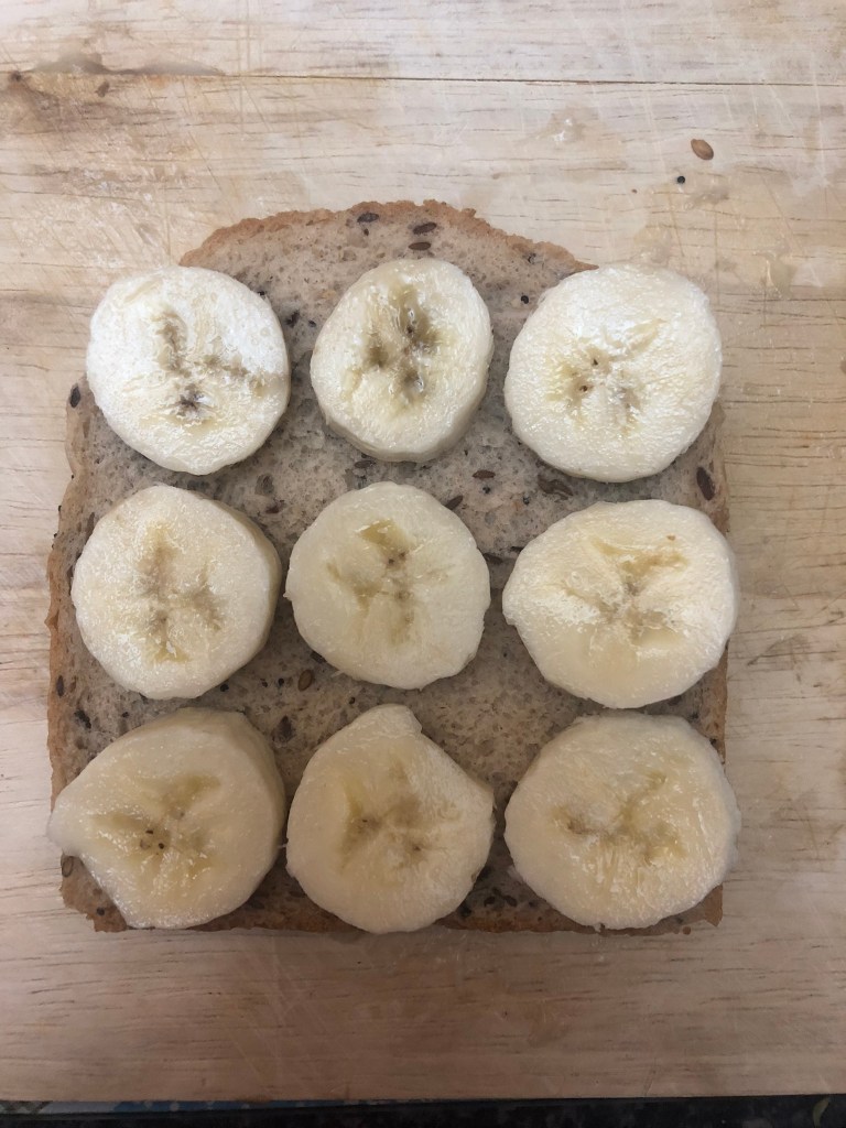

I took a few photos at different angles and different poses – I made a full on banana sandwich, a slice of bread with slices of banana, a slice of bread with mashed up banana (how it is supposed to be! ;), a full photo of a whole, skin-on banana and then some final photos of half a banana whole and the other half mashed up. These are all the angles and poses that appear in my design ideas.
I had 2 design ideas that I liked the most and that “had legs” which I decided to develop further:
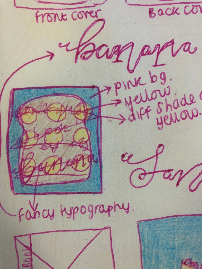

I then went into Photoshop and started work on developing the ideas!


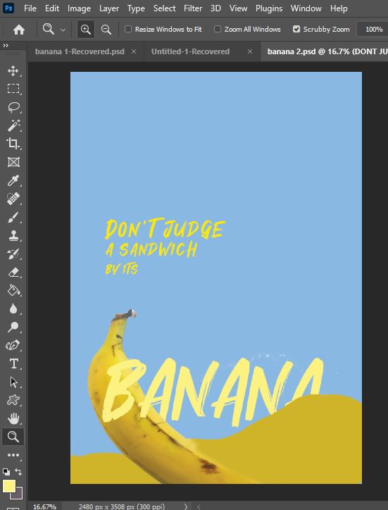
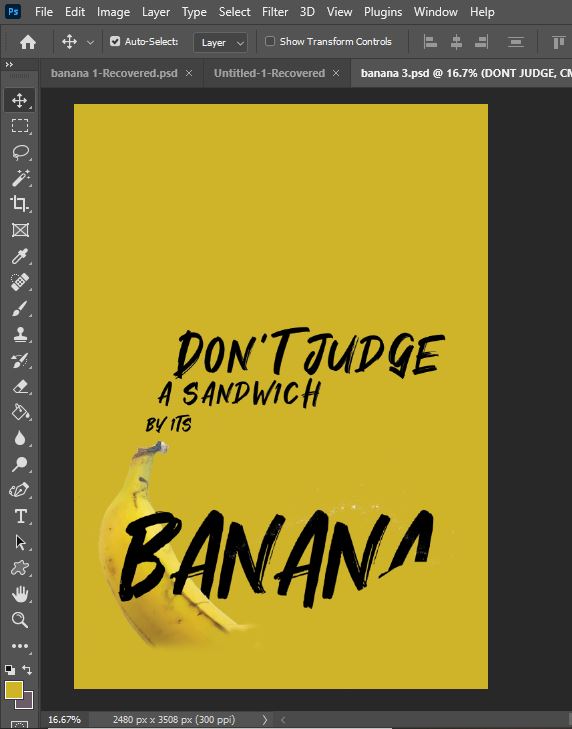
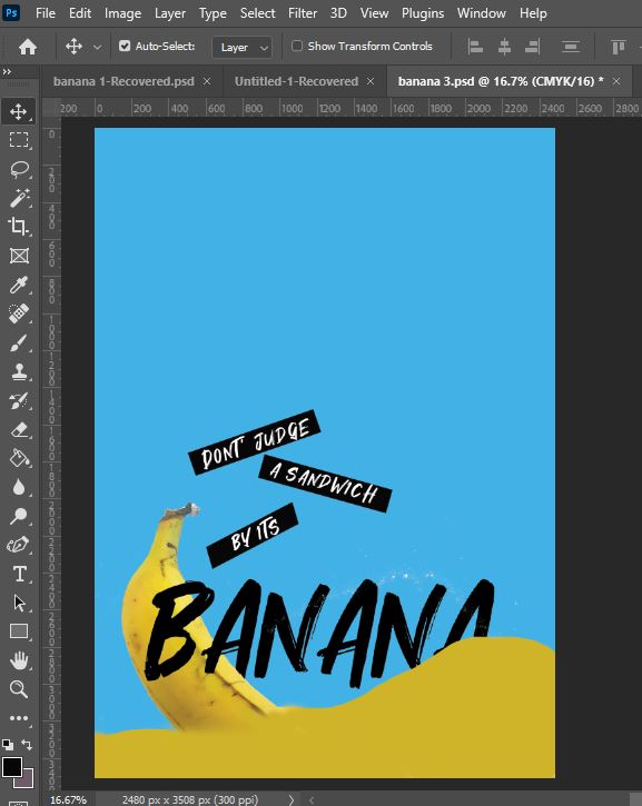

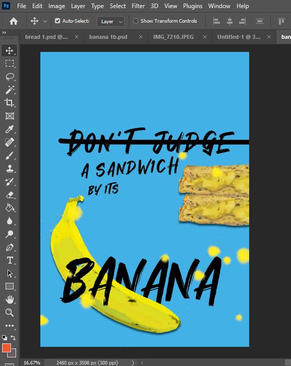


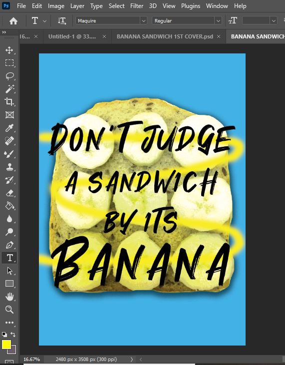
What I ended up designing I was fairly pleased with. I like the use of bright colours; the Blue really makes everything “pop“. I wanted to keep the designs simplistic, bold and fun. I had to alter and manipulate the colours of the banana sandwich because the original photograph was very dull (I took the photo at night time and attempted to use my fiancés large standing flashlight that he uses to enter our loft!) and also because the sandwich had white tones in it which I needed to remove because it made it look like an egg sandwich! I did the same with the banana photograph; I wanted it to be a really bright and vibrant banana!
These are the 2 covers I ended up with:
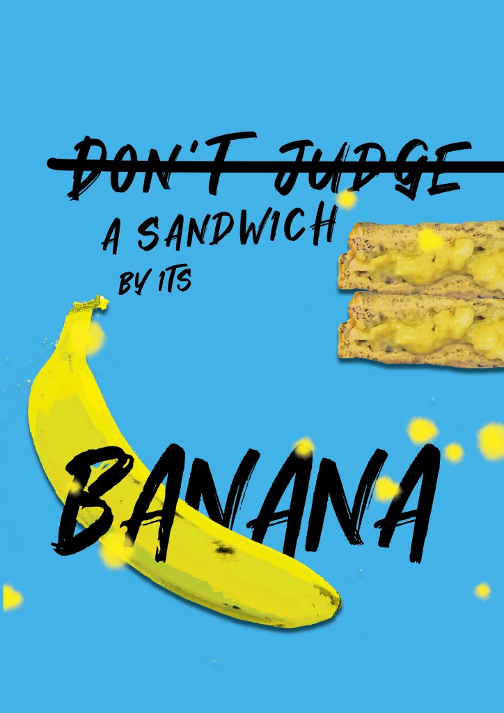
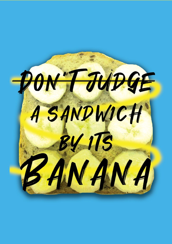
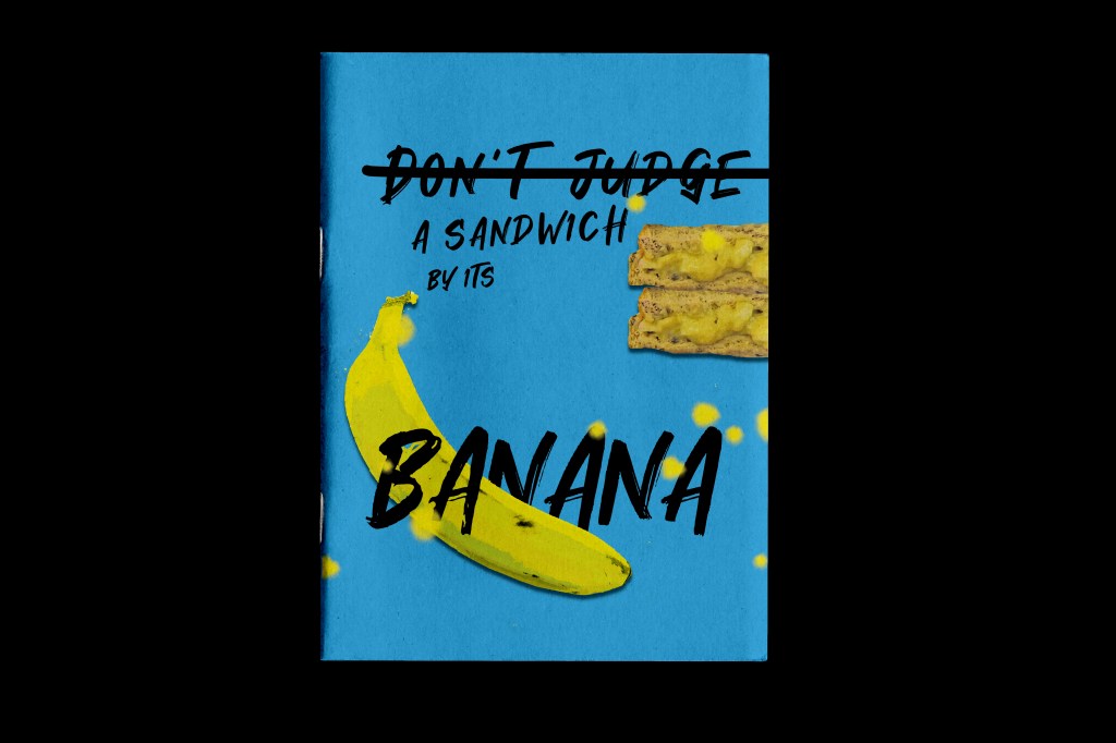
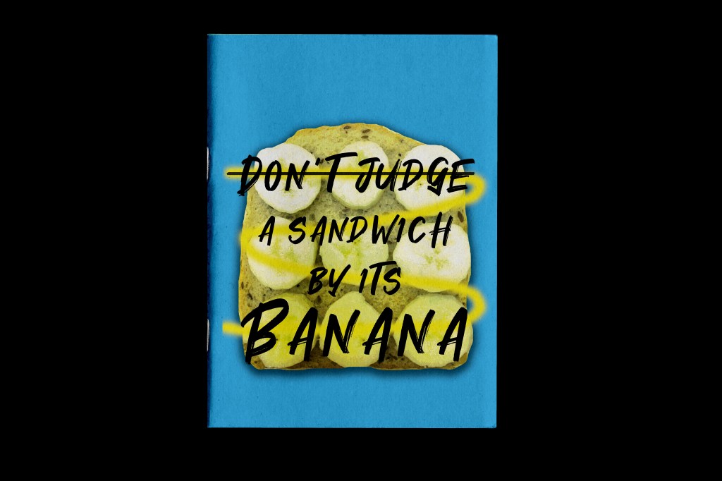
I then decided to mock them up onto a zine mockup to see how they would look.
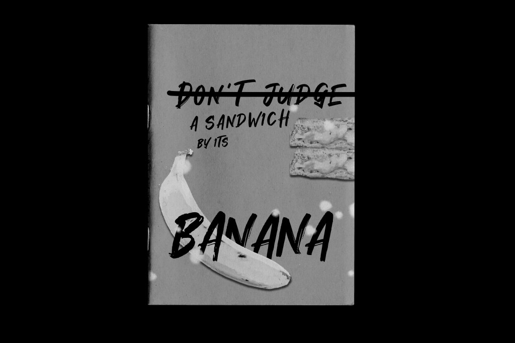
I then decided to mock them up in b&w to see what they would look like if I had to use a photocopier to print them:

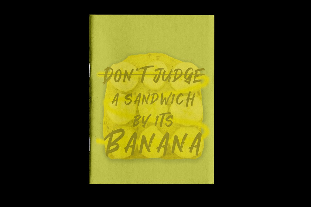
and again to see what they would look like if I printed in b&w but on yellow paper:

Critiquing my designs
My worries about my designs are the line across “Don’t judge” – what I was trying to emphasise here was “Don’t” which should not be done so it needs a line through it, however it could be misconstrued as to judge the sandwich by its banana or “A sandwich by its banana” which I don’t mind because I like banana sandwiches! Either way I quite like how it makes the reader question what it is all about! If I was to use this as the cover for my zine it would certainly provoke some kind of response as to what it is all about! – I think that is what zines are all about though; to be slightly whacky, quirky, weird and artistic in their approach! They can be taken however the reader views them.
As I was critiquing my designs I decided to bring the “mashed banana” yellow bottom back in design number 1 just to see if I preferred it back:


I also found a blemish of Blue inside the top counter of “B” in Banana that I needed to get rid of.
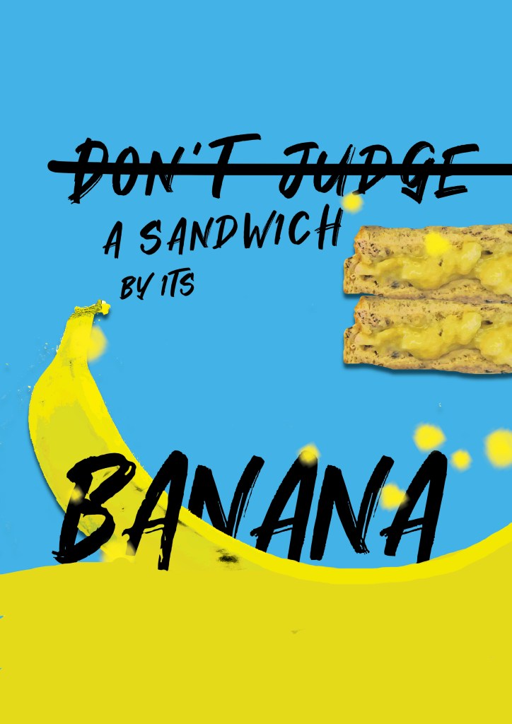


With the blemish gone I then had to decide which bottom “mash” I liked; I think the curved bottom works the best out of both because it matches the curve of the banana.
The design that still works the best and stands out to me is the original design.
Overall I like how they have turned out! They have met what I originally sketched and imagined in my design ideas.
