- The Brief
- First thoughts
- Pen and paper trials
- Final artwork
- Self Critique
The Brief
First thoughts
This is probably one of the kindest exercises I have had so far in this unit! – I went into this exercise fairly confident that I could come away with some good compositions. This exercise reminds me of the poster design videos by Chris Do on YouTube . In these videos he explains the theory behind effective poster design;
- the rule of thirds.
- Not putting things in the corners – do not put the design in a “box” give the design room to breathe with space around it.
- Making sure that there is a natural flow from the eye between the objects on the page.
- Making sure that any split words should be split by syllables only.
- Negative space is a MUST – you can never have too much negative space; negative space is as much a design choice as the main design itself.
This is the link to one of these videos which massively helped me in a previous exercise for a poster design!
Even though the videos I refer to are related to poster design, they still have relevance to this exercise. This exercise is all about;
- Composition
- layering
- hierachy
- contrast
This exercise is not as simple as putting a few design elements into a box in different variations, (which is what I was trying to explain to my boyfriend as he sat watching me wondering why I was finding it so complex!) There is a reason and a thought process behind everything in design – no matter how simple it might seem! There is a lot of psychological theory behind the practise!
The human brain and eye are very clever things! The brain will try and fill a space or gaps where there is any, (negative space) and the eye will only see things in a particular way… the most attention seeking element first followed by any least important information.
In the western world we read from left to right, where we position text on a page therefore is vital, our eyes will immediately seek left to right. The most important design element on the page needs to be positioned in eye line focus to the eye, be the right size and in the right place. Design elements should not be placed in the corners either, this will constrict the design to a “box”, there is no space or room for the design to breathe around it. Keeping all this in mind I planned how I would start this assignment and how I would create all the 20 designs…
Pen and paper trials
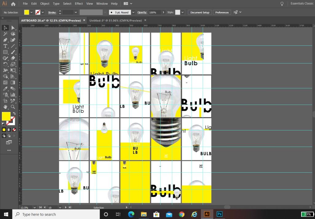
The best way for me to come up with different layouts and compositions was to use traditional pen and paper and draw some up. I knew that I wanted to use Illustrator or Photoshop to complete the finals and I was thinking around the best way to show 20 designs all at once – I decided to use 20 art boards to display them on. I created the art boards in Illustrator and then screenshot the screen and printed off a few pages to practise drawing the layouts onto it.
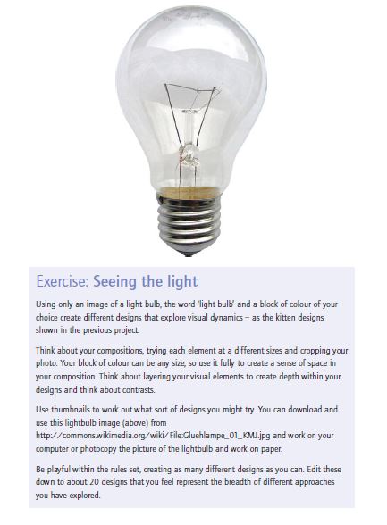
I then just quickly before I started any rough drawings, trialled out downloading the light bulb image (I imported it into Photoshop, cut around it and removed the white background) I picked my colour for the blocks – yellow, I felt this best described “light” and the light bulb and I then went on to try and choose a font. I knew I wanted a sans-serif, modern looking round font to match the feel of the bulb.
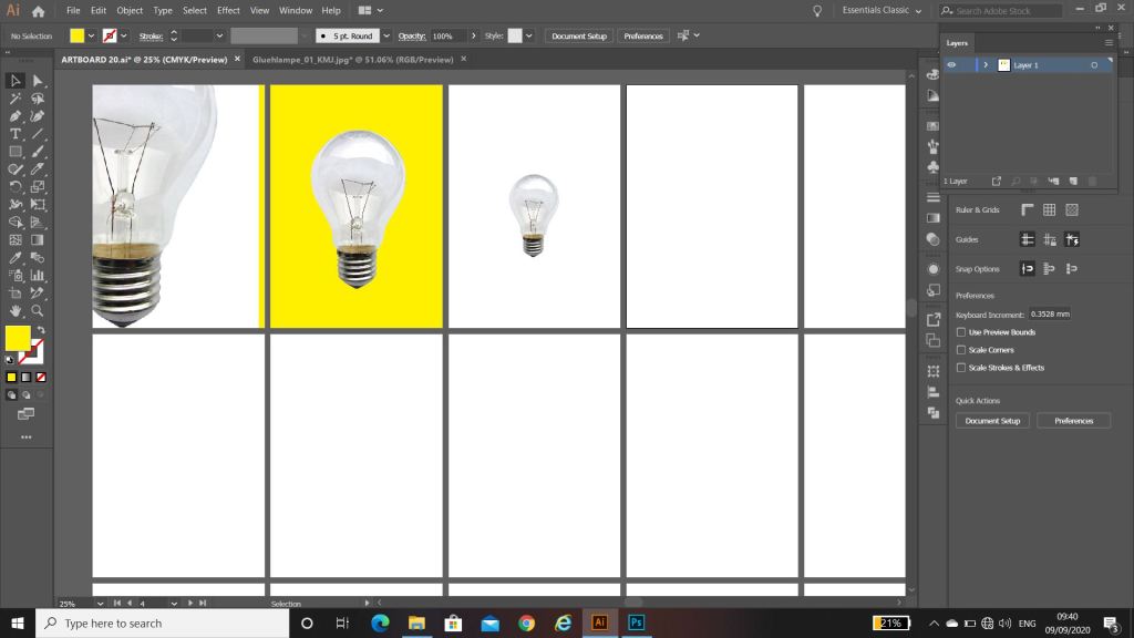

The font I decided to go with was Century Gothic. It is very simple, legible, modern looking and meets what I was looking for with its rounded shape. I like the kerning with this font also.
With everything decided, I then drew out some rough designs.
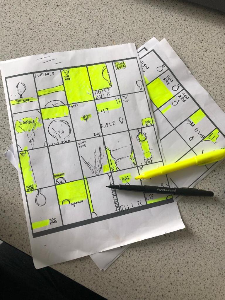
I then transferred these over to my previous document that I set up on Illustrator.
I had my document set up with my 20 art boards and started putting the different elements in place on them, however working with the rule of thirds I decided to create myself a grid to work to. This helped a lot! I found that placing the objects within this grid made the designs have more flow and look more professional.

Final Artwork

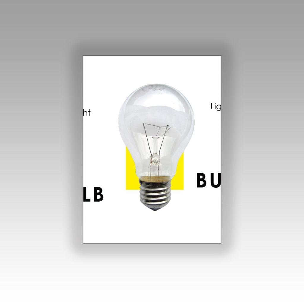
This above design is my favourite. It was a completely accidental piece – I ended up cutting my text in half by accident but really liked how it turned out. I wanted the text to speak rather than the image so I used parts of the lightbulb that possibly would not be identifiable if they appeared on this piece alone. Going back to Chipp Kidd and the “apple” lesson; a photo of an apple does not need “apple” written next to it. A light bulb does not need “lightbulb” written next to it to identify what it is, this is why I have only chosen parts of the bulb where you would have to guess what it is – the text speaks for itself. I wrote “light” in small at the top to emphasise light and lightness – plus I really liked the use of negative space in this design. The contrast between dark, big and bold text next to the small, light text draws more attention to the design. I incorporated the block colour into the letter L.
This piece reminds me of something that David Carson would possibly design – subconsciously my influence from Carson and Cranston came out to play with this piece.
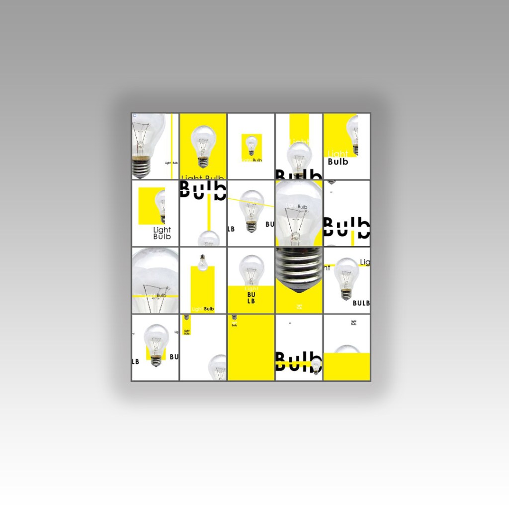
This piece oozes more negative space. The colour block in this piece fills the page. Again, I used part of the bulb rather than the whole image – just because once again I did not want to use “light bulb” twice with the image and text. I emphasised the light and dark contrast again with “light” and “bulb” using bold and regular text. I wanted to keep the negative space so kept everything very minimal and small at the top. The eye is drawn there first and all information is taken in.
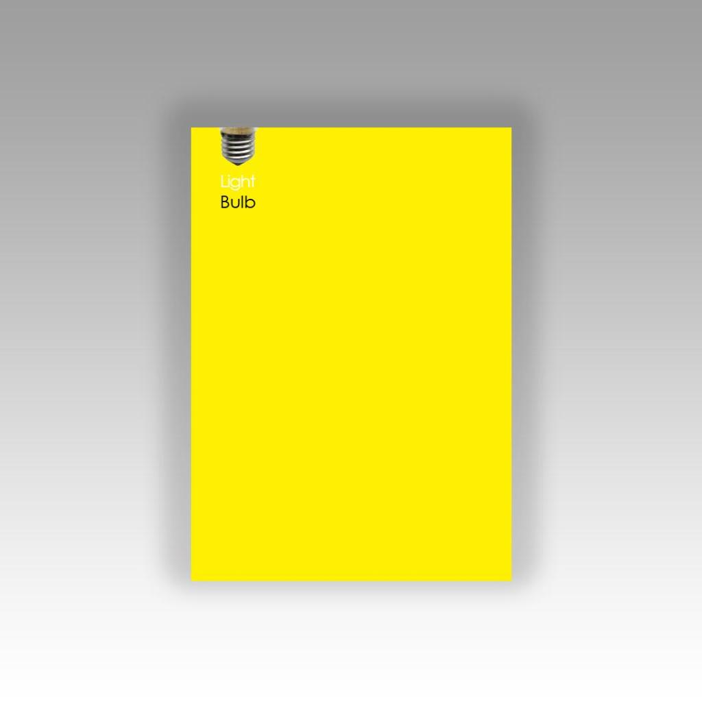
I relied solely on my grid of thirds for this design. I made sure that there was a design element in each third of the grid. This design does not naturally flow, however there is structure to it. I have gone against my rules though and split words without syllables. I quite like the modern feel to it though and again the contrast between light and dark in the typography. I have placed the block of colour behind the light bulb in this piece – layered up the colour block to the image – to add depth, contrast in colours and to separate elements of the design. I have kept a lot of negative space within this design once again.
Self Critique
I was actually surprised at how long it took me to complete this exercise, it was a whole afternoons work. The design possibilities with this are endless! I could have designed easily another 20. I found that I became more confident and less “rigid” in my approach by the end of the exercise.
I started off fairly unconfident with the typography part involved in this exercise but then by the end I started experimenting with cutting up letters and repositioning text to come up with some creative responses. I found that I was experimenting with one design and then seeing other new ways I could change it, I found that I was taking one design and then altering it to create endless other possibilities. It has definitely been a good exercise to “think outside the box”, to problem solve and work on a constrictive, closed brief.
