
The Brief
Identify a range of books that have fundamentally different functions in terms of how these books are engaged with – how they’re held, where they’re read, by whom, and for what purpose. Try to look at least six books, but you can extend this if you want to. The differences between these books might be determined by their genres. For example, you might look at a cookery book, a biography of a sports personality, a travel guide, a work of historical fiction, a teenage film tie-in like Twilight, this course guide – the choice is yours.
Think about how each book’s form reflects its function. The front cover is an obvious starting point (and the focus on your upcoming assignment) but try to look more broadly than this. Think about things like page extent, paper quality, typeface, the weight of the book, imagery and more. Is the book illustrated with photographs, reproduced images or drawings? Are these concentrated in one or two places or distributed throughout the book?
What about the front matter and end matter? Historical novels like Hilary Mantel’s Wolf Hall may have family trees and/or a list of characters as part of the front matter. A scholarly biography will usually have many pages of end-notes and references.
Reflect on this in your learning log, with examples of some of the books you’ve selected. Identify how each book designer has reflected the genre and function of your chosen books in their final design.
First Thoughts
This exercise is getting me to think outside the box and open my mind to the fact that books are far more than just informational or imaginary pieces of literature! My mind in fairness was already open to this! I know that books are far more than just thick or thin blocks of pages with lots of words in them! We are way past books purely existing to belong on fusty shelves in old libraries! Books are pieces of art! They show off the craftmanship of the author, the illustrator or the maker of the book! Having a coffee table full of iconic books purely just for show in a home is now fashionable!
We ARE judging books by their covers. The appearance of a book matters just as much as the content inside nowadays. Hopefully the 6 titles I have chosen will prove my point!
My Chosen Books!
1) Louis Vuitton travel guide to Madrid

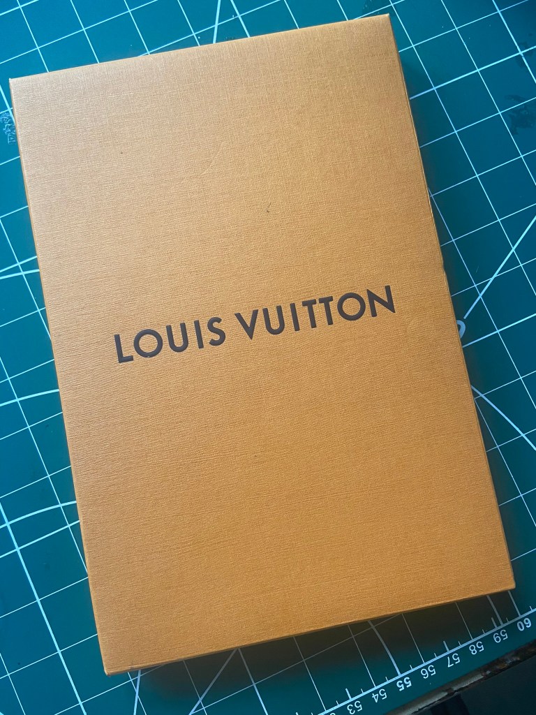


This is a luxury Louis Vuitton guide to Madrid that I purchased when I was studying the Abstract Cities exercise in Core Concepts:
In this series there are many popular cities and they all have their own colour schemes. This one is a mustardy colour and it reflects all the way throughout the book. Even the photographs are duotone using this colour. It is Louis Vuitton so the quality of the book is pretty good! It arrives inside Louis Vuitton trademark Orange packaging (the fastening is a bit rubbish!-it snapped on my trying to open it!) and when you take the book out it is hardback, cloth bound front and bac. I like the fact it is cloth bound, it adds that element of luxury and also gives the book an old, vintage, classic feel to it. This is a book that I could have on my bookshelf in 50 years time and it would still be as appealing as what it is today- it it timeless.
What is the function of the book? – The function of this book ultimately is to help you navigate and tour across Madrid but it also does so much more than that.. This book is a statement as with all Louis Vuitton products; yet it is one of their cheaper products costing just £25 which could be considered costly for an A5 guide book but not when you consider it is designer. You can navigate around Madrid with a £5 tour guide from a bookshop or newsagent but with this tour guide you are fashionably navigating around the city like an A-list! This book is a coffee table piece- you can imagine it displayed in a fashionable home or a showhouse alongside some Chanel and Dior books on a glass coffee table with a fur rug beneath it!
What is the front cover like? – The front cover is very simplistic. It doesn’t need to speak volumes though because again, its Louis Vuitton! but also because the cover is cloth bound. The instant you pick this book up you are transported into luxury! As I mentioned before the feel and texture of this front cover is classic timeless – in 50 years time this is still going to be as relevant and as desired as what it is today. The book corners are also rounded. Louis Vuitton use Futura typeface which again is a timeless classic! The cover simply says “Madrid” in a dark brown colour, but the tracking between the letters is spaced out – I think this allows us to take longer to read it and process it. That in itself is making a bold, attention seeking statement. There is also a Louis Vuitton city guide stamp which looks like a stamp you would have inside of a passport or a sticker that would appear on old luggage- this again is a nod in the direction of vintage and classic but also in a subtle way shows what the purpose of the book is. The city guide stamp also ties all the series together – this is like Louis Vuittons branding for its travel guides.
How many pages? – The page extent of this book is 320 pages.
What is the paper quality like? – The paper quality is lovely! The corners of the paper are perfectly rounded off to match the front and back covers. The feel of the paper is very smooth and soft – the pages themselves are very thin, they feel just a little bit thicker than tracing paper! This tells me that this wasn’t a cheap book to print and that every last detail has been thought about and quality ensured. The edges of the paper are also in keeping with the colour scheme; they appear in the same mustard/green colour.
It also states on the Louis Vuitton website that this book has been sustainably printed and manufactured:
Louis Vuitton is implementing a responsible wood sourcing policy by working to find alternatives to the endangered wood species protected by CITES (Washington Convention). The wood used in this product is FSC© (Forest Stewardship Council©)-certified, a standard that guarantees the sustainable management and exploitation of forests, in addition to respecting biodiversity and benefiting the local communities that live or work there. To reinforce our commitment, Louis Vuitton is proud to rely on the expertise of Canopy, a global non-profit environmental organization dedicated to the protection and preservation of forests, animal species and the climate.
What Typeface? – Louis Vuittons trademark typeface is Futura; a timeless classic! The typeface is a sans-serif which makes it the perfect option for legibilty and readability as well as for bold, statement titles and headings. The simplistic approach of the front cover with just the stylish, bold typeface really works well.
What is the weight of the book? – The weight of the book is what I would expect from a standard A5 book that’s job is to pick up and read inside the house and to live on a bookshelf or coffee table.. however this book is to be carried around in a backpack or a travel bag/handbag as the city in question is being explored and because of this it does feel quite heavy for that. I would also contribute the heaviness down to the fact that it is a hardback book and cloth bound.
What is the inside of the book like? Images/text? – The inside of the book very much matches its exterior. The colour scheme runs throughout. Fashion photographers contribute to the photographs inside the book which again screams statement, quality and money! The photographs are duotone which match the colour scheme but I also imagine would keep print costs down. The overall cost of the book to print I imagine would not be cheap considering its quality, but they have managed to keep print costs down by using minimal colours; The colours used are the green and black.
There is use of blank pages in the green colour – I think these are supposed to separate the chapters of the book. The layout of the text in the book is set to a 2 column grid with the text feeding down the 2 columns. The layout has continuity by using a bold, all caps heading followed by a sub headings in the green colour followed by the main body of text that is in black. Some of the text is highlighted but again it is using the green colour. In the outer margin on the pages are the page numbers and “Madrid Louis Vuitton” which match the spine of the book.
The spine- The spine of the book is in a different colour to the rest of the book. The spine is a dark brown – this could be so that is contrasts nicely against the green. The brown allows the green to pop out! I also think that they use the dark Brown colour because it ties in nicely with their luxury luggage which is what they are famous for selling. There is only text down the bottom half of the margin – again, using Futura typeface in all caps and bold. At the very bottom is the famous Louis Vuitton logo.
What about the front matter? – The front matter is the very front chapter of a book; it is usually the shortest too! On the inside front cover there are 2 pages of the dark brown and when you turn the page again there is another blank page of the dark brown followed by just a black and white photograph of the city. If you turn the pages for the next 2 double pages these are just black and white photographs again. Turn the page again and there is a double page consisting of 1 blank green page and the one on the right with the opening title. The next double page consists of another blank page on the right hand side and a tiny piece of text on the bottom left explaining about the series of Louis Vuitton city guides. The book then continues to explain about the city. There are a lot of blank pages in this book at the very beginning – a lot of negative space! I think it gives a very expensive, clean, luxurious feel to the guidebook.
What about the end matter?- The end matter in this book consists of Louis Vuitton’s Guide for travellers which is a chapter that gives the history about Louis Vuitton, it advertises their luxury travel luggage and it even gives a helpful, illustrated step by step on how to pack a suitcase correctly and spaciously! It is quite a cool closing chapter to the book! There are then the index pages and a couple of pages that mention the photography and editorial staff. It then closes with a few lined pages where the reader can make any notes if they wish to. The inside back cover again is the dark brown colour with the Louis Vuitton logo and stamp on the bottom right.
Conclusion! – If I were to design a timeless, classic book that I wanted to stand the test of time I would definitely take notes from Louis Vuitton! They are experts in quality assurance and luxury! I really like how this book is very simplistic in its approach and uses very minimal colours and seems effortless and basic but actually the amount of thought and work that has gone into the layout and continuity of the book to make it an exceptional piece of art and design! I love the cloth binding- this really sets it apart from a lot of other books in its genre. If you want to travel in luxury and have that A-list experience in your city vacay then this is the book that would do that! The only thing that is against this book that other books in its genre might win at is the weight; this book although a nice size in A5 is a little heavier than what you would expect a guide book to be… but it compensates in other areas where other books might have failed; such as in the fantastic photography, the added content at the back and the inside tips from fashion insiders on the best shops, restaurants and bars in the city.
2) The Rainbow Bible


I personally am not religious in any way, I received this as a gift from my grandparents on what I presume from the date written inside was my christening. My Mum only gave this back to me a few weeks ago and I almost forgot that I had it! It is a nice gift for a newborn baby as a christening gift! The Bible is a lengthy piece of literature!- I can imagine a lot of young people would give up reading it! This seems like a child friendly way of introducing the Bible with the use of intense, bright colours and they way the publishing house has broken the book down by including helpful resources that explain in depth certain aspects of the book. This seemed like a good book to explore in depth though as it is possibly the most famous book and writing! The fact that it is so lengthy and complicated, I was interested to explore in more depth how they have problem solved this in a childs version!
What is the function of the book? – The function of this book is to present the holy scriptures of Christianity. I would not imagine that the Bible would be used as a piece of art or as a means of displaying as art in a home. I cannot imagine it to be a coffee table conversation starter! Usually the people that would buy a Bible are religious people who want to use the Bible as a reference to guide and practise daily or to read at nights before reflecting and going to sleep. It would be used as a means of prayer also and maybe be kept by a bedside table in the home. The Bible could be used (as it was in my house when I was a student at school!) as a reference for Religious Studies homework.
The copy I have though I feel is for reference but also to be aesthetically pleasing as I feel it is trying to reach out to younger generations to encourage them to read it more through the use of the intense, bright colours and the illustrations. It is a copy of the Bible that I feel would be used as gifting purposes only for special events such as christenings or as Sunday school gifts.
What is the front cover like? – The front cover has a shiny, glossy protective coating over it. This is to protect the book but to also make it appear high quality. The front cover depicts Jesus potentially talking and preaching to children; again, it is aiming at children through the front cover also. The illustration is very high quality and the colours are very bright and intense. The title Holy Bible uses gold foiling which again adds luxury and an old, antique feel to the book. The Bible is a very old, treasured piece of work so this is reflective in that title. The front cover is also hardback which makes the book look more expensive and high quality and that will also lengthen the life of the book potentially from creases and bending.
How many pages? – The Bible is a lengthy piece of literature at 269 pages long – again, I feel like this could be a lot more but the point size of the text inside is very small!
What is the paper quality like? – The paper quality in this Bible is very thin!- it is the same weight as tracing paper! Using this quality and weight of paper in this publication makes the book again seem expensive and luxurious – a timeless book to be treasured! The only thing I will say is that this Bible is meant to be aimed at children but using this quality of paper possibly isn’t the wisest with young, clumsy hands! The pages can be easily ripped and torn.
What Typeface? – The Bible is a very intricate, ornate piece of work. The typefaces that are used in the Bible are ornate, decorative, serif typefaces. The fancy look of serif typefaces helps to showcase this piece of work as treasured and priceless.
What is the weight of the book? – The size of the book is A5 which is what I would expect the size to be of a Bible.. it is quite lightweight though to the hardback Bibles that you would find in a church or likewise. I think this is because the pages are so light with being as thin as they are!
What is the inside of the book like? Images/text? – The inside of the book is obviously text heavy! The pages are split into 2 columns of text. The columns are very tight and close together though with just a line that runs down the middle and helps separate the 2 pieces of text. This is again because there is a lot of text to try and cram into minimal pages. At the beginning of every paragraph there is the use of drop caps- drop caps and illustrated letters were used and seen as a thing of beauty, luxury and for real treasured, ornate, historical, important pieces of writing. The text in the book is also very small and the leading is very tight. This would not be friendly for young children to read – it would be challenging for a lot of adults! I think that the text has been made the smallest and tightest it can be though because there is a lot of text again! A bigger point size would mean that the text would go over many more pages and the book itself would be a much thicker and heavier volume.
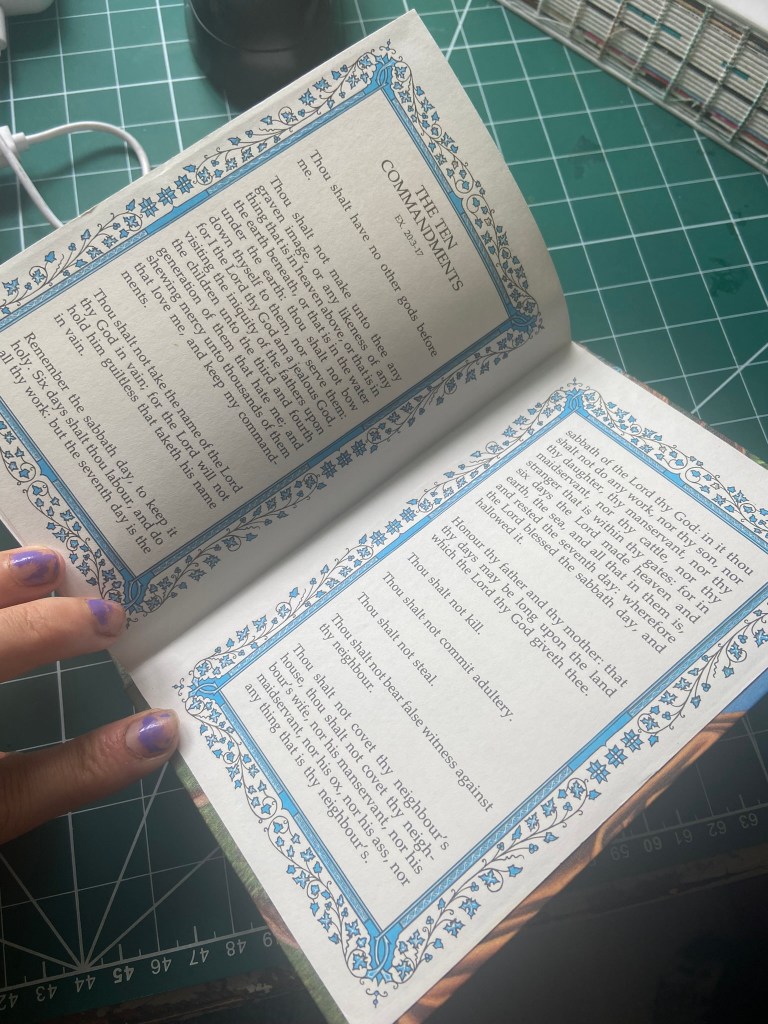
There are some gorgeous illustrations in this book though – 16 full colour pages to be precise. These are also printed on a much thicker paper (bordering a card thickness) I think these illustrations help to break up the masses of text and to also feed the imagination and depict better what is happening in some of the stories and pages. It also adds a little something extra to make the book that little bit more treasured and high quality.
The spine- The illustration from the front of the book carries on into the spine and the back cover. The illustration runs all the way around the book. The title Holy Bible on the spine is again in the gold foiling but from the distance sitting on a bookshelf I would struggle to see the title because it blends in with its dark background; the dark brown of the trees in the illustration.
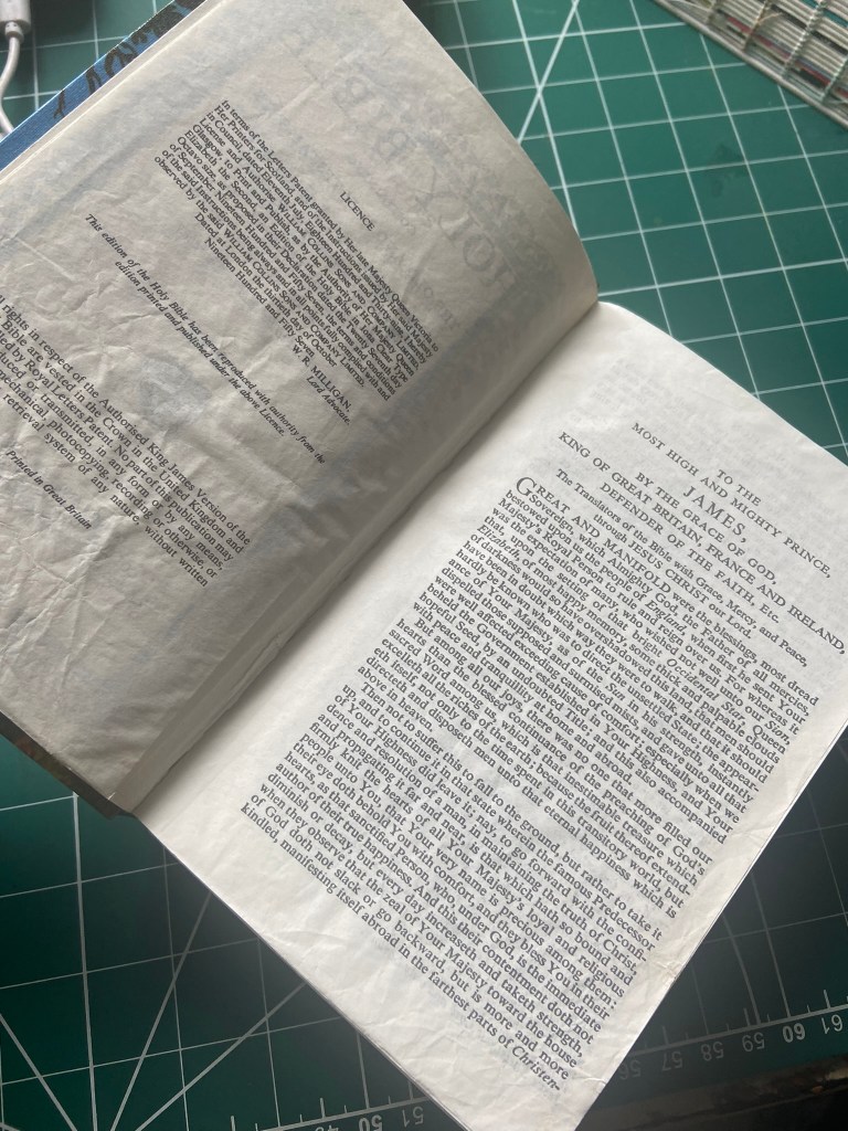
What about the front matter? – The first inside cover shows the “presented to” page which is for when you give the book as a gift for someone; like my grandparents did with me. This page is very ornate and allows the person to write their own personal message for the person they are gifting the book to and for it to be seen and felt as if the gift is to be treasured. On the following pages there is a prayer that is inside a coloured, ornate border and the opening title page for the book with a dedication to King James (which is the time this version of the Bible was published) it also states that this was a copy that was to be used in churches! On the following pages before Genesis begins there is further dedication and blessings to King James.
What about the end matter?- The end of the Bible has the 10 commandments in a coloured border on the inside back covers and then before that there are several pages of key word pronunciations so that you can better read and understand.
Conclusion! – This is a very attractive version of the Holy Bible, it is perfect for gifting to special people in your life or for special occasions. It is aimed at children which I can see from the use of bright colours and the illustrations but as far as the thin pages and the pages full of small text are concerned, it isn’t entirely child friendly. This I imagine was a difficult task for whoever designed this edition anyway because the Bible isn’t exactly the easiest book to design for. It isn’t like the Bible can be shortened or reworded either! I said above that the Bible isn’t really a piece of art but I am going to contradict myself and say that maybe this edition is! It is more for the purpose of gifting and having as a keepsake to pass down the generations and for admiring as a thing of beauty more for the practicableness of reading it.
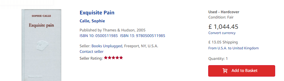
3) Exquisite pain by Sophie Calle


This was a book I purchased when I was at college. I was interested in the author and photographer Sophie Calle and her controversial work that I have explained more in my video!
The book is a little smaller than A5 and is very simplistic again. The book is cloth bound again for that timeless, classic look and similar to the Bible uses foiling for the front and back covers. There is also an embossed image on the front which is different and isn’t seen in many books. The colour scheme throughout is Red; Red can be quite a difficult colour to convey.. it can mean love or anger and I think that this book is a mix of the two considering it is based around a relationship break down and break up of hers that affected her for many years…
What is the function of the book?– The function of the book is to journal her diary and photographs on a countdown to the end of her relationship. It is informative but only for people who wish to delve into the personal life of Sophie Calle. Other than the stories that are being told it is a publication filled with personal and random photographs that she took on each of the days leading to the relationship breakup. The book is supposed to be quite sorrowful and expressive and I think this is portrayed with how it looks. The author is a photographer and her style of work is very quirky and controversial and I think the style of her book she wants to express itself as a piece of art… the fact that since it was published in 2003 it is now a rare and expensive book!
What is the front cover like? – The front cover is hardback and cloth bound. As I have said with the previous cloth bound titles this is to make the publication look more luxurious, expensive and a timeless classic. This book will not date, I have had it since 2003 now and it still looks as though I could have brought it brand new today. The simplistic cover is timeless and will stand the test of time. The title and authors name on the front uses red foiling. As I explained above, I think Red was used to convey her love for this man and also the anger at her hurt and loss. The foiling makes the simple cover just that bit more aesthetically pleasing. There is an embossed image of an old vintage telephone which it used as this was the way she used to contact him and ultimately he contacted her to end the relationship. It is embossed in the cover like a stamp-this could also be seen as how this event in her life was imprinted into her for many more miserable years as she explained in the book. The publishing house also appears at the bottom of the cover. All in all the cover is very simple and basic, I think this is how it was supposed to be though – it is about a relationship breakup so it is not going to be happy and cheerful! Also, I think with the simplistic cover it allows the reader to be more intrigued as to what is happening inside the book.
How many pages? – The page extent in this publication is 281 pages.
What is the paper quality like? – There are various papers used in this book. The majority of the pages are a glossy, thick, high quality paper but there are also some textured papers in this publication. The thickness of all the paper I would say is the same but it uses glossy, matte and textured paper. The first half of the book is her 95 day countdown to unhappiness and the pages leading to day 1 (the middle of the book) use glossy paper; this could be because she is a photographer and usually you print high quality photographs using glossy paper. The textured paper is used in the second half of the book where the countdown and the photographic journaling end and she allows other readers to join her in explaining their moments of Exquisite pain. It is like the author uses different papers at different stages of the story. The edges of the pages of the book are a shiny metallic Red which again links in to Red being love and pain but also luxury.
What Typeface? – For the titles and main body of text she uses a clean looking serif typeface but to highlight the days of unhappiness in her book she uses a san-serif in bright red- possibly because this is more aggressive, bold and abrupt.
What is the weight of the book? – This book is very slimline; slightly slimmer than A5 size. It is quite a chunky read but to hold in your hands is quite a petite read! (excuse the french pun!) I can imagine this book being read sat outside in French cafes.. it is the perfect size to fit into a handbag or for a student (reason why I bought it!) to carry around in a bag.
What is the inside of the book like? Images/text? – The first half of the book is Exquisite pain. The first half of the book is love and anger wrapped up together. It is a photographic daily journal leading up to day 1 where her love leaves her forever. It documents raw emotion. The colour Red represents this; it runs deep throughout the first half of the book and there is continuity with each page having a Red border around it. On the photographs that accompany her daily writings there is the use of the red sans-serif bold, abrupt typeface that stands out and if it had motion would slap you around the face! When the middle of the book is met this signifies the moving on stage where she seeks reassurance and pain from others in sharing similar stories and she decides to constantly repeat her story to others and her feelings of loss and anger daily until gradually it gets so repetitive and she eventually tires of it, is fed up feeling like it and eventually gets over it. The second half of the book is very repetitive in the storyline and the layout. The left hand pages are the same content pretty much on (give or take a few sentences she changes) every page until the end. She is telling herself ever so slightly on each page different versions of her hurt to try and evict the feelings from her body. The left hand pages are where she asks other reader and French civilians to tell us their own stories of hurt and pain. The second half of the book uses the matte textured paper and loses the abrasive red border around the pages; it is not as intense as the first half of the book… it has a more calming effect.
The spine- The spine is quite balanced out. It has the authors name at the top, the title of the book in the middle and the publishers logo embossed at the very bottom. Again, the text uses the red foiling and the use of the clean serif typeface.
What about the front matter? – The front of this book slowly and gradually (almost quite bitter and sarcastically) lead you into the story. The first inside covers are plain black and then following on from that there are several pages of double white pages with the left hand page being left blank. The first right hand page has a simplistic logo at the very bottom of the publishing house and the right hand page to follow that one has a page with just a small title at the top. The next page following on is a sarcastic dedication to the man who left her and who she dedicates the book to. The following page after that describes the dictionary meaning for Exquisite pain. There are then two red double pages that follow where she explains what the book is all about before the story begins.
What about the end matter?- The end of the book isn’t quite a slow, tormenting lead.. the end of the book uses a very clever way to display an Index and then just signs off simply with the printing information and a final blank closing page with just the iconic telephone sat right at the bottom as a haunting reminder of what was.
Conclusion! – As with the other cloth bound books that I have looked at for this exercise I feel like this allows for a timeless, classic look that will stand the test of time. Exquisite Pain in itself is a work of art as well as a journal detailing a story of heartbreak, hurt and sorrow. The book is again very simplistic in its design but it is reflective of the mood and feeling of the book. The only thing I am not keen on is the type on the back cover. The grid is one column and the text is spread the whole way across but then stops about 1/4 from the bottom. There doesn’t seem to be a hierarchy for this. The tracking and spaces between the words is too much too. It is like you have to drag your eyes reluctantly and literally jump from word to word to read it. I like the hidden meanings behind different elements on this book; the embossed telephone that is a haunting reminder – embossed and imprinted into her emotions. The red that appears throughout to symbolize the love yet anger she felt.
4) The Secret Garden (seasons laser cut edition)


I bought this copy purely because I wanted to buy the special edition of Dracula that I found on a visit to Whitby Abbey but stupidly didn’t buy!.. they are now sold out everywhere else! I ended up buying this copy of The Secret Garden because I am familiar with this story (whereas I am not with Dracula I suppose..) but this copy doesn’t look as beautiful as the Dracula edition:


The edition of Dracula is just strikingly beautiful! The Red and black contrast each other beautifully whilst the black also signifies darkness and fear with the red echoing the presence of blood. The red pages also tie in nicely with this. It is just a hauntingly, beautiful piece of work!
Whilst my copy of The Secret Garden isn’t as beautiful, it is still a fine piece of art and craftmanship!
What is the function of the book? – The function of this book is to tell the story of The Secret Garden but to also be treasured as a limited edition copy and for it to be seen as a work of art. The appeal of the book isn’t necessarily for the story itself but to awe in the beauty that is in the laser cut design. This is a collectors book that would be put on display as a work of art as well as literature. I bought the book for the aesthetics alone and the Dracula edition lured me in even more so I am sure a lot more people would buy this for the way it looks as supposed to just the story itself.
What is the front cover like? – The front cover is a beautifully laser cut design relating to the book, cut out on a pale green card. The underneath book is a purple hardbook book. There is a protective sleeve on the book as the book is a collectors edition to keep it clean and protected from sun fade and dust. I am guessing the designer chose the laser cut design to be printed on pale green as this best represents a garden. I also noticed that the rest of the books in this season Spring series feature pale pastel colours on their covers. Pastel. pale colours are very popular in the Spring season so this is possibly why? Dracula was in the Autumn series which would explain the bolder, darker colours that represent each book in that series. The title The Secret Garden is embossed into the hardback book with gold foiling underneath the laser cut design.
How many pages? – There are 282 pages in this book.
What is the paper quality like? – The paper quality in this book is that what I would expect in a normal hardback book. The pages are of average weight and are matte texture. They don’t have any fancy tipped edges.. the cover does all of the speaking for the book. I also looked on Amazon where I bought the book and found the details for the print and pages:
two-color printing on 105 gsm stark white paper with sewn binding.
What Typeface? – The typeface used on the front cover is a clean looking serif typeface. It is embossed snuggly on the hardback book where there is a gap in the lasercut design. The same typeface flows into the pages and the story.
What is the weight of the book? – The weight of the book is typical to that of an A5 hardback book and similar page extent. This wouldn’t be a book that is needed to be carried around anywhere though, it is purely to be treasured and looked after in the home so it doesn’t necessarily matter about how much it weighs.
What is the inside of the book like? Images/text? – The inside text of this book is just like any other story book of its kind. The colour scheme of purple runs throughout and matches the cover of the book. The chapter headings are in the colour purple and there are full page illustrations in there with quotes from the book in a script typeface which are in a similar style to the laser cut cover and again in purple.
The spine- The laser cut design from the front goes on into the spine and the back cover. There are little windows laser cut out on the spine at the top and bottom. There is also the title of the book in the middle and the authors name at the bottom. These are written in purple onto the green lasercut card.
What about the front matter? – When you open the front of the book there is the blurb on the book on the inside cover. On the right hand side page there is a purple page in the theme of the laser cut cover with a “This book belongs to..” space where you can gift the book to a special person and write their name in for them. It is very ornate and intricate in design which matches the feel of the laser cut design- laser cutting is a very intricate and fine skill. On the following pages the colour scheme of purple follows through and on the left hand page is the number edition of the copy that you have.. mine is 6323 of 10,000. This is presented to you on a sticker that has obviously be applied by hand with care which also goes to show you the exclusivity of this book. The next right hand page is the title page for the start of the book and has publisher details etc and the following pages that then follow are the contents of pages and the beginning of the story.
What about the end matter?- The end of the book pretty much comes to an abrupt end.. on the inside back cover there is a double page filled with purple and then on the pages before that on the left hand page is the end of the story and the right hand page a blank page with “The end” on it.
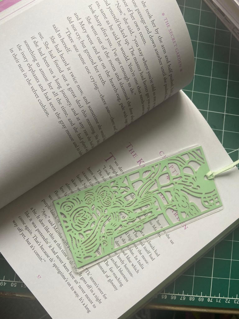
Conclusion! – I really like this book but purely just for its laser cut design and the fact I can display it and it looks so beautiful! I don’t like it as much as the Dracula edition though because that was truly stunning! I also like the added touch with the free laser cut bookmark which also has a protective cover on it. It is a nice added extra to a collectors piece. The protective cover is a great idea for a collectors edition as it will help keep the book safe from spillages, sun fade and dust and help keep its value.
If I had to be extremely picky I would have chosen different colours for the book and have tipped edge pages (the page edges a different colour). The purple is a lovely colour but I feel that the green could have been a darker green (but again that wouldn’t tie in with the rest of the Spring series considering it is supposed to be pastels for Spring!) I would have liked to have seen a greater contrast with the colours.
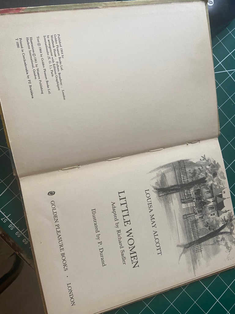
5) Little Women (1964 edition)


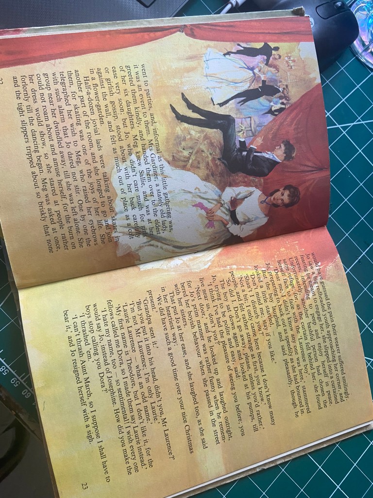
I have always loved the film Little Women. I first watched it when I was about 7 years old and I just loved the different personalities of all the 4 sisters! One of the characters is called Amy and she was blonde and she is the artist in the family so I always steered more towards her as my favourite one! My Grandma even bought me a limited edition decorative plate that depicted Amy in France painting at her easle. I absolutely loved it until about 20 years later when my Dad smashed it to bits accidentally and I ended up buying a replacement that is the same but just isn’t… When I found this copy of Little Women at my Mums in her old stuff that I didn’t even know existed, I had to steal it! I thought it would be a perfect example of a timeless classic and how well they age through the years!
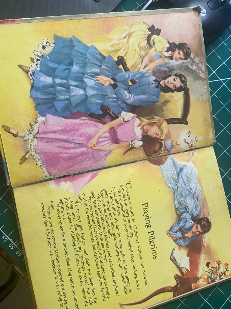
What is the function of the book? – The function of this book was to tell the story of Little Women to young children; I have read the ending though of this book and they have missed out the death of Beth so I am guessing this was a copy that was supposed to shelter children from the harsh reality that Beth got ill and died!- I can imagine that this would be typical for the time period it was published! It was clearly aimed towards children from the bright and engaging illustrations that are on the cover. I just love how Amy is portrayed to be Blonde and Pink- just like me! ;p
What is the front cover like? – The front cover is a cloth bound hardback front with the gorgeous illustrations of the 4 siblings – the illustrations are so detailed and it is easy to see the personalities of the siblings from the drawing! The illustrative cover though is printed on a glossy sheet and then stuck over the top of the cloth cover. The bright, engaging illustrations really draw you in to wanting to turn the pages and read the rest of the book. The text on the front is justified left which is the correct way of doing things!- but it is placed on the right hand top side of the cover where there is a gap between the drawings. The title is also in Pink which matched Amy’s outfit below it. The logo for the publishing house is on the bottom right hand side.. I would have liked to have seen it align up with the title above more but that’s just being picky!
How many pages? – The page extent of this book is 60 pages. A nice amount for a young learner.
What is the paper quality like? – The paper is almost like a thin card – making it ideal for a children’s book where children might be rough pulling on the pages!
What Typeface? – The book uses a mix of sans-serif and serif typefaces. There is a contrast between the two on the front cover- the authors name is a sans-serif font whilst the title is a serif font. The serif font runs throughout the whole book.
What is the weight of the book? – The weight of the book again is about right for what you would expect an A5 hardback book to be.. It weighs more than a typical children’s book of today but is better as a hardback because it protects the book itself from spillages, dirt and from being torn or bent.
What is the inside of the book like? Images/text? – The book is a mixture of illustrations and text. On the pages where there are illustrations they are beautiful- they run over the text. The illustrations have that beautiful vintage look and style to them. The pages that don’t have illustrations are full of text but the text isn’t small- it is legible and readable enough for older children and early teens.
The spine- The spine is cloth bound with the title and publishing house embossed into it. The pages are also stitched together which is an old fashioned way now. Usually nowadays the spine and pages are glued.
What about the front matter? – There are not many pages at the beginning of the book before the story starts. There is the inside front cover which has another beautiful full sized illustration of the 4 siblings.. the next double page is dedicated to the publishers information and the main title page for the book
What about the end matter?- The end of the book is the same as the front of the book- there is the same full sized illustration of the 4 siblings which covers the back inside cover. The page before that is blank and then the page before that the story comes to an end.
Conclusion! – Just like the other books on here that I have looked at with a cloth binding this one was no exception; I really like how classic and timeless a cloth cover looks. I didn’t think about just having a cloth spine though and having the cover printed glossy over the top of the cloth. I really like the bright animated illustrations in this book too – they make the book come to life! It is quite nice how for a children’s book it isn’t too much of a hefty read either!
5) David Carson – Nu Collage
I bought this book at the start of enrolling with OCA! I was new to David Carsons work and when I found he had a new book out I had to order it! It is also signed by him which makes it even more special! My photograph I took of it when I received it also made it to his Instagram page which was also quite cool!
This is very different from his usual work! – (watch the video to see his toe and you will see what I mean!!) this book showcases a lot of experimental collages he has done through the use of photography. This is a very minimalistic book and mainly focuses around the artwork than text, there is a lot of negative space in this book too which makes it a very clean looking publication.


What is the function of the book? – The function of this book is for David Carson to document his collages and to show off his work- it is more or less like a portfolio of his nu work. There is very limited information in the book- just annotations and notes about the pieces he has showcased in there. The book in itself is a work of art and would definitely be a coffee table conversation starter for a designers home.
What is the front cover like? – The front cover is a very clean looking design. The front cover is a hardback with a lot of white negative space and one of David Carsons designs in the middle. The design he has chosen for the front cover works really well against the clean white background. The red and black contrast against it. There is also experimental typography which he is renowned for and even that is in different point sizes so that it contrasts.
How many pages? – There are no page numbers in this publication! It is however a chunky publication! It is a book that you dip into every now and then- I don’t think I’ve read this page by page ever.. I just dip in and take inspiration from pages when I see fit! I think Carson wanted it to be a laid back portfolio of work and if anyone wants to reference parts of it to do what he would probably do and use post it notes or scraps of magazines etc!.. The lack of pages numbers could show a lack of structure but this just goes to prove David Carson’s personality; that he doesn’t go by rules- he goes with what feels right for him!
What is the paper quality like?– The paper quality is like a glossy, medium, thick card. I think he has chosen glossy because the publication is full of photography and glossy really works well with photographs – it also makes the publication look high quality.
What Typeface? – What typeface exactly!!- David Carson is famous for his experimental typography and in this book it is no different! Except in this book the typography he uses is mostly cut out of magazines and composed into collages. The text that he uses to annotate his collages is a sans-serif font- he writes in his own nu style of writing e.g. rite instead of right, he uses small i’s instead of capitals… he really is following his own rulebook in this publication!
What is the weight of the book? – This book is a chunky, hefty book! It is very heavy! That could be a combination of the hardback covers and the thick paper that is used for the pages. This definitely is not a book to be carried around!
What is the inside of the book like? Images/text? – The inside of the book is a lot of white negative space and photographs of his collages, studios, family.. it is a portfolio showcasing everything recent that is happening in his life. There is very little text, only when he annotates a collage or explains a little bit about a photograph he has taken. The photographs and his artwork very much lead and the text just accompanies.
The spine- I remember hearing an interview with David Carson before he released this book saying that he really liked the exposed spine when he saw copies start being produced and he wanted to keep it that way. It is a modern approach to book binding and is definitely a way of making his book stand out against the rest in its genre. The exposed spine shows the work that has been involved in gluing and stitching the pages together. It is also nice to see the bleed of the pages come through and create random blocks of colour.
What about the front matter? – There is no front matter as such to this book; there is no introductory it is just straight into it with his designs. There is the inside front covers which have a strike of blue through (a hint to his surfing interest) and which luckily for me he has signed!
What about the end matter?- The end matter is similar to the front of the book – there are no pages especially dedicated to closing the book in anyway but David Carson does dedicate the second from last page of the book hoping that the reader has enjoyed the publication and then the page after that is a nod to the publishers and anyone who helped contribute in any way. There is still a design on the inside back cover so he goes all the way to the end of the book. literally. The back cover has a photograph of him and has a little bit of writing about the designer and what his new work is all about.
Conclusion!- From taking a closer look at this book I really like how there is no structure or rules to it and how it is a reference book but within its own rights a reference book purely to dip in and out of whenever inspiration is wanted. I like the use of negative space and the modern, clean look it gives off. I also like experimental typography and how this book doesn’t conform to what a typical book should look like! – especially with the exposed spine!
