Postcard 4 is going to reflect my areas of interest within Graphic Design.
I want to make this postcard very much a mixed media piece.
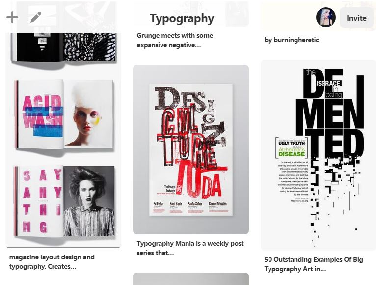
My interests in Graphic Design are Typography (even though this is an area I need to improve on!) magazine design and layout and using more hand drawn/arty elements.
I have looked on Pinterest for inspiration and have decided I am going to use a range of different media for this postcard;
- Homemade DIY letterpress/stencilling type
- lino printing
- Typewriter
- marker pens/highlighters
- ripped paper/neon pink post-it notes
- collage of magazine cuttings
- Acrylic paint and spray paint
- Photoshop
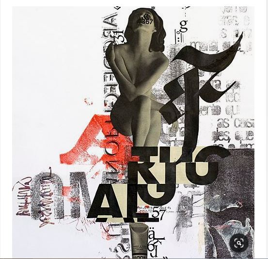
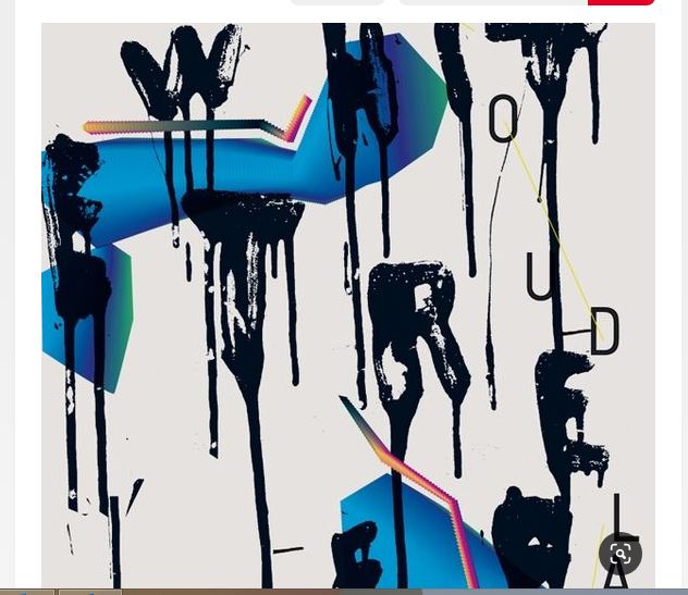
I have always had an interest in grunge type – just like how Alternative music is my favourite; grunge type is very much this but in a visual form! If the alternative 90s songs I like were written in art form they would be written in grunge type! Grunge type is visual Nirvana!
However my design so far is quite feminine and soft in appearance. The grunge look is messy, chaotic and can be “dirty” looking. I plan to do a grunge look but soften it by using pinks. The grunge look is rebellious and my postcards have a certain feel of that with the theme of it being strong, feminism, independent, not playing by rules and wearing/looking how you want to.
I have looked at a few styles of Grunge type and some stood out to me and gave me ideas on what I could try out in my own designs. I particulary like the typewriter one. (I have an old typewriter at home I have meaning to use in a creative way.) I figured I could type some words out relating to my postcard and layer them up in a similar way to the one I found on Pinterest.
I will do some mixed media pages in my sketchbook to experiment with the different techniques.