i AM SO EXCITED FOR THIS POST! I know!…. I really do live a sad life! 😛 I do love stumbling across acidental design gems though and I feel like this might be one of them!….
I was writing my post for my “Netflix, Design and Chill” section of my blog about the Abstract Documentary featuring Paula Scher and Pentagram when I accidentally stumbled across something interesting as part of my research for assignment 1!
Trying to find a decent image to upload to my blog post about Paula Scher led me to her Pentagram design agency website in which there was some of their recent work uploaded to the home page; one of Pentagrams clients is a Catholic University in Los Angeles called Loyola Marymount University and their publication called LMU Magazine. LMU have been completely rebranded by Pentagram and their relaunch issue “The Los Angeles Edition” is EVERYTHING relating to my design ideas around the “Los Angelenos”
….(I can’t help but feel a bit smug that my mind obviously works in a similar way to the great Scher and Pentagram! :P)….
The idea and concept, the images used and the way in which they are used to link to the articles and cleverly communicate a message. It really stands out to me. The layout is also flawless. The content of the magazine obviously also looks very educational and interesting and completely relates to my interest of LA, the history, the locals, the arts and surrounding area.
I HAVE to get a copy of this magazine to read!
https://www.pentagram.com/work/lmu-magazine/story
So.. I have emailed LMU very nicely to see if they might kindly be able to send me a copy all the way across the pond to me! (I know!.. it’s quite a long way!) I eagerly await their response!
Here are a few snippets of the articles I found online.. the layout and images used!
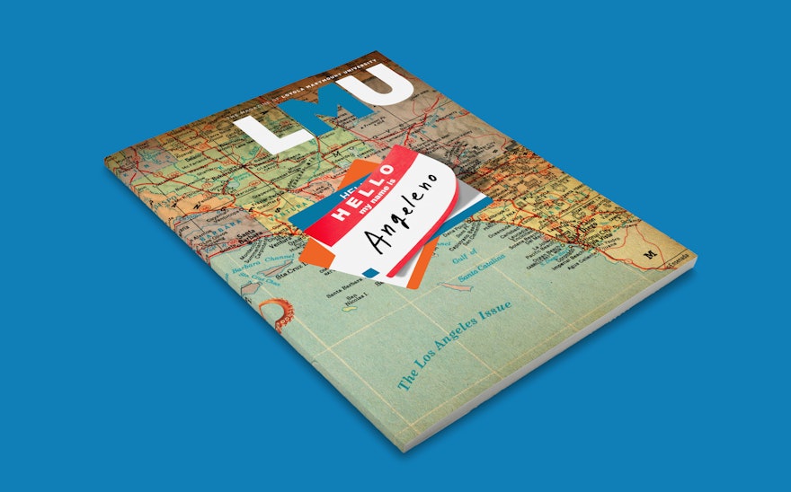
The way “The Los Angeles Edition” has been incorporated into the design is also very clever – Following Schers love of maps this has been incorporated into how seas would be written on maps.


