
The Brief:
This exercise hopes to broaden your understanding of other book designers’ work by looking at their cover designs. Start to identify the kinds of book covers you are drawn to, and critically assess why you think these designs are successful.
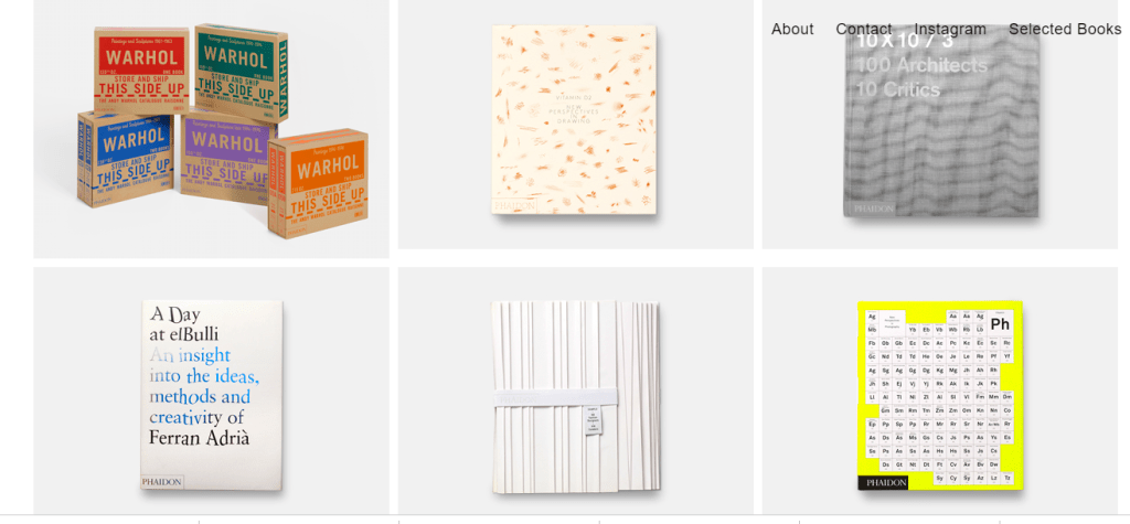
1) Undertake a combination of library and internet research into the following designers, identifying a number of book cover designs for each. Reflect on their conceptual and/or expressive approaches to design. Write a very brief description of your selected cover designs and a brief overview of the designer – try to focus on keywords rather than long descriptions. Do this in note form, using the designer and the chosen example design to visually inform how the information appears in your learning log.
- Phil Baines
- Coralie Bickford-Smith
- Derek Birdsall
- Kelly Blair
- Irma Boom
- Suzanne Dean
- Julia Hastings
- Linda Huang
- Jost Huchuli
- Ellen Lupton
- Peter Mendelsund
- Paul Rand
- Paula Scher
- Jan Tschichold
- Wolfgang Weingart
Phil Baines
In 1958 Phil Baines was born in Kendal, Cumbria. He was studying for the Roman Catholic Preisthood in Durham where he abandoned his studies in his fourth year. He took quite a change in career and enrolled in 1981 onto a foundation course at Cumbria College of Art and Design. The Following year he moved to London to study Graphic Design at St Martin’s School of Art.
Baines work was mostly experimental typography that took inspiration from medieval manuscripts and writings (His studies in priesthood could have inspired this!) Baines work was influenced by written sources rather than visual. Baines was also inspired by the use of Letterpress which was popular at the time as this was a process he felt he could do all himself without the need for outside production or involvement. Baines then went on to study for two more further years at the Royal College of Art and he graduated during a pre-recession boom for Graphic Design. His work was then featured a lot in Typography Now: The Next Wave and he contributed two typefaces to Fuse and guest edited its fourth issue.
In 1991 he became a part-time senior lecturer in typography back at St Martin’s and he has remained there since. He became a professor in 2006 and St Martin’s has been a client of his design work ever since; college promotional material, Toulon typeface (which is incomplete) and signage.
Most of Baines work has been for Arts organizations and galleries and his DIY ethic extends to his chapel-like-studio which he built from his own design in his back garden. He also reproduces his own stationery.
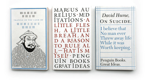
As Baines started the beginning of his life studying religious studies, I can see the religious influences in the book covers above. I am not a massive fan of these designs if I am completely honest. They remind me of what I might see in a Cathedral or in a museum about monks or priests or medieval times on information boards etc.. Even though they are modern designs, they have a very dated feel to them. The designs are very simplistic with the use of very little images. I like the middle book cover design the best; I do like the typeface that is used and the fact he has separated the author, title and publisher into sections by adding the Red. Although it is a busy looking cover it has a lot of negative space and room to breathe because of how the letters are spaced out.
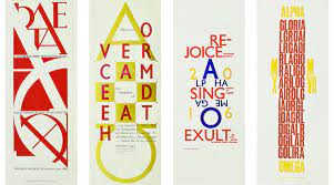
I like the above designs the best. I like the use of the bright, contrasting colours unlike the previous designs. I like how he has tried to make the letters visual as images as well as just letters themselves. These designs still give me religious vibes though which is not really something I like.
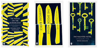
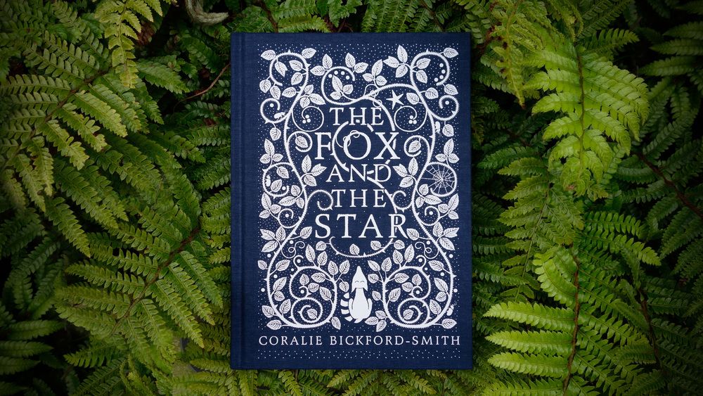
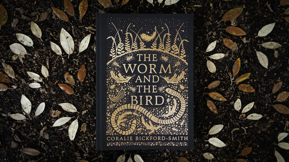
Coralie Bickford-Smith
Coralie Bickford-Smith is a Graphic Designer who studied and graduated from Reading University after studying Typography and Graphic Communication. Coralie currently works at Penguin Books (everyone’s dream job right! *sigh) and her work has featured in numerous international magazines and newspapers including The New York Times, Vogue and The Guardian. Coralie worked on a clothbound series for Penguin which attracted worldwide attention and harks back to the world of Victorian bindings and a golden age of book binding. Coralie has also been commissioned by a wide range of clients including Fortnum & Mason, Waterstones and Arts Council England. In 2017 she was awarded an honorary Doctor of Letters by Reading University.
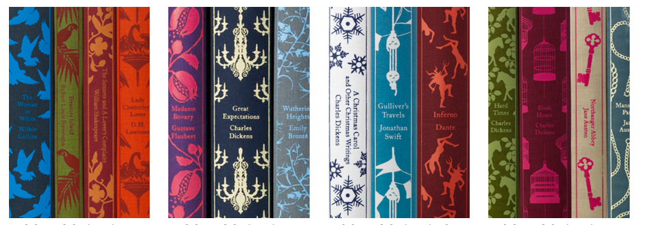
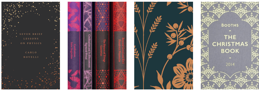
Her work above reminds me a lot of Surface Pattern Design possibly because her book designs use a lot of very repetitive designs. The colours are also very rich! They remind me of rich tapestries or luxury textiles! – This makes sense though as she designs cloth bound titles!
Derek Birdsall
Derek Birdsall was born in Wakefield, Yorkshire in 1934 and attended Wakefield College of Art and Central School of Arts and Crafts in London. Birdsall was taught the difference between beautiful lettering and typography- concentrating on clarity and legibility. Birdsall didn’t qualify however and therefore started his career late in the 1950s and 60s where he got most of his work through design commissions. He designed covers for Penguin Booksand Pirelli calendars. He also art directed Nova magazine in the 1960s and designed books for the Tate, V&A and the British Council. In 1987 he also started teaching at the Royal College of Art.

A lot of his work actually looks like it would appeal to me, I have ordered his book “Notes on Book Design” so that I can get some helpful knowledge on better designing my own covers!
Kelly Blair
There wasn’t a lot of information about Kelly Blair other than what is on her own website. She states that she is a freelance Illustrator and an Art Director of Pantheon books and that she loves Cats and Dogs and Instagram. I followed her on Instagram and to be honest her content is pretty varied; a lot of photographs from random things that she finds daily that influence her.
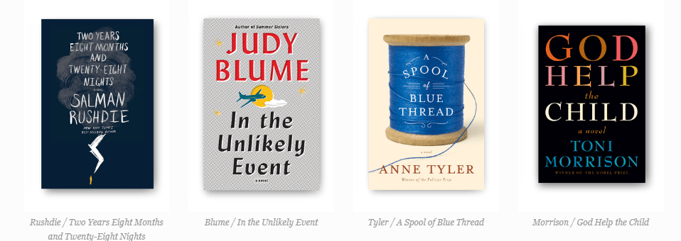
Her designs are also very varied; I cannot distinctly see a style she necessarily has and that can be recognized as her designs. She uses a mixture of illustration, photo manipulation and collage work in her designs. It also looks like she uses her own style of lettering to use on the titles such as the You cover. The only cover I am familiar with is the cover for Judy Blumes In the unlikely event which is one of her new adult novels. Some of her cover designs seem to be quite representative and “obvious” and more or less spell out what the book is about; such as Judy Blume (plane crash) and A spool of Blue thread (pictured as a spool of Blue thread).
Irma Boom
Irma Boom born in 1960, is a Dutch Graphic Designer who specialises in book making. Irma Boom has been described as the Queen of book making! She has created over 300 books and has a reputation for being really artistic within her field; she has a bold, experimental approach to her designs and challenges traditional books both physically and printed.
Having researched her the little bit for this exercise her work has intrigued me and made me think outside the box about how far you can push the boundaries of book design! Irma uses embossing, die cutting, she adds scents to her pages by mixing scents in with her writing and drawing inks and she challenges the size and thickness of books with her “fat books”. Creating a sensory tactile experience when designing and making books is very important to Boom and she aims to inspire discovery and interaction.
She has been known to have books without page numbers or an index and to print a book in reverse. Book covers of hers have been left blank and the book itself been distorted in size and thickness. Inner pages have had hidden colour codes or motifs and every detail she analyzes to maximize its potential to engage and outdo the digital competition!


Suzanne Dean
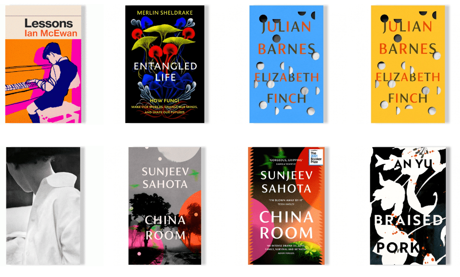
Suzanne Dean has been Creative Director at Vintage Books (which is part of Penguin!) since 2000. She designs and art directs all of Vintage’s imprints which include Jonathan Cape, Chatto & Windus, Harvill Secker and Bodley Head. Suzanne established the design for the Vintage Classics list in 2007.
Mark Haddon, Haruki Murakami, Ian McEwan, Julian Barnes, Yuval Noah Harari, Richard Flanagan, Margaret Atwood and Rachel Kushner are a few well known authors that she has designed covers for. Her covers include The Curious Incident of the Dog in the Night-Time, The Sense of an Ending, Sapiens, Atonement and The Handmaid’s Tale.
Before working at Vintage, Suzanne graduated from Kingston University, where she studied Graphic Design. Her first job was in general design, focusing on food packaging and brochures. A year later she was approached to join Penguin Books as a Senior Designer, working for Hamish Hamilton. Three years later she joined Macmillan, to work on the Picador list.
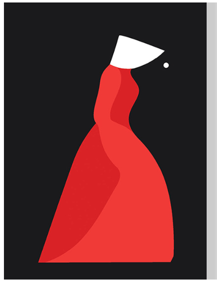
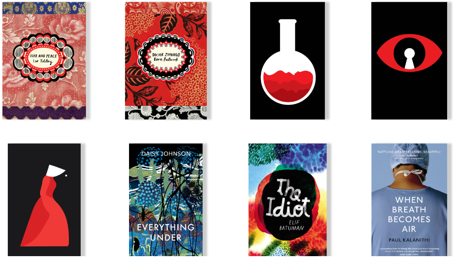
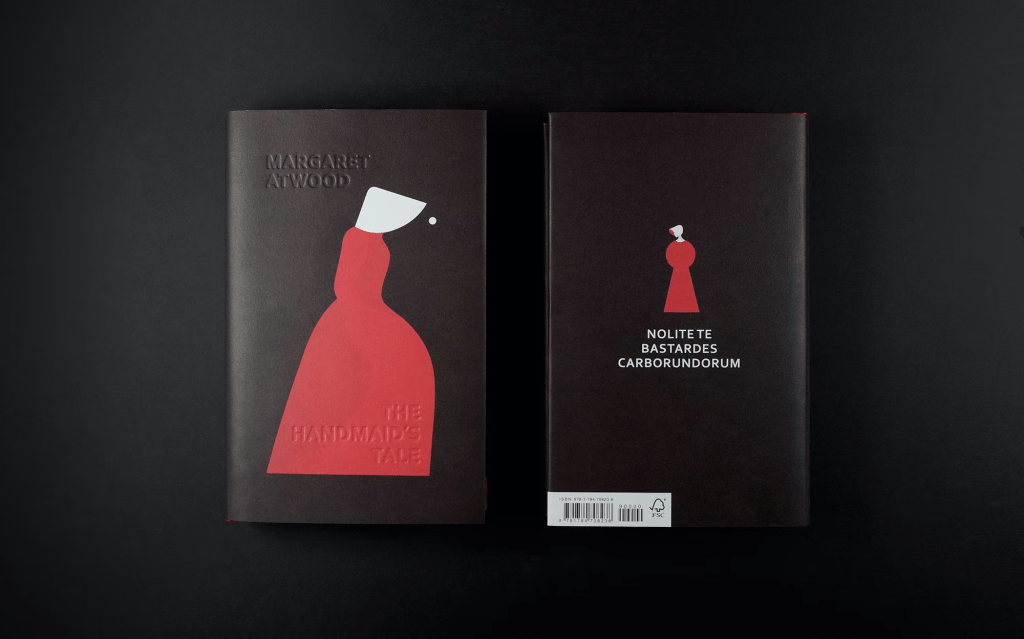
I really like the above design for The Handmaids Tale. The textured cover with the embossed title and the simplistic design that clearly portrays the handmaid in her white bonnet and Burgundy dress. The back cover is a keyhole that has been played into the image of a woman- this symbolizes the woman’s imprisonment. It is very simplistic but well thought out. It makes you stop and think and understand what is happening in the design and to then eventually find out what the story is about.

I also like the Bond covers above; I like how the typography is quite experimental and is depicting images using just the type and negative space alone. I like how the colours are simplistic and bold and how they ooze the era from the time the books were written (the 50s and 60s).
Julia Hasting
Julia Hasting was born in Bremen, Germany and she attended the Kunsthochschule Kassel where she and some first year students studied an advanced design class of the poster designer Gunter Rambow. One year later Ramboe took on a position at Karlsruhe University of Arts and Design and picked a number of students to apply for the school and to move with him. Hasting was already working with commercial clients so seemed the best fit for this! – In 1997, she founded her design practice and was designing corporate identities, posters and books .
In 1998 she met Phaidon Press’s Art Director Alan Fletcher in London to which he spotted her potential and hired her to design more books for Phaidon. Her outlook and design methods shaped Phaidon setting a new standard in the industry. In 2000 Hasting moved to New York City to become an Art Director and lead the design team for Phaidon. During her time at Phaidon she had many award-winning books and became one of the most successful art publishers in the world.
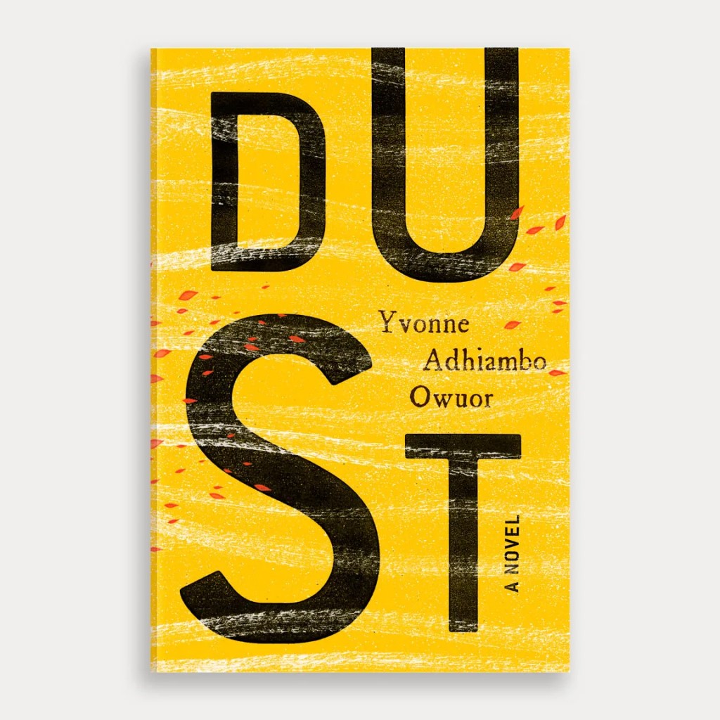
Linda Huang
Linda Huang is a graphic designer based in New York. Her work has been recognized by The Type Directors Club, Print Magazine, The New York Times, among many others. Huang is currently an associate Art Director at Vintage & Anchor Books- part of the Penguin Random House.
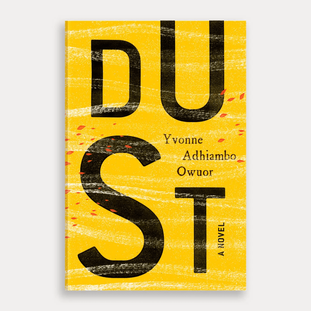
I really like this cover because I can hear and feel dust move when I look at it! It is like the wind blowing and moving the type and the dust across it!- very cleverly done! I like the bold use of typography and how simple but effective it is.
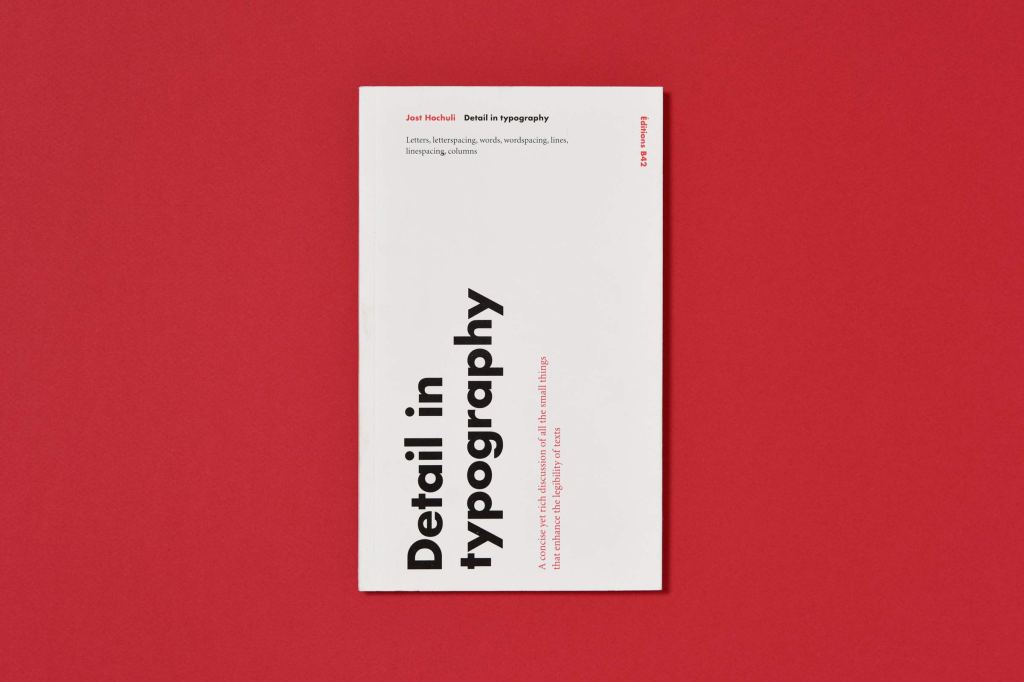
Jost Huchuli
Jost Huchuli is a little bit of what I like!- Swiss typography! Old school Swiss type designer who is known for his book covers. I love Swiss typography where everything is sans-serif, legible, readable and has clarity! I’ve had a look on Amazon again because his book “Detail in typography” might be another read that would interest me!


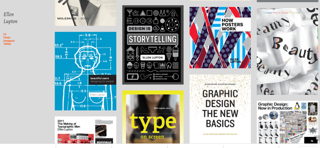
Ellen Lupton
Ellen Lupton is a Graphic Designer and educator known for her love of typography. I have seen a few Skillshare classes that she has done on typography and Graphic Design! Ellen has written numerous books about Graphic Design for a variety of audiences; she has written for Print, Eye, I.D and The New York Times. Ellen also does a lot of poster design.
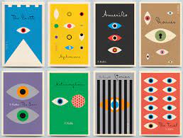
Peter Mendelsund
Peter Mendelsund is the associate Art Director of Alfred A. Knopf and is also a classical pianist. His designs have been described by The Wall Street Journal as being “the most instantly recognizable and iconic book covers in contemporary fiction.”
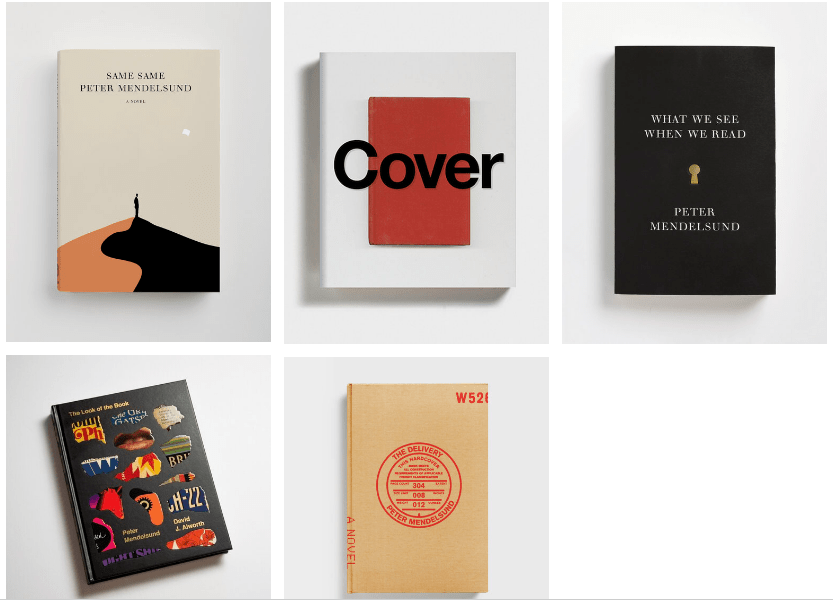
I really like the idea behind this cover… I am not going to lie, I don’t like the typeface!- it feels all too much a little bit Microsoft Word.. but the idea behind the cover being a play on the title and how it plays out a different version of the hierarchy but actually how your mind still sees and is able to read it correctly.
I have noticed he used collage quite a lot in his work too such as this one below- I quite like how a simple cut out collage is all the cover needs to represent what its talking about.
He also designed a series of books for the Czech author Kafka and these books puzzled me slightly!- I just kept asking myself what is the significance of the eye on every single cover?! The designs were colourful and simplistic and supposedly great but I just didn’t get it! I then read that the eyes create intimacy and paranoia (I guess when you go to sleep and picture some evil eyes peaking over the bed at you in the middle of the night kinda thing!) The eyes I guess are the window to the soul so I can see where he might want to convey a horror through the use of eyes:
“So, as you can see, I’ve gone with eyes here (not the first or last time I will use an eye as a device on a jacket-book covers are, after all, faces, both literally and figuratively, of the books they wrap). I find eyes, taken in the singular, create intimacy, and in the plural instill paranoia. This seemed a good combo for Kafka- who is so very adept at the portrayal of the individual, as well as the portrayal of the persecution of the individual. I also opted for color. It needs saying that Kafka’s books are, among other things, funny, sentimental, and in their own way, yea-saying. I am so weary of the serious Kafka, the pessimist Kafka. Kafkaesque has become synonymous with the machinations of anonymous bureaucracy- but, of course, Kafka was a satirist (ironist, exaggerator) of the bureaucratic, and not an organ of it. Because of this mischaracterization, Kafka’s books have a tendency to be jacketed in either black, or in some combination of colors I associate with socialist realism, constructivism, or fascism- i.e. black, beige and red. Part of the purpose of this project for me, was to let some of the sunlight back in. In any case, hopefully these colors, though bright, are not without tension”.

https://www.flavorwire.com/146667/new-kafka-book-covers-by-peter-mendelsund
Paul Rand
Paul Rand is one of the most iconic Graphic Designers of our time. He was best known for his corporate logo designs which include famously IBM. Rand was famous for pioneering a distinctive American-modernist style and for changing Americas mind on Visual communication and corporate identity. His influence was European Avant-Garde and he brought these ideas to America mixing Art with commercial design. Through his use of colourful combinations, typography and different media he wanted to show his desire to “Defamiliarize the ordinary“.

From looking at the book covers he designed you can clearly see an Art and political influence. De Stijl and Dada is present in these designs as well as an abstract influence. The book covers are mainly designed from basic shapes and basic colours. The first cover is giving me Josef Albers vibes with the overlapping of colours and shapes.
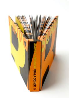
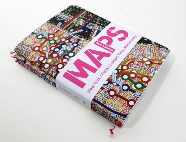
Paula Scher
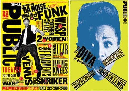
I am quite familiar with Paula Scher having watched her episode on Netflix Abstract. Paula Scher is famous for her hand type! She also illustrates drawings of maps. Paula mixes influences from pop culture and fine art into her designs. In the mid 90s she redesigned The Public Theater identity and her popularity grew from there. Scher is inspired massively by wood type and this was a massive influence in the new look of the Public Theater- the idea was to get people who normally wouldn’t be interested in going to the theater going!- The design was to appeal to a broad audience from the inner cities to the outer boroughs, especially those who hadn’t been attracted to theater. Her iconic wood typefaces, silhouetted photographs and bright flat colors for the theater’s posters and billboard brought it back to life and appealed to a new audience. Her emphasis was that text or type needs to have movement.

Jan Tschichold
Jan Tschichold was a German calligrapher, typographer and book designer. He played a significant role in the development of graphic design in the 20th century. He developed and promoted principles of typographic modernism and subsequently idealized conservative typographic structures.
Tschichold was the son of a sign painter and he was trained in calligraphy and because of this Tschichold began working with typography at a very early age. Raised in Germany, he fled to Switzerland during the rise of the Nazi party as they found Soviet posters in his house and associated him with communists. His emphasis on new typography and sans-serif typefaces was deemed a threat to the cultural heritage of Germany which traditionally used Blackletter Typography. The Nazis seized much of his work before he was able to flee the country.
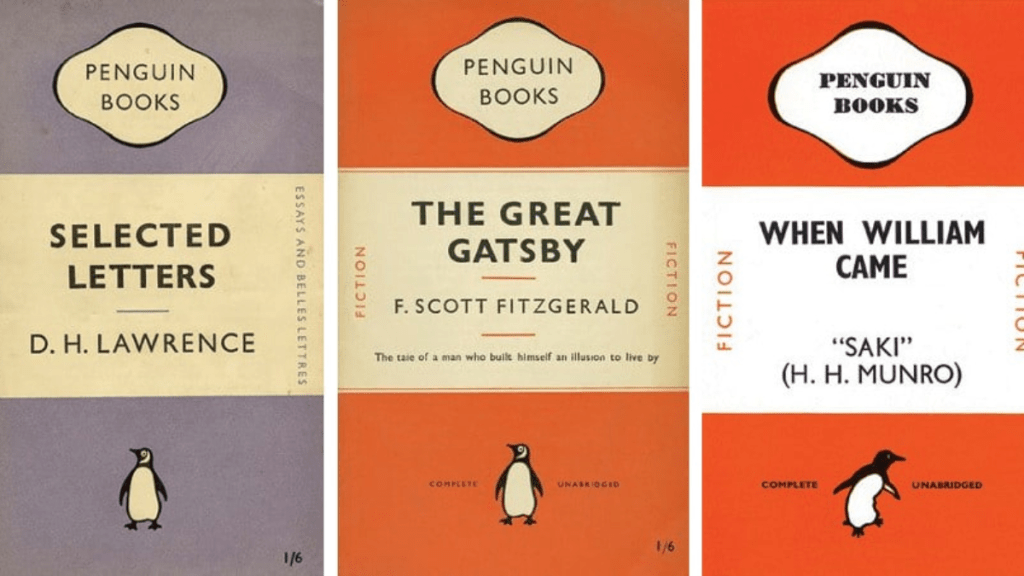
His direction of the visual identity of Penguin Books in the decade following World War II served as a model for the burgeoning design practice of planning corporate identity programs. He developed a standardized practice for creating the covers for all of the books produced by Penguin. He personally oversaw the development of more than 500 books between the years 1947-49.
Wolfgang Weingart
I am familiar with Weingart as he is a massive influence of Chris Ashworth and Roy Cranstons whose experimental typography work I have explored in past assignments. He was a Swiss Graphic Designer who specialized in Swiss typography or New Wave or Swiss punk typography. Weingart takes the basic principles of Swiss typography but then puts his own twist on it by bending the rules and creating a “Weingart style“.

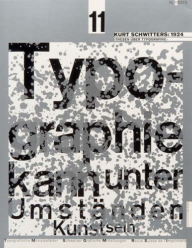
I really like Weingarts style; I love the use of bold, san-serifs fonts and a clean, minimalist look. I like how the text is all different sizes and widths to create contrast and the use of negative white space.
2) Compare and contrast some of the cover designs.
For example, how does the cover of Peter Mendelsund’s Kafka series compare with Coralie Bickford-Smith’s gothic horror series for Penguin? Are these expressive or conceptual in nature? Are they both conforming to genre expectations, or are they challenging them in some way? Do Jan Tschichold and Ellen Lupton’s cover designs have anything in common? Make a drawing, sketch or tracing of the covers you’re comparing to help give you a better understanding of the imagery, typography, and arrangement within the design.
Use your learning log to reflect on your comparisons, identifying which covers you think are the strongest and why.
I first decided to print out some of the covers and lay them out on my desk to see which ones contrasted and compared:
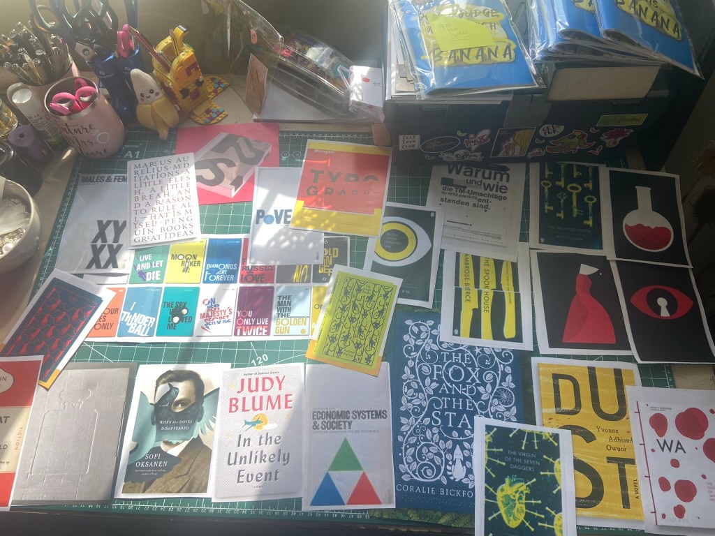
I then put Post-It notes on the ones that I could identify as being similar or contrasting in any way:
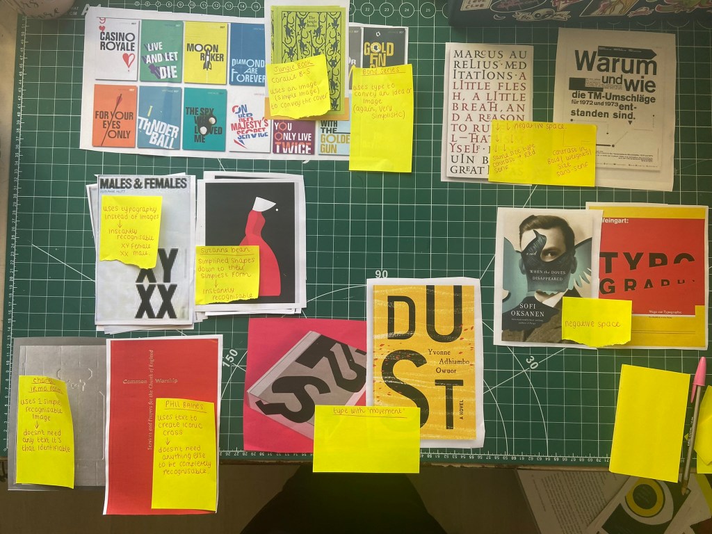
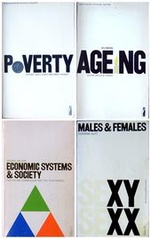
I have compared Derek Birdsall’s designs with that of Suzanne Dean (below) and from appearances they do not look similar at all, the design principal is though. Suzanne Deans illustration of The Handmaid is simplified down to its bare essentials; the illustration is the woman’s shape but just using blocks and shapes of colour to take it down to its simplest form. Derek Birdsall’s designs follow the same principal but using simple typography and basic imagery to convey the design. Birdsall’s designs use a lot of negative space and that is similar of Dean’s design. From Looking at Suzanne Deans illustration we as a reader can tell it is a woman wearing a red dress and white bonnet. from looking at Birdsall’s design we can see from Males & Females through the use of simple typography that XY is male and XX is female -nothing else needs to be added to this design, design at its simplest and purest. They are both conceptual in nature because there is hidden meanings behind both of these designs styles.

The next 2 books I have compared which are similar in their principles are Derek Birdsall’s work and Irma Booms work. Both of these designs are embossed onto the book and both are significant and recognizable in their own right. Birdsall uses type to construct his cross symbol whereas Irma Boom doesn’t need type to symbolize that the image on the front of her cover for Coco is a Chanel bottle.


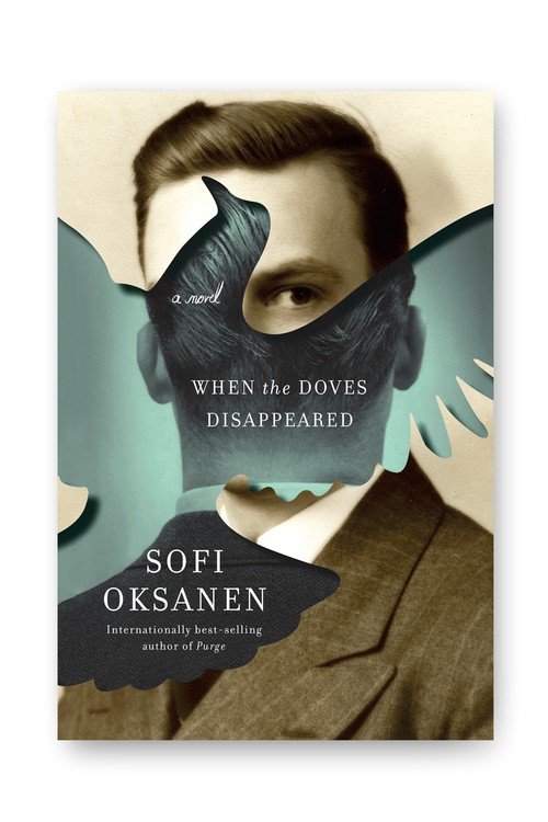
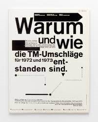
I next compare the designs below because I noticed they all use negative space but in a very different way. In the first design by Kelly Blair negative space is used in a creative way as part of the design by using the space to represent the shape of a Dove. The middle design by Phil Baines uses a typeface that is the same size for the whole cover but the spaces in-between the letters allow the design to breathe and for negative space to be present to some extent. The white border all of the way around the design allows it to breathe also. Wolfgang Weingart’s design allows for negative space but in a different way again; It’s use of type is very different too in that it uses text of different sizes and weights. Weingart’s bottom cover design shows negative space in that some of the type is missing.
Another 2 designs that are similar are that of Paula Scher and Linda Huang. They both wanted to design type with movement. I particularly like the design by Huang because it is so simple but so effective. The reader can almost feel the breeze on their face and the words and dust moving!
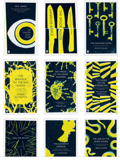
I compare Coralie Bickford-Smiths gothic series with Peter Mendelsund’s Kafka eye series and for continuity within the series I do like Mendelsund’s designs; it took a while for me to get my head around what the eye actually meant but now I have a better understanding I can see how an eye would work on each of the titles. The books themselves I believe are surreal and bohemian pieces of writing which I am sure again, explains the eyes! Also it might explain the bright colours and how the covers are quite surreal compared to what the stories are about. When you compare them to Bickford-Smith’s designs she has clearly shown that the books are dark and mysterious and might be of horror genre. She has used contrasting colours which make the designs bold and there is no doubt to what feeling the book covers are giving off and also what the genre may be. This is where the 2 designers couldn’t have been more different from each other if they tried!
3) Now, select three or more designers from the list that you are particularly drawn to either because you like their work or because you don’t understand their approach and research their design careers in more depth. Think about how they’ve responded to very different design challenges, whether they have an underlying conceptual and/or expressive approach and how their work has evolved over time.
The designers I am going to choose to look into more are:
- Coralie Bickford-Smith
- Derek Birdsall
- Suzanne Dean
- Jan Tschichold
- Wolfgang Weingart
I am already familiar with the work of Tschihold and Weingart but I like their work so it is always good to learn more about them.
A closer look at the work of Coralie Bickford-Smith
I was intrigued to research more into Coralie because she designed the cloth bound covers for the Penguin classics; from doing the previous exercises and looking at different books I really like the look and feel of cloth bound publications. Designing for my own covers in the future I shall keep this in mind! Having a closer look at Coralie’s website I can see that she writes and illustrates some of her own children’s books! She also designs her own prints and jewellery that you can buy from her website.
I followed Coralie’s work on Instagram and it seems she has royal approval with a photograph of Kate Middleton at Kensington Palace with her cloth bound series on her shelf! Her Instagram also shows a lot of influence from William Morris which makes a lot of sense when you look at her cloth bound covers. When I first researched her style earlier her work reminded me of textiles and surface pattern design. When I think of William Morris I think of leafy, floral patterns and I can see how this has rubbed off into her designs.
Her first and earlier titles “The Fox and the star” and “The Worm and the Bird” are quite different to the cloth bound classics that she did for Penguin in that these 2 titles were her own work and style of illustration and drawing. The covers she did for Penguin were similar to that of pattern design in that the designs were repetitive and taking influence from William Morris and Textile design. The covers she did for Penguin from what I can see on her Instagram was a lot more digital work than that of which she did by hand for her first 2 books.
A closer look at the work of Derek Birdsall
Derek Birdsall has strong typography roots and influences from Swiss typography and this is where I wanted to explore more about him as this is an area in which I am interested. I am looking forward to receiving a copy of his book – Notes on Book Design to read what he has to say about typography and what makes a good book cover.
Derek runs a design business called Omnific Studios with his business partner Martin Lee. The most high tech piece of equipment they have in the studio is an electric typewriter – Birdsall designs books still in a much traditional way!
Birdsall chose the name Omnific, whose latest incarnation he founded with Lee in 1983 because the idea of a design studio bearing its founders’ names made him nervous. He had a chat and decided that words starting with ‘O’ or ‘Q’ sounded nicest. Birdsall combed the dictionary dallying over Quarto and Octavo before choosing Omnific: ‘It’s nice looking and it meanings all-creating.’
‘I’m fond of telling people I was born just a year after the Bauhaus folded,’ says Birdsall. (He was born in Yorkshire in 1934.) ‘My first instinct when asked to design the Bauhaus book was to avoid doing so-called “Bauhaus” typography – in fact, there’s no such thing. That meant no sans serif type. Instead, I used Walbaum, which was cut in Weimar around 1805. The Bauhaus was in its own way a perfectly conventional art school –a hotpotch of styles, lifestyles and beliefs out of which some recognizable characteristics emerged. One of the most curious discoveries in doing the book was that an early Bauhaus emblem contained a swastika – well before the Nazis arrived. As designers, we tend to pluck from history those things that suit us. My first and best idea was that the book should look like itself.’
The Bauhaus book illustrates one of Birdsall’s most cherished views about what he calls ‘design redundancy’. He looks back to a time when printers produced elegant books without any need of an external ‘designer’ and strives to achieve simplicity and even a certain obviousness of effect. If a design works, says Birdsall, then there is every reason, whether it is your own or someone else’s, to use it again. Articulate and literate, he is highly suspicious of individual designer styles or fashions and is rooted in the classical influences which shaped his training.
In 1964 Birdsall formed the forerunner to Omnific Studios with Derek Forsyth, the advertising manager at Pirelli. Immediately Birdsall designed the first Pirelli calendar. He used the Beatles’ photographer Robert Freeman to set a Pirelli style based on the female form that swiftly became one of the visual icons of the era. When Birdsall and Forsyth fell out at the end of the 1960s, Birdsall handed over the Pirelli account to Forsyth. But there were other clients who would give him the creative freedom to remain at the leading edge of international graphic design. IBM commissioned him and remains a client today.
My favourite quote of his though has to be this one which I whole heartedly agree with!
‘White space is the lungs of the layout,’ booms Birdsall over my shoulder. ‘Clients don’t understand the function of white space. It’s not there for aesthetic reasons. It’s there for physical reasons. I want to do this entire book without a single reference to aesthetics. ’
https://www.eyemagazine.com/feature/article/white-space-black-hat
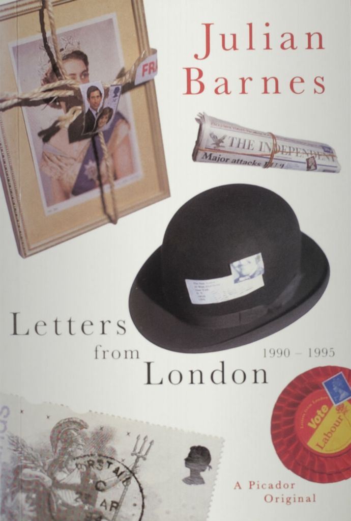
A closer look at the work of Suzanne Dean
Before working at Vintage, Suzanne graduated from Kingston University where she studied Graphic Design. Her first job was in general design, focusing on food packaging and brochures. A year later she was approached to join Penguin Books as a Senior Designer working for Hamish Hamilton. Three years later she joined Macmillan to work on the Picador list.
I have read an interview on Penguin website with Suzanne Dean and an author called Julian Barnes who she designs most of his book covers for. In this interview it shows you the first cover she designed 20 years ago which was for this author:
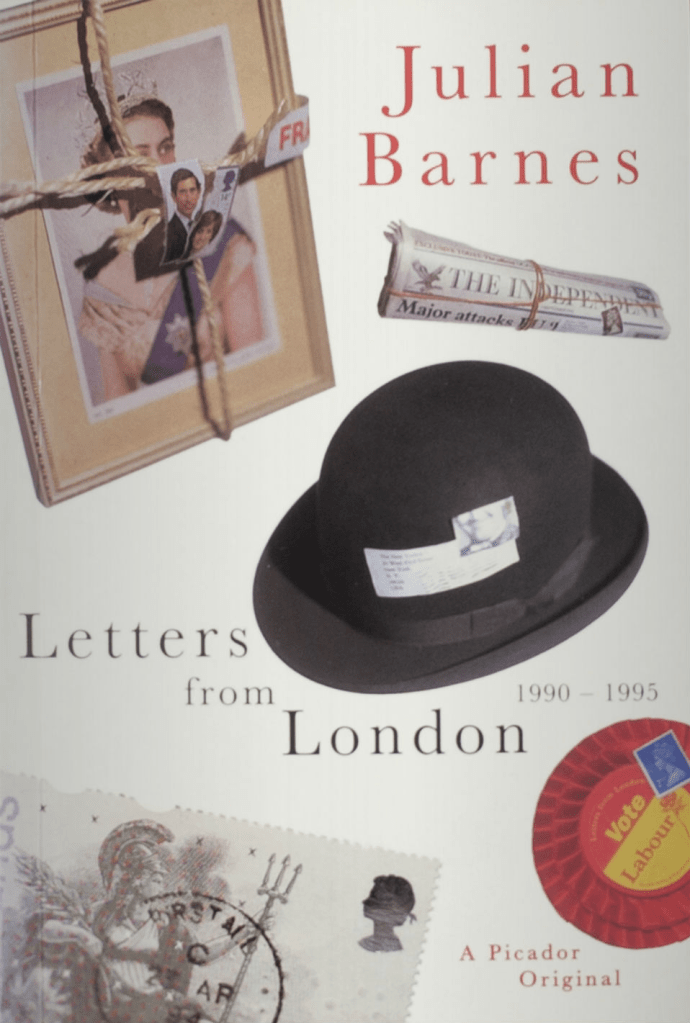
This is definitely a long way from The Handmaids Tale cover she designed!
If I put the two covers side by side we can see how far Dean as a designer has progressed!

I also listened to an interview with her:
https://spinemagazine.co/articles/interview-suzanne-dean
A closer look at the work of Irma Boom
I wanted to look a bit more closely at Irma Booms work because I quite like how she mixed handmade and different mediums with digital. I like how she questions what the role of a book is and how she challenges it. I never knew that the Chanel book she designed to be embossed was embossed all of the way throughout with no ink present.

Boom hasn’t always been received well though as she found out in 1987 when she was commissioned to design the annual Dutch postage stamp book:
“To start with, I thought everybody was right and I really was shitty. It was 31 years ago. And actually I’m currently working on a book which is about those stamp books. Part of that is about the controversy. I got hate mail, people totally disliked these books in every sense – the quality of the paper, the printing, the typography. As revenge against Total Design, I used Univers, Futura, Gill, used all the typefaces, everything! I was saying, “You didn’t want me? Well, I’ll do it again. Things didn’t get much better after the book was released, though. It was from the design community, surprisingly. And of course, not surprisingly, from the stamp collectors who had a subscription to the series. Many of them sent their books back – they said it was bad printing, complained there was no hyphenation, there is text running off the edges. They complained about everything! In the beginning, I thought people were right and it was a mistake, but now it’s considered my first best-designed book. A colleague of mine at the time described it as a giant, gigantic mistake. But a brilliant mistake“.
The book is now a part of the MoMA collection.
https://www.itsnicethat.com/features/irma-boom-in-conversation-graphic-design-160320
4) Finally, identify at least three different book designers you find visually engaging. To do this you might want to visit a library, bookshop, or browse online. Identify who designed these covers and find out more about them. Try to work out why you are drawn to them. Is it to do with genre or their approach to design? What is it about the design that captures you? What sort of imagery (if any) is used on the cover? How does the text relate to the image? What atmosphere or style does the cover evoke? Summarize your thinking in your learning log focusing on the kinds of book covers you are drawn to and why? Continue to document what these covers look like.
Kate Armstrong
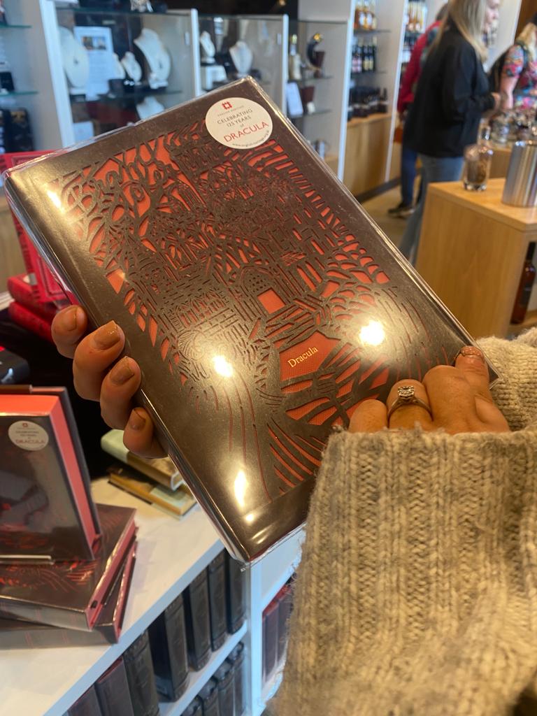
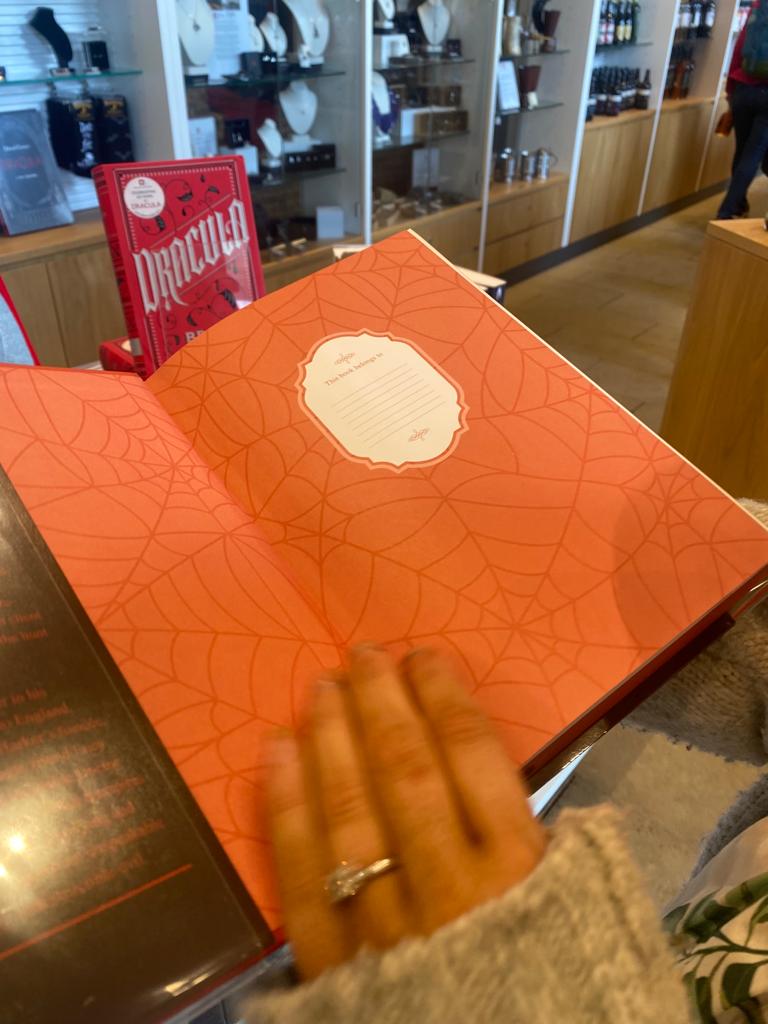
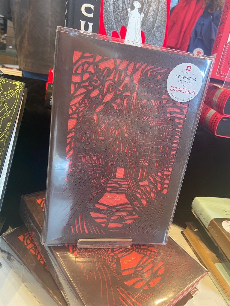
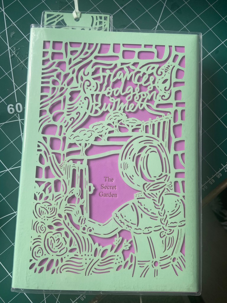
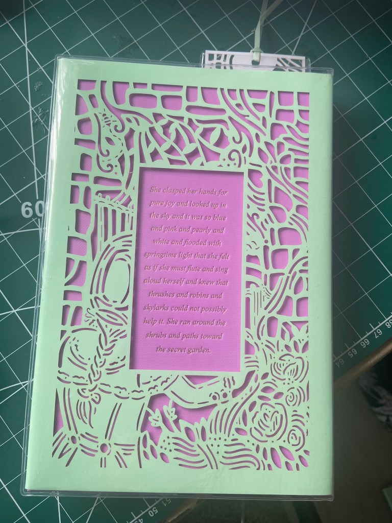
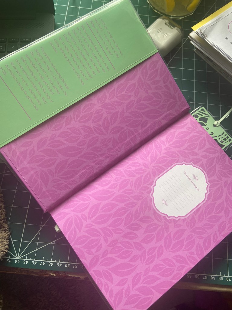
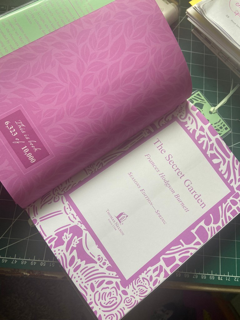
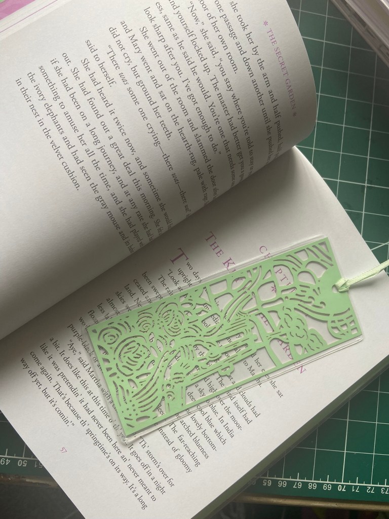
I knew as soon as I read this part of the brief that I wanted to find the illustrator or designer who designed the laser cut seasons series of books that I talked about earlier that I love! After doing some online research I found out that the illustrator is Kate Armstrong. I also found out that the series in which my Secret Garden book belongs is the last series she is doing! I just think the laser cut design is so beautiful and intricate! – the only issue is now that die cutting/laser cutting is quite popular in book design and isn’t really revolutionary or new anymore.
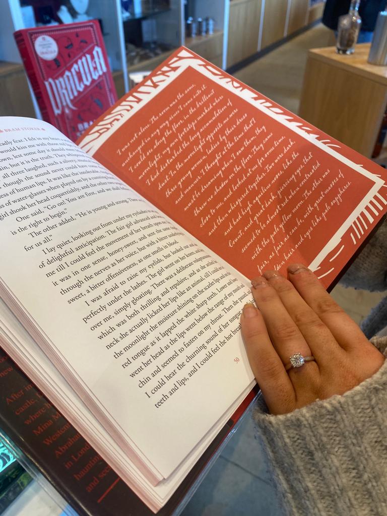
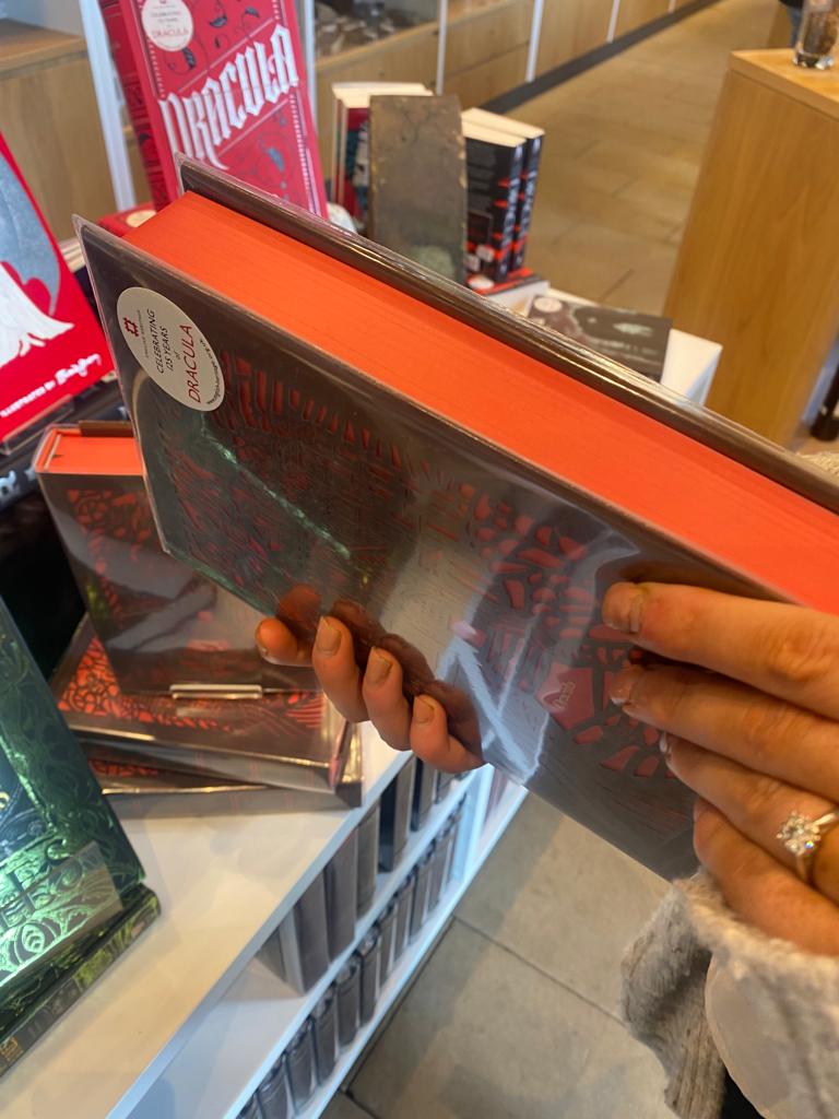
I just LOVE the Dracula edition… and previous in my post where I said it had sold out and I only found it in Whitby Abbey – I went on the English Heritage website and it IS on there! (I may have cheekily brought a copy too..)
https://www.english-heritageshop.org.uk/bk-hb-dracula-limited-edition-bookmark
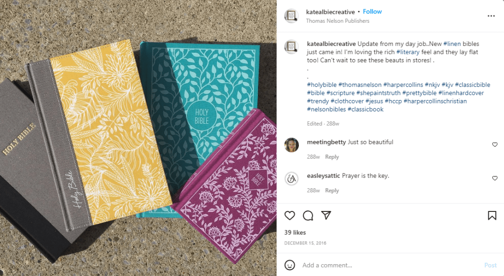
I had a look on Kates Instagram to see what other work she has done and by looks of it she does a lot of hand lettering, book cover design and Bibles!… She works for Harper Collins Christian.

Oh! One last thing.. she bakes some pretty nice looking cookies too!
https://www.instagram.com/katealbiecreative/
Jessica Hische
Jessica Hische is a lettering artist that I have followed for some time. I have one of her books and took inspiration from her when I was doing some lettering on a chalkboard.. I also have a book by Penguin on their classic Penguin covers (which is a good read!) and I remembered seeing a series in here that I also researched as part of Assignment 5: Core Concepts. Hische designed a Drop Caps series of books using just her lettering as the covers.
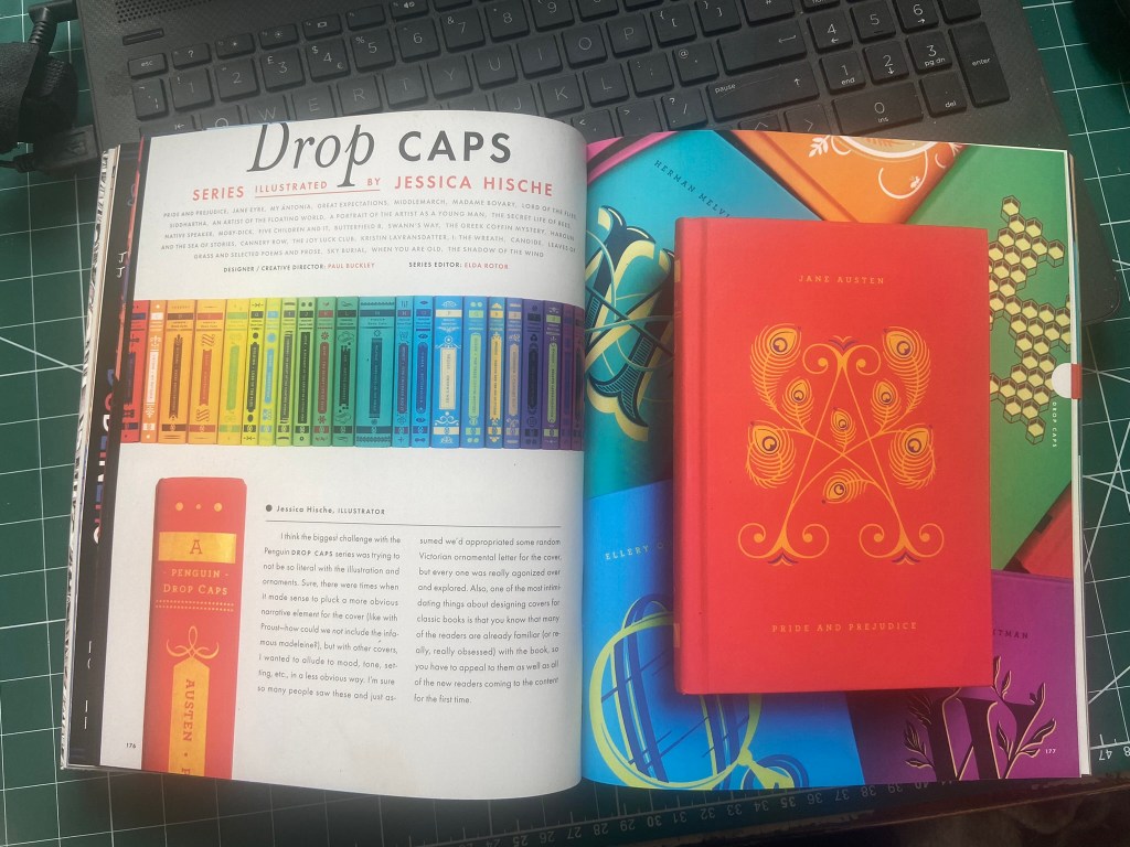
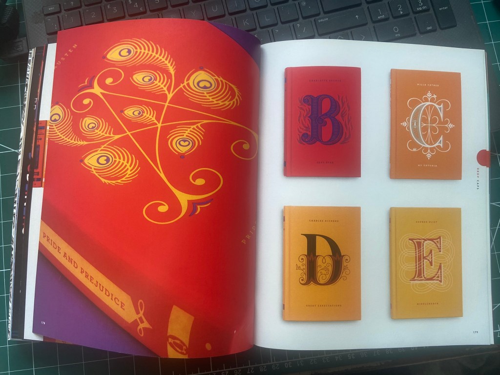

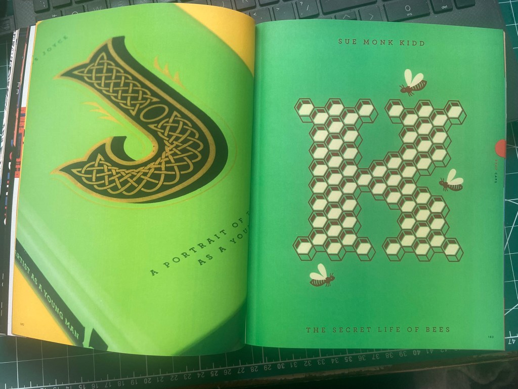
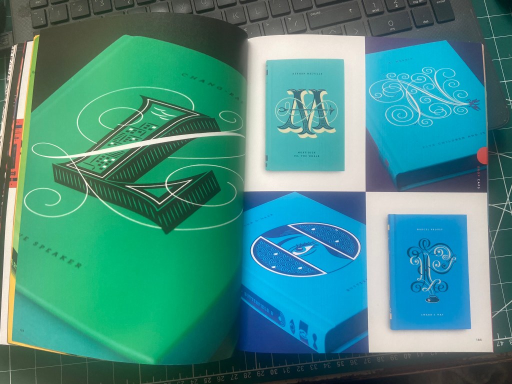
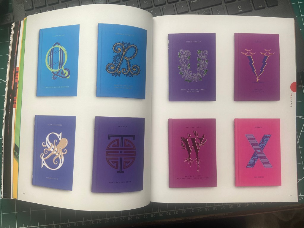

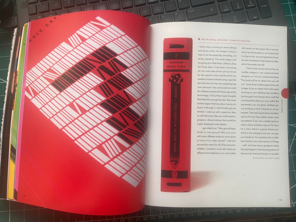
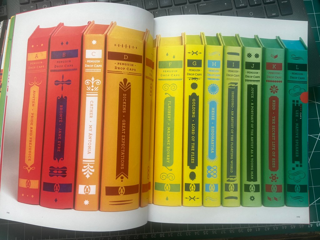
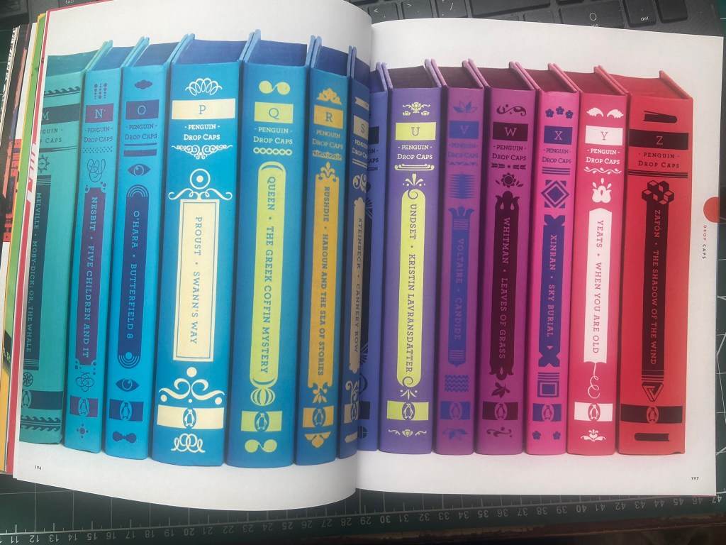
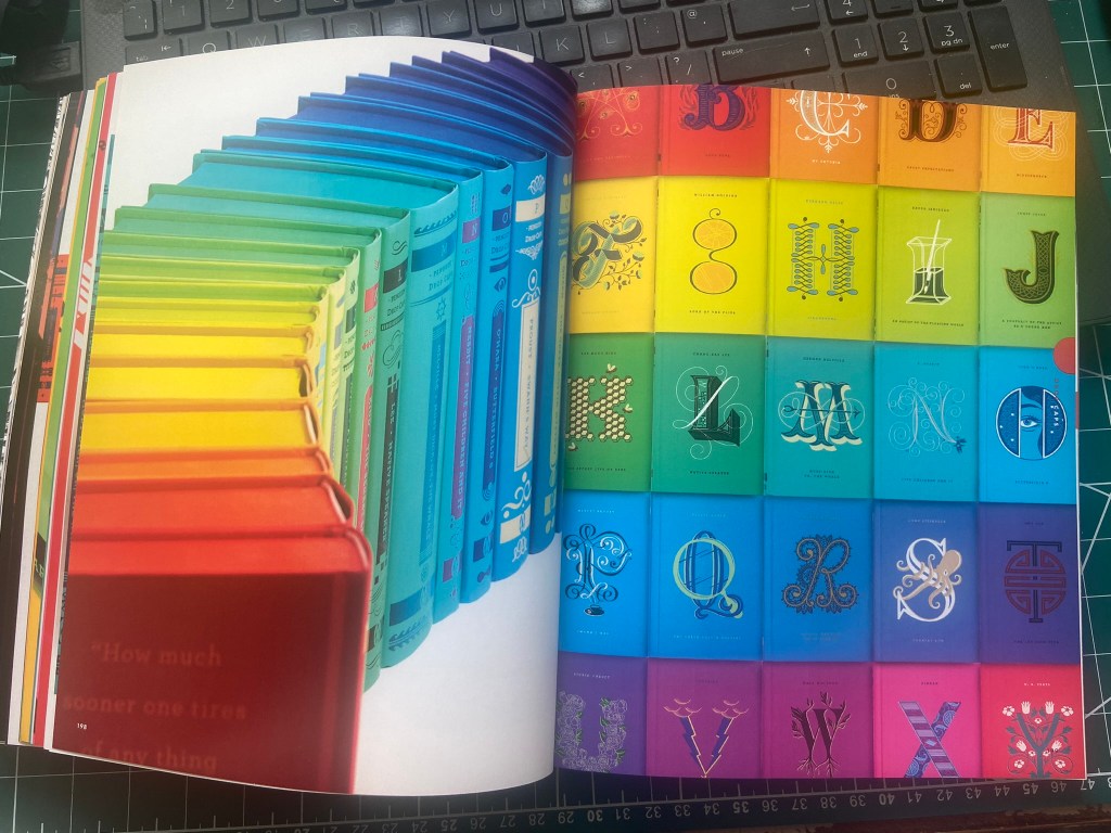
I love how they are all colour coded and the letters that she designs match the feel and era of the story that she is designing for.
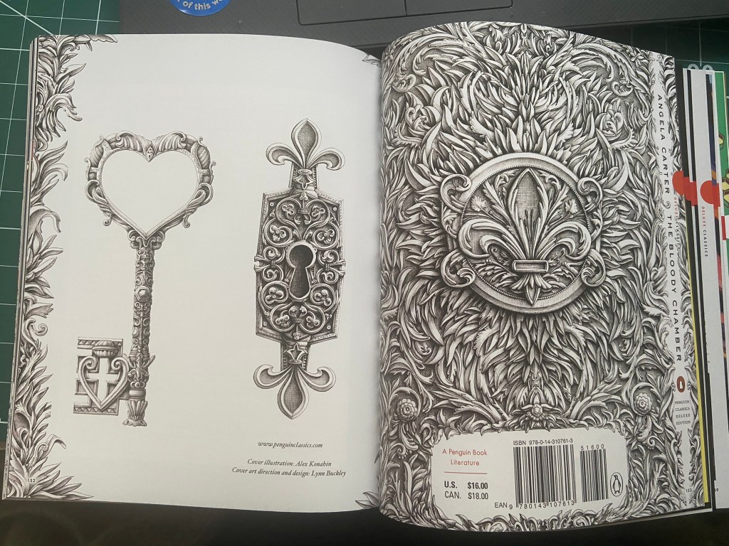
Alex konahin
Alex Konahin is a self-taught graphic artist, born in 1981 in Goulkevitchi Russia. He lives and works in Riga, Lithuania. He has worked for famous organizations such as Hachette, Amnesty International and Penguin Random House.
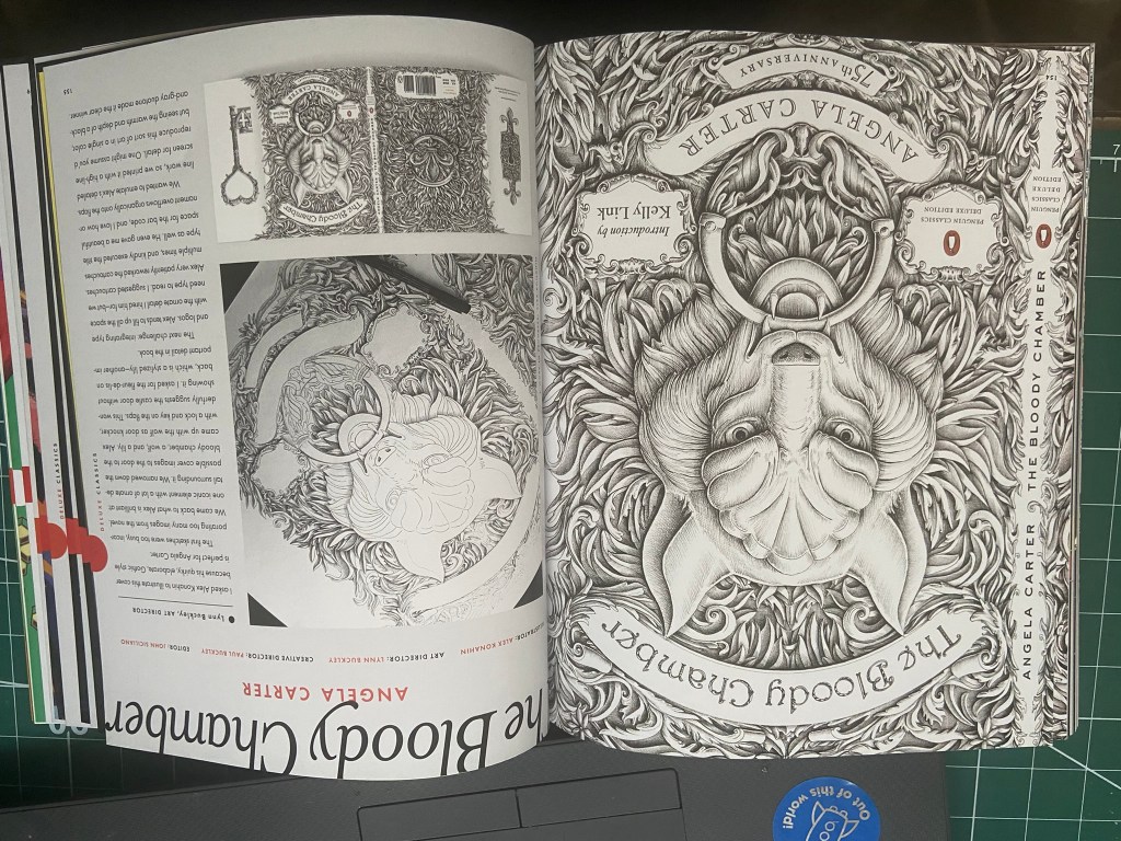
I came across some of his work again, in the Penguin classics book. He designed a cover for The Bloody Chamber by Angele Carter and it was all ink drawn and absolutely amazing! I love ink drawing- it is something I am good at but only wish I could be even better at! The back cover design for this book reminded me a lot of what I drew in my zine for The Secret Garden double page spread I did, where I did an ink drawing of a lock. His drawings are phenomenal though in the attention to detail and the amount of work that has been put into it! – There is something about Black ink drawings that is so special; it makes the piece look so deep, thoughtful and beautiful!
Conclusion
This was a top heavy exercise!- probably the most research I have done in an exercise to date! (or at least it seems like it!!) I understand the reasoning behind it all though and it has helped to find new designers that I had previously never heard of. (I have bought 2 books about the new found designers to read up on!) It has also helped to open my mind about good book design and also opened my mind about challenging briefs and to not to conform to traditional ideas.
