Pages 1-2: Helvetica (Sans-Serif)
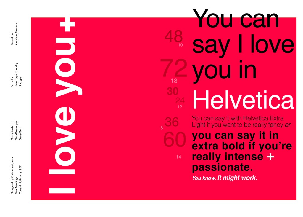
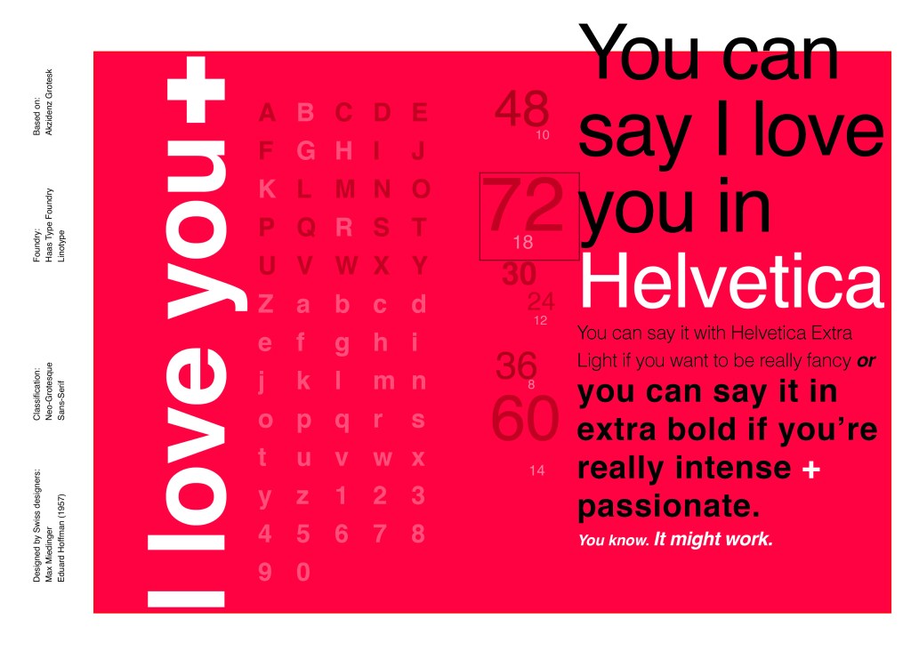
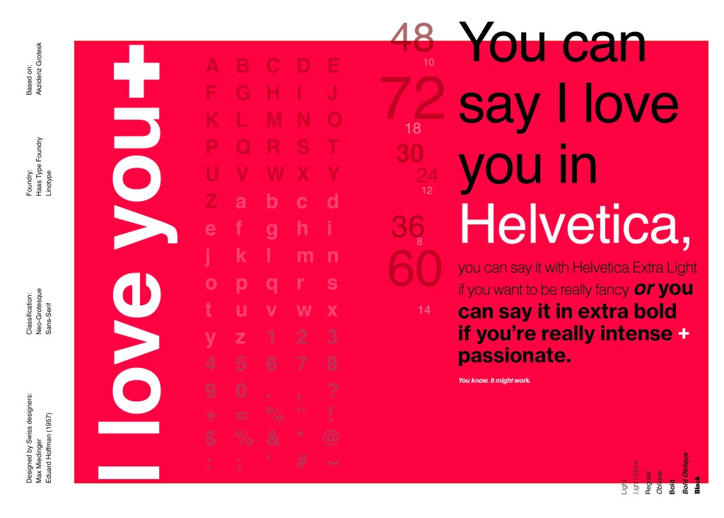
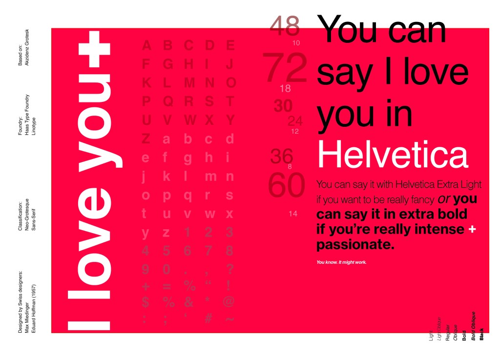
When you think of Sans-Serif there is only one typeface that comes to mind immediately and that is Helvetica. Helvetica is possibly a designers all time favourite. It was designed in 1957 in a new world after the war where the need for function over beauty prevailed. There was a need for clarity, function, cleanliness and for text to be readable, legible and straight forward communicating. The mantra was “less is more” and “form follows function”. The focus became on the content rather than the design and any ornate detailing. The designs of the time were very mathematical; Designers of the time designed religiously around the grid. Bauhaus at the time was also a massive influence.
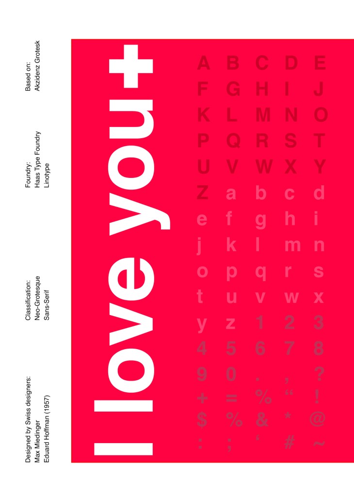
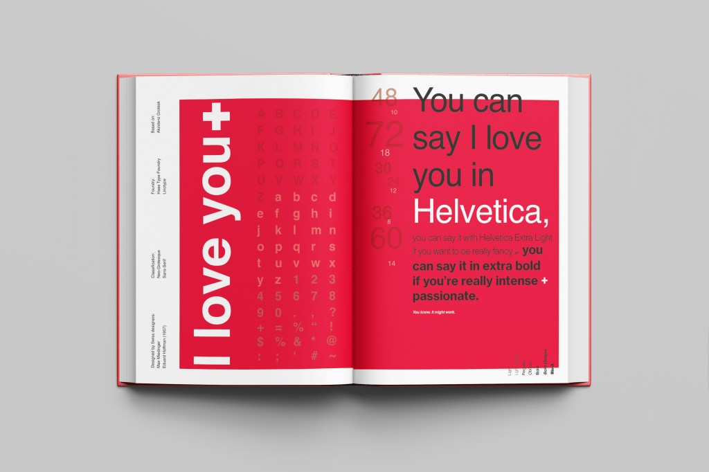
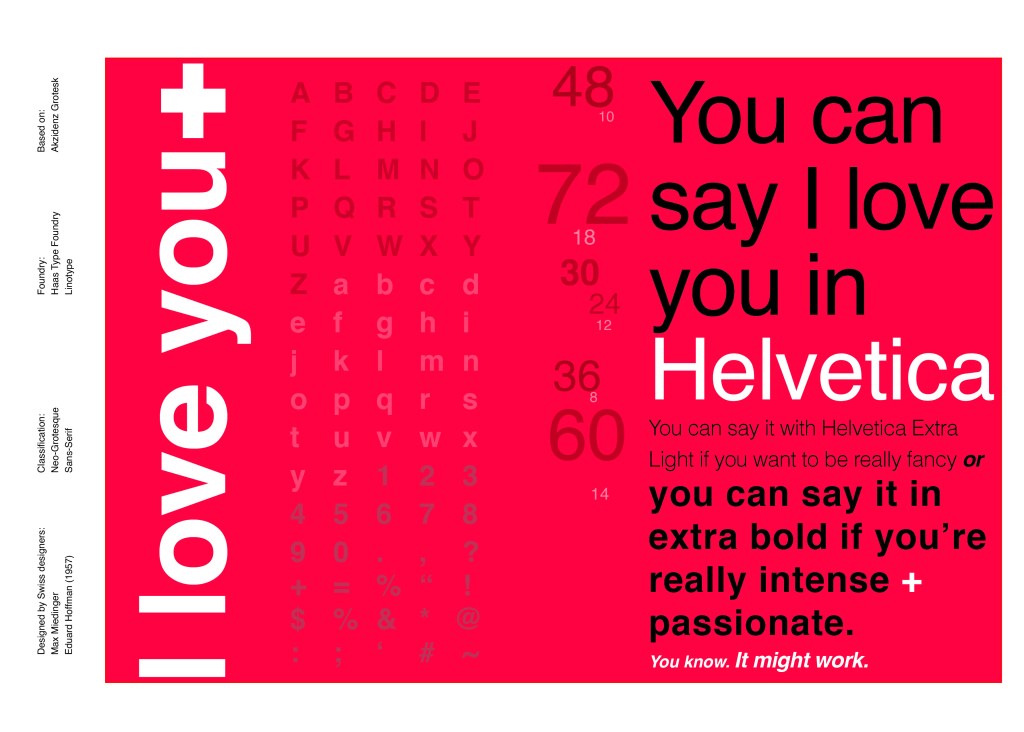
For this design I wanted to represent everything that this typeface stands for; minimalism, cleanliness, Swiss designed and legible. I started off by doing some intensive research into the typeface; I used Pinterest as I always do to look at lots of type specimen books that already exist for Helvetica. I watched the film Helvetica again, I bought a book all about the history of Helvetica.. I really went deep with the research!
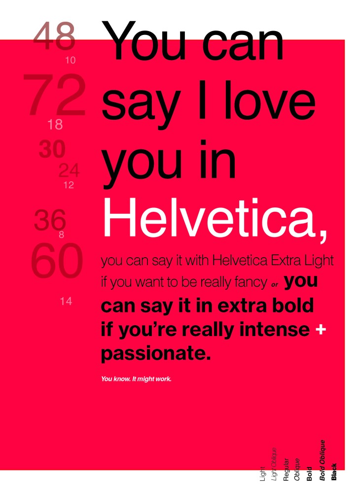
I noticed that a lot of type specimen books use “The quick brown fox jumped over the lazy dog” to showcase their typefaces with the different styles/weights/widths etc.; I did not want to do that. It just did not fit in with the feel of the typeface at all! I was really making myself nervous about completing this double page layout for the fact that I wanted to do the typeface justice and didn’t want to design something awful. I decided to refresh myself on the typeface by re-watching the film “Helvetica” for some inspiration and ideas, It was from this that I got the idea to use one of the quotes from the film;
You can say, “I love you,” in Helvetica. And you can say it with Helvetica Extra Light if you want to be really fancy. Or you can say it with the Extra Bold if it’s really intensive and passionate, you know, and it might work.
Massimo Vignelli
I decided it would be a good idea to use this on my main design to replace “The Quick Brown Fox”. I actually used Helvetica Extra Light and Extra Bold when I wrote the quote to show the different styles and weights of Helvetica on my type specimen page.
I used Red as the dominant colour and the red Swiss cross in my design to represent the origins of Helvetica.
I then started to lay everything out onto my pages and reorganise. I wanted a lot of negative space. It needed to be minimal and to not be ornate in any way.
Design Development – The stages of reaching my final design and layout!


I was really happy with how my final design and layout turned out and it was also well received on social media when I uploaded it to my college Instagram page!