This is postcard 3!
This postcard I designed to be a bit more different from the other 2. I wanted to show more of a “Graphic Design” element. I have an interest in typography and hand lettering (although they are not my strong areas) I wanted to push myself out of my comfort zone with it.
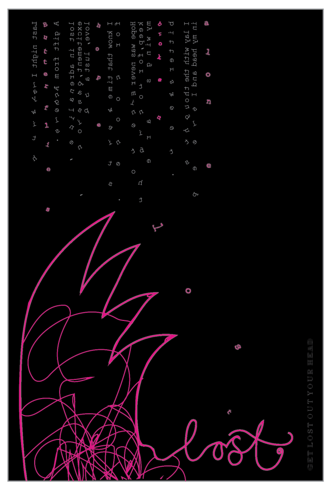
I explored a lot of different ways in which I could design this postcard… I experimented a lot of different mixed media techniques and ideas but ended up going back to designing purely digitally.
I wanted to use my old vintage type writer to design this postcard. I researched into typewriter art and visited a typography (using typewriter art) exhibition (“see my places to go, people to see” section of my blog!) I wanted to create the type with the typewriter and make it fall down the postcard. This was really tricky and actually did not look as effective as I imagined so I ended up creating it all digitally.
The text I have used for this piece is a poem I wrote myself. It is raw emotion which is what I wanted to portray. It shows real feelings. I decided to place it along the top of the postcard in the end as it is more believable for the type within it to be falling down that way. I reflected it and made the text backwards so that the type was facing downwards on the postcard. I took the last words from each sentence and dropped them down to create the falling effect. The text is really hard to read and not very legible at all.. this is the point, it is supposed to be messy and confusing to read; as messy and confusing as the thought that was in my head.
The wing was the most difficult part of this design to include. I did not want to use up all of the negative space and I wanted to try and keep it in keeping with the rest of the design. I decided that the design was quite dark and needed brightening up, plus the fact the darkness of the design did not match the vibrance of the other postcards… this is where I brought the pink in. I matched the other postcard designs and gave the wing a neon effect and then also added the hand lettered word “lost”. This was done with the pencil tool and then I tidied the curves up afterwards. The messy scribble part of the wing was brought about by a quote… “The creative mind is never a tidy place”. I instantly thought of mess and scribbles and this is why I brought this element in… I did decide after though that it reminded me very much of the existing “Mind” logo.
Overall I really like how this turned out!
