The Brief

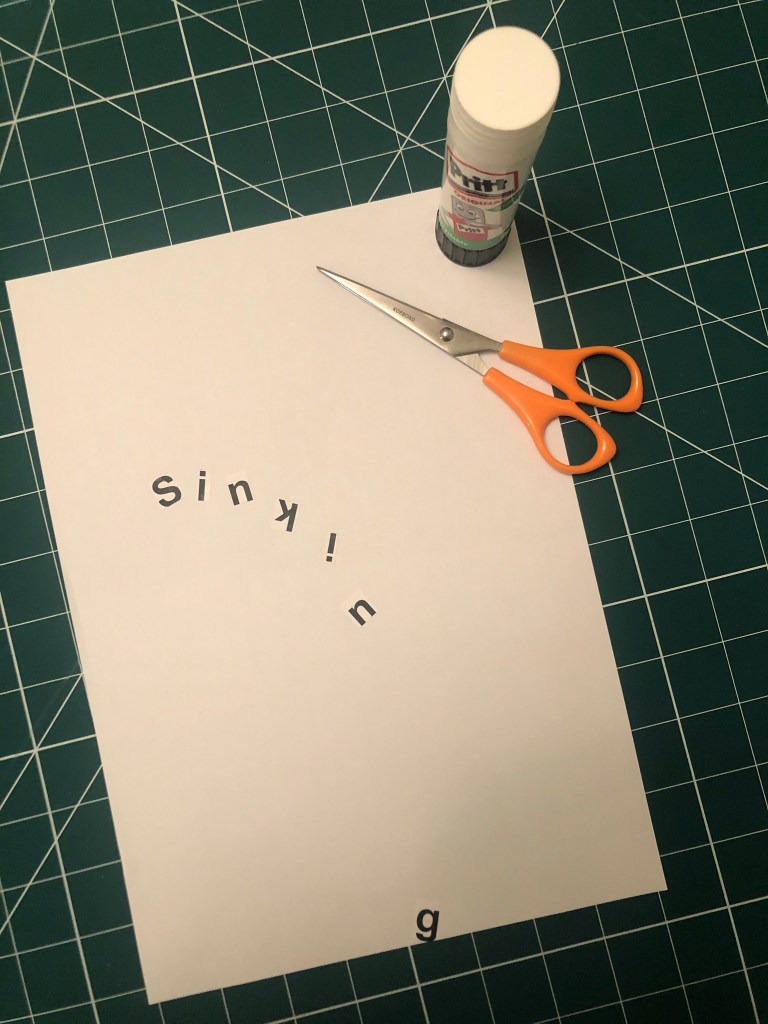
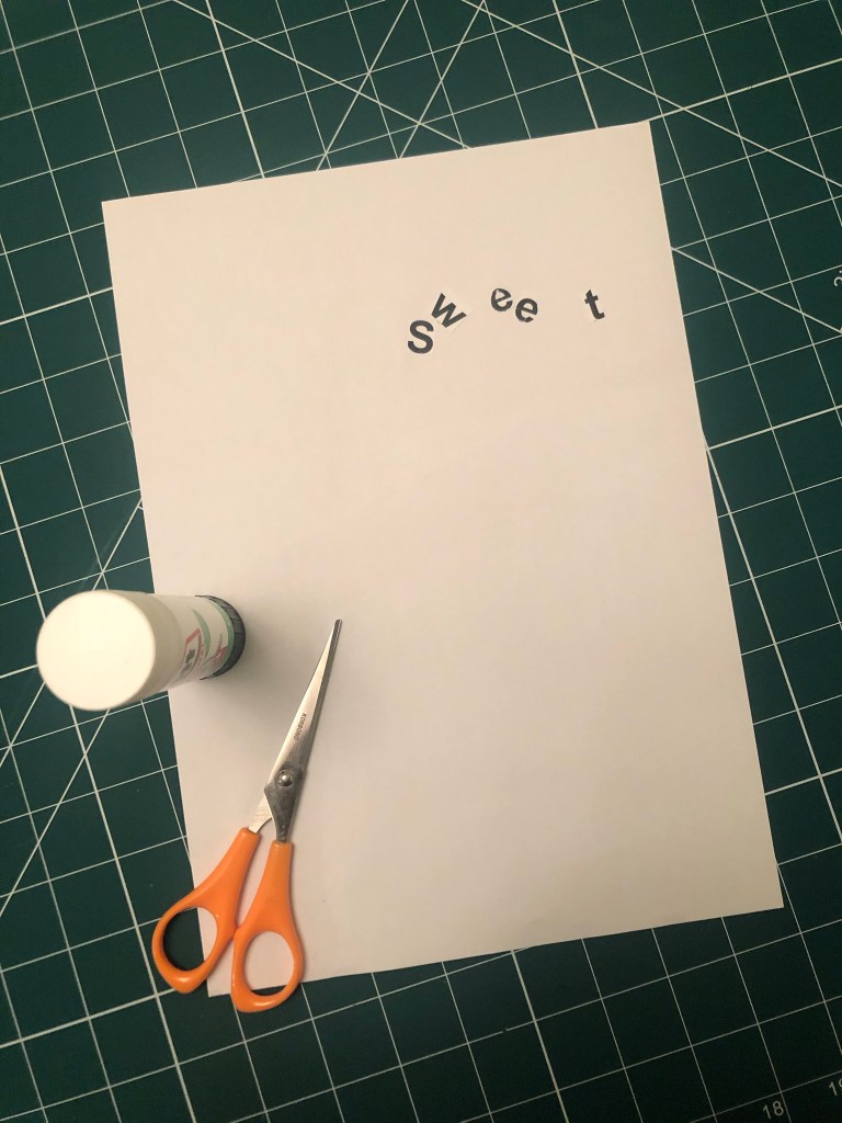
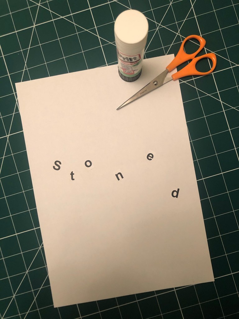
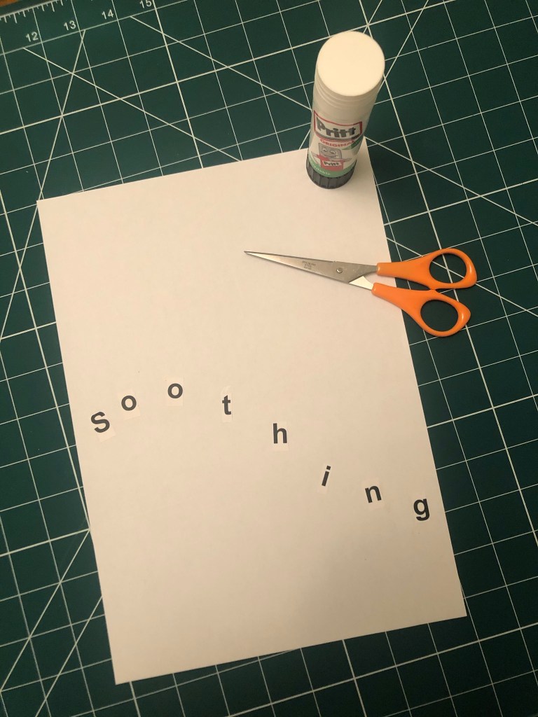
This was the first exercise in Unit 4: Typography and I can see why we was set this exercise to understand that type can look like words and the different typefaces that you use represent the feeling or meaning of the word. This exercise did take a lot longer than what I expected! – but this was probably because the majority of the exercise was done by hand! It was a little bit tedious by the end of it and there was a lot of words to represent! Some of the words I really had to sit and think about too! There were some words I even had to look up the meaning of them because I had never heard of them! It might look like an easy exercise from first glance but it did require some brain work!
The exercise specifies that we used Helvetica as the typeface at 48pt to print out the words; this made me chuckle a little bit because there is a debate about using Helvetica to represent a feeling or meaning of a word; a lot of modern day designers such as David Carson strongly disagree that Helvetica represents a word or feeling of the word. In the film Helvetica he states that “explosive” written in Helvetica is not explosive at all! “Happy” in Helvetica does not feel happy at all. The typographers of typography past and those typographers who design strictly around old traditions disagree with Carson that Helvetica cuts out the unnecessary, ornate, decorative “crap!” and communicates straight to the point strongly and boldly. I am a mix of the 2 opinions… I believe that a typeface plays an important role in a design and representing the mood, feel and subject of the design but I am also a massive fan of sans-serif typefaces and the simplicity, modernity, legible effortless designs that can be created by using them.
Making the words visual
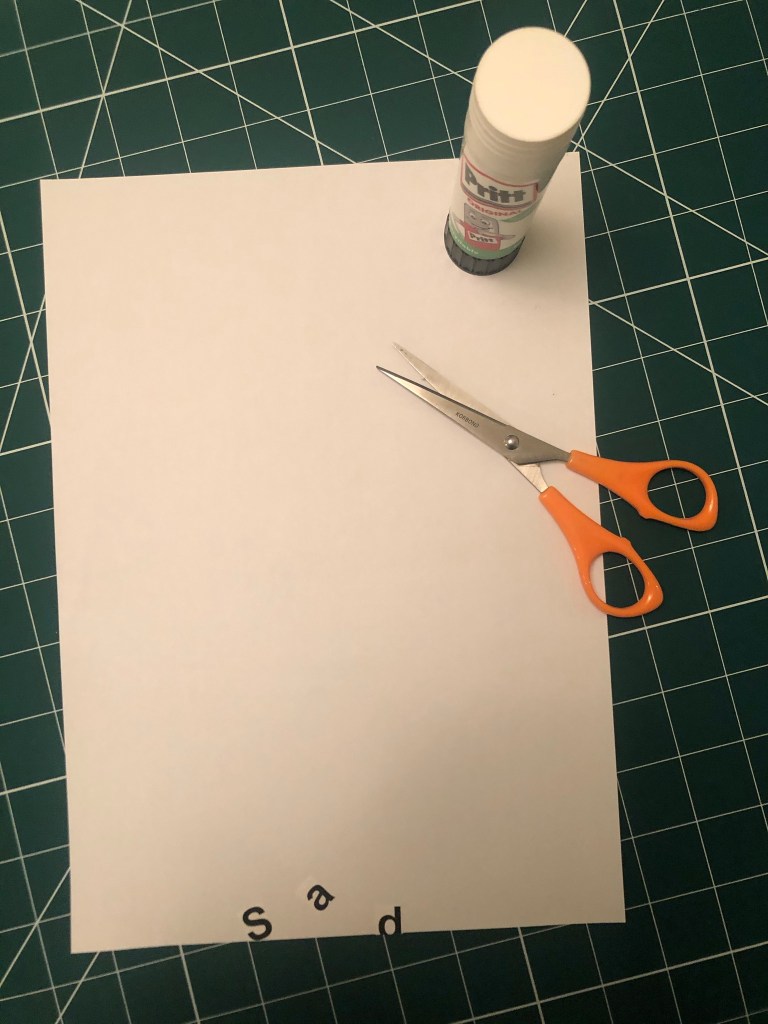
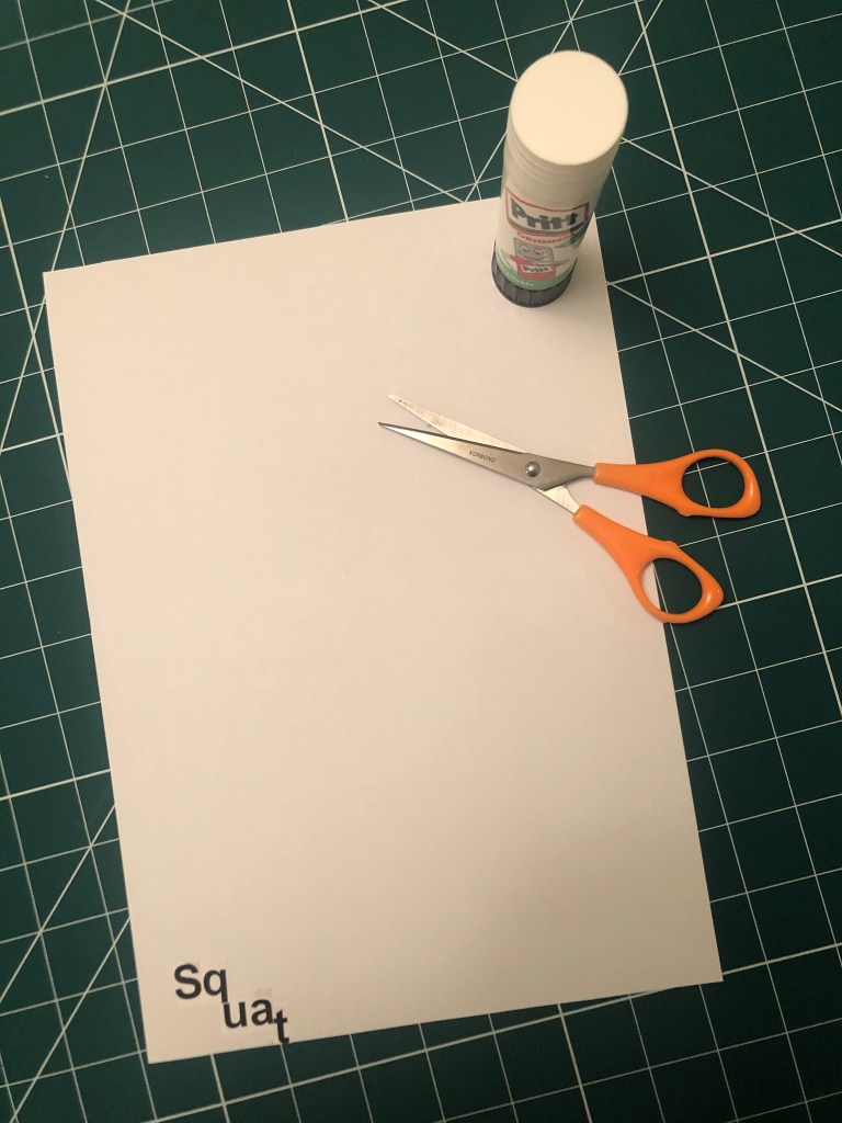
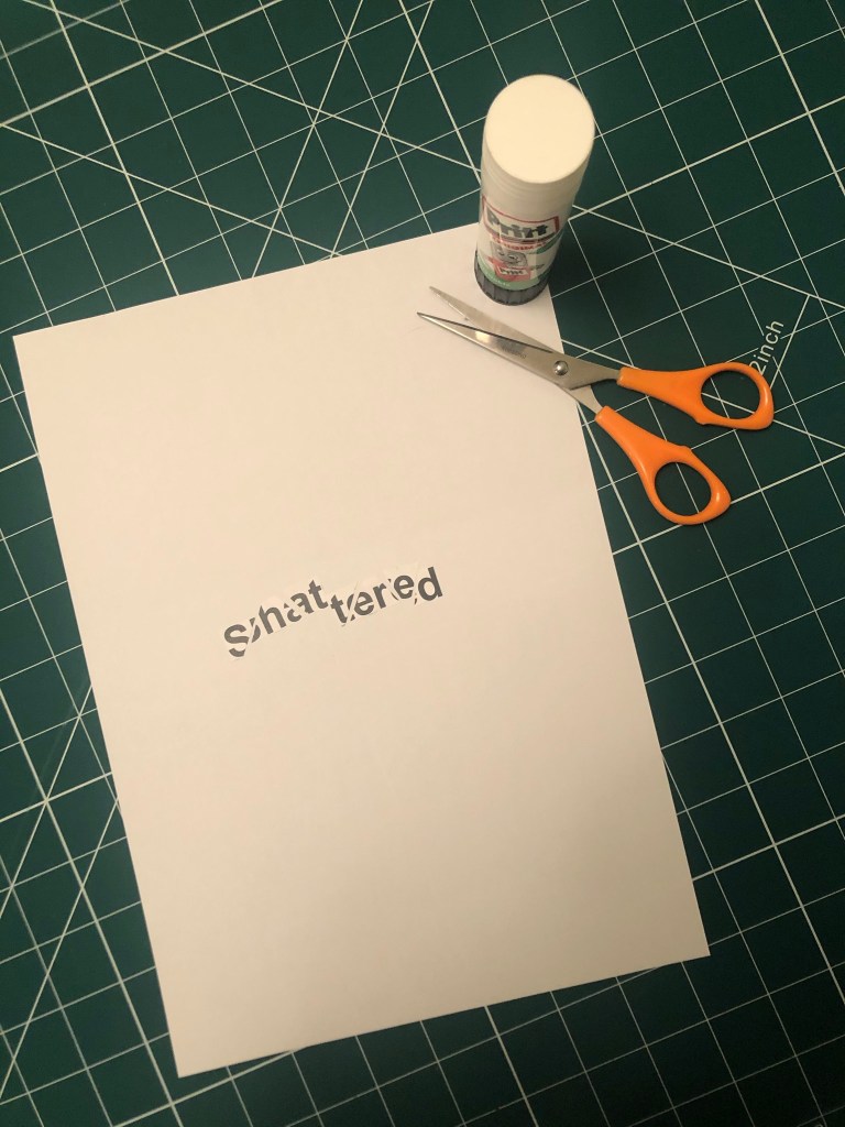
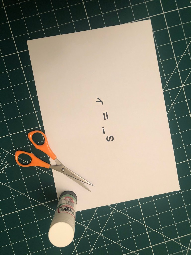
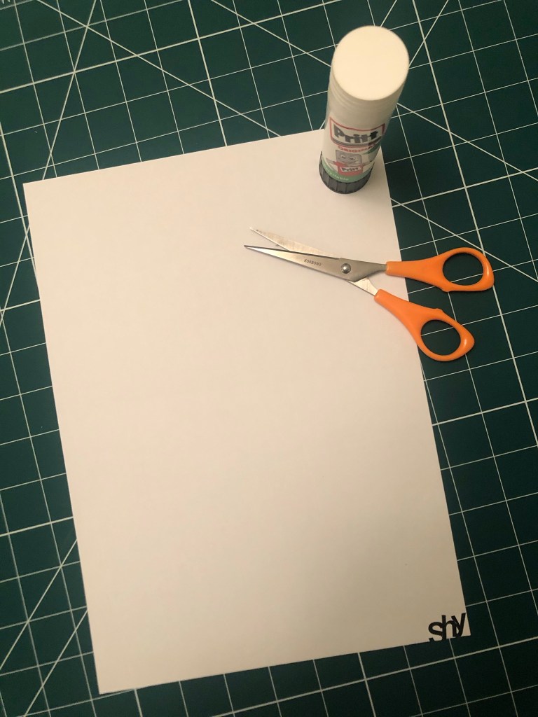
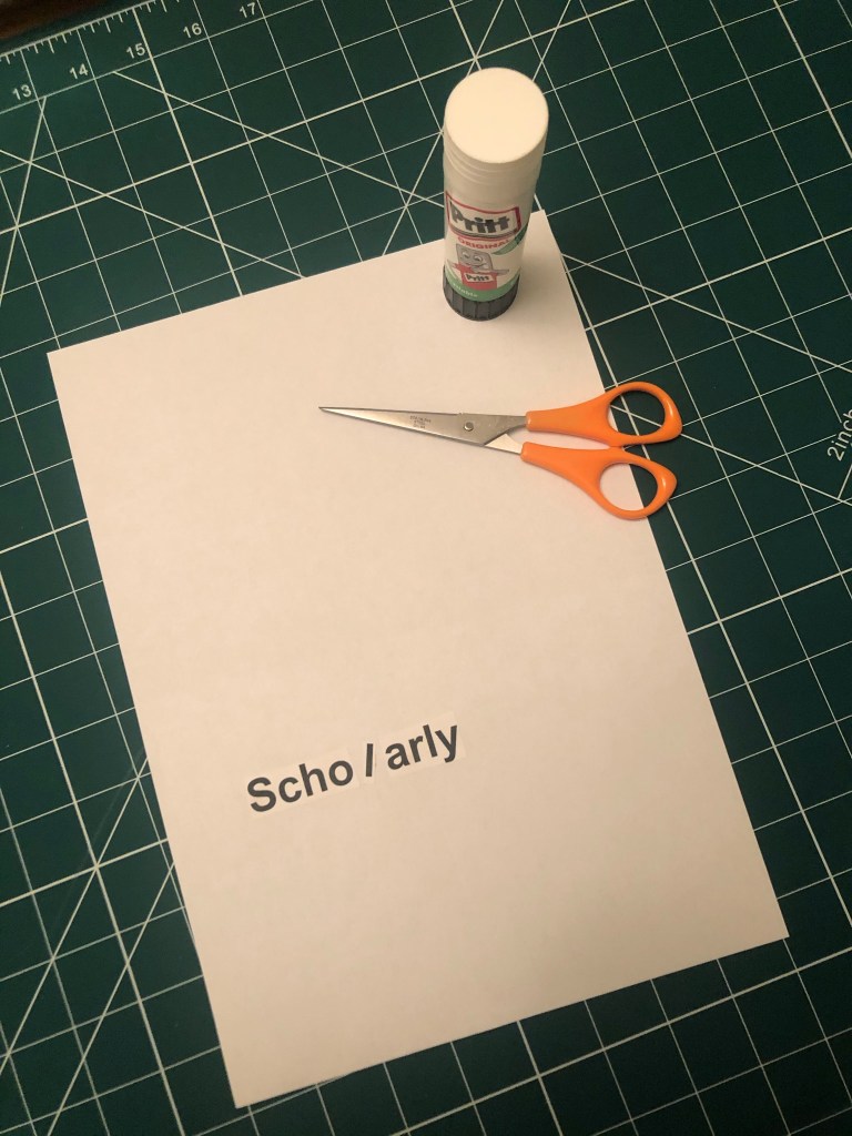
I printed out my sheets using Helvetica and then cut the words up to create my visuals. I used the whole A4 sheet as my blank canvas, I wanted to make good use of negative space and really think about where I was going to place my words within the space.


Digital Development
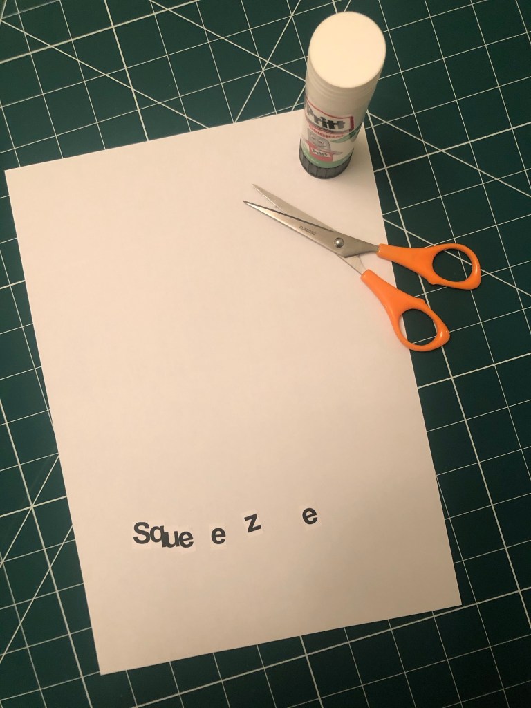
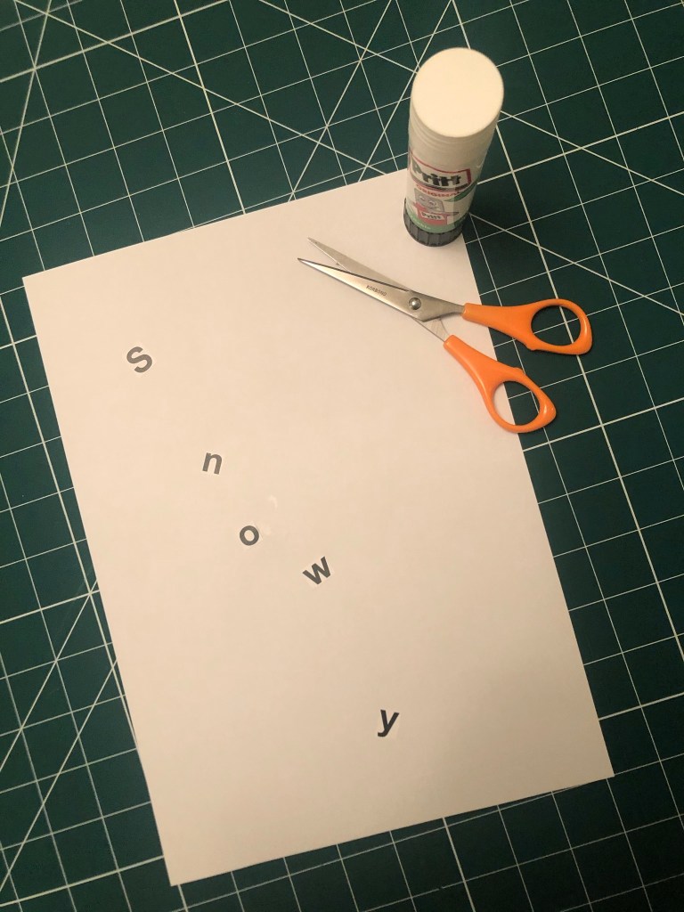
My favourite words were speed, squeeze and shatter. I feel that these 3 worked the best overall and I decided to take them through digitally to develop further…
Firstly I drew out visually what comes to mind when I think of the word and then I imported them in to adjust in Photoshop and Illustrator.


This exercise was more difficult than I originally thought… Helvetica as a typeface is difficult to make “visual” I had to rely on using illustrations and effects to really get the feel of the word across. For “squeeze” I used the entire width of the page and literally squeezed the text on, the lemon and lime give the feeling of being squeezed.
For speed I used the original typeface (Helvetica) and drew around with a fine liner creating a hatched lines to give a “speed” effect. I like the “shattered” one the most. This was created by typing out “shattered” and then cutting chunks of it out using Illustrator. I placed them in such a way to look like it had shattered in the middle of the layout.
Overall this exercise made me learn how type can be used in a visual way to represent an emotion, verb or feeling; typefaces are all designed very differently and each and every one is designed to look a particular way and to better suit different designs. When we see type that looks like what it is supposed to represent, we can associate and relate with it more.
