The second card that I designed in my series was based around Debbie Harry (Blondie).
Debbie Harry is another iconic blonde of our time, she seemed suitable to use for one of the illustrations in my range of cards. One of Blondies most iconic songs is “Atomic” where the lyrics are: “Oh, your hair is beautiful” I decided to put a twist on this and use the lyrics as the message on my card but change it to “Oh, your hair is beautiful.. (in a hat)”. Debbie Harry was well known for wearing baker boy style hats and hats are ideal right now for covering dodgy isolation hair and roots!
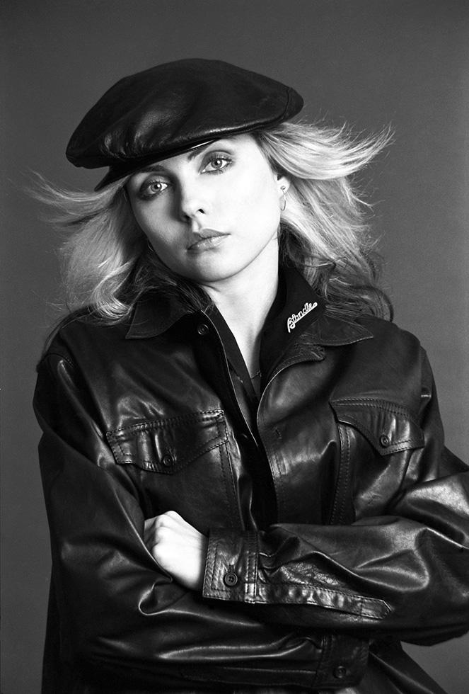
All I needed to do at this point was to find a photograph online of Debbie Harry wearing a hat to be able to draw inspiration from and trace around.
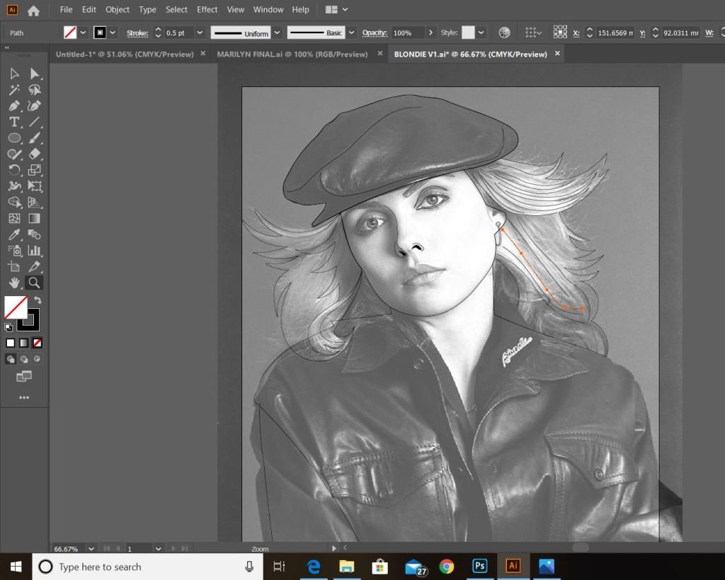
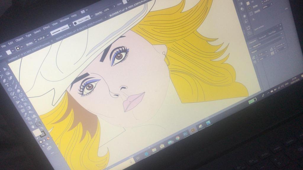
This was the image that I found on Google and the beginnings of tracing around it using the pen tool in Illustrator!
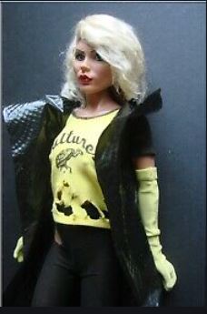
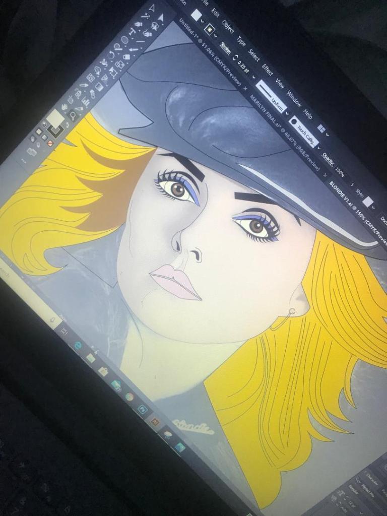
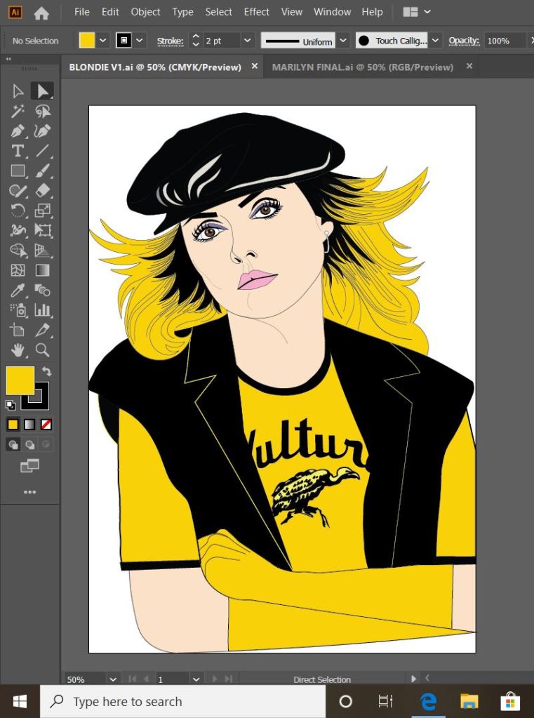
This is exactly the same process as what I did with Marilyn. I traced around the image completely in Illustrator with the pen tool and just added colour, texture, tone etc! I wanted to represent Debbie Harry as true as possible from the “Atomic” music video and this image that I have found of her is not from that video.. therefore I had to find several separate images of her outfits to draw from. I did try and play the music video and screengrab from that but the resolution was too poor. In the music video she wears an iconic “Vulture” t-shirt, I searched online to find this logo to draw from.
These images below show the progress at this tracing out stage;
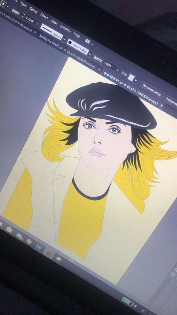
dark black roots worked best
I actually found Blondie a lot more easier to draw out than what I did Marilyn. I don’t know whether that is because I was a little rusty from not illustrating for so long and now I have got back into the swing of things I have picked up pace?.. However, I am pleased with how she turned out!
This is my final finished drawing of Blondie;
Again, the same goes as with Marilyn – I need to research and come up with ways of how I am going to portray the message. As I explained in my previous post I want the text on the card to be in the same similar illustrative approach to the drawings… I am going to do a separate post to research my findings and document the design development around the rest of the cards.
Responding to Tutor feedback…
“Be sure to use photographic reference with care: for example, the image used as reference
for Debbie Harry doesn’t give you the clear information you need in relation to the folded
hand and visual info for the little finger. Identifying this type of issue means you just need to
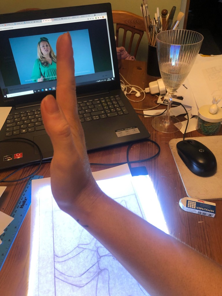
reference the position, getting someone to model the position so that the fingers are not
distorted in their translation”.
I completely agree with the feedback that Bee gave me for this piece of work. Even though I have a qualification in Life Drawing, over the years my drawing skills have become a bit rusty!
I found a random image online at the time and I traced the fingers on the hand from that onto my drawing of Debbie Harry as the original photo of Debbie Harry I used as reference did not include her fingers. I tried to go back and find the image I did use to reference the hands and fingers from in my archive of photographs but sadly I did not keep it!
I have however taken this advice and used it in future exercises and assignments… for Assignment 5 I drew illustrations for a children’s book – in this me and my boyfriend modelled in photographs to use as reference and to give me an idea of scale for my own drawings! (I am so sorry Chris for including the photo of you topless ;D…I needed a reference for someone clutching something in their arm… the Pokemon toy got the short straw!)
