The Briefs:
“The kind of paper stock you choose will be informed by the nature of the job you’re
doing. If you were working commercially, then checking paper quality – the
weight and finish of the paper – is something you would do with your client, as
paper choices can add both quality and cost to a design job. The advent of high
quality digital printing in almost every high street has made high finished
standards much more achievable and affordable – although you might be
amazed at what can be achieved with a photocopier and coloured 80gsm paper!
Knowing what papers are available and their qualities is an important part of
what you might offer as a commercial book designer. One way to do this is by
requesting sample books from commercial paper merchants, or talking to your
local printers, who can give you a swatch of the papers they recommend for you
to share with your client and keep for future reference. Another way of doing this
is by looking at as many different kinds of books as you can and critically start to
gauge the weight, grain and finish of the papers.
Doing some research…
I decided to spend some money and order some books prior to completing these exercises to try and clue me up some more on the printing process and how books are bound and made!
I have done a little video doing a bit of a review on these books!..
Do all books keep the same paper choices throughout?
What I noticed from the previous exercise of analyzing 6 books I own was that they all used different paper stock. Out of pure coincidence, all of the books I looked at and studied in the previous exercise had hardback covers (I didn’t really notice this when I picked them out!) and they all used a fairly thick paper stock- either glossy or matte. I noticed that the books that used mainly photographs used a glossy, thick paper stock which would make sense considering that photographs always look better printed glossy. With Sophie Calle’s Exquisite Pain book different stock paper was used throughout. Exquisite Pain used glossy stock paper at the beginning through to the middle of the book. In the middle of the book there was a textured slightly thinner paper and then from the middle all the way to the end there was a matte finish stock paper. The end matter of the book again used the textured paper in plain black. I found that in the books that had illustrations glossy paper wasn’t used too much; it was mostly a medium weight matte finished paper.
For paperback books I have found that the inside paper stock is quite textured and a relatively light paper stock. Paperback books are cheaper to produce and are lightweight because most of the time they need to be easy to pick up and go and read whenever and wherever. There is nothing particularly fancy about a paperback book; they are usually fit for purpose and a quick read before they are passed on. Hardback books are considered much more luxurious and higher quality and are much more desirable as collectors pieces to read and then use as pieces of art to display in the home or office.
What’s the relationship between the covers and the paper inside?
The cover sets the tone for the rest of the book inside; the only book from the previous exercise that disappointed me slightly was The Secret Garden seasons laser cut edition. This book had a grand cover- beautifully laser cut which set the standards high for the rest of the book. Sadly though I don’t think the cover matched what was going on inside of the book – I would have liked to have seen coloured tip edged pages to match the rest of the colour theme on the book. The pages were a medium weight and were smooth and coated which made the book feel high quality but I feel there could have been a bit more luxury added to the pages. If the front cover is quite grand I feel like the inside pages need to meet the high standards of the covers.
Which books do you like the feel of, and why?
I much prefer hardback books because as well as being able to read them they are works of art in themselves. Greater designs can be achieved with hardback books because they have more scope; paperback books are cheaply, quickly and easily produced. I really like the cloth bound covers on hardback books – I like the timeless, classic, contemporary feel that this gives the book. If I’m designing a cover for a hardback book I would want it to be relevant for decades and still have a contemporary modern day look which is timeless. I found that with the cloth bound books simplicity is best – in fact simplicity overall works best! If the book was to feature a lot of photography or illustrations, I like the thick, glossy pages as they would be great to print onto and the print quality would be high. I quite like textured paper for inside hardback books – especially with a cloth bound cover; it would be a complete sensory experience!
How does the book block adhere to the cover? How does it adhere to the spine? Is it stitched or glued?
It was interesting to see how the spine is made when looking at David Carson’s – Nu Collage and the exposed spine he uses on his book. It shows that several pages at a time are sewn and bound and then attached to each other. The front and back boards are then attached and the pages adhered to them on the inside. Reading “Making books” and watching “The Art of the Book” tutorials on YouTube really helped me to understand how books are sewn, bound and glued together.
Research Task: Paper and Bookbinding
Further inform your understanding of paper and bookbinding by reading pages 165–180 of Alan Pipes’ chapter ‘On Press’ available as a downloadable resource at
http://www.oca-student.com/
I struggled to find a digital copy of “On Press” in the online library; all that appeared were actual physical copies on shelves in various universities.. so I decided to purchase a 5th edition copy from Ebay. I figured I could refer back to it in future exercises and assignments anyway and that it would be invaluable to my learning.
Collect lots of different paper samples, and assemble these into a standalone book, or integrate them into your sketchbook. See this as the start of an ongoing resource that you can add to, and refer back to. Add notes to your paper sample book/sketchbook identifying the paper source, stock, and any reflection on the paper’s qualities. You may want to extend this investigation by exploring how your paper samples can be folded, combined, stitched, printed on, or bound together. Explore your samples’ physical properties by working with them, testing them out, and visually documenting the results of your research.
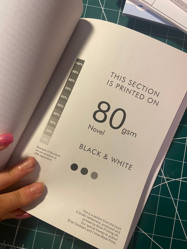
I did my research prior to this exercise because I knew that I would need samples of papers and that they would take a while to appear in the post.. about 2 weeks ago prior to starting this exercise I started to request for free samples from various printing websites.. I struggled though to find free samples from book printers. The samples that I received in the post were mostly business stationery, wedding stationery and different kind of papers for brochures and leaflets and posters etc… I found that the samples which arrived in books were far more helpful and organised than those that sent me individual pages.
I have done a video showing some of the papers that I received and my thoughts on them:
The best samples were definitely the sample book from Book Printing UK as it was informative and had a lot of samples from different books and different papers and the book of paper samples from Solo Press. This featured a lot of techniques I hadn’t particularly thought of before such as spot UV and gloss lamination.


I wanted something that I could refer back to that was actually really helpful for me.
I started doing some research online and came across the company GF Smith:
https://gfsmith.com/the-making-of-the-collection-2020
They have compiled a sample book featuring 450 pages of different stock paper which they sell on their website for £39.. I managed to get 25% off with a generous student discount. It is costly, but I felt it was worth it considering that I now have a ready made, professional book that I can refer back to time and time again with papers that are actually suitable for book printing.
I had a look on their Instagram page and designers and creative businesses alike had all commented that they had purchased this sample book and it is invaluable to helping them achieve the best design outcomes.
https://gfsmith.com/the-collection-2020

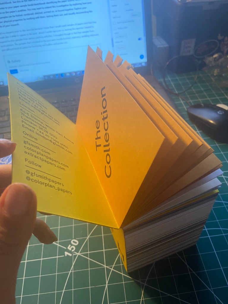


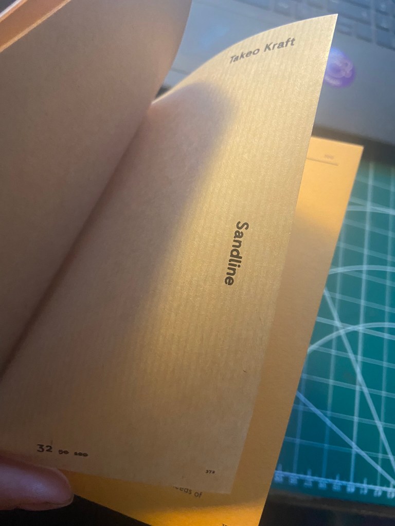


There are a lot of papers in this book! A lot that I never even knew existed! There are even soft, furry white papers in here! My favourite is the Takeo paper though.. it looks like cloth; It would be ideal for a cloth bound publication! There is a black paper that is ideally named! – Go to Hell Black!!
