The Brief
First Ideas
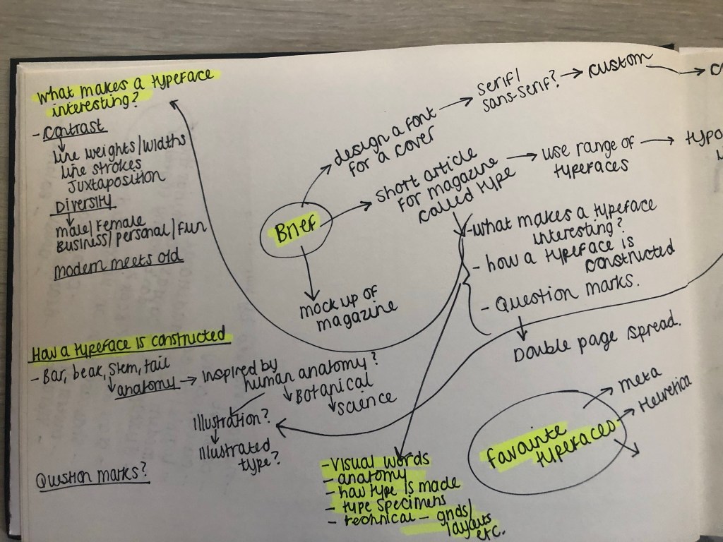
When I first read this brief I knew I would enjoy it because magazine and book design is an area in design that I particularly enjoy. From reading the brief it seemed to be a continuation of the exercise “If the face fits” where it is based around type specimen books and type foundries. I had already researched into type foundries in the previous exercise (If the face fits) so I already had some background knowledge as to what I would be designing. From my understanding of the brief it was asking me to design a typeface to use for the magazine but to also design the magazine in a similar way to which a publication would be released by a type foundry to promote their typefaces.
I knew I wanted my Type Magazine to be one of the high quality Matte or glossy magazines that cost a small fortune in the shops! ;p One of my favourite magazine venues is Magazine Heaven with my nearest being based at Rushden Lakes and inside there they have a whole host of Art and Design magazines which range anywhere from £6-£15.

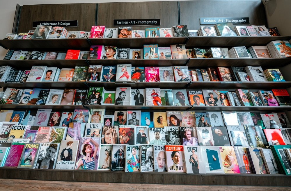

Magazine Heaven at Rushden Lakes
The next step for me in this assignment was to see what magazines were already on the market and how I could make my magazine look similar to what already exist out there. I also needed to research into type foundry publications and typefaces that I could create for my own publication.
Research
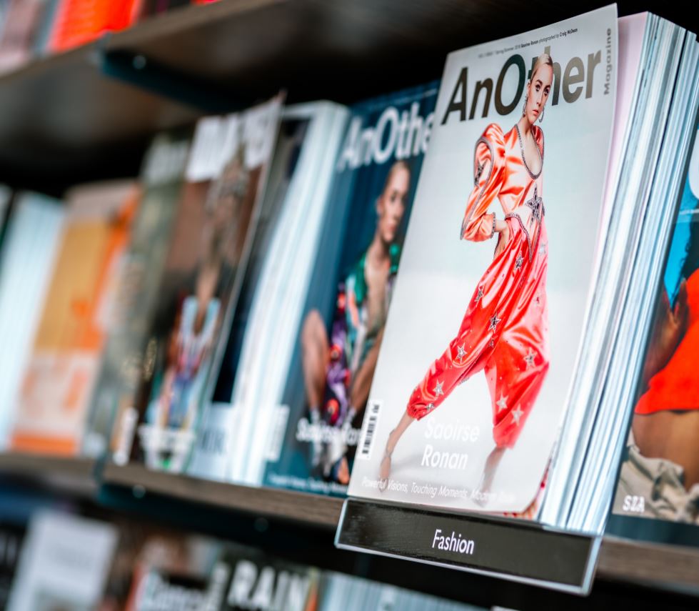
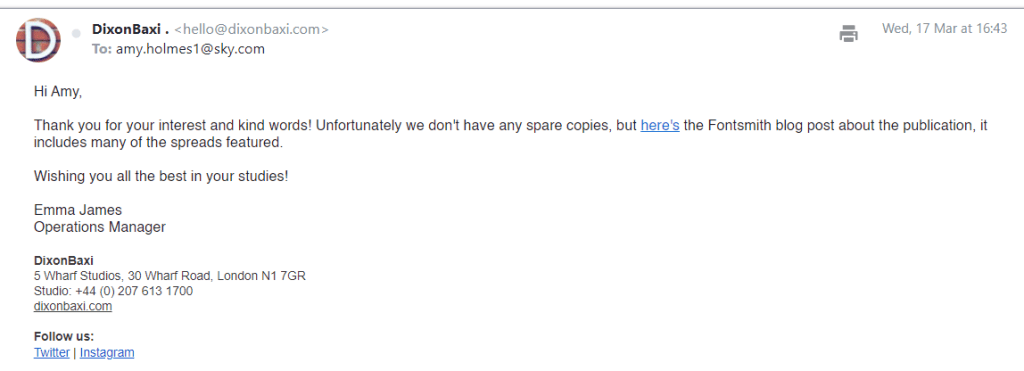
As always I did some intense research for this assignment; some of which I did before I started this assignment as part of the exercise “If the face fits”. I came across a magazine publication for a typeface called FS Benjamin that I really liked and enquired with the type foundry to see if they had any of the print copies left to send me; unfortunately they didn’t but they sent me a link to their blog to their typeface to have a look at the content on there. It was then that I researched into who Fontsmith were as I had no idea really as to what type foundries did. Here is the content they sent me for the typeface:
https://www.fontsmith.com/fonts/fs-benjamin

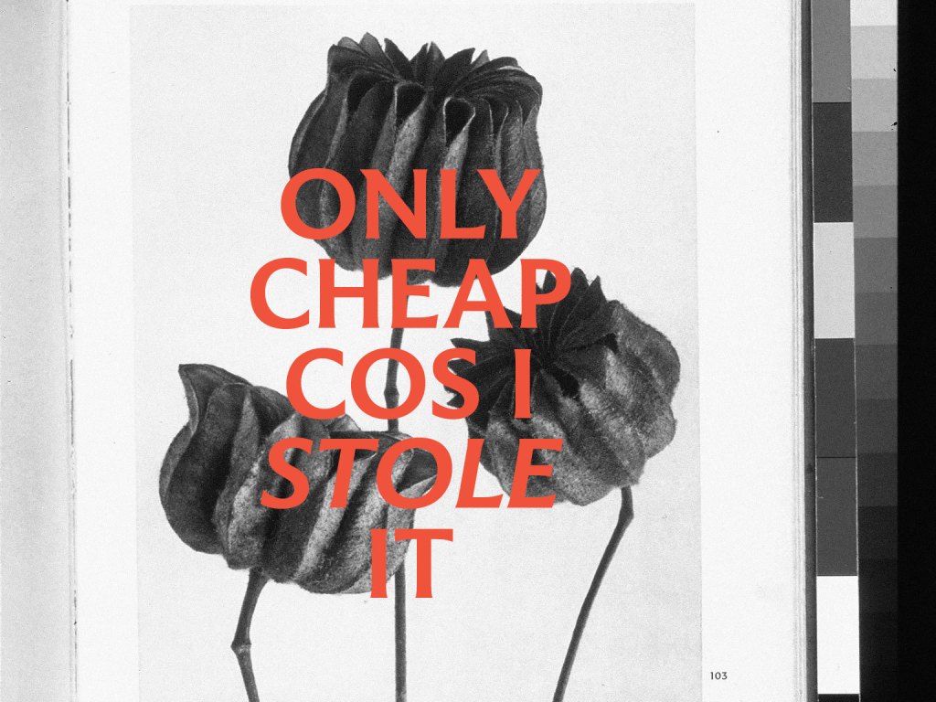


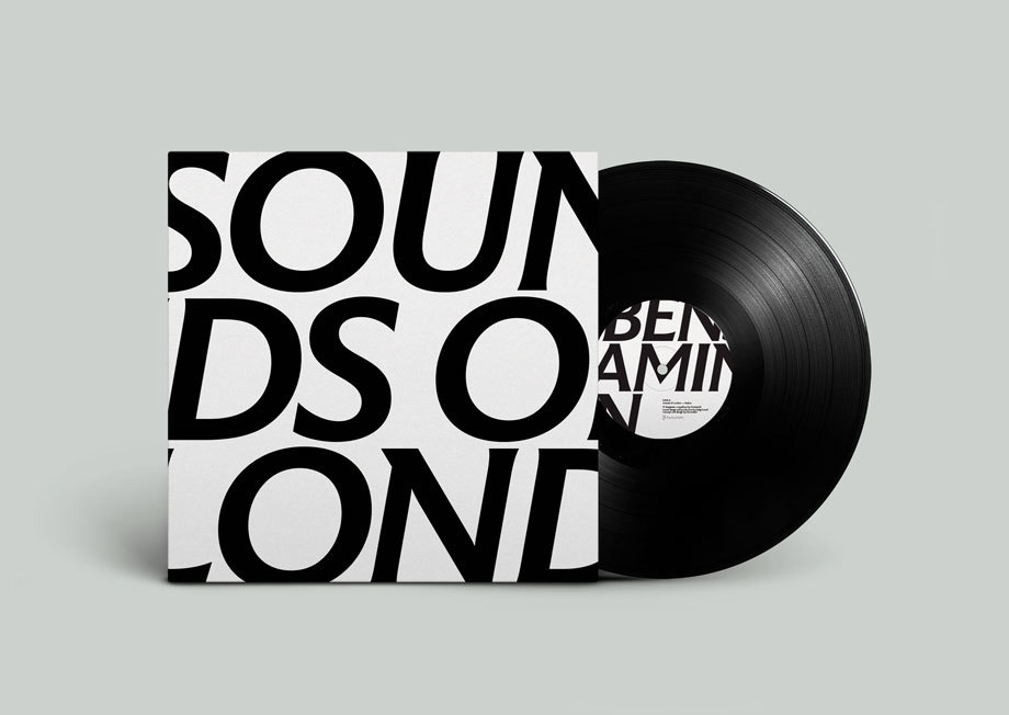
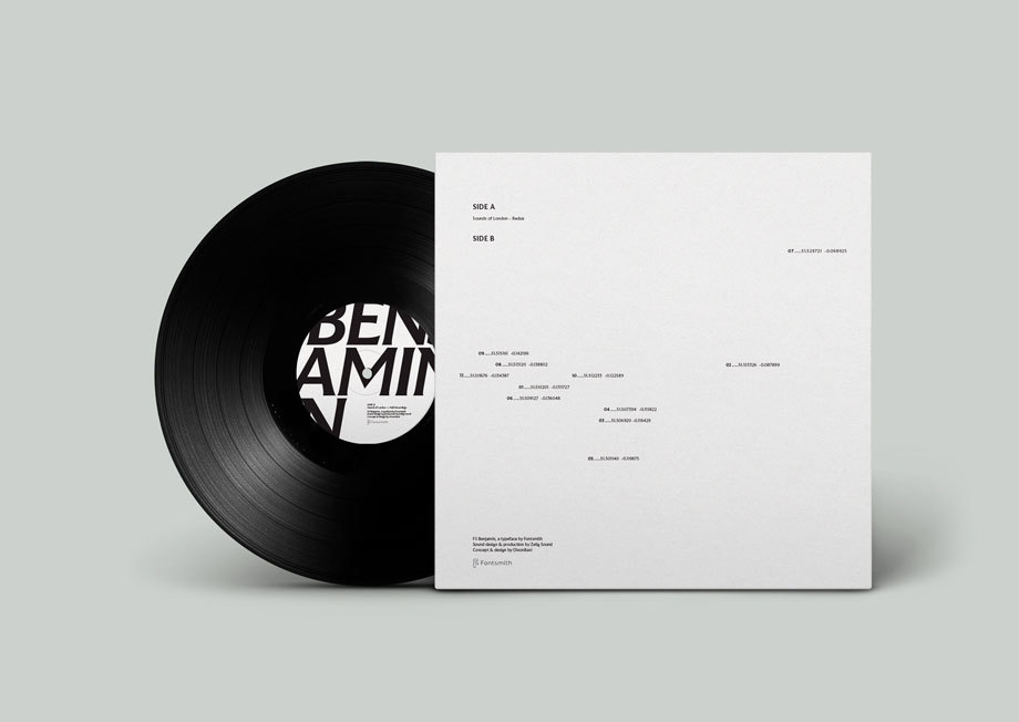
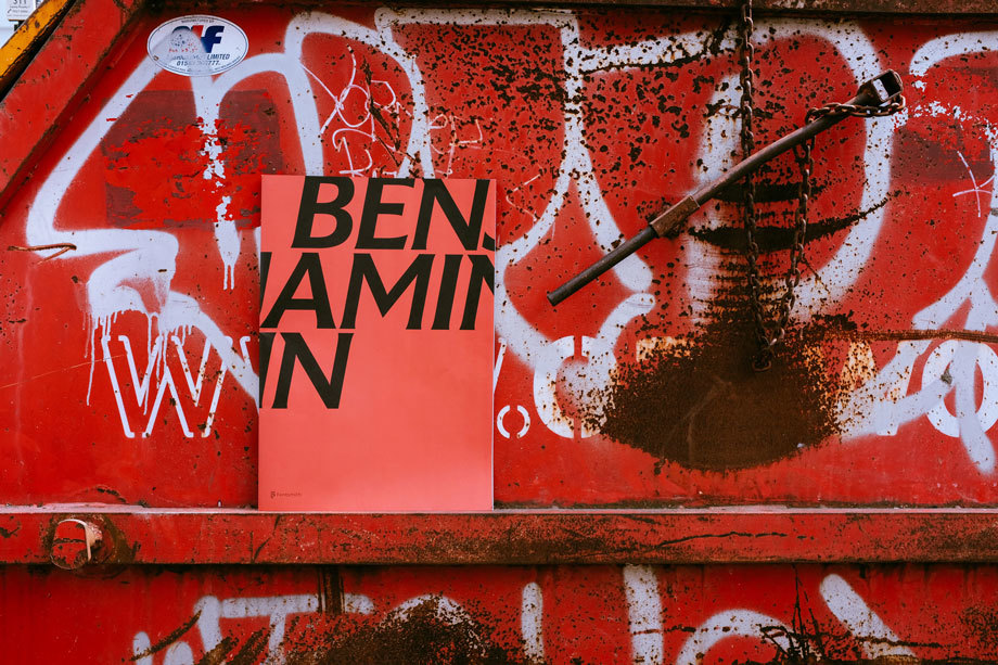

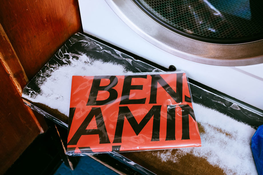
I really liked the modern, simplistic, catchy and witty way that they advertised their typeface in their print publication. FS Benjamin was designed around the theme of London. It was inspired by the noises, the smells, the atmosphere, the buildings and the people. The name Benjamin FS originates from the real full name of “Big Ben”. It was inspired by the contrast that there is in and around London; the old signs and old buildings juxtaposed against the modern glass architecture that now surrounds the city. I liked the idea that they had designed a typeface around something and thought that I could do similar in my own design. I started to think of things that inspired me lately or what I have a passion for.
As well as producing a print publication in the form of a magazine to promote their typeface they also collaborated with Dixon Baxi a branding company to host an evening to promote the typeface and create a playlist of sounds and music on Vinyl as part of the print publication that match the mood and feel of FS Benjamin and London. I really liked this idea; it is taking the idea further than just selling a typeface as a typeface, they are making it into an atmosphere, a mood and vibes. It is not just selling the typeface it is also selling what the typeface represents, the idea behind the type and the city behind it.
I had a lot of ideas and inspiration to draw from this!
My other research came in the form of researching Pinterest. I always find Pinterest a great way to find inspiration and to be able to organise pins into sections that are easy for me to refer back to or to find. I created a new board for this assignment and then added sub sections to the board and researched into;
Now was the time to research into existing Art and Design magazines that already grace the shelves of fancy newsagents.

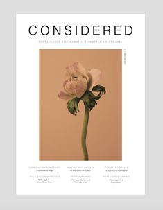
I wanted my magazine to be very simple and minimalist. I wanted it to look high quality and to be a high end magazine that would feature in a magazine shop such as Magazine Heaven. I wanted to have one main eye catching, attractive image on the cover to draw peoples attention to the magazine. In my head I could imagine it to be produced out of high quality recycled heavy weight gsm paper (ideally with a matte finish!) so these are the sort of magazines that I was researching into. My only thoughts were now how to create a magazine and a look around a typeface that I was to design…
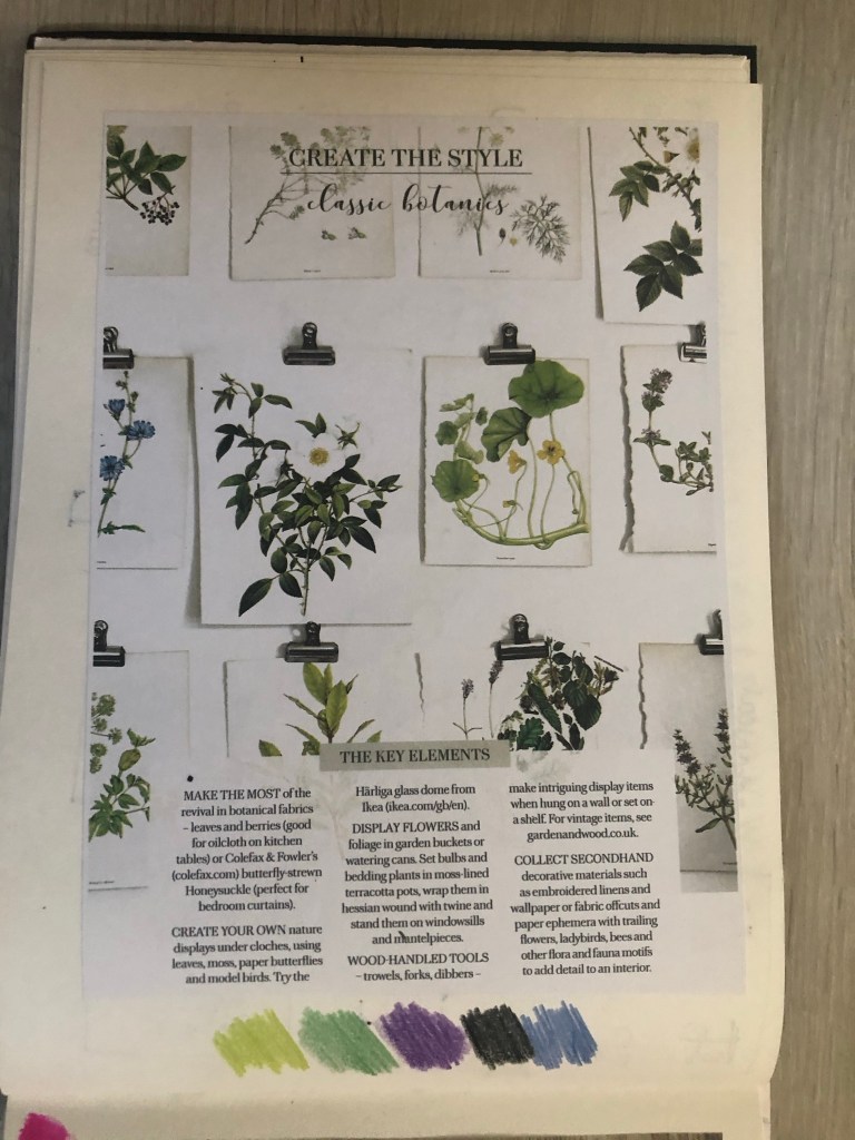
Another one of my favourite magazines of the moment is a Country Living Vintage Home magazine that I bought on a whim (for a really pricey buy of £13!!) I saw it in WHSmiths a few months ago and just really loved the look of the front cover and the Botanical section that was in there and all of the vintage drawings and finds!
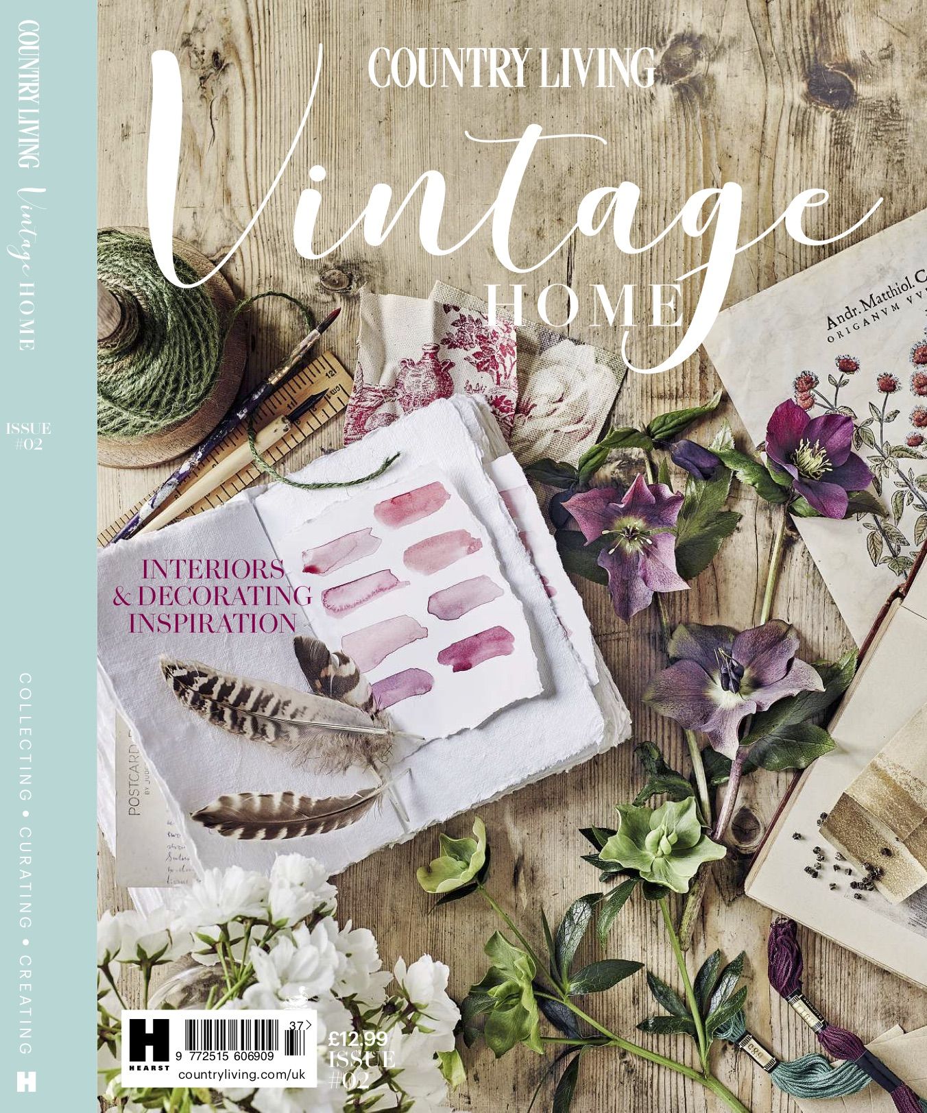
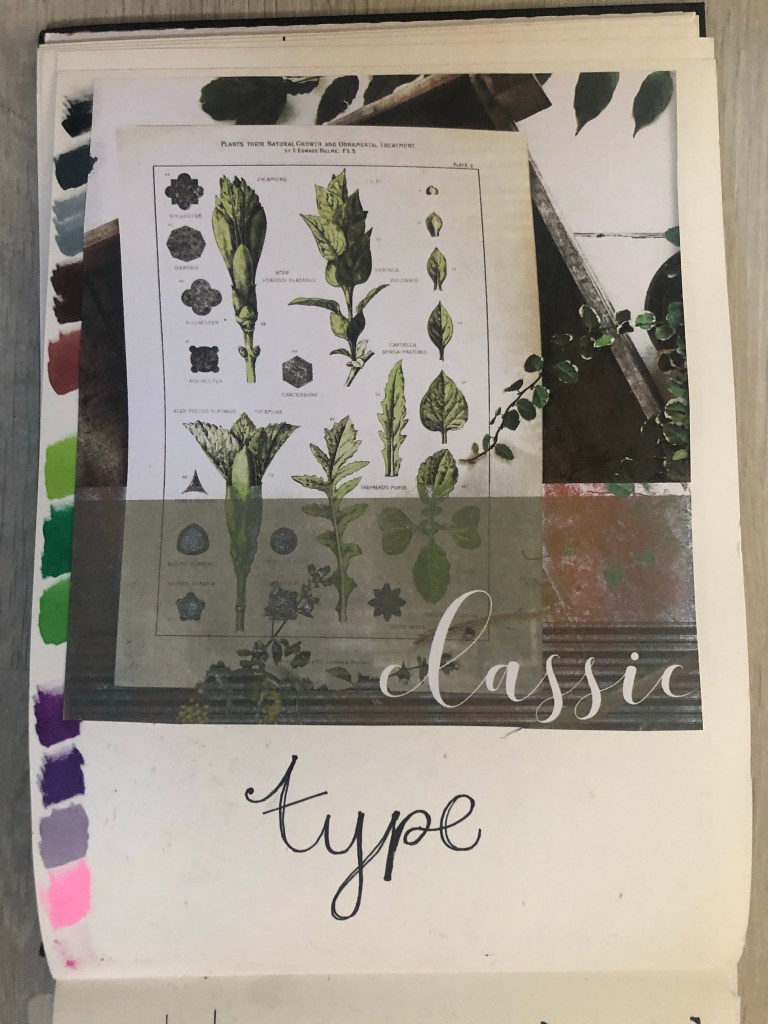
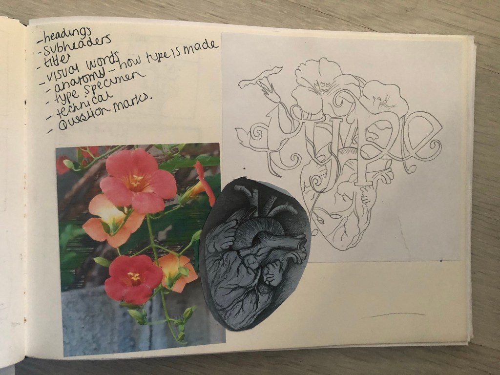
For some reason at the moment I really like the Botanical trend. I like the old vintage books, the cartridge paper that some of the old botanical drawings are drawn on, I like the colours and the ink drawn drawings and I like the feminine, old fashioned book typefaces that are used in the vintage plant specimen books. I had to buy this magazine just to draw inspiration from or just to look at every time I feel uninspired! – That is exactly what I did when I started ideas for this assignment. I looked at the book and knew I wanted to create a typeface based around the botanical influence whilst taking inspiration from timeless, old fashioned typefaces that appear on those old plant specimen books.
Another factor which makes the botanical theme perfect to use in my designs and type is that my article in my magazine has to be based on the anatomy of type; anatomy relates to plant anatomy and also human anatomy. I could use the type anatomy as a simile for plant or human anatomy. I did some dark, anatomy style art for my Time Machine book designs and had the idea that I could do similar for this.
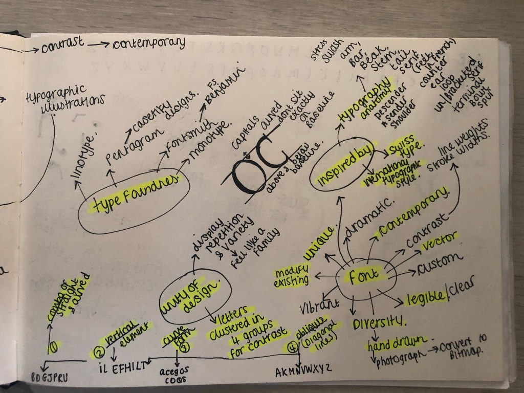

I felt like Baskerville or Mrs Eaves was the ideal typeface to match the botanical theme I was aiming for. Even though Mrs Eaves is not a vintage typeface it is based around Baskerville which is. It was also designed for use in book design. I also really love the intricate, ornate ligatures of Mrs Eaves, I wanted to try and recreate that with my own typeface. I have a pretty style of hand lettering so I figured I would use that but add in inspiration from Mrs Eaves and Baskerville.
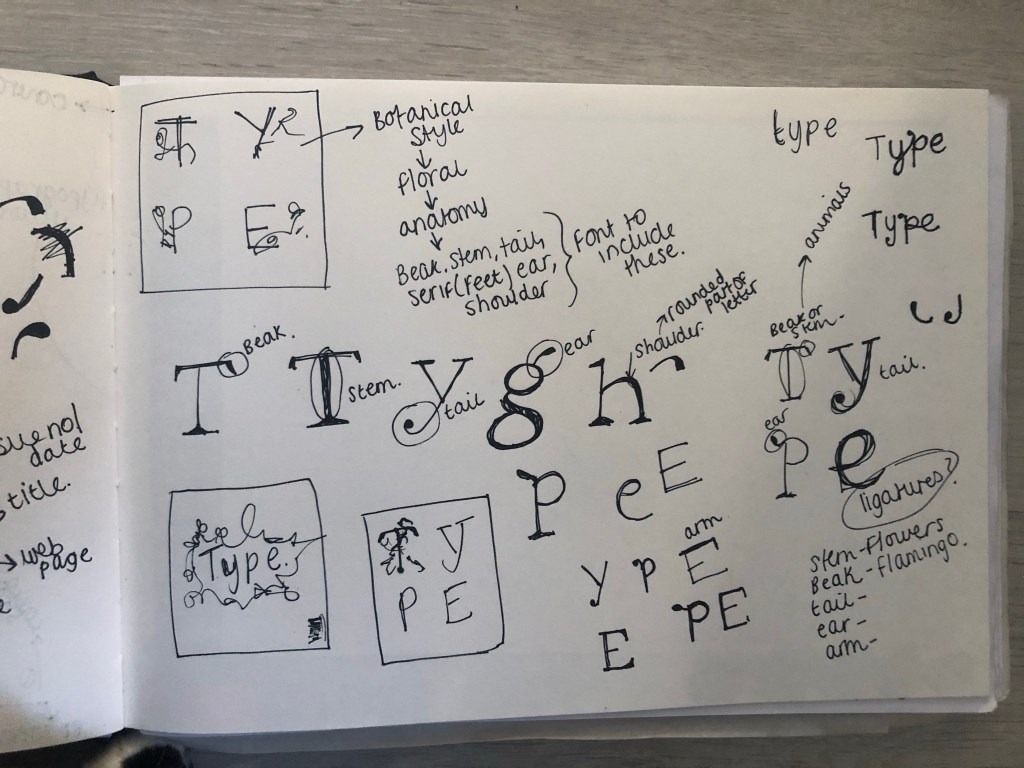

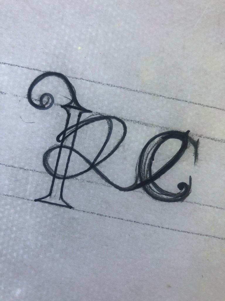
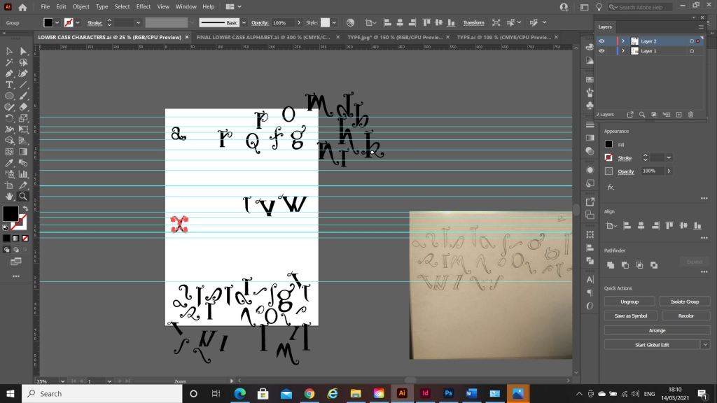
I started off with drawing some rough sketches of the different parts of a typeface and some different styles that I could explore. I particularly liked the PE ligature that I sketched. This gave me ideas for the rest of the typeface.
I used a specimen sheet of Baskerville from a previous exercise (A typographic jigsaw puzzle) where the typeface was dissected into all its parts to piece back together again. I figured that I could use this as a base to design my own typeface from. It gave me ideas of how to design my typeface, I knew I would have to design it all as completely separate parts (dissected) and then piece the letters together from the parts. Once I designed certain parts of the letters; such as the stem, I realised I could then use them again in other letters, e.g. I could use the stem I designed on all lowercase letters such as b,d,h,l but also use it again on the uppercase characters like D,T,H,F,E etc.. The bowl on the b could also be used on the d.
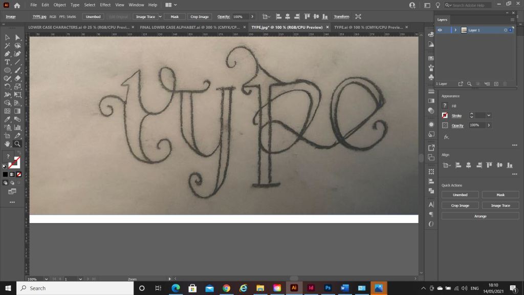
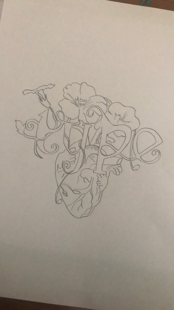
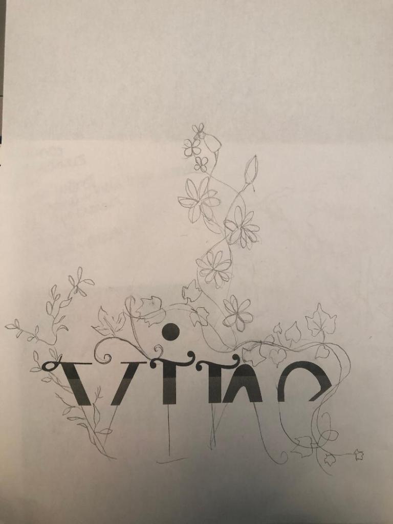
What happened next was that I spent endless hours with a pack of tracing paper, armed with erasers and a whole pack of HB pencils and I sketched out my upper and lower case alphabet for my typeface. Before I mastered the full alphabet though, I drew out “Type” first as this needed to be perfect as this is the focal point of my whole magazine.


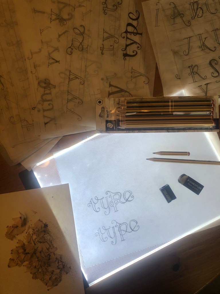
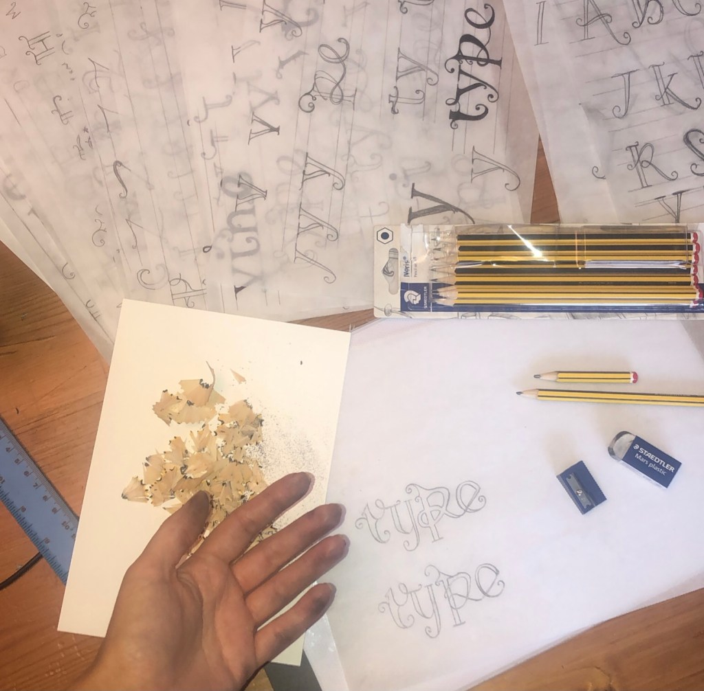

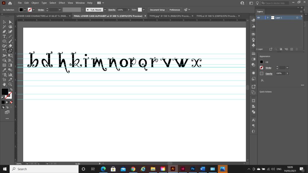
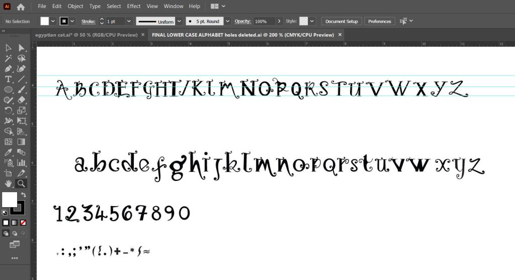
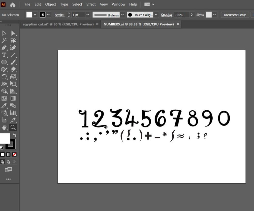
Once I perfected “Type” I then created the rest of the alphabet- lowercase, uppercase, numbers and symbols.
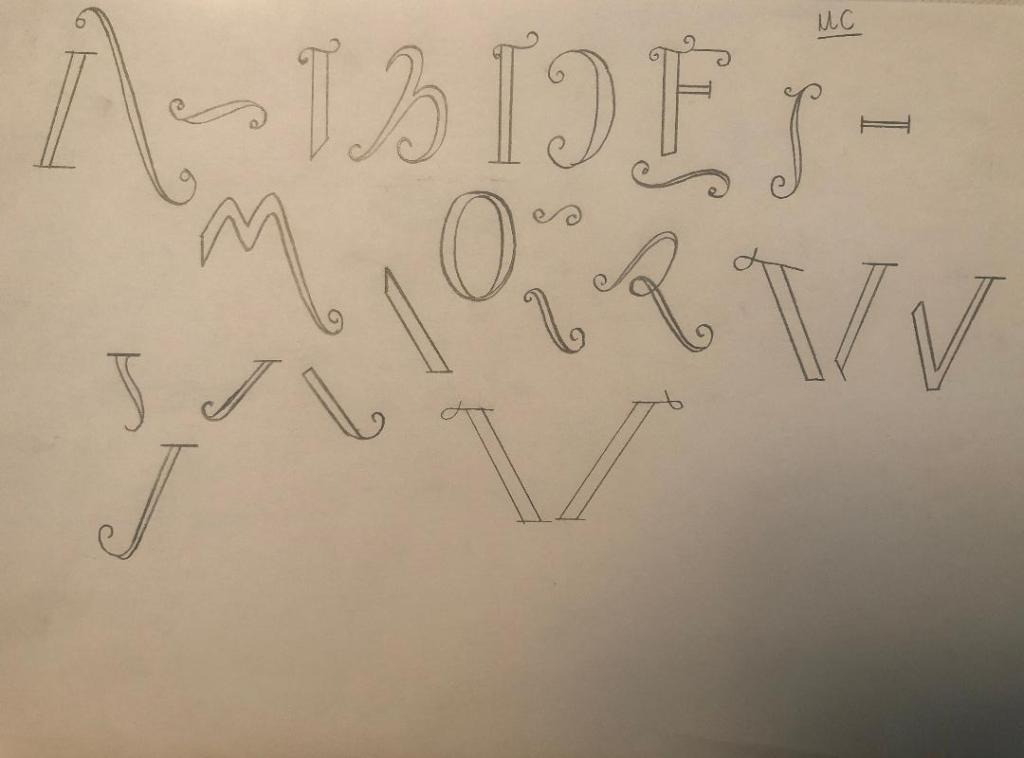
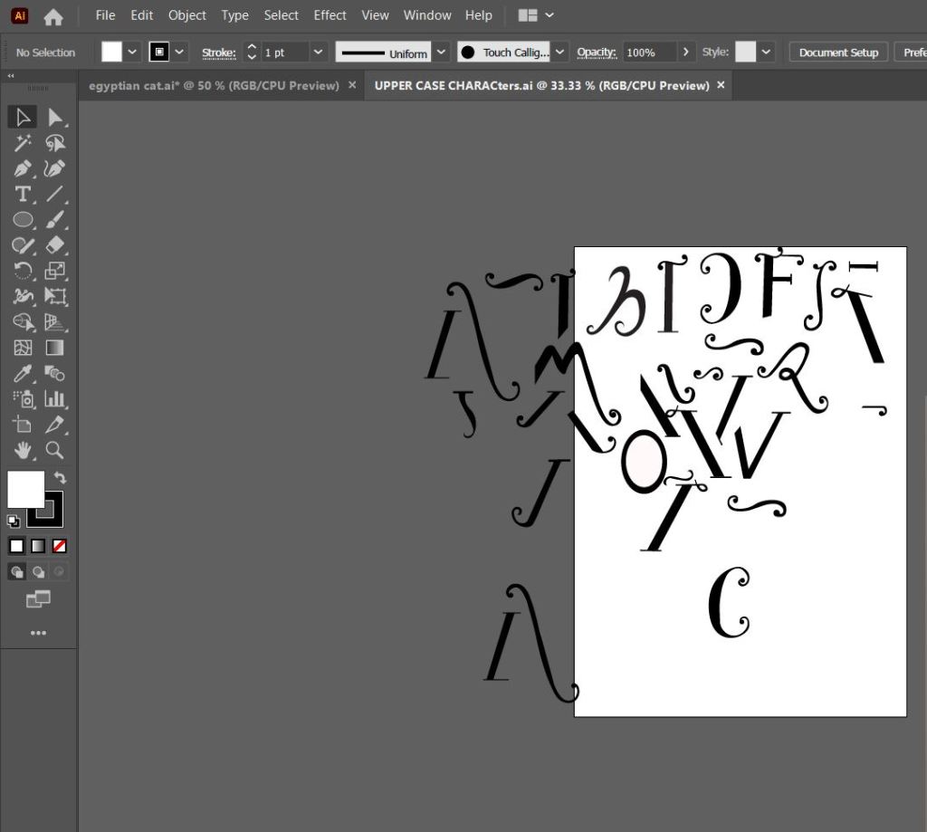
The sheet above are the parts I created that would make up all of the uppercase letters and alphabet.
This is how my letters turned out. It looks very Avante Garde and reminds me of Biba! It also looks like a Led Zeppelin Stairway to Heaven poster I used to have in my house. Clearly without knowing it I have some 1970s influences!
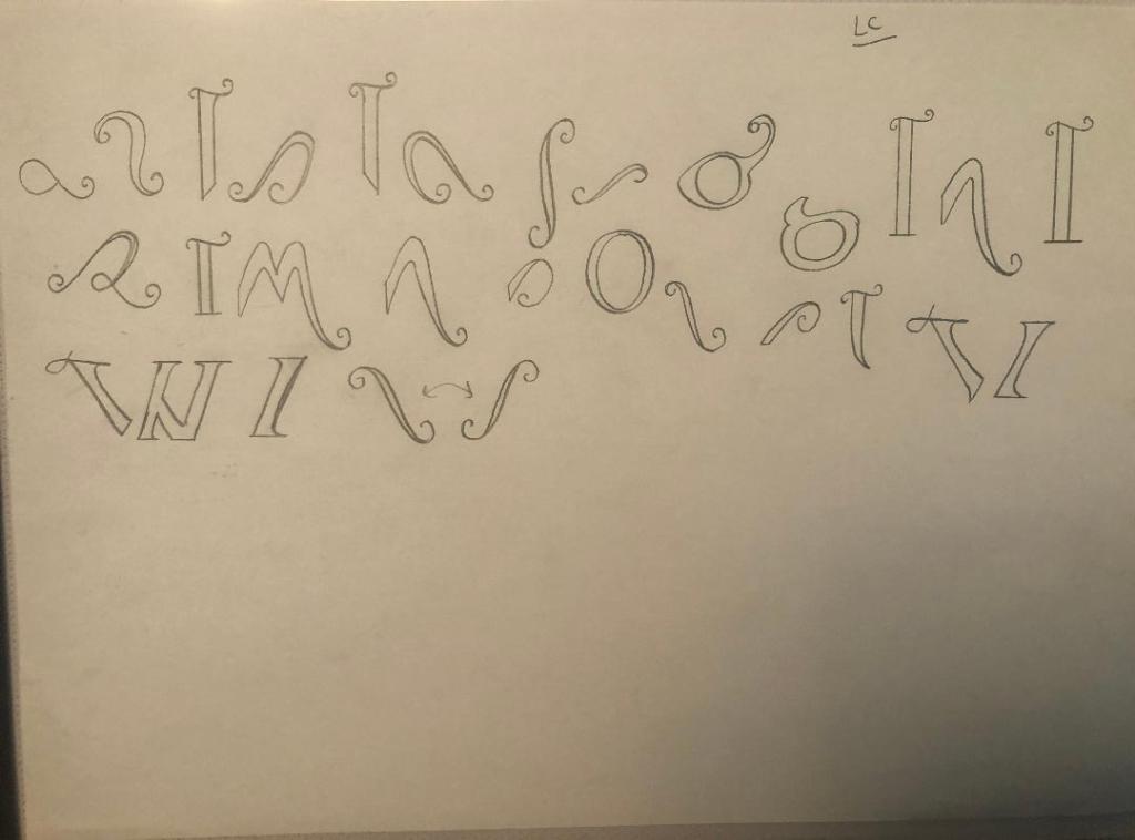
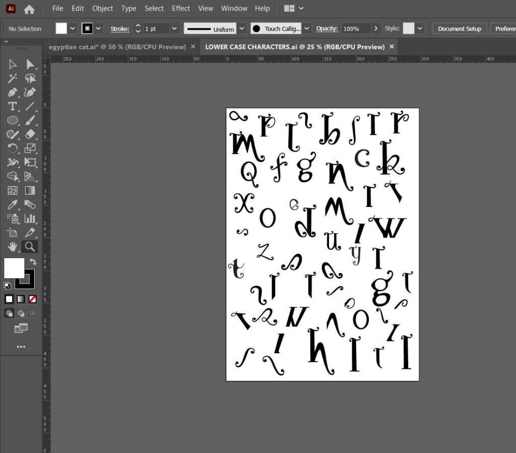
The sheet above are the parts that make up the lowercase letters and eventual lower case alphabet.
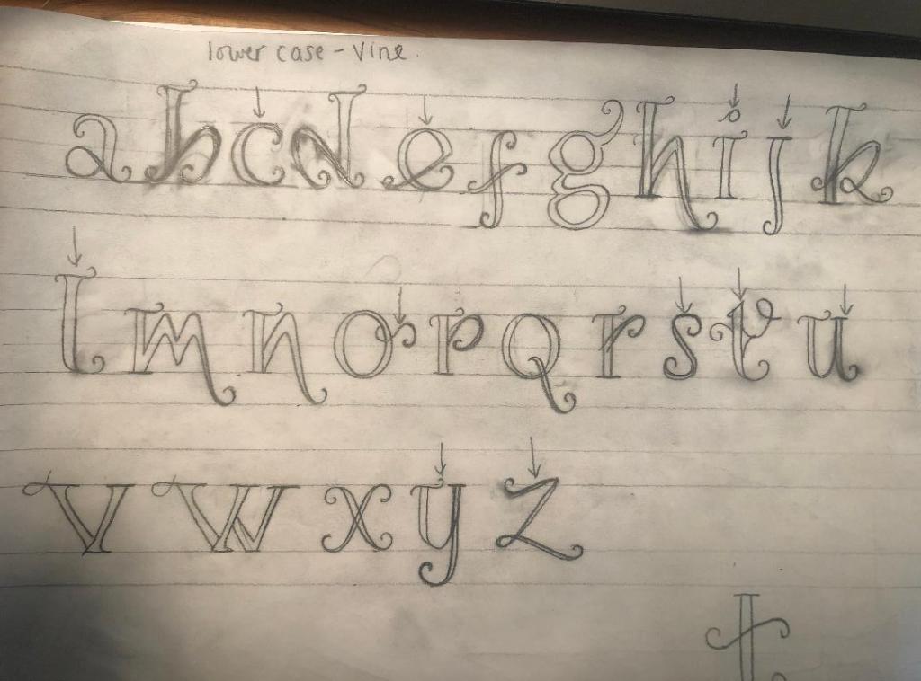
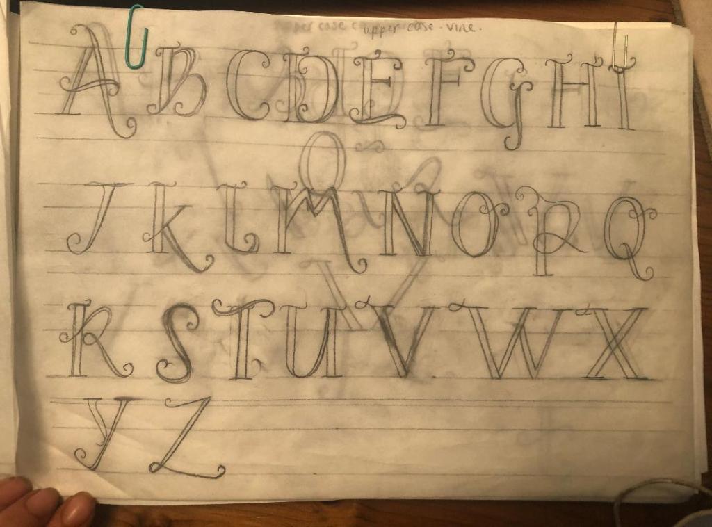
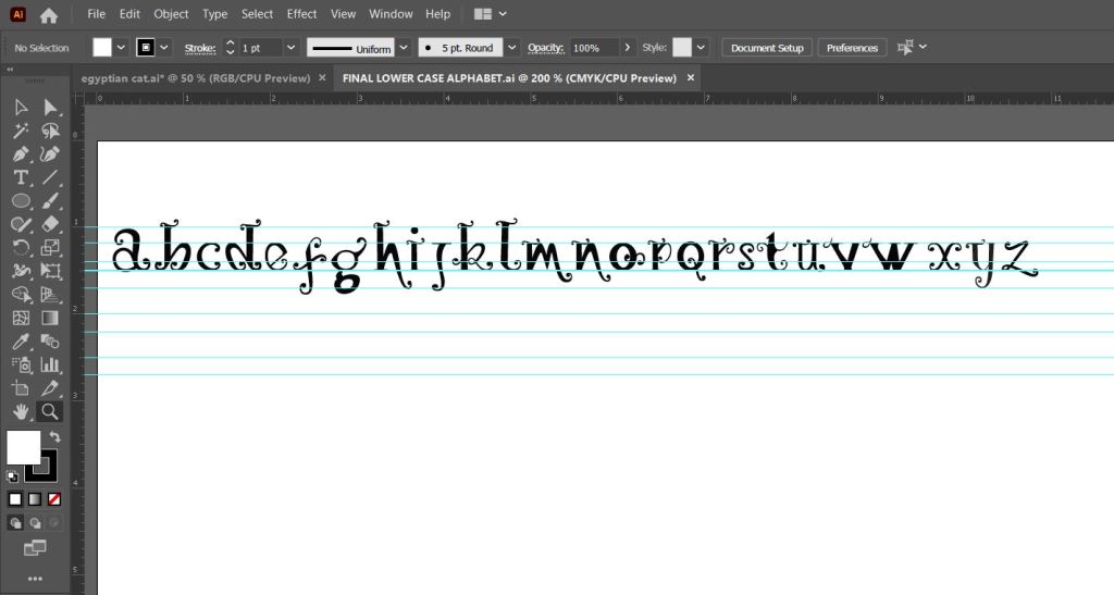
Above is the final lowercase alphabet! I actually quite like the b and d. Again, I am feeling a 1970’s vibe with this!
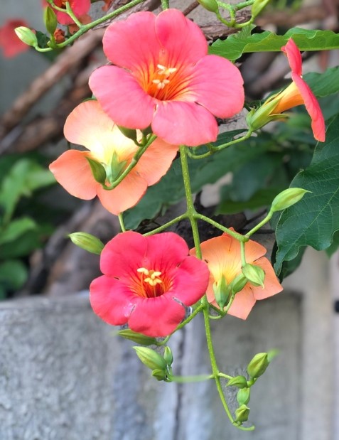
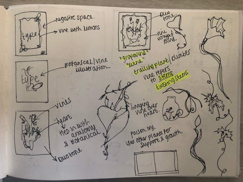
I needed a name for my typeface and asked my boyfriend Chris for any ideas, he actually came up with the name I used for it – Vine! In his opinion it looks like a vine with all the twists and twirls and to be honest it tied in perfectly with the plant botanical influence I wanted to use. I had also visited Beaulieu Estate whilst doing this assignment and there was a trumpet Vine there that I took a photo of as inspiration and to potentially use in my magazine design.

The trumpet Vine at Beaulieu 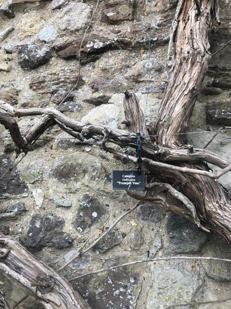
Digital Development
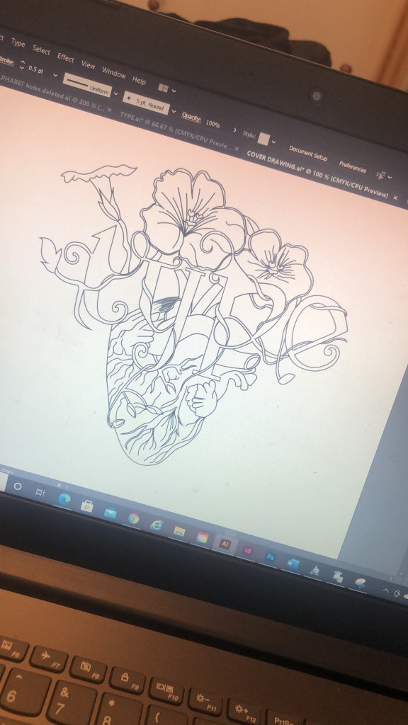
The next stage was a painstakingly long one! I had to take my drawings of Vine and draw them in Illustrator and turn it into Vector lettering to eventually import into a programme I bought called Fontself which turns your vector lettering into an actual font! How exciting!!
Eventually I drew out all the parts of the letters and pieced them together to form my letters. I then imported them into Photoshop to measure them out on a baseline and to an X-height and Cap height etc..

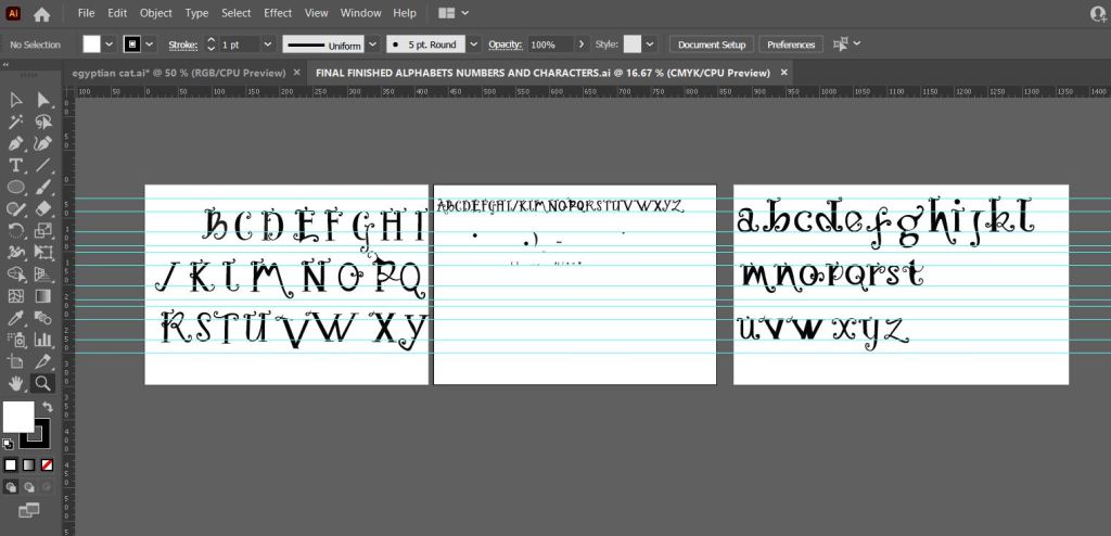

I mentioned earlier that I bought and used Fontself to create my typeface. I downloaded it from their website and then it is opened up in Photoshop where you can drag your letters into the programme directly from Photoshop to create your font!

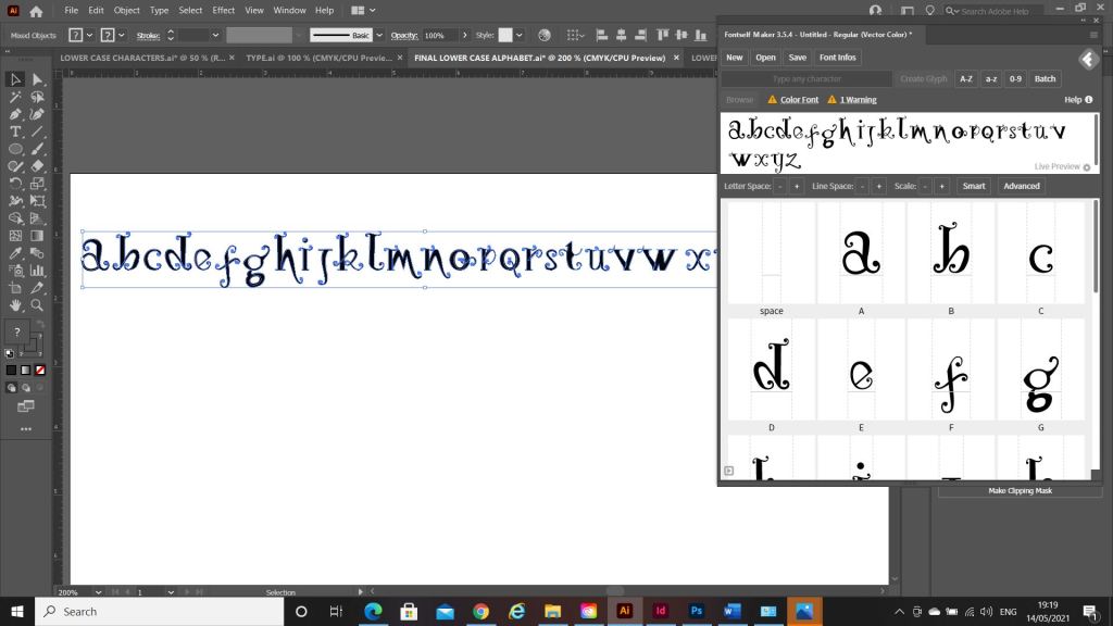
When the typeface has been made by Fontself it can then be downloaded as an actual font!

The only downside to my font is that it actually looks like the gimmicky, tacky font called Jokerman! I did watch a YouTube video on how to use Fontself though by Chris Do and he did seem to design a version of Comic Sans so it could always be worse! Also, because I did not spend as much time as I would have liked creating the typeface the sizes all came out wrong from my hand drawn baseline. That is why letters such as the J sit way too high. It takes years and years to perfect a typeface though so I am pretty pleased with the one I have created and also it has given me an idea of how type is created! Even if I have done it in an amateur way, I have gone through the correct process of designing a typeface. I did read about optical illusions after I had created this though and wished I had created the X differently. Where a thin line is obstructed by thicker lines they seem to continue on a different path; i.e the X. To balance this illusion the thin diagonal strokes must be placed at different angles parallel to each other. The greater the contrast, the more this illusion happens. It can also be visible in Q, W and ampersands. I would definitely have another go at designing a typeface however, maybe when I have more time though and deadlines are not looming!
My next step was to figure out how to turn my title into a beautiful magazine cover!
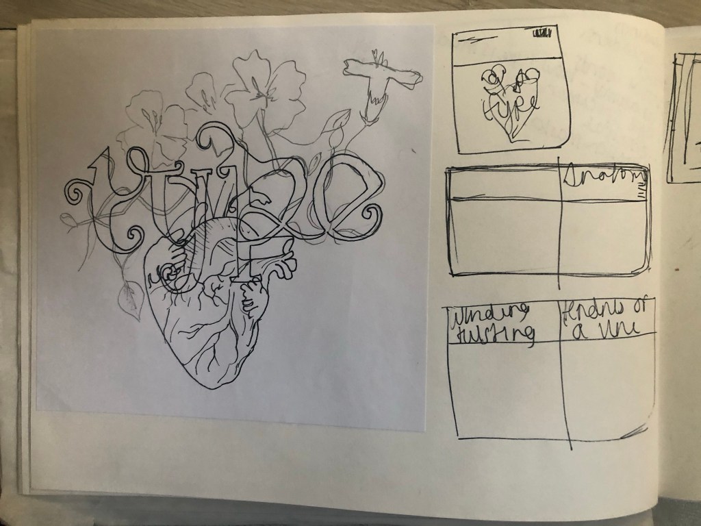
I already mentioned how I had the idea to use a drawing as the main image for my magazine cover; similar to what I achieved with my HG Wells titles that I did earlier in the course. I had the idea to create an anatomical design which links to the anatomy of type but is also similar to plant and human anatomy. Whatever design I chose to do would also have to relate back to Vine also.
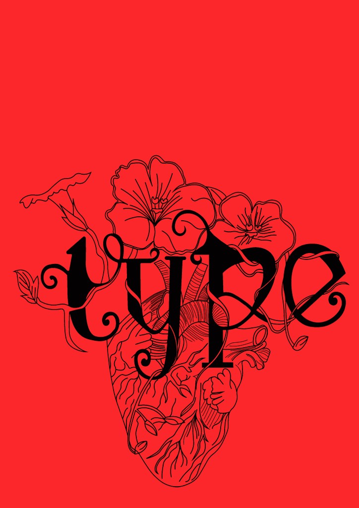
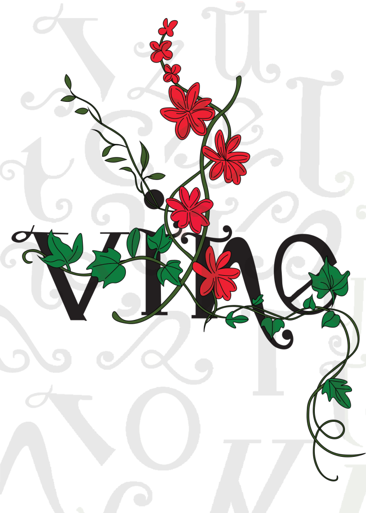
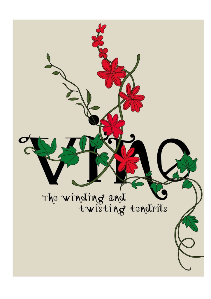
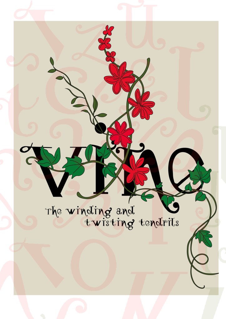
This is the design I came up with; very similar to the art I did for one of my HG Wells covers, in fact I used the drawing of the heart I used for that in this. The heart relates back to the human anatomy and the vine that is wrapped around the heart and the type represents the fact that it is also living in the same way. I also googled vine flowers and it came back with Red flowers which matched the colour scheme I was going after.

The heart I used in my HG Wells covers
Once I had drawn it up, it really did look like a good piece of vector art!
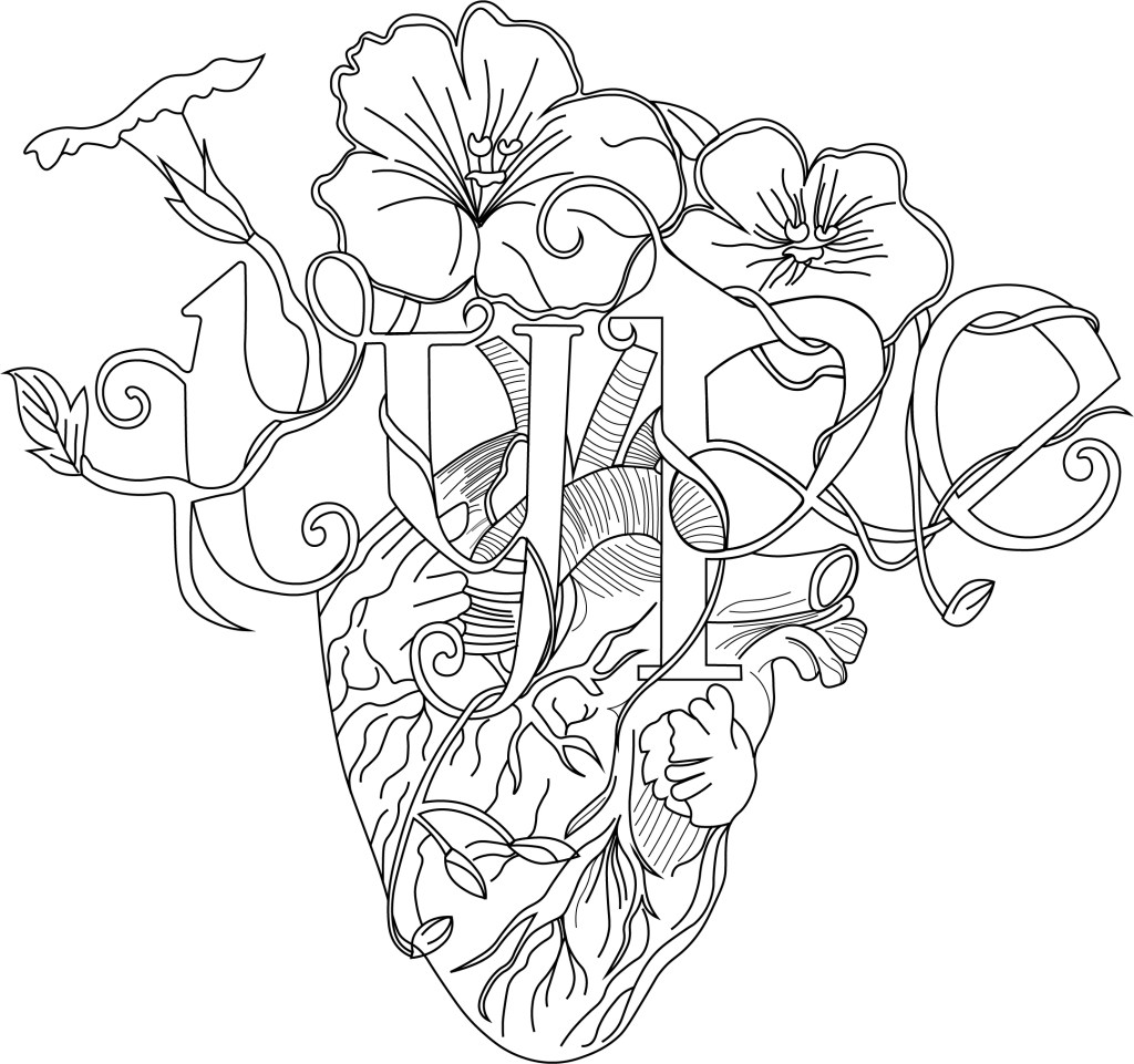
As much as I love Black and White line drawings, with vector art it just doesn’t look as good. I had the idea to do Duotones on this but none of the colour schemes I came out with really worked. I decided in the end to colour it in. Once I had it coloured it in, it gave me once again Avant Garde vibes.. like the sort of illustration you would have found on a 1920s postcard or in an illustrated Victorian style flower book. Either way, I liked it!

Now was the time to start designing the magazine cover!
Designing the magazine cover
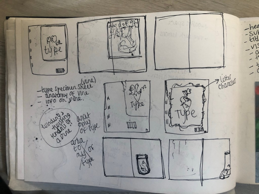
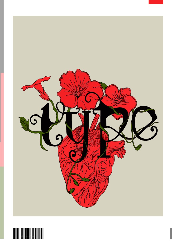
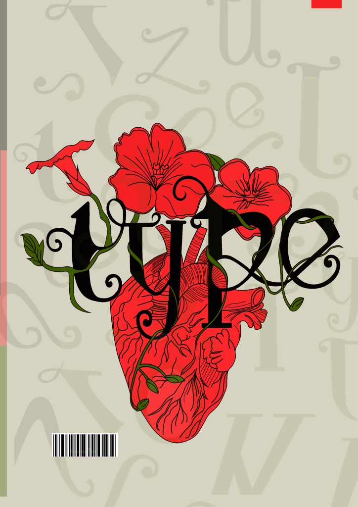
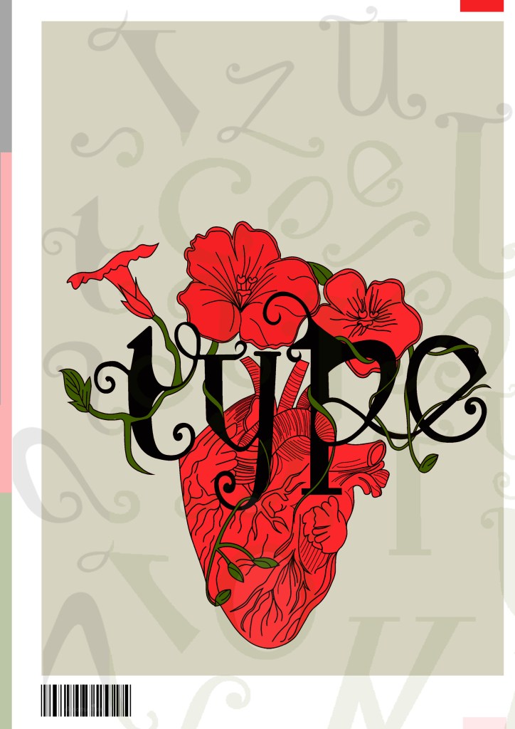
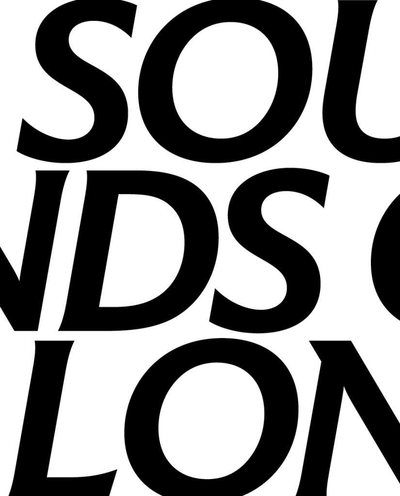
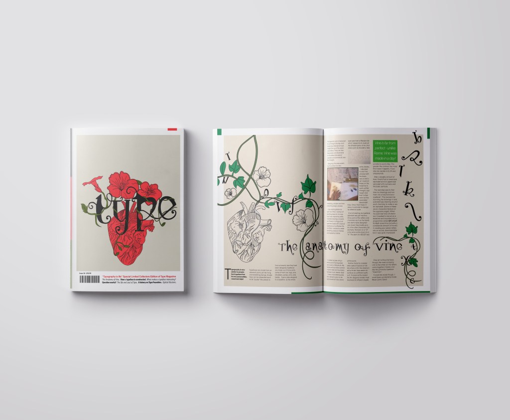
I wanted a cover with lots of negative space, to look minimalistic and to be instantly eye catching and bold to look at and these were the final contenders for my front covers. I really struggled to choose between the middle one I went with and the bottom one with the parts of the letters in the background. Everyone I asked chose the bottom design, but in the end I thought the simple plain background worked better and didn’t take the attention away from the main image. It felt like the bottom one was trying to hard to compete against itself. I did ask one of my colleagues at work (she is a Textiles teacher) and she said when she saw it, it reminded her of one of the matte expensive magazines you buy from fancy exhibitions and museums! BOOM! I met my own expectations! ;p
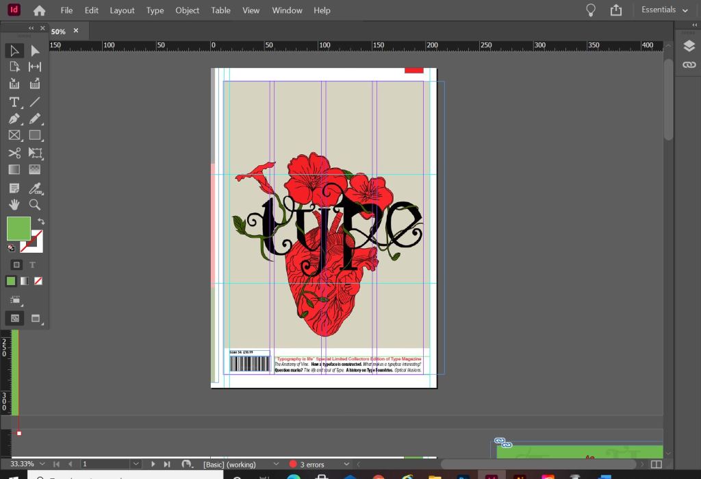
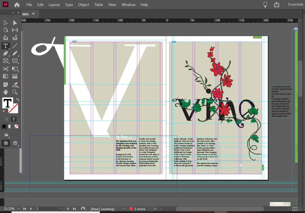
I created the illustration in Illustrator and then exported it as a PNG with a transparent background so that I could import it into InDesign and change the colour background to whatever I wanted. I worked to a 4 column grid. The typefaces I used along the bottom of the magazine were Helvetica, Meta condensed Bold and Meta condensed book italic. They all work well together and bring contrast to the layout.
Designing the introductory pages
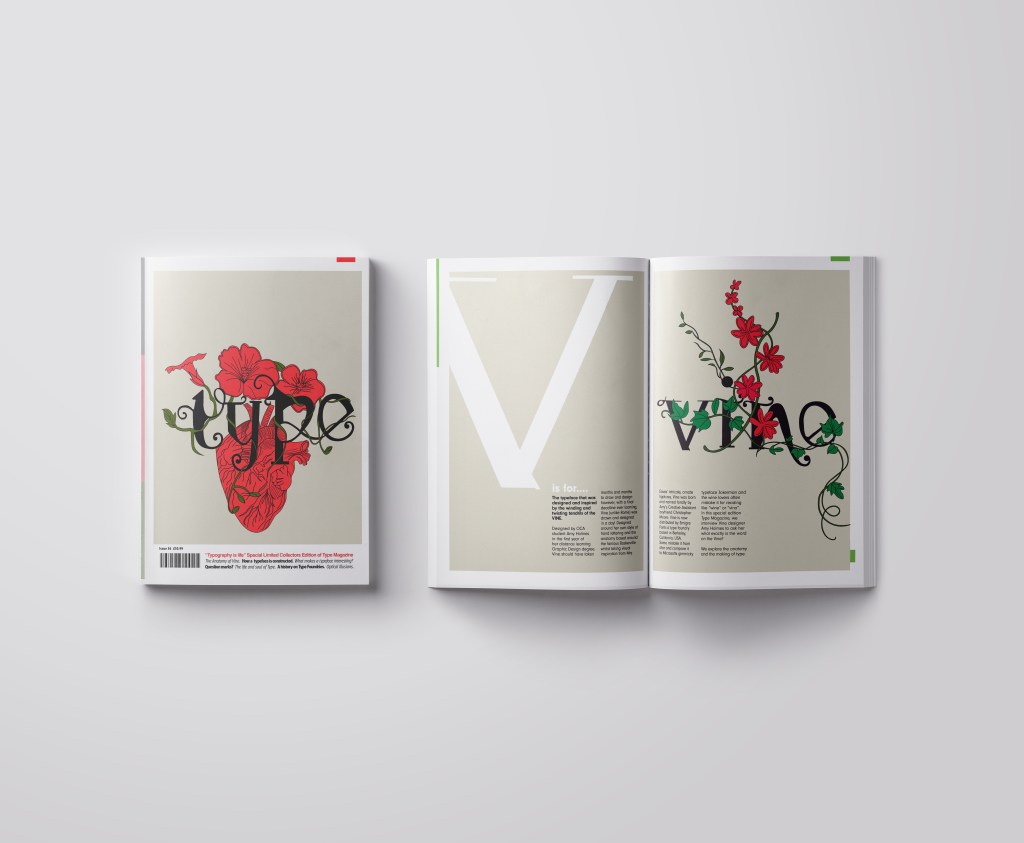
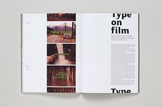
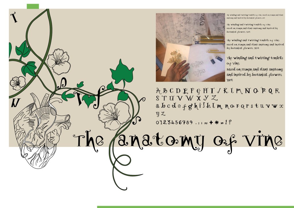
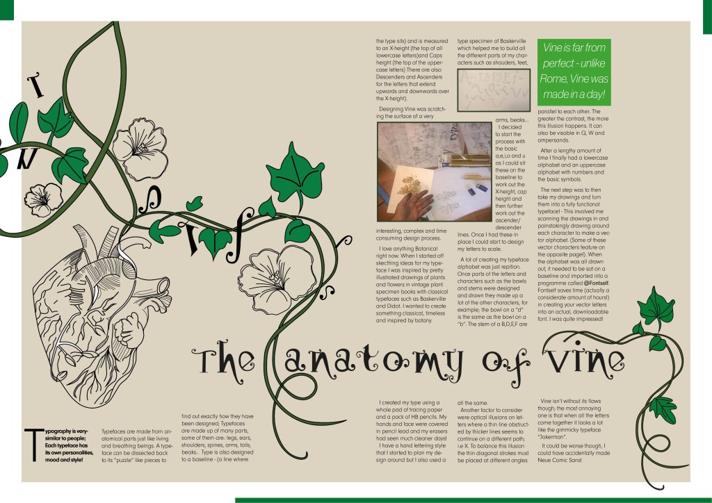
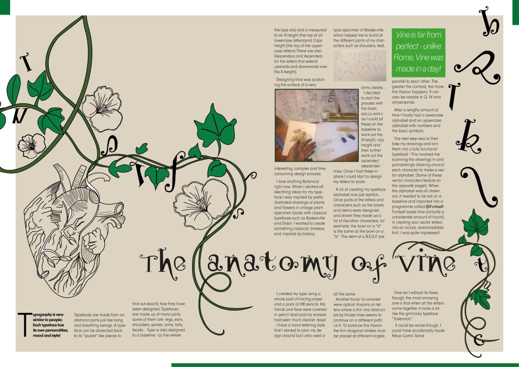
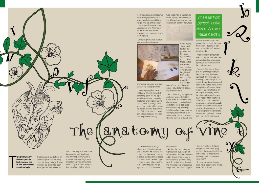
On pages 2-3 I really wanted to give an introduction on what I was going to write about rather than going straight into the article. The brief specified that I must mention the anatomy of type and write about what I have learned from how type is designed. I decided to put a twist on it and write about how I made my own typeface; I had the idea to do “The anatomy of Vine” an article telling the reader the process involved with making Vine. I would put a spin on it and make out the magazine was interviewing the designer (which would be me). To do this though it meant that I needed to keep a similar layout and theme to the front cover. I would also need to showcase my font- Vine. This particular article would be more like a type foundries publication that they would produce when they were promoting one of their typefaces (just like FS Benjamin). With this idea in mind I then created the next phase of my magazine design and drew an illustration to represent Vine.
I then did exactly the same as before and turned my art into vector art. I did not need to draw around the text though as that is now an installed, useable font! ;D


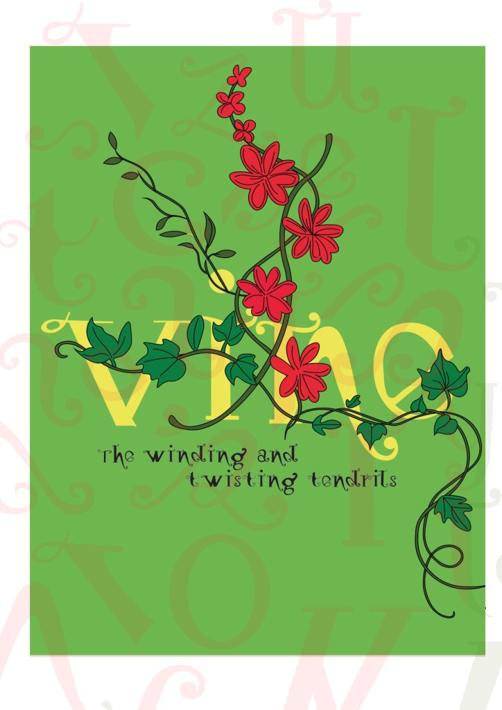


I really toyed once again with which version to go with. I really liked the contrast in colour against the bottom grey and the top left bright green and really did think that the green would have been a better option to choose because of this, but then I decided to keep the pages in repetition with the front cover and went with the grey.
I wanted my illustration to fill the whole right hand page and then have an intro on the left. The introduction is basically a blurb which says that Type Magazine is interviewing the designer of Vine and is exploring the anatomy of type. I wanted to keep negative space and not have the pages crammed full of information. I wanted to keep the clarity and cleanliness. I decided to use an enlarged V (In Vine typeface) for the left hand side and then sticking to the same 4 column grid I placed my introductory text in the 4 columns along the bottom. I made sure that the text was aligned to the baseline grid so that the text aligned along the bottom. The green boxes along the edge are just to bring some contrast ad colour into the design.

Designing the Anatomy of Type (Vine) article
I am not going to lie.. I pretty much winged this part of the assignment! I started from scratch in InDesign with no prior sketches, just an idea in my head and then kept on developing it from there!
These are all the versions of it that I tried out before I reached my final version (bottom right)
I wanted to have that illustrative element in it again to match the rest of the article so I took pieces off the illustrations I had drawn already to create a new illustration. I wanted it to also look like the Vine was alive as much as the typography so had parts of the letters growing off the vine and a heart growing from one of the branches; again, this ties in with the anatomy part.
I originally wanted the text to flow through the piece as if it were a vine; winding up the page, but with the amount of text this was impossible. The only way was to stick to a 4 column grid again and have the text flow throughout it. I used green at certain points in the design for contrast and that “pop” of colour. I used a pull quote in a green box to separate the text up and I used some photographs of where I designed the typeface.


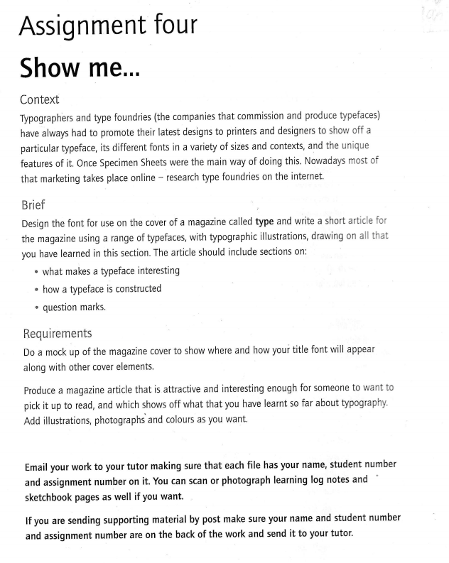
Designing “What makes a typeface interesting?” article
I also designed this article slightly differently.. I also winged this and developed it as I went along! One thing I knew though was that I did not want to use the heading “What makes a typeface interesting?” I googled exactly what does make a typeface interesting and it came up with 5 points:
- Contrast
- Originality
- Legibility
- What is the purpose
- It’s more than a font
These points made perfect sense to me and I easily wrote up an article stating what was important about all of these facts and how they helped to make great type!
http://psd.fanextra.com/articles/thursday-theory-what-makes-great-typography/
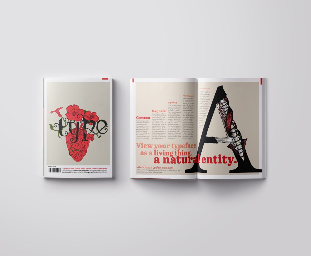
I did however read a good quote – “View your typeface as a living being, a natural entity” oohh it felt deep! I loved it! It tied in again with how I was trying to liken type to human and plant anatomy. I searched Pinterest for “Type anatomy” and there were images of type being torn apart to reveal bones and muscles. I loved this idea! I drew my own version of it on a letter A. I would use this as the main image for that article!
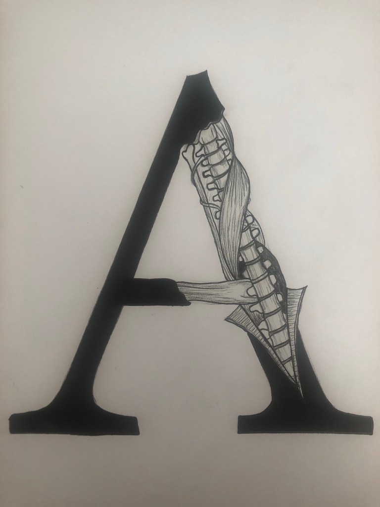
I drew the first version in Black and White and scanned it in and then went back to the original and added colour just so I had two versions I could choose from. Eventually I decided that the colour one was the best and I imported it into Photoshop to tweak and adjust the levels and colours etc.
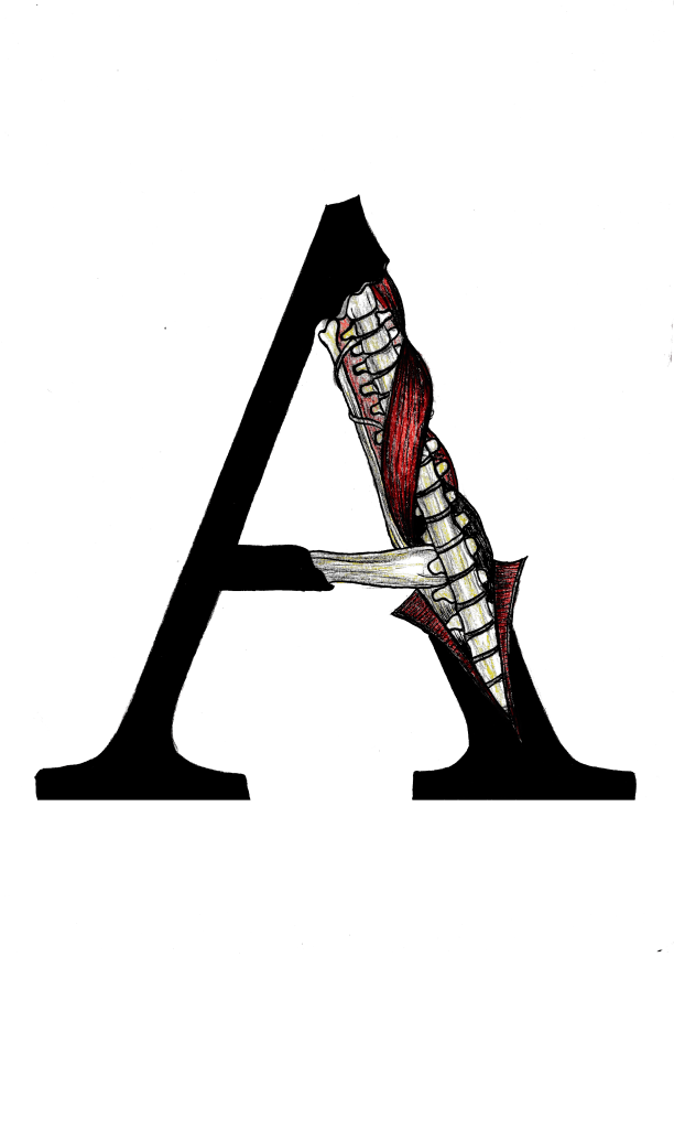
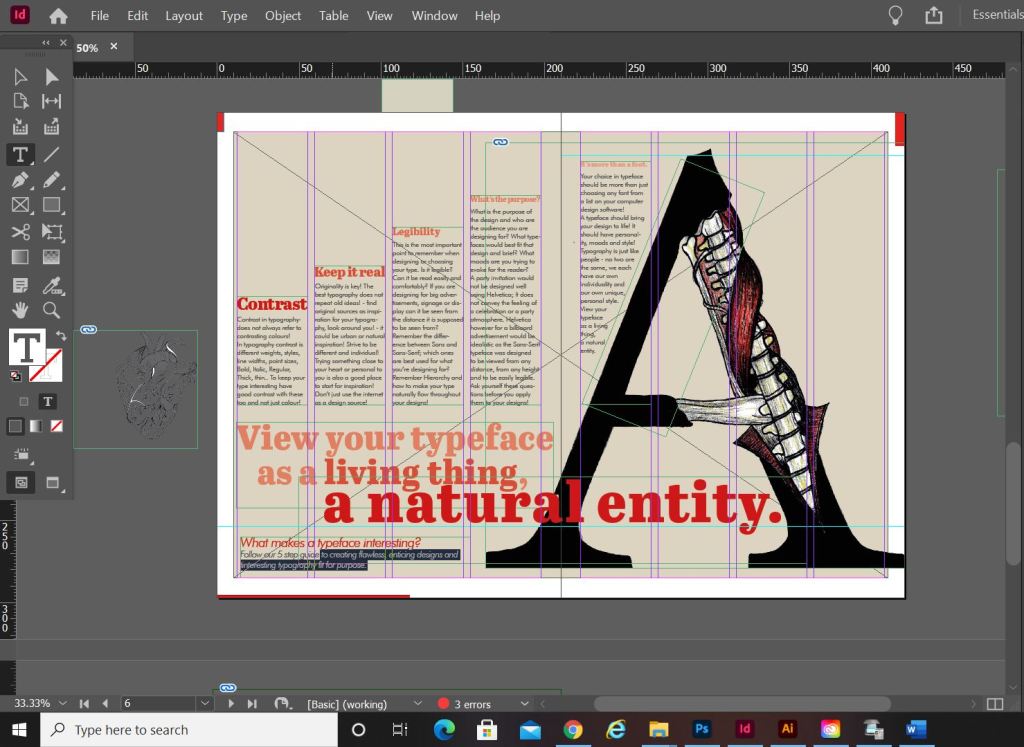
I am actually quite pleased with how this double page spread turned out. I did worry for it at the beginning because I just could not get the sizing of the “A” right or get the heading to look right. In the end it worked out better when I broke the heading up into different point sizes and lowered the opacity on parts of the type. I used the quote that I found as a main heading; I felt like that would draw attention more and add more curiosity to the article than directly saying what the article is about. I kept the same 4 column grid layout but decided to place the text slightly differently; I placed the text in an upwards direction to resemble evolution. To add more depth and for that element of contrast I also used different point sizes and changed the opacity for the headings as they moved upwards.
The typefaces that I used for this layout were;
- Abril Titling for the main heading
- Futura light for the main body text
- Futura light Italic for the sub heading along the bottom


Designing “Question marks” article
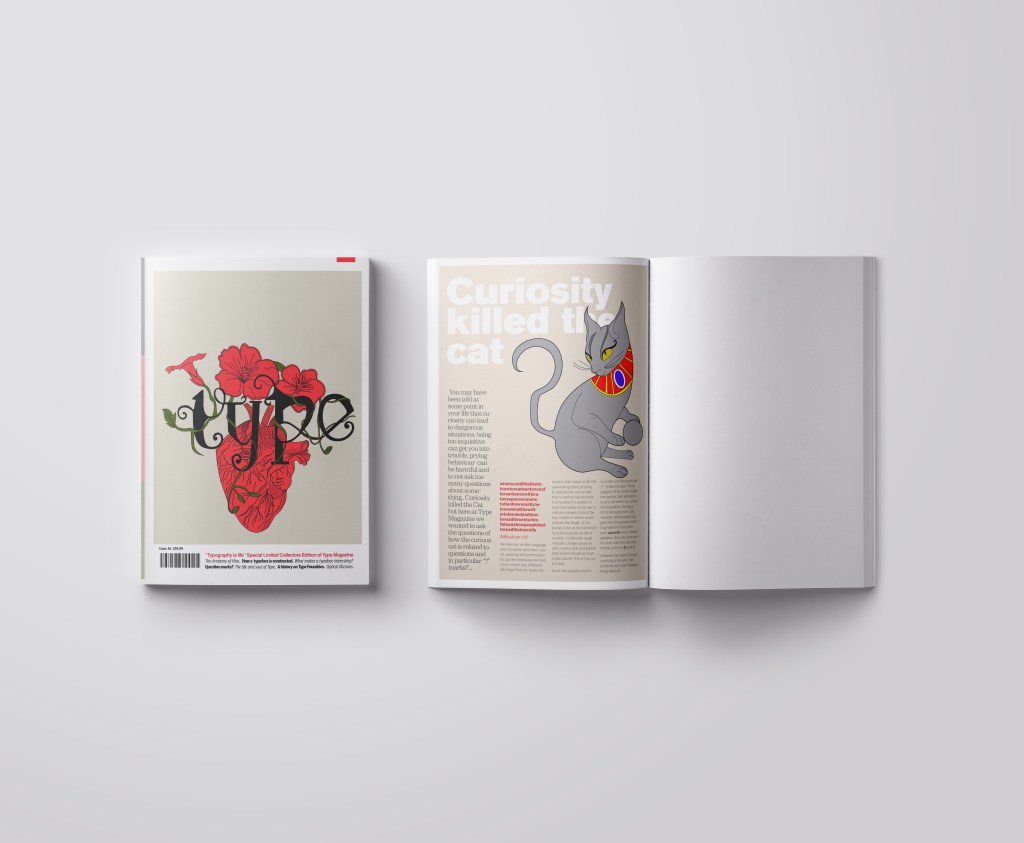
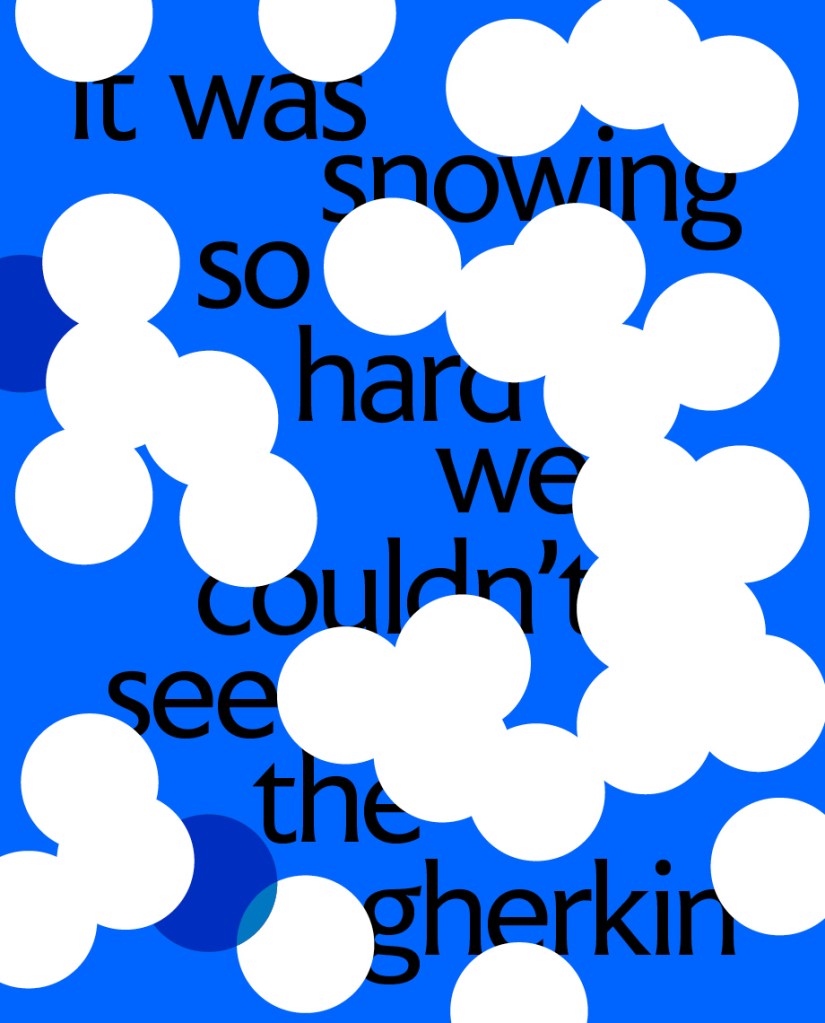
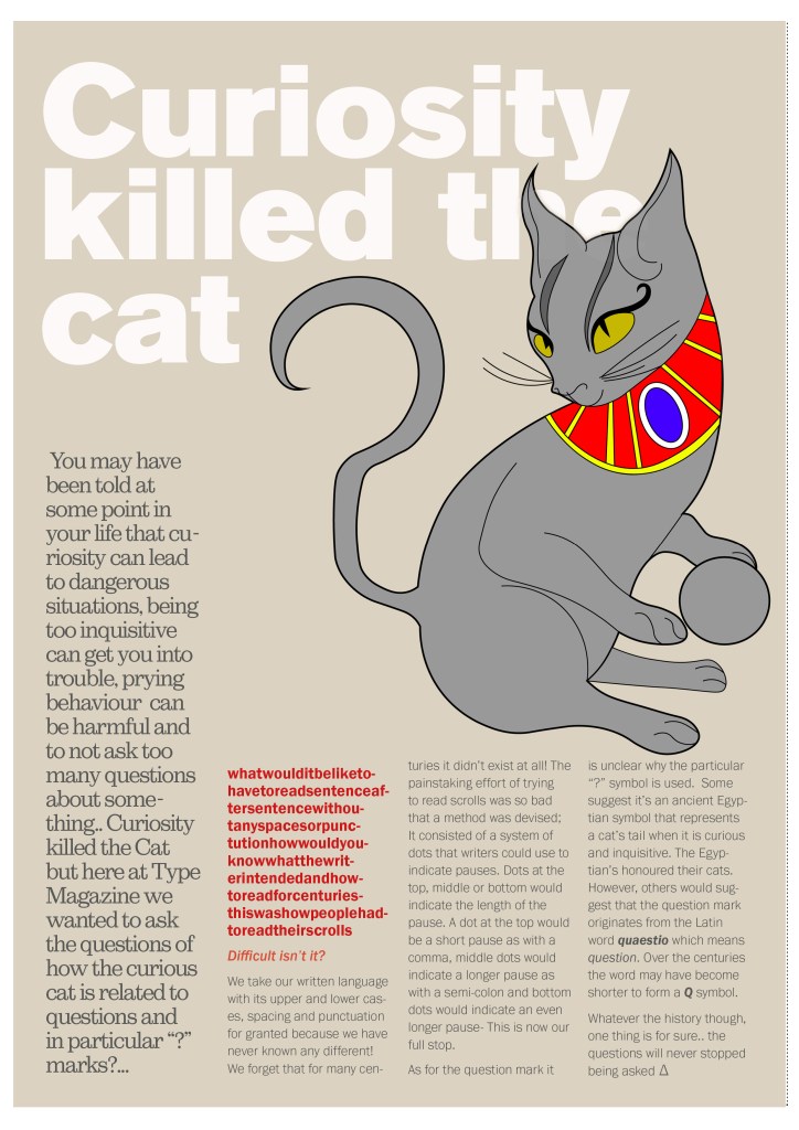
This is the section of the brief that really confused me. I was actually wondering whether it was a trick question and the answer was so simple that It was staring me in the face! However, I had a snoop at fellow students work and it seems that none of them were any the wiser! The only answer that I could think of was that the brief was asking for a history of the question mark… I mean, who did come up with that for a symbol? a squiggly weird shape! – this is where I got the idea for my final page!..
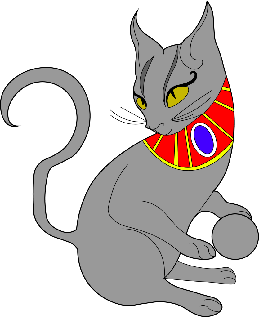
I searched on Google and found the above link, that explained to me that the question mark was possibly invented at the time of the Egyptians and the design of the question mark based on a cats curly tail! Well!.. I have heard things that make less sense! -With this in mind I thought about drawing an illustration of an Egyptian cat to use on my design and make its tail in the shape of a question mark. It also made me think of the quote “Curiosity killed the cat” – this is also where a person is curious for answers!!
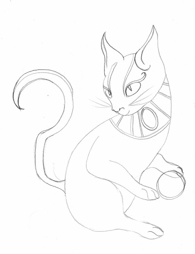
This is the drawing I ended up with! In his/her paws is a ball which makes up the lower point of the question mark on his tail! Again, I went into Illustrator and drew him/her in vector!
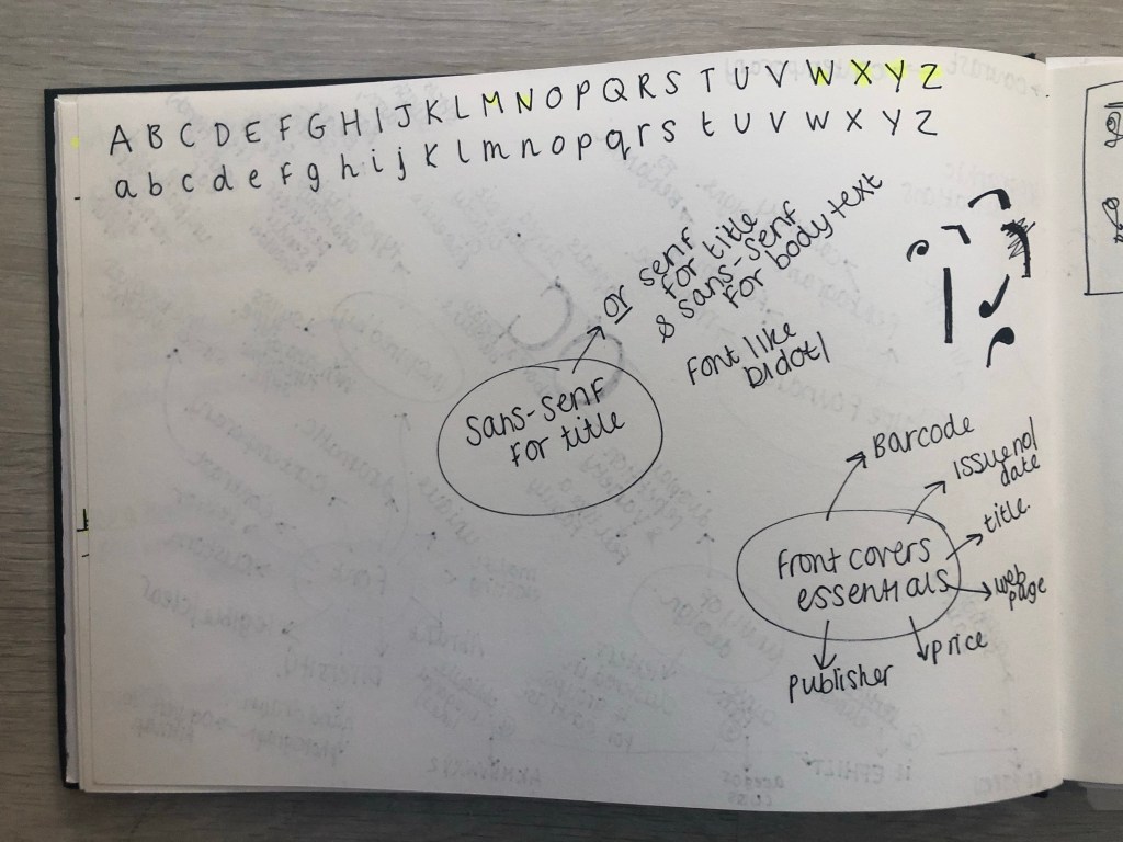
The typefaces I used for this page were:
- Berthold Akzidenz Grotesk – the main heading
- Sutro Light – for the side blurb (which is Egyptian designed)
- Franklin Gothic Light – for the body text
I struggled with hyphenation in the left introduction blurb column.. I struggled to choose a point size that would fill the space but also stop the words from having hyphens. In the end I went along with it because I have seen magazines use hyphens and also because I did not want massive rivers between the text; I am still learning how to adjust the tracking/kerning accordingly. Changing some of the text to Red brought attention to that specific part of the article which is actually quite important to see why this article is as important as it is and also because of contrast again! It adds a pop of colour!


Conclusion
Overall I am pleased with how this assignment has turned out! When I started this typography unit I felt very scared and overwhelmed and now I can say that I have learned so much and I am feeling confident about using typography in my future designs from now on! I particularly love book and magazine design so really enjoyed this brief. I am becoming more familiar using InDesign now, again, I felt a little overwhelmed when I first started. I still need to improve on tracking/kerning etc to make sure that my type looks perfect on my layouts but that will come with further practise! I think I have met what the brief has asked of me, except I have possibly gone about it in a slightly different way.. The only thing I could have improved on was to make the articles “short” but I was too busy experimenting with how to lay everything out whilst still keeping negative space and making it interesting. I had a lot of information to fit on one double page spread!
The final mock ups!